
DATA VISUALIZATION FOR ANALYZING SIMULATED
ROBOTIC SOCCER GAMES
Brígida Mónica Faria
1,2
, Beatriz Sousa Santos
1
, Nuno Lau
1
and Luis Paulo Reis
3
1
DETI/UA – Departamento de Electrónica, Telecomunicações e Informática, Universidade de Aveiro
IEETA – Instituto de Engenharia Electrónica e Telemática de Aveiro, Aveiro, Portugal
2
ESTSP/IPP
– Escola Superior de Tecnologia de Saúde do Porto, Instituto Politécnico do Porto, Porto, Portugal
3
DEI/FEUP – Departamento de Engenharia Informática, Faculdade de Engenharia da Universidade do Porto
LIACC – Laboratório de Inteligência Artificial e Ciência de Computadores da Universidade do Porto, Porto Portugal
Keywords: Data Visualization, Visual Data Mining, RapidMiner, RoboCup Soccer, Simulation.
Abstract: RoboCup is an international cooperative research project aimed at promoting research in Artificial
Intelligence and Robotics. It includes a simulation league where two teams of 11 players compete in a
robotic soccer game very similar to real soccer. Teams exhibit very complex strategies in these games that
are very difficult to analyze by conventional observation methods. This paper presents an approach to the
visualization of simulated robotic soccer games using the RapidMiner software package. Various
visualizations were developed using Andrew´s Curves, Survey Plots, several types of Parallel Coordinate
visualizations and Radial Coordinate Visualizations. These visualizations enabled to take some interesting
conclusions about the differences between games of FC Portugal robotic soccer team using different
formations and against distinct opponents.
1 INTRODUCTION
RoboCup is an international cooperative research
project aimed at promoting Artificial Intelligence,
Robotics and related fields (Lau et al., 2007)
(Robocup, 2009). There are different leagues
divided in two main groups: robotics and simulation.
The first group involves physical robots with
different sizes and different rules based on the
competition that they integrate. The second one has
the goal of, without the necessity to maintain any
robot hardware, enable to research on artificial
intelligence, coordination methodologies and team
strategy (Robocup, 2009) (Reis et al., 2001).
RoboCup Simulation League has been one of the
pioneer competitions integrated on the RoboCup
international project. It is subdivided into three
distinct fields of simulation (Lau et al., 2007): 2D
and 3D Simulation League and mixed reality using
the Eco-Be Citizen Robots. In the 2D Simulation
League two teams of eleven autonomous agents
(software programs) each play soccer in a two-
dimensional virtual soccer stadium represented by a
central server, called SoccerServer. This server
knows everything about the game, the current
position of all players and the ball and is responsible
for updating the world state executing the players’
commands and sending the perception information
to the players (Reis et al., 2001). The football games
are recorded to a log file that holds all actions that
took place at every moment in each game. Studying
the other team’s code and binaries is not an easy task
since most teams don’t publish their code and the
binaries change throughout the competition. So, a
possible alternative is to visualize the recorded data
in previous games logfiles to get a general
understanding of other teams’ techniques.
This work involves a simple case study using
visualizations of a data set containing robotic soccer
games of the FC Portugal simulation 2D team
developed by the Universities of Aveiro and Porto
(Reis et al., 2001). The data set contains the
coordinates of the players and ball and the
information concerning the opponent team as well as
the formation that was being used by the FC
Portugal team.
This paper is organized as follows. Section 2
includes an initial explanation about theoretical
concepts concerning Information Visualization and
Visual Data Mining. Next a simple comparison
161
Faria B., Sousa Santos B., Lau N. and Paulo Reis L.
DATA VISUALIZATION FOR ANALYZING SIMULATED ROBOTIC SOCCER GAMES.
DOI: 10.5220/0002851301610168
In Proceedings of the International Conference on Computer Graphics Theory and Applications (VISIGRAPP 2010), page
ISBN: Not Available
Copyright
c
2010 by SCITEPRESS – Science and Technology Publications, Lda. All rights reserved

study about some software available and more
specialized for developing this kind of analysis is
presented. The explanation is focused on the
RapidMiner software (RapidMiner, 2009) since it is
suitable for applying Data Mining techniques and to
produce visualizations with multi-dimensional data.
Finally, the experimental developments and results
are presented along with some conclusions and
future work.
2 DATA VISUALIZATION
The term visualization may serve several areas
(Chen et al., 2008) with their own specificity. Data
visualization, information visualization and visual
data mining are some examples of fields intimately
connected to the multidimensional data with high
dimensionality (Keim, 2002). In fact, information
visualization and visual data mining are areas of
research that are gaining increasing attention due to
the huge importance of extracting information of
vast volumes of data produced everyday (Keim,
2002) (Card et al., 1999) and as stated by Edward
Tufte (Tufte, 1983): “often the most effective way to
describe, explore and summarize a set of numbers –
even a very large set – is to look at pictures of those
numbers”. More scientific research about data
visualization and visual data mining has been
published and can be found in (RapidMiner, 2009)
(Hansen et al., 2005) (Tan et al., 2006) (Young et
al., 2006) (Sebillo et al., 2008) (Rao et al., 2005).
Nowadays several simple functions for
generating complex images from abstract data are
available. The objective is to provide a way to
understand and get insight into non trivial
agglomeration of data (Rao et al., 2005). Therefore
the main goal is to communicate information
without discarding the design and simplicity of
images (or animations) in order to produce and be
able to extract the most significant knowledge.
The development concerning data visualization
techniques is occurring in a very fast way in the last
years. Some examples are the development of a
variety of highly interactive computer systems, new
paradigms of direct manipulation for visual data
analysis such as linking, brushing, selection or
focusing. New methods for visualizing high
dimensional data and the invention of new graphical
techniques for discrete and categorical data are other
examples of the fast progress on this domain (Rao et
al., 2005).
The advances in theoretical and technological
infrastructure such large-scale software engineering,
extensions of classical linear statistical modeling to
wider domains, the increase of computer processing
speed or even capacity and access to huge and
variable data accelerate the advances in order to
solve the new challenges.
Another goal of visualization is the interpretation
of the visualized information by an individual and
the creation of a mental model of information (Tan
et al., 2006). Every day visual techniques such
graphs and tables are used to display simple
information like weather forecasts or sports results.
With the same importance visual techniques
represent an significant role in data mining and are
usually known as Visual Data Mining.
3 VISUAL DATA MINING
Using visualization techniques it is possible to
absorb large amounts of visual information and find
patterns in it. However, it is important to include the
individuals in the data exploration process to draw
conclusions and directly interact with the data (Keim
et al., 2002). The definitions proposed for Visual
Data Mining (Simoff et al., 2008) have in common
that visual data mining relies on human visual
processing channel and uses human cognition.
However, there are some variations in the
understanding of this concept. In fact, it is defended
that “the objective of visual data mining is to help an
individual to get a feeling for the data, to detect
knowledge and to gain a deep visual understanding
of the data set” (Simoff et al., 2008) or, as it is
proposed by Niggemann (Simoff et al., 2008), that
visual data mining is a visual presentation of the data
close to the mental model.
Data visualizations can provide the verification
of the initial hypotheses and may be accomplished
by automatic techniques from statistics and machine
learning. Nevertheless it is important to mention that
using visual data exploration, allows identifying
rather homogeneous and noisy data and, obviously,
it is more intuitive and does not require
understanding complex mathematical or statistical
algorithms (Keim et al., 2002).
There are three phases (Keim et al., 2002) that
should be followed to process visual data
exploration according to Keim (Keim et al., 2002).
First it is necessary to get an overview of the data to
find patterns and outliers. Next it is important to
zoom and filter the data. The final step consists in
interactively selecting parts of data to be visualized
in more details known as details-on-demand (Keim
et al., 2002).
IVAPP 2010 - International Conference on Information Visualization Theory and Applications
162

The type of data to be visualized can be 1D (e.g.
time-series); 2D (e.g. geographical maps);
multidimensional data (e.g. relational tables); text
and hypertext; hierarchies and graphs (e.g. telephone
calls). Closely to the type of data are the
visualization techniques used. The techniques can be
classified as standard 2D/3D displays (e.g. scattered
plots, histograms); geometrically transformed (e.g.
parallel coordinates); icon-based display (e.g.
Chernoff faces); dense pixel display and stacked
displays (e.g. treemaps). More detailed explanations
of these techniques can be found at (Chen et al.,
2008) (Keim et al., 2002) (Hansen et al., 2005)
(Young et al., 2006) (Ware et al., 2004) (Tan et al.,
2006).
To implement Data Mining (DM) techniques
there are several options (RapidMiner, 2009) (Eibe
et al., 2002) (Miner3D, 2009) (Moebes, 2009), all
incorporating some of the visual components
previously described. In this work three software
options were chosen for a comparative analysis:
Weka (Eibe et al., 2002) for historical reasons
since it is one of the oldest and one of the most
used software in this field;
3D Miner is a data visualization software for
multidimensional exploratory data analysis
(Miner3D, 2009). Recently it has been receiving
attention due to its capacity to support visual data
analysis, visual data mining and visual creativity,
speed and freedom to analyze and explore data;
RapidMiner (RapidMiner, 2009) provides
solutions for data mining, text mining and data
analysis.
The choice of the RapidMiner software has to do
with several points (RapidMiner, 2009). First the
number of operators related with data mining and
visual data is higher in this package than in the
others, second its usability, since the data flow is
always the same in a tree based structure. The tree-
based layout with a modular concept also enables
breakpoints and re-using building blocks. Another
important aspect is concerned with the efficiency
because of the layered data view concept, many data
transformations are performed at run-time instead of
transforming the data and storing the transformed
data set. The scalability of RapidMiner has
improved and in the last versions algorithms were
optimized for speed and the internal data handling of
RapidMiner allows the application of a large amount
of data mining and learning methods directly on an
external database. The Weka toolkit is easy to
integrate into other software products. However, to
integrate different data mining processes into the
same product based on Weka it is necessary to re-
transform the data. In RapidMiner the layered data
views allow the integration of different lines of
analysis into a single product without copying and
re-transform repeatedly (RapidMiner, 2009). 3D
Miner has developed the visualization structure for
analyzing the data, however in RapidMiner
visualization techniques for 1D, 2D and multivariate
are also available and allow the best choice of visual
data. Another aspect that separates these two
software packages is that RapidMiner is Open
Source and has a quick response for questions, since
the Rapid-forum is maintained by several full
members. On the other hand, 3D Miner provides
information, demos, videos, support on the official
web page, however it is not Open Source.
For the abovementioned reasons RapidMiner
was chosen for this study.
4 EXPERIMENTAL TASKS
This section describes the importance of the
visualizations and the problem context. Therefore it
establishes several steps to perform the data
acquisition, visualization and a preliminary
evaluation with the target users of the visualizations,
as well as external experts in design and visual
statistics.
4.1 Visualization and User’s Objectives
Visualizing Robotic Soccer games and gathering
adequate information from them is a key issue to the
performance of a robotic soccer team. However,
most of the information needed is not easy to gather
or visualize from the games. The information
gathered along in the games contains the coordinates
of 22 players and the ball throughout time. Even
simple information like the team formation (spatial
distribution of the players of the team) is hidden in
the data and some global analysis and visualization
is needed in order to correctly detect it.
Although in the data used for developing the
visualizations in this work, information regarding
the team formation was manually added in the log
files, in real games this information is not directly
available in these log files. Thus, the formations
must be inferred from the (x,y) coordinates of the
opponent team players prior to using it in the team
strategic decisions.
The users for visualizations of RoboCup simulated
soccer games are mainly the team developers that
need information about the opponent’s teams in
order to define their team strategy for a given game.
DATA VISUALIZATION FOR ANALYZING SIMULATED ROBOTIC SOCCER GAMES
163
Sometimes, very simple strategical decisions like
playing
in a 4-3-3 or 4-4-2 formation may be of
crucial importance to win a given game.
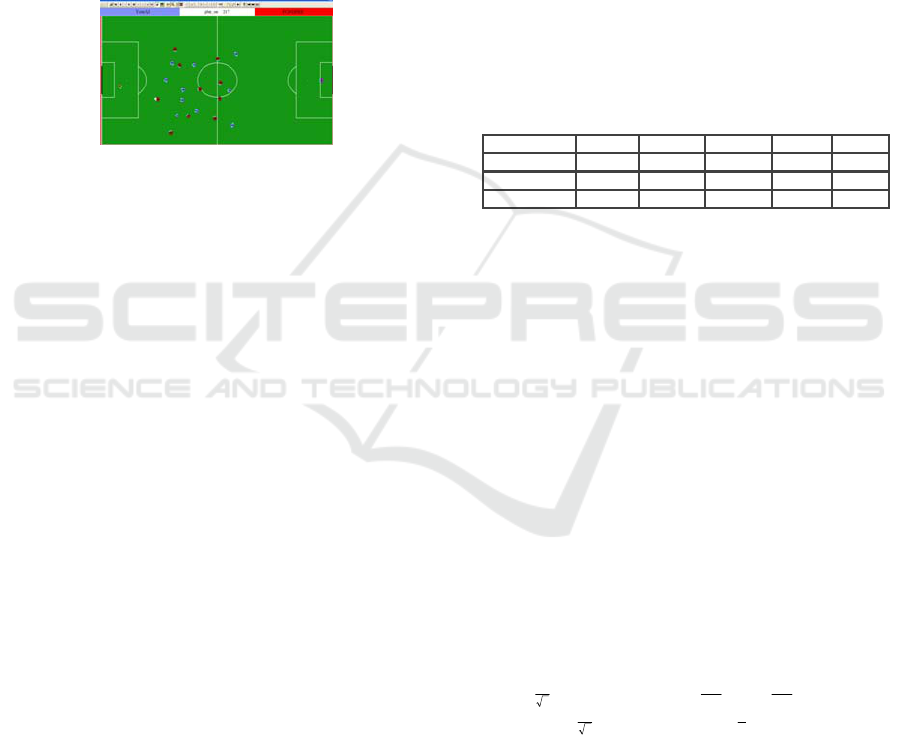
SoccerMonitor (RoboCup, 2009) is an application
that generates visual representations of the log files
as can be seen in Figure 1. Although it provides
information about all variables of each player, at
every moment of a single game, it does not analyze
or summarize the global motion of the players and
the team. This motion reflects the group’s strategy
and coordination capacities. However, the software
only gives consecutive snapshots of the positions of
the players and ball at a given moment in time.
Figure 1: Frame of a game in Soccer Monitor.
The objective of this study is to generate
visualizations that can gather information about the
global motion of the FC Portugal team (RoboCup,
2009) (Reis et al., 2001) against different teams and
with different formations.
4.2 Data Set Description
The dataset was constructed using the log files of a
very basic version of FC Portugal team playing with
three teams that historically participate in the
Simulation League (Almeida, 2009): AT Humbolt
(GermanTeam, 2009), Hellios and Brazil (Bahia,
2009). These teams were chosen since one of them
is a very strong team (Hellios), other is a good team
(AT Humboldt) and the other is a very weak team
(Brazil). Thus, the games against these teams are
very different from each other.
The dataset was produced with the x, y positions of
eleven players of FC Portugal Team in six distinct
games (two with each of the abovementioned teams)
without dynamic positioning and role exchange for
the players. The attributes are the positions and the
class is the formation that the team was playing or
the team against which FC Portugal Team was
playing. The field coordinate x had the range [-
52,5;52,5] and the coordinate y varies between [-
34,0;34,0] (corresponding to a typical real soccer
field of 105x68m).
The games were executed in Linux and the log files
are converted in text files with a simple application
getWState (Almeida, 2009) written in C++ for this
purpose. The information that can be extracted from
the games are the position as well as velocity of the
ball and the eleven players of the two teams and
other particular characteristics such as stamina,
kicks, head and body angles.
The final data set had the positions of the
players, the position of the ball, the formation that
the team was playing and the name of the opponent
team. Thus the global data base has 24 numerical
and continuous attributes (R
24
) and two nominal
attributes. The nominal attributes are the team
formation (10 formation options) and the name of
the opponent team (3 opponent options in this data
set). With this 26 attributes the visualizations can be
perceived as a multivariate problem. Table 1
displays the possible formations that the team could
play.
Table 1: Formations of FC Portugal Team.
Classes One Two Three Four Five
Formation 433 442 343 352 541
Classes Six Seven Eight Nine Ten
Formation 532 361 451 334 325
4.3 Visual Techniques
RapidMiner incorporates several options for
analyzing multivariate data. The first objective was
to give a general view of the three games on the
database and let three groups with different
experience: RoboCup experts, designers and
statisticians decide which of the visualizations better
represent the data set. Five visualization methods
were selected: Andrew´s Curves (Hardle, 2007), the
Survey Plot Parameter (Orange, 2009), two types of
Parallel Coordinate Parameters (Young et al., 2006)
and the RadViz (Hoffman, 1999).
Andrews’ Curves. Andrews’ Curves were first
suggested in 1972 (Andrews, 1972) and the idea was
mainly to code and represent multivariate data by
curves. Each multivariate observation X
i
=(x
i1
, x
i2
,
…, x
ip
) is transformed in a curve using:
⎪
⎪
⎩
⎪
⎪
⎨
⎧
⎟
⎠
⎞
⎜
⎝
⎛
++++
⎟
⎠
⎞
⎜
⎝
⎛
−
+
⎟
⎠
⎞
⎜
⎝
⎛
−
++++
=
−
even for
2
sin...)cos()sin(
2
odd for
2
1
cos
2
1
sin...)cos()sin(
2
)(
32
1
132
1
pt
p
xtxtx
x
pt
p
xt
p
xtxtx
x
tf
ipii
i
ipipii
i
i
(1)
where the observation represents the coefficients of
the Fourier series and
[ ]
( )
ππ
,-t ∈
.
The visualization of
the database with distinct
formations and with diverse opponents was
produced and in Figure 2 it is possible to observe the
Andrews’ curves coloured by formation. The curves
are different for each formation.
IVAPP 2010 - International Conference on Information Visualization Theory and Applications
164
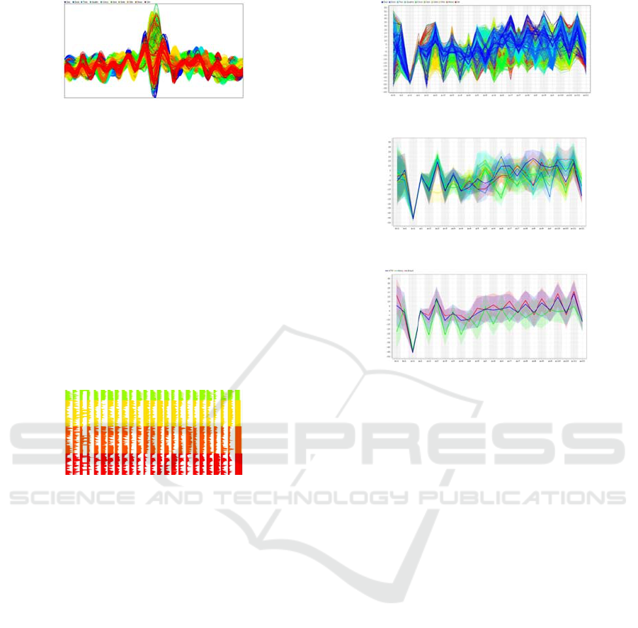
Figure 2: Andrews’ Curves coloured by formations.
Survey Plot. The survey plot is a multi-attribute
visualization technique that can help to find
correlations between any two variables especially
when the data is sorted according to a particular
dimension (Orange, 2009). Each horizontal line in a
plot corresponds to a particular data example. The
data on a specific attribute is shown in a single
column, where the length of the line corresponds to
the dimensional value. When data includes a discrete
or continuous class, the data examples are colored
likewise (Orange, 2009). This diagram enables,
naturally, to observe the different formations and the
different opponents since they are depicted with
different colours (Figure 3).
Figure 3: Survey Plot fragment with 3 distinct formations.
However, a more detailed analysis is necessary and
certainly the opinion of the experts could help
understand important spots in this kind of
visualization.
Parallel Coordinates.
Parallel coordinates (Tufte,
1983) (Hoffman, 1999) represent multidimensional
data using lines and was first introduced by
(Inselberg, 2009). A vertical line represents each
attribute and the maximum and the minimum values
of those attributes are usually scaled to the upper and
lower points on these vertical lines. Therefore for
representing a N-dimensional point N-1 lines are
connected to each vertical line at appropriate value.
Figure 4 represents the dataset using the formation
information.
An alternative for this kind of visualization is also
available in RapidMiner and is called a deviation
plot were the examples are not so marked as in these
two previous visualizations. The plots for formations
and games may be observed in Figure 5 and 6.
Figure 4: Parallel coordinates plot with formations.
Figure 5: Parallel coordinates plot (Deviation)-formations.
Figure 6: Parallel coordinates plot (Deviation) – teams.
It is interesting to see on this diagram that the x
coordinates of the team players in games against
Hellios (green line) are lower than the x coordinates
of the games against the other teams. Also the x
coordinates of the players in games against Brasil
(red line) are higher than in the other games,
indicating that the FC Portugal Team attacked more
on the games against this team.
Radial Coordinate Visualization (RadViz
). Radial
Coordinate Visualization (Andrews, 1972) is an N-
dimensional radial visualization in which N lines
originate radially from the center of the circle and
terminate at the perimeter where the points called
Dimensional Anchors (DA) are. One end of a spring
is attached to each DA and the other end of each
spring is attached to a data point. The visualized
attributes correspond to points equidistantly
distributed along the circumference of the circle.
The spring constant has the value of the i-th
coordinate of the data point and each point is then
displayed at the position that produces a spring force
sum of zero. The attribute with larger magnitude
than the others will dominate the spring
visualization. Therefore this approach maps a set of
N-dimensional points into a 2D space.
DATA VISUALIZATION FOR ANALYZING SIMULATED ROBOTIC SOCCER GAMES
165

Figure 7: RadViz with teams.
Some characteristics of this kind of visualizations
are described at (Andrews, 1972) and can be
summarized as: points with equal values, after
normalization, lie on the center; points with similar
dimensional values, whose dimensions are opposite
to each other on the circle lie near the center; points
which have one or two coordinate values greater
than the others lie closer to the dimensional anchors
of those dimensions; the position of a point depends
on the layout of a particular dimensions around the
circle. Figure 7 show the RadViz by opponent
teams.
4.4 Results’ Evaluation
Visualizations were performed using RapidMiner [5]
in a Pentium dual-core processor T2330 (1.60 GHz,
533 MHz FSB L2 Cache) and 2 GB DDR2.
The first preliminary evaluation of the visualization
were performed with the help of personal
interviews/inquiries to three groups of individuals:
the first group was constituted by four experts on
simulated robotic football; the second included
seven teachers of Statistics of Escola Superior de
Tecnologia de Saúde do Porto and the third was
formed by two web designers.
The questions that were asked had to do with: Q1)
which visualization conveys more information; Q2)
which visualization shows more intuitively the
differences of formations and opponents; and the
third point was Q3) the evaluation on an esthetics’
point of view. The answers were analyzed by a
voting system inspired in Borda Count (Taylor et al.,
1996). The Borda count determines the winner of a
preference by giving, in this case, each visualization
a certain number of points corresponding to the
position in which it is ranked by each voter. Once all
votes have been counted the visualization with fewer
points is the winner. Sometimes the broadly
acceptable visualization is chosen, rather than those
preferred by the majority.
Concerning the results obtained for question Q1
users think that Deviation and Parallel visualizations
are the ones that convey more information.
Andrew’s curves are believed to convey less
information (although some statisticians disagree on
this result). For question Q2, most users believe that
Deviations are the visualizations enabling to better
see the differences between formations and
opponents. Concerning aesthetics of the
visualizations it is interesting to see that RadViz and
Andrew’s Curves were preferred, although most of
the experts and designers didn’t like the latter.
Visualizations are very important tools to
understand patterns in data, although the advices
given by Keim (Keim, 2002) concerning zooming
and filtering the data must be followed. Moreover,
parts of the data should also be interactively selected
to be visualized in more detail. To perform this kind
of analysis two experts contributed with their
specific domain knowledge.
Figure 8 shows a display of the x positions of
players 2, 7 and 10 of the team (defender, midfielder
and attacker of the right wing of the team)
depending on the x coordinate of the ball. It is
interesting to see that there is a strong correlation of
the positions of the players with respect to the ball.
However, there are several deviations that are higher
in the attacker player (red in figure 9). These
deviations correspond to active situations in which a
player has control of the ball and thus abandons his
formation position, for example dribbling the ball
towards an empty space. Other deviations,
corresponding to vertical lines in the figure, are
caused by playoff situations like throw-ins. In these
situations, the ball is stopped but players move
towards their playoff positions for that situation.
This is more evident for player 2 (defender
represented in blue) that sometimes goes to the
attacking field in order to perform a thrown in
Figure 9 shows a display of the team attacking
players y coordinates in a 4-3-3 formation (players
9, 10 and 11) depending on the ball y coordinate. It
is interesting to see that the y coordinates of the
players vary with the ball y coordinate. However,
the correlation seems higher for player 9 (the central
attacker).
Figure 8: Scatter Plot with right wing x coordinates.
IVAPP 2010 - International Conference on Information Visualization Theory and Applications
166
Figure 9: Scatter Plot with team attackers y coordinates.
This is due to the fact that the winger players are
more often in active play than the central forward.
Thus, their y positions change in a less correlated
way with the ball y position.
Figure 10: Andrew´s Curve for formation One.
Figure 10 shows an Andrews’ curve for formation
One with colour depending on the opponent. An
interesting result is that the game against Brasil
(displayed in Red) is a lot different than the other
two games. The justification is that in this game, FC
Portugal Team was always attacking with the ball
controlled by its players while the other games were
not so unbalanced.
Figure 11 shows a Parallel Curve for the x
coordinate of the ball and players of formation One
depending on the opponent. The diagram enables to
see that in the games against Hellios (displayed in
green) the team had a lot more defensive positions
while in the game against Brasil the positions were a
lot more offensive.
Figure 12 shows a RadViz of the right wing players
(2, 7 and 10) for FC Portugal Team, in formation
One against the three distinct opponents (identified
by colors). It is interesting to see that in the games
against Brazil (represented in red) players 7 and 10
(midfielder and attacker) have equal weight during
the game, while player 2 has a very low weight. In
the games against Hellios (green points) player 2
(defender) has greater weight attracting most of the
points, while the weight of player 10 is very
reduced.
Figure 13 enables to take the same conclusions
showing that the points are attracted towards the
attacking side (left side of the image) for the games
against Brasil and towards the defender players
(right side of the image) against Hellios.
Figure 11: Parallel Curve for formation One.
Figure 12: RadViz with right wing players.
Figure 13: RadViz with defending and attacking players.
Another important issue is the problem of colour,
since most visualizations use different colours to
separate the cases by classes. So, and since one of
the members of the group of experts is colour blind,
he was truly helpful to understand which
visualizations are more easily readable by colour
blind people. By using the filter available in
(Dougherty et al., 2009) the images were
transformed in PhotoShop (Adobe et al., 2009) into
images that let us perceived how a colour blind sees.
Those images are represented in the annex. By
analyzing them it is very interesting to conclude that
most of the default colours used by Rapid Miner are
almost indistinguishable for colour blind people.
5 CONCLUSIONS
Several visualizations for robotic soccer games were
created, using Andrew´s Curves, Survey Plot, two
types of Parallel Coordinate and Radial Coordinate
Visualizations. These visualizations allowed some
interesting conclusions concerning the differences
among games of FC Portugal Team using different
formations and against distinct opponents. The
visualizations were developed using the freely
available RapidMiner software package. Although
DATA VISUALIZATION FOR ANALYZING SIMULATED ROBOTIC SOCCER GAMES
167

the visualizations were very simple, they enabled to
spot several characteristics not easily detectable by a
normal visualization.
A simple inquire was conducted to several users
showing that, independently of the expertise, users
prefer simpler visualizations as parallel plots
(Deviation) to explain and analyze the data.
Future work will be concerned with testing games of
other robotic soccer teams and other robotic soccer
leagues, the small or middle size leagues. Other
future development of the work could include
producing visualizations using high-level
information previously extracted from the log files.
Finally the development of a color blind safe palette
for RapidMiner, as well as tests with color blind
individuals are planned.
ACKNOWLEDGEMENTS
We would like to acknowledge to FCT – Portuguese
Science and Technology Foundation: PhD
Scholarship FCT/SFRH/BD/44541/2008 and
FCT/PTDC/EIA/70695/2006 – Project ACORD -
Adaptative Coordination of Robotic Teams.
REFERENCES
Adobe, 2009. Adobe Photoshop Family. Available at
[http://www.adobe.com/products/photoshop/family/?p
romoid=BPDEK/] Consulted June 2009.
Almeida, R., 2009. Análise e Previsão das Formações das
Equipas no Domínio do Futebol Robótico, Tese de
Mestrado, FEP, Porto, May.
Andrews, D.F., 1972. Plots of high dimensional data,
Biometrics, 28:125-136, Bell Telephone Laboratories,
New Jersey, Princeton University, March.
Bahia Robotics Team, 2009. Futebol Simulado 2D. Avail.
at [http://www.acso.uneb.br/]. Cons. May 2009.
Card, S.K., Mackinlay, J.D., Shneiderman, 1999. Readings
in Information Visualization using Vision to Think.
Chen, C., Hardle, W., Unwir, A., 2008 Handbook of Data
Visualization, Springer Handbooks of Computational
Statistics, Springer.
Dougherty, B., Wade, A., 2009. Vischeck, Univ. British
Columbia. Available at [http://www.vischeck. com/].
Cons. July 2009.
Eibe, F., Mark, H., Len, T., 2009. Weka 3: Data Mining
Software in Java, Available at [http://www.cs.waikato.
ac.nz/~ml/weka/index.html]. Consulted on June 2009.
GermanTeam, 2009. GermanTeam. Available at
[http://www.germanteam.org/]. Cons. May 2009.
Hansen, C. D., Johnson, C. R., 2005. The Visualization
Handbook, Elsevier, Academic Press.
Hardle, W., Simar, L. 2007. Applied Multivariate
Statistical Analysis. 2nd Edition, Springer Verlag,
Berlin-Heidelberg-New York, pp. XVIII/486.
Inselberg, A., 2009. Parallel Coordinates: Visual
Multidimensinal Geometry and Its Applications.
Springer 2009.
Keim, D., 2002. Information Visualization and Visual
Data Mining, IEEE Trans.Visualization and Computer
Graphics, Vol. 7, No. 1, pp. 100-107, Jan – Mar.
Hoffman, P. E., 1999. Table Visualizations: A formal
model and its applications, Institute for Visualization
and Perception Research, Department of Computer
Science, University of Massachusetts Lowell, Lowell.
Lau, N., Reis, L. P., 2007. FC Portugal - High-level
Coordination Methodologies in Soccer Robotics,
Robotic Soccer, Book edited by Pedro Lima, Itech
Education and Pub., Vienna, Austria, pp. 167-192.
Miner3D, Inc., 2009. Visual Data Analysis Software for
Business Intelligence and Science. Available at
[http://www.miner3d.com/]. Consulted on June 2009.
Moebes, T., 2009. Data Mining Software for Windows and
Solaris|Insighful Miner. Available at [http://www.
insightful.com/products/iminer/]. Cons. June 2009.
Orange, 2009. Survey Plot. Orange: Data Mining
Fruitful&Fun. Available at [http://www.ailab.si/
orange/]. Consulted on June 2009.
Rao, C.R., Wegman, E.J., Solka, J.L., 2005. Data Mining
and Data Visualization, Elsivier, England.
Rapid|Miner, 2009a. RapidMiner Report the Future
Availab
le at [http://rapid-i.com/]. Cons. June 2009.
Reis, L. P., Lau, N., 2001. FC Portugal Team Description:
RoboCup 2000 Simulation League Champion, in P.
Stone et al. eds, RoboCup-2000: World Cup IV,
Springer LNAI, Vol. 2019, pp.29-40.
Robocup, 2009, Robocup 2009, Available at
[http://www.robocup2009.org/]. Cons. June 2009.
Rhyne, T.M., 2003. Does the Difference between Inform.
and Scientific Visualization Really Matter? IEEE
Comp. Graphics and Apps, pp. 6-8, May/Jun.
Sebillo, M., Vitiello, G., Schaefer, G., 2008. Visual
Information Systems: web-based visual information
search and management. Proc. 10th Int. Conference,
Visual 2008, Salerno, Italy, September.
Simoff, S., Bohlen, M., Mazeika, A., 2008. Visual Data
Mining: Theory, Techniques and Tools, State-of-the-
Art, Springer, London.
Tan, P., Steinback, M., Kumar, V., 2006. Introduction to
Data Mining, Pearson Education, Inc.
Taylor, A.D. Brams, S.J., 1996. Fair Division: From cake-
cutting to dispute resolution, Univ.Press, Cambridge.
Tufte, E., 1983. The Visual Display of Quantitative
Information, Graphics Press, pp. 9-10.
Ware, Colin, 2004. Information Visualization: Perception
for Design, Morgan Kaufmann, 2nd Edition.
Young, F. W., Valero-Mora, P. M., Friendly, M., 2006.
Visual Statistics: Seing Data with Dynamic Interactive
Graphics, Wiley-Interscience, John Wiley&Sons, Inc.
IVAPP 2010 - International Conference on Information Visualization Theory and Applications
168
