
A TALE OF TWO (SIMILAR) CITIES
Inferring City Similarity through Geo-spatial Query Log Analysis
Rohan Seth, Michele Covell, Deepak Ravichandran, D. Sivakumar and Shumeet Baluja
Google, Inc., San Francisco, CA, U.S.A.
Keywords: Data mining, Spatial data mining, Log analysis, Large scale similarity measurement, Search engine queries,
Query logs, Census data.
Abstract: Understanding the backgrounds and interest of the people who are consuming a piece of content, such as a
news story, video, or music, is vital for the content producer as well the advertisers who rely on the content
to provide a channel on which to advertise. We extend traditional search-engine query log analysis, which
has primarily concentrated on analyzing either single or small groups of queries or users, to examining the
complete query stream of very large groups of users – the inhabitants of 13,377 cities across the United
States. Query logs can be a good representation of the interests of the city’s inhabitants and a useful
characterization of the city itself. Further, we demonstrate how query logs can be effectively used to gather
city-level statistics sufficient for providing insights into the similarities and differences between cities.
Cities that are found to be similar through the use of query analysis correspond well to the similar cities as
determined through other large-scale and time-consuming direct measurement studies, such as those
undertaken by the Census Bureau.
1 CENSUS & QUERY LOGS
Understanding the backgrounds and interest of the
people who are consuming a piece of content, such
as a news story, video, or music, is vital for the
content producer as well the advertisers who rely on
the content to provide a channel on which to
advertise. A variety of sources for demographic and
behavioral information exist today. One of the
largest-scale efforts to understand people across the
United States is conducted every 10 years by the US
Census Bureau. This massive operation, which
gathers statistics about population, ethnicity and
race, is supplemented by smaller surveys, such as
the American Community Survey, that gathers a
variety of more in-depth information about
households. Advertisers often use the high-level
information gathered by these surveys to help target
their ad campaigns to the most appropriate regions
and cities in the US.
In contrast to the Census studies, passive studies
of search engine query logs have become common
since the introduction of search engines and the
massive adoption of the Internet to quickly find
information (Jansen and Spink, 2006); (Silverstein
et. al., 1999). These studies provide the quantitative
data to not only improve the search engine’s results,
but also to provide a deeper understanding of the
user and the user’s interests than the data collected
by the Census and similar surveys.
The goal of our work is to extend techniques and
data sources that have commonly been used for on-
line single-user (or small group) understanding to
extremely large groups (up to millions of users) that
are usually only taken on by large studies by the
Census. We want to determine whether the query
stream emanating from groups of users – the
inhabitants of 13,377 cities across the United States
– is a good representation for the interests of the
city’s inhabitants, and therefore a useful characteri-
zation of the city itself. Figure 1 shows the geogra-
phic distribution of the queries analyzed in this study.
As a motivating example, consider whether by
examining the queries emanating from cities in
Silicon Valley, California could be automatically
determined to be similar to other technology centers
in the United States – for example in Redmond,
Washington or Cambridge, Massachusetts. Beyond a
city’s businesses, other factors, such as weather
patterns, socio-economic distributions, and
ethnicities, etc., play an important role in which
queries are submitted by a city’s denizens.
179
Seth R., Covell M., Ravichandran D., Sivakumar D. and Baluja S..
A TALE OF TWO (SIMILAR) CITIES - Inferring City Similarity through Geo-spatial Query Log Analysis.
DOI: 10.5220/0003641501710181
In Proceedings of the International Conference on Knowledge Discovery and Information Retrieval (KDIR-2011), pages 171-181
ISBN: 978-989-8425-79-9
Copyright
c
2011 SCITEPRESS (Science and Technology Publications, Lda.)
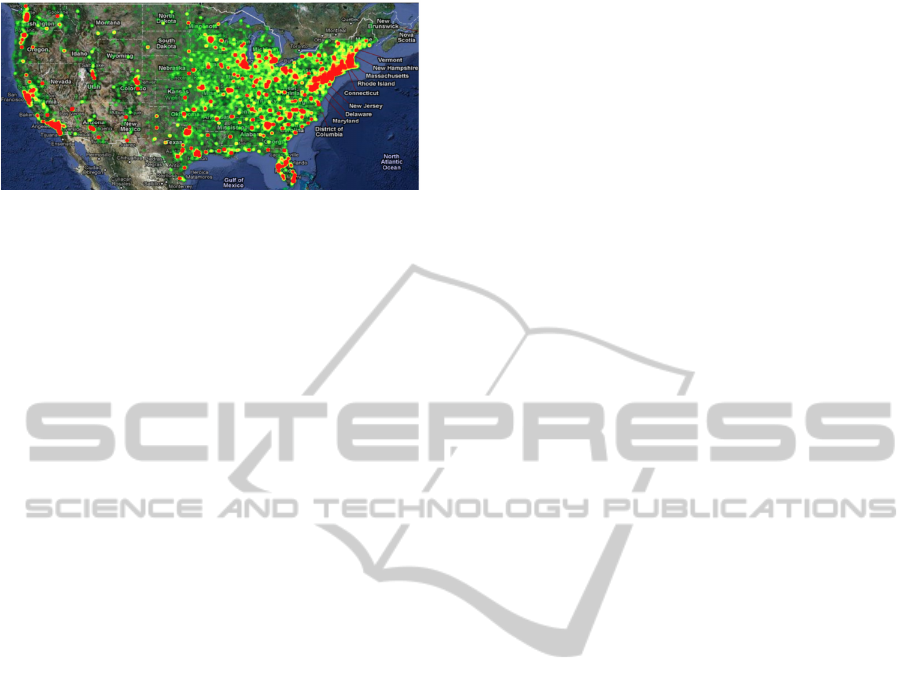
Figure 1: Geographic distribution of query samples used in
this study.
We show that by effectively combining location
information (at the city level) with search engine
query logs, we can ascertain the similarity of cities –
even those that may not be geographically close.
Finding similar cities provides a valuable signal to
advertisers and content creators. Once success (or
failure) is determined for the advertiser/content-
creator in one city, this analysis provides a basis for
setting expectations for similar cities – thereby
providing advertisers and content creators new cities
to target (or avoid). Additionally, knowledge of the
interests inherent in a city’s population provides
important information for tailoring search-engine
results to deliver results with a relevant local focus.
It is important to note that all of the signals used in
this paper can be discovered with minimal privacy
concerns – individuals do not need to be identified
and their individual search history need not be used.
As background, it should be pointed out that
there has been growing interest in utilizing
geography as a signal for returning search engine
results. Many search-engine query log analyses have
examined a user’s queries to better understand the
user’s interests and infer the user’s intent (Gan et al.,
2008); (Sanderson and Kohler, 2004); (Yi et al.,
2009). The hope is that by gaining this insight, the
search results returned to a user can be better
tailored to the user’s needs. Other studies have
combined the user’s IP location with the query to
determine what type of content the user may be
interested in (Hassan et al., 2009); (Jones et al.,
2008a) and also how to rank the search engine
results in light of strong geographic signals
(Andrade and Silva, 2006); (Jones et al., 2008b).
Systems to efficiently combine geographic relevance
with relevance as measured by more traditional
information retrieval measures have been developed
(Backstrom et al., 2008); (Chen et al., 2006). Often
geographic queries do not explicitly contain location
names. Nonetheless, by looking at the geographic
distribution of clicks or queries, the geo-sensitivity
of the query can be determined (Zhuang et al.,
2008a); (Zhuang et al., 2008b). Additionally, once
geo-intent is determined, language models specific
to geo-content or to a particular city can be
developed (Yi et al., 2009).
To analyze the massive set of queries required
for this study in order to determine city-level query-
streams, three problems must be overcome: (1)
extremely noisy query stream data: many queries
are mistakes, tests, or spam; (2) different city
population sizes: computer usage and access
patterns for cities make direct city comparisons
difficult; (3) “regression to the mean”: when
looking at aggregate level statistics, at a coarse level,
the diversity of people in each city lead effectively
to masking differences between cities within an
already diverse set of queries (i.e. all cities have a
large number of queries for “Twitter,” “Facebook,”
etc. and smaller amounts for “dog”, “topaz”, etc).
2 DATA COLLECTION
The analysis presented in this paper is based on
seven days of logs from Google.com gathered in
December, 2009. From this data, over 75 GB of
summary data was extracted, based on queries
originating in the United States. Based on the user’s
IP address that submitted the query, each query was
assigned a geographic “city-level” location, using a
database of IP-to-location mappings in conjunction
with the Google geocoder city-level “localities”
(discussed later), for a total of 13,377 distinct
locations. The accuracy of the IP-to-geographic
mapping varies depending on the location. In
particular, the number, layout, and size of the
internet service providers greatly affect the accuracy
of the mapping. The city-level locality is at a similar
accuracy level for many of the IP-address mappings.
We will refer to these 13,377 localities as Cities
G
.
Very simple pre-processing steps were employed
to clean the query stream. First, we normalized each
query by removing extraneous white spaces, special
characters, and capitalizations. Second, we discarded
any query that did not occur in at least 10 unique
cities. No more complex heuristics were employed.
Hereafter, the final set of unique queries will be
referred to as Q.
To begin this study, we first verified that
geography is a factor in query distributions
(Backstrom et al., 2008); (Zhuang et al., 2008a);
(Zhuang et al., 2008b). Figure 2 displays a few
example query distributions for terms that were
highly localized: “San Jose Mercury News,” and
“Northern Virginia Community College. (NVCC)”
NVCC appears almost exclusively in the northern
KDIR 2011 - International Conference on Knowledge Discovery and Information Retrieval
180
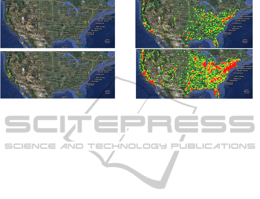
F
igure 2: Geographic localized queries. Top: Northern
V
irginia Community College. Bottom: San Jose Mercury
N
ews.
Figure 3: Non-localized queries. Top: “Christmas.
”
Bottom: “Google.”
parts of Virginia. “San Jose Mercury News” appears
in San Jose and surrounding towns, a bit in Los
Angeles, and a bit in New York – places commonly
associated with venture capital funding for startup
companies. In contrast, the geographic distribution
of other queries, for example those of a more general
interest, exhibit far less geographical coherence. A
few examples, “Google,” and “Christmas,” are
shown in Figure 3.
2.1 Ground-truth Data
There is no definitive measure of city-to-city
similarity. Often, simple measures such as
distribution of income levels, ethnicity, or education
level are used. However, each of these attributes
only captures a specific, small aspect of a city.
Rather than limiting our analysis to a single
dimension or risking introducing potential sources of
bias in our analysis by hand-selecting a single or
small set of attributes as our target, we took a more
comprehensive and automated approach.
We gathered over 750 city-to-city similarity lists,
based on information in the census-related surveys.
These lists only contained “the top 101” cities (and
counties) in the United States, in each of the 750
categories. List categories ranged from the expected
(population size, % of population with advanced
degrees, income level, etc.) to the obscure (largest %
of males working as cashiers, smallest percentage of
divorced people). Each list was used as a
component in our ground-truth calculations. To
create our ground truth similarities, we simply count,
for all pairs of cities, the number of lists in which
they co-occur. The end result is a “city-to-city”
association list that contains pairs of 12,873 unique
cities and counties. The highest-co-occurrence of
any two cities is 30. A wide range of cities is
included in these 12,873: for example, ranging in
population from 9.5 million (Los Angeles County
CA) to 95 (Indian Beach NC). This final list has the
advantage of measuring similarity across a large set
of dimensions and avoids testing biases introduced
by manually choosing a set of criteria.
Recall that this namespace of 12,873 cities and
counties have been generated by a completely
separate process than the logs analysis that generated
the 13,377 Cities
G
set. The set of 12,873 location
names are simply what was present on the 750 “top
101” lists that we used, derived the Census data.
The 13,377 Cities
G
set are based on the geo-coding
of the IP addresses we saw in the query logs that we
analyzed. As such, the names generally will not
match. We address this in Section 2.2.
While all 12,873 of city-to-city locations have
associations with 100 other cities (each list has 101
entries), many are only on a single list. This weak
information will be biased by which list that city was
listed on, which is what we are trying to avoid by
using 750 lists. To avoid this problem, we will only
consider as target cities for evaluation, those cities
that have at least one cohort city that shared lists
with them at least 3 times. This reduces the list of
“target cities” down to 8123 city-to-city locations.
We continue to use the full list of 12,873 as potential
partners to each target city, using the co-occurrence
to weight the associations and give more emphasis
to city pairs that occur more frequently.
2.2 Location Alignment
For reproducibility of our experiments, we provide a
A TALE OF TWO (SIMILAR) CITIES - Inferring City Similarity through Geo-spatial Query Log Analysis
181

detailed description of our location alignment
procedure. For readers not specifically interested in
implementing similar experiments, a skim of this
section will suffice.
As noted in the previous section, the ground-
truth and query-analysis results are built on two
separate namespaces. To try to bring the two
together, we passed each city-to-city name through a
geo-coder supplied by http://maps.google.com. Each
location was translated into latitude and longitude
coordinates. We then reverse geo-coded each of
these 12,873 latitude/longitude coordinates, mapping
each to the city-level “localities” used by
Google.com. These forward-reverse geo-coding
operations resulted in many-to-one assignments
from the 12,873 city-to-city lists to Google
localities. While all of these mapped into the Cities
G
set (for which we have query-log data), the mapping
was such that they mapped onto only 8093 Google
localities. Many-to-one mappings typically occurred
when counties from the city-to-city lists mapped to
the same locality as one of the also-referenced cities
within the county. In addition, we also saw within-
city neighborhood names from the city-to-city lists
mapping onto the same city-level locality.
To handle this ambiguity, we first consider how
we will evaluate the quality of our similarity results.
In Section 6, we provide a variety of analysis tools.
In all cases, we cycle through a list of target cities,
measuring for each our similarity results (given by
logs analysis) compared to what was given by the
ground truth (given by the city-to-city lists).
We define the “target city” as the city-to-city
location to which we want to measure or rank all the
known cities. In order to decide which Google
locality to use as the target city, we simply use the
forward/reverse geo-code mapping described above.
This gives us a pair of vectors to compare: one from
the city-to-city namespace, containing sparse
mappings within a set of 12,872 other city-to-city
names and the other from the Google locality
namespace, giving us a dense mapping to 8093 other
Google localities that are their geo-coding-based
“partners.” Note that, based on the list occurrence
requirements mentioned in the previous subsection,
there are 8123 target cities, which then map onto
only 4478 Google localities. The full 8123-target set
is distinct since the target city data is evaluated as a
pair and the city-to-city sparse mappings will be
different for each of the 8123 names, even when the
query-analysis mappings are repeated by the many-
o-one nature of the association.
For each of these target cases, we need to
compare a sparse association mapping into the
12,872 city-to-city namespace with a dense mapping
into the 8093 Google query-stream localities. For
many Google localities, there is only one city-to-city
name with a default mapping onto that Google
locality name. We fix these mappings as our first
step. For the remaining Google localities, where the
association to a city-to-city name is ambiguous, we
use an optimistic mapping onto city-to-city names
that have not already been used. The greedy
mapping starts from the most strongly associated
Google locality (in the ambiguous set) and picking
(from the city-to-city set within the 30km radius) the
most strongly associated city-to-city name that has
not already been used.
This mapping is used in all evaluations,
including the baseline orderings by geographic
distance, total population, and population difference
(Section 6). Despite this bias to closer alignments,
by looking at relative performance where all
alternatives share the same optimistic advantages,
we avoid overstating results in any direction.
3 FEATURE SPACE
One of the difficulties in comparing queries, even
after standard normalization steps are taken, is that
queries that may initially appear to be far apart, in
terms of spelling and edit distance, can represent the
same concept. For example, the terms “auto” and
“cars” are often used interchangeably, as are “coke”
and “pop” or “mobile” and “phone.” To treat these
sets of queries as similar, we replace each query
with a concept cluster.
Concept clusters are based on a large-scale
Bayesian network model of text, as detailed in
(Datta, 2005); (Harik and Shazeer, 2004). Datta
describes the creation of PHIL (probabilistic
hierarchical inferential learner). Although a full
explanation of the PHIL system is beyond the scope
of this paper, a cursory overview is provided here.
PHIL is a top-down weighted directed acyclic graph
in which the top node represents “all concepts” and
the leaf nodes represent individual words or
compound-word tokens. The intermediate nodes,
which can be learned through word co-occurrence
statistics over large text corpora, are created
automatically. The intermediate nodes contain many
conceptually similar words. PHIL was originally
used as a generative model of text. For our
purposes, each query is used as input to the system,
and the intermediate nodes that are most highly
activated are assigned to the query. Similar concept
queries will activate similar nodes. Interestingly, this
KDIR 2011 - International Conference on Knowledge Discovery and Information Retrieval
182

system not only helps account for different words
often used to represent the same concept (e.g.,
autos/cars) but it also helps to automatically correct
for common spelling mistakes: the same nodes will
be activated for common variations of the same
word.
In Section 6, we will empirically compare the
use of terms and PHIL clusters as the underlying
features for our system.
4 A CITY’S QUERY SIGNATURE
For each city, we need to compute a signature vector
that will be used to compare with the signature of
other cities. In addition to the choice between query
terms and query concepts, described in the previous
section, we must consider purely descriptive versus
discriminative signature vectors.
The simplest signature is a (descriptive)
histogram of the queries that originated from the
city. This has a straightforward computation: for
each unique query (whether term or concept), q, that
occurs from any city in our collected set, Q, we
count how many times the query originated from a
city, c. Each city is assigned a vector of integers, of
length |Q|. Many smaller cities will have numerous
zero entries; these indicate that the query never
occurred in the city during the sampling time. The
histogram is normalized so that each query’s entry
reflects the percentage of the total query volume the
query accounts for.
A limitation of this simple histogram approach is
seen in many descriptive signatures: it may place
emphasis on non-interesting portions of the query-
space. For example, we expect that a common query
such as ‘pizza’ will occur far more often than a
query such as ‘babaganoush,’ or that ‘blue-ray’ will
be far more numerous than ‘cassette tape.’ The fact
that these relations repeatedly hold in almost every
city is neither interesting nor surprising when trying
to find how cities differ. Rather, the converse is true:
when these relations do not hold is when the data is
interesting.
To draw attention to the surprise features of a
city, we use a simple discriminative scheme that is
analogous in spirit to the family of TF-IDF (Salton
and McGill, 1983) procedures commonly employed
in information retrieval tasks. We call the measure
an excess score. Intuitively, the goal of an excess
score is to determine how much above (or below)
each query was from the expected. We determine
how much we expected to see a query by treating the
entire set of queries from all cities (Cities
G
) as a
single city, and computing the distributions of
queries in this aggregated set. Specifically, it is
computed as follows. First we compute the expected
volume of the query averaged across all cities. This
percentage becomes our expectation for that query:
expectedPercentage
query
=
Volume
c,query
c ∈Cities
G
∑
Volume
c,q
q ∈Q
∑
c ∈Cities
G
∑
Using the expected percentage, we compute how the
query volume in a city differed from the percentage
we expected from that city, given its total volume:
excess
query|city
=
Volume
city,query
Volume
city,q
q ∈Q
∑
− expectedPercentage
query
Four points should be made about the excess score.
First, as shown above, it calculated the “surprise
factor” of each query per city – it does not represent
the volume directly. Alternatively, we could have
simply modified the calculation to find the excess
cities for each query – i.e., for each query, find
which cities had a higher (or lower) than expected
occurrence of that query. First we compute the
expected query volume of a city, averaged across all
queries, and then we estimate that city’s expected
percent contribution to the total number of queries
examined in the study.
expectedPercentage
city
=
Volume
city,q
q ∈Q
∑
Volume
c,q
q ∈Q
∑
c ∈Cities
G
∑
excess
city|query
=
Volume
city,query
Volume
c,query
c ∈Cities
G
∑
− expectedPercentage
city
Second, it should be noted that the excess scores
can be negative. Intuitively, for the cities that have a
negative excess score for a query, in that city, the
query may have occurred less than expected.
Third, the excess score for the queries for any
city should sum to 0.0. The fact that some query
occurred more times than expected implies that
some other query (or set of queries) must have
occurred less than expected when looking at that
same volume of queries.
Fourth, for simplicity, we calculated the
expectation as the ‘global expectation,’ using all the
cities in Cities
G
. An alternative is to compute more
specific expectations, such as using only the nearest
n-cities, or dividing the U.S. into quadrants, etc.
A TALE OF TWO (SIMILAR) CITIES - Inferring City Similarity through Geo-spatial Query Log Analysis
183
5 SIMILARITY COMPUTATION
Given the excess metrics as well as the simple
percentage based signatures, described in the
previous sections, we need to decide how to
compute the distance between two cities. We
consider two alternative methods. The first method
is the standard cosine similarity, with the excess
vectors and the percentage based vectors.
A second similarity metric is based on the excess
scores for a city given a query (
excess
city|query
). For
this calculation, we examined every query in Q.
For each query, q, cities were assigned their excess
score and the list was sorted. This sorted list
represented which cities had the highest (positive)
“surprise factor” for q, taking into account their
expected total volume. From each list, all cities that
co-occurred within the top-10 query excess scores
had their similarity score incremented. Intuitively,
this measures how many times each pair of cities
coincided on having more than expected query
volumes for a particular query. We refer to this
similarity measure as “reverse-occurrence voting”.
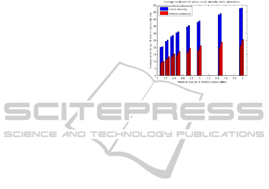
The problem with reverse-occurrence voting is
that there is no guarantee that every city will be
voted for, even once, by the query set that was seen.
Even with more than 12 million distinct query terms,
some cities (typically small ones) never rise to the
top 10 of even a single query list. Nearly one fourth
of our target cities suffered from this anonymity. As
can be seen in Figure 4, even those cities that did
make it to some type of characterization were more
poorly described by the reverse-occurrence voting
than by the cosine similarity.
In Figure 4, we show a comparison of the
performance of cosine similarity and reverse-
occurrence voting, where both measures were taken
over only the target cities that were not anonymous
under reverse-occurrence voting (just over 6000
city-to-city names). The figure shows the
performance for all four combinations from Sections
3 and 4: query terms or PHIL clusters with excess or
percentage scores. The graph shows how many of
the top-10 most strongly connected cities were
retrieved using cosine similarity versus reverse-
occurrence, according to the retrieval-set size. The
retrieval set is taken from the ordering of most-to-
least similar cities given by each of the two alternate
measures. In Figure 4, the x-axis is the size of the
retrieval set (as a % of the full 8093 possibilities)
and the y-axis is the average recall rate for these top
city-to-city localities, averaged across the non-
anonymous target cities. The average retrieval using
cosine similarity is, for this one graph, also averaged
on this reduced set of cities that was not anonymous
under reverse-occurrence voting.
Figure 4: Using cosine similarity vs. reverse-occurrence
voting. The average retrieval rates for the top-10 matches
for each city when retrieving N% (x-axis) of the cities –
ordered by similarity. For example, when cosine distance
is used and 1.5% of the cities are retrieved, approximately
43% of the top-10 most similar cities are included. With
reverse occurrence, only 20-24% of the top-10 closest
cities are included. This lower performance is true whether
we use query terms or PHIL clusters and whether we use
excess or percentage features.
Not only does reverse-occurrence voting leave
many cities completely uncharacterized, but it also
provides only about half of the recall rate, compared
to cosine similarity, for the same size retrieval set.
For this reason, the remainder of this paper uses
cosine similarity on the query vectors (query terms
or PHIL clusters in excess scores or percentages) to
determine city similarities.
6 EXPERIMENTS
As discussed in Section 2.2, our method for mapping
city-to-city names onto Google locality names will
tend to bias our evaluations towards aligning our
similarity lists to be more in agreement with the city-
to-city lists. As a result of this systematic bias, we
need to separately measure the improvement
provided the optimistic name remapping and remove
it from our evaluation results. Throughout this
section, we match the bias-removal method to the
summary statistic being shown.
One summary statistic that we provide is the
weighted connected similarity: measured from each
target city to all of the cities with which it co-
occurred in the city-to-city lists, it is the cosine
similarity, weighted by the shared-list count. We
correct this simple statistic using two factors. The
first corrects for the similarity that each target city
KDIR 2011 - International Conference on Knowledge Discovery and Information Retrieval
184

shows to all known cities. The second corrects (on
average) for the bias introduced by the optimistic
namespace mapping. By correcting for both, we can
interpret a zero offset similarity as being equivalent
to random selection of neighbor cities.
Figure 5 shows the histograms of the first
correction factor: for each target city, what similarity
its query vector showed, on average, with the query
vectors of all of the other known cities. There is a
very strong positive similarity seen in all of our
query-based similarity measures for our locality set.
This strong positive average similarity across all of
our known localities is easy to understand for the
percentage measures: all of the values for the
percentage features will be positive, since all
percentages are positive, so measuring cosine
similarity on these vectors will always give a
positive result.
Figure 5: Histogram of the average similarity, from each
target city to all known cities. The strongly positive biases
show that the query vectors, whether terms or clusters,
percent or excess, vary across our localities in strongly
correlated ways.
The even stronger positive similarity seen in the
excess measures shows that directions of variations
in the underlying percentages are also strongly
aligned: even taking a differential measure of the
per-location query vectors does not scatter these
vectors uniformly across the vector space. High
positive average similarities limit the offset
similarity that we can achieve: that is, the weighted
similarity of the linked cities relative to (or offset
by) this all-city average. Even so, high positive
average similarities suggest that our excess scores
are not measuring noise only: our query vectors do
contain a lot of related entries that should show
synchronized variation, which will remain even after
taking the excess score.
The second correction factor is a further offset to
the similarity score to, on average, reduce the effect
of the optimistic namespace mapping that we are
doing. For each type of query vector (term or PHIL,
excess or percentage), we looked at the scores of all
the cities available for any of the ambiguous
namespace mappings that were within the 30 km
radius of an ambiguous Google locality. Within
each of these 30 km sets, we measured the standard
deviation in the similarity score and then took the
average of all these standard deviations, across all of
the sets. This gives us an average measure of how
optimistic our namespace mapping will tend to be,
according to the query vector type. Since these
localized standard deviations are not the same for
the different query-vector representations, we need
to reduce the offset similarity scores by these
representation-dependent amounts before
comparison. For the four different query
representations, these corrections reduced our
reported offset similarity: for percentage query terms
and PHIL clusters, by less than 0.01; for excess
PHIL clusters, by 0.06; and for excess query terms,
by 0.13. Our histograms, shown in Figure 6, have
had their offset similarity scores reduced by these
amounts before plotting.
Based on Figure 6 (left and center), the excess
score is more accurate than the percentage scores in
finding similar cities. The excess scores are nearly
always doing better than simple random association,
as shown by the excess bars (yellow) being 100% of
the target cities above the zero offset-similarity
score. In contrast, only 58% and 60% of the target
cities are doing as well or better than random, using
percent PHIL clusters and percent query terms,
respectively. Based on this weak result for the
percentage terms, we do not consider it further.
Figure 6 (right) suggests that the excess-PHIL vector
is giving a stronger similarity signal than are the
excess-term vector: the excess-PHIL vector has
nearly 50% of the target cities at or above an offset
similarity score of 0.3, while the excess-term vector
has only 10% of the target cities at or above that
level. However, since we have not adjusted these
two offset-similarity populations for differences in
dynamic range, we cannot draw any substantive
conclusion from this comparison. Normalizing by
the standard deviation will not help, since the
excess-term vector similarities form a super-
Gaussian (heavy-tailed) distribution while the
excess-PHIL vector similarities give a sub-Gaussian
(weak-tailed) distribution.
In order to further evaluate the relative
performance of excess-PHIL and excess-term
vectors, we look at the detailed recall behaviors of
the two approaches. We do this, for each target city,
by looking for 10 cities that were most strongly
A TALE OF TWO (SIMILAR) CITIES - Inferring City Similarity through Geo-spatial Query Log Analysis
185
Figure 6: Offset similarity histograms. Weighted-average similarity from each target city to their city-to-city connected
localities, offset by the average similarity of that target city to all known localities. Left and center: excess-based
representations do better than the corresponding PHIL-based representations. Right: the excess-PHIL representation does
better than the excess-term.
associated with that target city in the city-to-city
lists, within the list of known cities, as ordered by
the query-analysis similarity. For example, for
Cambridge MA, we would look for Berkeley CA,
Stanford CA, Brookline MA, Somerville MA,
Boston MA, Albany CA, New York NY, Hanover
NH, Ithaca NY, and Bethesda MD, based on the
city-to-city lists. We would then count how many of
these 10 cities were among the top 0.1% (10 of
8096) , 0.2% (20), 0.4% (30), 0.5% (40), 0.7% (60),
1% (80), 1.5% (120), and 2% (160). Continuing
with our Cambridge MA example, using the excess-
term vectors to order our retrieval results, we see
four of these top cities in the first 10 results (namely,
Boston, Brookline, New York, and Bethesda), 5
cities in our first 20 results (adding in Stanford), 6
cities in our first 30 results (adding in Somerville), 7
cities in our first 40 results (adding in Ithaca), 8
cities in our first 60 results (adding in Hanover), and
9 cities in our first 80 results (adding in Berkeley).
The tenth city (Albany) does not occur in our
retrieval results until position 212, so it is not
included in our reported results.
When we do this more detailed evaluation of the
most-similar recall rates, the differences in recall
rates between excess-PHIL and excess-term are not
significant. Excess-PHIL processing gives, on
average, 1.5% to 2% better recall than excess-term
across the considered retrieval sizes (where recall of
all 10 top cities corresponds to 100% recall).
Excess-term does better than excess-PHIL on large
cities while excess-PHIL does better on mid-sized
and small cities. However, the standard deviation in
these recall differences are on the order of 12% to
15% and none of these differences even approach
statistical significance. Based on this lack of
significance, we only show the results of the excess-
term vector for the remainder of this paper.
Figure 7 shows the details of our recall results,
across retrieval-set size, for all target cities. The x
axis is the retrieval set size. The different colors in
stacked bar graphs at each x position show how
many of the sought-after 10 cities were seen at that
retrieval size and the size of each colored section
show what percentage of the target-city set got that
level of recall, at that retrieval size. Returning to our
Cambridge example, this city would be included in
the “4” color region, at the 0.1% retrieval size (with
higher recall than 79% of the other target cities at
that retrieval size); in the “5” color region, at the
0.2% retrieval size (better than 78% of the target
cities); in the “6” color region at 0.4% recall (better
than 81% of the target cities); in the “7” color region
at 0.5% recall; and so on.
We again need to provide a baseline result
against which to compare. While it is tempting to
compare to random sampling without replacement,
that comparison is too optimistic due to our
namespace mapping process. Instead, in Figure 8,
we show three baseline orderings: by distance, by
population size, and by population difference. For
our distance ordering, for each target city, we sort all
known cities according to their distance from the
target. This is based on the hypothesis that places
that are near each other are most similar. After we
have done this initial sort, we repeat the same
namespace mapping as was described in Section 2.3,
so the distance mapping can receive the same boost
to its recall results. Our second baseline ordering is
by population size. We sort all known cities once,
according to their reported population size (largest to
smallest). We use this single ordering as a starting
point for all target cities but allow it to be modified
for the ambiguous names, again using the mapping
described in Section 2.3. Our final baseline ordering
is by population difference. For each target city, we
sort all known cities, according to their (absolute)
population difference compared to that target, so that
KDIR 2011 - International Conference on Knowledge Discovery and Information Retrieval
186
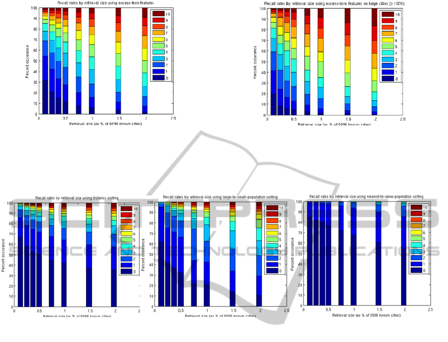
Figure 7: Recall rates, by retrieval-set size, using excess-term features. Each bar show the recall distribution, across
target cities, attempting to find the top 10 city-to-city associations in the retrieval result provided by excess-term similarity
sorting. The colors correspond to different recall rates, from finding all 10 cities (top, red) to finding none (bottom, blue-
black). The X-axis is the retrieval-set size, as a % of the full set of 8096 known cities, ranging from 0.1% up to 2%. Left:
the results across all target cities. Right: the results on large cities (> 100K population).
Figure 8: Recall rates, by retrieval-set size, using three baseline methods. These graphs provide baseline performance
levels for the recall according to retrieval-set size. Left: Using geographic distance to sort known cities. Middle:
population size (from largest to smallest). Right: we use the difference in population size compared to the target-city size
(from closest in size to most different).
cities that are of similar size to the target will occur
early in the list and cities that are much larger or
smaller will occur late in the list. We again use the
namespace mapping from Section 2.3.
As can be seen by comparing Figures 7 and 8,
the recall results for the excess-term-based sorting
are much higher than what would be provided by
any of our simple baseline methods. Since the
baseline methods enjoy the same optimistic
namespace mapping as our excess-term results, our
results are not due to that mapping. In Figure 7, we
can also see an improvement from the average
target-city recall performance to that of the largest
target-city recall.
For an intuition of the derived similarities, we
look at the results from two well-known, mid-sized,
locations: Cambridge, MA and Redmond, WA.
Cambridge is the home of two prestigious
universities (MIT and Harvard), as well as being a
center for high-tech startups and defense contracting.
When we look at the top associated cities, the first
three associated localities share some of these
characteristics but most likely are listed due to
geographic location: Boston MA, Brookline MA,
and Waltham MA are all very close to Cambridge.
In addition to those nearby cities, we see
associations that are best explained by character:
Palo Alto CA has a high quality university
(Stanford), as well as many high-tech companies,
both start-up (Facebook, VMware, etc) and
established (Hewlett-Packard, Xerox PARC, Fuji-
Xerox Research). There is a cluster of associated
cities from the defense-contractor centers:
specifically, Bethesda VA, Arlington VA, and Fort
Myer VA. The association with Irvine CA is may be
due to its mix of academics (UC Irvine) and high
tech (Broadcom). Bellevue WA is also closely
associated, probably since it is near Microsoft.
Similar types of associations can be seen for
Redmond WA (Microsoft Headquarters). Two
nearby communities are most strongly associated:
Seattle WA and Bellevue WA. There is a cluster of
cities from the Boston area, which share the high-
tech bias: namely, Cambridge MA, Waltham MA
A TALE OF TWO (SIMILAR) CITIES - Inferring City Similarity through Geo-spatial Query Log Analysis
187

(with many high-tech start ups), and Lexington MA
(with MIT Lincoln Labs). The largest group of
associated cities for Redmond is from the Silicon
Valley area: Sunnyvale CA, San Jose CA, Mountain
View CA, and San Francisco CA. In addition,
Buffalo NY (with SUNY) and Oakland CA (with
Berkeley) are associated with Redmond, probably
based on their engineering schools.
7 CONCLUSIONS
In this paper, we have employed techniques that
have previously been used to examine either single
or small sets of users and extended the procedures to
analyze the populations of more than 13,000 cities
across the U.S. Despite the diversity of people in
cities, we are able to find signals in the aggregate
query streams emanating from the cities and use
them to determine similar cities that are not
necessarily geographically close.
The most important signal we used for our
analysis, the excess score, was both simple and easy
to compute. Intuitively, it measures the ‘surprise’ in
the volume of a particular query. This measure helps
us overcome two important difficulties with the data.
First, every city has many queries for common
terms; instead of simply eliminating these common
terms (as is often done with stop-list type
approaches), the effect of these terms is reduced
unless there is a reason to pay attention to the terms
(i.e. they occur either more or less than expected in a
city). Second, the excess measure also provides a
simple basis with which to normalize for the query
volume of a city. This was crucial, considering the
wide range of population sizes and search engine
usage in the cities examined.
The results obtained by our system perform well
even with small retrieval sets. With only retrieving
160 cities (2% of the known cities), on average, we
find 6 cities from the top-10 closest cities (measured
by the census-data-based city-to-city dataset). Other,
intuitive heuristics, such as geographically closest
160 cities, or 160 cities with the closest sized
population, performed significantly worse.
There are a number of future directions for
exploration. In terms of the algorithms, one of the
first experiments to conduct is with weighted excess
metrics. Currently, each term is normalized such
that its contribution is proportional to its deviation
from its expected volume. However, some terms
may be more important than others – for example, if
a term that was expected to account for a large
percentage of a the query traffic didn’t (i.e. there
was only 1/10
th
the number of expected queries of a
popular term like “Twitter”), that may be more
telling about the population than the drop of a less
popular term (i.e. 1/10
th
the volume of the query
“Pinto muffler”). One simple method to incorporate
an importance weighting is to multiply the excess
score with the query’s expected percentage of
traffic. Experiments need to be conducted to see
whether such a weighting translates into improved
performance.
In this paper, we attempted to find similar cities
by looking at their query distributions.
Alternatively, we could also address the task of
finding related queries by looking at their excess
distributions across cities.
Beyond comparing directly to Census data,
perhaps most important to large scale adoption of
this work, we need to measure how the similar-city
lists found here correlate with the success and failure
of content and advertising campaigns that have been
launched in multiple cities. Understanding this, first
through historical log analysis and then through
controlled trials, will be an important step towards
understanding the extent to which the city-
similarities can be used for helping content-creators
and advertisers.
REFERENCES
Andrade, L. and Silva, M.J. (2006). “Relevance Ranking
for Geographic IR.” In Proc. ACM SIGIR Workshop
on Geo.Information Retrieval
Backstrom, L., Kleinberg, J., Kumar, R., and Novak, J.
(2008). “Spatial Variation in Search Engine Queries.”
In Proc. International Conference on World Wide Web
pp. 357-366.
Y. Chen, T. Suel, and A. Markowetz (2006). “Efficient
Query Processing in Geographic Web Search
Engines.” In Proc. ACM SIGMOD Int. Conference on
Management of Data pp. 277-288.
Datta, R. (2005) “PHIL: The Probabilistic Hierarchical
Inferential Learner,” 10
th
Annual Bay Area Discrete
Mathematics Day. http://math.berkeley.edu/
~datta/philtalk.pdf
Gan, Q., Attenberg, J., Markowetz, A., and Suel, T.
(2008). “Analysis of Geographic Queries in a Search
Engine Log.” In Proc. ACM International Workshop
on Location and the Web pp. 49-56.
Harik, G., Shazeer, N. (2004) “Method and Apparatus for
Learning a Probabilistic Generative Model for Text,”
U.S. Patent 7231393.
Hassan, A., Jones, R. and Diaz, F. (2009). “A Case Study
of using Geographic Cues to Predict Query News
Intent.” In Proc. ACM SIGSPATIAL International
Conference on Advances in Geographic information
Systems pp. 33-41.
KDIR 2011 - International Conference on Knowledge Discovery and Information Retrieval
188

Jansen, B.J., and Spink, A. (2006). “How are We
Searching the World Wide Web? A Comparison of
Nine Search Engine Transaction Logs.” Info.
Processing and Management 42 (1): 248-263.
Jones, R., Zhang, W.V., Rey, B., Jhala, P., and Stipp, E.
(2008a). “Geographic Intention and Modification in
Web Search,” Int. J. Geographical Information
Science. 22 (3): 229-246.
Jones, R., Hassan, A., and Diaz, F. (2008b). “Geographic
Features in Web Search Retrieval.” In Proc.
International Workshop on Geographic Information
Retrieval (Napa Valley, CA), pp. 57-58.
Salton. G. and McGill, M.J. (1983). Introduction to
Modern Information Retrieval. McGraw-Hill.
ISBN 0070544840.
Sanderson, T. and Kohler, J. (2004). “Analyzing
Geographic Queries.” In Proc. ACM SIGIR Wkshp on
Geo. Info. Retrieval
Silverstein, C., Marais, H., Henzinger, M., and Moricz, M.
(1999). “Analysis of a Very Large Web Search Engine
Query Log.” SIGIR Forum 33 (1): 6-12.
Yi, X., Raghavan, H., and Leggetter, C. (2009).
“Discovering Users' Specific Geo Intention in Web
Search.” In Proc. International Conference on World
Wide Web (Madrid, Spain), pp. 481-490.
Zhuang, Z., Brunk, C., and Giles, C.L. (2008a). “Modeling
and Visualizing Geo-Sensitive Queries based on User
Clicks.” In Proc. ACM International Workshop on
Location and the Web, pp. 73-76.
Zhuang, Z., Brunk, C., Mitra, P., and. Giles C.L (2008b).
“Towards Click-Based Models of Geographic Interests
in Web Search.” In Proc. IEEE/WIC/ACM
International Conference on Web Intelligence and
Intelligent Agent Technology pp. 293-299
A TALE OF TWO (SIMILAR) CITIES - Inferring City Similarity through Geo-spatial Query Log Analysis
189
