
Interactive Visualization of a News Clips Network
A Journalistic Research and Knowledge Discovery Tool
Jos
´
e Devezas and
´
Alvaro Figueira
CRACS/INESC TEC, Faculdade de Ci
ˆ
encias, Universidade do Porto
Rua do Campo Alegre, 1021/1055, 4169-007 Porto, Portugal
Keywords:
Visualization, Networks, Communities, Interactive, Named Entities, News Clips.
Abstract:
Interactive visualization systems are powerful tools in the task of exploring and understanding data. We
describe two implementations of this approach, where a multidimensional network of news clips is depicted
by taking advantage of its community structure. The first implementation is a multiresolution map of news
clips that uses topic detection both at the clip level and at the community level, in order to assign labels to
the nodes in each resolution. The second implementation is a traditional force-directed network visualization
with several additional interactive aspects that provide a rich user experience for knowledge discovery. We
describe a common use case for the visualization systems as a journalistic research and knowledge discovery
tool. Both systems illustrate the links between news clips, induced by the co-occurrence of named entities, as
well as several metadata fields based on the information contained within each node.
1 INTRODUCTION
Interactively exploring data through visualization en-
ables the users to improve their understanding of the
provided information. They gain knowledge by “con-
necting the dots”, establishing mental relationships
between the individual pieces of data in an intuitive
manner. Visualization can be used as a tool during
the research process, but it may as well become the
end product of an information system.
Breadcrumbs (Figueira et al., 2009) is a social net-
work based on the relations established by collections
of text fragments taken from online news. This intel-
ligent information system can be used to collect and
store fragments of text from online sources in a Per-
sonal Digital Library. These fragments, usually gath-
ered from online news sites, are then semantically or-
ganized, based on several latent features found in the
text, tags and comments assigned by the users.
We present two interactive visualization systems
based on a multidimensional network of news clips
from the Breadcrumbs platform. In this network,
nodes represent news clips, while edges were created
between every two clips that mentioned the same en-
tity (e.g. two clips are connected if they both mention
“United Kingdom”). Three classes of entities (Places,
People, and Dates) were used to establish the three
distinct network dimensions, resulting in three types
of edges: Who, Where, and When.
Our goal was to create an interface for the user
to explore the already available information in a user-
friendly and insightful manner. We largely took ad-
vantage of the community structure of the news clips
network — identified by the Breadcrumbs system us-
ing methodologies such as the Louvain method (Blon-
del et al., 2008) or Tang’s multidimensional integra-
tion methods (Tang et al., 2011) — not only to vi-
sually define coherent groups of nodes by using dif-
ferent colors, but also to support the discovery of la-
bels capable of illustrating the main topics of the news
clips. The developed systems consisted of:
1. A multiresolution visualization based on
gvmap (Gansner et al., 2010), a tool to gen-
erate static illustrations of graphs as maps and an
integrating part of GraphViz (Ellson et al., 2002).
2. A force-directed visualization (Fruchterman and
Reingold, 1991) developed using the data-driven
approach of d3.js (Bostock et al., 2011), a
JavaScript library for the manipulation of docu-
ments, that allows the production of dynamic and
interactive visualizations using technologies such
as SVG, HTML and CSS.
This paper is organized as follows. In Section 2, we
characterize the news clips network depicted in the
visualizations. In Section 3, we present our goal and
describe the two visualization systems, detailing the
techniques used to create them. In Section 4, we pro-
157
Devezas J. and Figueira Á..
Interactive Visualization of a News Clips Network - A Journalistic Research and Knowledge Discovery Tool.
DOI: 10.5220/0004108701570162
In Proceedings of the International Conference on Knowledge Discovery and Information Retrieval (KDIR-2012), pages 157-162
ISBN: 978-989-8565-29-7
Copyright
c
2012 SCITEPRESS (Science and Technology Publications, Lda.)
pose a use case of the developed systems as a journal-
istic research and knowledge discovery tool. In Sec-
tion 5, we present some final observations, including
the main challenges encountered during the develop-
ment phase, as well as the future contributions regard-
ing this work.
2 NEWS CLIPS NETWORK
The network of news clips we used for the visualiza-
tions comprises 94 nodes with 166 edges connecting
them. Out of these, 17 edges belong to the dimen-
sion Who, 106 to the dimension Where, and 43 to the
dimension When. To store the network, we used the
GraphML format (Brandes et al., 2002), saving sev-
eral attributes alongside each node and edge:
Nodes
clipID A unique identifier for the news clip.
date The date when the news clip was collected.
url The online news source from where the clip
was gathered.
text A text fragment collected from an online
news source.
community The membership identifier, uniquely
representing the community the node belongs
to, according to the Louvain method.
Edges
weight An integer number representing the num-
ber of times an entity co-occurs in a pair of
news clips.
dimension One of the three dimensions: Who,
Where, and When.
class One of the many classes contained within
each dimension (e.g. dbpedia-owl:Scientist).
uri A unique resource identifier for the named
entity.
3 VISUALIZATION SYSTEMS
In this section, we present our goal and describe the
main features of the developed visualization systems,
explaining how some of the metadata content was
used to define visual attributes, including the node la-
bel and color.
3.1 Mapping the Relationships of News
Clips
Our intention was to conceive a system capable of
providing the user with an environment that would fa-
Figure 1: Lowest resolution zoom level for the network map
visualization.
cilitate the exploration of the connected data, includ-
ing the previously identified grouping relationships,
available in the network of news clips.
Given the gvmap tool was only capable of gener-
ating static map images for a single network and in
order to introduce an additional interactivity layer ca-
pable of providing semantic zoom, we used OpenLay-
ers (Hazzard, 2011) to define a multiresolution visu-
alization based on several different map images, inde-
pendently generated for each resolution. To achieve
this, we started by converting the GraphML file rep-
resenting the news clips network into a dot file (Kout-
sofios and North, 1991), the native format supported
by GraphViz. A dot file describes a graph that can be
directly converted into a high resolution image. The
visualization of these large files is a computationally
intensive task that can be highly simplified by creating
several smaller tiles, which can then be dynamically
loaded and rendered by OpenLayers.
Algorithm 1 illustrates the steps taken to gener-
ate the tile images for each resolution of the map vi-
sualization. We used the text attribute as the node’s
label and, during the conversion process, we also in-
troduced a new attribute with the PageRank (Brin
and Page, 1998) of each node, computed through the
JUNG library (O’Madadhain et al., 2003) from within
the Breadcrumbs system. We used GraphViz’s sfdp to
calculate the positions of the nodes based on a force-
directed algorithm. The result of this process was
then passed to gvmap, which identified the clusters
and defined the borders of the “countries” in our map,
resulting in a dot file that could be directly plotted
with GraphViz to generate an image representing the
largest resolution of our visualization.
In order to obtain semantically coherent map plots
for each resolution, we parsed the resulting dot file,
clearing the existing labels, so that a larger font could
be used and a smaller, descriptive label could replace
the clip’s text, without the need to recalculate the lay-
out. Using the PageRank attribute allowed us to to
KDIR2012-InternationalConferenceonKnowledgeDiscoveryandInformationRetrieval
158

(a) Level 3 zoom resolution showing several double labels, such as “Greece: Banks”.
(b) Maximum zoom resolution showing the text for the “Greece: Banks” news clip along with its information tooltip.
Figure 3: Partial views of the multiresolution map for the news clips network.
50
100
150
200
250
300
●
●
●
●
●
●
●
256
512
1024
2048
4096
8192
16384
0 1 2 3 4 5 6
Zoom Level
Font Size
Figure 2: Evolving font size for progressively larger zoom
levels and resolutions.
identify the most central nodes in the network, which
often correspond to visually central nodes as well, us-
ing them to position the new labels. We generated
n image files, where images 0 to n − 1 represented
progressively larger resolution zoom levels of the vi-
sualization. A larger number of labels were succes-
sively added to the most central nodes as the reso-
lution increased, while the font size decreased. Fig-
ure 2 depicts the function used to calculate the font
size, so that each image, corresponding to a squared
map, could be resized to its final side measure — for
example, at zoom level 2, the font size would be 95
points, for an image displayed in 1024 pixels. Image
n simply represented the largest resolution of the map
visualization, with the clip’s text as the label.
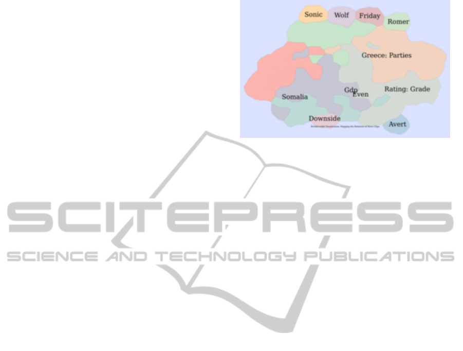
Figure 1 shows image 0 of the resulting visual-
ization, corresponding to the lowest resolution pos-
sible. As we can see, only a few labels are shown.
These coincide with the most central node in each
community. Labels were sometimes defined using
two words, which was, for instance, the case of
“Greece: Parties”. This double label was defined by
combining a community label (“Greece”) with a clip
label (“Parties”). To compute the community label
returned by the getCommunityLabel function, we ag-
gregated the text of the community’s news clips as
a single document, calculating the TF-IDF (Salton
and Buckley, 1988) of its terms, after removing stop
words. Ranking the terms from highest to lowest TF-
IDF gave us the label, or labels, of the community. We
repeated this process for the news clips, using the text
of each clip as the document, thus acquiring a second
label from the getVertexLabel function.
Given the multiresolution map should have a se-
mantic zoom behavior, it was important to maintain
an inter-resolution coherence, specifically regarding
the transition to the highest zoom level, where the
map changed from displaying a set of labels to dis-
playing a set of text fragments from news clips. Ac-
cordingly, we only assigned a community label to a
node whenever the text in the corresponding news clip
contained that same label. Otherwise we search for
the next community label, according to the TF-IDF
ranking, until we found a matching label — this was
done within the getCommunityLabel function. In the
particular case when the community label and the clip
label were equal, or when none of the possible com-
munity labels were contained in the clip text, we sim-
ply used the clip label.
Figure 3 depicts the zooming behavior that our
network map provides. In Figure 3(a) we can see la-
bels such as “Greece: Banks”, “Income: Taxes”, or
simply “Stress”, as well as “Rating: Grade” or “Rat-
ing: Business”. Zooming to the maximum resolution
for the node labeled “Greece: Banks” shows the cor-
responding clip text depicted in Figure 3(b). Next to
InteractiveVisualizationofaNewsClipsNetwork-AJournalisticResearchandKnowledgeDiscoveryTool
159

Algorithm 1 : Pseudocode for the generation of the mul-
tiresolution network map.
Input: News clips network G
max(levels)
in dot format.
Output: Set of tiled images for each resolution.
tileSide ← 256
G
base
← gvmap(sfdp(G
max(levels)
))
for all V ∈ G
base
do
V.label ← None
V.pageRank ← computePageRank(V )
end for
for all n ∈ levels \max(levels) do
nrLabels ← 2 ×(n + 1)
f ontSize ←
300
2
n
+ 5 ×(n + 1) + 5
G
n
← G
base
for all V ∈ G
n
decreasingly ordered by PageRank
∧ while labelCounter < nrLabels do
V. f ontSize ← f ontSize
communityLabel ←
getCommunityLabel(V.community,V.text)
vertexLabel ← getVertexLabel(V )
label ← concat(communityLabel, vertexLabel)
if communityLabel = nodeLabel
∨¬V.text.contains(communityLabel) then
V.label ← vertexLabel
end if
increment(labelCounter)
end for
image ← createImage(G
n
)
side ← 2
n
×tileSide
resize(image, width ← side, height ← side)
createTiles(image, tileSide)
end for
the text fragment, there is an information icon that
can be pressed to display a tooltip containing relevant
metadata for the corresponding news clip, including
its identification number and date of clipping, as well
as a link to the news website where the text was col-
lected from, along with a set of user-assigned tags.
3.2 Multidimensional Network of News
Clips
Although zooming is an interesting interactive behav-
ior, our aim was to provide a more dynamic and even
more interactive tool that would allow the user to ex-
plore every aspect of the news clips network, includ-
ing the metadata that supported the discovery of the
multidimensional relationships. Thus, based on the
same network data, we used d3.js to create the visu-
alization depicted in Figures 4, 5 and 6. The users
can hover through a node to see its identified named
entities, as well as its metadata in the sidebar. Addi-
tionally, users can pin nodes by dragging them, which
allows them to navigate through the metadata of these
nodes by pressing “Previous” and “Next”. This way
they can for instance examine the semantics provided
by the different communities, which are mapped as
Figure 4: Interactive visualization for a multidimensional
network of news clips, with three pinned nodes.
(a) With the singleton nodes hovering around the main component.
(b) With the singleton nodes hidden.
Figure 5: Interactive visualization for a multidimensional
network of news clips, with the Where dimension disabled.
Figure 6: Interactive visualization for a multidimensional
network of news clips, with a filter for “greece”.
colors. As we can see from Figure 5, the user can
also enable and disable each dimension. This visually
KDIR2012-InternationalConferenceonKnowledgeDiscoveryandInformationRetrieval
160

translates into the removal of the edges of the same
type as the toggled dimension, disconnecting the cor-
responding pairs of nodes and actively updating the
force system until it stabilizes. Figure 5(a) shows the
Where dimension disabled, with all the disconnected
nodes hovering around the main network component.
Figure 5(b) illustrates the same behavior, now with
the singleton nodes hidden for a cleaner interface.
Finally, users can also apply a node filter based
on the news clip’s text, allowing them to find nodes
for specific topics. Figure 6 shows an example fil-
tering, where the word “greece” is used to find news
clips about the country. Visually, any node that
doesn’t contain any reference to the word “greece” is
faded out, so that the users can find the nodes about
the topic they searched.
4 VISUALIZATION-BASED
JOURNALISTIC RESEARCH
We describe a possible use case of the developed vi-
sualization systems, in a journalistic environment, as
a news research and knowledge discovery tool, using
the underlying socially based collection of news clips,
provided by the Breadcrumbs platform.
Our visualization tools are specially useful when-
ever a journalist wishes to research the public’s opin-
ions and interests on either current or past reported
events. Given the folksonomic character of the ex-
plored data set, a journalist should be able to explore
the news through the reader’s point of view, reaching
the original news article from the fragments of text
that the users collected. Next, we present an example
of a typical usage pattern of our visualization systems
in the process of interactively organizing information
and discovering hidden relations.
To better understand the available information, a
journalist might use the multiresolution map visual-
ization tool. This provides an overview of the net-
work, enabling the journalist to immediately become
familiar with the global topics which the users are
reading about. The semantic aggregation of news
clips provided by the colored communities should
help identify the different groups of related topics, as
well as the boundaries where topics transition to new
subjects. Zooming into a higher resolution should
provide further topical information, making it pro-
gressively clearer to the journalist what were the top-
ics in the center of the user’s attention. Finally, the
journalist might access the highest resolution zoom
level, being able to read the news clips at the source
of the displayed topics, as well as access some of the
news clip’s metadata, such as the news source loca-
tion, the date of clipping, or the user-assigned tags.
Nevertheless, the overview provided by the map vi-
sualization tool might not be sufficiently insightful.
To continue the research, the journalist might use the
multidimensional network visualization tool.
The multidimensional network contains relational
knowledge about the entities present in news clips,
including people, places and dates. These three di-
mensions are at the core of any news article, and help
provide an answer to three of the five questions in the
“Five Ws” journalistic maxim: Who, Where, When,
What and Why. When using this visualization sys-
tem, the journalist might start by discovering which
nodes are in the center of each community (depicted
using different colors). A simple mouse hover on a
node with a high number of connections should be a
good starting point. Whenever an interesting node is
found, a journalist can pin that node, consult its meta-
data, and continue researching and pinning as many
nodes as desired (see Figure 4). Pinned nodes, corre-
sponding to single news clips, have a label where the
identified entities are displayed, allowing the journal-
ist to understand the focus of readers when collect-
ing news clips. For instance, whenever a group of
news clips containing several entities are connected
to each other for coreferencing a single entity, such as
“Barack Obama”, the journalist might decide to ex-
plore the related news clips in the same community,
knowing that the public is interested on that person.
The system has two additional features that can help
the journalist filter the displayed nodes and edges.
Whenever the researcher is, for example, interested
in discovering news clips connections solely based on
people and dates, the Where dimension can be dis-
abled and the singleton nodes hidden, providing a fil-
tered view of the network (see Figure 5). On the other
hand, the journalist can directly search for news clips,
by using a text filter that highlights all nodes corre-
sponding to the news clips that match the input string.
This type of behavior is depicted in Figure 6, where
a filter for “greece” was applied to the multidimen-
sional network visualization, therefore allowing the
researcher to find news clips about Greece.
These visualization tools can be used to comple-
ment a journalist’s research by taking advantage of a
knowledge base created by the readers, thus bringing
the producer closer to the consumer’s interests.
5 CONCLUSIONS AND FUTURE
WORK
We developed two interactive visualization systems
for a multidimensional network of news clips. Our
InteractiveVisualizationofaNewsClipsNetwork-AJournalisticResearchandKnowledgeDiscoveryTool
161

implementations enabled users to explore the re-
lationships between news clips, based on the co-
occurrence of named entities and the community
structure of the network, empowering them with a
set of tools to explore the relational data present in
news clips. The biggest challenge for the interactive
map visualization was the identification of descriptive
node labels, as well as their positioning. This hap-
pened because the tool we used to generate the set
of images for the multiresolution visualization didn’t
take into account the different label lengths to de-
fine a common layout across zoom levels. We solved
this problem by positioning the labels for lower res-
olutions in the most central nodes, according to the
PageRank, as well as by selecting the appropriate font
size for the various zoom levels.
The multiresolution map visualization was effec-
tive in producing a clear illustration of the network’s
nodes and clusters, however it didn’t provide by itself
a very rich interaction to the user apart from a seman-
tic zooming behavior and the consultation of news
clips metadata. Using the layout properties to influ-
ence the behavior of other web components would
require further implementation as the tool only pro-
vided the means to generate a simple static map in
the format of an image. On the other hand, with
the visualization of the multidimensional network of
news clips, developed using a data-driven approach,
we were able to develop several web components that
enabled the user to organize and filter the nodes, as
well as to visually toggle any of the available edge di-
mensions. This allowed the users to interactively ex-
plore several aspects of the data that would otherwise
be difficult to interpret, resulting in a tool that can be
used in journalist research.
As future work, we would like to improve on the
existing network map visualization, specially in re-
gards to the method of community and news clip topic
discovery, when computing the pair of node labels.
We would also like to evaluate the developed visual-
ization systems based on human input, assessing user
experience and usability, with a focus on the journal-
istic community.
ACKNOWLEDGEMENTS
This work is financed by the ERDF — European
Regional Development Fund through the COMPETE
Programme (operational programme for competi-
tiveness) and by National Funds through the FCT
— Fundac¸
˜
ao para a Ci
ˆ
encia e a Tecnologia (Por-
tuguese Foundation for Science and Technology)
within project UTA-Est/MAI/0007/2009.
REFERENCES
Blondel, V. D., Guillaume, J.-L., Lambiotte, R., and Lefeb-
vre, E. (2008). Fast unfolding of communities in large
networks. Journal of Statistical Mechanics: Theory
and Experiment, 2008(10):P10008.
Bostock, M., Ogievetsky, V., and Heer, J. (2011). D3: Data-
Driven Documents. IEEE transactions on visualiza-
tion and computer graphics, 17(12):2301–9.
Brandes, U., Eiglsperger, M., Herman, I., and Himsolt, M.
(2002). GraphML progress report structural layer pro-
posal. Graph Drawing, pages 501–512.
Brin, S. and Page, L. (1998). The anatomy of a large-scale
hypertextual web search engine. Computer Networks
and ISDN Systems.
Ellson, J., Gansner, E., Koutsofios, L., North, S. C., and
Woodhull, G. (2002). Graphviz – Open Source Graph
Drawing Tools. In Graph Drawing, pages 594–597.
Springer Berlin - Heidelberg.
Figueira, A., Ribeiro, P., Leal, J. P., Zamith, F., Cunha, E.,
Francisco-Revilla, L., Ribeiro, H., Silva, A., Pinto,
M., Alves, H., Devezas, J., Santos, M., and Cravino,
N. (2009). Breadcrumbs: A social network based on
the relations established by collections of fragments
taken from online news. Retrieved January 19, 2012,
from http://breadcrumbs.up.pt.
Fruchterman, T. and Reingold, E. (1991). Graph drawing
by force-directed placement. Software: Practice and
experience, 21(11):1129–1164.
Gansner, E., Hu, Y., and Kobourov, S. (2010). GMap:
Drawing Graphs as Maps. In Graph Drawing, pages
405–407. Springer.
Hazzard, E. (2011). OpenLayers 2.10. Packt Publishing.
Koutsofios, E. and North, S. (1991). Drawing graphs with
dot. AT&T Bell Laboratories.
O’Madadhain, J., Fisher, D., and White, S. (2003). JUNG
(Java Universal Network/Graph) Framework.
Salton, G. and Buckley, C. (1988). Term-weighting ap-
proaches in automatic text retrieval. Information pro-
cessing & management, 24(5):513–523.
Tang, L., Wang, X., and Liu, H. (2011). Community de-
tection via heterogeneous interaction analysis. Data
Mining and Knowledge Discovery.
KDIR2012-InternationalConferenceonKnowledgeDiscoveryandInformationRetrieval
162
