
Using EVOWAVE to Analyze Software Evolution
Rodrigo Magnavita
1,2,3
, Renato Novais
4
and Manoel Mendonc¸a
2
1
Fraunhofer Project Center for Software and Systems Engineering, Bahia, Brazil
2
Computer Science Department, Federal University of Bahia, Bahia, Brazil
3
Software Development Area, SENAI/CIMATEC, Bahia, Brazil
4
Computer Science Department, Federal Institute of Bahia, Bahia, Brazil
Keywords:
Software Visualization, Software Evolution, Software Comprehension, Software Engineering.
Abstract:
Software evolution produces large amounts of data which software engineers need to understand for their
daily activities. The use of software visualization constitutes a promising approach to help them comprehend
multiple aspects of the evolving software. However, portraying all the data is not an easy task as there are
many dimensions to the data (e.g. time, files, properties) to be considered. This paper presents a new software
visualization metaphor inspired by concentric waves, which gives information about the software evolution
in different levels of detail. This new metaphor is able to portray large amount of data and may also be
used to consider different dimensions of the data. It uses the concepts of the formation of concentric waves
to map software evolution data generated during the waves formation life cycle. The metaphor is useful for
exploring and identifying certain patterns in the software evolution. To evaluate its applicability, we conducted
an exploratory study to show how the visualization can quickly answer different questions asked by software
engineers when evolving their software.
1 INTRODUCTION
Software evolution has been highlighted as one of the
most important topics in software engineering (No-
vais et al., 2013). It is a very complex activity because
the process generates a huge amount of data. Dealing
with these data is challenging: developers may spend
more than 60% of the maintenance effort understand-
ing the software (Corbi, 1989).
This has led the software engineering research
community to create methods, processes and tech-
niques to improve software comprehension. The goal
is to increase the overall effectiveness of software de-
velopment. The use of software visualization is in-
creasingly being used. It helps people to understand
software through visual elements, reducing complex-
ity to analyze the amount of data generated during
the software evolution (Diehl, 2007). Nevertheless,
building visual metaphors that effectively represent
the time dimension with all the information related
to software evolution is a difficult task.
Authors have taken different approaches to this
task. Some present the big picture of the software,
providing an overview of the whole software history
(Kuhn et al., 2010)(Voinea and Telea, 2006)(Lungu,
2008)(Lungu et al., 2010)(Telea and Auber, 2008),
while others show snapshots of the software evo-
lution in detail (Abramson and Sosic, 1995)(No-
vais et al., 2011)(Novais et al., 2012)(Bergel et al.,
2011)(D’Ambros et al., 2009). They are both impor-
tant because each approach fits better to specific soft-
ware evolution tasks. A important issue in the area is
to understand how to combine both approaches in a
practical and useful way so that users can really take
advantages of the proposed visualizations.
A mapping study performed in the area (Novais
et al., 2013) highlighted other issues for the software
evolution visualization community. Many works ad-
dress software evolution by viewing only one type
of data (e.g. source code change, defects, features).
They do not usually display or cross-reference differ-
ent information that can be recovered from different
sources. Again, they are able to help users to perform
few or specific tasks.
In this paper, we propose a new software evolution
visualization metaphor called EVOWAVE. It is able
to visualize different types of data generated in the
development process from the overview aspect to the
detail of interest. EVOWAVE can represent a great
number of events which occurred during the software
126
Magnavita R., Novais R. and Mendonça M..
Using EVOWAVE to Analyze Software Evolution.
DOI: 10.5220/0005373901260136
In Proceedings of the 17th International Conference on Enterprise Information Systems (ICEIS-2015), pages 126-136
ISBN: 978-989-758-097-0
Copyright
c
2015 SCITEPRESS (Science and Technology Publications, Lda.)

development at a glance. This metaphor was inspired
by the formation of concentric waves while seeing it
from the top (Section 3). We observed different facts
about this phenomenon that could be used to visualize
the software evolution and then created the concepts
of our metaphor from it (Section 3.1). We developed
a tool that made use of the metaphor to help users
to perform software evolution tasks. To evaluate its
usefulness, we conducted an exploratory study. As a
result of this study, we found that the metaphor is able
to answer many of the different questions commonly
asked by developers (Sillito et al., 2006) (Section 5).
The remainder of this paper is structured as fol-
lows. Section 2 presents different related works. Sec-
tion 3 provides a detailed explanation of the facts
extracted from the formation of concentric waves.
It also discusses the EVOWAVE concepts created
from the analysis of these facts. Section 5 explains
how some questions about an open source project
were addressed with the metaphor. Finally, Section
6concludes this work presenting some limitations and
pointing to future works.
The figures used in this paper have many de-
tails that can be better seen in a full resolution
version available on https://wiki.dcc.ufba.br/SoftVis/
EVOWAVE.
2 RELATED WORK
Several works visualize software evolution. They dif-
fer in the strategy used to portray all the data, the type
of the data used or according to the task that they are
designed to do.
Some authors have proposed overview visualiza-
tions that are able to visualize all the software history
in one single screen shot. For example, Kuhn et al.
(Kuhn et al., 2010) developed an iconography visu-
alization that extracts information directly from the
source code. It calculates the source code vocabu-
lary distance to visualize the software evolution us-
ing a Cartography metaphor. Voinea et al. (Voinea
and Telea, 2006) presented a multiscale and multivari-
ate approach to visualize software evolution. They
are able to visualize many data combined with mul-
tiple attributes collected from the software configura-
tion management (SCM) and the source code itself.
Kula et al. (Kula et al., 2014) proposed a visualiza-
tion to visualize how the dependency relationship be-
tween the program and its dependencies evolves. This
work uses the closest metaphor to our work. It uses a
radial metaphor to visualize the dependencies. Rufi-
ange et al. (Rufiange and Melancon, 2014) proposed
a matrix-based visualization that animates how soft-
ware designs evolve. In (Lungu, 2008), one visualiza-
tion for reverse engineering of a software ecosystem
was presented. He also used information from SCM
data and source code. Ogawa and Ma use visualiza-
tion techniques in a software project history (Ogawa
and Ma, 2009). They used a graph-based visualiza-
tion that shows a snapshot of the software at a specific
time, combined with a bar chart visualization to pro-
vide an overview of the amount and type of commits
over time.
In contrast to the overview approach, other au-
thors focus on visualizing the software in details,
showing a snapshot of the software history, high-
lighting the software modules. Beyer et al. (Beyer
and Hassan, 2006) proposed a graph-based metaphor
called Storybords. It aims to highlight the structural
changes in the software modules, spotting good de-
sign and signs of structural decay. In (Ratzinger et al.,
2005), the authors proposed a visualization to ex-
plore the data evolution across multiple dimensions.
They analyze the co-change coupling information of
the software modules. Another work that also an-
alyzes co-change coupling is the one proposed by
(D’Ambros et al., 2009). The visualization proposed
in (Godfrey and Tu, 2001) aims to help users to un-
derstand structural and architectural change. They vi-
sualize SCM data and source code using graph-based
and tree-based metaphors. Sandoval et al. (San-
doval Alcocer et al., 2013) proposed a visualization
that represents the performance evolution of a system.
They use a graph-based metaphor to create a perfor-
mance evolution blueprint of the system.
Our metaphor aims to do both: provide an
overview the software history as well as see the soft-
ware in detail focusing on the information of inter-
est. Furthermore, EVOWAVE is designed to visualize
any evolutionary data. It also allows users to visualize
combined data from different repositories.
3 THE EVOWAVE METAPHOR
The software development process, i.e. its evolution,
generates a huge amount of valuable data from dif-
ferent sources. However, tons of data without analy-
sis tells us little or nothing about the software. Ways
Figure 1: A snapshot of real concentric waves.
UsingEVOWAVEtoAnalyzeSoftwareEvolution
127

to organize well, visualize and analyze the data are
needed. For example, it would be interesting to know
which software module has been using most of the
project resources. Therefore we need to extract this
information in an organized way, visualize it in such
a way that users can correctly analyze it and get this
information.
EVOWAVE is a new visualization metaphor that
enriches the analysis capabilities of software evolu-
tion. It is inspired in concentric waves with the same
origin point in a container seen from the top as Figure
1 shows. This section presents the facts and concepts
related to concentric waves which make EVOWAVE a
promising software evolution visualization metaphor.
3.1 Concentric Wave Facts
During our research we identified some facts about
the formation of concentric waves which can be used
to represent evolutionary data. Figure 1 will help to
understand the facts related to the proposed metaphor.
Each of them is discussed below.
3.1.1 The Concentric Wave Propagation Occurs
in All Directions
An external force must be applied in a container filled
with liquid to generate the propagation of waves. In
normal situations, they are distributed equally in all
directions from the center. This happens when the
force direction is 90 degrees to the flat surface of
the container. This force pushes the same amount of
molecules in all directions which creates redundant
information. This is by no means what the metaphor
wants to achieve. If one installs delimiters in the con-
tainer following the propagation path from the center
(as a radius line), it creates regions that have no influ-
ence on adjacent ones. Thus, an external force could
be applied to each region to push different amounts of
molecules between each pair of delimiters solving the
generation of redundant information.
3.1.2 Biggest Waves have More Molecules
The magnitude of the applied force responsible for
the wave formation will define how many molecules
will be pushed away. During the wave formation the
strongest force applied will generate the biggest wave.
Thus, it will be the wave with the most molecules.
3.1.3 The Wave Closest to the Center is the Last
Formed
Concentric waves are formed from the application of
a force at its center and spread over time. When look-
ing at a snapshot of the wave formation process, the
least propagated wave is the one closest to the center.
This means that it is the last formed. This leads to
a conclusion about the existence of a timeline in the
wave propagation path where the center is when the
snapshot was taken and the most propagated wave dis-
tance from the center is the beginner. Therefore, each
molecule has information about when some force was
applied to it according to its location in the propaga-
tion path.
3.2 EVOWAVE Concepts
Based on these wave facts, we derived a set of con-
cepts used in the EVOWAVE metaphor
3.2.1 Layout
We observed from the described facts that the wave
propagation path has the behavior needed to repre-
sent a period of time in software history. EVOWAVE
has a circular layout with two circular guidelines (in-
ner and outer), as shown in Figure 2-A. They repre-
sent a software life cycle period (e.g. [01 January,
2000 10:01:20 AM] to [01 January, 2014 05:20:01
PM]). This period, named timeline (Figure 2-A), is
composed of a set of small periods (lower possible
displayed screen size) with the same periodicity (e.g.
ten days, two hours, a month). The periodicity may
differ among visualizations according to the available
display size. The newest date can be associated with
the inner guideline and the oldest date with the outer
in order to give some orientation to the path between
them, or the other way round. The display region be-
tween the two circular guidelines contains the time-
line used for an overview of the software history for
analysis.
3.2.2 Windows
EVOWAVE has mechanism, named window, which
compares a subset of small periods, making it pos-
sible to carry out a detailed analysis regarding the
overall context. A window (Figure 2-B) is a group
of consecutive small periods. It is circular in shape
and its length depends on the number of grouped peri-
ods. The timeline is composed of these windows and
each one of them has the same number of consecutive
small periods.
3.2.3 Molecules
All the data generated from the software development
process can be associated to a event that occurred dur-
ing it (e.g. bug reports, file changes, team changes).
ICEIS2015-17thInternationalConferenceonEnterpriseInformationSystems
128
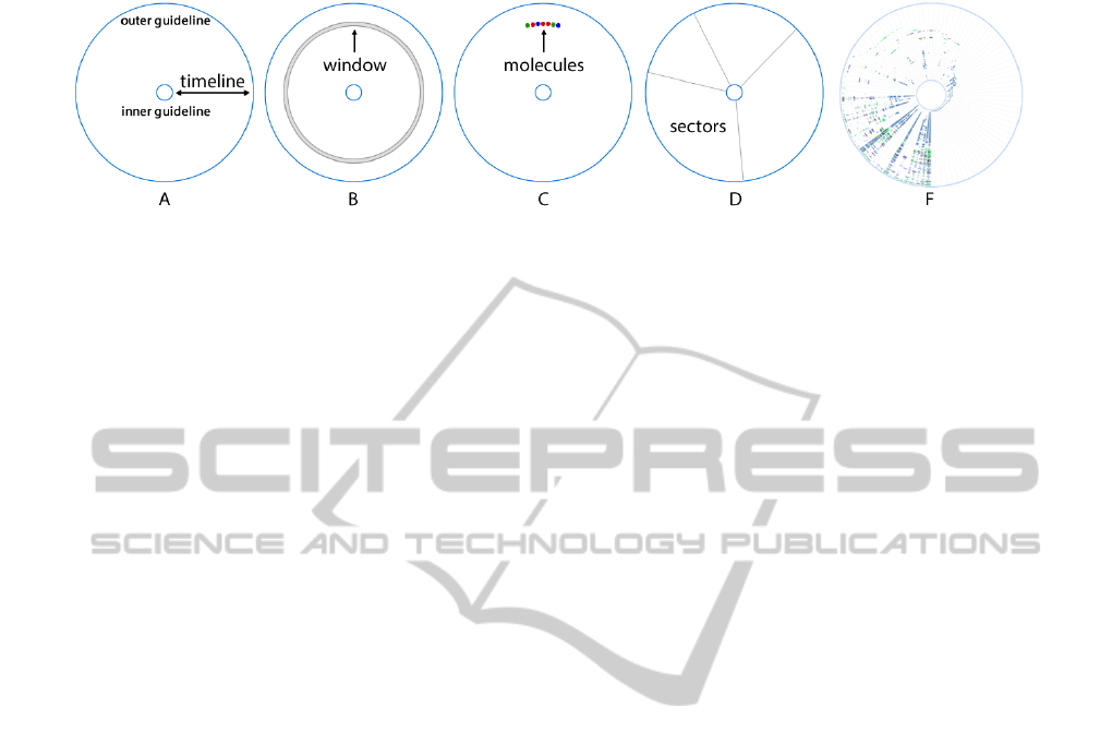
Figure 2: The EVOWAVE concepts (A to D) and one possible visualization of the metaphor using them (F).
Lets consider for example a change in class and there-
fore in its package. In this example, the event was the
change of a java class and its associated data was the
package of this java class. These events will be or-
ganized between the two circular guidelines, in one
window, according to when they occurred
A visual element is provided to actually represent
these events because it increases the level of detail
provided by the metaphor. Molecules (Figure 2-C) are
mainly depicted as circular elements inside the sectors
and windows. Each molecule has an event associated
to it. Unfortunately, the display size limits the num-
ber of molecules that can be drawn inside the window.
When it is not possible to fill all the molecules they
are joined together and singled drawn as a quadrilat-
eral polygon that fills the region where the molecules
are to be put in. Figure 2-F presents a possible visu-
alization of the metaphor with all of these concepts.
3.2.4 Sectors
A mechanism to compare different groups of data
must be provided to improve the analysis capabilities
of the software engineer. The concept of a circular
sector was used to group events that share some char-
acteristic because of the metaphors circular layout. A
sector (Figure 3.2-D) is a visual element drawn be-
tween the two circular guidelines according to its an-
gle. Each sector can have different angles which will
result in different areas. The sectors should be one
of the first visual element to be realized during analy-
sis. It will clarify how the events are organized. Once
it is understood how EVOWAVE builds the group of
events, it is possible to compare the sectors in two lev-
els: globally or periodically. Globally is used to un-
derstand how the events flowed through the timeline
more abstractly while periodically helps to obtain a
higher level of detail by comparing the same window
in different sectors.
The defined characteristic used to group the
events sometimes has an implicit hierarchy. An
example would be the java class package (i.e.
com.magnavita.evowave) of a changed file event
which before each dot represents a different level in
the hierarchy. Treemap (Shneiderman, 1992) means
the notion of turning a hierarchical structure into a
planar space-filling. This concept was achieved by
drawing a sector inside sector according to its level
in the hierarchy. This brings the capacity to see
tens of thousands of nodes from this hierarchy in a
fixed space which certainly will be needed due to the
amount of levels it could have.
Software evolution visualization tools use many
strategies to visualize the evolution (Novais et al.,
2013) and they are classified in two groups: differen-
tial and temporal strategies. The differential strategies
analyze the evolution considering two versions per
time, while the temporal strategies consider all avail-
able versions at once. The support of multiple strate-
gies is an important feature, since each one gives a dif-
ferent view of the software development process. The
use of multiple views is encouraged because it gives
more information related to the task that the software
engineer needs to perform the task (de F. Carneiro
et al., 2008).
We believe when we have a metaphor which can
generate multiple views of the software according to
its setup, it is better than using multiple metaphors
because the user needs to understand each metaphor
before learn about the software. Furthermore, multi-
ple metaphors need concise navigation among them.
The EVOWAVE metaphor has the ability to analyze
software evolution using both strategies according to
the configuration applied to it.
4 MAPPING SOFTWARE
PROPERTIES
EVOWAVE concepts define how the metaphor orga-
nizes and displays events which occurred during any
general data history. The EVOWAVE metaphor is also
able to represent software evolution, by mapping its
visual elements to software history attributes. It is
important to take into account that each mapping will
give different information and should be chosen ac-
cording to the software development task at hand. We
UsingEVOWAVEtoAnalyzeSoftwareEvolution
129
list the EVOWAVE characteristics that can be mapped
to software history attributes below.
4.1 Timeline
The timeline defines the period of analysis through
two dates: the beginning and the end of a software de-
velopment phase. We can map two software versions
and analyze what happened between them. If we map
the first version to the inner guideline, and the last
version to the outer one, the history of the software is
portrayed from the middle to the boundaries.
4.2 The Pooler of a Sector
A pooler defines how the events will be grouped. The
chosen software property to be the pooler has to cate-
gorize the events. The events with the same category
will be in the same sector. There are many software
properties that can be associated with this property.
Some examples are: The package of a changed class
event; the file type of a changed file event; the author
of a bug report event; the bug type of a bug report
event. The user should choose the property according
to the task goal. For example, if the goal is to analyze
developers efforts, the pooler could be the author and
the event could be a file changed, created or removed.
Figure 3 shows a snapshot of our metaphor set up for
this case. In this case it is possible that the developer
mapped to a sector labeled as A was the most active
developer at the beginnings of the project. Around the
project mid life cycle period, he/she stopped work-
ing. Then, from that point on, two other developers
(the ones mapped to the sectors labeled as B and C)
become the main project contributors.
Figure 3: The pooler is the authors and the events are any
changed files.
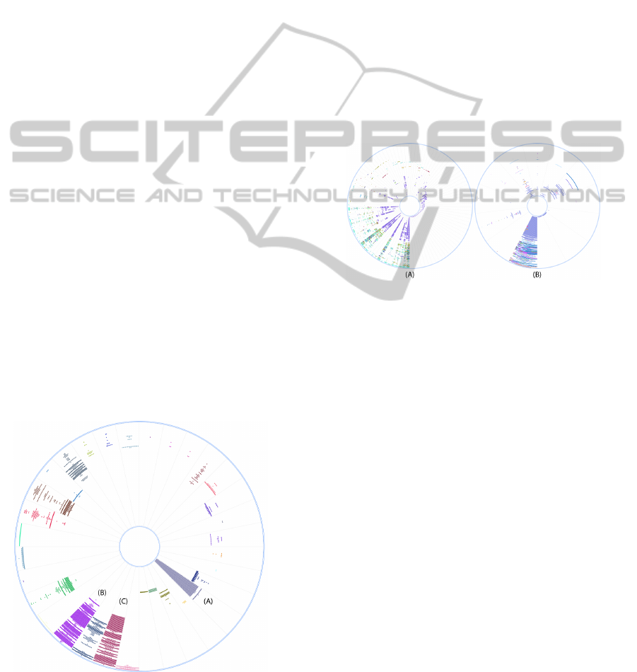
4.3 The Splitter of a Sector
The splitter defines how the hierarchy of the pooler
property will be created. The pooler property usually
has some delimiter that can be point out to be the split-
ter property. The splitter needs to be part of the pooler
in order to split it into different levels. For example,
the slash character could be used as a splitter for the
file path of a changed file. It is part of the pooler prop-
erty and will divide it in many folders where each one
is a different level in the hierarchy. Figure 4 shows an
example of the metaphor without (A) and with split-
ters (B). Again, the decision to use splitters or not de-
pends on the task at hand. For example, if the task is
to identify the most active packages, the visualization
in Figure 4 (A) will achieve the goal faster. Other-
wise, if the goal is to identify the big picture of each
module, Figure 4 (B) gives a clearer view.
Figure 4: The sectors are the java packages. At (A) no split-
ter was used and all packages are presented at once and at
(B) the dot was used as splitter and only one level of the
java package hierarchy are displayed at once.
4.4 The Angle of a Sector
The angle defines how much of some software prop-
erty the sector has relative to the others. The sum of
this software property determines how much bigger
it should be compared with the others. If the pooler
is the package of a changed class, the angle could be
package complexity growth, for example. In this case,
all the increased complexities events are summed up
for each package. The bigger complexity is mapped
to the larger sector angle.
4.5 The Color of a Molecule
The color is other important visual attribute in the
EVOWAVE metaphor. It can also be used to map soft-
ware properties as an event categorization or a numer-
ical property range. An example of the event catego-
rization is the authors of a bug report where each au-
thor could have a different color associated to them.
For numerical property range we may consider how
much a java class complexity grew or shrank. In this
ICEIS2015-17thInternationalConferenceonEnterpriseInformationSystems
130

last case, we can select two specific colors to paint the
changed file with the most increased complexity and
the most decreased complexity. Any event between
these two ones will have its color interpolated.
When there are too many molecules to display, a
quadrilateral polygons is drawn and its color can be
associated to the number of molecules in it or the pro-
portion of each color. The second one can be a lin-
ear gradient where the amount of each color in it will
be related to the number of molecules that have this
color.
5 AN EXPLORATORY STUDY
To evaluate the EVOWAVE applicability on a real
scenario, we conducted an exploratory study over
the jEdit (jEdit, nd). jEdit is an open source pro-
gramming text editor written in Java with more than
fourteen years of development and at least 300,711
lines of code. Slava Pestov started to develop it in
1998. Later, the project received more contributions
from the IT community. We collected more than 14
years of changes in the git repository from September
30,1998 to August 08, 2012. However, the user can
set the EVOWAVEs timeline to any period of interest
in order to answer questions about a specific time. We
mapped the molecules to change java file events, and
used the colors to represent the author of the change.
The sectors were mapped to the changed java file, its
package or the author.
To guide our evaluation, we considered a study
that reports typical questions asked by developers
and project managers in the context of software
collaboration (Sillito et al., 2006). We were able to
answer 16 of these (out of 27 questions presented
in this study) about the jEdit using the metaphor
with the configuration described. However, due
to page limitations we will only present five of
them. The other questions require other sources
of information that our tool is not yet extracting.
Who is working on what?
This is a typical question asked by software man-
agers and technical leaders. In big teams, the manager
knows which feature or bug developers are coding us-
ing a tool like Bugzilla or Jira. However, it is difficult
to track what artifacts the developers are working on
(e.g packages they are changing).
To reach this goal, we narrowed some information
to give a more accurate answer. We adapted the ques-
tion to: Who has been working in the last 5 months
on what package?. Thus, we configured the timeline
to represent 5 months (March 08, 2012 - August 08,
2012) the oldest (inner guideline) to the newest date
(outer guideline) respectively. The molecules are as-
sociated to the change of a java file and its color with
the author of the change. The sectors are using java
package as their pooler. We do not consider the split-
ter or angle property for this analysis.
Figure 5 presents the visualization of the
EVOWAVE metaphor within the described set-up for
jEdit. The authors who have been working on the
last 5 months are listed in the bottom-right area of
the figure with their respective colors. By analyz-
ing the timeline paths, it is possible to have a per-
ception about the time of the contributions. However,
EVOWAVE still provides a tooltip box, which gives
more precise time information when the user inter-
acts with the visualization. In addition, EVOWAVE
uses the sectors to show the packages developers are
working on during the selected period.
This visualization allows us to understand what
happened during this period of time. Then we can
start to explore it in order to do some interpretations.
For example: the author Hisateru Tanaka (brown
color) has contributed to all the changed classes in
the last 5 months in the same window. Maybe it is
important to understand what changes he made in
the past that had many impacts; the org/gjt/sp/jedit/
sector (top-center) had many changes (in terms of
commits) performed by different authors. As a possi-
ble side effect, bugs can appear later if these authors
are not synchronized about their tasks. Therefore,
a code review should be performed in this package
to disclaim any possibility of architecture violations.
How much work has people done?
In 14 years of development it is hard to obtain how
much work each collaborator has done. Work done
may have several interpretations. For example, one
may consider the number of commits as a metric to
evaluate the quantity of work; others may use the
number of lines of code. The timeline could be
mapped to any period inside the 14 years. For this
question, we decided to visualize the whole period,
as shown in Figure 6. The orientation was set-up
from the oldest (inner guideline) to the newest date
(outer guideline). The molecules are associated to the
change of a java file and their colors with the author of
the change. The sectors are also the authors. Again,
we do not need to use the splitter or angle visual prop-
erties on this analysis.
Figure 6 shows EVOWAVE in action for the de-
scribed period and configuration. All the developers
who worked in the project are listed in the sectors.
The number of molecules in each sector represents the
UsingEVOWAVEtoAnalyzeSoftwareEvolution
131
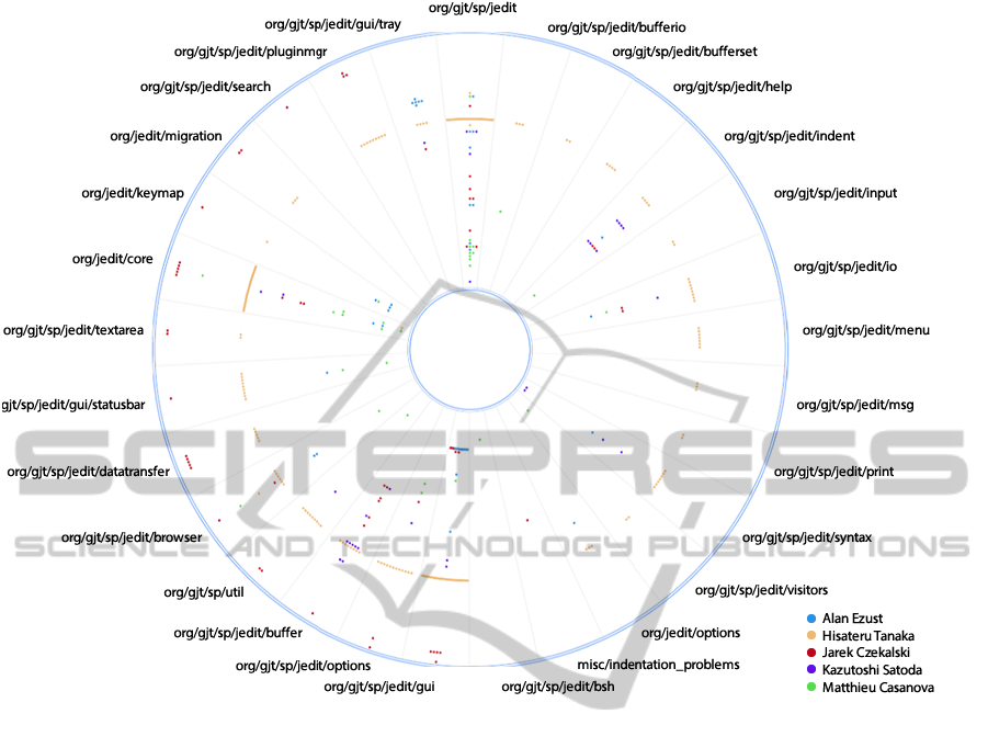
Figure 5: EVOWAVE showing who is working on that.
amount of work. More precise information can be ob-
tained by using some of the EVOWAVE mechanisms
of interaction (e.g. hold the mouse over the sector
while pressing the keyboard modifier key shift).
Using this visualization, it is also possible to
clearly see that Slava Pestov (black color) was the
founder of the project. In the middle of the project
he left it. Matthieu Casanova and Alan Ezust were
the two main code contributors after the founder
while Jazub Roztocill, Damien Radtke and Sebastian
Schuberth gave small contributions before leaving the
project. Many questions can be raised, such as: Did
those three developers have enough knowledge about
the system to make those changes?. What were the
decisions made by them?. It is important to recovery
these answers as soon as possible because they may
not return to the project or be available for question-
ing.
What classes have been changed?
During the software development it is important to
make track of the classes that are being modified. The
majority of the version control systems clients have
this feature. However, when there are many commits
they do not provide a big picture of the changes. They
only allow us to see what classes were changed com-
mit by commit. To reach the goal of this task, we
established a timeline of one month (August, 2012).
The orientation was set-up from the oldest (inner
guideline) to the newest date (outer guideline). The
molecules are associated to the change of a java file
and their color with the author of the change. The
sectors are the classes changed and no splitter or an-
gle property was used.
Figure 7 shows an EVOWAVE visualization for
the described period and configuration. All the
classes changed in August, 2012 are displayed in the
sectors. The authors who made those changes are
listed in the bottom-right corner. Jarek Czekalski
was the author who most changed the system in the
last month. During one window he changed a lot of
classes in different packages. The changes Matthieu
Casanova made do not seem have a direct impact on
the changes of Jarek Czekalski because they changed
different artifacts in different periods.
Who has the knowledge to do the code review?
This is also a hard question to answer since many fac-
ICEIS2015-17thInternationalConferenceonEnterpriseInformationSystems
132
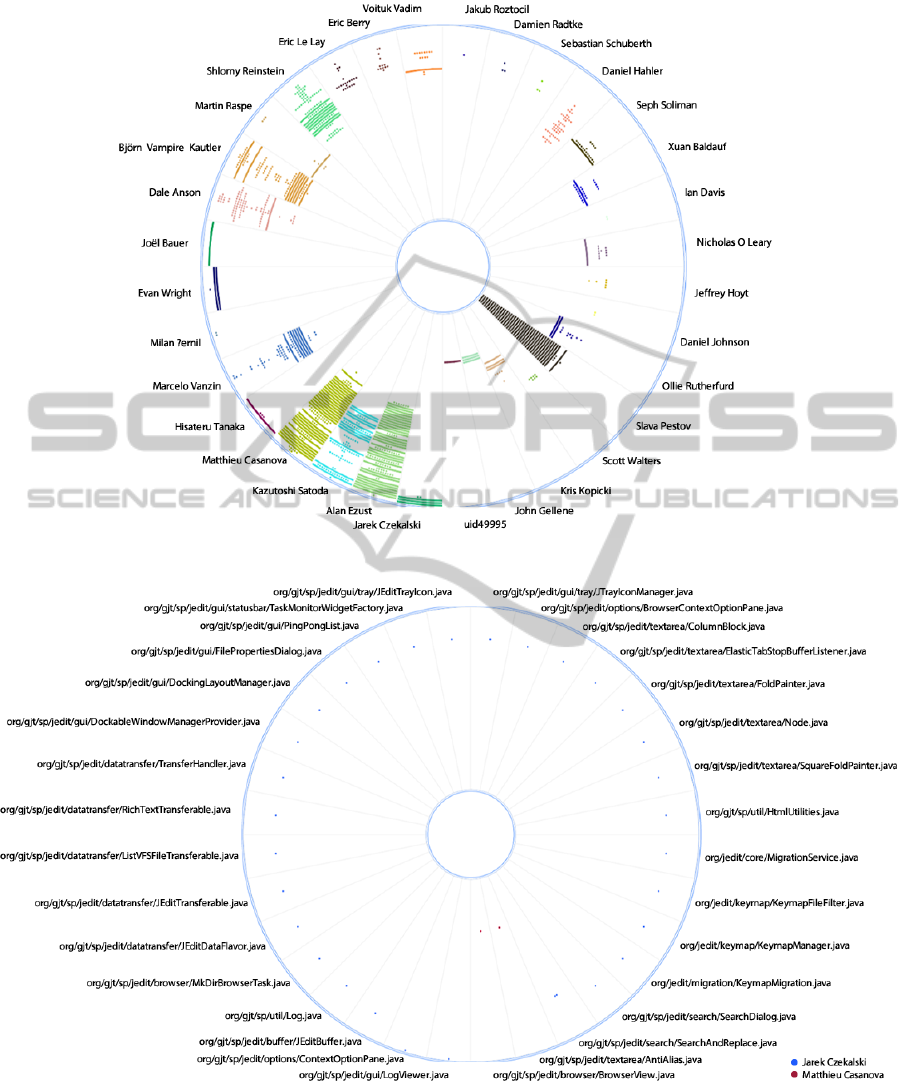
Figure 6: EVOWAVE showing how much work has people done.
Figure 7: EVOWAVE showing what classes have been changed.
tors involved (e.g. business knowledge, architectural
knowledge). However, it is possible to assume that the
author who made a lot of changes in some artifact dur-
ing a long period of time has knowledge about it. We
set a timeline from 2006 to 2012 because this was the
period that the project received many contributions.
The orientation is from 2006 (inner guideline) to 2012
(outer guideline). The molecules are associated to the
UsingEVOWAVEtoAnalyzeSoftwareEvolution
133
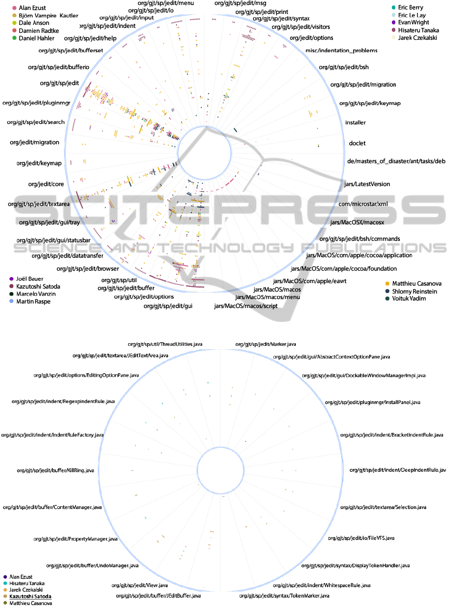
Figure 8: EVOWAVE showing who has the knowledge to do the code review.
Figure 9: EVOWAVE showing who is working on the same classes as Kazutoshi Satoda and in what java files.
ICEIS2015-17thInternationalConferenceonEnterpriseInformationSystems
134

change in a java file and its color with the author of
the change. The sectors are using the java package as
their pooler.
Figure 8 shows an EVOWAVE visualization for
the described period and configuration. The visual-
ization depicts the contributors on the corners with
their respective color. Some of them can be identified
as the owner (i.e. most contributions) of some pack-
ages. Alan Ezust, for example, is the most indicated
person to do the code review of the MacOS code
(packages jars/MacOS/com/apple at the bottom-right
quadrant). He mainly contributed to previous features
as can be seen in the bottom-right packages. Another
example is the package with the most number of
commits (org/gjt/sp/jedit). Even though many people
changed this package, the EVOWAVE shows that
Matthieu Casanova (yellow color) had a consider-
able number of commits during the whole period.
Therefore, he may be indicated to do the code review.
Who is working on the same classes as I am and for
which work item?
Developers and managers may ask this question. De-
velopers may want to know the collaborators that are
changing similar artifact, while managers may want
to control the conflicts between the tasks. To an-
swer this question, we set up the timeline for the last
5 months (March 08, 2012 - August 08, 2012) and
set Kazutoshi Satoda as the developer who wants to
know who is working in the same artifacts. The ori-
entation was set-up from the oldest (inner guideline)
to the newest date (outer guideline). The molecules
are associated to the change of a java file and its color
with the author of the change. The sectors use the java
package as their pooler.
Figure 9 presents the visualization of the
EVOWAVE metaphor within the described set up.
The authors who are working on the same classes are
displayed in the bottom-left corner. All the classes
that were changed in the last 5 months by Kazutoshi
Satoda are listed as sectors.
6 CONCLUSION
In this paper we presented a new software visual-
ization metaphor for visually extracting information
about software evolution. EVOWAVE can reduce the
amount of work needed to analyze software artifacts
such as source code files and version control system
data, in order to answer questions that developers are
interested in. To evaluate the applicability of our pro-
posed visualization approach, we conducted an ex-
ploratory study, aiming to answer five questions about
the jEdits collaboration evolution system.
6.1 Limitations
EVOWAVE has some known limitations. The color
palette of the molecules could be too extensive lead-
ing to a difficult eye distinction between some of
them. To overcome this limitation we can select all
molecules for a specific color in order to identify
witch one has the same color. Beyond that, it is possi-
ble to adjust the color palette to a better set of colors.
The collection of more data about the software
evolution needs to be improved. The tool collects
source code and version control system logs from git
repositories as well as issues information from bug
tracking systems. We believe more information will
help developers and managers to answer many ques-
tions about the software evolution from different per-
spectives
6.2 Future Work
We plan to perform a controlled experiment in order
to evaluate the effectiveness and correctness of this
approach with participants from industry.
We are extending the prototype with more extrac-
tion capabilities in order to obtain different types of
information (e.g. concerns) and extract more metrics
to visualize them over time.
We intend to explore other domains beside soft-
ware collaboration. For this we will be performing
other exploratory studies to evaluate the usefulness of
this metaphor in other domains and searching for a
correlation among them. This exploration is impor-
tant to retrieve cross-domain information that can lead
us to a better knowledge about the software evolution.
ACKNOWLEDGEMENTS
This work was partially supported by the National In-
stitute of Science and Technology for Software En-
gineering (INES - http://www.ines.org.br/), funded
by CNPq and FACEPE, grants 573964/2008- 4 and
APQ-1037-1.03/08.
REFERENCES
Abramson, D. and Sosic, R. (1995). A debugging tool for
software evolution. In Computer-Aided Software En-
gineering, 1995. Proceedings., Seventh International
Workshop on, pages 206 –214.
UsingEVOWAVEtoAnalyzeSoftwareEvolution
135

Bergel, A., Baados, F., Robbes, R., and Binder, W. (2011).
Execution profiling blueprints. Software: Practice
and Experience, pages n/a–n/a.
Beyer, D. and Hassan, A. E. (2006). Animated visualiza-
tion of software history using evolution storyboards.
In Proceedings of the 13th Working Conference on
Reverse Engineering, WCRE ’06, pages 199–210,
Washington, DC, USA. IEEE Computer Society.
Corbi, T. A. (1989). Program understanding: Challenge for
the 1990s. IBM Systems Journal, 28(2):294–306.
D’Ambros, M., Lanza, M., and Lungu, M. (2009). Visual-
izing co-change information with the evolution radar.
IEEE Trans. Softw. Eng., 35(5):720–735.
de F. Carneiro, G., Magnavita, R., and Mendonc¸a, M.
(2008). Combining software visualization paradigms
to support software comprehension activities. In Pro-
ceedings of the 4th ACM Symposium on Software Vi-
sualization, SoftVis ’08, pages 201–202, New York,
NY, USA. ACM.
Diehl, S. (2007). Software Visualization: Visualizing
the Structure, Behaviour, and Evolution of Software.
Springer-Verlag New York, Inc., Secaucus, NJ, USA.
Godfrey, M. and Tu, Q. (2001). Growth, evolution, and
structural change in open source software. In Proceed-
ings of the 4th International Workshop on Principles
of Software Evolution, IWPSE ’01, pages 103–106,
New York, NY, USA. ACM.
jEdit (n.d.). jedit - programmer’s text editor. Retrieved
November 1, 2014, from http://jedit.org/.
Kuhn, A., Erni, D., Loretan, P., and Nierstrasz, O. (2010).
Software cartography: thematic software visualiza-
tion with consistent layout. J. Softw. Maint. Evol.,
22(3):191–210.
Kula, R., De Roover, C., German, D., Ishio, T., and Inoue,
K. (2014). Visualizing the evolution of systems and
their library dependencies. In Software Visualization
(VISSOFT), 2014 Second IEEE Working Conference
on, pages 127–136.
Lungu, M. (2008). Towards reverse engineering software
ecosystems. In Software Maintenance, 2008. ICSM
2008. IEEE International Conference on, pages 428
–431.
Lungu, M., Lanza, M., G
ˆ
ırba, T., and Robbes, R. (2010).
The small project observatory: Visualizing software
ecosystems. Sci. Comput. Program., 75(4):264–275.
Novais, R., Lima, C., de F Carneiro, G., Paulo, R., and
Mendonc¸a, M. (2011). An interactive differential
and temporal approach to visually analyze software
evolution. In Visualizing Software for Understand-
ing and Analysis (VISSOFT), 2011 6th IEEE Interna-
tional Workshop on, pages 1–4.
Novais, R., Nunes, C., Lima, C., Cirilo, E., Dantas, F., Gar-
cia, A., and Mendonca, M. (2012). On the proac-
tive and interactive visualization for feature evolution
comprehension: An industrial investigation. In Soft-
ware Engineering (ICSE), 2012 34th International
Conference on, pages 1044–1053.
Novais, R. L., Torres, A., Mendes, T. S., Mendonc¸a, M.,
and Zazworka, N. (2013). Software evolution visual-
ization: A systematic mapping study. Inf. Softw. Tech-
nol., 55(11):1860–1883.
Ogawa, M. and Ma, K.-L. (2009). code
swarm: A de-
sign study in organic software visualization. IEEE
Transactions on Visualization and Computer Graph-
ics, 15(6):1097–1104.
Ratzinger, J., Fischer, M., and Gall, H. (2005). Evolens:
Lens-view visualizations of evolution data. In Pro-
ceedings of the Eighth International Workshop on
Principles of Software Evolution, IWPSE ’05, pages
103–112, Washington, DC, USA. IEEE Computer So-
ciety.
Rufiange, S. and Melancon, G. (2014). Animatrix: A
matrix-based visualization of software evolution. In
Software Visualization (VISSOFT), 2014 Second IEEE
Working Conference on, pages 137–146.
Sandoval Alcocer, J., Bergel, A., Ducasse, S., and Denker,
M. (2013). Performance evolution blueprint: Under-
standing the impact of software evolution on perfor-
mance. In Software Visualization (VISSOFT), 2013
First IEEE Working Conference on, pages 1–9.
Shneiderman, B. (1992). Tree visualization with tree-maps:
2-d space-filling approach. ACM Trans. Graph.,
11(1):92–99.
Sillito, J., Murphy, G. C., and De Volder, K. (2006).
Questions programmers ask during software evolu-
tion tasks. In Proceedings of the 14th ACM SIG-
SOFT International Symposium on Foundations of
Software Engineering, SIGSOFT ’06/FSE-14, pages
23–34, New York, NY, USA. ACM.
Telea, R. and Auber, D. (2008). Code flows: Visualizing
structural evolution of source code. computer graphics
forum 27(3): 831??838.
Voinea, L. and Telea, A. (2006). Multiscale and multivari-
ate visualizations of software evolution. In Proceed-
ings of the 2006 ACM symposium on Software visual-
ization, SoftVis ’06, pages 115–124, New York, NY,
USA. ACM.
ICEIS2015-17thInternationalConferenceonEnterpriseInformationSystems
136
