
SSV: An Interactive Visualization Approach for
Social Media Stock-related Content Analysis
Felipe Lodur and Wladmir Cardoso Brand
˜
ao
Department of Computer Science, Pontifical Catholic University of Minas Gerais (PUC Minas), Belo Horizonte, Brazil
Keywords:
Data Visualization, Social Media, Content Analysis, Stock.
Abstract:
Users interactions in social media have proven to be highly correlated with changes in the Stock Market, and
the large volume of data generated every day in this market makes the manual analytical processing imprac-
tical. Data visualization tools are powerful to enable this analysis, generating insights to support decisions.
In this article we present SSV, our data visualization approach to analyze social media stock-related content.
In particular, we present the SSV architecture, as well as the techniques used by it to provide data visualiza-
tion. Additionally, we show that the visualizations displayed by SSV are not disposed arbitrarily, by contrary,
it uses a ranking system based on visualization entropy. Moreover, we perform experiments to evaluate the
ranking system and the results show that SSV is effective to rank data visualizations. We also conducted a
case study with finance specialists to capture the usefulness of our proposed approach, which points out room
for improvements.
1 INTRODUCTION
Social media is a valuable platform for communica-
tion, and users interactions sentiment on social me-
dia are highly correlated with stock market activi-
ties (Bollen et al., 2011). Due to high volume of
content shared every day, it is impractical to manu-
ally analyze the data. To address this problem, data
visualization frameworks can be used as an assisting
tool to analyze and understand social media content
aggregations. Visualizations manipulate data to en-
able findings that support decision making. This pro-
cedure was formalized as Exploratory Data Analysis,
this concept emphasizes the statistical insights analy-
sis on data variance using graphics (Tukey, 1977).
In this article we present our interactive social me-
dia visualization approach to analyze stock-related in-
teractions, including the sentiment of these interac-
tions. We also describe the architecture and visu-
alizations techniques used by our approach. Partic-
ularly, the evaluation of our proposed visualization
techniques is based on usefulness and effectiveness,
that is, if the visualization helps translating data into a
more structured and functional model, such as infor-
mation or knowledge (Chen et al., 2009). The main
contributions of this article are: i) We propose a visu-
alization ranking technique based on entropy; ii) We
evaluate the effectiveness and usefulness of our pro-
posed approach.
We organized this article as follows: In Section 2
we present the concepts used in this work. In Sec-
tion 3 we present the related work. In Section 4 we
describe the SSV architecture. In Section 5 we report
the evaluation results. Finally, in Section 6 we present
the outlines conclusions and future work.
2 THEORETICAL BACKGROUND
The core concepts used in the SSV approach and in
its evaluation are presented in this section.
2.1 Interactive Visualization
Data visualization is the communication of data
through visual techniques. In more general terms, a
visualization is the transformation of a symbol into
geometry (McCormick, 1988). Moreover, in the
computational space, information visualizations can
be described as computer-generated interactive visual
representations of data to enhance perception (Card
et al., 1999). Visualizations support data-driven deci-
sion making and include, performing graphical calcu-
lations, answering and creating questions about data,
enabling insights otherwise hard to achieve, identify-
ing patterns, allowing further research, observing data
Lodur, F. and Brandão, W.
SSV: An Interactive Visualization Approach for Social Media Stock-related Content Analysis.
DOI: 10.5220/0006803502450252
In Proceedings of the 20th International Conference on Enterprise Information Systems (ICEIS 2018), pages 245-252
ISBN: 978-989-758-298-1
Copyright
c
2019 by SCITEPRESS – Science and Technology Publications, Lda. All rights reserved
245
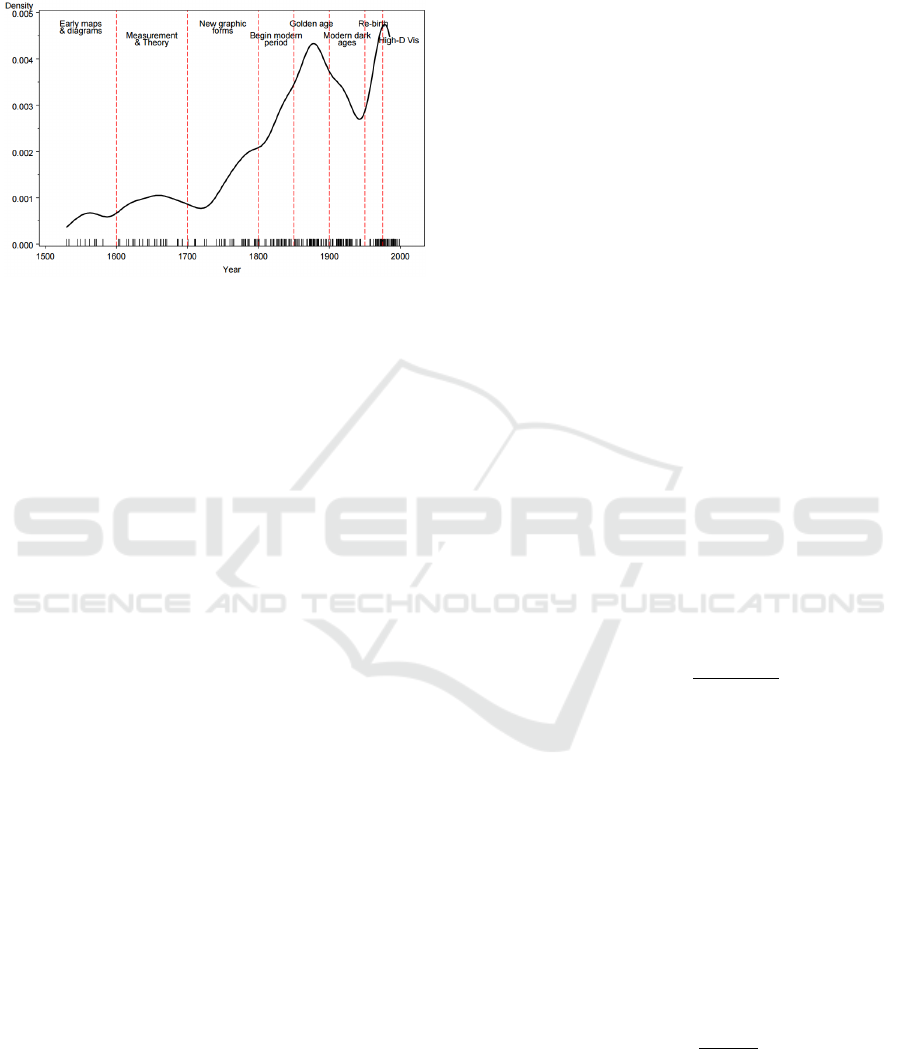
in context, to enable better understanding. The history
of visualizations is summarized by Figure 1, which
highlights the milestones events in data visualization.
Figure 1: Time distributions of milestones events in the
history of data visualization. Source: (Friendly, 2006).
Due to high volumes of information being pro-
duced in the Digital Era, the need of better visualiza-
tions tools to synthesize information was increased.
the demands of users for interactive and responsive
interfaces demanded even more attention for improve-
ments in usability. To address this problem in the data
visualization area, interactivity is a key component, as
it facilitates data exploration.
Interactive visualizations changes based on user
interaction to enhance its usability and enable more
powerful insights. Interactive visualizations are used
across many fields (Ward et al., 2010). A visualiza-
tion information survey (Liu et al., 2014) indicates the
rise of interactive visualization works and presents us-
ability as one of the challenges for the information
visualization area, which is directly associated with
interactivity.
2.2 Information Entropy
In information theory, an alphabet is described as a
set Z =
{
z
1
, z
2
, z
3
, ..., z
n
}
, of all possible values a vari-
able Z can assume. The components of the set are
also referred as letters. In this article, we refer to the
process of transforming a information set into a new
one as alphabet transformation. This process happens
when translating raw data to visualizations. In this
translation, the information is processed to be used
by each visualization technique and, therefore, the al-
phabet entropy before and after the alphabet transfor-
mation may differ.
Information entropy is a metric for information
disorder (Shannon, 2001). Given an alphabet Z =
{
z
1
, z
2
, z
3
, ..., z
n
}
, and p(z
i
) as the probability function
for a letter, the information entropy is calculated by:
S(Z) = −
n
∑
1
p(z
i
)log
2
p(z
i
) (1)
Chen and Golan (2016) describes an abstract
model for visualization and inference processes
(Chen and Golan, 2016), which indicates that the
transformation of data spaces when producing visual-
izations regularly corresponds to the reduction of the
information set entropy in the alphabet transforma-
tion process and therefore, the higher the reduction is,
the better the visualization is.
2.3 Ranking Evaluation
There are many ways of evaluating ranking systems.
The Discounted Cumulative Gain (DCG) metric is
used to consider results with varying relevance levels
(J
¨
arvelin and Kek
¨
al
¨
ainen, 2000). To do so, the nDCG
takes in consideration two factors that other metrics
in the literature do not:
• Marginally relevant results are penalized in con-
trast to highly relevant ones;
• Results in early positions are more important than
later ones.
The process to calculate the nDCG is: For an
ordered collection of results P =
{
p
1
, p
2
, p
3
, ..., p
n
}
and n associated relevances values for each result
R =
{
rel
1
, rel
2
, rel
3
, ..., rel
n
}
, the DCG is given by:
DCG
P
=
n
∑
i=1
rel
i
log
2
(i + 1)
(2)
This equation retrieves the score for the given
ranking. However, it does not demonstrates how close
the ranking is to the best performance. To solve this
problem a normalization process can be conducted
and it requires the calculation of the Ideal Discounted
Cumulative Gain (IDCG), which is given by the DCG
of the collection of results I =
{
p
1
, p
2
, p
3
, ..., p
n
}
,
necessarily ordered, from the most relevant result to
the least relevant one. Then, the normalized Dis-
counted Cumulative Gain (nDCG) is obtained by the
following equation:
nDCG
P
=
DCG
P
IDCG
P
(3)
The nDCG value ranges from 0 to 1 and indicates
how close the system is to the best possible ranking.
ICEIS 2018 - 20th International Conference on Enterprise Information Systems
246

To calculate the average performance of a ranking
system, the nDCG metric have to be computed for
different rankings, generated by different system en-
tries and then, the system performance is given by the
average of these values.
3 RELATED WORK
Previous research proposed frameworks to analyze
social media content stream. In particular, a system
retrieves data on popular events from Twitter in a dy-
namic, real-time scenario (Gaglio et al., 2016). The
system was evaluated based on an experiment during
the 2014 FIFA World Cup and presented great accu-
racy for topic detection. Our approach does not focus
on providing analysis, it is a supporting tool for ana-
lyzing social media content aggregation.
Social media is largely used by researchers to an-
alyze people behavior, for instance, a study explores
the relation of twitter activity and their health pro-
file (Paul and Dredze, 2011) and other approaches fo-
cused on the correlation of the shared content and the
probability of the user profile to be suicidal (Colombo
et al., 2016). Moreover, a research explored the corre-
lation between sentiment and stock activities. In par-
ticular, an investigation of how current general opin-
ions on stocks impacts stock activities have been con-
ducted (Chen et al., 2014). Additionally, other stud-
ies explore clustering of opinions, dividing them by
topics (Nguyen et al., 2015). These techniques have
achieved better results than historical price methods.
Our approach have explored visualizations of senti-
ment features on stock topics to enable similar in-
sights from analyzers.
Due to the mentioned correlations between senti-
ment, users profile and changes in the financial mar-
ket, there are visualizations systems to explore the
social media and websites user sentiments. Opin-
ionBlocks displays the most discussed topics in con-
sumers product reviews and associate them with the
respective sentiment polarity of the review (Alper
et al., 2011). TexVis system analyzes people’s reac-
tion and feedback regarding an event or product based
on a particular keywords (Humayoun et al., 2017).
Additionally, some visualization approaches have
explored the stock market (Roberts, 2003), their work
evaluates information designs for stock market ticks
and is one of the first data visualization approaches
to assess the finance area and demonstrates that infor-
mation visualization improves human performance in
trading. Other approach presents a visualization sys-
tem for stock market charts to support analysis of fi-
nancial time series data to enable general insights into
stock behavior (Ziegler et al., 2010). Our approach
is complementary, their work focus on visualizations
of stock behavior specifically whereas our approach
explores social media stock-related content.
A business intelligence system explores the pos-
sibility of displaying sentiment of users on company
products through a geographical map (Sijtsma et al.,
2016). The referred approach allows location explo-
ration and business branches filtering. In their ap-
proach, a case study was conducted to evaluate the
system that identified the system as a great supporter
for data exploration.
Our approach is mostly inspired by Vox Civitas,
a visualization system for journalistic inquiry (Di-
akopoulos et al., 2010), which aggregates social me-
dia content to support journalists find events for fur-
ther research. An exploratory study was conducted
with specialists that indicated how the elements of
the system were used as well as general strengths
and weaknesses. Our system evaluation follows the
methodology used in their work, applying it to our vi-
sualization approach.
Moreover, this kind of application has seen in-
creased importance in industry as well through tools
such as Tableau (Murray, 2013), which are software
solutions for data visualization and analytics that dis-
plays adaptable visualizations according to the dataset
that it is connected to.
In our work, by the contrary to all the other re-
lated approaches, focus on the stock context in social
media and provides a ranking system to display the
visualizations in order, instead of placing them in an
arbitrarily chosen order.
4 SSV
SSV stands for Social Stock Visualization. Our ap-
proach aims at exploring data of social media stock-
related content. Figure 2 presents the architecture.
used by our approach. The architectural modules of
our approach are further described in this section.
4.1 Fetcher
This component is responsible for acquiring stock-
related social media content. A given content is con-
sidered stock-related if its text contains the stock sym-
bol of any NASDAQ100 companies. This companies
were chosen because they are of high interest of finan-
cial analysts and are popular stock acquisition pos-
sibilities. To avoid redundancies, identical posts by
the same user are ignored. Our approach indicates
whether a content is a shared content or not. Shared
SSV: An Interactive Visualization Approach for Social Media Stock-related Content Analysis
247
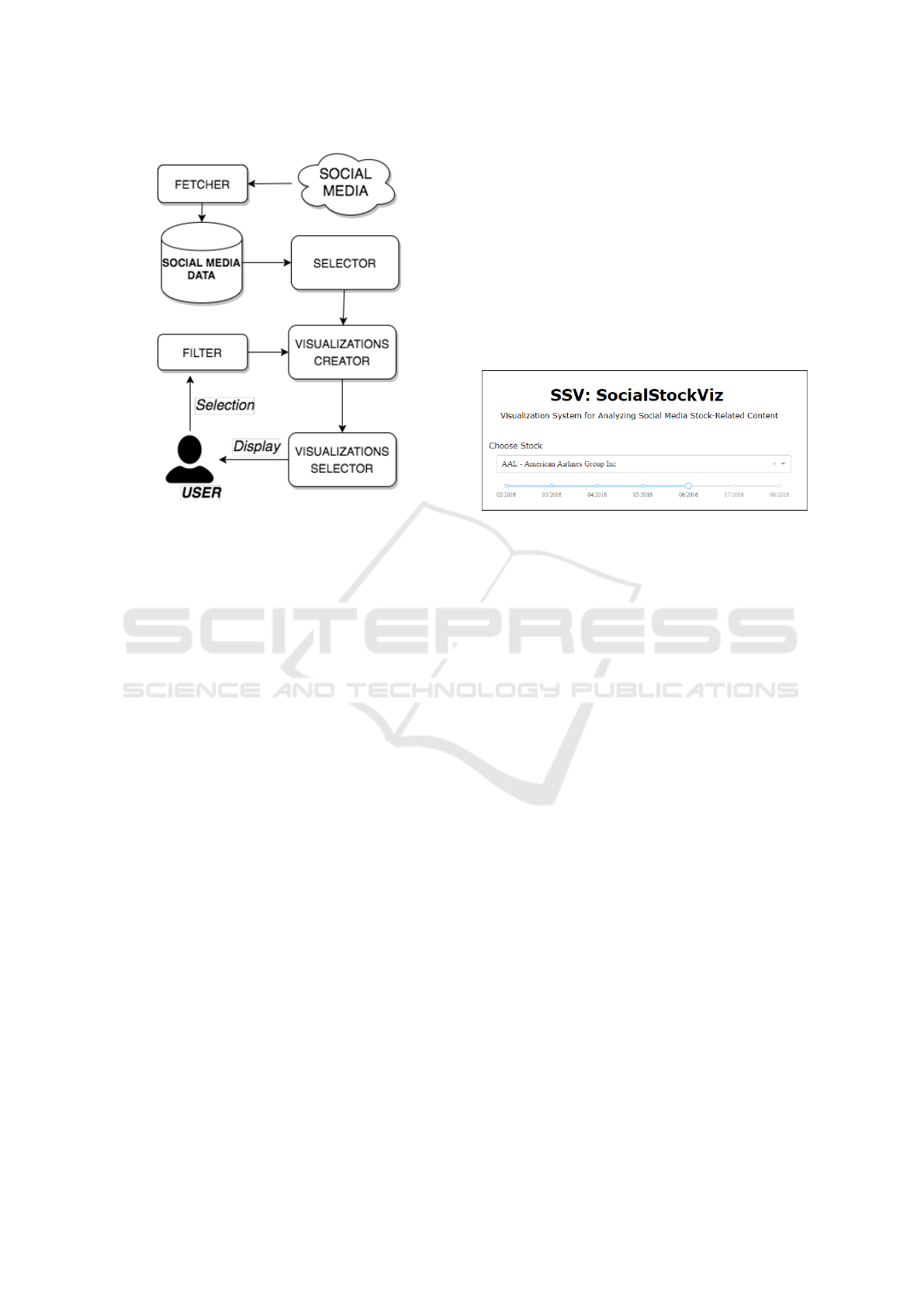
Figure 2: Proposed visualization architecture, used in our
approach.
contents are texts refers to social media interactions
originally produced by another person. Additionally,
if a user has shared a content produced by himself, as
this information is irrelevant, it is also excluded.
Afterwards, the retrieved content is stored in the
social media data local corpus. Our approach sep-
arates the content by the stock mentioned in their
text and increments it with the following meta-
information: Country, latitude, longitude, day, time,
text content, a list of stocks mentioned and the total
numbers of users that have interacted with the referred
content. Finally, the local corpus will be further pro-
cessed by the selector component.
4.2 Selector
The selector component is responsible for processing
the local corpus, which contains social media data
collected by the fetcher component. As previously
mentioned, sentiment of user shared content in so-
cial media is correlated to the stock activities (Bollen
et al., 2011) and therefore, this component calculates
sentiment polarity and subjectivity. To do so, we have
used a rule based technique that is independent of
the domain, this approach is furthered described by
Khan (Khan et al., 2011) and uses WordNet database
(Miller, 1995) to learn the patterns of content senti-
ment based on the contextual sentence structure.
Once the features are processed, this component
proceeds every feature to the visualizations creator
component along with the feature type. Our approach
has defined the following feature types: numerical,
categorical, temporal and spatial. This information
is further used to construct the visualizations and the
process for doing so is described in the visualizations
creator component section.
4.3 Filter
This component receives information about the selec-
tions made by the user through the interface presented
in the Figure 3.
Figure 3: SSV interface for user entries.
The interface presented has the following ele-
ments: i) drop-down menu, which is used by the user
to select which stock from NASDAQ100 companies to
display; ii) slider component, which is used to inform
the time period to be included in the visualizations.
The selected options are given to the visualizations
creator component to limit the creation of the visu-
alizations, that is, respecting the stock and time con-
straints defined by the user and this way, displaying
only relevant results by taking into consideration the
user preferences.
4.4 Visualizations Creator
This component is responsible for constructing the vi-
sualizations presented in our approach. It receives
the features from the selector component and consid-
ers options defined by the filter component. Our ap-
proach separates the features types four groups: cat-
egorical, numerical, spatial and temporal. Our ap-
proach is able to create the following visualizations:
bar graph, doubled bar graph, line plots, scatter plots,
scatter map and choropleth maps. Table 1 presents
the number of features required for each visualization
type.
The dataset contains four different numerical fea-
tures and two categorical features. The four numeri-
cal features are: number of positive interactions with
the shared content, number of shares the content re-
ceived, text subjectivity and text polarity. The two
categorical features are: originality (which indicates
whether a content is original or not) and the country
ICEIS 2018 - 20th International Conference on Enterprise Information Systems
248
Table 1: Feature requirements for each visualization type.
”Num” stands for Numerical.
Type Num Nominal Spatial Time
Bar graph 1 1 0 0
Double bar 2 1 0 0
Line 1 0 0 1
MultiLine 1 1 0 1
ScatterPlot 2 1 0 0
ScatterMap 1 0 1 0
Choropleth 1 0 1 0
of the shared content. For displaying the geographi-
cal visualizations, the latitude and longitude features
are used. To present the line plots visualizations, a
temporal feature is used.
Our approach automatically produces the visual-
izations based on the possible feature combinations,
while respecting the constraints displayed on Table 1.
This process generates a total of eighty unique and
interactive visualizations, that is, the user can manip-
ulate the visualization by zooming in or out and by
filtering some categories to be displayed.
Figure 4 presents a simple bar graph visualization.
This type of visualization is used to display how nu-
merical data behave in different groups defined by a
categorical feature. Hovering over a bar displays the
exact numerical value associated with that category,
that corresponds to the sum of the numerical feature
for every instance in the category. To visualize multi-
ple features at a time, a variant visualization is used.
Figure 5 presents a variant of the bar graph, named
doubled bar graph, that enables the comparison of two
numerical features instead of only one. Hovering over
the visualization will display the exact value of the
numerical feature. Moreover, in this visualization the
user can filter the categories to be displayed, enabling
the separate analysis of numerical features.
Figure 6 presents the line plot visualization. This
type of visualization demonstrates how a numerical
feature changes over time. The variant displayed on
Figure 7 presents the numerical feature in different
groups, defined by categorical features, changing over
time. In the later one, it is possible to filter the groups
from the categorical feature to be displayed, enabling
a more precise analysis of groups that interests more
the user. In both visualizations it is possible to change
the time period to either a shorter or longer one.
Figure 8 presents an example of the scatter plot
visualization, used to observe the correlation between
two numerical features. One categorical feature is
used to determine the color of each data point and,
therefore, enabling more insights. Hovering over data
points displays more information about the data en-
Figure 4: Interactive bar graph generated by SSV.
Figure 5: Interactive double bar graph generated by SSV.
Figure 6: Interactive line plot graph generated by SSV.
try, such as the text of a social media content and the
exact values for the numerical features used in the vi-
sualization.
Figure 9 presents the geographical scatter visual-
ization. It requires latitude and longitude along with a
numerical feature to display each data point. Hover-
SSV: An Interactive Visualization Approach for Social Media Stock-related Content Analysis
249
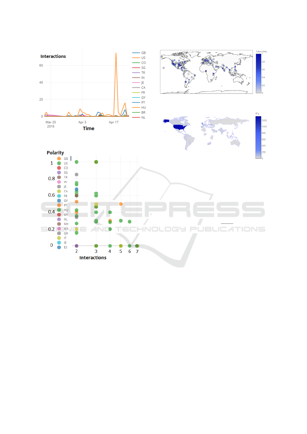
Figure 7: Interactive multiple line plot graph generated by
SSV.
Figure 8: Interactive scatter plot graph generated by SSV.
ing over the data points display the text content and
the exact value of the numerical feature associated
with that entry. Another type of geographical visu-
alization is presented in Figure 10, which is used to
visualize the distribution of a numerical feature in dif-
ferent countries, the absence shared content mention-
ing a specific stock in a country leads to not display-
ing it in the map. In both geographical plots, social
media contents without location information are not
considered.
4.5 Visualizations Selector
This component is responsible for analyzing all vi-
sualizations generated by the visualizations creator
component in order to build the ranking of visualiza-
Figure 9: Interactive geographical scatter plot graph gener-
ated by SSV.
Figure 10: Interactive chrolopleth graph generated by our
approach.
tions and then display them ordered by their respec-
tive score. Our approach uses the entropy reduction of
the alphabet transformation process that occur when
creating a visualization as the score, this is obtained
by:
Score(V ) =
S(Z
v
)
S(Z
r
)
(4)
Where V is the given visualization, S(x) is the en-
tropy calculation for the set x, as described in the sec-
tion Z
v
is the alphabet for the given visualization and
Z
v
is the original alphabet, that is, the alphabet for the
data before the alphabet transformation process.
This metric to rank the visualization was inspired
by the work of (Chen and Golan, 2016) as it indi-
cates that a bigger entropy reduction after the alphabet
transformation is correlated with a more optimized vi-
sualization process. To calculate this metric we ana-
lyze the information at two different moments: i) the
raw information and ii) the information displayed in
the visualization. Between moment i and ii the data
is transformed through preprocessing, some informa-
tions will be discarded or clustered to fit the corre-
sponding visualizations style. Then, the entropy of
the alphabet in both moments is calculated and the al-
phabet compression from moment i to ii is the metric
used to rank the visualizations.
ICEIS 2018 - 20th International Conference on Enterprise Information Systems
250

5 EVALUATION
This section presents the methods used for evaluat-
ing our approach. Seven finance market specialists
supported this evaluation process to explore the effec-
tiveness and usefulness of the rankings generated and
our overall approach.
The seven specialists were chosen to improve di-
versity. Five had formal training in finance and two
only job training. The specialists were from four dif-
ferent countries. Four male and three female, with
ages ranging from 24 to 57. All of them are familiar
with social media and stock visualization tools.
5.1 Ranking
To calculate the average performance of the system
ranking, it is necessary to determine the relevance
level of each result (visualization). To do so, seven
finance market specialists that are familiar with stock
visualization systems have assigned a grade from zero
to five, to each visualization they were exposed to.
The relevance of each system result was calculated
by the average of the grades assigned by the financial
specialists.
To minimize the amount of work while still en-
abling a good evaluation of the system, this process
was made for three different stocks entries, that were
chosen by the researchers. The three results of the
nDCG using the calculated relevance levels is shown
in Table 2.
Table 2: nDCG values for different rankings produced with
different stock entries.
Stock nDCG
Alphabet Inc Class C 0.9693945858
American Airlines Group Inc. 0.9814165825
Facebook Inc. 0.9675392669
Therefore, the average performance of the our
ranking is approximately 0.972, which is nearly 2.8
percent away from the best ranking possible and,
therefore, indicates a great overall performance.
5.2 Case Study
The study focused on assessing the following ques-
tions: i) Is SSV useful and effective to enable in-
sights? ii) How do users interact with the visualiza-
tions? iii) What are the shortcomings of our approach
in this process? This evaluation was conducted on-
line to enhance the external validity of the study and
to include specialists from different countries. The
participants were asked to explore the data of the
three stocks previously decided by them (Alphabet
Inc Class C, American Airlines Group Inc. and Face-
book Inc.) and report their actions and opinions.
During the exploration, users have spent more
time in the first visualizations and then skimmed
through the other ones. They reported that the early
visualizations were able to retrieve much more rele-
vant insights than the later ones and that the interactiv-
ity of the approach was useful for further exploration.
The zoom-in interactive feature have been used to ex-
plore more cluttered visualizations. The mouse hov-
ering was frequently used to obtain more informations
about the data points in each visualization and thus, it
was useful supporting the analytical process.
The financial specialists suggested that SSV ap-
proach is useful for retrieving insights on users opin-
ion about different stocks and that the order of the vi-
sualizations assisted in the knowledge discovery pro-
cess. They also indicated that the visualizations were
very responsive and that they did not had any per-
formance issues while analyzing them. In the other
hand, even thought the best visualizations are ranked,
there was some redundancy on the information be-
ing visualized and there was no technique to compare
different stocks or to relate the visualizations to the
real stock value changes. Two specialists suggested
that when clicking on visualizations more informa-
tions could be provided.
6 FINAL CONSIDERATIONS
The ranking system proved to be very efficient to dis-
play the most relevant visualizations first. However,
as stated by the users, the ranking often presents vi-
sualizations about similar informations and therefore,
future work should consider the diminished value
when disposing sequential visualizations about sim-
ilar informations to enable more insights about the
data aggregation.
Moreover, future versions of SSV should consider
the possibility of crossing the social media data with
other data sources, such as the real stock changes, so
users can analyze correlations between them. We in-
tend to increment our approach by adding more visu-
alizations techniques and improving the existing ones.
The interactivity of the visualizations should be en-
hanced to enable users to explore the data with more
freedom and potentially generating more insights.
Furthermore, the usage of dimensionality reduc-
tion techniques may be considered to expand the vi-
sualizations possibilities. The presented ranking tech-
nique, as well as the system architecture, can be ap-
plied to different visualization systems and the results
SSV: An Interactive Visualization Approach for Social Media Stock-related Content Analysis
251

it produces in different contexts should be further ana-
lyzed. Lastly, we believe many improvements can be
made to the system and that there is space for inno-
vation in data visualization area for systems to assist
financial analysts in their stock acquisition decisions.
ACKNOWLEDGEMENTS
The authors are thankful for the support given by
FAPEMIG (Foundation for Research and Scientific
and Technological Development of Minas Gerais),
PUC Minas (Pontifical Catholic University of Minas
Gerais), and the MASWeb Project. Particularly, this
work is supported by PUC Minas under Grant No.:
FIP 2016/11086-S2, and FAPEMIG/PRONEX under
Grant APQ-01400-14.
REFERENCES
Alper, B., Yang, H., Haber, E., and Kandogan, E. (2011).
OpinionBlocks: Visualizing consumer reviews. In
Proceedings of the IEEE Workshop on Interactive Vi-
sual Text Analytics for Decision Making.
Bollen, J., Mao, H., and Zeng, X. (2011). Twitter mood
predicts the stock market. Journal of Computational
Science, 2(1):1 – 8.
Card, S. K., Mackinlay, J. D., and Shneiderman, B. (1999).
Readings in information visualization: using vision to
think. Morgan Kaufmann.
Chen, H., De, P., Hu, Y., and Hwang, B.-H. (2014). Wis-
dom of crowds: The value of stock opinions transmit-
ted through social media. The Review of Financial
Studies, 27(5):1367–1403.
Chen, M., Ebert, D., Hagen, H., Laramee, R. S., van Liere,
R., Ma, K. L., Ribarsky, W., Scheuermann, G., and
Silver, D. (2009). Data, information, and knowledge
in visualization. IEEE Computer Graphics and Appli-
cations, 29(1):12–19.
Chen, M. and Golan, A. (2016). What may visualization
processes optimize? IEEE Transactions on Visualiza-
tion and Computer Graphics, 22(12):2619–2632.
Colombo, G. B., Burnap, P., Hodorog, A., and Scourfield,
J. (2016). Analysing the connectivity and communi-
cation of suicidal users on twitter. Computer commu-
nications, 73:291–300.
Diakopoulos, N., Naaman, M., and Kivran-Swaine, F.
(2010). Diamonds in the rough: Social media visual
analytics for journalistic inquiry. In 2010 IEEE Sym-
posium on Visual Analytics Science and Technology,
pages 115–122.
Friendly, M. (2006). A brief history of data visualiza-
tion. In Chen, C., H
¨
ardle, W., and Unwin, A., edi-
tors, Handbook of Computational Statistics: Data Vi-
sualization, volume III, pages 01–06. Springer-Verlag,
Heidelberg. (In press).
Gaglio, S., Re, G. L., and Morana, M. (2016). A framework
for real-time twitter data analysis. Computer Commu-
nications, 73, Part B:236 – 242. Online Social Net-
works.
Humayoun, S. R., Ardalan, S., AlTarawneh, R., and Ebert,
A. (2017). TExVis: An interactive visual tool to ex-
plore Twitter data. In Kozlikova, B., Schreck, T., and
Wischgoll, T., editors, EuroVis 2017 - Short Papers.
The Eurographics Association.
J
¨
arvelin, K. and Kek
¨
al
¨
ainen, J. (2000). Ir evaluation meth-
ods for retrieving highly relevant documents. In Pro-
ceedings of the 23rd annual international ACM SIGIR
conference on Research and development in informa-
tion retrieval, pages 41–48. ACM.
Khan, A., Baharudin, B., and Khan, K. (2011). Sentiment
classification from online customer reviews using lex-
ical contextual sentence structure. In International
Conference on Software Engineering and Computer
Systems, pages 317–331. Springer.
Liu, S., Cui, W., Wu, Y., and Liu, M. (2014). A survey on
information visualization: recent advances and chal-
lenges. The Visual Computer, 30(12):1373–1393.
McCormick, B. H. (1988). Visualization in scientific com-
puting. ACM SIGBIO Newsletter, 10(1):15–21.
Miller, G. A. (1995). Wordnet: a lexical database for en-
glish. Communications of the ACM, 38(11):39–41.
Murray, D. (2013). Tableau Your Data!: Fast and Easy Vi-
sual Analysis with Tableau Software. Wiley Publish-
ing, 1st edition.
Nguyen, T. H., Shirai, K., and Velcin, J. (2015). Sentiment
analysis on social media for stock movement predic-
tion. Expert Systems with Applications, 42(24):9603–
9611.
Paul, M. J. and Dredze, M. (2011). You are what you tweet:
Analyzing twitter for public health. Icwsm, 20:265–
272.
Roberts, P. (2003). Information visualization of the stock
market ticks: toward a new trading interface. PhD
thesis, Massachusetts Institute of Technology.
Shannon, C. E. (2001). A mathematical theory of commu-
nication. ACM SIGMOBILE Mobile Computing and
Communications Review, 5(1):3–55.
Sijtsma, B., Qvarfordt, P., and Chen, F. (2016). Tweetviz:
Visualizing tweets for business intelligence. In Pro-
ceedings of the 39th International ACM SIGIR Con-
ference on Research and Development in Information
Retrieval, SIGIR ’16, pages 1153–1156, New York,
NY, USA. ACM.
Tukey, J. W. (1977). Exploratory data analysis, volume 2.
Reading, Mass.
Ward, M. O., Grinstein, G., and Keim, D. (2010). Interac-
tive data visualization: foundations, techniques, and
applications. CRC Press.
Ziegler, H., Jenny, M., Gruse, T., and Keim, D. A. (2010).
Visual market sector analysis for financial time se-
ries data. In Visual Analytics Science and Technol-
ogy (VAST), 2010 IEEE Symposium on, pages 83–90.
IEEE.
ICEIS 2018 - 20th International Conference on Enterprise Information Systems
252
