
A TOOL FOR AUTOMATIC ADAPTATION OF WEB PAGES TO
DIFFERENT SCREEN SIZE
Roberto Armenise, Cosimo Birtolo
Poste Italiane S.p.A., Tecnologie dell’Informazione, Sviluppo Sistemi Informativi, Centro Ricerca e Sviluppo
Piazza Matteotti 3, 80133 Naples, Italy
Luigi Troiano
University of Sannio
Department of Engineering, Viale Traiano, 82100 Benevento, Italy
Keywords:
Optimization of layout, User interface, Genetic algorithm, Search based software engineering.
Abstract:
Digital contents are often designed having desktop applications as target in mind. As Mobile Web is becoming
a common means to access internet services, there is a need for adapting content to smaller displays of mobile
devices. Adaptation of web pages should be in accordance with aesthetics and usability requirements. In this
paper we propose a tool, based on genetic algorithm, able to assist designers in delivering content adapted to
mobile devices. In particular the tool, starting from a given page, searches for alternative layouts in order to
best fit the content to reduced target screen size. The result is a set of adapted web pages. Experimental results
show this approach is feasible and can compete with design made by humans.
1 INTRODUCTION
Pervasiveness of Internet in everyday life is leading
to the introduction of new means for accessing digi-
tal contents. Nowadays we have new devices such as
smart phones, PDAs and netbooks by which we get
access to Mobile Internet by wireless networks. A
remarkable difference in using this class of devices
regards the screen size. As digital content is gener-
ally designed with respect to standard desktop and
laptop displays, it is badly rendered when delivered
to mobile devices. In some cases, a version specific
for mobile devices is made available by the content
providers. For example, designers usually provide a
reduced version of content suitable for being accessed
by hand-held devices, generally referring to screen
resolution of 240 × 320 pixels. However, this is still
prerogative of larger corporations.
Main issues arise from usability due to the small
physical size of the mobile form factor, that is related
to limited resolution screens and user input/operating
limitations. Generally, users are demanded to scroll
the screen in both vertical and horizontal directions
to find the desired portion of content, in contrast with
W3C recommendations. There are different strategies
to deal with mobile devices. One option entails the
optimization of page in order to fit specific displays
and user requirements. This is a challenging task as
many constraints must be taken into consideration at
a time. Among them we consider: (i) the specific fea-
tures of content element being included, (ii) which el-
ements to include and which not, (iii) where to dis-
pose the elements, and (iv) the number of pages in
which to split the content.
In this paper we propose a tool for supporting the
page layout rearrangement by delegating this task to
an evolutionary algorithm which acts keeping into ac-
count designer’s preferences, target display and de-
vice constraints. In particular we introduce an inter-
active software application able to assist a web inter-
face designer in adapting an existing web page to mo-
bile devices. The algorithm presented in this paper
has been tested in order to asses performances and
quality of solutions. This contribution is organized
as follows: in Section 2 we briefly overview issues
related to the design of mobile user interfaces; in Sec-
tion 3 we outline the proposed genetic algorithm fo-
cusing on representation and fitness of solutions, then
providing experimental results regarding convergence
and performances; Section 4 is aimed at presenting
91
Armenise R., Birtolo C. and Troiano L. (2010).
A TOOL FOR AUTOMATIC ADAPTATION OF WEB PAGES TO DIFFERENT SCREEN SIZE.
In Proceedings of the 12th International Conference on Enterprise Information Systems - Human-Computer Interaction, pages 91-98
DOI: 10.5220/0002976300910098
Copyright
c
SciTePress

the tool, describing an example of application and re-
porting experimental results; in Section 5 we discuss
conclusions and future work.
2 RELATED WORKS
Over the years we assisted to an increasing avail-
ability of screen size. Even considering only the
most popular ones, size of modern devices ranges
from 320× 200 (CGA, adopted for smartphones and
PDAs) to 1024 × 600 (WSVGA, for netbooks). In
addition legacy displays (e.g. 128 × 128, 128 × 160,
176 × 220) still represent a significant share of avail-
able devices. With such a variety of displays differ-
ing in size, the task of adapting existing web con-
tent becomes challenging. Many different techniques
have been developed over the time. A survey is given
by Stormer (Stormer, 2006) who overviews different
strategies to adapt web pages to mobile devices, and
provides a classification in three main categories: (i)
Rewrite the page in a suitable way for mobile devices;
(ii) Adapt the pages automatically choosing a differ-
ent CSS; (iii) Use XML to transform the pages.
Ahmadi and Kong (Ahmadi and Kong, 2008) pro-
pose a novel method to automatically adapt a desk-
top presentation to mobile, in order to overcome the
frustrating task of users in scrolling the screen both
vertically and horizontally. Their approach integrates
structural analysis of the HTML source and visual
layout detection to identify closely related content and
then to generate an adapted layout.
An alternative approach is based on segmenting
web pages, choosing informative sections and re-
laying these sections into a compact form, as pro-
posed by Sengamedu, Mehta, and Madaan (Sen-
gamedu et al., 2008). In their work, they present a
system that, leveraging structural, content and visual
information, learns the page template, assigns rele-
vance to each section, and scales them according to
their score.
Lethonen et al. (Lehtonen et al., 2006) introduce
a proxy based platform able to render web pages and
to extract only the necessary information to be sent to
the mobile client. Novelty of this approach resides
in resembling a view similar to that available by a
desktop browser but smaller. Baluja (Baluja, 2006)
proposes to present the user a thumbnail image of the
full web page, allowing the user to zoom into regions.
All solutions above and others (e.g. Olivera
(De Oliveira, 2008)) attempt to identify heuristics for
solving the problem. More recently, another direc-
tion being investigated regards the page layout as an
optimization problem aimed at maximizing usability
criteria and user preferences, meeting as much as pos-
sible dimensional constraints.
Ahmad, Basir and Hassanein (Ahmad et al., 2003)
pursue a different approach. They suggest fuzzy logic
rules as means for trading-off between different, often
conflictive, requirements and user preferences, still
meeting the standard usability guidelines at the same
time.
In another work, Ahmad et al. (Ahmad et al.,
2004) regard the page layout as a bin packing prob-
lem. They address the problem by optimization strate-
gies based on heuristic rules for placing content mod-
ules (shaped as rectangles) in sequence. The strategy
outcome depends on the order by which modules are
placed. In particular the strategy fitness is function of
module position and dimension. A genetic algorithm
is introducedin orderto find the module sequence that
maximize the strategy outcome.
Gajos, Weld and Wobbrock (Gajos et al., 2008)
solve the problem of finding an appropriate trade-
off among device constraints and user preferences by
adopting a decision-theoretic optimization.
Usability becomes a key element in mobile de-
vices. A usable interface brings many benefits: users
are able and willing to use the various features and
services supplied by the operators, the need for cus-
tomer support decreases, and above all, user satisfac-
tion improves (Jokela et al., 2006). Given the typical
input limitations of a mobile device, Mobile Web Best
Practices (W3C, 2008) suggest to limit scrolling to
one direction and to split pages into more but usable
parts. According to Nielsen (Nielsen, 1994) usability
is associated to five attributes: learnability, efficiency,
memorability, error and satisfaction. These attributes
must be prioritized according to user and task analy-
sis, and then operationalized and expressed in a mea-
surable way. A related study led by Google (Baluja,
2006) analyzes the problem of browsing web pages
on small screens. In particular they adopt a Machine
Learning Framework for segmenting a target front
page. They segment the page into 9 equally sized re-
gions, each able to be enlarged using the phone key-
pad.
Generative approach can be employed in page
adaptation (Russo et al., 2008). Troiano, Birtolo, Ar-
menise and Cirillo (Troiano et al., 2008) investigate
the application of genetic algorithms as a viable ap-
proach to optimize structural elements such as menu
layouts. More recently, they propose genetic algo-
rithms as means for re-arranging Web form fields in
a sequence of pages according to some constraints
(Troiano et al., 2009). The paper is focused on a pre-
defined page layout (i.e. vertical flow in mobile de-
vices) which allows only to determine the sequence of
ICEIS 2010 - 12th International Conference on Enterprise Information Systems
92
fields on each page. By this way horizontal scrolling
is automatically avoided but it is not possible to re-
organize the page layout. In this paper, instead, we
arrange page elements (e.g. images, text areas, but-
tons, etc.) in new and unforeseen layouts.
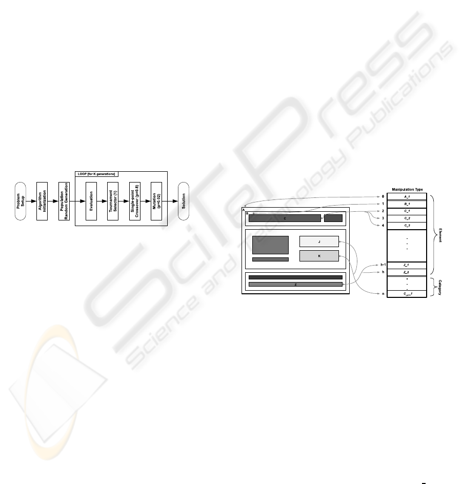
3 ALGORITHM
The algorithm is inspired to the GA given by Gold-
berg and its structure is outlined in Fig.1. The algo-
rithm breeding is based on the following stages:
• Evaluation: a fitness score is assigned to each
population individual.
• Genetic Processing: here individuals are ge-
netically processed by selection, single-point
crossover and mutation.
In particular, the algorithm adopts elitism with a
random selection of individual to be substituted by the
best ones. Tournament is implemented by selecting
the best individual after t pairwise comparisons, as
described in (Goldberg, 1989).
Figure 1: Algorithm structure.
3.1 Chromosome
Page content is structured in a hierarchy of elements,
organized in a tree, whose leaves are terminal el-
ements and non-leaves are containers of elements.
Each node is described by a set of parameters which
are targets of search. In particular we have:
• Container specific parameters: flow, provides the
vertical/horizontal layout of contained elements
and sub-containers.
• Element specific parameters: font-size, controls
the text typeface size; resizeH and resizeV, rep-
resent the element resizing factors.
• Common parameters: weight, provides the impor-
tance of node compared to siblings sharing the
same container, in order to control the percentage
of area reserved to the node; split, available only
for nodes directly held by the top-level page con-
tainer, makes possible to organize the content in
different pages if necessary.
In order to reduce the search space, parameter
values are indexed, that is parameters are not free
to assume any value; possible values are enumer-
ated. For instance, weight can assume 11 pos-
sible values ranging from 0% to 100%, namely
0%,10%,. ..,90%,100%. Font-size and resize factors
are expressed in terms of ratios of values taken di-
rectly from the starting page if available, or of default
values if not. Boolean parameters are instead coded
as 0 for true and 1 for false.
In order to keep the page consistent, elements can
be grouped in classes (i.e. categories). Each category
refers to specific parameters, so that optimization is
able to control the rendering of several elements at
once.
The procedure to map page to chromosome fol-
lows. The tree-structure of the page is inspected and
each parameter of each node becomes a gene. Genes
assume as allele the index among a set of admissible
values for that parameter. Parameters belonging to a
category are coded and appended to the chromosome
structure. In other words, an individual represents a
particular set of parameter values for rendering the
page in a modified layout. The chromosome mapping
is depicted in Fig.2.
Figure 2: Chromosome.
3.2 Fitness
The fitness function for an individual x is aimed at as-
sessing a resulting layout in order to limit scrolling
in both vertical and horizontal direction. As said, an
individual is a set of parameters ruling the page lay-
out. The actual page size is determined by rendering
elements layout according to parameters as expressed
by the chromosome. The resulting page size is com-
pared to the target display size, providing the score to
the individual.
The fitness function we adopted is
fitness(x) =
n
∏
i=1
(w
h
.S
h
(x) + w
v
.S
v
(x))
!
1
n
(1)
A TOOL FOR AUTOMATIC ADAPTATION OF WEB PAGES TO DIFFERENT SCREEN SIZE
93
where n is the number of pages obtained by splitting
the content, S
h
is the contribution due to avoiding hor-
izontal scrolling and S
v
the contribution for vertical
scrolling, weighted respectively by w
h
and w
v
(with
w
h
+ w
v
= 1). The two scrolling components are ex-
pressed as
S(x) =
1−
1−
d
t
3
d < t
exp(−(d − t)) d > t
(2)
where d is the size of resulting page and t is the size
of target display. We note, that penalization occurs
in both cases the available size is not met. Indeed,
exceeding the size entails a scrolling that should be
avoided to improve usability, while being below the
available size entails a waste of space that could be
instead devoted to enlarge elements. Obviously, the
first is more penalized than the latter.
The fitness function ranges in [0, 1], being 0 the
worst result and 1 the best, i.e. each page is exactly
fitted by assigned elements. Being below 1 at each
page contributes to get a lower overall score, due to
the product of scores obtained by each single page.
Each page is scored by the quality of tradeoff between
horizontal and vertical size penalization.
3.3 Experimentation
Experiments were carried out on Intel Pentium IV
machine with 2 GB of RAM running Windows XP
Professional Edition Service Pack 2. We gave higher
penalization to horizontal scrolling, as generally con-
sidered more tedious than vertical. In particular we
set w
h
= 0.7 and w
v
= 0.3. Genetic operators are
the single-point crossover and simple mutation. Se-
lection is a 3-way tournament, in order to make the
algorithm less sensitive to the distribution of fitness
values; elitism is 1. Parameters are summarized in
Tab.1.
Table 1: Algorithm parameters.
Parameter Value
Crossover rate 0.8
Mutation rate 0.1
Elitism 1
w
h
0.7
w
v
0.3
These parameters have been chosen by a prelimi-
nary qualitative analysis, proving to be a good trade-
off between exploration and exploitation behavior. In
particular, a higher rate of mutation helped to keep the
genetic diversity high due to the chromosome length
(65 genes
1
).
1
The number of the genes depends on the complexity of
In addition, as the algorithm was aimed at evolving an
existing solution, the initial population was provided
with clones of the initial reference page together a
number of randomly generated solutions. Random-
ization rate is the portion of individuals that was gen-
erated. Higher values of randomization enrich the ge-
netic variety of population but evolution can slightly
diverge from the original sample.
P = 1000
P = 500
P = 200
P = 100
generations
fitness
Figure 3: Fitness average of best individuals by varying
population size.
We repeated 5 runs for different problem config-
urations and we observed how the fitness profiles at
different population size (i.e. 100, 200, 500 and 1000
individuals) and randomization rate (i.e. 0.5, 0.8 and
1.0) as depicted respectively in Fig.3 and Fig.4 by
plotting the fitness average of best individuals. As ex-
pected, population size has an impact on discovery of
optimal solutions and best results occur when popu-
lation size is 1000 (0.9972). Instead adopting 100 in-
dividuals the algorithm reaches solutions with lower
fitness on average (0.7031). Observing the effect of
randomization rate of the initial population, best per-
formance is obtained with a rate of 0.8, whilst rate
1.0 (meaning a completely random initial population)
leads to worst results.
fitness
generations
r = 0.8
r = 0.5
r = 1.0
Figure 4: Fitness average of best individuals by varying ran-
domization rate.
the page and the amount of content.
ICEIS 2010 - 12th International Conference on Enterprise Information Systems
94
4 A TOOL FOR AUTOMATIC
ADAPTATION
In order to assist the designer, we developed a tool
able to optimize web pages employing the algorithm
described above.
The tool interface (see Fig.6) is organized in three
main panels. The central panel contains the web page
being adapted. The page can be retrieved by the
url navigation bar, similar to that available in web
browsers. After the page is loaded, elements we wish
to have in the adapted page can be selected by click-
ing on them. The panel on the right shows the starting
page DOM structure. Elements can be selected also
by this panel in a finer way. Right-clicking on DOM
tags opens a pop-up menu that makes available some
actions, such as selecting an entire branch of DOM.
Selected elements are highlighted by a surrounding
blue sketched border. The panel on the left regards
the desired structure of resulting page (on top). Ele-
ments can be arranged in the resulting page structure
by drag&drop. On bottom, there are settings control-
ling the genetic algorithm (i.e. population size, gen-
eration limit, cross-over probability, etc.), whose im-
plementation uses an open source optimized library
for genetic algorithms written in Java (Troiano and
De Pasquale, 2009). Besides controls to run the page
adaptation, the user is able to perform a quantitative
test of the algorithm in order to check performances
and convergence.
For each node in the resulting page, it is possible
to set the parameters as described in Section 3 (i.e.
weight, flow, split, font-size, etc.). Parameter initial
values are obtained from the original web page, as the
tool is able to capture both in-line HTML attributes
and CSS style-rules. If one parameter value is miss-
ing, a default value is assumed. Initial values can be
changed in order to provide an initial solution to the
algorithm. After the algorithm is run, parameters can
be changed in order to refine the resulting page(s).
The initial solution and output can be previewed. As
we said before, in order to keep the page aspect con-
sistent, elements can be grouped in categories. The
tool makes possible to create categories and to assign
them to nodes.
In summary, adapting web pages by the tool en-
tails four steps:
1. Building a hierarchical structure of the target web
page.
2. Running the Genetic Algorithm with a specific set
of parameters.
3. Upgrading GA solution by means of human feed-
back.
4. Repeat from Step 2 until a satisfactory solution is
reached.
In the first step, the user can use the browser and
the DOM structure on right to select the content to be
included. The resulting page layout is structured by
organizing the tree on the left panel, describing the hi-
erarchy of containers. In the second step, the user runs
the Genetic Algorithm with the given settings, search-
ing for optimal alternatives. After the search pro-
cess is complete, an optimal solution is made avail-
able to the user. In the third step, the user can further
refine the solution acting on node parameters. This
step is required in order to better meet aesthetics and
user preferences, thus improving the page look. If
the result is not satisfactory, a further search can be
performed starting from the partial result obtained or
from scratch (step 4). The output can be exported
into a set of HTML files, each representing one of
the web pages obtained. This is in accordance to a
broader definition of Interactive Evolutionary Com-
putation (IEC) (Takagi, 2001).
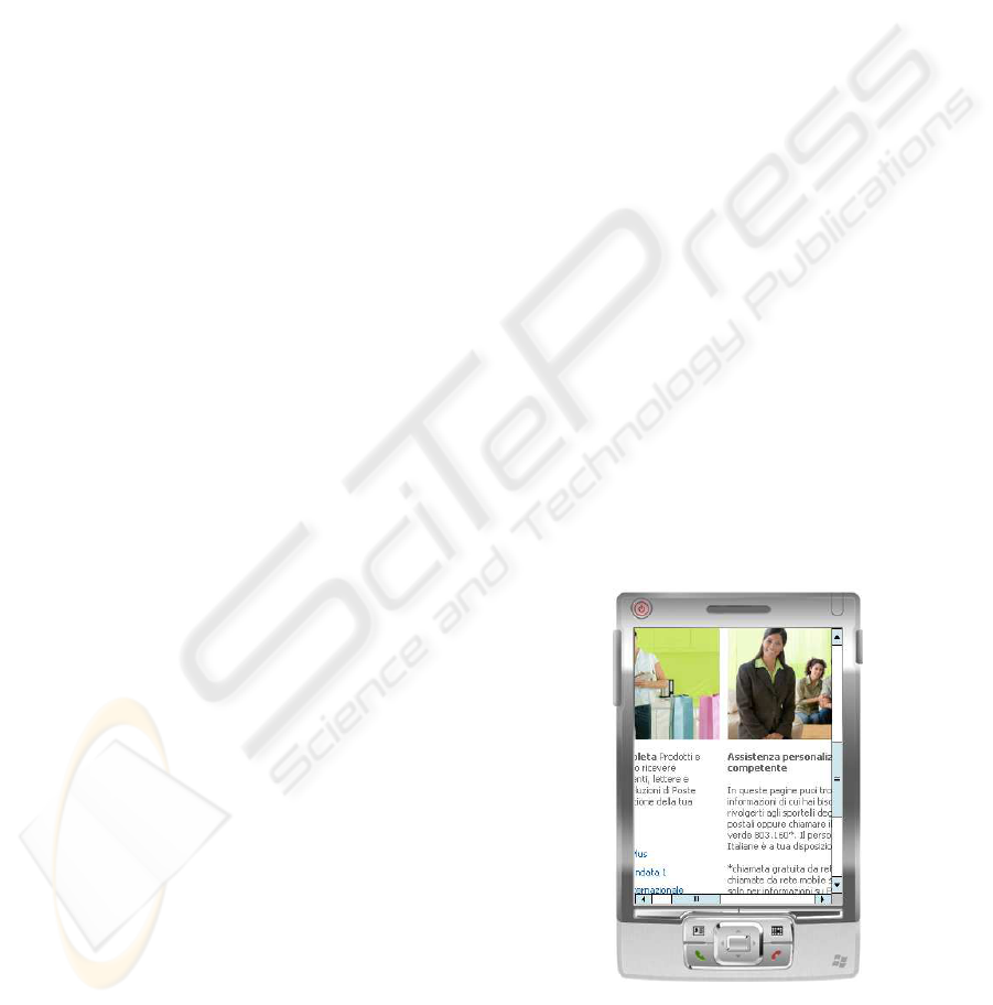
4.1 Examples of Application
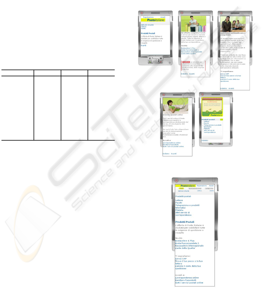
As an example of application we can consider a
web page of Poste Italiane. The target page pro-
vides access to some postal products such as letters,
parcels and e-services, in order to find the best means
for sending postage. Although the page is accessi-
ble by mobile devices, it is characterized by a two-
dimensional scrolling thus limiting the usability of
page (see Fig.5).
Figure 5: Initial page.
First, we prepare the search according to instruc-
tions described above (see Fig.6). The target structure
A TOOL FOR AUTOMATIC ADAPTATION OF WEB PAGES TO DIFFERENT SCREEN SIZE
95
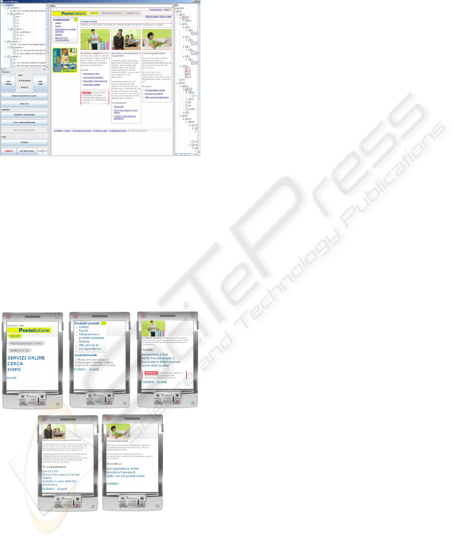
is chosen ensuring the semantic relations among infor-
mation and guaranteeing a splitting in usable parts.
Figure 6: Tool for selecting contents.
In addition we define the genetic algorithm set-
tings and the target device size. In particular we
choose: generation limit = 100, population = 1000,
crossover probability = 0.8, mutation probability =
0.1, elitism = 1 and a screen resolution of 240 × 320
pixels. After 10 generations we reach the fitness value
of 0.9981 and we stop the evolution. Best individual
obtained so far is shown in Fig.7. As the solution is
satisfactory, there is no need to further search better
solutions.
Figure 7: Solution of IEC system.
4.2 Experimental Results
For the experimentation we enrolled 20 participants.
All participants employed a Personal Computer dur-
ing daily work and possessed at least the basic level
of computer literacy. They usually navigate web-site
by means of their PC even if all of them have a mo-
bile device. The average age of the participants was
42, ranging from 28 to 55 years old. Experiments
were conducted at Research and Development Cen-
tre of Poste Italiane in Naples. Three participants
designed a solution in order to adapt a source page
to mobile device. The chosen target page was the
url: http://www.poste.it/postali (see Fig.5). Among
designers, two of them adopted a tool in order to edit
the page and to adapt it to the mobile device, one of
them adopted the proposed tool (see Fig.6) for au-
tomatic page adaptation. The solution proposed by
first designer is depicted in Fig.8 (namely Solution
1), while the solution of the second designer is shown
in Fig.9 (namely Solution 3). Solution obtained by
the tool is reported in Fig.7 (namely Solution 2). In
these pictures, page exceeding the display height of
PDA means that vertical scrolling occurs. One par-
ticipant trained and assigned tasks to a focus tester
group made by the remaining 16 participants. The
group was aimed at evaluating the three different so-
lutions regarding quality and usability by means of a
questionnaire made by the following 12 questions:
• Question 1: The contents were well organized
and were easy to find.
(Strongly disagree 1.2.3.4.5 Strongly agree).
• Question 2: Screens have the right amount of in-
formation.
(Strongly disagree 1.2.3.4.5 Strongly agree).
• Question 3: The site has characteristics that make
it especially appealing.
(Strongly disagree 1.2.3.4.5 Strongly agree).
• Question 4: It is easy to remember where to find
things.
(Strongly disagree 1.2.3.4.5 Strongly agree).
• Question 5: Information is easy to read.
(Very difficult 1.2.3.4.5 Very easy).
• Question 6: Information is written in a style that
suits me.
(Strongly disagree 1.2.3.4.5 Strongly agree).
• Question 7: I immediately understood the func-
tion of each page.
(Strongly disagree 1.2.3.4.5 Strongly agree).
• Question 8: All of the functions I expected to find
in the different pages were present.
(Strongly disagree 1.2.3.4.5 Strongly agree).
• Question 9: The site is well-suited to first-time
visitors.
(Strongly disagree 1.2.3.4.5 Strongly agree).
ICEIS 2010 - 12th International Conference on Enterprise Information Systems
96
• Question 10: The site is well-suited to frequent
visitors.
(Strongly disagree 1.2.3.4.5 Strongly agree).
• Question 11: My overall impression of the site is
(Very Negative 1.2.3.4.5 Very positive).
• Question 12: I think that the site is developed by
(Human, Computer, I don’t know).
User group had to give a level of agreement to
each question with a score ranging from 1 (Strongly
disagree) to 5 (Strongly agree), except of the last
question.
We collected the results and analyzed them by
Wilcoxon paired test, comparing for each question
levels of agreement of Solution 1 vs. Solution 2, So-
lution 2 vs. Solution 3 and Solution 1 vs. Solution 3.
P-values of these comparisons are reported in Tab.2.
Table 2: P-Values.
Questions S1 vs. S2 S2 vs. S3 S1 vs. S3
Question 1 1.0000 0.0431 0.0679
Question 2 0.2489 0.0425 0.1056
Question 3 0.5930 0.0425 0.0277
Question 4 0.1797 0.3980 0.8886
Question 5 0.0935 0.1282 0.0180
Question 6 0.3454 0.0747 0.0300
Question 7 0.6858 0.0431 0.0431
Question 8 0.2012 0.0747 0.3452
Question 9 0.7353 0.2488 0.5294
Question 10 0,3454 0.0747 0.1089
Question 11 0.7794 0.0117 0.0180
As outcome of the questionnaire, users considered
Solution 1 (Human) better than Solution 3 (Human).
Looking at p-values (assuming < 0.05 to reject test
null hypothesis H
0
, > 0.50 to accept H
0
), we can
state:
1. Best human solution and machine solution are
equivalent from the point of view of the organiza-
tion of content (Question 1, Sol1 vs. Sol2, p-value
= 1.0000);
2. The solution proposed by the machine has an ap-
pealing comparable with the best human solution
(Question 3, Sol1 vs. Sol2, p-value = 0.5930);
3. Also from the point of view of usability, the solu-
tion proposed by the tool is statistically compara-
ble with the best human solution (Question 7, Sol1
vs. Sol2, p-value = 0.6858) and better than the
other human solution (Question 7, Sol2 vs. Sol3,
p-value = 0.0431);
4. Machine page is considered well suited for first
time visitors as much as the best human one
(Question 9, Sol1 vs. Sol2, p-value = 0.7353);
5. In summary, users enjoyed the solution generated
by machine as much as the best human one (Ques-
tion 11, Sol1 vs. Sol2, p-value = 0.779434528)
and more than the other human one (Question 9,
Sol2 vs. Sol3, p-value = 0.011718686).
Moreover, results of question 12 show that the
group was not able to recognize that Solution 2 was
generated by a computer (50% said by human). In
general nobody was able to correctly distinguish this
solution from the others.
Figure 8: Solution of first human designer.
Figure 9: Solution of second human designer.
A TOOL FOR AUTOMATIC ADAPTATION OF WEB PAGES TO DIFFERENT SCREEN SIZE
97

5 CONCLUSIONS AND FUTURE
WORK
Adapting web pages to mobile devices is sometimes a
challenging task for human and automatic tools. Evo-
lutionary algorithms represent a feasible approach to
support users in searching alternative layouts for Mo-
bile Web. In this paper we presented a tool enabling
genetic algorithms in searching optimal solutions for
mobile devices given a web page designed for desk-
top application. Experimental results show that in-
teresting results can be obtained even only consider-
ing a parameterized layout, as defined by the user.
There are two directions we aim at investigating in
future work in order to overcome current limitations.
In particular, the algorithm implemented so far is not
able to deal with multiple conflicting preferences and
constraints. This suggests to move to multi-objective
evolutionary optimization. In addition, the algorithm
is not able to escape from the given layout, as the
structure is left unchanged. Genetic Programming
offers an interesting direction to investigate. Other
limitations refer to computational cost for searching
and evaluating solutions. Although this limits the al-
gorithm to be employed in real world problems, the
quality of solutions makes this approach already com-
petitive with human abilities. Technology progress
will offer unexplored opportunities for the future.
REFERENCES
Ahmad, A., Basir, O., Hassanein, K., and Imam, M. H.
(2004). Improved placement algorithm for layout op-
timization. In The 2nd International Industrial Engi-
neering Conference (IIEC2004). IIEC press.
Ahmad, A. R., Basir, O. A., and Hassanein, K. (2003).
Fuzzy inferencing in the web page layout design. In
WSMAI, pages 33–41.
Ahmadi, H. and Kong, J. (2008). Efficient web browsing
on small screens. In AVI ’08: Proc. of the working
conference on Advanced visual interfaces, pages 23–
30, New York, NY, USA. ACM.
Baluja, S. (2006). Browsing on small screens: Recast-
ing web-page segmentation into an efficient machine
learning framework. In WWW ’06: Proc. of the 15th
Int. Conf. on World Wide Web, pages 33–42, New
York, NY, USA. ACM.
De Oliveira, J. a. B. S. (2008). Twoalgorithms for automatic
document page layout. In DocEng ’08: Proc. of the
8th ACM symposium on Document engineering, pages
141–149, New York, NY, USA. ACM.
Gajos, K. Z., Weld, D. S., and Wobbrock, J. O. (2008).
Decision-theoretic user interface generation. In Fox,
D. and Gomes, C. P., editors, AAAI, pages 1532–1536.
AAAI Press.
Goldberg, D. E. (1989). Genetic Algorithms in Search, Op-
timization and Machine Learning. Addison Wesley.
Jokela, T., Koivumaa, J., Pirkola, J., Salminen, P., and Kan-
tola, N. (2006). Methods for quantitative usability re-
quirements: a case study on the development of the
user interface of a mobile phone. Personal Ubiquitous
Comput., 10(6):345–355.
Lehtonen, T., Benamar, S., Laamanen, V., Luoma, I., Ruot-
salainen, O., Salonen, J., and MikkonenP, T. (2006).
Towards user-friendly mobile browsing. In AAA-
IDEA ’06: Proc. of the 2nd Int. Workshop on Ad-
vanced Architectures and Algorithms for Internet De-
livery and Applications, page 6, New York, NY, USA.
ACM.
Nielsen, J. (1994). Usability Engineering. Morgan Kauf-
mann, San Francisco, CA, USA.
Russo, G., Birtolo, C., and Troiano, L. (2008). Genera-
tive UI design in SAPI project. In CHI ’08: extended
abstracts on Human Factors in Computing Systems,
pages 3627–3632, New York, NY, USA. ACM.
Sengamedu, S. H., Mehta, R. R., and Madaan, A. (2008).
Web page layout optimization using section impor-
tance. In Proc. of the 17th International World Wide
Web Conference. WWW2008.
Stormer, H. (2006). Exploring solutions for a mobileweb. In
Proc. of CEC/EEE, page 75. IEEE Computer Society.
Takagi, H. (Sep 2001). Interactive Evolutionary Compu-
tation: Fusion of the capabilities of EC optimiza-
tion and human evaluation. Proceedings of the IEEE,
89(9):1275–1296.
Troiano, L., Birtolo, C., Armenise, R., and Cirillo, G.
(2008). Optimization of menu layouts by means of
genetic algorithms. In van Hemert, J. I. and Cotta,
C., editors, EvoCOP, volume 4972 of Lecture Notes
in Computer Science, pages 242–253. Springer.
Troiano, L., Birtolo, C., Armenise, R., and Cirillo, G.
(2009). Web form page in mobile device: Optimiza-
tion of layout with a simple genetic algorithm. In
Proc. of 11th Int. Conf. on Enterprise Information Sys-
tems. ICEIS.
Troiano, L. and De Pasquale, D. (2009). A java library
for genetic algorithms addressing memory and time
issues. In Proc. of the World Congress on Nature
Biologically Inspired Computing, 2009. NaBIC 2009,
pages 642 –647. IEEE.
W3C (2008). Mobile web best practices 1.0. Tech-
nical report, W3C Recommendation. available at
http://www.w3.org/TR/mobile-bp/.
ICEIS 2010 - 12th International Conference on Enterprise Information Systems
98
