
Responsive Universal Design with Universal User Profiles and
CSS User Queries
Hao-Wen Yang and Hsing Mei
Department of Computer Science and Information Engineering, Fu-Jen Catholic University, Taipei, Taiwan
bardichezanber@weco.net, mei@csie.fju.edu.tw
Keywords: Responsive Design, Responsive Universal Design, Cascading Style Sheet, CSS User Queries, Universal
User Profile.
Abstract: Accompanying the rapid progressing of information and communication technology, the number of web-
based mobile applications grows significantly. The web page design does bring different user experiences
on various mobile devices. The Responsive Web Design (RWD) was the first trial to deal with this issue.
RWD aimed at designing adaptive web interface for different mobile devices. However, RWD consider
only the difference of devices, but not the users, especially the needs of elders. This paper proposes the
Responsive Universal Design (RUD), an enhancement of RWD, to consider both the devices and users. A
unique Universal User Profile (UUP) is maintained for each user on device. Based on UUP, CSS User
Queries functions are used to adjust the user interface dynamically with the best experience. RUD can
increase the flexibility of web design, and improve user experience. A JavaScript library is implemented for
build/load UUP, to parse user queries, and to apply CSS styles. This paper reports a critical step to create a
universal and user-oriented web environment.
1 INTRODUCTION
Accompany with the fast growth of network and
mobile technologies, no matter when or where, we
can find people using mobile phone or tablet devices
for Internet access. However, most of the web sites
are designed for desktop. Mobile web sites are costly
to design. In 2010, Ethan Marcotte coined the term
Responsive Web Design (RWD) in his article.
Through the adoption of CSS Media Queries, the
RWD based web page can response different views
for different devices. However, RWD could meet the
needs for each individual user. In the meantime, the
aging society is approaching rapidly, and the number
of elders (senior citizens) in physical and mental
degradation is fast increasing. Small text font and
complicated workflow are difficult to learn and use
for elders. Neither traditional web design nor RWD-
design can solve the above problem. In other words,
RWD based web sites are still not friendly for elder
and children. The specialized web sites for elders do
not provide personalized solution for user. In this
paper, we extend the RWD to a meta-level as
Responsive Universal Design, and designed two
tools to solve the problems.
This research designed and implemented a
Universal User Profiles (UUP) to save user’s
experiences, behaviour, and preference. Accompany
with the proposed CSS User Queries, which is an
extension from the CSS3 Media Queries, web
designer and/or developer can transform an ordinary
desktop based web pages, to an adaptive page, we
named the design process Responsive Universal
Design (RUD). The design principals of RUD are:
Universal design, Personalize optimization, and User
Centered Design. The goal is to construct an Internet
environment that allows the elder, the young, and
the physical and spiritual disabled people to browse
the web intuitively. The second section of this paper
introduces the background of this research and
current web environment. In the third section, we
present the main idea of RUD’s design. The fourth
section illustrates the CSS User Queries and
Universal User Profiles (UUP). The following
section is the experiment and result of this research.
The final section is conclusion and future works.
2 BACKGROUNDS
This section introduces the two major background
255
Yang H. and Mei H.
Responsive Universal Design with Universal User Profiles and CSS User Queries.
DOI: 10.5220/0005426802550260
In Proceedings of the Fourth International Symposium on Business Modeling and Software Design (BMSD 2014), pages 255-260
ISBN: 978-989-758-032-1
Copyright
c
2014 by SCITEPRESS – Science and Technology Publications, Lda. All rights reserved
technologies of RUD: Responsive Web Design
(RWD), and CSS3 Media Queries.
2.1 Responsive Web Design
The accessibility of a web page is depending on
screen resolution and size of the device; it is
different on a desktop, a notebook, a tablet, or a
smartphone. In the past, there are two possible ways
to deal with this situation. (1) Minimize the design
layout for smallest size screen. (2) Develop various
mobile version sites, and server detects mobile
devices to redirect the sites to mobile version. From
developer’s view, the second solution is more
popular. However, there are too many new device
types available in recent years. To develop web site
for each device is not only expensive but also
difficult to synchronize and update for all versions.
Fortunately, Responsive Web Design (RWD), a
flexible design paradigm, has been proposed for
adapting multiple devices. RWD-based web sites
can render a suitable layout based on different
screen resolution or device type. RWD not only
combined the front-end technologies, such HTML;
CSS; and JavaScript, but also integrated the
concepts of information flow and graphic design.
The web page could detect the screen size to respond
the content and layout dynamically. Hence, RWD
provides the best visual effects for contents. It also
eliminated the need for additional development and
maintenance costs for each device. For users, RWD
provides consistency content style and user
interface. RWD has become one of the leading web
design trends.
2.2 CSS3 Media Queries
CSS3 Media Queries is a relatively new feature of
CSS. It is now the core technology that makes RWD
possible. Through the Media Queries, developer can
set HTML elements’ size and style dynamically.
RWD provides the design idea of Fluid Grid, which
makes web page linearized on the phone, and
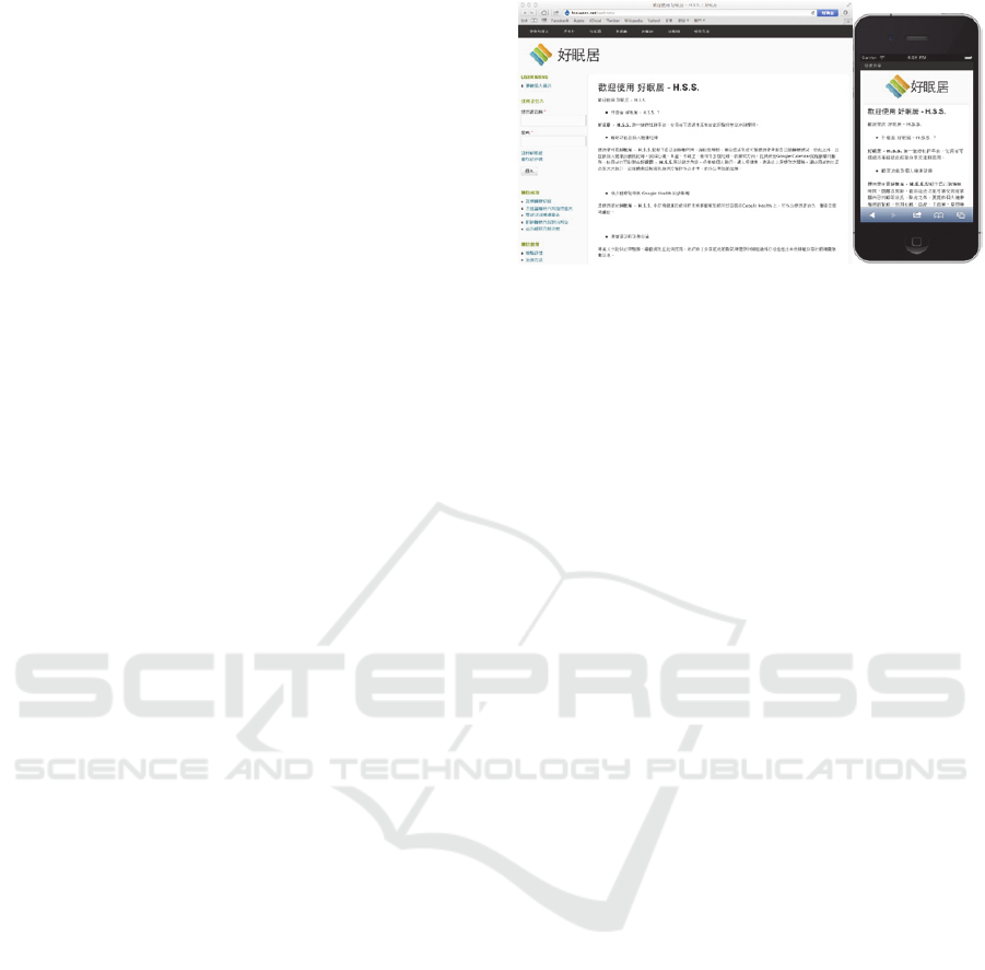
coordinate with flexible images and texts. Figure 1
shows a single page made with CSS3 Media Queries
on desktop and iPhone.
With various CSS styles, we can not only
produce different page layouts but also make some
change of page content. For example, the CSS
attribute 'display' can choose either to control the
content display, or not to control.
Figure 1: Example of Response Web Design with CSS3
Media Queries.
3 RESPONSIVE UNIVERSAL
DESIGN
The user experience issues are receiving increasing
attention. RWD supports adaptive design and style
for various devices, but the difference of users is not
considered. Here we propose a RWD-based
extension which aiming at the user difference and
experience. The Responsive Universal Design
(RUD) is based on the following three principals:
• Universal Design
Similar to the concept of general universal design,
we do not use RUD for specific groups. This design
pattern does not only meet the need for elderly
people, children and disabled persons, but also for
the average person.
• Personalize Optimization
The main focus of responsive design is changing for
difference. A web page is not suitable for anyone to
browse. We need to do specific modification for
different user, and provide them a most friendly
experience.
• User Centered Design
Relative to “rendering on what devices”, this design
attaches more importance for “display for what type
of user”. The focus is returning to the user, and the
design is initialized from the user’s view.
Moreover, RUD is based as RWD and keeps all the
advantages, e.g. lower development and maintain
cost, high compatibility, etc.
4 UNIVERSAL USER PROFILES
AND CSS USER QUERIES
To achieve the Responsive Universal Design (RUD),
Fourth International Symposium on Business Modeling and Software Design
256
mechanisms to record user’s experience and to query
the preferred rendering are required. Here, we design
the Universal User Profile (UPP) scheme and the
CSS User Queries scheme.
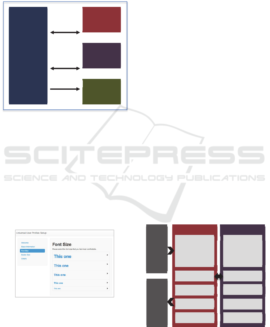
Figure 2: The relationship of JavaScript Library, User
Queries, Universal User Profiles and Document Object
Model (DOM).
4.1 Universal User Profile
RUD needs a mechanism to define the attributes and
rules for the conditional query. All of user's
attributes saved in a file dedicated to this task, called
Universal User Profiles (UUP). Then, JavaScript can
access and query for the user information to
complete a RUD-based rendering. Figure 3 shows a
setup screen layout of Universal User Profiles.
Attributes in UUP include: Birthdate, Sex,
Acceptable font size, Acceptable touch area, and
preferred device.
Figure 3: Setup screen of Universal User Profiles.
• Birthdate
Birthdate is an important attribute in UUP and RUD
mechanism. Due to the physical limitation, designers
need pay more attention to elders and children when
designing.
• Sex
This attribute is user’s sex. We trust Internet is an
open space and regardless of sex that anyone can
browse, but the sex still will influence the user
experience. We hope developer or designer can use
this attribute for the style and composing, not for
sexual content. It may also be useful for future data
mining.
• Acceptable Font Size
UUP selected font size as a required attribute
because most users are sensitive for the font size.
This can ensure the experience of reading and make
developers more convenient to set the font size.
• Acceptable Size of Touch Area
More and more people connect Internet through the
touch-based devices like tablet or smartphone. The
size of button directly affected the experience of the
web site. Each person has his/her own definition of
“easy-to-touch”, for example, elderly people or
children may need a bigger button for correct touch
selection. Hence, UUP added the Acceptable size of
touch area as attributes. The value of this attribute is
a width of button, developer or designer can user
this attribute with the Fitts’ Law (in Human
Computer Interaction) to deploy a fit button.
• Preferred Device
User’s favoured devices and/or operating systems
are also an important factor of user experience.
UUP suggests give priority to the device that is
using, to complete a consistency user experience.
Also, if user/developers have any demands on
special device, this attribute could be used to provide
valuable information.
Figure 4: The model from the designer view.
UQRespon
d.js
CSS with
User
Queries
UUP
DOM
Get UUP
and check
queries
A
pp
l
y
CSS
Parse
CSS code
to get
UserQueries UUP
Designer
Web Page
elder adult
teenchild
birthdate
years
sex
acce
p
table‐font
touchable‐size
preferred‐device
Birthdate
Sex
Acceptablefontsize
Acceptablesizeoftouch
area
PreferredDevice
Responsive Universal Design with Universal User Profiles and CSS User Queries
257
4.2 CSS User Queries
Similar to the CSS3 Media Queries used in RWD,
RUD also needs a mechanism for querying user
status and applying the selected CSS code.
Extending the format of CSS3 Media Queries, we
developed the CSS User Queries. The usage of User
Queries is again similar to Media Queries.
Developer just tags @user in the CSS code and
performs the query. It is simple and straightforward.
Figure 5 illustrates a CSS User Queries example for
an elder whose minimum acceptable font size is 14
pixels, and the background of web page will be light
yellow, and the font size start from 14 pixels.
Figure 5: An example code of CSS User Query for an
elder.
CSS User Queries provides 3 ways to query
about user's age.
1. Elder, Adult, Teen or Child
Considering the distribution of users, users are
divided to four age groups: elder, adult, teen and
child. Developer can make a suitable adjustment for
that age directly. The default area of each age are
0~14, 15~24, 25~64 and above 65 years old.
Developers can adjust the border when they need.
2. Birthdate : yyyy (- yyyy)
If the developer likes to have a more precise query
for age, 'birthdate' can be used as the parameter.
Developer or designer can target a certain age to
change the content or style of web sites. The
parameter can be a range for some specify queries,
e.g. '198x' or '1956 - 196x'.
3. Years : yy (- yy)
The third way is the current age representation. If
developers want to query user's current age, they can
user 'years_old' to complete this. It has similar usage
as 'birthdate'.
Developer and designer can perform the following
queries for the other UUP attributes.
• Acceptable font size: (acceptable-font : n px|em)
• Acceptable size of touch area: (touchable-size : n
px|em)
• Preferred device: (preferred-device : device-type)
• Sex: Just add 'male' or 'female' in query.
4.3 JavaScript Library: Respond for
User Queries (UQRespond.js)
To accomplish a RUD-based page, we designed and
implemented a JavaScript library to build or load
UUP, to parse user queries, and to apply CSS styles.
This library is called UQRespond.js. It forked from
an open source project named Respond.js, a
JavaScript library to enable responsive web designs
in browsers that don't support CSS3 Media Queries.
Based on Respond.js, we edited it for User Queries
and added core functions for UUP.
When user connected to a user query website
first time, website can actively initiate or passively
request user to setup the UUP file. UQRespond.js
provide a simple and fast setup for that, just call the
function "createUUP()”, and it will start the UUP
setup in the web page. With UUP setup, users do not
need input parameters by themselves. In addition,
UUP setup provides many examples for user to
choose the best one. The Completed UUP will be
saved as cookies or HTML5 web storages with the
device. Hence, other web applications can access the
same UUP.
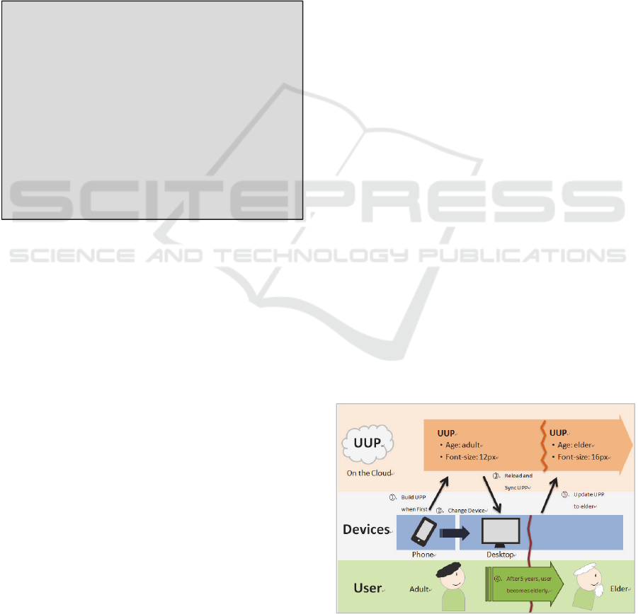
We are also building a web service that user can
be authenticated through OpenID. In this case, user
can switch between difference devices, and maintain
the user experience at same time. The relationship
between UUP and user/devices is shown in Fig. 6.
Figure 6: Schematic diagram of UUP, devices and user.
@user elder and (min-acceptable-
size:14px){
body{
background: #F8F1D9;
}
p,a{
font-size: 14px;
}
.content{
font-size: 16px;
color: #333;
}
}
Fourth International Symposium on Business Modeling and Software Design
258
5 EXPERIMENT AND RESULT
This research proposed the Responsive User Design
(RUD) mechanism for mobile web design. We
designed and implement UUP Setup tool and library
to verify the RUD. We also conduct real person
experiment to investigate the user’s behaviour with
RUD. There are two objectives are expected from
the experiment. First, User Queries can improve the
user experience of reading and control a webpage.
Among many User Experience parameters, we
selected some quantifiable factors (e.g. reading time)
to measure. Second, an UUP will bring a same fluent
experience from web pages with different styles. We
hope user can keep the improved user experience,
which can be migrated from one RUD-based site to
another.
There are two types of participants in this
experiment, elders and teens. All participants have
previous experience of using iPhone, iPad or
Android devices. Before the experiment, subjects
did not know the process of the experiment they will
participate, and they will just receive an iPad with an
opened web page. In the beginning, subject will
enter their ages and set up a simplified UUP on the
page. When the subject clicked the start button, the
page shows an article and a next button. After read
the article and clicked next, the web page will
display a multiple-choice question about the article.
Each experiment has four rounds of article and
question.
The article in the experiment is a short and
simple story or news that everyone can read easily.
This research prepared two different CSS layouts to
make articles look like reading from different web
sites as shown in Figure 7, and randomly selected
the styles with enable or disable User Queries in
those four rounds. Our experimental pages save the
touch events, reading time and status of each subject
for analysing.
Figure 7: Two different CSS layouts.
From the experiments, User Queries did improve
participant's reading time. The User Queries enabled
article reduced 12 percent reading time than
disabled. It reduced 17 percent reading time for elder
and 4 percent for teen. Totally 87.5 percent of
participants improved reading efficiency with the
UUP and User Queries.
Table 1: Experiment results.
All
Elder
s
Teen
Selected font size (pixels)
26 27 26
Reading time
(sec/article)
All
21.68 25.10
14.9
1
User Queries
enabled
20.27 22.73
14.6
0
Default
23.10 27.48
15.2
4
Difference
reading time
in different
styled pages
(sec/article)
User Queries
enabled
0.37 1.12 0.49
Default
1.86 3.31 0.65
Number of touch events
(times)
16 22 10
For the second objective, UUP will bring same
experience from web pages with different style. The
average reading time difference of two pages
different with difference style is 1.86 seconds, and
the average time difference become 0.37 seconds. It
improved about 80 percent after enabled User
Queries. As the result, UUP indeed improve the
reading efficiency on the changing of the reading
environment. This experiment is the first step of
User Queries study, and we except User Queries will
become an essential tool for designer to improve the
user experience.
6 CONCLUSIONS
The idea of Responsive Universal Design (RUD)
with CSS User Queries, and Universal User Profiles
(UUP) was inspired and implemented from the
Orange Technology. RUD can increase the
flexibility of web design, and improve user
experience. The JavaScript library is still under
development and experiments are conducted on
testbed continuously. We will release it as open
source libraries to mobile web developer/designer
community. We are also evaluating and planning the
business model of the UUP web service. This paper
reports the first step to create a universal and user-
oriented web environment, and we trust this will be
a trend for the web design in the future.
Responsive Universal Design with Universal User Profiles and CSS User Queries
259

REFERENCES
Ethan Marcotte. (2010). Responsive Web Design.
Retrieved from: http://www.alistapart.com/articles/
responsive-web-design/
Hsing Mei, Vhien-Chang Hsu, and Wei-Ting Lai. (2008).
Mashup a Reliable Virtual Health 2.0 Testbed
Environment. Proceedings of the 4th Taiwan
Conference on Software Engineering, 277-282.
Yan-Ting Lin, Chia-Hao Lin, Xiang-Lin Wen, Ching-
Yang Hung and Hsing Mei. (2012). Joyful Health
Space: An Age Friendly Testbed for Responsive Web
Design. Orange Beneficence - International Design
Conference of Smart Living for Elderly, 178-186.
F. Rivoal, H. Lie, T. Çelik, D. Glazman and A. van
Kesteren. (2012). Media Queries, W3C
Recommendation 19 June 2012. Retrieved form:
http://www.w3.org/TR/css3-mediaqueries/
William Lidwell, Kritina Holden and Jill Butler. (2010).
Universal Principles of Design, Revised and Updated:
125 Ways to Enhance Usability, Influence Perception,
Increase Appeal, Make Better Design Decisions, and
Teach through Design(2nd ed.). New York: Rockport
Publishers.
Jesse James Garrett. (2010). The elements of user
experience: user- centered design for the Web and
beyond (2nd ed.). San Francisco: New Riders Press
Scott Jehl. (2011). Respond.js. Retrived from:
https://github.com/scottjehl/Respond
Fourth International Symposium on Business Modeling and Software Design
260
