
A User-centric Taxonomy for Multidimensional Data Projection Tasks
Ronak Etemadpour
1
, Lars Linsen
2
, Christopher Crick
1
and Angus Forbes
3
1
Computer Science Department, Oklahoma State University, Stillwater, OK, U.S.A.
2
School of Engineering and Science, Jacobs Bremen University, Bremen, Germany
3
Department of Computer Science, University of Illinois at Chicago, Chicago, U.S.A.
Keywords:
Multidimensional Data Analysis, Task Taxonomy, Multidimensional Data Projection, User-centric Evaluation.
Abstract:
When investigating multidimensional data sets with very large numbers of objects and/or a very large number
of dimensions, a variety of visualization methods can be employed in order to represent the data effectively
and to enable the user to explore the data at different levels of detail. A common strategy for encoding multidi-
mensional data for visual analysis is to use dimensionality reduction techniques that project data from higher
dimensions onto a lower-dimensional space. In this paper, we focus on projection techniques that output 2D
or 3D scatterplots which can then be used for a range of data analysis tasks. Existing taxonomies for mul-
tidimensional data projections focus primarily on tasks in order to evaluate the human perception of class or
cluster separation and/or preservation. However, real-world data analysis of complex data sets often includes
other tasks besides cluster separation, such as: cluster identification, similarity seeking, cluster ranking, com-
parisons, counting objects, etc. A contribution of this paper is the identification of subtasks grouped into four
main categories of data analysis tasks. We believe that this user-centric task categorization can be used to
guide the organization of multidimensional data projection layouts. Moreover, this taxonomy can be used as
a guideline for visualization designers when faced with complex data sets requiring dimensionality reduction.
Our taxonomy aims to help designers evaluate the effectiveness of a visualization system by providing an
expanded range of relevant tasks. These tasks are gathered from an extensive study of visual analytics projects
across real-world application domains, all of which involve multidimensional projection. In addition to our
survey of tasks and the creation of the task taxonomy, we also explore in more detail specific examples of how
to represent data sets effectively for particular tasks. These case studies, while not exhaustive, provide a frame-
work for how specifically to reason about tasks and to decide on visualization methods. That is, we believe
that this taxonomy will help visualization designers to determine which visualization methods are appropriate
for specific multidimensional data projection tasks.
1 INTRODUCTION
Visualization is a crucial step in the process of data
analysis. Often, when analyzing multidimensional
data, dimensionality reduction (DR) techniques are
displayed in form of 2D or 3D scatterplots that project
the multidimensional points onto a lower-dimensional
visual space. Methods using different algorithms to
generate scatterplots with particular point placements
are the most common visual encoding (VE) tech-
niques for the resulting lower-dimensional data. DR
techniques, coupled with appropriate VEs, enable an
understanding of the relations that exist within the
higher-dimensional data by displaying them in such
a way that makes it easier for users to discover mean-
ingful patterns (Samet, 2005).
Data analysis tasks are primarily concerned with
the detection of structures such as patterns, groups,
and outliers. Within a multidimensional data set,
data points can be grouped manually into classes or
automatically into clusters. For example, classes may
be defined through manually labeling a collection
of documents so that each document belongs to one
topic within a set of topics, or by splitting an image
collection into ten classes by assigning each image a
particular theme from a set of ten themes. Clusters,
on the other hand, are generated automatically using
a clustering algorithm that may, for instance, identify
groupings of similar points, or partition the data
into dissimilar groups where each cluster contains
similar items (M
¨
uller et al., 2009). However, it may
be difficult to see these clusters or classes when
projected onto a lower-dimensional space. To make
sense of this multidimensional data, it can be useful
to know how the clusters or classes are defined and
structured in the original multidimensional attribute
space. However, multidimensional projection map-
51
Etemadpour R., Linsen L., Crick C. and Forbes A..
A User-centric Taxonomy for Multidimensional Data Projection Tasks.
DOI: 10.5220/0005313400510062
In Proceedings of the 6th International Conference on Information Visualization Theory and Applications (IVAPP-2015), pages 51-62
ISBN: 978-989-758-088-8
Copyright
c
2015 SCITEPRESS (Science and Technology Publications, Lda.)

pings are especially prone to distortion because
projection methods may not necessarily preserve the
spatial relations of the data. Thus, it is important to
know how effective the scatterplots are at preserving
segregation of the data (Sips et al., 2009).
Several studies evaluate the quality of projec-
tions with respect to preserving certain properties,
thus guiding a user to select the most appropriate
projection method for their task. Various numerical
and visual methods have been introduced to quantify
the accuracy of projection methods with respect
to such properties (Sips et al., 2009; Tatu et al.,
2009). Recent studies (Sedlmair et al., 2012b) have
shown that the quality of cluster separation by these
measures was highly discrepant with user assessment
of the cluster separation within the same data sets.
Lewis et al. (Lewis and Ackerman, 2012) believe
that accurate evaluation of clustering quality is
essential for data analysts, and they showed that such
clustering evaluation skills are present in the general
population.
On the other hand, other studies have attempted
to find a perception-based quality measure for scat-
terplots. They either evaluated users’ performance
on layouts generated by different projection tech-
niques (Etemadpour et al., 2014c) or allowed users
to assess a series of scatterplots (Albuquerque et al.,
2011). Etemadpour et al. (Etemadpour et al., 2014c)
used eye-tracking in a user study, asking users to
perform typical analysis tasks for projected multi-
dimensional data. Other studies have investigated
the perception of correlation in scatterplots from a
psychological perspective; however these studies
did not consider real-world data sets (Rensink and
Baldridge, 2010), (Etemadpour et al., 2014a).
Because of the absence of a standard approach
for evaluating multidimensional data projection,
the results of these studies, and others like them,
are difficult to compare. We present a taxonomy
of visual analysis tasks for multidimensional data
projection that we believe could be a useful means
for evaluation. The idea of creating a task taxon-
omy has been recently explored by Brehmer and
Munzner (Brehmer and Munzner, 2013). They con-
tribute a multi-level typology of visualization tasks
that augments existing taxonomies by filling a gap
between low-level and high-level tasks. Specifically,
they distinguish what the task inputs and outputs
are, as well as why and how a visualization task
is performed. In doing so, they more thoroughly
organize the motivations for and methods of specific
tasks for particular data analysis situations. Their
task taxonomy is more general, and does not address
multidimensional data projection in any detail. In
this paper, we provide a taxonomy of visual analysis
tasks related to multidimensional data projection.
Our task taxonomy enables evaluation designers to
investigate visualization performance effectively on
both synthetic and real-world data sets. The main
contributions of the paper is:
• We provide a systematic user-centric taxonomy of
visual tasks related to projected multidimensional
data.
• We divide the projection-related tasks into differ-
ent categories based on their impact on the anal-
ysis of multidimensional data. The categories
we identify are relation-seeking, behavior com-
parison, membership disambiguation, and pattern
identification tasks.
• We enable, via our task taxonomy, visualization
designers to improve visualization tasks related to
the analysis of multidimensional data.
• We present our taxonomy as a guideline for re-
searchers in choosing visualization techniques for
these tasks, and provide explicit examples.
• We adapt Brehmer and Munzner’s multilevel ty-
pology of abstract visualizations to multidimen-
sional data projection tasks (Brehmer and Mun-
zner, 2013).
In the next section, we provide a brief review
of existing task taxonomies for DR and VE tech-
niques. In Section 3, we introduce our task tax-
onomy for multidimensional data projection by de-
scribing new sets of tasks related to typical analy-
sis tasks, including pattern identification, such as de-
tecting clusters, behavior comparison, such as com-
paring characteristics of subsets, membership disam-
biguation, such as counting the number of objects in a
cluster, and relation seeking, such as correlating sub-
sets to each other. We discuss the effects of our pro-
posed tasks on the evaluation of scatterplots by pro-
viding some examples of how different tasks support
decision making respective to human perception over
multidimensional data projections. We also character-
ize our proposed tasks using the multi-level typology
of abstract visualization tasks (Brehmer and Munzner,
2013). We applied Brehmer and Munzner’s multi-
level topology concept for describing two tasks as
guidelines, while the three questions (WHY, WHAT,
HOW) can be used to structure the description of all
tasks.
IVAPP2015-InternationalConferenceonInformationVisualizationTheoryandApplications
52

2 RELATED WORK
Many projection methods exist to generate 2D
similarity-based layouts from a higher-dimensional
space. The design goals include maintaining pairwise
distances between points as implemented in multidi-
mensional scaling (MDS) (Borg and Groenen, 2010),
maintaining distances within a cluster, or maintain-
ing distances between clusters (Tenembaum et al.,
2000). Principal component analysis (PCA) gener-
ates similarity layouts by reducing data to lower di-
mensional visual spaces (Jolliffe, 1986). Some pro-
jection methods, such as isometric feature mapping
(Isomap), favor maintaining distances between clus-
ters instead. Isomap is an MDS approach that has
been introduced as an alternative to classical scaling
capable of handling non-linear data sets. It replaces
the original distances by geodesic distances computed
on a graph to obtain a globally optimal solution to
the distance preservation problem (Tenembaum et al.,
2000). Least-Square Projection (LSP) computes an
approximation of the coordinates of a set of projected
points based on the coordinates of some samples as
control points. This subset of points is representa-
tive of the data distribution in the input space. LSP
projects them to the target space with a precise MDS
force-placement technique. It then builds a linear sys-
tem from information given by the projected points
and their neighborhoods (Paulovich et al., 2008).
The correlations of data points or clusters are not
always known after they have been mapped from a
higher-dimensional data space to 2D or 3D display
space. Thus, several approaches evaluate the best
views of multidimensional data sets. Sips et al. (Sips
et al., 2009) provide measures for ranking scatterplots
with classified and unclassified data. They propose
two additional quantitative measures on class consis-
tency: one based on the distance to the cluster cen-
troids, and another based on the entropies of the spa-
tial distributions of classes. They propose class con-
sistency as a measure for choosing good views of
a class structure in high-dimensional space. Tan et
al. (Tan et al., 2005), Paulovich et al. (Paulovich et al.,
2008), and Geng et al. (Geng et al., 2005) also eval-
uate the quality of layouts numerically. By ranking
the perceptual complexity of the scatterplots, other
studies investigate user perception by conducting user
studies on scatterplots, finding that certain arrange-
ments were more pleasing to most users (Tatu et al.,
2010), (Albuquerque et al., 2011). However, these op-
erational measures were not necessarily equivalent to
the measures of user preference based on their quali-
tative perceptions.
Sedlmair et al. (Sedlmair et al., 2012a) have dis-
cussed the influence of factors such as scale, point dis-
tance, shape, and position within and between clus-
ters in qualitative evaluation of DR techniques. They
examined over 800 plots in order to create a de-
tailed taxonomy of factors to guide the design and
the evaluation of cluster separation measures. They
focused only on using scatterplot visualizations for
cluster finding and verification. DimStiller (Ingram
et al., 2010) is a system to provide global guidance
for navigating a data-table space through the process
of choosing DR and VE techniques. This analysis
tool captures useful analysis patterns for analysts who
must deal with messy data sets.
Rensink and Baldridge (Rensink and Baldridge,
2010) explore the use of simple properties such as
brightness to generate a set of scatterplots in order
to test whether observers could discriminate pairs us-
ing these properties. They found that perception of
correlations in a scatterplot is rapid, and that in or-
der to limit visual attention to specific information it
is more effective to group features together. Etemad-
pour et al. (Etemadpour et al., 2014c) postulate that
cluster properties such as density, shape, orientation,
and size influence perception when interpreting dis-
tances in scatterplots, and specifically, observe that
the density of clusters is more influential than their
size.
In general, little attention has been paid to provid-
ing details about low-level tasks that guide users to
choose DR and VE techniques. However, both high-
level goals and much more specific low-level tasks
are important aspects of analytic activities. Amar et
al. (Amar et al., 2005) presented a set of ten low-level
analysis tasks that they found to be representative of
questions that are needed to effectively facilitate an-
alytic activity. Andrienko and Andrienko distinguish
elementary tasks that address specific elements of a
set and synoptic tasks that address entire sets or sub-
sets, according to the level of analysis (Andrienko
et al., 2011).
Brehmer and Munzer (Brehmer and Munzner,
2013) emphasize three main questions, why the tasks
are performed, how they are performed, and what are
their inputs and outputs. These questions encompass
their concept of multi-level typology. They believe
that “low-level characterization does not describe the
user’s context or motivation; nor does it take into ac-
count prior experience and background knowledge.”
Their typology relies on a more abstract categoriza-
tion based on concepts, rather than a taxonomy of
pre-existing objects or tasks. In contrast, we attempt
to specify tasks at the lowest level that can provide
details about multidimensional data projection. How-
ever, the general approach of Brehmer and Munzner
AUser-centricTaxonomyforMultidimensionalDataProjectionTasks
53

can be easily adopted as a tool to put these low-level
tasks in context, facilitating the evaluation of user ex-
periences by evaluation designers. This approach pro-
vides essential information, such as motivation and
user expertise, for field studies that examine visual-
ization usage. Therefore, we show how our defined
tasks can be described according to a typology of ab-
stract tasks relating intents and techniques (how) to
modes of goals and tasks (why).
We 1) categorize possible tasks performed when
analyzing a specific multidimensional data visualiza-
tion, and 2) formulate guidelines for analysts to assist
in selecting appropriate projection techniques for per-
forming specific visualization tasks on data sets.
3 TASK TAXONOMY FOR
MULTIDIMENSIONAL DATA
PROJECTION
We define a list of tasks from studies of different
projection techniques and their 2D layouts such as
PCA (Jolliffe, 1986), Isomap (Tenembaum et al.,
2000), LSP (Paulovich et al., 2008), Glimmer (Ingram
et al., 2009), and NJ tree (Paiva et al., 2011), as well
as the applications behind the data (e.g. document and
image data). We explain some of these tasks in de-
tail and provide examples of effective data representa-
tions for relevant visual analysis tasks. As explained
in Section 2, how well groups of points can be dis-
tinguished by users in scatterplots defines visual class
separability. Our cluster-level tasks also focus on how
easily a grouping of related points in multidimen-
sional space (e.g., clusters) can be detected by users
when projected into lower-dimensional space. How-
ever, rather than only looking at visual class separa-
bility, we consider how effective users are performing
meaningful tasks related to the perceived clusters.
Although other researchers have explored some of
these tasks, we systematically list the full range of
analytic tasks for multidimensional projection tech-
niques appropriate for large data sets. Additionally,
our organization of these tasks takes into considera-
tion user perception.
We divided the tasks into four categories accord-
ing to the typical visualizations required to support
them:
Pattern Identification Tasks: We examine
trends, which are more obvious for lower-dimensional
data than for projected higher-dimensional ones. Rel-
evant issues include cluster/class preservation and
separation.
Relation-seeking Tasks: Relationships and
similarities between different reference sets are
considered.
Behavior Comparison Tasks: To compare
characteristics of subsets (or clusters), we consider
capturing different data behaviors (like asking the
subjects to compare the point densities within clus-
ters, where density is defined as the number of points
per area).
Membership Disambiguation Tasks: Po-
sitional and distributional relationships within
classes/clusters are particularly considered where
objects occlude each other. Clutter and noise obscure
the structure present in the data and make it hard
for users to find patterns and relationships. Peng et
al. (Peng et al., 2004) state that clutter reduction is
a visualization-dependent task. Therefore, the DR
and VE need to minimize the amount of confusing
clutter. We believe that clutter can be measured by
users using a wide variety of visualization techniques.
We now clarify these taxonomic categories by
looking at common tasks found in the literature.
3.1 Pattern Identification Task
Multidimensional data sets may include hundreds or
thousands of objects described by dozens or hundreds
of attributes. Data characteristics regarding the dis-
tribution within multidimensional feature spaces vary
for different application domains. For example, con-
sider document data versus image data: text usually
produces sparse spaces while imagery produces dense
spaces. As Song et al. (Song et al., 2006) state, tra-
ditional document representation like bag-of-words
leads to sparse feature spaces with high dimensional-
ity. This makes it difficult to achieve high classifica-
tion accuracies. Figure 1 shows histograms of the dis-
tribution of the pairwise distances between four data
objects after normalization to the interval [0; 1]. The
document data sets are referred to as CBR and KD-
Viz
1
. The image data sets are referred to as Corel
2
1
CBR comprises 680 documents, which include ti-
tle, authors, abstract, and references from scientific pa-
pers in the four different subjects, leading to a data set
with 680 objects and 1,423 dimensions. KDViz data
has been generated from an Internet repository on the
topics bibliographic coupling, co-citation analysis, mil-
grams, and information visualization, leading to 1,624 ob-
jects, 520 dimensions, and four highly unbalanced labels
(http://vicg.icmc.usp.br/infovis2/data sets).
2
1,000 photographs on ten different themes. Each image
is represented by a 150-dimensional vector of SIFT descrip-
tors (3UCI KDD Archive, http://kdd.ics.uci.edu).
IVAPP2015-InternationalConferenceonInformationVisualizationTheoryandApplications
54
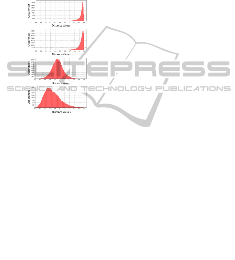
and Medical
3
. The revealed histograms illustrate dif-
ferent characteristics for document data sets and im-
age data sets. Both image data sets exhibit lower
mean distance values and much wider variance (repre-
sentative of a denser feature space) than the document
data sets.
(a)
(b)
(c)
(d)
Figure 1: Histograms of document data (top) and image
data (bottom) exhibit characteristic distance distributions:
(a) CBR. (b) KDViz. (c) Corel. (d) Medical.
Identifying patterns in high-dimensional spaces
and representing them using dimensionality reduc-
tion techniques, in order to reveal trends, is a chal-
lenge in many scientific and commercial applications.
To identify outliers, trends and interesting patterns in
data, one of the many objectives of data exploration
is to find correlations in the data, thus uncovering
hidden relationships in the data distribution and pro-
viding additional insights about the high-dimensional
data (Zhang et al., 2008). Therefore, a list of ques-
tions are suggested that can reveal user’s perspective
about local and global correlations with respect to fea-
tures – for instance, those subsets of data which form
relevant patterns (e.g. subsets of data within dense
feature groups):
• Estimate the number of outliers in the given lay-
out.
• Estimate the number of observed clusters.
3
Each image is represented by 28 features, including
Fourier descriptors and energies derived from histograms,
as well as mean intensity and standard deviation computed
from the images themselves. Hence, the data set contains
540 objects and 28 dimensions
• Find the number of clusters in a selected region.
• Find the number of subclusters in a given cluster.
• Find a cluster with a specific characteristic (e.g.,
longish).
• Find the specific characteristics (e.g., sparsity) of
a cluster.
• Determine the number of outliers in a given clus-
ter.
If researchers aim to find the user’s performance
on class segregation, it is important to draw the user’s
attention to global project views. Thus, we suggest
asking Estimate the number of clusters in the given
layout to identify the informative aspects of the data.
Pattern identification tasks often favor clear segre-
gation by class, which means that techniques which
incorporate cluster enclosing surfaces can be helpful.
In some situations, the labeled classes in each data set
can be considered as ground truth. For such cases,
Poco et al. (Poco et al., 2011) developed a 3D projec-
tion method by generalizing the LSP technique from
a 2D to a 3D scheme. A non-convex hull (of each
cluster) that is computed from a 3D Voronoi diagram
of the cluster points is illustrated in Figure 2(a). This
representation, when it is possible to construct, is both
accurate and satisfying to users, compared to other
techniques.
While this projection works well when the data’s
pre-assigned class structure accurately models the
data’s inherent organization, this is often not feasible.
In many situations, analysts want to leverage human
perception to identify “visual groupings” of points,
and in this case a point cloud representation produces
favorable results. For example, when grouping infor-
mation is not available, a point-based visualization as
shown in Figure 2(b) is still applicable. Also, Glim-
mer (Ingram et al., 2009), as a technique represen-
tative of force-directed placement MDS, does not fa-
vor class segregation when employed on the KDViz
data set
4
. Thus, color coding to separate nodes of dif-
ferent classes can be useful as shown in Figure 2(c).
Therefore, if we have accurate class labels and good
class separation, we suggest enclosing surfaces like
nonconvex hulls. According to the eye-tracking study
on Glimmer projection, the visual attention pattern is
scattered and it is hard to identify any meaningful area
of interest (AOIs) for Glimmer (Etemadpour et al.,
2014c). Hence, it is useful to differentiate classes
when the projection doesn’t reflect the class distribu-
tion at all.
4
KDViz contains documents collected from an Internet
repository related to four different topics with 1,624 unique
documents, 520 different dimensions, and 4 highly unbal-
anced labels, http://vicg.icmc.usp.br/infovis2/data sets
AUser-centricTaxonomyforMultidimensionalDataProjectionTasks
55

(a) (b) (c)
Figure 2: Estimate the number of observed clusters: (a) Non-convex hulls computed from enclosing surfaces isodistant to
cluster using LSP projection; (b) Point-based visualization using PCA projection taken from (Schreck et al., 2010); (c) The
layout obtained with Glimmer projection on the KDViz data set. Circle color indicates instance class label.
3.2 Relation-seeking Tasks
Relation-seeking tasks investigate the similarities and
differences between subgroups which represent clus-
ters or individual objects. Similarity layouts em-
ploy projection techniques to reducing data to lower-
dimensional visual spaces, but in a different man-
ner from that used in pattern identification. In this
application, an analyst is interested in investigating
whether a point (or object) is more similar to one
cluster or to another, or whether a whole cluster is
more similar to a second cluster or a third. We be-
lieve that relationship-seeking is a search task, An-
drienko’s visual task taxonomy model notwithstand-
ing (in which search tasks are limited to lookup and
comparison) (Andrienko et al., 2000). In contrast,
Zhang et al. (Zhang et al., 2009) consider comparison
and relationship-seeking to be compound tasks, con-
taining at least two relationships, one being the data
function and the other being relationships between
values (or value sets) of a variable. Under this defini-
tion, we believe that finding similarities in projected
high-dimensional data can be considered as a relation-
seeking tasks. Users perform comparison tasks with
respect to a given reference set, which can be a cluster
or an individual object, and can undertake a similar-
ity search by identifying a given cluster’s neighbors.
In such a search, the specified relationship is defined
by a distance search within a high-dimensional data
projection.
A list of potential tasks within the relation-seeking
task category can be considered for multidimensional
data visualization:
• Identify the closest cluster to a given cluster.
• Identify the most similar cluster to a given cluster.
• Identify the closest cluster to a reference point.
• Identify the most similar cluster to a given object.
• Find k closest (most similar) clusters to the given
cluster.
• Find k closest (most similar) objects to the given
cluster.
• Find k closest (most similar) objects to the refer-
ence object.
• Find the closest (most similar) cluster to a cluster
with a specific characteristic (e.g., Find the closest
cluster to the longish cluster).
• Identify the cluster to which the reference set/sets
belong.
• Find the closest (most similar) cluster to the set
of points with specific characteristics (e.g., points
that have identical movement).
• Find k closest (most similar) points to the set of
points with specific characteristics.
• Find the clusters that have hierarchical relations.
• Find k similar objects within a cluster.
• Find a cluster that is the parent of two reference
sets.
Etemadpour et al. (Etemadpour et al., 2014b) in-
vestigated how domain-specific issues affect the out-
come of the projection techniques. They used a num-
ber of similarity interpretation tasks to assess the
layouts generated by projection techniques as per-
ceived by their users. To show that projection per-
formance is task-dependent, they generated layouts
of high-dimensional data with five techniques repre-
sentative of different projection approaches. To find
a perception-based quality measure, they asked indi-
viduals to identify the closest cluster to a given cluster
and object. Users also ranked the k nearest objects to
a given object. As shown in Figure 3, the target clus-
ter/object was shown in one color (red) and two other
clusters in other colors (green and blue), from which
the one closer to the target cluster/object should be
identified.
Node-link diagrams have been studied in detail in
many graph drawing topics or graph visualization ap-
proaches, where a node is representing an entity that
is connected to other nodes through lines (i.e., links).
Although the node-link diagram is an intuitive way to
visually represent relationships between entities for
relatively small data sets (Henry and Fekete, 2006),
IVAPP2015-InternationalConferenceonInformationVisualizationTheoryandApplications
56

Figure 3: Task: determine whether green or blue cluster is
closer to red object in order to investigate PCA projection
performance.
there may be too many lines crossing with each other
that obscure relationships among entities when deal-
ing with larger data sets. In order to represent spa-
tial distance visually in cases like these, a technique
like the Force-Directed Placement approach (Eades,
1984) can be used to reveal connections and similar-
ity magnitude between entities. This technique relies
on iterative algorithms that model the data points as a
system of particles attached to each other by springs.
The length of the spring connecting two particles is
given by the distance between their corresponding
data points as shown in Figure 4. A spatial embedding
is obtained with an iterative simulation of the spring
forces acting on this hypothetical physical system, un-
til it reaches an equilibrium state.
Figure 4: The spring embedder model (Eades et al., 2010).
To Find k closest objects to the reference object, if
the performance of a projection in terms of maintain-
ing distances within a cluster is under investigation
and the cluster structure is known, a combination of
hull-based and point-based visualizations can be used.
Schreck et al. (Schreck et al., 2010) implemented an
interactive system that combined these two visual pre-
sentations letting users choose the best visual repre-
sentation of the projected data. They believed that
such combined representations introduce visual re-
dundancy; however, it can improve user’s perception
of the projection precision information depending on
the application. Poco et al. (Poco et al., 2011) im-
proved the performance of their 3D point representa-
tion when they combined standard point clouds with
this user-guided process. Figure 5 demonstrates find-
ing 3 closest objects to the red object within a cluster
when the convex hull of the points is used.
Brehmer and Munzner’s typology is intended to
facilitate understanding of users’ individual analytical
strategies. We employ their multi-level code, used
to label user behaviour, to enhance the evaluation
of high-dimensional data projection. By utilizing
the Brehmer and Munzner multi-level typology, we
provide a systematic way of justifying the choice of a
particular task through asking three main questions:
Why, What and How. This multi-level typology
of abstract visualization tasks fills the gap between
low-level and high-level classification to describe
user tasks in a useful way. This approach to ana-
lyzing visualization usage supports making precise
comparisons of tasks between different visualization
tools and across application domains (Brehmer
and Munzner, 2013). For an effective design and
evaluation of multidimensional data visualization
tools, one should consider why and how our defined
tasks should be conducted, and what are their po-
tential inputs and outputs. Meanwhile, sequences
of tasks can be linked, so that the output of one
task may serve as input to a subsequent task. We
focused on Find k closest clusters to the given
cluster in the relation-seeking category. We did not
consider any specific projection technique because
it can be changed based on the evaluator’s motivation.
Find k closest cluster to the given cluster: WHY:
The goal is to Discover k groups that are closest to a
given cluster. A known target (given cluster) and the
whole projection visualization are provided. If the lo-
cation of a given cluster was known (or given by the
examiner), then participants perform a Lookup. If the
characteristic of the given cluster was given, the user
can Locate the given cluster with specific characteris-
tics (e.g., searching for a given cluster in which the el-
ements are colored red). Then individuals search for
k clusters that are in the neighborhood of the given
cluster and list these groups. WHAT: The input for
this task is a given cluster; this can be shown by the
examiner or can be indicated by a particular character-
istic like the color red. All other clusters in the entire
visualization are also visible to the participants. The
output is a list of k groups that are closest to the given
cluster. HOW: Participants identify the k closest clus-
ters to the given cluster. For example, they determine
whether the green or blue cluster is closer to the red
cluster. They provide a list of clusters that follow an
ascending order, so that the distance of the first clus-
ter in this list to the given cluster is shortest compared
to the other clusters. Select refers to differentiating
selected elements from the unselected remainder.
Trees are a natural form for depicting hierarchi-
cal relations and can be used to Find the clusters that
AUser-centricTaxonomyforMultidimensionalDataProjectionTasks
57

Figure 5: Find 3 closest objects to the red object: Convex-
hull of the point clusters.
have hierarchical relations. A distinct category of
2D mapping employs tree layouts to convey similarity
levels contained in a distance matrix. The algorithms
to generate similarity layouts (Cuadros et al., 2007;
Paiva et al., 2011) are inspired by the well-known
Neighbor-Joining (NJ) heuristic originally proposed
to reconstruct phylogenetic trees. Similar points
among members of the same subsets are placed at the
ends of branches. The points nearer the root of the
tree are less similar when compared with the points at
the ends of branches.
Similarity trees generate a hierarchy, creating a
tree structure where interpretation is subject to orga-
nization of the branches; for example, mapping data
setswith the NJ and LSP projections are compared in
Figure 6. In this example, the INFOVIS04 data set
is composed of documents published in a conference
on information visualization, and its content is homo-
geneous. Using NJ, documents with a high degree
of similarity are placed along the same branch. The
branches circled in the figure are examples of long
branches without too many ramifications, and proba-
bly represent specific sub-topics inside the collection.
LSP, on the other hand, has a tendency to create clus-
ters in round clumps. This representation performs
well for certain tasks, but is less useful for finding the
closest clusters to selected objects (Etemadpour et al.,
2014b).
Figure 6: Comparison of INFOVIS04 document data set
map using Neighbor Joining and LSP projections: Four dif-
ferent topics of information visualization are identified by
coloring points. Figure is taken from (Cuadros et al., 2007).
Collins et al. (Collins et al., 2009) introduced
BubbleSets as a visualization technique for data that
makes explicit use of grouping and clustering infor-
mation. Members of the same set are in continu-
ous and concave isocontour, while a primary semantic
data relation is maintained with spatial organization.
These delineated contours do not disrupt the primary
layout, so they avoid layout adjustment techniques.
This visualization technique is designed in order to
facilitate depicting more than one data relationship
in data sets that contain multiple relationships. Us-
ing this concept, we suggest contours around nodes
belonging to the same set to Find k similar objects
within a cluster in a projection technique. Figure 7
shows an example that uses the BubbleSets concept
for an NJ heuristic projection. The points that are
sharing the same contour are members of the same
set. These boundaries are used to indicate the group-
ing clearly.
Figure 7: NJ projection: geometric relationships, hierarchy
and cluster perimeter are all clearly defined using Bubble-
Sets concept.
3.3 Behavior Comparison Tasks
A third way in which high-dimensional data projec-
tions can display data items in lower-dimensional sub-
spaces can provide insight into important data dimen-
sions and details. Our taxonomy distinguishes the
subsets of tasks used for behavior comparison:
• Find the cluster with the largest (smallest) occu-
pied visual area.
• Find the cluster with the most (least) number of
points or size.
• Find densest (sparsest) cluster.
• Given specific number of clusters (e.g. 5 clusters
is given).
• Rank the clusters by density.
• Rank the clusters by their occupied visual area.
• Rank the clusters by their size.
• Compare density of two given clusters with dif-
ferent or similar characteristics (e.g., density of a
longish cluster vs. a roundish cluster).
• Compare the size of two given clusters with dif-
ferent or similar characteristics.
• Compare the visual area of two given clusters with
different or similar characteristics.
IVAPP2015-InternationalConferenceonInformationVisualizationTheoryandApplications
58

Density is an important metric because it indicates
stronger relationships between points within a cluster.
Moreover, many studies have indicated that represen-
tations of density can play an important role in vi-
sualization (Ahuja and Tuceryan, 1989; Sears, 1995;
Tullis, 1988). Further, studies in psychophysics have
shown that visual search can be affected by the vari-
ance in the number of objects within groups (Duncan
and Humphreys, 1989; Rosenholtz et al., 2009; Treis-
man, 1982). Sedlmair et al. (Sedlmair et al., 2012b)
named density as one of the Within-Cluster factors,
namely, the ratio between count and size. This can
range from sparse, with few data points and a large
spread, to dense, with many points and a small spread.
If the task is to Compare density of two given clusters
with different or similar characteristics(i.e. differ-
ent shapes), we suggest a point-based visualization.
This allows users to easily see the point distribution
within a cluster and the occupied visual space. More-
over, as investigated in (Etemadpour et al., 2014c),
according to the Gestalt principle (Koffka, 1935), the
shape and orientation of a cluster should also influ-
ence decisions during visual analysis. For example,
when two stretched clusters are aligned, they may
be perceived as a continuation of one cluster or in
other words, characteristics of the clusters influence
the visual analysis from a perceptual view. Following
these ideas, continuity and closure create the percep-
tion of a whole cluster. Figure 8 illustrates the density
of a longish cluster versus a cluster that looks more
roundish. In this example, cluster shape (e.g., whether
a cluster appears to be round or elongated) has been
examined, while density and size of the clusters were
the same. In addition, 2D scatter plots are manually
generated using synthetic clusters (Etemadpour et al.,
2014c). Cluster shape (in projected space) influences
users’ performance on various inference tasks.
Figure 8: Task: Compare the density of the longish clus-
ter versus the roundish cluster. Scatter plots were generated
with varying shapes, while holding density and size con-
stant, in order to investigate the effect of cluster shape (in
projected space) on a user’s inferences and perceptions of
the data.
Again by utilizing the Brehmer and Munzner
multi-level typology, we provide an example that
shows how our defined tasks can be fitted to this
multi-level typology of abstract visualization tasks,
in order to concisely describe our pre-defined
tasks. Find the cluster with the highest number of
sub-clusters in the behavior comparison category
has been considered. Additionally, we did not
consider any specific projection technique because
it can be changed based on the evaluator’s motivation.
Find the cluster with the highest number of sub-
clusters: WHY: The purpose is to Discover a cluster
with the highest number of sub-clusters. The clus-
ter characteristic is not provided; therefore, the search
target is unknown and Explore entails searching for
the cluster with the highest number of sub groups.
Once the search process is done, Identify returns the
desired reference. WHAT: The input for this task is
the entire visualization, including all clusters and their
sub-groups. The output is the identity of a cluster
with the largest number of sub-clusters. HOW: In-
dividuals need to estimate the number of sub-clusters
of each cluster. This involves counting sub-groups
within successive clusters until the largest number is
found. Therefore, they must Derive new data ele-
ments, then Select the desired cluster.
3.4 Membership Disambiguation
It is desirable for the visual representation to avoid
clutter, resolve ambiguity and handle noise. At times,
“identifying overlaps” may indicate that the classes
are not clearly separable, which suggests that the
overriding task is one of pattern identification. How-
ever, too much data on too small an area of the dis-
play, such as a dense region of entangled clusters, di-
minishes the potential usefulness of the projections
even if the projection consists of some clearly sepa-
rated clusters. This is especially true when the user is
exploring the data to:
• Estimate the number of objects in a selection.
• Find an object with specific characteristic (e.g. la-
beled point) within a cluster.
• Count the number of objects in a given cluster.
• Identify the objects that overlap in a selected area.
When Finding an object with a specific charac-
teristic within a cluster, a visualization can favor
good performance in preserving distances and rela-
tionships, but only at the expense of producing visual
clutter. As an example, the PCA scatterplot of KD-
Viz is too cluttered and distinguishing a specific ob-
ject within a cluster is not an easy task (Figure 9).
To Estimate the number of objects in a selection, a
target cluster/selection can be highlighted with a dif-
ferent color as shown in Figure 10.
AUser-centricTaxonomyforMultidimensionalDataProjectionTasks
59

Figure 9: Find a purple object within the green cluster. Us-
ing a PCA projection employed on the KDViz data set, it is
hard to distinguish the purple point.
Figure 10: Estimate the number of objects in a selection in
LSP projection.
3.5 Meta-projection
The tasks that are explained above can be used as
given, or can be combined into multi-step macrotasks.
We note that the tasks that we have provided may not
cover all possible tasks of a given type, but they can
be used as exemplars when defining new tasks. Sub-
clusters of a given cluster or group of points can be
considered as a meta-object. Meta-objects can create
a meta-projection, and new tasks can be executed on
this projection based on this process. In Figure 11(a),
the task is: “Find the closest cluster to the given clus-
ter”. For instance, as apparent “Linear Square” is
the closest sub-cluster to the “Information Visualiza-
tion” sub-cluster and “Tree” is the closest sub-cluster
to “Graph Drawing”. Therefore, as shown in Fig-
ure 11(b) we can analyze the meta-projection to see
that “Time Varying Filtering” is the closest cluster to
the “Visualization” cluster and similarly “Visualiza-
tion” is the closest cluster to “Data Mining”. Using
this meta-projection, we can get more insight into our
data.
Thus, in section 3, we saw examples of how ap-
propriate visualization methods could be determined
for specific tasks.
4 CONCLUSION
Our taxonomy supports precise comparisons across
different multidimensional data projection tech-
(a)
(b)
Figure 11: A meta-projection: (a) sub-clusters; (b) clusters
(meta-objects).
niques. However, it can be extended by considering
more application domains like volumetric data sets,
which may introduce new VEs like continuous scat-
terplots. We argue that projection methods are dis-
tinct in their characteristics in terms of sparseness
and distance distribution, and that the nature of the
task (in taxonomic terms) should guide the visual-
ization design. We believe that our taxonomy can
be used for examining projection layouts and scat-
terplots to see how users perceive multidimensional
data. We also incorporate findings about perception
rules (e.g., Gestalt laws) and cognitive processes like
visual attention as a valuable source of information
for such analyses. Our taxonomy can help in catego-
rizing possible tasks when analyzing a multidimen-
sional data visualization. These tasks can be used
as guidelines for assessing other visualization tech-
niques as well, such as Star Coordinates (Van Long
and Linsen, 2011).
Our tasks are not projection-specific or data-set-
specific. We list a number of example tasks within
each taxonomic task classification; these are not in-
tended to be exhaustive. Other tasks can be placed
within our taxonomic categories, and our visualiza-
tion recommendations applied appropriately. We may
extend our study to look into whether certain tasks are
specific for certain applications.
IVAPP2015-InternationalConferenceonInformationVisualizationTheoryandApplications
60

REFERENCES
Ahuja, N. and Tuceryan, M. (1989). Extraction of early
perceptual structure in dot patterns: Integrating re-
gion, boundary, and component gestalt. Comput. Vi-
sion Graph. Image Process., 48(3):304–356.
Albuquerque, G., Eisemann, M., and Magnor, M. (2011).
Perception-based visual quality measures. In Proc.
IEEE Symposium on Visual Analytics Science and
Technology (VAST) 2011, pages 13–20.
Amar, R., Eagan, J., and Stasko, J. (2005). Low-level com-
ponents of analytic activity in information visualiza-
tion. In Proceedings of the Proceedings of the 2005
IEEE Symposium on Information Visualization, IN-
FOVIS ’05, pages 15–, Washington, DC, USA. IEEE
Computer Society.
Andrienko, G., Andrienko, N., Bak, P., Keim, D., Kisile-
vich, S., and Wrobel, S. (2011). A conceptual
framework and taxonomy of techniques for analyzing
movement. J. Vis. Lang. Comput., 22(3):213–232.
Andrienko, N. V., Andrienko, G. L., and Gatalsky, P.
(2000). Visualization of spatio-temporal informa-
tion in the internet. In 11th International Work-
shop on Database and Expert Systems Applications
(DEXA’00), 6-8 September 2000, Greenwich, London,
UK, pages 577–585.
Borg, I. and Groenen, P. J. F. (2010). Modern Multidimen-
sional Scaling Theory and Applications. Springer Se-
ries in Statistics. Springer, 2nd. edition edition.
Brehmer, M. and Munzner, T. (2013). A multi-level ty-
pology of abstract visualization tasks. IEEE Trans.
Visualization and Computer Graphics (TVCG) (Proc.
InfoVis), 19(12):2376–2385.
Collins, C., Penn, G., and Carpendale, S. (2009). Bubble
sets: Revealing set relations with isocontours over ex-
isting visualizations. IEEE Transactions on Visualiza-
tion and Computer Graphics, 15(6):1009–1016.
Cuadros, A. M., Paulovich, F. V., Minghim, R., and Telles,
G. P. (2007). Point placement by phylogenetic trees
and its application to visual analysis of document col-
lections. In Proceedings of the 2007 IEEE Symposium
on Visual Analytics Science and Technology, pages
99–106. IEEE Computer Society.
Duncan, J. and Humphreys, G. (1989). Visual search and
stimulus similarity. Psychological Review, 96:433–
458.
Eades, P., Huang, W., and Hong, S. (2010). A force-directed
method for large crossing angle graph drawing. CoRR,
abs/1012.4559.
Eades, P. A. (1984). A heuristic for graph drawing. In Con-
gressus Numerantium, volume 42, pages 149–160.
Etemadpour, R., Carlos da Motta, R., Paiva, J. G. d. S.,
Minghim, R., Ferreira, M. C., and Linsen, L. (2014a).
Role of human perception in cluster-based visual anal-
ysis of multidimensional data projections. In 5
th
In-
ternational Conference on Information Visualization
Theory and Applications (IVAPP), pages 107–113,
Lisbon, Portugal.
Etemadpour, R., Motta, R., de Souza Paiva, J. G., Minghim,
R., de Oliveira, M. C. F., and Linsen, L. (2014b).
Perception-based evaluation of projection methods for
multidimensional data visualization. IEEE Trans-
actions on Visualization and Computer Graphics,
99(PrePrints):1.
Etemadpour, R., Olk, B., and Linsen, L. (2014c). Eye-
tracking investigation during visual analysis of pro-
jected multidimensional data with 2d scatterplots. In
5
th
International Conference on Information Visual-
ization Theory and Applications (IVAPP), pages 233–
246, Lisbon, Portugal.
Geng, X., Zhan, D.-C., and Zhou, Z.-H. (2005). Supervised
nonlinear dimensionality reduction for visualization
and classification. IEEE Transactions on Systems,
Man, and Cybernetics, Part B, 35(6):1098–1107.
Henry, N. and Fekete, J. (2006). Matrixexplorer: a
dual-representation system to explore social networks.
IEEE Transactions on Visualization and Computer
Graphics, 12:677–684.
Ingram, S., Munzner, T., Irvine, V., Tory, M., Bergner, S.,
and Mller, T. (2010). Dimstiller: Workflows for di-
mensional analysis and reduction. In IEEE VAST,
pages 3–10. IEEE.
Ingram, S., Munzner, T., and Olano, M. (2009). Glimmer:
Multilevel mds on the gpu. IEEE Transactions on Vi-
sualization and Computer Graphics, 15(2):249–261.
Jolliffe, I. T. (1986). Pincipal Component Analysis.
Springer-Verlag.
Koffka, K. (1935). Principles of Gestalt Psychology. . Lund
Humphries, London.
Lewis, J. M. and Ackerman, M. (2012). Human cluster eval-
uation and formal quality measures: A comparative
study. pages 1870–1875. 34th Annual Conference of
the Cognitive Science Society.
M
¨
uller, E., G
¨
unnemann, S., Assent, I., and Seidl, T. (2009).
Evaluating clustering in subspace projections of high
dimensional data. PVLDB, 2(1):1270–1281.
Paiva, J. G. S., C., L. F., Pedrini, H., Telles, G. P., and
Minghim, R. (2011). Improved similarity trees and
their application to visual data classification. IEEE
Transactions on Visualization and Computer Graph-
ics, 17(12):2459–2468.
Paulovich, F. V., Nonato, L. G., Minghim, R., and Lev-
kowitz, H. (2008). Least square projection: A fast
high-precision multidimensional projection technique
and its application to document mapping. IEEE
Transactions on Visualization and Computer Graph-
ics, 14(3):564–575.
Peng, W., Ward, M. O., and Rundensteiner, E. A. (2004).
Clutter reduction in multi-dimensional data visualiza-
tion using dimension reordering. In Ward, M. O. and
Munzner, T., editors, INFOVIS, pages 89–96. IEEE
Computer Society.
Poco, J., Etemadpour, R., Paulovich, F. V., Long, T. V.,
Rosenthal, P., de Oliveira, M. C. F., Linsen, L., and
Minghim, R. (2011). A framework for exploring
multidimensional data with 3d projections. Comput.
Graph. Forum, 30(3):1111–1120.
Rensink, R. A. and Baldridge, G. (2010). The perception
of correlation in scatterplots. Comput. Graph. Forum,
29(3):1203–1210.
AUser-centricTaxonomyforMultidimensionalDataProjectionTasks
61

Rosenholtz, R., Twarog, N. R., Schinkel-Bielefeld, N., and
Wattenberg, M. (2009). An intuitive model of percep-
tual grouping for hci design. In Proceedings of the
SIGCHI Conference on Human Factors in Computing
Systems, CHI ’09, pages 1331–1340, New York, NY,
USA. ACM.
Samet, H. (2005). Foundations of Multidimensional and
Metric Data Structures (The Morgan Kaufmann Se-
ries in Computer Graphics and Geometric Model-
ing). Morgan Kaufmann Publishers Inc., San Fran-
cisco, CA, USA.
Schreck, T., von Landesberger, T., and Bremm, S. (2010).
Techniques for precision-based visual analysis of pro-
jected data. In Park, J., Hao, M. C., Wong, P. C., and
Chen, C., editors, VDA, volume 7530 of SPIE Pro-
ceedings, page 75300. SPIE.
Sears, A. (1995). Aide: A step toward metric-based inter-
face development tools. In Proceedings of the 8th An-
nual ACM Symposium on User Interface and Software
Technology, UIST ’95, pages 101–110, New York,
NY, USA. ACM.
Sedlmair, M., Brehmer, M., Ingram, S., and Munzner, T.
(2012a). Dimensionality reduction in the wild: Gaps
and guidance - ubc computer science technical re-
port tr-2012-03. Technical report, The University of
British Columbia.
Sedlmair, M., Tatu, A., Munzner, T., and Tory, M. (2012b).
A taxonomy of visual cluster separation factors.
Comp. Graph. Forum, 31(3pt4):1335–1344.
Sips, M., Neubert, B., Lewis, J. P., and Hanrahan, P. (2009).
Selecting good views of high-dimensional data using
class consistency. Computer Graphics Forum (Proc.
EuroVis 2009), 28(3):831–838.
Song, Y., Zhou, D., Huang, J., Councill, I. G., Zha, H., and
Giles, C. L. (2006). Boosting the feature space: Text
categorization for unstructured data on the web. In the
Sixth IEEE international Conference on Data Mining,
(ICDM 2006). IEEE.
Tan, P.-N., Steinbach, M., and Kumar, V. (2005). Intro-
duction to Data Mining. Addison-Wesley Longman,
Boston, MA, USA.
Tatu, A., Bak, P., Bertini, E., Keim, D. A., and Schnei-
dewind, J. (2010). Visual quality metrics and human
perception: an initial study on 2D projections of large
multidimensional data. In Proceedings of the Working
Conference on Advanced Visual Interfaces (AVI ’10),
pages 49–56.
Tatu, A., Theisel, H., Magnor, M., Eisemann, M., Keim, D.,
Schneidewind, J., and et al. (2009). Combining auto-
mated analysis and visualization techniques for effec-
tive exploration of high-dimensional data.
Tenembaum, J. B., de Silva, V., and Langford, J. C. (2000).
A global geometric faramework for nonlinear dimen-
sionality reduction. Science, 290:2319–2323.
Treisman, A. (1982). Perceptual grouping and attention in
visual search for features and for objects. The Ex-
perimental Psychology, Human perception and per-
formance, 8(2):194–214.
Tullis, T. S. (1988). A system for evaluating screen formats:
Research and application. Hartson, H. Rex, and Hix,
Hartson, Advances in Human-Computer Interaction,
2:214–286.
Van Long, T. and Linsen, L. (2011). Visualizing high den-
sity clusters in multidimensional data using optimized
star coordinates. Comput. Stat., 26(4):655–678.
Zhang, X., Pan, F., and Wang, W. (2008). Care: Finding lo-
cal linear correlations in high dimensional data. 2014
IEEE 30th International Conference on Data Engi-
neering, 0:130–139.
Zhang, Y., Passmore, P. J., and Bayford, R. H. (2009).
Visualization of multidimensional and multimodal
tomographic medical imaging data, a case study.
Philosophical Transactions of the Royal Society A:
Mathematical, Physical and Engineering Sciences,
367(1900):3121–3148.
IVAPP2015-InternationalConferenceonInformationVisualizationTheoryandApplications
62
