
Bali State of Polytechnic Typography
Putu Gde Sukarata
1 a
, I Gede Suputra Widharma
2 b
, I Nyoman Mudiana
3
,
and I Putu Bagus Arya Pradnyana
4
1
Politeknik Negeri Bali, Badung, Bali, Indonesia
2
Department of Electrical, Politeknik Negeri Bali, Badung, Indonesia
Keywords: Characteristic, Company, Corporate, Identity, Symbol, Typography.
Abstract: Computer technology has developed from 1985 until now it has been very far developed. This development
occurs in all fields of life. Like the world of medicine, industry, agriculture and others. Technology is also
very helpful for various human work to be easier, faster and efficient. This computer technology is in the
form of hardware and software. Corporate Identity is the first image and image seen by the community.
Consumers assess the image, professionalism and level of trust in the company from this Corporate Identity.
Once the importance of this identity that it can be concluded that some of the characteristics that must be
possessed by a good, professional and reliable company identity in the eyes of consumers, customers or
investors. Corporate identity must be easy to remember because there are two things that must be possessed
by a product or company identity. First that the corporate identity must be able to make consumers
remember the company when you want to buy a product, in other words that corporate identity must have
the nature that proposes or influences. Second, corporate identity must be able to make consumers recall the
company when they want to buy the same product for the second time or when going to repeat orders.
Usually in addition to the image or image there are also typography that accompany. Typography of the Bali
State Polytechnic Symbol (PNB) will later help all stakeholders in finding information on the shape of the
image and text that will be used as a corporate identity of PNB. The use of typography will also facilitate
the introduction of the Bali State Polytechnic institution as the leading vocational education institution
producing international competitive professional graduates in Indonesia.
a
https://orcid.org/0000-0003-1917-3457
b
https://orcid.org/0000-0002-7090-545X
1 INTRODUCTION
1.1 Problem Background
Technology advances today are very rapid and
include all disciplines. Especially in computer
technology, the use of computers in daily life can
not be released with lifestyle. Almost every activity
or work carried out is greatly helped by the existence
of a computer. Technological advances always aim
to help human life better, more comfortable, or easy.
But there are still many people who still do not use
technology, for example the closest to our lives is
digital technology.
Digital technology has been widely used in
various fields, both felt or not felt, for example the
closest is songs. In the era of the 80s and 90s,
listening to music still uses cassettes (cassette
ribbons), whereas now without feeling already using
digital files for songs, namely MP3. Digital cameras
also give us a lot of convenience compared to film
cameras.
In the development of communication and
interaction between companies and consumers many
are done through the media, among others, with
symbol-symbols or symbols that are brand products.
These symbols are usually in the form of images and
text, which will be the hallmark of a company
(Luthfi, 2014).
Bali State Polytechnic (PNB) in 2021 has carried
out visual Lauching Corporate Identity in the form
of a new PNB symbol in accordance with the 2015
campus statutes. For typography used while using
typoface or images that resemble letters. To avoid
512
Sukarata, P., Widharma, I., Mudiana, I. and Pradnyana, I.
Bali State of Polytechnic Typography.
DOI: 10.5220/0011817800003575
In Proceedings of the 5th International Conference on Applied Science and Technology on Engineering Science (iCAST-ES 2022), pages 512-517
ISBN: 978-989-758-619-4; ISSN: 2975-8246
Copyright © 2023 by SCITEPRESS – Science and Technology Publications, Lda. Under CC license (CC BY-NC-ND 4.0)

the existence of these letters has a license that must
be accounted for (Ariesta, 2013).
So researchers have the idea to make typography
as a brand product that has a philosophical value
contained in the PNB symbol. This will also be used
by all academic community in the Bali State
Polytechnic as a means of promotion to the
community so that it is easy to remember and
recognize that the Bali State Polytechnic is one of
the vocational educational institutions that have
professional graduates and international
competitiveness (Ilham, 2021).
1.2 Problem
One way to facilitate the introduction of this PNB
symbol to be able to interact with the user
community is to make the PNB symbol containing
typography that is easily known.
The problems that arise are:
a. How to make typography so that it is easily
recognized and easily remembered by the user
community and has its own characteristics.
b. What applications are used to create these
typography.
2 RESEARCH METHOD
2.1 Approaches and Concepts
This typography is very close to workers in the
design world. So for you prospective graphic
designers, don't be lazy to get to know more about
typography. One of the most appropriate places to
learn it is in the International Design School,
because you will be taught directly by the experts.
Besides typography, in IDS you will also learn other
things that are important for your career as a graphic
designer later (Rina, 2019). Using books, articles
and other decent sources, such as manuscripts
available on the internet to support this research
problem. This research design is described as
follows:
From the picture above is a research concept that can
be explained with the following steps:
1. Preparing existing data that has been found in the
2015 Bali State Polytechnic Statute.
2. The data obtained will be reprocessed according
to the existing statutes.
3. Using Corel Draw as a vector graphics processor
as a typography processing to produce a visual
corporate identity with a proportional form.
4. The form of symbols in the form of digital or
traditional documents will produce information
for the academic community and the user
community.
True Type Font is one type of digital letters that
can write down characters and can be run on the
Windows operating system (EES, 2006). True Type
Font is one of the made from Microsoft Office as
Open Type Font (OTF). Photoshop, Illustrator,
INDESIGN will carry a postscript font type package
as a type of default writing to run the application.
Adobe also has its own type of letter namely, Adobe
Type Manager (ATM) which is the standard type of
product made by Adobe. As the development of the
world of technology, writing or font face that used to
only exist in paper printing media also developed
(Pendit, 2008). Fonts develop into digital in the
world of printing and communication. The world of
font technology has taken a big step with the
emergence of innovative letters designs and has
enriching the world of visual communication design
in digital form (Adi, 2004). On the initial journey of
digital font technology, fonts are designed with
definite sizes such as 9, 10, 12, 14, 18 and 24pt
using the computer screen bitmap standard so that it
has weaknesses when the font must be enlarged or
reduced. However, now with the presence of vector
and anti -font technology technology continues to
develop by leaving bitmap technology. The type of
writing True Type is more popular than the
postscript font. True Type is an outline information -
based font and the need for the size of the vector
format can be adjusted with high accuracy. True
Type uses the Quadratic B-Spline method by
applying points directly on the lines and parts that
are curved. Standard software from (Saul 2011).
True type is made by Apple, but now it can also
be used by the Windows operating system. Both
systems have True Type Rsterizer which provides
information for the depiction of the screen and print
output. True type is designed as a single file
(suitcase), in which there are already families in the
form of plain, plain italic, bold and bold italic make
this type of letter more neat in file data collection
compared to postscript font (Suryanto, 2004).
Corel Draw is a software or computer desktop -
based application that is used to create or do vector
graphic editors. Applications created by Corel (a
software company based in Ottawa, Canada) was
first released with version 1 in January 1989. In its
development, this application has appeared the latest
version of Corel Draw 8 or Corel Draw X8 which
was released on March 15, 2016. This Corel Draw
application focuses on image editors, so that it is
Bali State of Polytechnic Typography
513
widely used by users in the field of advertising,
visual design, and printing and other fields that
require visualization format (Chandra, 2003)(Willy,
2005).
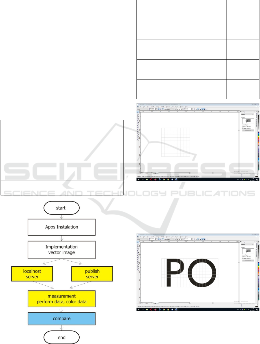
2.2 Flowchart
This study begins with preparing supporting data
such as Windows systems, Word applications,
Excel, PowerPoit, Photoshop, Corel Draw, Anti
Virus Applications as Resident Memory
Applications and several other applications.
Processing of vector images that are run on the
Windows system and printable as a preview.
2.3 Research Procedure
1. Installing systems on computers with various
versions such as Windows XP SP3 systems,
Windows Vista systems and Windows 7 systems and
several other applications such as Microsoft Word,
Microsoft Excel, Microsoft PowerPoint, graphics
applications such as Adobe Photoshop, Corel Draw,
Macromedia Flash, Macromedia Dreamweaver
2. Implementation of this Corel Draw vector
processor is used in localhost first with various
printables such as PDF Viewer and Microsoft Paint.
3. Perform processing processes on localhost, after
running well then publishing to hosting and domain
server like the website.
4. Measurement of proportional PNB symbol data
(P3M, 2017)(P3M, 2021).
5. Comparing the results of data processing in
localhost with data to be published on the website.
Figure 1: Design Block Diagram.
The basic framework of making a Bali State Polytechnic
Corporate Identity in the form of an upright line and
curved line
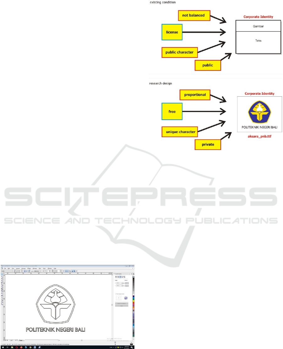
Figure 2: Existing Conditions and Research Design.
3 RESULT AND DISCUSSION
In this study we use the same files to get stability in
measurement. This treatment is carried out on the
same application by distinguishing the use of
typeface characters in the Character Map. Making
characters using the Corel Draw vector processing
application. The results are exported to the TTF or
True Type Font form. Character design uses 9x9
matrix with a total width of 720pt and 720pt height.
3.1 Result Measurement
Each form of letters in an alphabet has a physical
uniqueness that causes our eyes to be able to
distinguish between the letter 'M' with 'P' or 'C' with
'Q'. A group of psychologists from Germany and
Austria in 1900 formulated a theory known as
Gestalt theory. This theory is based on 'pattern
seeking' in human behavior. One of the laws of the
perception of this theory proves that to know or
'read' an image requires a contrast between a positive
space called a figure and a negative space called the
ground.
3.2 Discussions
The first step to study typography is to recognize or
understand the anatomy of the letters. The
combination of all components of a letter is a visual
iCAST-ES 2022 - International Conference on Applied Science and Technology on Engineering Science
514
identification that can distinguish between letters
from one another. If we have understood the anatomy
of the letters well, we can easily recognize the
characteristics and characteristics of each type of
letter. The following is a terminology that is
commonly used in naming every visual component
structured in physical letters.
Every individual letter, number, and punctuation
in typography is called character. The entire
character optically flat to the baseline. Height of the
body of lowercase letters optically flat with x-height.
Each character whether a large or lowercase letter
has a stem (stem) which at the ends can be found
several final lines as a cover called the terminal.
Basically each letter consists of a combination of
various strokes (strokes) which are divided into two,
namely basic stroke and secondary line strokes.
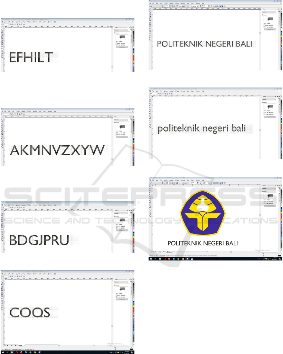
Table 1: Review from Angle.
Geometry Result Figure Result
Flat upright
line
EFHIL
negative curved
angle
BCDGOP
QRSU
Tilted upright
line
AKMNVZ
XYW
negative
rectangular angle
EFHILT
Curved
upright line
BDGJPRU
negative triangle
angle
AKMNV
WXYZ
Curve
COQS
Figure 3: Research Flowchart.
Table 2: Review from Ground.
Geometry Result Figure Result
Flat
upright
line
efhil
negative curved
angle
bcdgopqrsu
Tilted
upright
line
akmnvzxyw
negative
rectangular
angle
efhilt
Curved
upright
line
bdgjpru
negative triangle
angle
akmnvwxyz
Curve
coqs
Figure 4: Character Design.
The odd matrix used to get the middle position on
the object in the form of middle letters with the same
proportional. We use an area of 80 square points
with an area of 720 square points. so there are 72
points of object forming points.
Figure 5: Unique Character.
The unique character that is highlighted and formed
in this study is the letter o in the text of
“POLITEKNIK NEGERI BALI” is really a circle
Bali State of Polytechnic Typography
515
- making object characters from the rectangular
angle of the flat line
Figure 6: Flat Upright Line.
- making object characters from the triangle angle
of the tilted line tilted
Figure 7: Tilted Upright Line.
- making an object character from the arch of the
curved line
Figure 8: Curved Upright Line.
Figure 9: Curve.
Figure 10: Typography from Angle Review.
Figure 11: Typography from Ground Review.
Figure 12: Complete Typography on The Symbol.
4 CONCLUSION
From the progress of the research we have done, it
can be concluded that by means of an understanding
approach that is in accordance with the theory of
geometry, figures and ground, the form of physical
uniqueness of the typeface produced in accordance
with the brand of the Bali State Polytechnic.
Calculation of physical height of letters has an
optical-mathematical principle, in the sense that in
the calculation of numbers, some letters in the
alphabet have different height, but optically the
whole letter looks the same height. Letters that have
curved shapes and taper triangles at the top or lowest
iCAST-ES 2022 - International Conference on Applied Science and Technology on Engineering Science
516

parts of the body will have more fields than letters
that have a flat shape. If some of these letters are
printed side by side, optical similarity will be
achieved.
ACKNOWLEDGEMENTS
This research is supported by P3M PNB, students in
D3 Manajemen Informatika. Also supported by
Smart IT Solusindo, G3 Rumah Produksi and
WAinar Community to tried it this system,
https://arsipdosen.com
REFERENCES
Luthfi, 2014, Corel Draw Media Advertising, Luthfi
Ariesta Sekarlaranti, 2013, Persepsi Konsumen Terhadap
Warna, Typography, Bentuk Grafis dan Gambar Pada
Kemasan Produk Dengan Pendekatan Multidimensial
Scaling. Jurnal Manajemen Teori dan Terapan,
Volume 1, Tahun 2013.
Muhammad Ilham dan Muhammad Fajri, 2021, Motion
Graphic Iklan Layanan Masyarakat Edukasi Tata
Tertib Rambu Lalu Lintas. Journal Of Applied
Multimedia and Networking (JAMN) Volume 5 No 1,
Juli 2021.
Rina Carina, 2019, Penggunaan Huruf Dekoratif Dalam
Tipography Kinetis. Trijurnal, Volume 4 No 1, 2019.
EES, 2006, Kekuatan Garis dan Warna, Elex Media
komputindo, Jakarta
Pendit, Putu Laxman.(2008). Perpustakaan Digital A
sampai Z. Jakarta: Karya Cipta Aksara.
Adi Kusrianto, 2004, Panduan Lengkap Memakai Corel
Draw 12, Elex Media komputindo, Jakarta
Saul Ayuso, Victor Manuel, 2011, Corel Draw 12 Manual,
Editorial CEP, Spanish
Suryanto Thabrani, 2004, Berkreasi Dengan Corel Draw
12, Datakom, Bandung
Chandra, 2003, Menggambar Kartun Dengan Freehand
MX, CV. Maxikom.
Willy Krieg, 2005, Corel Draw 12 Praxis, Kraus Uwe,
German
Pusat Penelitian dan Pengabdian Kepada Masyarakat
Politeknik Negeri Bali, 2021, Rencana Induk
Penelitian (RIP) Politeknik Negeri Bali.
Pusat Penelitian dan Pengabdian Kepada Masyarakat
Politeknik Negeri Bali, (2017). Rencana Induk
Penelitian (RIP) Politeknik Negeri Bali, P3M PNB.
Bali State of Polytechnic Typography
517
