
The Usability of Hidden Functional Elements in Mobile User
Interfaces
Mubashar Munir and Pietro Murano
Department of Computer Science, Oslo Metropolitan University, Postboks 4, St. Olavs plass 0130, Oslo, Norway
Keywords: Usability, Hidden Elements, Mobile User Interfaces, Evaluation.
Abstract: The trend of maximizing mobile screen real estate by hiding user interface features has been in use for some
time. However, there is a lack of empirical knowledge concerning the real usability issues of using this
strategy. In this paper, we present novel and statistically significant evidence to suggest that hiding user
interface elements decreases usability in terms of performance and user experience. We conducted a within-
users experiment comparing identical user interfaces, where the only differences between them were that one
version hid the user interface elements and the other version had all the user interface elements visible to the
user. We recorded task times, errors and user satisfaction for a series of tasks. We also discuss our results in
light of existing user interface design guidelines and show that our results are in harmony with existing
guidelines.
1 INTRODUCTION
In this paper we present the results of an investigation
into the common trend of hiding functional elements
at the user interface for increasing screen real estate
on mobile devices such as smartphones and tablets.
Such hidden elements are typically accessed from
within an app by swiping one of the sides of the
mobile device and then the extra features available in
an app appear on the screen. When not in use, or if
one swipes in the opposite direction of access, these
disappear again from the user interface.
While this solution typically maximises the screen
real estate available, it reduces the overall usability of
an app, because users need to remember where the
features are and are required to make more interaction
touches to interact with the app. Frequent use of such
apps will likely ensure users can remember how to
access such features in the future. However, this may
not be the case for infrequent use of such an app.
Also, forcing users to swipe from a side in order to
access other app features could increase task times
and errors while also reducing user satisfaction.
Therefore, the authors of this paper investigated
the issue of hiding features within an app with a view
to maximizing screen real estate. This was done
specifically in relation to effects on task time, errors
and user satisfaction. To our knowledge this direct
and specific investigation has not been done before
and closes an important gap in knowledge.
In the following sections we discuss some
background literature related to this investigation.
Then our experiment and results are presented.
Finally, some discussions and conclusions conclude
the paper.
2 BACKGROUND
The issue of screen real estate available on a mobile
device has been studied for some time. Clearly,
smaller screens incur interaction challenges and
therefore researchers have tried many strategies to
overcome the issue of small screens or less screen real
estate.
Gomes, Priyadarshana, Visser, Carrascal and
Vertegaal (2018) explored the area of using flexible
displays that are held in a roll shape, but which can
then be unrolled to reveal a tablet-sized screen, thus
giving more screen-real estate than with most
conventional smartphones. The authors concluded
that tasks involving navigation were intuitive with
their prototype device. Their set of participants
seemed to indicate that the shape of their device could
improve grasping when compared with a telephone
shape.
256
Munir, M. and Murano, P.
The Usability of Hidden Functional Elements in Mobile User Interfaces.
DOI: 10.5220/0011827700003467
In Proceedings of the 25th International Conference on Enterprise Information Systems (ICEIS 2023) - Volume 2, pages 256-263
ISBN: 978-989-758-648-4; ISSN: 2184-4992
Copyright
c
2023 by SCITEPRESS – Science and Technology Publications, Lda. Under CC license (CC BY-NC-ND 4.0)

Concerning small screens and touch interaction,
Butler, Izadi and Hodges (2008) tried to look at the
issue of the fingers potentially occluding some of the
already small screen area on most mobile devices
during an interaction. Their approach was to trial
‘infra-red proximity sensors embedded along each
side’ (Butler et al, 2008) of the mobile device. This
enabled detection and positioning of the fingers in
nearby areas of the screen, effectively increasing the
interaction zone size. Although rigorous evaluation
was not reported by the authors, the concept is
interesting.
Further, Song, Sörös, Pece, Fanello, Izadi, Keskin
and Hilliges (2014) developed an algorithm which
would recognize in-air gestures using only the
standard camera found on a mobile device. The idea
was to maximise the screen real estate available by
including the possibility of in-air gestures in the
proximity of the mobile device. This would also
somewhat alleviate issues of finger occlusion during
interaction. Their comparative evaluation consisting
of touch interaction only versus touch and in-air
gestures, suggested that interacting with a mobile
device where touch and in-air gestures were available
simultaneously is statistically significantly faster.
Informal evaluation with a few individuals also
suggested that users were mostly positive towards
using in-air gestures for interaction.
Byrd and Caldwell (2009) compared 2.8”, 3.5”
and 7” screen sizes. While not all results produced
significant outcomes, the overall trend showed that
larger screen sizes produced faster task times and
shorter screen access times. Differences in errors for
each screen size were not statistically significant.
This gave users a larger input area, particularly if the
device rested on a surface.
Also, Wang, Hsieh and Paepcke (2009)
investigated the option of deliberately hiding files (or
content) out of sight on a small screen device.
Content, such as photographs, etc. could be placed in
virtual ‘piles’ away from the main screen real estate,
but available by accessing the sides of the screen,
through small visual cues located at the sides of the
screen. These represented distinct ‘piles’ of content,
e.g. photographs or categories of photographs, etc.
Although the concept suggested is interesting, it
forces users to rely on their memory. It also raises
doubts concerning the length of time it would take
users to forget (or partially forget) what each ‘pile’
contains. There is also lack of evidence concerning
the optimum amount of ‘piles’ a user should use,
before increased quantities of ‘piles’ would become
easier to forget.
This brief consideration of previous works shows
that a lot of effort has been expended over the years
in trying to deal with the basic issue of mobile devices
having very limited screen real estate.
However, the main solution that has been adopted
in recent years is to hide as many of the user interface
elements as possible so as to maximise the use of the
physical dimensions available of mobile devices.
However, as will be seen from the evidence presented
below, this is not the best option in terms of usability.
Therefore, in the next section we present detailed
information on the experiment we conducted in
relation to hidden user interface elements.
3 EXPERIMENT
3.1 Experiment Introduction
In order to evaluate the usability of hiding functional
elements on a mobile user interface it was decided to
use a mobile camera-type application as the main
context. The mobile camera was chosen for several
reasons. (1) As far as we know all new or not so old
smartphones include one or more cameras. (2) The
camera application on a smartphone is one which
often contains several functionalities that can be
tailored or adopted by users and is therefore suitable
for an experiment and a series of realistic tasks which
would be ecologically valid. (3) Camera usage on
smartphones is very common amongst users. Already
in 2017, one survey indicated that 85% of all digital
photographs were taken with a smartphone (Richter,
2017).
We chose to use an empirical experiment with
hypotheses (Lazar, Feng and Hochheiser, 2017),
rooted in the hypothetico-deductive approach.
However, our experiment also contained a more
qualitative side to it, by using a questionnaire, with a
Likert-type scale (Likert, 1932) to elicit participant
opinions. The main reasons for this, were that we
wanted to conduct the study in controlled conditions
in order to collect precise numerical data, whilst at the
same time collecting some qualitative data. We felt
this approach was more useful than having a
completely quantitative or completely qualitative
approach. Furthermore, this is an approach that has
been used in previous research to good effect (e.g.
Shrestha and Murano (2022), Keya and Murano
(2022) and Shrestha and Murano (2016)).
The Usability of Hidden Functional Elements in Mobile User Interfaces
257

3.2 Experiment Hypotheses
In our design of the experiment, we devised a series
of two-tailed hypotheses. These are as follows:
H1 - There will be a statistically significant difference
between the two developed prototypes in terms of
task times.
H1
0
– There will be no statistically significant
difference between the two developed prototypes in
terms of task times.
H2 - There will be a statistically significant difference
between the two developed prototypes in terms of
user errors.
H2
0
- There will be no statistically significant
difference between the two developed prototypes in
terms of user errors.
H3 - There will be a statistically significant difference
between the two developed prototypes in terms of
user satisfaction.
H3
0
- There will be no statistically significant
difference between the two developed prototypes in
terms of user satisfaction.
3.3 Users
In this experiment 20 participants were recruited
within varied age ranges (21-30 years – 9 participants,
31-40 years – 6 participants, 41-50 years – 3
participants, 51-60 years – 2 participants). Our
sample of participants consisted of 10 males and 10
females.
All the participants had in common that they were
familiar in advance in using a camera application.
Overall, all participants were competent in the use of
mobile devices/computers.
These common aspects of knowledge amongst the
sample ensured that the overall sample was relatively
homogeneous. This was important especially as some
of the data collected could have been biased by overly
novice or overly experienced participants, e.g. the
timings and errors recorded.
All ethical considerations concerning human
participants were implemented in line with
Norwegian guidelines for such research.
3.4 Design
For this experiment, a within-users experimental
design was chosen. The main reason for this choice
was that it allowed each participant to experience
both user interface types and thus evaluate their
experiences based on having interacted with two
different user interfaces.
3.5 Variables
The independent variables were the two user
interfaces being evaluated and the specific tasks used
in connection with the user interfaces.
The dependent variables were in connection with
performance and user satisfaction.
The dependent measures were the time to
complete a task and the number of errors. Errors were
simply defined as a participant not completing a task.
A post-experiment questionnaire with six specific
user experience-type questions was used to reveal
some details on user satisfaction.
3.6 Tasks
The tasks were designed to be as realistic as possible
within a camera application. The five tasks we
designed were: To capture a picture, To adjust the
"Zoom Level", To turn off the "Flash", To open the
"Settings" and To adjust the "Auto White Balance"
AWB. Therefore, each prototype had five working
options – one for each task. During the experiment the
tasks were executed by participants in the same order
as listed here.
The appearance of the two prototypes used is
shown in Figure 1.
3.7 Procedure
The experiment was conducted in three main stages.
The first stage welcomed the participants and at this
point participants signed a consent form (Note: the
experiment met ethical standards for Norway) in
relation to having read an information sheet
concerning the research.
The second stage consisted of carrying out the
tasks, as described in the previous section. During this
stage the participants were observed for their
interactions and the results of each task were recorded
on a spreadsheet.
The third and final stage involved the participants
completing a post-experiment questionnaire, which
elicited opinions concerning the experiences they had
had in using the two different prototypes.
The next section will present the results of the
statistical analysis on the collected data.
ICEIS 2023 - 25th International Conference on Enterprise Information Systems
258
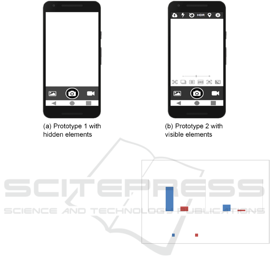
Figure 1: The Final Design of the Prototypes.
4 RESULTS
In this section we present the results of a statistical
analysis on the data collected and described earlier in
this paper. The main aim was to determine the
presence of any statistical significance.
The data was initially analysed using the Shapiro-
Wilk test, which indicated that the data was
parametric in nature and therefore suitable to be
analysed further with a parametric significance test.
For the data we chose a t-test. We have chosen to
show in this section the precise figures for the means,
standard deviations, t-tests and p values for readers
interested in the details. However, we also present the
means and standard deviations in graphical format to
allow readers who wish only a quick overview to
achieve this.
Task Time: Overall task time (minutes and
seconds) was recorded as the total time taken for all
tasks on each prototype by a participant.
Descriptive statistics show that the Mean (M) task
time in using Prototype 1 with the hidden elements is
M = 1.1470, Standard Deviation (SD) = .2215 and the
Mean task time in using Prototype 2 with the visible
elements is M = .3095, SD = .0697. The t-test result
is t = 18.142, p < .001. This shows a highly significant
difference in the overall task times, where the
prototype with visible elements was significantly
faster to use to complete the designated tasks. Figure
2 displays the means and standard deviations for the
task times.
Figure 2: Means and Standard Deviations for Task Times.
Number of Errors: As discussed above, errors
were defined as a failure to complete a task. One error
in performing a task was counted as a failure. A total
of 15 errors were observed for prototype 1 with
hidden elements, and there were no errors observed
for prototype 2 with visible elements.
Descriptive statistics show that the Mean (M)
number of errors incurred in using Prototype 1 with
the hidden elements is M = .75, SD = .550 and the
Mean number of errors incurred in using Prototype 2
with the visible elements is M = 0, SD = 0. The t-test
result is t = 6.097, p < .001. This shows a highly
significant difference in the overall error rate, where
the prototype with visible elements was significantly
better at helping users avoid making errors. Figure 3
displays the means and standard deviations for the
errors made during the tasks.
1,147
0,3095
0,2215
0,0697
PROTOTYPE HIDDEN
ELEMENTS
PROTOTYPE VISIBLE
ELEMENTS
TASK TIMES
Mean Standard Deviation
The Usability of Hidden Functional Elements in Mobile User Interfaces
259

Figure 3: Means and Standard Deviations for the Errors
Made During the Tasks.
User Satisfaction: In order to find out
participants’ opinions regarding user satisfaction, a
seven-question questionnaire was designed. Each
question was asked for each user interface version
and the scores for each pair were statistically analysed
for significant differences. Each question in the
questionnaire used a Likert-type scale ranging from 1
to 5 (Strongly Disagree = 1, Disagree = 2, Neutral =
3, Agree = 4, Strongly Agree = 5). Higher scores
indicated higher user satisfaction.
Question 1 concerned the user interface being
easy to interact with. Descriptive statistics show that
the Mean (M) response for Prototype 1 with the
hidden elements is M = 2.60, SD = 1.353 and the
Mean response for Prototype 2 with the visible
elements is M = 4.40, SD = 1.273. The t-test result is
t = -3.488, p = .002. This shows a statistically
significant difference in overall opinions, where the
prototype with visible elements was rated
significantly easier to interact with. Figure 4 displays
the means and standard deviations for the user
interface being easy to interact with.
Figure 4: Means and Standard Deviations for the User
Interface Being Easy to Interact With.
Question 2 concerned how easy it was to
remember the commands. Descriptive statistics show
that the Mean (M) response for Prototype 1 with the
hidden elements is M = 2.45, SD = 1.356 and the
Mean response for Prototype 2 with the visible
elements is M = 3.85, SD = 1.226. The t-test result is
t = -2.692, p = .01. This shows a statistically
significant difference in overall opinions, where the
prototype with visible elements was rated
significantly easier for one to remember the
commands. Figure 5 displays the means and standard
deviations for the ease of remembering the
commands.
Figure 5: Means and Standard Deviations for the Ease of
Remembering the Commands.
Question 3 concerned the tasks being easy to
complete on the interface. Descriptive statistics show
that the Mean (M) response for Prototype 1 with the
hidden elements is M = 3.25, SD = 1.209 and the
Mean response for Prototype 2 with the visible
elements is M = 4.50, SD = 1.147. The t-test result is
Figure 6: Means and Standard Deviations for the Ease of
Completing the Tasks at the User Interface.
0,75
0
0,55
0
PROTOTYPE HIDDEN
ELEMENTS
PROTOTYPE VISIBLE
ELEMENTS
ERRORS
Mean Standard Deviation
2,6
4,4
1,353
1,273
PROTOTYPE HIDDEN
ELEMENTS
PROTOTYPE VISIBLE
ELEMENTS
USER INTERFACE EASY TO
INTERACT WITH
Mean Standard Deviation
2,45
3,85
1,356
1,226
PROTOTYPE HIDDEN
ELEMENTS
PROTOTYPE VISIBLE
ELEMENTS
EASE OF REMEMBERING
COMMANDS
Mean Standard Deviation
3,25
4,5
1,209
1,147
PROTOTYPE HIDDEN
ELEMENTS
PROTOTYPE VISIBLE
ELEMENTS
EASE OF COMPLETING THE
TASKS WITH THE USER
INTERFACE
Mean Standard Deviation
ICEIS 2023 - 25th International Conference on Enterprise Information Systems
260
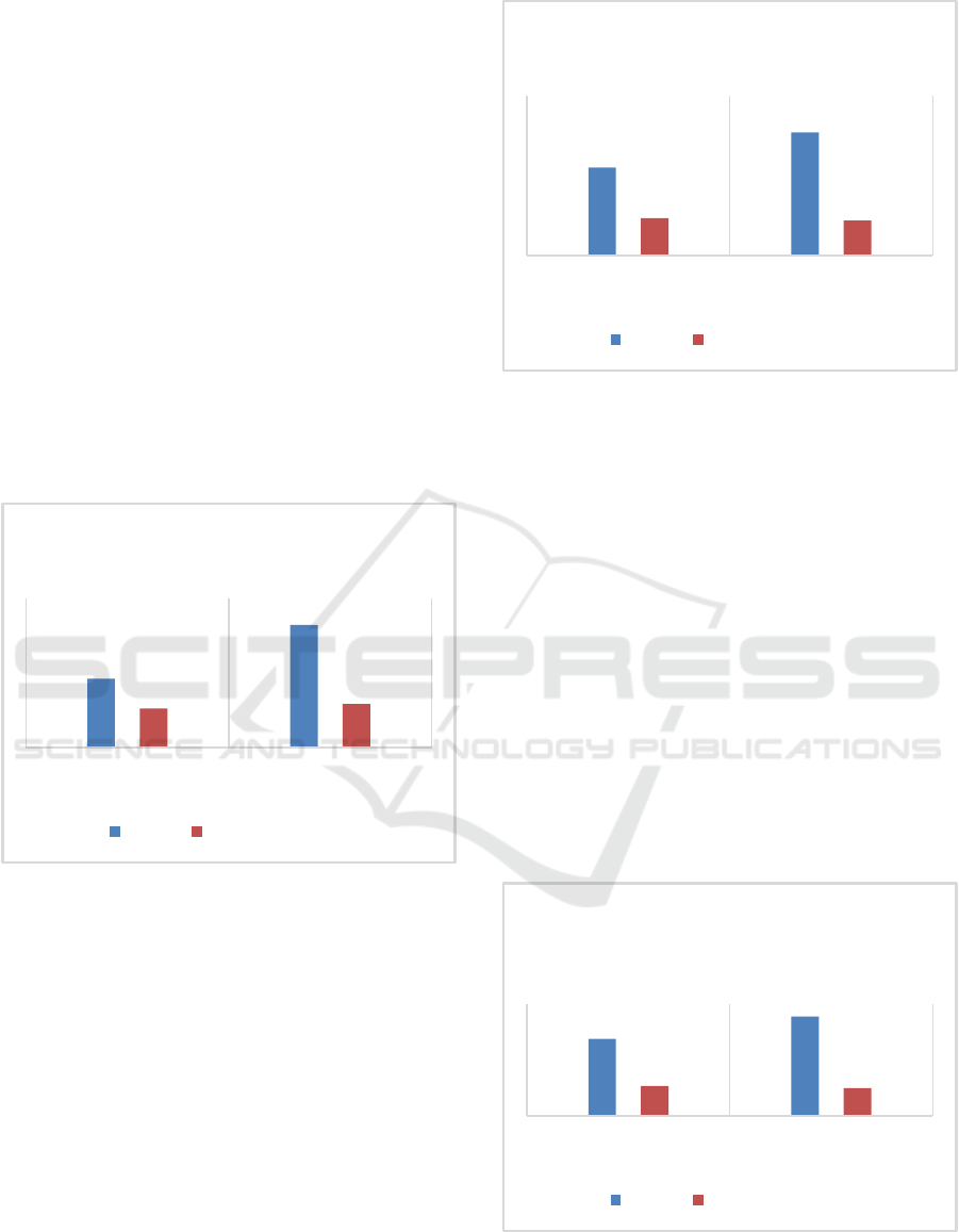
t = -3.101, p = .006. This shows a statistically
significant difference in overall opinions, where the
prototype with visible elements was rated
significantly easier for the tasks used in the
evaluation. Figure 6 displays the means and standard
deviations for the ease of completing the tasks at the
user interface.
Question 4 concerned the clarity of one finding a
desired option/command. Descriptive statistics show
that the Mean (M) response for Prototype 1 with the
hidden elements is M = 2.30, SD = 1.302 and the
Mean response for Prototype 2 with the visible
elements is M = 4.10, SD = 1.447. The t-test result is
t = -3.214, p = .005. This shows a statistically
significant difference in overall opinions, where the
prototype with visible elements was rated
significantly clearer in terms of finding a particular
option or command. Figure 7 displays the means and
standard deviations for the clarity in finding a desired
option/command.
Figure 7: Means and Standard Deviations for the Clarity in
Finding a Desired Option/Command.
Question 5 concerned feelings of comfort with
hidden elements or visible elements. Descriptive
statistics show that the Mean (M) response for
Prototype 1 with the hidden elements is M = 2.75, SD
= 1.164 and the Mean response for Prototype 2 with
the visible elements is M = 3.85, SD = 1.089. The t-
test result is t = -2.463, p = .02. This shows a
statistically significant difference in overall opinions,
where the prototype with visible elements was rated
as significantly more comfortable in featuring visible
user interface elements. Figure 8 displays the means
and standard deviations for the feelings of comfort
with hidden elements or visible elements.
Figure 8: Means and Standard Deviations for the Feelings
of Comfort With Hidden Elements or Visible Elements.
Question 6 concerned feelings of comfort with
the app interface using maximum screen space by
hiding elements or the app interface occupying more
screen space for displaying commands/options.
Descriptive statistics show that the Mean (M)
response for Prototype 1 with the hidden elements is
M = 2.75, SD = 1.070 and the Mean response for
Prototype 2 with the visible elements is M = 3.55, SD
= .999. The t-test result is t = -2.270, p = .03. This
shows a statistically significant difference in overall
opinions, where the prototype with visible elements
was rated as significantly more comfortable despite
having less screen real estate available due to
displaying options/commands (rather than hiding
them). Figure 9 displays the means and standard
deviations for the feelings of comfort with the app
interface screen space.
Figure 9: Means and Standard Deviations for the Feelings
of Comfort With the App Interface Screen Space.
2,3
4,1
1,302
1,447
PROTOTYPE HIDDEN
ELEMENTS
PROTOTYPE VISIBLE
ELEMENTS
CLARITY IN FINDING AN
OPTION/COMMAND
Mean Standard Deviation
2,75
3,85
1,164
1,089
PROTOTYPE HIDDEN
ELEMENTS
PROTOTYPE VISIBLE
ELEMENTS
FEELINGS OF COMFORT WITH
HIDDEN/VISIBLE ELEMENTS
Mean Standard Deviation
2,75
3,55
1,07
0,999
PROTOTYPE HIDDEN
ELEMENTS
PROTOTYPE VISIBLE
ELEMENTS
FEELINGS OF COMFORT WITH
THE APP INTERFACE SCREEN
SPACE
Mean Standard Deviation
The Usability of Hidden Functional Elements in Mobile User Interfaces
261

Question 7 asked participants to make one choice
regarding which of the two user interface types they
would prefer to use. In line with the responses of the
previous six questions participants overwhelmingly
(80%) responded that they would choose the user
interface where the user interface elements were
displayed (not hidden). The other 20% of the sample
would choose the user interface where the elements
were hidden from view.
This section has presented detailed results in
terms of performance in carrying out representative
tasks and user opinions. In the next section we discuss
how real-world use of our findings would improve the
usability of mobile interaction.
5 DISCUSSION
The results detailed in the previous section are quite
clear and categorical. We have novel and significant
results. All the performance and user perception
aspects we investigated show clearly that hidden user
interface elements perform much more poorly and are
strongly disliked when compared with an equivalent
counterpart that does not hide any of the elements. To
our knowledge no other studies have directly and
specifically investigated by direct empirical
comparison the hiding of user interface elements for
increasing screen real estate. Further, the results
should be a clear signal to all user interface designers
that hiding user interface elements is not the best way
forward.
Therefore, our three positive hypotheses (see
Experiment Hypotheses section above) which related
to task times, user errors and user satisfaction are all
accepted. In each of the three cases we observed,
categorically statistically significant figures to
suggest that in all three areas under investigation the
visible elements perform significantly better and are
significantly preferred over a version of a user
interface designed to have invisible elements.
The results of this investigation are also very
much in line with current knowledge of user interface
design. For example, Nielsen’s Heuristics (Nielsen,
2020), which can be used in an evaluative process
and/or a design process suggest in Heuristic 6 to use
‘Recognition rather than recall’ (Nielsen, 2020). In
further explaining this, we are encouraged to
‘Minimize the user's memory load by making
elements, actions, and options visible. The user
should not have to remember information from one
part of the interface to another. Information required
to use the design (e.g. field labels or menu items)
should be visible or easily retrievable when needed.
(Nielsen, 2020) (see also Budiu, (2014))’ This
suggests that hiding necessary elements of an app in
order to have more screen real estate is not the best
option as it forces users to remember where
everything is.
Furthermore, the International Organization for
Standardization (ISO) provides support for the
findings in this investigation and Nielsen’s
Heuristics. The ISO 9241-110:2021 (International
Organization for Standardization, 2021) concerns
Interaction Principles. Sub-section 5.4.1 under the
Learnability section outlines various principles
related to Discovery. One of these is that ‘the
interactive system supports discovery of its
capabilities and how to use them, allows exploration
of the interactive system, minimizes the need for
learning and provides support when learning is
needed. (International Organization for
Standardization, 2021)’. We would suggest that
hiding user interface features, etc. does not support
discovery or learning.
6 CONCLUSIONS
The trend over recent years to maximise at all costs
the screen real estate for mobile devices is probably
unnecessary, as suggested by our investigation and
well-established guidelines and principles. Even
though human users are generally good at adapting to
different modes of interaction, e.g. in remembering
where hidden options are within an app, we would
argue that this does not justify bad usability practices
and bad user interface design.
It is acknowledged that there needs to be a trade-
off between screen real estate and making all
elements (e.g. app features, settings and/or navigation
etc.) visible. However, the trend to hide everything is
not the best option given our investigation results and
the well-established user interface design principles.
However, more and better design decisions should
lead designers to not hiding everything, but to making
at least the most important aspects visible. This
clearly suggests that some elements would continue
to be hidden. If that would be the case, better user
interface cues that do not use much screen space
could be adopted to let users know there are other
options available.
Future work in this area would benefit by
investigating the option of using user interface cues
to inform a user that other elements are available.
However, our suggestion is that if the number of
elements are not too numerous, these should always
be visible by default, with perhaps an easy option to
ICEIS 2023 - 25th International Conference on Enterprise Information Systems
262

make them invisible for experienced users. Further,
this investigation did not specifically look at the
effects on human memory (short or long term
memory) in relation to hiding/making visible user
interface elements. Future work could also focus on
this aspect and provide useful insights into these
approaches.
REFERENCES
Budiu, R. (2014) Memory Recognition and Recall in User
Interfaces,
https://www.nngroup.com/articles/recognition-and-
recall/
Butler, A., Izadi, S. and Hodges, S. (2008) SideSight:
Multi-“touch” Interaction Around Small Devices, UIST
'08: Proceedings of the 21st annual ACM symposium
on User interface software and technology, October
2008, P. 201–204.
Byrd, K.S and Caldwell, B.S. (2009) From UMPCs to Cell
Phones: How Does Diminishing Screen Real Estate
Affect Screen Access and Working Memory?,
Proceedings of the Human Factors and Ergonomics
Society 53rd Annual Meeting.
Gomes, A., Priyadarshana, L.L., Visser, A., Carrascal, J.P.
and Vertegaal, R. (2018) MagicScroll: A Rollable
Display Device With Flexible Screen Real Estate and
Gestural Input, MobileHCI'18, September 3-6,
Barcelona, Spain, ACM.
International Organization for Standardization (2021)
Ergonomics of Human-System Interaction - Part 110:
Interaction Principles (ISO 9241-110:2021).
Keya, R. T. and Murano, P. (2022) Is Carousel Interaction
Really Usable?, First Monday, Volume 27, Issue 1,
January 2022.
Lazar, J., Feng, J. H. and Hochheiser, H. (2017). Research
Methods in Human-Computer Interaction, Morgan
Kaufmann.
Likert, R. (1932) A technique for the measurement of
attitudes. Archives of psychology, number 140. New
York: Science Press.
Nielsen, J. (2020) 10 Usability Heuristics for User Interface
Design, https://www.nngroup.com/articles/ten-usabi
lity-heuristics/
Richter, F. (2017) Smartphones Cause Photography Boom,
Statista, Aug 31, https://www.statista.com/chart/10913/
number-of-photos-taken-worldwide/
Shrestha, S. L and Murano. (2022) The Design and
Evaluation of an Online Dictionary User Interface -
PDF, International Journal of Computing and Digital
Systems, Volume 1, March 2022.
Shrestha, S. and Murano, P. (2016). A Universally
Designed and Usable Data Visualization for A Mobile
Application in the Context of Rheumatoid Arthritis.
International Journal of Advanced Computer Science
and Applications, Vol. 7, Issue 12, December.
Song, J., Sörös, G., Pece, F., Fanello, S.R., Izadi, S.,
Keskin, C. and Hilliges, O. (2014) In-air Gestures
Around Unmodified Mobile Devices, UIST '14:
Proceedings of the 27th annual ACM symposium on
User interface software and technology, October 2014,
P. 319–329.
Wang, Q.Y., Hsieh, T. and Paepcke, A. (2009) Piles Across
Space: Breaking the Real-Estate Barrier on Small-
Display Devices, International Journal of Human-
Computer Studies 67 (2009) 349–365.
The Usability of Hidden Functional Elements in Mobile User Interfaces
263
