
GenExViz: Effective Visualizations of Bioinformatics Data - An Analysis
Studies on Cancer Prevention
Tommy Dang
a
Department of Computer Science, Texas Tech University, Lubbock, Texas, U.S.A.
Keywords:
Data Visualization, Parallel Coordinates, Multidimensional Projections, Bar Charts, Bubble Charts, Network
Visualization, Bioinformatics, Cancer Prevention.
Abstract:
Data visualization plays an essential role in analyzing bioinformatics as it can provide a holistic view of the
data, facilitate high-dimensional biological data analysis, and uncover the latent relations between proteins.
However, current methods can not deal with large and complex multidimensional bioinformatics data. This
paper explores the novel marriage of data visualization and user interface for analyzing large gene expression
data generated under different tested conditions. In particular, we focus on analyzing and visualizing the gene
networks of cancer pathways. Although our work focuses on analyzing cancer datasets, our methodology has
more general implications for other bioinformatics data sets in a similar setup.
1 INTRODUCTION
Gene expression data captures the expression levels
(under-expressed vs. over-over-expressed) under dif-
ferent controlled conditions compared to the natural,
non-mutated form (wild type). For example, plant
genomics and genetics scientists, who would like to
identify genes that control important agronomic traits,
are interested in measuring gene behaviors of plants
under different environments, such as high phosphate
supply, low pH soil, and knockout mutant background
for the transcription factor. In another example, can-
cer researchers, who would like to study suppression
of malignancy in p53 knockout mice for curing can-
cer, are interested in measuring gene behaviors of dif-
ferent cross-bred mice monitored in multi-replicates
of mice in both normal and test conditions (Awasthi
et al., 2018).
Analyzing gene expression data is challenging due
to the data size: a large number of genes (usually
represented by rows in the data) versus the num-
ber of tested conditions (traditionally represented by
columns in the data). The gene expression data needs
to be normalized across tested conditions prior to ap-
plying the analysis methods. In this work, we intro-
duce a set of different visual representations for var-
ious analysis tasks. Hence, our contributions can be
summarized as the following:
a
https://orcid.org/0000-0001-8322-0014
• We study and narrow down a small set of analysis
tasks for gene expression data through close col-
laborations with experts in cancer drug develop-
ment and stress tolerance mechanisms in plants.
• We design and implement various visualization
tools to support these analysis tasks focusing on
highlighting the highly expressed genes. We also
provide effective ways to interact and navigate a
large amount of data.
• We demonstrate the visualization tools on various
data and visual examples to show the effectiveness
of the proposed techniques.
In this paper, we start with the related visualiza-
tions in Section 2. We then introduce the require-
ments, the analysis tasks, and the methodology of our
work in Section 3. Next, we provide the use cases
with visual explanations in Section 4. Finally, the
summary and conclusion are given in Section 5.
2 RELATED WORK
In this section, we do not ambitiously survey all gene
analysis tools. Instead, we will focus on the most re-
lated techniques. Uchida and Itoh (Uchida and Itoh,
2009) introduced a visualization tool for monitoring a
large number of time series values. It employs cluster-
ing algorithms to better represent the data as polylines
Dang, T.
GenExViz: Effective Visualizations of Bioinformatics Data - An Analysis Studies on Cancer Prevention.
DOI: 10.5220/0011903200003414
In Proceedings of the 16th International Joint Conference on Biomedical Engineering Systems and Technologies (BIOSTEC 2023) - Volume 3: BIOINFORMATICS, pages 301-308
ISBN: 978-989-758-631-6; ISSN: 2184-4305
Copyright
c
2023 by SCITEPRESS – Science and Technology Publications, Lda. Under CC license (CC BY-NC-ND 4.0)
301

to improve readability without losing much informa-
tion. The tool also provides sketch and click options
that come in handy when users need to choose sim-
ilar time-series patterns for further analysis. Cloud-
Lines (Krstajic et al., 2011) allows the detection of
visual clusters in limited space of multiple time se-
ries and also can handle incremental data coming in
different time frames. Parallel coordinates (Inselberg,
1985) is another well-known visualization technique
for analyzing multivariate data. Several comprehen-
sive surveys have been conducted on classifying and
evaluating the parallel coordinates techniques (Jo-
hansson and Forsell, 2015). The authors present the
comparisons on variations of parallel coordinates and
discuss the integration with other visual methods.
M
¨
uller and Schumann provided a quick survey on
time series visualization in terms of static, dynamic,
and event-based visualization techniques (M
¨
uller and
Schumann, 2004). In their work, they mentioned
some visual representations that do not automatically
change over time, such as Stacked Bar charts, Paral-
lel Coordinates, as well as some time-dependent tech-
niques, such as ThemeRiver and TimeWheel. In an-
other work, Aigner at el. made another comprehen-
sive overview of popular types of time and presented
visual examples (Aigner et al., 2008) regarding three
aspects, namely visualization, analysis, and user. The
author also created an online website for quick ac-
cess to hundreds of techniques in time series visual-
ization (survey, ).
3 RESEARCH METHODOLOGY
3.1 Data Normalization
There is a variety of normalization methods, such
as Gene length normalization, Library size nor-
malization, Upper Quartile (UQ), Trimmed Mean
of M-values (TMM), and Relative Log Expression
(RLE) (Abbas-Aghababazadeh et al., 2018). In this
paper, we focus on some most popular approaches.
The first technique is the TMM normalization im-
plemented in the edgeR package (Robinson et al.,
2009). The second method is the RLE normaliza-
tion introduced in the DESeq2 package (Love et al.,
2014). These normalization methods were adequately
described step by step in Maza’s work (Maza, 2016).
They have been shown to return results of similar
quality with both real and simulated data sets and out-
perform other approaches (Reddy, 2015). Moreover,
some new normalization techniques have been carried
out by iterating one of these methods (Tang et al.,
2015). After using one of the normalization meth-
ods mentioned above, we apply one more normaliza-
tion step using linear normalization for visualization
purposes. The final values range from 0 to 1, inclu-
sively. Other normalization methods, such as z-score
normalization, can be naturally adopted into our visu-
alization without significant modifications.
In our project, the cancer researcher provided the
collected data containing replicates of mice genetics
in wild-type vs. controlled conditions for malignancy
in p53 knockout. Prior to the analysis, we applied
the standardized expression methods from the RNA-
Seq data, such as DESeq2 (Love et al., 2014). More
thoughtful normalization techniques can be found in
this journal publication (Abbas-Aghababazadeh et al.,
2018).
3.2 Analysis Tasks
Through weekly conversations with the cancer re-
searchers, we have narrowed down a smaller
list of analysis tasks following Shneiderman’s
mantra (Shneiderman, 1997) “overview first, zoom
and filter, and then details-on-demand”:
• T1: Overview first: Provide an overview visu-
alization of all genes vs. all controlled condi-
tions (Keim, 2002).
• T2: Zoom and Filter: Provide navigation and fil-
tering tool for the focus view (Hochheiser and
Shneiderman, 2004).
• T3: Details on Demand: Users can request nu-
merical data when needed (Amar et al., 2005).
• T4: Compare gene expression levels on various
controlled condittions (Pham et al., 2020).
• T5: Group genes of similar behaviors using clus-
tering algorithms (Hartigan, 1975).
In the next session, we will explore various tools as-
sociated with these analysis tasks. The visualization
tools that we investigated extend from simple charts,
such as bar chart or bubble charts, to more compli-
cated visual representation of multidimensional data,
such as parallel coordinates or multidimensional pro-
jections.
4 VISUALIZATION TOOLS
4.1 Parallel Coordinates
Parallel coordinates are a popular method of visualiz-
ing high-dimensional data. In particular, a gene is rep-
resented as a polyline; the polyline meets the parallel
axes (represented for different controlled conditions)
BIOINFORMATICS 2023 - 14th International Conference on Bioinformatics Models, Methods and Algorithms
302
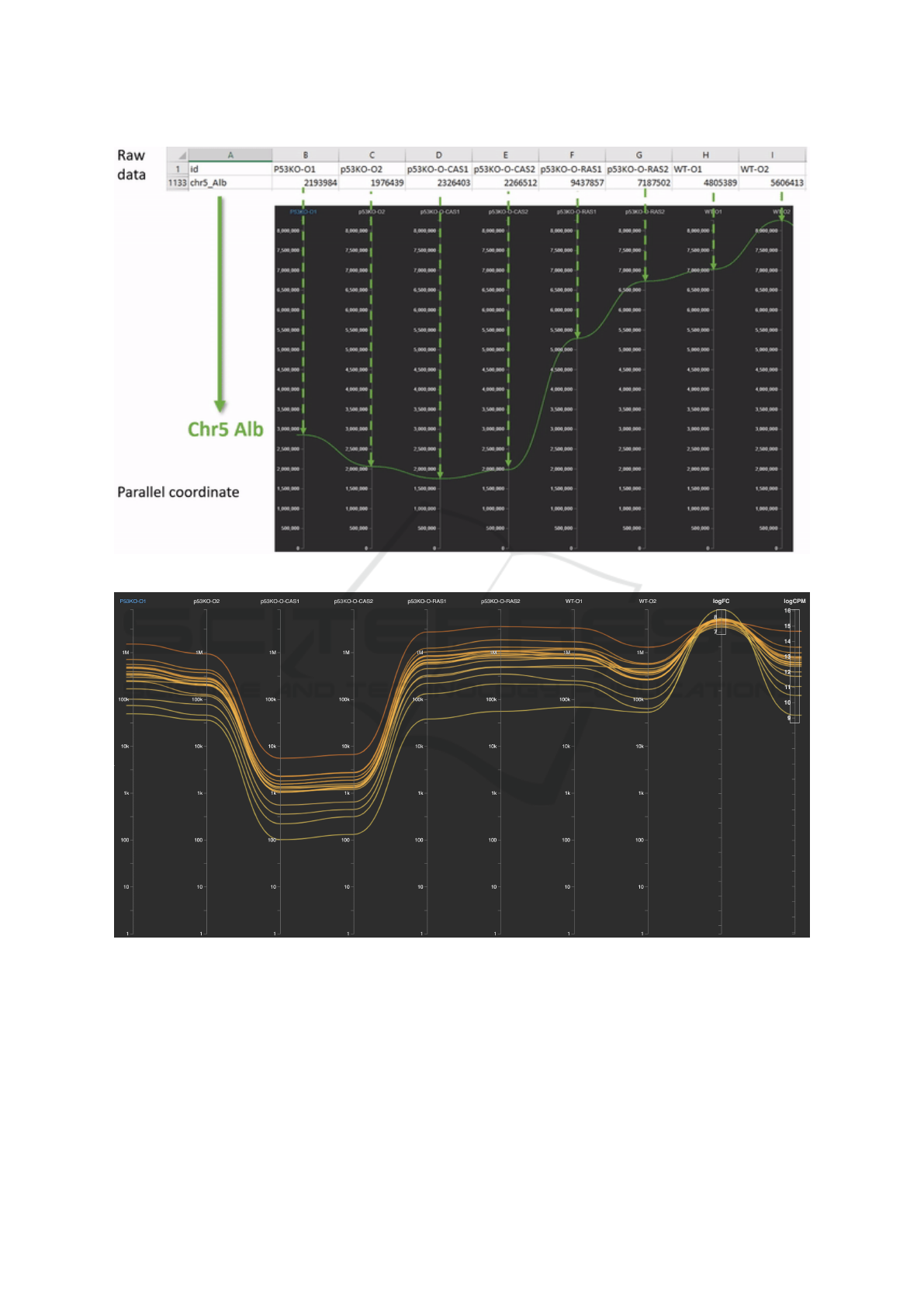
Figure 1: Parallel coordinate representation of the sample gene Chr5 Alb: the green curve travels from left to right.
Figure 2: Apply filtering on parallel coordinates, we obtain 18 genes with similar behaviors across all dimensions: genes are
colored by the expression level on the first condition (P53KO-O1) as highlighted in blue.
at the altitudes corresponding to the expression value
in that controlled condition. Figure 1 shows an exam-
ple gene Chr5 Alb and its expression data (in green)
in parallel coordinates.
By applying filters (Analysis task T2) on the last
two columns in Figure 2, we obtain 18 curves as-
sociating to 18 genes with similar behaviors across
all dimensions. As depicted below for Analysis task
T4, the expression levels on P53KO-O, P53KO-RAS,
and WT-O (wild type) are significantly higher than
p53KO-O-CAS (the third and fourth columns).
GenExViz: Effective Visualizations of Bioinformatics Data - An Analysis Studies on Cancer Prevention
303
4.2 Bar Charts
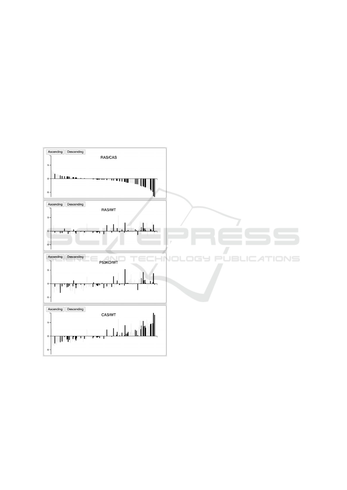
For detailed comparisons of gene behaviors on vari-
ous tested conditions, the side-by-side bar charts can
be used (Analysis task T4). As depicted in Figure 3,
genes are organized from left to right; the heights of
the bars represent the expression levels; downward
bars are down-regulated genes, while upward bars are
up-regulated genes. Moreover, genes can be ordered
from left to right by one of the bar charts as depicted
on the top panel of Figure 3. This allows users to
compare the gene expression data across various con-
trolled conditions.
Figure 3: Bar charts of expression data of 20,450 genes:
Highlighted genes are from the KEGG cancer pathway.
These bar charts can be linked to other visualizations ex-
plained in this paper.
In this example, we highlighted the genes from the
Breast cancer pathway obtained from KEGG (Kane-
hisa et al., 2020). Note that the gene expression levels
of the first and last panels are correlated, while the
second and the third are independent.
4.3 Multidimensional Projection
Multidimensional projections are popular methods
for reducing high-dimensional data onto lower-
dimensional planes (Dang and Nguyen, 2022). A
comparison between many nonlinear projection tech-
niques on biological data (Becht et al., 2019) shows
that t-distributed Stochastic Neighbourhood Embed-
ding (t-SNE) tends to ignore the global structure of
the dataset and spread the low-density areas. Large
t-SNE (Van Der Maaten and Hinton, 2008) clusters
are less dense than the smaller ones, while the den-
sity of Uniform Manifold Approximation and Pro-
jection (UMAP) clusters is more uniform. Besides,
UMAP (McInnes et al., 2018) is also a faster algo-
rithm compared to t-SNE for large biological datasets.
Besides t-SNE and UMAP, we also applies other di-
mension reduction techniques for projecting the high-
dimensional. We found that Principal Component
Analysis, or PCA, is useful for highlighting abnor-
mal genes as it provides linear projects. More-
over, PCA (Wold et al., 1987) is significantly faster
than other nonlinear dimension reduction techniques.
Through an informal study with researchers at a uni-
versity medical cancer research center, our collabora-
tors indicated that multidimensional projection is use-
ful for the holistic overview (such as highlighting the
major clusters) before performing more detailed in-
vestigations in other views. As the same time, the
cancer researchers prefer to use simple charts (such
as bar charts or line graphs) as they do not require a
steep learning curve.
Figure 4 shows the overview (Analysis task T1)
of 20,450 mice genes provided by our collaborators
from a medical cancer research center (Awasthi et al.,
2018). The genes have been color-coded by their
groups generated by the k-means clustering algo-
rithm (Hartigan, 1975) on the expression data (Anal-
ysis task T5). Users can click on the dots (genes) to
request the numerical expression data for comparing
and exploring why they are grouped and located near
each other on the 2D plane (Analysis task T3). Users
can also use the panning and zooming tools to navi-
gate different interesting groups in the projection. The
gene names slowly appear at certain zooming levels
as the screen spaces are allowed.
4.4 Network Visualizations
Networks are suitable for representing the relation-
ships of a large number of entries. In our project, we
use network visualization for representing gene inter-
actions in cancer pathways. Figure 5 lists the 15 can-
cers that we obtained from KEGG (Kanehisa et al.,
BIOINFORMATICS 2023 - 14th International Conference on Bioinformatics Models, Methods and Algorithms
304

Figure 4: Multidimensional projection of 20,450 genes: Genes are colored by their groups generated by k-means clustering
algorithm on the expression data.
2022). The bubbles are scaled based on the size of
the cancer pathways. This bubble charts can be used
to select the cancers of interested for other views, in-
cluding the network view below. It is interesting to
reveal the shared genes and their interactions between
different cancers (such as Breast cancer vs. Prostate
cancers) which can be displayed in our network view.
Figure 6 shows the network of genes from the 15
KEGG cancer pathways. Notice that the genes are
colored to show the pathways that they belongs to.
Consequently, some genes may received multiple col-
ors (the circles are divided into multiple colored pies);
this also means that the same genes may play roles in
multiple cancers. Users can filter this network views
by selecting only the cancers of interest by clicking on
the bubbles in Figure 5 and vice versa. Moreover, the
gene expression data can be integrated and annotated
on this network view.
We currently investigate the gene symbols
changes over time. In other words, the two different
gene symbols could come from the same gene entry
(which have been changed and approved in the past).
This might be useful to link the knowledge from re-
searches in different cancers, and therefore support
better understandings of the relations/causalities be-
tween different pathways (Dang et al., 2015).
GenExViz: Effective Visualizations of Bioinformatics Data - An Analysis Studies on Cancer Prevention
305

Figure 5: Bubble charts of 15 cancers that we obtained from KEGG. The bubbles are scaled based on the number of
genes/entries of the pathways.
5 CONCLUSION
This papers proposes a set of visualizations for an-
alyzing, comparing, and visualizing gene expression
data, including parallel coordinates, multidimensional
projection, bar charts, bubble charts, and networks.
Each of these charts are more suitable for different
analysis tasks that we identified from meeting and dis-
cussing with the experts in the medical domain. We
also suggest to integrate pathway data with gene ex-
pression data for ordering and filtering for more fo-
cused views. These user interactions are supported
through multiple linked views. For example, users
can select the cancers of interested and narrow downs
the views of only genes in the chosen cancer pathways
for comparisons.
From the feedback of our collaborators from
a medical cancer research center, multidimensional
projection is useful for the holistic overview be-
fore performing more detailed investigations in other
views. Moreover, bar charts, bubble charts, and net-
work view are more intuitive and accessible com-
pared to parallel coordinates which required a certain
amount of training for the new users and can be clut-
tered for a large number of genes displayed as colored
curves on a common display.
BIOINFORMATICS 2023 - 14th International Conference on Bioinformatics Models, Methods and Algorithms
306

Figure 6: Bar charts of expression data of 20,450 genes: Highlighted genes are from the KEGG cancer pathway.
REFERENCES
Abbas-Aghababazadeh, F., Li, Q., and Fridley, B. L. (2018).
Comparison of normalization approaches for gene ex-
pression studies completed with high-throughput se-
quencing. PLOS ONE, 13(10):1–21.
Aigner, W., Miksch, S., M
¨
uller, W., Schumann, H., and
Tominski, C. (2008). Visual methods for analyzing
time-oriented data. IEEE Transactions on Visualiza-
tion and Computer Graphics, 14(1):47–60.
Amar, R., Eagan, J., and Stasko, J. (2005). Low-level com-
ponents of analytic activity in information visualiza-
tion. In Proc. of the IEEE Symposium on Information
Visualization, pages 15–24.
Awasthi, S., Tompkins, J., Singhal, J., Riggs, A. D., Yadav,
S., Wu, X., Singh, S., Warden, C., Liu, Z., Wang, J.,
Slavin, T. P., Weitzel, J. N., Yuan, Y.-C., Awasthi, M.,
Srivastava, S. K., Awasthi, Y. C., and Singhal, S. S.
(2018). Rlip depletion prevents spontaneous neopla-
sia in tp53 null mice. Proceedings of the National
Academy of Sciences, 115(15):3918–3923.
Becht, E., McInnes, L., Healy, J., Dutertre, C.-A., Kwok,
I. W., Ng, L. G., Ginhoux, F., and Newell, E. W.
(2019). Dimensionality reduction for visualizing
single-cell data using umap.
Dang, T., Murray, P., Aurisano, J., and Forbes, A. G. (2015).
Reactionflow: An interactive visualization tool for
causality analysis in biological pathways. BMC Pro-
ceedings, 9(6):S6. 10.1186/1753-6561-9-S6-S6.
Dang, T. and Nguyen, N. V. (2022). Multiprojector: Tem-
GenExViz: Effective Visualizations of Bioinformatics Data - An Analysis Studies on Cancer Prevention
307

poral projection for multivariates time series. In In-
ternational Symposium on Visual Computing, pages
91–102. Springer.
Hartigan, J. (1975). Clustering Algorithms. John Wiley &
Sons, New York.
Hochheiser, H. and Shneiderman, B. (2004). Dynamic
query tools for time series data sets: Timebox widgets
for interactive exploration. Information Visualization,
3(1):1–18.
Inselberg, A. (1985). The plane with parallel coordinates.
The Visual Computer, 1(2):69–91.
Johansson, J. and Forsell, C. (2015). Evaluation of parallel
coordinates: Overview, categorization and guidelines
for future research. IEEE Transactions on Visualiza-
tion and Computer Graphics, 22:1–1.
Kanehisa, M., Furumichi, M., Sato, Y., Ishiguro-Watanabe,
M., and Tanabe, M. (2020). Kegg: Integrating viruses
and cellular organisms. Nucleic Acids Research, 49.
Kanehisa, M., Furumichi, M., Sato, Y., Kawashima, M., and
Ishiguro-Watanabe, M. (2022). KEGG for taxonomy-
based analysis of pathways and genomes. Nucleic
Acids Research. gkac963.
Keim, D. A. (2002). Information visualization and visual
data mining. IEEE Transactions on Visualization &
Computer Graphics, (1):1–8.
Krstajic, M., Bertini, E., and Keim, D. (2011). Cloudlines:
Compact display of event episodes in multiple time-
series. IEEE Transactions on Visualization and Com-
puter Graphics, 17(12):2432–2439.
Love, M. I., Huber, W., and Anders, S. (2014). Moderated
estimation of fold change and dispersion for rna-seq
data with deseq2. Genome Biology, 15(12):550.
Maza, E. (2016). In papyro comparison of tmm (edger),
rle (deseq2), and mrn normalization methods for a
simple two-conditions-without-replicates rna-seq ex-
perimental design. Frontiers in genetics, 7:164–164.
27695478[pmid].
McInnes, L., Healy, J., and Melville, J. (2018). Umap: Uni-
form manifold approximation and projection for di-
mension reduction.
M
¨
uller, W. and Schumann, H. (2004). Visualization meth-
ods for time-dependent data - an overview. volume 1,
pages 737 – 745 Vol.1.
Pham, C., Pham, V., and Dang, T. (2020). Genexplorer:
Visualizing and comparing gene expression levels via
differential charts. In Bebis, G., Yin, Z., Kim, E., Ben-
der, J., Subr, K., Kwon, B. C., Zhao, J., Kalkofen,
D., and Baciu, G., editors, Advances in Visual Com-
puting, pages 248–259, Cham. Springer International
Publishing.
Reddy, R. (2015). A comparison of methods: Normalizing
high-throughput rna sequencing data. bioRxiv.
Robinson, M. D., McCarthy, D. J., and Smyth, G. K.
(2009). edgeR: a Bioconductor package for differ-
ential expression analysis of digital gene expression
data. Bioinformatics, 26(1):139–140.
Shneiderman, B. (1997). Designing the User Interface:
Strategies for Effective Human-Computer Interaction.
Addison-Wesley Longman Publishing Co., Inc., USA,
3rd edition.
survey. A visual survey of visualization techniques for time-
oriented data.
Tang, M., Sun, J., Shimizu, K., and Kadota, K. (2015).
Evaluation of methods for differential expression
analysis on multi-group rna-seq count data. BMC
Bioinformatics, 16(1):360.
Uchida, Y. and Itoh, T. (2009). A visualization and level-
of-detail control technique for large scale time series
data. In 2009 13th International Conference Informa-
tion Visualisation, pages 80–85.
Van Der Maaten, L. and Hinton, G. (2008). Visualizing
Data using t-SNE. 9:2579–2605.
Wold, S., Esbensen, K., and Geladi, P. (1987). Principal
component analysis.
BIOINFORMATICS 2023 - 14th International Conference on Bioinformatics Models, Methods and Algorithms
308
