
A Measure Data Catalog for Dashboard Management and Validation
Bruno Oliveira
1a
, Ana Henriques
1b
, Óscar Oliveira
1c
, Ana Duarte
2d
, Vasco Santos
3e
,
António Antunes
4,5 f
and Elsa Cardoso
5,6 g
1
CIICESI, School of Management and Technology, Porto Polytechnic, Portugal
2
ALGORITMI R&D Centre, University of Minho, Campus de Gualtar, Braga, Portugal
3
School of Management and Technology, Porto Polytechnic, Portugal
4
National Laboratory for Civil Engineering (LNEC), Lisboa, Portugal
5
ISCTE – Instituto Universitário de Lisboa, Lisboa, Portugal
6
CIES - ISCTE, Lisboa, Portugal
Keywords: Data Catalogs, Measures, Analytical Systems, Business Intelligence, Dashboards.
Abstract: The amount and diversity of data that organizations have to deal with, intensify the importance and challenges
associated with data management. In this context, data catalogs play a significant role, as they are used as a
tool to find and understand data. With the emergence of new approaches to storing and exploring data, such
as Data Lake or Data Lakehouse, the requirements associated with building and maintaining the data catalog
have evolved and represent an opportunity for organizations to develop their decision-making processes. This
work explores a metric data catalog for analytical systems to support building, validating, and maintaining
dashboards in a Business Intelligence system.
1 INTRODUCTION
Analytical systems are an essential asset for analysing
business activities. The ability to analyse data and
understand its meaning, context, and outcomes,
represents a powerful tool that can be used to support
decision-making processes (in the most diverse areas
such as sales, marketing, product development, and
business-to-business partnerships). Without support
from one of the most important elements of any
business: the data itself, managers must base their
decisions on assumptions and/or intuition.
Nowadays, there is an increasing awareness that it
is necessary to understand the organizational reality
and map it with the reality external to the
organization. Managers want to understand market
behaviors and anticipate changes, which often
translate into strategic tactics and changes. This is a
a
https://orcid.org/0000-0001-9138-9143
b
https://orcid.org/0009-0005-0789-8452
c
https://orcid.org/0000-0003-3807-7292
d
https://orcid.org/0000-0001-6505-9888
e
https://orcid.org/0000-0002-3344-0753
f
https://orcid.org/0000-0001-7707-9202
g
https://orcid.org/0000-0002-5555-4567
premise that has always supported the development
of Business Intelligence (BI) systems. However,
decision-making processes are increasingly
influenced by the amount of existing data, its
heterogeneity in terms of structure, and by the time
window available to make decisions.
One of the ways to analyse data is through the
creation of reports/dashboards. Visuals are usually
framed within a report/dashboard context and are
used to present relevant information to decision-
makers. To develop the visuals, it is necessary to link
previously prepared data (typically stored in a Data
Warehouse) and create measures that are based on the
business processes, perspectives, and events that need
to be analysed. Measures can be represented by a
simple numeric attribute, can be derived, or
composed by several attributes, or even from other
metrics. They can also be additive, semi-additive, or
non-additive (Kimball & Ross, 2013) and can have
Oliveira, B., Henriques, A., Oliveira, Ã ¸S., Duarte, A., Santos, V., Antunes, A. and Cardoso, E.
A Measure Data Catalog for Dashboard Management and Validation.
DOI: 10.5220/0012088400003541
In Proceedings of the 12th International Conference on Data Science, Technology and Applications (DATA 2023), pages 381-389
ISBN: 978-989-758-664-4; ISSN: 2184-285X
Copyright
c
2023 by SCITEPRESS – Science and Technology Publications, Lda. Under CC license (CC BY-NC-ND 4.0)
381

different format representations considering the
context in which they are used. Additionally, some
tools allow for the creation of measures used only for
producing reports, providing a way to reuse previous
calculations to create a new measure. Several
reports/dashboards are developed and used across all
organization departments in real-world scenarios. In
such cases, maintaining and using metrics with
consistency is a difficult task since each measure can
be used by other measures in different reports to
support different business activities. This means the
same metrics can appear in different fact tables.
Conformed facts should be used, ensuring the metrics
that are compared or computed together have the
same technical definition. If they conform, they
should have the same name, otherwise should be
named differently to alert business users. We believe
the naming conventions are not enough and are
potentially error-prone.
A Data Catalog (DC) supports the documentation
of data used in the analytical system, preserving the
metadata in which definitions of the objects used,
their relationship, exploration paths, and quality
evaluation are stored. A DC helps to understand the
meaning of the data from a business glossary, consult
information from the data dictionary in a
contextualized way, and to visualize, analyze and
monitor the different data sources (Wells, 2019). A
Measure Data Catalogue (MDC) for an analytical
system can be seen as a specialized DC, storing a
collection of specific business metrics, maintained by
the data engineers/governance team, which can be
used in several data sources, reports, and dashboards.
This paper explores an MDC implementation to
support metrics management and its use. In practice,
the MDC is presented to semantically describe the
metrics composition, relationship, lineage, and visual
representation according to specific contexts. After
the presentation of the related work in section 2, the
concept of MCD is presented in section 3,
demonstrating how the use of metrics metadata can
improve the development of dashboards and reports.
Section 4 presents a case study that exemplifies the
MDC application for a specific scenario. Finally, the
main conclusions and future work directions are
presented in section 5.
8
https://www.alation.com
9
https://azure.microsoft.com/en-us/products/data-catalog
2 RELATED WORK
In recent years, the complexity and amount of data
have increased considerably, which has contributed to
the emergence of new techniques to enrich and
represent data, enhancing the extraction of knowledge
to add business value. As a result, Data Lakes (DL)
emerged as a possible solution to deal with these new
requirements. With DL popularization, Data Catalogs
(DC) have been increasingly used for metadata
management. Atalion Data Catalog
8
, Azure Data
Catalog
9
, and Google Cloud Data Catalog
10
are just a
few examples of proprietary DCs that use technology
and specific vocabularies. Currently, the DC
technological offer is also strongly associated with
proprietary technology platforms and integrated as an
integral part of "full-stack" data platforms.
Recently (Guido De Simoni, 2021), Gartner
presented a new approach based on the concept of
active metadata for handling metadata in modern data
applications. The main idea is to replace the
traditional metadata approach in which data is
statically stored (and accessed manually as a
separated tool) in a repository (DC), with an active
metadata management approach that considers
metadata as a part of a data platform, which means
that it can be embedded across analytical and
transformation procedures to provide context. With
these new trends in mind, this section presents the
most relevant and disruptive approaches for
representing and exploring metadata in a DC context.
In (Dibowski et al., 2020), the authors present a
semantic layer incorporating a semantic DC built with
standard technologies. The semantic layer consists of
an ontology and a knowledge graph, providing a
semantic description of all DL resources. Resources
include a heterogeneous set of documents, datasets,
and databases. The semantic description of these
resources includes information about the content, its
origin, and access control permissions. The access
control component is supported by the Open Digital
Rights Language (ODRL) ontology, allowing the
description of access to DL resources, mapping
resources, users, and allowed actions. The use of
knowledge graphs for the representation of metadata
is also explored in (Dibowski & Schmid, 2021). This
work shows the application of knowledge graphs for
semantic description and data management in a DL,
improving the ability to reuse data and enhancing
automatic data processing by specialized algorithms.
The authors argue that data without a description of
10
https://cloud.google.com/dataplex
DATA 2023 - 12th International Conference on Data Science, Technology and Applications
382

its meaning and schema has a reduced value and that
semantic enrichment is the key for data to be used
more intelligently by different applications.
There are still some interesting works that use
metadata to support the data presentation layer that
typically translates into reports and/or dashboards. In
(Blomqvist et al., 2017), the authors present a
knowledge graph (an ontology that supports indicator
discovery and data visualization) and an application
capable of performing metadata analysis to build and
present dashboards according to the identified
indicators. In (Lavalle et al., 2021), the authors
propose a methodology that collects user needs and
creates appropriate visualizations in a semi-automatic
way. The proposal covers the entire process, from the
definition of requirements to the implementation of
visualizations. Another work that explores
personalized data exploration is presented in
(Bianchini et al., 2019), where the authors propose an
ontology for the semantic representation of key
indicators. In addition to the ontology and user
characterization, a semantic layer is presented that
supports personalized access to urban data.
A DC exposing an architecture incorporating a
semantic layer, built with standard semantic
technologies, enhances the use of data in areas such
as Machine Learning and Artificial Intelligence, see
(Dibowski & Schmid, 2021). Furthermore, the
growing importance of using semantic layers in
analytical systems is increasingly evident, see (Zaidi
et al., 2017). Its level of applicability is directly
associated with the type of enrichment performed on
the data. Several authors have used DC to support
access control mechanisms and data quality control
and allow exploring data in a personalized way and
framed with the main indicators of a given domain.
These are recent research topics with practical
applicability in several business domains, which
translates into an ever-increasing potential for
application. For the interested reader, we refer to the
following publications on the subject (Eichler et al.,
2021; Megdiche Imen and Ravat, 2021; Ravat Franck
and Zhao, 2019; Sawadogo & Darmont, 2021;
Scholly et al., 2021).
3 THE COMPLEXITY BEYOND
MEASURES DEFINITION
From marketing to sales, BI can be applied
everywhere. It is already common practice in
companies to support daily decisions with BI
analyses. This process enables decision-makers to
gain a more comprehensive and informed overview
of what is happening at the corporate level. For this
purpose, decision-makers are usually presented with
reports and charts based on existing business data in
data warehouses. The most common method for
building these data warehouses is the dimensional
model proposed by (Kimball & Ross, 2013). In this
approach, business-relevant measures are stored in
fact tables so that they can be grouped according to
different dimensions that represent various ways of
analysing the data.
For example, “SalesQuantity” can be one of the
measures used in a fact table that allows analysing of
sales levels from different angles, such as the number
of sales per day or per store. Since in this case, it is a
measure that can be summed in all dimensions (facts
can be summarized by adding them together), it is
called an additive measure. On the other hand,
measures that can only be summed in some
dimensions are considered semi-additive. “Stock” is
one of these examples, because if we consider the
dimensions “Product”, “Store” and “Calendar”, we
can add the stock of several products and several
stores, but we cannot add it over the dimension
“Calendar”. Finally, when facts cannot be added in
any of their dimensions, as is the case with ratios, they
are called non-additive measures. Since the goal of
Kimball's dimensional modelling is to facilitate
queries and analysis, it is preferable to include
numerical and additive measures in the fact table
(Kimball & Ross, 2016).
To make data useful for decision-makers and
enable an assessment of business performance, it is
necessary to use measures that serve as a basis for
creating charts and reports. These metrics can be
divided into three types: elementary, aggregated, or
derived. An elementary metric corresponds to a fact
(fact table measure) with the lowest level of detail. An
aggregated metric shows the result of an aggregation
function (such as SUM, COUNT, or MAX) applied
to an elementary metric. Finally, a metric is “derived”
if it has been created using formulas that consider
other metrics. As an example, let us assume that a
company uses a data warehouse consisting of the fact
table “Sales” including the measures for each sales
line:
1. Quantity: the number of units sold
2. Value: total value in dollars
3. Cost: value in dollars
4. Margin: value in dollars
Measures 1, 2 and 3 are elementary measures
corresponding to the sales line grain, i.e., the more
granular detail level. Measure 4 can be computed by
subtracting the “Cost” from the “Value” measure. For
A Measure Data Catalog for Dashboard Management and Validation
383

Figure 1: Sales schema.
that reason, it is classified as a derived metric since it
is calculated from other metrics. All these metrics are
additive (or fully additive) since they may be summed
up across any dimension, producing a meaningful
result from a business perspective.
Additionally, several measures that can be
identified from business requirements, are not placed
directly in the fact table but created in the BI tool for
supporting the development of reports and charts.
Nonadditive measures are not typically stored in fact
tables. Instead, they are broken down into additive
measures that can be used to calculate them. Ratios
represent a typical example of a nonadditive measure
that represents a critical measurement for business
processes that is posteriorly computed by the BI tool
to support data presentation:
1. “Total Sales”
2. “Sales Current Month” and “Sales Previous
Month”
3. “Sales Variance” represents the total sales
value from the current month minus the total
sales value from the last month
4. “Sales Variance %” represents the ratio
between the total sales value from the
current month and the total sales value from
the previous month
5. “Total Units Sold”
In this case, measures 1, and 5 are aggregate
measures. These measures consider the sum of the
“Value” and “Quantity”, respectively, along any
11
https://powerbi.microsoft.com
dimension of the star schema, such as the ‘Calendar’
dimension. Measures in 2 are also aggregate
measures obtained from the elementary measure
“Value” aggregated for the current and last month.
Measure 3 is a derived metric that calculates the sales
variance as the difference between the sales value
from the current month and the sales value from the
previous month (Eq. 1). Measure 4 is also a derived
measure, is non-additive and corresponds to the ratio
between the “Sales Current Month” and the “Sales
Previous Month” (Eq. 2).
𝑆𝑎𝑙𝑒𝑠𝑉 = 𝑆𝑎𝑙𝑒𝑠 𝐶𝑀 − 𝑆𝑎𝑙𝑒𝑠 𝑃𝑀 (1)
𝑆𝑎𝑙𝑒𝑠𝑉
%
=
× 100
(2)
Considering these measures, the company can use
data analysis software such as Power BI
11
to create
reports and charts to help with business data analysis.
When defining metrics, it is important to ensure that
they cover all intended analysis requirements and that
they are valid and error-free. For example, it should
be ensured that there are no metrics that are calculated
by summing non-additive measures. Based on the
defined metrics, it might be useful for the company to
create a chart showing the sales variance values for
each product (measure 3) and a second chart showing
the evolution of the percentage of sales variance
associated with each product on each day (measure
1
*
*
1
*
1
1
*
1
*
*
1
1
*
DIM_day
sk_day integer
date datetime
day_of_month_number int
day_of_week_name varchar(12)
day_of_week_number int
month_name varchar(20)
month_number int
year_number int
DIM_customer
sk_customer integer
name varchar(80)
email varchar(60)
postal_code varchar(10)
district varchar(80)
city varchar(80)
country varchar(80)
creation_date date
DIM_store
sk_store integer
name varchar(50)
address varchar(200)
postal_code varchar(10)
district varchar(80)
city varchar(80)
country varchar(80)
manager_name varchar(120)
DIM_product
sk_product integer
sku varchar(80)
brand varchar(60)
category varchar(60)
FACT_sales_lines
sk_day integer
sk_store integer
sk_customer integer
sk_product integer
sale_id integer
sale_line_id integer
margin float
cost float
value float
quantity int
DIM_month
sk_month integer
month_name varchar(20)
month_number int
year_number int
semester int
FACT_sales_by_month
sk_month integer
sk_store integer
sk_product integer
number_of_customers int
average_unit_price float
receipts float
quantity int
DATA 2023 - 12th International Conference on Data Science, Technology and Applications
384
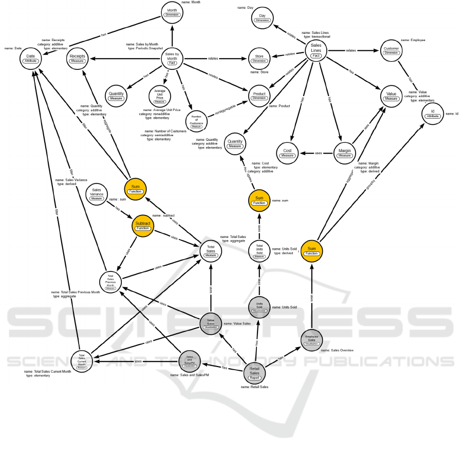
Figure 2: Property graph for representing the described use case domain.
4). Note that in this case the value of this measure is
directly linked to the value of measure 3. This
dependency requires special care because any change
in the formula used to calculate measure 3 affects the
values of measure 4. Suppose that for some reason the
company has understood that from a visual point of
view, it is better to report sales variance in thousands
of euros and starts to use the calculation formula of
Eq. 3. This change means that Eq. 2. must also be
changed, otherwise the chart will show incorrect
values.
𝑆𝑎𝑙𝑒𝑠𝑉 = 𝑆𝑎𝑙𝑒𝑠 𝐶𝑀 − 𝑆𝑎𝑙𝑒𝑠 𝑃𝑀/1000
(3)
Therefore, when analysing data with hundreds of
measures covering different business areas and with
many derived measures, it is important to know the
relationships between them and to identify the
reports/charts in which they are used to avoid errors
of this kind. In these cases, it is important to ensure
that changes to any of the metrics do not lead to
incorrect metrics in the areas that depend on them.
4 CONNECTING MEASURES
Reports and dashboards are two common tools to
visualize data. Typically, these tools provide several
visualizations to fulfil analytic needs. Bar, Pie, and
gauge charts are just examples of visualizations that
can compose reports and dashboards. Reports and
dashboards can have different meanings depending
on the tool or scope used. For example, Microsoft
Power BI sets the dashboard on the hierarchy top, i.e.,
they are built from the developed reports,
representing a story through visualizations. In this
case, reports embody the complexity related to
managing and presenting summarized data. The
A Measure Data Catalog for Dashboard Management and Validation
385

reports are made up of pages which in turn are
composed of visuals configured to present data from
a specific dataset. Visuals are in turn composed of
data objects holding data (dimension and fact tables)
and the respective measures used in aggregation
procedures.
Measures calculate a result using a mathematical
expression. Associated with visuals, page, and report
filters, data aggregation changes according to the
user's interaction with the reports, allowing faster and
more dynamic data exploration. Business changes can
imply changes in the measure’s composition, and
those measures can be shared not only by multiple
visualizations/reports but also can be used to create
other measures. Maintaining visualization's
correctness in large reports can be difficult to handle
since one simple change can require multiple
adaptations, which is time-consuming and prone to
error. Additionally, when dealing with several
measures and complex dimensional schemas, errors
can occur and compromise the results presented in the
visualizations. For example, applying a SUM
aggregate function to a non-additive measure can
result in unexpected results.
The data representation is another important
consideration since the same measure can be
represented in different formats considering the
context in which is used. There are also business rules
that affect not only measurement calculation but also
the presentation of dimension attributes. These
considerations are studied and evaluated in the early
development phases. For example, in the dimensional
modelling development process (included in the four-
step Kimball method (Kimball & Ross, 2016)), the
measure identification and categorization are done
when fact tables are planned. Typically, the data mart
profiles are identified and based on their needs, a set
of queries are analysed to identify the requirements
that need to be fulfilled by the system. Based on these
query requirements, the measures are identified and
evaluated. The findings are documented alongside the
categorization of each measure and from the
identified measures, a subset (the elementary
measures) is used for implementation in the
dimensional schema. Even if measures are not
included in the final schema, they will be used
posteriorly when aggregate schemas are developed or
when reports or dashboards are implemented. This
documentation is an important asset for building an
analytical system and we believe it should be
integrated within the system, i.e., it should play an
active role in the development of dashboards, instead
of being stored in some repository in a nonstructured
way.
These resources are identified using a semantic
approach. Semantic technologies involve the use of
structured vocabularies to define and organize
meaningful data, easier to understand for both domain
experts and computers. Metadata is stored in a
machine-readable format that can be easily processed
and interpreted by other system components. This
allows for more advanced capabilities, providing
mechanisms to categorize and contextualize data, and
enabling validations and data discovery capabilities
about measures and their context.
Figure 1 presents a data mart schema composed
of two stars each one supporting the same business
process in different grains. The transaction
“FACT_sales_lines” fact table stores the individual
sales lines information, which includes the set of
elementary measures described in section 3, and the
derived measure ‘Margin’, defined for the same
atomic level of detail . It serves as a granular
repository of atomic data for this business process.
The snapshot “FACT_sales_by_month” fact table
periodically samples the “FACT_sales_lines” data.
While “FACT_sales_lines” is considered an
elementary schema (preserves the more granular
version of data), the “FACT_sales_by_month” is an
derived schema since it stores data aggregated from
individual transactions in a periodic snapshot. In the
“FACT_sales_by_month” fact table the following
measures are represented:
1. number of customers
2. average unit price
3. receipts
4. quantity
Metric 1 represents the number of customers that
purchase for a given month and is not aggregable
across product (DIM_product) or calendar
dimensions. Metric 2 is non-additive, however the
MIN or MAX operator can be used to aggregate it.
Receipts and quantity are additive metrics for the
“FACT_sales_by_month” schema. These schemas
are used for supporting Power BI reports and
dashboards developed to support sales analysis.
Figure 2 presents a property graph model for
supporting measures representation and the related
context in the analytical system. In a property graph
model, both the relationships and their connecting
nodes of data are named, and capable of storing
properties(Fensel et al., 2020). The represented
knowledge model describes interlinked entities,
properties, and relationships. It consists of the
following:
• Nodes represent entities in the domain subset:
several labels are declared to represent the
node’s purpose in the graph. The data artefacts
DATA 2023 - 12th International Conference on Data Science, Technology and Applications
386

such as dimension (“Dimension” label) and fact
(“Fact label”) tables are represented.
Additionally, their attributes (“Attribute” label)
and in particular the measures (“Measure” label)
are represented. Measures can be attached to the
fact table or can represent measures created in
the BI tool concept. Aggregation functions
(“Function” labels) and expressions
(“Expression” labels) are also represented using
specific nodes since they are fundamental to
understanding how measures are calculated and
used. Additionally, concepts related to the data
visualization used by BI tools are represented.
There were identified reports (“Report”) and
their visualizations (“Visualization”). The
relationships between these concepts allow for
the identification of the reports and respective
visualizations that are using specific measures
(allowing for measures traceability).
• Relationships represent how entities interrelate:
they have a type, direction, and properties. The
“Relates” label is used to associate “Fact” nodes
with “Dimension” nodes, and the “has” label
provides a way to describe a stronger
relationship between concepts. For example,
data artefacts (Facts and Dimension) and their
parts, i.e., fields and more specifically,
measures. The “has” label is also used to
associate visualizations with reports and
specific functions or expressions with measures
or visualizations to describe specific
calculations. The “uses” label describes a
weaker dependency between nodes and it is
useful to describe how nodes depend on one
another. It can be used to describe the
dependency of a given measure on other
measures (for derived measures), the
dependency of visualizations on specific
measures or the dependency of some
functions/expressions in specific fields or
measures. There are also represented some
specific labels used to describe measures can or
attributes that can be used in a specific
calculation: “aggregation” for describing data
aggregation, “groupby” for describing grouping
constraints or “filter” for describing some
selection applied to data that will be used in a
specific calculation.
• Properties represent key-value pairs used in both
nodes and relationships to store additional data.
For example, they are used to describe measures
type (“elementary”, “aggregated”, or
“derived”), category (“additive”, “nonadditive”
or “semi-additive”), name and description
(omitted in the graph from Figure 2).
The graph from Figure 2 describes a subset of the
concepts related to the case study described in Figure
1. It focuses on measures and how they can be
represented in the graph data model. There are
measures created in the context of fact tables (the
"has" relationship with “Fact” nodes allows for their
identification) and measures created in the context of
a specific BI tool, in this case, the Power BI.
Additivity is expressed for measures, i.e. allowing
for the identification of measures that cannot be used
in the SUM operator for an aggregation operation.
This is particularly useful if some report is using them
for data aggregation, allowing for the identification of
errors that can compromise analytics perception. The
graph can also represent the limitations in the
aggregation through the “nonaggregable”
relationship, providing another validation aspect to
the measures used in reports.
Each measure is classified into the following
types: i) “elementary” represent granular facts, ii)
“aggregate” represent an aggregation of facts, and iii)
“derived” when the measures is calculated from other
measures. These definitions are helpful for
identifying dependencies between measures if
something changes as described in section 3. This is
in fact a real problem today for Power BI developers
since the same measure can be used in several
visualizations and can be the origin for dozens of
other measures. In complex scenarios it can be
difficult to manage all these dependencies and
anticipate the impact of a simple change in a measure
formula. The dependency is also preserved using
functions and expressions, describing measures, and
manipulating calculations, revealing important
dependencies not only between measures but also
between dimensional attributes (for example,
involving filtering). These calculations can be
expressed between measures and visualizations.
Considering a Power BI specific scenario, source
data is ingested, transformed, and enriched to serve
specific analytic purposes. A Power BI project can
have specific visualizations and filters, and metrics
over the data. Power BI metrics, i.e., measures, can be
created based on calculations that are needed to be
analysed. Metrics can be used to summarize,
aggregate, or calculate specific values, as explained
in section 4. Measures implementation is supported
by DAX (Data Analysis Expressions) language that
covers a wide range of operators and functions for
filtering, aggregation, and calculations. For example,
the following expression in DAX:
A Measure Data Catalog for Dashboard Management and Validation
387

Total Sales PM = CALCULATE([Sales],
PREVIOUSMONTH('Calendar'[Date]))
is used to calculate the total sales for the previous
month. The expression is organized as follows:
•
Total Sales PM is the name of the measure
being created;
•
=CALCULATE([Sales],
PREVIOUSMONTH('Calendar'[Date]))
represents the calculation being performed.
The
CALCULATE function is used to modify
the filter context of the calculation. In this
case, it's being used to filter the sales data to
the previous month.
• The
[Sales] measure is being used as the
expression to be filtered by the
PREVIOUSMONTH function;
• The
PREVIOUSMONTH function is a time
intelligence function that returns the
previous month of the date provided in the
argument. In this case,
'Calendar'[Date]
is the date column being used as the
argument.
After the creation, the metrics
Total Sales PM
can be used to analyze and visualize the total sales for
the previous month.
All the artefacts developed in a Power BI project
are stored inside the pbit file, which is used as a
template file that contains the data model and queries
from the Power BI report. Measures and schema
models can be extracted, parsed and linked as in the
graph model presented in Figure 2. For testing
purposes, a Neo4j
12
database was used. A set of
validation rules written in Cypher - the query
language used in Neo4j - allows the identification of
wrong aggregations either by identifying non-
aggregable measures across some dimensions or
wrong aggregations (such as the use of the SUM
function in non-additive measures). For example, the
measure
Sales Variance cannot be used with the
SUM operator since it doesn’t make sense to add
percentile values across records. Additionally, the
graph allows traceability, which is in fact a pressing
problem for Power BI users. It is possible to
understand the impact of measure changes, for
example in related measures or in the visualizations
and associated reports. The following Cypher
expression:
MATCH(m:Measure{name:'Total Sales'}) <-
[:uses*]-(o:Measure) return m,o
12
https://neo4j.com/developer/graph-database
can be used to find the measures that are connected to
the measure denoted as
Total Sales through the
relationship denoted as
uses.
5 CONCLUSIONS
In recent years, organizations are dealing with more
and more data that need to be processed and analyzed
to support their decision-making processes. In
addition to the organizational data typically supported
by a centralized data architecture, there is an
increasing need to consume external data that
complement and contextualize the organizational
reality.
Data cataloguing and semantic layers can be used
to provide context and control, providing meaning to
the data so that it can be correctly explored by users.
Therefore, we believe that its use in the particular
context of reports/dashboards will help to facilitate
the design and implementation process, as well as the
process of maintenance and control of the entire
process of visualization and data exploration. In this
paper, a Data Catalog sub-component for analytical
systems was presented, describing how measures can
be documented and connected with their underlying
context: Fact/dimension tables and
reports/visualizations, preserving important
properties that constrain its use for providing business
insights. A property graph was implemented serving
as a metadatabase for supporting the
reports/dashboards development, helping to ensure
data correction, and allowing for data control and
traceability.
As future work, the research presented in this
paper can be extended in several ways. For example,
expanding the coverage areas for metadata, which can
help data scientists in searching and discovery data,
providing access control and privacy rules to data,
data lineage useful for ETL pipelines, explanation
and reproducibility for Machine Learning techniques
applied to data and data quality thought data statistics,
preservation business rules and identification of
outliers. All this can be connected to powerful
knowledge graphs that can be extended with
taxonomies and ontologies, bringing new capabilities
related to data representation and exploration (using,
for example, inference mechanisms).
DATA 2023 - 12th International Conference on Data Science, Technology and Applications
388

ACKNOWLEDGEMENTS
This work has been supported by national funds
through FCT - Fundação para a Ciência e Tecnologia
through project UIDB/04728/2020 and PhD grant:
2022.12728.BD.
REFERENCES
Bianchini, D., de Antonellis, V., Garda, M., & Melchiori,
M. (2019). Using a Smart City ontology to support
personalised exploration of urban data (discussion
paper). CEUR Workshop Proceedings, 2400.
Blomqvist, E., Maynard, D., Gangemi, A., Santos, H.,
Dantas, V., Furtado, V., Pinheiro, P., & McGuinness,
D. L. (2017). From Data to City Indicators: A
Knowledge Graph for Supporting Automatic
Generation of Dashboards. Lecture Notes in Computer
Science (Including Subseries Lecture Notes in
Artificial Intelligence and Lecture Notes in
Bioinformatics), 10249 LNCS, V–VII. https://doi.org/
10.1007/978-3-319-58451-5
Dibowski, H., & Schmid, S. (2021). Using Knowledge
Graphs to Manage a Data Lake. Informaitk 2020,
Lecture Notes in Informatics (LNI), January, 41–50.
Dibowski, H., Schmid, S., Svetashova, Y., Henson, C., &
Tran, T. (2020). Using semantic technologies to
manage a data lake: Data catalog, provenance and
access control. CEUR Workshop Proceedings, 2757,
65–80.
Eichler, R., Giebler, C., Gröger, C., Schwarz, H., &
Mitschang, B. (2021). Modeling metadata in data
lakes—A generic model. Data & Knowledge
Engineering, 136, 101931. https://doi.org/https://
doi.org/10.1016/j.datak.2021.101931
Fensel, D., Şimşek, U., Angele, K., Huaman, E., Kärle, E.,
Panasiuk, O., Toma, I., Umbrich, J., & Wahler, A.
(2020). Knowledge Graphs. Springer International
Publishing. https://doi.org/10.1007/978-3-030-37439-6
Guido De Simoni. (2021, October 12). Market Guide for
Active Metadata Management. Gartner Research.
https://www.gartner.com/en/documents/4006759
Kimball, R., & Ross, M. (2013). The Data Warehouse
Toolkit, The Definitive Guide to Dimensional
Modeling (Third). John Wiley & Sons.
https://doi.org/10.1145/945721.945741
Kimball, R., & Rosse, M. (2016). The Kimball Group
Reader - Relentlessly Practical Tools for Data
Warehousing and Business Intelligence. In Relentlessly
Practical Tools for Data Warehousing and Business
Intelligence Remastered. Wiley.
Lavalle, A., Maté, A., Trujillo, J., Teruel, M. A., & Rizzi,
S. (2021). A methodology to automatically translate
user requirements into visualizations: Experimental
validation. Information and Software Technology, 136,
106592. https://doi.org/10.1016/j.infsof.2021.106592
Megdiche Imen and Ravat, F. and Z. Y. (2021). Metadata
Management on Data Processing in Data Lakes. In R.
and G. J. and G. G. and J. T. and P. C. and S. F. and W.
P. W. H. Bureš Tomáš and Dondi (Ed.), SOFSEM
2021: Theory and Practice of Computer Science (pp.
553–562). Springer International Publishing.
Ravat Franck and Zhao, Y. (2019). Data Lakes: Trends and
Perspectives. In J. and C. S. and A.-K. G. and T. A. M.
and K. I. Hartmann Sven and Küng (Ed.), Database and
Expert Systems Applications (pp. 304–313). Springer
International Publishing.
Sawadogo, P., & Darmont, J. (2021). On data lake
architectures and metadata management. Journal of
Intelligent Information Systems, 56(1), 97–120.
https://doi.org/10.1007/s10844-020-00608-7
Scholly, E., Sawadogo, P., Liu, P., Espinosa-Oviedo, J. A.,
Favre, C., Loudcher, S., Darmont, J., & Noûs, C.
(2021). Coining goldMEDAL: A New Contribution to
Data Lake Generic Metadata Modeling.
http://arxiv.org/abs/2103.13155
Wells, D. (2019). An Introduction to Data Catalogs: The
Future of Data Management.
Zaidi, E., Simoni, G. de, Edjlali, R., & Alan D. Duncan.
(2017). Data Catalogs Are the New Black in Data
Management and Analytics.
A Measure Data Catalog for Dashboard Management and Validation
389
