
PRINCIPLES FOR CREATING WEB SITES: A DESIGN
PERSPECTIVE
Carlos J. Costa
Departamento de Ciências e Tecnologias de Informação, ISCTE, Portugal
Pedro Costa
Industrial Designer/ Multimedia Designer
Manuela Aparício
LusoCrédito, Lda, Lisboa, Portugal
Key words: Web design, web theory, web evaluation
Abstract: The importance of aesthetics is frequently forgotten
, in order to solve this problem, we identified in the
literature some of the theory that is underlying graphic design, gestalt theory and multimedia design. Based
in the literature review, we proposed principles for web site design. We also present a tool to evaluate web
design
1 INTRODUCTION
Internet plays an important role in the
communication between people and is also an
important corporate tool. Its importance is so
significant that web presence is considered a
strategic issue. But, the importance of aesthetics is
frequently forgotten, as long as approaches based
in communication, usability and technique are
considered more pragmatic.
According to Anders (1999), “there are three
th
ings to remember about website design: content
is king, content is king, content is king. But in
order to ensure its primacy, we must present the
content in a way that is attractive, orderly, and, if
possible, original”.
In this context Brink et al. (2002) suggest the
im
portance of design principles in the web design,
and specifically in the page design layout, even
having as main reference the concept of usability.
In the next section, a literature review of design
i
s developed, starting in the graphical design
theory, concluding in the multimedia approach.
Then, based in the literature review, design
principles are identified and principles for web site
design are proposed. In the following section we
present a tool to evaluate web design.
2 FROM GRAPHIC DESIGN
THEORY TO MULTIMEDIA
DESIGN
2.1 Graphic Design Theory
The graphic design theory explains the different
features of design which are considered when
composing a piece of art or creating a graphic
layout in an advertisement (Mills & Smith, 1985,
Lauer, 1985, Wilson, 1966).
As long as one of the most important elements
o
f websites is the image, it seams to be
understandable that graphical design theories could
484
J. Costa C., Costa P. and Aparício M. (2004).
PRINCIPLES FOR CREATING WEB SITES: A DESIGN PERSPECTIVE.
In Proceedings of the Sixth International Conference on Enterprise Information Systems, pages 484-488
DOI: 10.5220/0002613004840488
Copyright
c
SciTePress

be applied. One perspective may be to consider
design elements as well as design principles.
Design elements are the building blocks or
basic units in the construction of a visual image.
The
elements of design include line, direction,
shape, size, texture, value, and colour (Graves,
1951). On the other hand, principles of design help
make visual images agreeable and interesting to
watch.
Design principles include repetition,
alternation, harmony, gradation, contrast,
dominance, unity, and balance (Graves, 1951).
But, as may be analysed in the following sections,
other authors identified different design principles.
2.2 Gestalt
Atomism examined parts of objects (or things)
with the idea that these parts could then be put
back together to make wholes. Atomists believed
the nature of objects to be absolute and not
dependent on context. This perspective has his
roots in several sources like the medieval
interpretation of Timaeus of Plato. In the Timaeus,
Plato observes the geometric fact that five and only
five regular geometric solids are possible.
Gestalt theory first appeared the 90s of the XIX
century as a reaction to atomism, the prevalent
psychological theory of the time. Gestalt theorists
were fascinated by the way our mind perceives the
totality, even when there are incomplete elements
(Behrens, 1984, Mullet & Sano, 1995).
To the Gestaltists, objects are affected by
where they are and by what surrounds them so that
objects are better described as more than the sum
of their parts (Behrens, 1984). Gestaltists believed
that context was very important in perception. An
essay by Christian von Ehrenfels discussed this
belief using a musical example. Take a 12-note
melody. Play it in one key, say the key of mi. Now
changes to another key, say the key of do flat.
There might not be any notes the same in the two
songs, yet a person listening to it knows that it is
the same tune. It is the relationships between the
notes that give us the tune, the whole, not which
notes make up the tune. In another example, Moore
& Fitz (1993) starts with a very poorly designed
diagram and by using gestalt principles, transforms
it into one which is much more useful.
Gestalt principles are figure and ground,
similarity, proximity or contiguity, continuity,
closure, area and symmetry.
2.3 Multimedia Design
Because of the similarities between computer
based multimedia and web sites, it seems useful to
consider guidelines for design, which have been
developed for multimedia (e.g. Foley, et al., 1997).
On the other hand, animation, sound, text, and
pictures may be linked together on a web page, just
like multimedia that also links these elements
together.
Research into perception, animation, and
multiple-channel communication (Moore et al.,
1996) contains findings, which may be important
for web design.
Some studies indicated that pictorial
information is remembered much more easily than
text (Anglin et. al, 1996, Braden, 1996, Horton,
1994) leading to the dual code theory: people store
information in two ways depending on whether it
is verbal or pictorial information.
Because text accompanied by pictures or
animations corresponds to saving information into
two separate ways in the brain (encoded verbally
and as a picture) there is more likelihood that
people will remember the information if it is
presented in both formats. On the other hand, care
must be taken when combining different modalities
(picture, text, audio, animation) simultaneously.
Certain combinations overflow the information
processing capacities of the brain. For example,
combining audio with text seems to overload our
channels. Audio may be combined with pictures or
animations, or text with pictures or animations,
given that the text and audio appears to be stored
and processed in a different manner than the
pictures and animations.
3 PRINCIPLES FOR WEB SITE
DESIGN
There are a set of principles that may be called
aesthetic principles and includes concerns such as
balance, harmony and unity (Schwier &
Misanchuk, 1993 Misanchuk, et al., 2000). In fact
according to Misanchuk, et al. (2000). “Balance,
unity, and harmony are three primary properties
that designers manipulate in order to create
aesthetic experience. When these properties are
manipulated in such a way that the effects satisfy
people's natural (and conflicting) cravings for
order, predictability, surprise and novelty, then
PRINCIPLES FOR CREATING WEB SITES: A DESIGN PERSPECTIVE
485
designers are creating aesthetically pleasing
objects or experiences.”
Multimedia and web sites are interrelated and
sometimes websites include multimedia
components. Consequently, we think it is adequate
to include guidelines for web design, which have
been developed for multimedia. Consequently,
some general principles derived from multimedia
design include
simplicity, consistency, clarity of
design. In fact according to Misanchuk, et al.
(2000) “Keep it simple; be clear; and be consistent
- these three bits of advice are the foundations of
good layout. Screens within a given multimedia
package should be consistent in all ways, from the
level of discourse and style of presentation from
one section to another, to the style of graphics used
in different places”.
Further design principles derived from the
gestalt theory of perception include
figure and
ground, similarity, proximity, continuity,
closure, area, and symmetry.
3.1 Balance
Objects are in balance when they are of equal
weight. If we have several small items on one side,
a large object on the other side can balance them.
Screen balance works in much the same way. In
opposition, a design is unbalanced when the eye is
needlessly drawn to meaningless discontinuities.
On the other hand, it can be affected not only
by the size of objects, but also their value (i.e.
lightness or darkness, termed visual weight).
One darker item may need to be balanced by
several lighter items. When a screen is not
balanced, it creates a feeling of tension, as if the
screen might tip, or things might slide off the side,
just as the unbalanced beam would tip to one side.
3.2 Harmony and Unity
In order to create harmony and unity, we must
design a page or site using consistency and
repetition. Similar fonts and colours, pictures that
match the topic, and graphics, which are similar in
tone used within a site, will make that site appear
harmonious. Ensuring that all the items, which are
present on a page, appear to belong together and
different pages in the site are similar in content and
design can foster unity. Visual identity can be very
important in a unified site design - similarity
amongst pages ties a site together and gives it a
feeling of totality.
3.3 Simplicity
Although gaining attention is an important part of
any communication act, it is important trying to
keep the message as simple as possible (Schwier
and Misanchuk, 1993). Using only the amount of
text and graphics used should be absolutely
necessary to get the point across. Superfluous
graphics can interfere with understanding (Anglin
et al., 1996; Levie & Lentz, 1982) and an
overabundance of fonts or colours can distract
rather than assist perception.
3.4 Consistency
According to Ulrich (2001), this principle refers to
the reliable placement of content on every page of
the site.
The layout of pages should be kept consistent.
Inconsistencies force people to waste time trying to
understand how to navigate, or where to find the
answers to questions we have. It increases
cognitive overhead. Norman (1988) and Schwier &
Misanchuk (1993) suggest that developers should
attempt to reach consistency in the level of
discourse and style of presentation from one
section of the sequence to another.
This consistency is obtained by an adequate
placement of various items, like orientation
information, navigation devices, student input,
feedback, operating instructions.
If our logo is in the upper-left corner of one
page, we should put it in the same place on the
other pages. Every page of our site can be new and
different but some thing should be in the same
place so people feel comfortable. The same rule
should be considered in the alignment. When
choosing horizontal and vertical alignment setting
for our text and graphics should be kept consistent
throughout the pages of our site.
3.5 Clarity
If the meaning of an image is readily apparent to
the viewer, we have visual clarity.
Schwier & Misanchuk (1993) suggest to
prepare (and reduce) the message down to the
absolute essentials for improving clarity keeping
the instruction at a language level compatible with
the intended audience, avoiding jargon and overly
scholarly language, unless that is your audience,
presenting ideas succinctly, and keeping prose
lean.
ICEIS 2004 - SOFTWARE AGENTS AND INTERNET COMPUTING
486
3.6 Gestalt Principles
Gestalt theorists were intrigued by way our mind
perceives totality beyond incomplete elements
(Mullet & Sano, 1995, Behrens, 1984). According
to Behrens (1984), to the Gestaltists, things are
affected by where they are and by what surround
them.
- The terms figure and ground explain how
we use elements of the scene, which are
similar in appearance and shape and group
them together as a whole. Similar elements
are contrasted with dissimilar elements
(ground) to give the impression of a whole. A
breakdown of figure and ground occurs with
camouflage, where the objective is to make
the figure so much like the ground that it
disappears from view.
According to Mullet and Sano (1995) the
following Gestalt principles apply in design: the
principle of similarity, the principle of proximity
or contiguity, the principle of continuity, the
principle of closure, the principle of area and the
principle of symmetry.
- The principle of similarity states that objects
which share visual characteristics (or look
alike) such as shape, size, colour, texture,
value or orientation tend to organize
themselves into groups or units.
- The principle of proximity or contiguity
states that objects, which are closer together,
tend to visually organize themselves into
groups or units.
- The principle of continuity predicts the
preference for continuous figures.
- The principle of closure applies when we
tend to see complete figures even when part
of the information is missing.
- The principle of area states that the smaller
of two overlapping figures is perceived as
figure while the larger is regarded as ground.
- The principle of symmetry describes the
instance where the whole of a figure is
perceived rather than the individual parts
which make up the figure.
4 A TOOL TO EVALUATE WEB
SITE DESIGN
In order to evaluate web design, we developed a
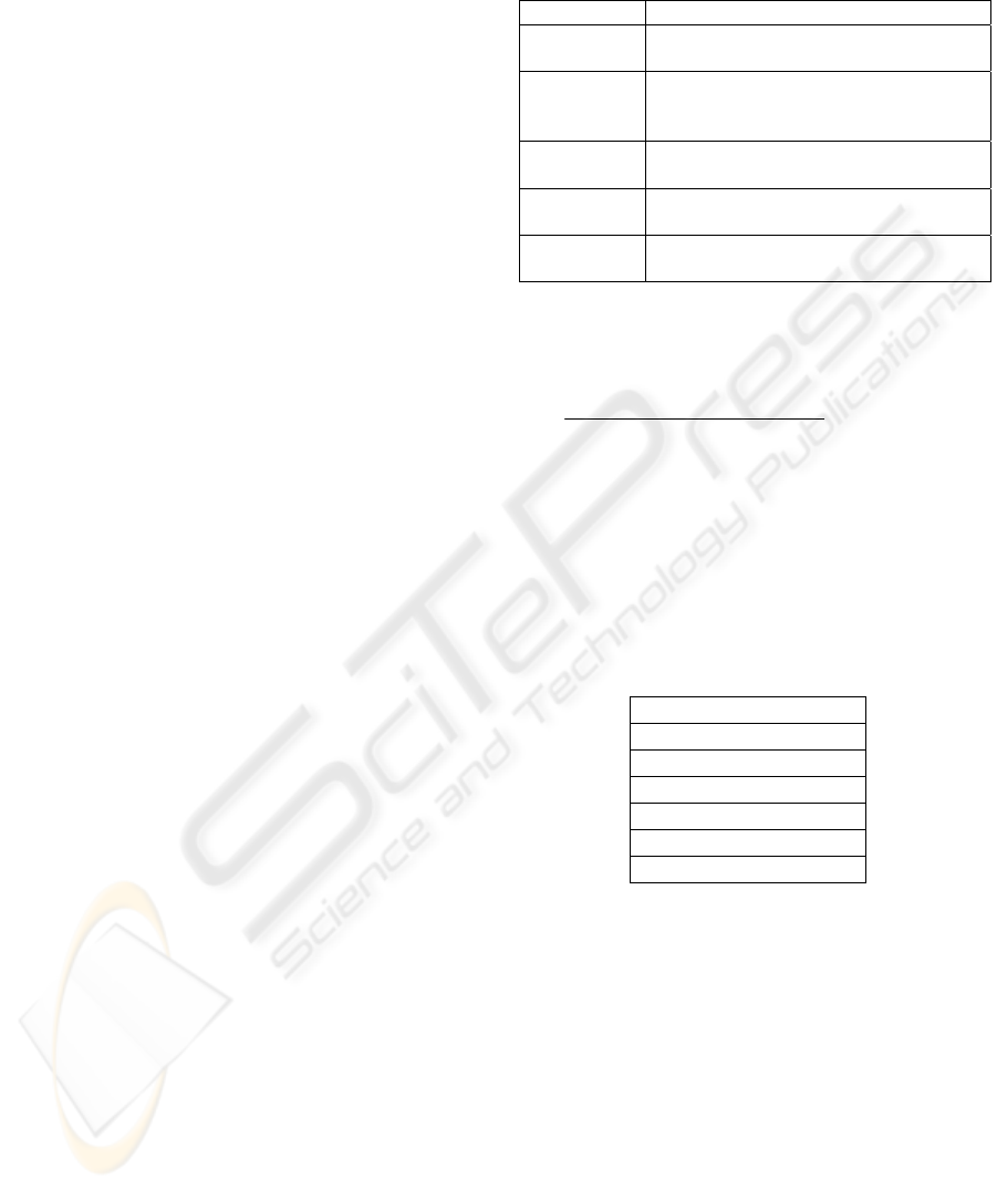
survey based in the principles of web site design.
The scale used was a 5-point scale, where 1
corresponds to the lowest value and 5 the highest.
Balance
(B
p
)
The visual weigh of the elements is
balanced in the page.
Harmony
and unity
(H
p
/H
s
)
Elements and pages are organized in
order to give a feeling of totality.
Simplicity
(S
p
/S
s
)
Use only the necessary elements to
reach the purposes.
Consistency
(C
p
/C
s
)
The similarity and repetition allows
presenting page/site with uniformity.
Design
Clarity (D
p
)
Readability of graphical elements in a
page.
A first step to quantify the quality of the design
may performed by the following formula:
sss
n
p
p
ppppp
n
p
p
s
CSH
w
wDCSHB
Q +++
++++
=
∑
∑
=
=
1
1
)(
p
w
– Weight of each page resulting from the hierarchy
of the site or the importance assigned by the evaluator.
In order to understand the quality of a given site
(s) it is important to identify other dimensions to
decode the quality rating (Q).
Here, the evaluator will analyse in what extent
those concepts were used and if they were applied
correctly.
Figure and ground
Similarity
Proximity
Continuity
Closure
Area
Symmetry
5 DISCUSSION
In this paper, we explicit the principles of website
design. Based in those principles, we propose a
tool. In fact, this approach is different from the one
that is based in a pure technical approach; it is also
different from the usability perspective (Nielsen,
1993); or from what we may call a
communicational perspective (e.g. Smith, 1997,
Kapoun, 1998).
At this moment, we verified that there is some
difficulties in the evaluation of the degree of
gestalt principles applicability.
PRINCIPLES FOR CREATING WEB SITES: A DESIGN PERSPECTIVE
487

But, this approach is not completely tested.
Some verification may be performed:
- Verify if the use of design principles
contribute to a more effective site;
- Verify if different evaluators have
different criteria;
- Verify if experts (like graphical designer)
have different perspectives, compared to
non-expert evaluators.
Other important issue consists of creating a
metric that could combine all the information
obtained from principle evaluation.
6 CONCLUSION
The importance of aesthetics is frequently
forgotten, as long as approaches based in
communication, usability and technique are
considered more pragmatic. It is why we
developed a literature review in order to identify
some of the theory that is underlying graphic
design. Based in the literature review, we proposed
principles for web site design. We also present a
tool to evaluate web design.
REFERENCES
Anders, L (1999), Great Web Architecture, IDG Books
Worldwide.
Anglin, G., Towers, R., & Levie, H. (1996). Visual
message design and learning: The role of static and
dynamic illustrations. In D.H. Jonassen (Ed.),
Handbook of Research for Educational
Communications and Technology. New York: Simon
and Schuster Macmillan.
Behrens, R. (1984). Design in the visual arts.
Englewood Cliffs, NJ: Prentice-Hall, Inc.
Braden, R. (1996). Visual literacy. In D.H. Jonassen
(Ed.), Handbook of Research for Educational
Communications and Technology. New York: Simon
and Schuster Macmillan.
Brink, T; Gergle, D. & Wood, S.; (2002) Usability for
the Web: Design Web sites That Work; Morgan
Kaufmann Publishers.
Foley, J; Van Dam, A; Feiner, S. & Hughes, J. (1997);
Computer Graphics: Principles and Practice;
Addison-Wesley.
Graves, M. (1951) The art of color and design, New
York: McGraw-Hill Book Company.
Horton, W. (1994). The icon book: Visual symbols for
computer systems and documentation, Toronto, ON:
John Wiley & Sons.
Kapoun, J. (1998) “Teaching undergrads Web
evaluation: A guide for library instruction”, C&RL
News, July-August, pp. 522-523.
Lauer, D. (1985). Design Basics (2nd Ed.) New York,
NY: Holt, Rinehart, and Winston.
Mills, J. & Smith, J. (1985). Design Concepts. New
York, NY: Fairchild Publications.
Misanchuk, E, Schwier, R. & Boling, E. (2000). Visual
design for instructional multimedia. Saskatoon,
Saskatchewan: M4 Multimedia & Copestone
Publishing.
Moore, D., Burton, J., & Myers, R. (1996) Multiple-
channel communication: The theoretical and
research foundations of multimedia. In D. H.
Jonassen (Ed.), Handbook of Research for
Educational Communications and Technology. New
York: Simon and Schuster Macmillan.
Moore, P. & Fitz, C. (1993). Gestalt theory and
instructional design. Journal of Technical Writing
and Communication. 23(2), 137-157.
Mullet, K. & Sano, D. (1995). Designing visual
interfaces: Communication oriented techniques.
Englewood Cliffs, NJ: Prentice Hall
Nielsen, J. (1993) Usability Engineering; Academic
Press; Cambridge, MA,.
Norman, D. (1988) The design of everyday things. New
York, NY: Doubleday.
Schwier, R. (1994). Multimedia Design Principles for
Constructing Prescriptive, Democratic and
Cybernetic Learning Environments. World
Conference on Educational Multimedia and
Hypermedia. Vancouver, B. C., June, 1994.
Schwier, R., & Misanchuk, E. (1993) Interactive
multimedia instruction. Englewood Cliffs, NJ:
Educational Technology Publications, Inc.
Smith, A. (1997) “Criteria for Evaluation of Internet
Information Resource” The Public Access Computer
Systems Review; 8; no. 3.
Ulrich L. (2001) Web Design Virtual Classroom,
Osborn/McGraw-Hill.
Wilson, R. (1966). An Alphabet of Visual Experience.
Scranton, PA: International Textbook Company
ICEIS 2004 - SOFTWARE AGENTS AND INTERNET COMPUTING
488
