
BulB – VISUALISING BULLETIN BOARD ACTIVITY
Rehman Mohamed, John Ferguson, David Elsweiler, Alasdair Mac Cormick, John Wilson,
George Weir
Department of Computer & Information Sciences, University of Strathclyde
26 Richmond Street, Glasgow, G1 1XH, Scotland, UK
Keywords: Online Communities, Bulletin Boards, Visualisation, Discussion Forum
Abstract: Visualisation is well known as an effectiv
e means of enriching user interaction with complex systems.
Recent research with online communities has considered the application of visualisation tool support, with
the intention of further improving communication between community members. This paper reviews
existing work in this area with specific reference to the application of visualisation to improve user
interaction within online forums such as bulletin boards. The paper then outlines work undertaken by the
authors to develop a second-generation visualisation tool - ‘BulB’.
1 INTRODUCTION
Online communities are now widespread and form
useful forums, unrestrained by geographical
boundaries, for groups who identify and interact
around common, purposeful and mutually beneficial
interests. Online communities are dynamic,
constantly changing systems. They exhibit ‘organic’
growth, evolving through different phases, reflecting
changes in the needs of their members, changes in
the social setting, or changes in the support
infrastructure (Malhotra et al, 1997; Liedka, 1999;
Squire and Johnson, 2000).
There is growing evidence that many online
co
mmunities fail to fulfil their purpose due to lack of
involvement by members (Kim, 2000). Further,
while many online communities are supported
through the use of communication services such as
bulletin boards, chat rooms etc, there is also
evidence that the provision of these facilities alone is
insufficient to engender a sense of community: there
are many examples of websites offering these
facilities with little or no participation (Kim, 2000;
Mohamed et al, 2002). In order to be successful they
must be built on solid foundations. Successful online
communities need to be organized and adopted by
the community; members must have a shared
purpose and be willing to openly share information.
They grow and thrive when members are able to
fulfil that purpose and accomplish those goals that
require other members to participate in the
community (Ferguson et al, 2002).
The concept of community is normally
associated wit
h interaction and shared co-presence,
whereas the typical contact between user and a
website is on the whole a solitary experience with
few visual clues of other participants and their
activity. The work outlined in this paper is aimed at
facilitating member communication within bulletin
boards and engendering a feeling of co-presence
akin to ‘face-to-face’ interaction.
This paper outlines the case for the use of
vi
sualisations as a driver for enhancing
communication within online communities. It then
proceeds to review previous work on visualisations
within the context of bulletin board support. The
authors have been working to develop a second
generation visualization tool that embodies lessons
learned from earlier work. This system is known as
‘BulB’ and provides an enhanced range of features
that enable community members to easily assimilate
bulletin board activity.
2 VISUALISING ONLINE
INTERACTION
One of the largest problems faced in trying to sustain
online communities is that of withdrawal or attrition
(Johnson, 2001; Haythornthwaite et al, 2000). This
31
Mohamed R., Ferguson J., Elsweiler D., Mac Cormick A., Wilson J. and Weir G. (2004).
BulB – VISUALISING BULLETIN BOARD ACTIVITY.
In Proceedings of the Sixth International Conference on Enterprise Information Systems, pages 31-35
DOI: 10.5220/0002640800310035
Copyright
c
SciTePress

may be a direct result of the prevalent text-based
representations which tend to suggest uniformity and
ennui rather than the lively social scene that is
actually present (Donath, 2002). Furthermore, text-
based representations tend to be unclear and require
extensive user participation in order to gain a
holistic view of the interaction environment and
context. Therefore, there is a requirement for good
facilitation techniques and social scaffolding to
support online communication technology. Donath
(1996) identifies three important areas in the design
of software aimed at supporting successful online
communities: visualisation of social phenomena, the
role of information spaces as contexts for
communication, and the presentation of the user in
the virtual world.
Instruments that encourage greater contribution,
raising levels of communication and feelings of
kinship, will enable interaction and remove barriers
that lead to lack of involvement and community
stagnation. One such technique is the use of
visualisations to augment and enhance existing
communication technologies such as bulletin boards.
Visual representation of social phenomena is
important in the design of successful software to
support online communities (Donath, 2002). In the
real world, individuals use social cues and
information from other people in order to find their
way and inform decisions. Social navigation cues
are also valuable in the digital domain, with the
movement of people around online communities and
activity within chat rooms or bulletin boards helping
to guide or inform decisions (Dieberger et al, 2000).
A key challenge of information visualisation is
inventing visual metaphors and developing new
ways of manipulating existing metaphors to make
sense of information (Eick, 2001).
Visualisation tools have already been applied
successfully to track and display, in a graphical
format, the distribution of users on a web site (Minar
and Donath, 2001). Much of the existing work is
general in nature, whereas this paper applies similar
concepts to visualising the activities of members
within a community bulletin board.
It is expected that the use of visualisation tools
will enrich the user’s experience within an online
community and lead to benefits such as reinforcing
the immediacy of the shared experience through the
use of visual cues and indicators, thus enabling
online community participation and sustainability.
Social navigation cues are as valuable in online
communities as they are in the real world. People
require indicators that allow them to make decisions
and interact (Dieberger et al, 2000). Within an
online community, these indicators enable users to
access and assess activities within different
functional areas such as chat rooms, bulletin boards,
etc.
3 BULLETIN BOARD
VISUALISATION TOOLS
There are a number of enhanced interfaces and
visualisation techniques that are currently being used
successfully to promote user interaction with the
web. Examples include WebFan (Xiong and
Brittain, 1999) and PeopleGarden (Xiong and
Donath, 1999). WebFan visualises web-based
bulletin board activity using a fan-like hierarchical
structure, allowing web pages with multiple threads
to be represented at the same time for overview and
comparison purposes. Threads are incorporated into
a fan-like structure, and lines on the fan change
colour to depict that a given posting has been read.
While WebFan enables the user to gain an
overview of postings and replies, it fails to include a
range of elements which would be useful to potential
users. Through looking at the visualisation, it is not
possible to ascertain which users have posted which
messages. Such a feature would be helpful to
potential users in order to get an overall picture of
posting patterns and of the most prolific users within
the bulletin board. Furthermore, there is no
indication of temporal thread development which
would allow a user to see how long a thread has
been active, the length of time between postings in a
thread and the comparative timeline of each thread.
PeopleGarden uses a flower and garden
metaphor to visualise user activity within a bulletin
board. Each bulletin board participant is represented
by a flower with the long plant-like stems depicting
the length of time the user has been an active
participant. Petals are used to signify each post that
has been made with red signifying initial postings
and blue for replies. Collections of flowers, or
gardens, are used to depict the contributions and
posting patterns of every participant within the
bulletin board.
Although PeopleGarden provides an excellent
visualisation of the behaviour pattern of members
and their contribution levels, it does not give users
information about the size of threads, the length of
time that threads have been ongoing or the
distribution of users across threads in the bulletin
board.
Babble (Erickson and Kellogg, 2000; Erickson et
al, 2002) makes use of ‘social proxies’ to graphically
represent users and their activities as a means of
supporting long-term conversations within existing
groups. Through making careful choices about
which social cues to reveal or suppress, they
ICEIS 2004 - SOFTWARE AGENTS AND INTERNET COMPUTING
32
designed several environments to support a range of
various types of interaction. These visually-enable
environments allow users to draw inferences about
current activity and consequently, shape the
collective activity of the group. In one such
environment, the “Timeline” social proxy is used to
support asynchronous conversations, leaving traces
when users log in and when they contribute to
conversations. While not applied directly to a
bulletin board, this visualisation helps in
understanding the usage patterns of the community,
highlighting ‘hot’ times when people tend to log in
or have a say.
4 BulB
The BulB visualisation approach, drawing influence
from prior work on visualising bulletin board
activity, aims to shed light on communication
patterns and examine the growth of conversations
within bulletin boards. In constructing a
visualisation of bulletin board activity, it was
deemed important to draw each thread separately so
that users could immediately see the distribution of
threads and identify which threads in particular were
livelier. Through keeping the colour of each
contributor consistent across all threads in the
visualisation, BulB enables users to instantly see
which contributors are most active across all threads.
In addition, this allows a user to easily identify the
distribution of individuals posting to a particular
thread and across the bulletin board as a whole.
The key features of BulB are:
• A stem, or stalk, to represent each thread.
• The height of each stalk represents the total
time that each thread has been active, from
the first post to the current time. Longer
stalks represent threads that have been going
longer.
• A unique colour is used to represent each
user. This colour is consistent across all
threads being visualised.
In addition to browsing through the bulletin
board in the normal way, BulB enables users to
navigate throughout the bulletin board by clicking
on the visualisation applet; the webpage for each
appropriate thread is loaded on a mouse click.
Further, when users mouse over anywhere within the
height of each thread, the thread title appears at the
bottom of the visualisation panel. Similarly when
moving the mouse over the coloured segment for
each user, their username appears at the foot of the
visualisation panel. Through providing this
information, it is easier from a user’s perspective to
compare threads and also examine the activity of
particular contributors across threads.
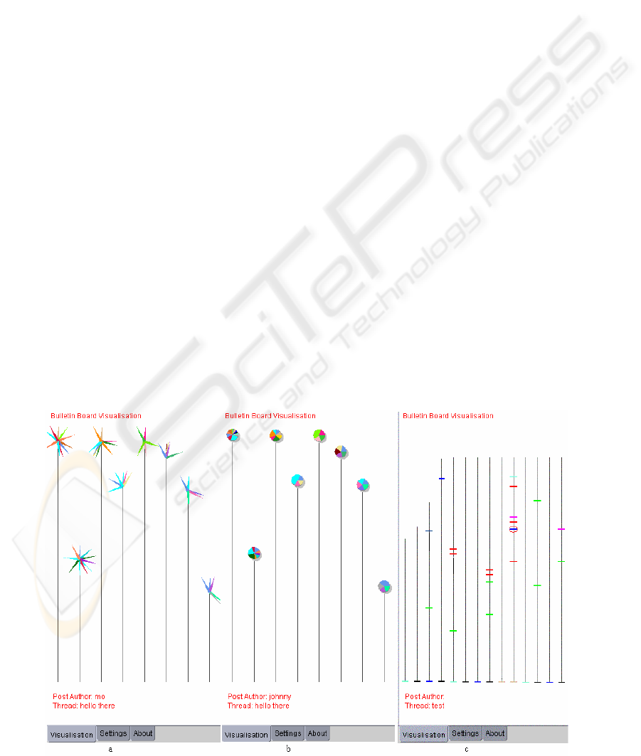
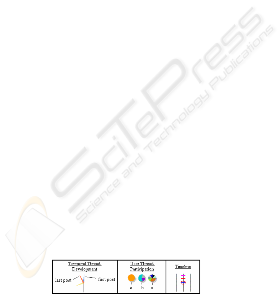
There are three separate visualisations within
BulB:
• Temporal thread development (Figure 1a)
• User thread participation (Figure 1b)
• Timeline (Figure 1c)
4.1 Temporal Thread Development
In this visualisation, the stalk-head is used to show
the development of the thread since it started.
Figure 1: Sample BulB Visualisations
BULB – VISUALISING BULLETIN BOARD ACTIVITY
33
Segments are drawn to signify each new post with
livelier threads having more segments. The stalk-
head circumference is scaled to represent the
timeline of every thread. Each segment in the head is
drawn clockwise around the circumference and the
position of each segment represents the time the post
was made in relation to the time the thread was
created.
Figure 2 shows a small thread with three posts,
each contributed by three different users. Given that
there has been a week since this thread was started,
it can be seen that the first reply to the initial post
was not made until midway through the fifth day,
and the final post in the thread was made a day ago -
six days after the thread was started.
4.2 User Thread Participation
This visualisation draws a pie chart as a stalk-head.
The pie signifies the proportion of each thread that is
made up by each contributor. Each slice of the pie
chart constitutes the percentage of each thread made
up by a particular user’s posts.
The visualisation extract in Figure 2 shows a set
of 3 threads. Thread a has a single post from one
contributor, Visualisation b shows a thread with one
dominant contributor, while thread c depicts a more
even spread of users.
4.3 Timeline
Unlike the previous two BulB visualisations, where
the bulletin board posts are drawn at the top of each
stalk, the Timeline distributes posts along the height
of each thread stalk. Each post is drawn at the
appropriate position on the Timeline, depending
upon when the post was made in relation to the
length of time that the thread has been active.
The Timeline visualisation in Figure 2 shows
three threads, the middle of which has a small flurry
of activity within a short time period. There are a
total of 4 posts shown, with the red oval depicting
that there are 2 posts close to each other and which
are overlapping on the visualisation.
4.4 BulB Settings
Users can customise BulB through using a settings
panel in order to get different views of the bulletin
board activity.
As previously outlined, users can choose
between one of the three different visualisations
depending upon their circumstances and preferences.
Other settings include the ability to filter the number
of threads that are drawn within the visualisation at
any time. For example, users can choose to visualise
only the five most popular threads within the
bulletin board at any time. In addition, users can
change the way that threads are filtered, opting to
display the most popular threads over a give time
period, or visualise the threads with the most recent
posts. Users can also filter each view by time-scale.
For example, visualising the most active threads
over the last week. All of these settings can be
combined to give fully customisable visualisations
depending upon the user’s requirements.
4.5 Using BulB
From looking at all BulB visualisations, it is easy to
see which threads have been active longest through
studying the length of each stalk. Similarly, users
can easily identify frequent contributors across
multiple threads by looking for the reoccurrence of
colours within the visualisations (see Figure 1).
Initial results from user trials have shown that
different visualisations are more helpful in certain
circumstances. The ‘Timeline’ and ‘Temporal
Thread Development’ visualisations aid in
identifying ‘hot’ points in a thread where there is a
flurry of posts in a short time period. The ‘Timeline’
visualisation has proved especially successful in
such circumstances given that posts are distributed
in a larger area along the height of the thread.
The User Thread Participation visualisation has
proved most helpful to users in identifying repeat
contributors across threads. Given that posts from
the same user are group together in a pie, users can
easily spot if there is an even distribution of
contributors in a particular thread, or whether there
are dominant users.
Figure 2: BulB Visualisation extracts
ICEIS 2004 - SOFTWARE AGENTS AND INTERNET COMPUTING
34

4.6 Areas for Further Research
There are several directions for future work related
to BulB. Formal user testing is underway to test the
usability of the system, and also to assess which
visualisations prove most successful in which
situations. The results of these tests will be useful in
modelling profiles of user interaction. BulB may
also be modified to visualise activity in other
communication areas such as Usenet newsgroups
and chat rooms.
5 CONCLUSION
Visualisation techniques have proven to be an
effective means of promoting user interaction with
complex systems. In this paper, the authors have
reviewed a number of visualisation tools aimed
specifically at promoting and enhancing user
interaction within online communities and
specifically bulletin boards.
This paper has introduced BulB, a second-
generation tool embodying a range of visualisations
and addressing some of the limitations of existing
tools. BulB elucidates communication patterns
within bulletin boards, enabling users to observe the
growth of conversations. Preliminary feedback on
the utility of these visualisations looks promising
and the authors are currently undertaking an in-depth
evaluation of their effectiveness through a series of
user trials.
REFERENCES
Dieberger, A., Höök, K., Svensson, M. and Lönnqvist, P.,
2000, Social Navigation: Techniques for Building
More Usable Systems, Interactions, vol. 7 no. 6, pp.
36-45.
Donath, J., 1996, Inhabiting the Virtual City: The Design
of Social Environments for Electronic Communities,
PhD Thesis
Donath, J., 2002, A Semantic Approach to Visualizing
Online Conversations, Communications of the ACM,
April 2002, Vol. 45 no. 4, pp. 45-49.
Eick, S. G., 2001, Visualizing Online Activity,
Communications of the ACM, vol. 44, 8, pp. 45-50.
Erickson, T. and Kellogg, W., 2000, Social Translucence:
An Approach to Designing Systems that Support
Social Processes. Transactions on Computer-Human
Interaction, Vol. 7, No. 1, pp 59-83. New York: ACM
Press.
Erickson, T., Halverson, C., Kellogg, W.A., Laff, M.,
Wolf, T., 2002, Social Translucence – Designing
Social Infrastructures That Make Collective Activity
Visible, Communications of the ACM, vol. 45 no 4,
pp40-44.
Ferguson, J.D., Mohamed, R., Weir, G. and Wilson, J.,
2002, Professional Development On-line, Computers
and Advanced Technology in Education (CATE 2002).
Haythornthwaite, C., Kazmer, M., and Robins, J., 2000,
Community Development Among Distance Learners:
Temporal and Technological Dimensions, Journal of
Computer-Mediated Communication, Vol. 6, No. 1.
Johnson, C. M., 2001, A Survey of Current Research on
Online Communities of Practice, Internet and Higher
Education, Vol.4, pp. 45-60.
Kim, A. J., 2000, Community Building on the Web,
Peachpit Press, Berkley.
Liedka, J., 1999, Linking Competitive Advantage with
Communities of Practice, Journal of Management
Inquiry, Vol. 8 No. 1, pp. 5-16.
Malhotra, A., Gosain, A. and Hars A., 1997, Evolution of
a Virtual Community: Understanding Design Issues
Through a Longitudinal Study, Proceedings of the
18th International Conference on Information
Systems, pp. 59-74.
Minar, N., and Donath, J., 2001, Visualizing the Crowds at
a Web Site, In Proceedings of CHI 99.
Mohamed, R., Ferguson, J.D., Weir, G., Wilson, J. and
Cameron, S., 2002, Supporting Arts and Science
Communities On-line, ED-MEDIA 2002.
Squire, K. and Johnson, C., 2000, Supporting Distributed
Communities of Practice with Interactive Television,
Educational Technology Research and Development,
Vol. 48 No. 1, pp. 23-43.
Xiong, R. and Brittain, E., 1999, LiveWeb: visualizing
live user activities on the Web, International
Conference on Computer Graphics and Interactive
Techniques, Los Angeles, p.254.
Xiong, R. and Donath, J., 1999, PeopleGarden: Creating
Data Portraits for Users, in Proceedings of the 12th
Annual ACM Symposium on User Interface Software
and Technology, New York: ACM, pp 37-44.
BULB – VISUALISING BULLETIN BOARD ACTIVITY
35
