
Visualisation of Fuzzy Classification of Data Elements in
Ubiquitous Data Stream Mining
Brett Gillick, Shonali Krishnaswamy, Mohamed Medhat Gaber
and Arkady Zaslavsky
Faculty of Information Technology, Monash University
Abstract. Ubiquitous data mining (UDM) allows data mining operations to be
performed on continuous data streams using resource limited devices. Visuali-
sation is an essential tool to assist users in understanding and interpreting data
mining results and to aide the user in directing further mining operations.
However, there are currently no on-line real-time visualisation tools to com-
plement the UDM algorithms. In this paper we investigate the use of visualisa-
tion techniques, within an on-line real-time visualisation framework, in order to
enhance UDM result interpretation on handheld devices. We demonstrate a
proof of concept implementation for visualising degree of membership of data
elements to clusters produced using fuzzy logic algorithms.
1 Introduction
With the increase in processing power and storage capacity of handheld devices,
lightweight analogues of traditional data mining algorithms are now able to operate
on handheld and mobile devices. This new application area is known as Ubiquitous
Data Mining (UDM), the process of performing mining of data streams on resource
limited devices.
UDM allows “anytime, anywhere” [12], [19] analysis of streaming data for mobile
users. The real-time analysis of time critical data allows patterns and trends to be
identified, and acted upon, as they happen.
Various algorithms have been developed for performing data mining operations on
these resource limited devices [6], [11]. These algorithms take into account the re-
source constraints of ubiquitous devices in order to perform data mining on continu-
ous streams of data.
In order to present meaningful information to users about the data stream being
analysed, humans must interact with the system to provide final analysis and under-
standing of the algorithm results. In a highly mobile environment, there may not be
time for a user to interpret raw results to garner pertinent information.
Creating a suitable visualisation makes use of a human’s perceptual abilities to
provide insights into, and understanding of, data to augment or replace automatic
algorithms [13]. Visualisation has been identified as a useful tool in the traditional
data mining process [14] as it allows users to interpret and understand information
Gillick B., Krishnaswamy S., Medhat Gaber M. and Zaslavsky A. (2006).
Visualisation of Fuzzy Classification of Data Elements in Ubiquitous Data Stream Mining.
In Proceedings of the 3rd International Workshop on Ubiquitous Computing, pages 29-38
DOI: 10.5220/0002485700290038
Copyright
c
SciTePress

more quickly. Therefore, providing visualisations for users in a mobile environment
will enhance the UDM process.
Along with the increasing processing power of handheld devices, the graphical ca-
pabilities of these devices are approaching what is possible on desktop computers.
This increase in graphical capabilities, as well as increasing screen resolutions will
allow more complex and detailed visualisations to be constructed and presented on
mobile devices.
It is known that visualisation is a key tool in allowing users to understand the re-
sults of unsupervised learning algorithms. This fact provides our motivation for in-
troducing visualisation tools in the area of UDM. The use of an appropriate visualisa-
tion allows the interpretation of results to be performed more quickly in time critical
mobile environments.
For example, imagine a road safety scenario. Two drivers are using in-vehicle
UDM systems to monitor the behaviour of other drivers in the immediate area for
signs of erratic driving, possibly due to drinking. One driver has a simple system,
where data about other vehicles is presented numerically in a table. The other driver
has a system which uses visualisation to present an overhead view of the driver’s
vehicle and vehicles in the surrounding area. Both systems use the same data mining
algorithm to determine levels of inebriation such as sober, slightly drunk, or very
drunk classes. For the driver using the system without visualisation extra time is
taken to interpret the numerical data to decide with a particular vehicle poses a dan-
ger. For the system using visualisation, a reduction in interpretation time for results
can be achieved, such as highlighting the dangerous vehicle to reduce the amount of
time taken for the driver to interpret the data. Therefore, the visualisation will give
the driver as much time as possible to take evasive action.
Another scenario where visualisation would assist a user is in the area of stock
market analysis. A user may wish to know about stocks in a particular market sector
which are rapidly changing in value. Trying to track multiple stocks using numeric
data is a difficult task, especially in a mobile environment where a user has a limited
time to analyse data. Using visualisation which shows a history of values for stocks,
and highlighting those clusters of stocks which are of interest under the rapid value
changing rule, would allow ‘at a glance’ analysis by the user. This rapid interpreta-
tion of data would enable the user to drill down on more interesting aspects of the
mining results by highlighting interesting features, such as outliers, and also relation-
ships between data.
The relative newness of the field of UDM, having only begun to come into its own
in the past few years, means that currently there are no on-line real-time visualisation
techniques for users to interact with results presented from
UDM algorithms [6], [11] operating on mobile devices.
Visualisation assists the user with interpreting and understanding complex data. It
allows representations of raw data and data processing results to be created which, if
presented in a meaningful way, can allow the user insights which would not other-
wise be possible.
Visualising data streams is a difficult task because of the volume and rapidity of
data arrival, and the inherent limitations of graphical devices to show infinitely de-
tailed images. For example, in [17] only a small subset of the IP address information
30

is able to be shown because the millions of possible IP addresses could not possibly
be displayed on a standard screen.
One example of UDM visualisation has been provided in [11] where stock market
data mining results are presented to a mobile user to assist with stock selection. In
this system the processing of data for Fourier spectrums is performed by a central
server, with results sent to the user’s PDA for visualisation.
As we have discussed in this section, there is limited work which has been done to
provide users with visualisations to aide the ubiquitous data mining process. How-
ever, these efforts do not focus on performing all of the processing required by the
visualisation, on the mobile device. Therefore, we propose and develop a framework
for the integration of visualisation into the UDM process by utilising the processing
and graphical capabilities of mobile devices.
We propose a model for a novel real-time visualisation module for use in conjunc-
tion with UDM algorithms. Our approach uses three-dimensional graphics to present
interactive visualisations of UDM clustering and classification algorithms to users.
In this paper we discuss the issues related to the visualisation of clustering and
classification of data stream information on a mobile device. The paper is structured
as follows: in Section 2 we present our proposed visualisation model; Section 3
demonstrates a practical implementation of the model. In Section 4 we summarise the
contributions of this paper.
2 Visualisation of Fuzzy Classification
We propose and develop a visualiser for a fuzzy labelling and classification UDM
mining technique. The technique we focus on has three main components:
• Light weight clustering (LWC) [6]
• Fuzzy labelling [10]
• Fuzzy classification [10]
For a description of the Lightweight Clustering algorithm refer to [6].
In the fuzzy classification stage of the model presented in [10], the incoming data
elements are compared to all of the known classes. Instead of being associated with a
single class, the degree of membership of the element to each class is calculated.
That is, the likelihood of an element belonging in a particular class is calculated.
Therefore, each new element may be associated with one or more classes, and is
given a calculated percentage of its likelihood of belonging in a class. A sample of
the output of this model is shown in Figure 1.
31
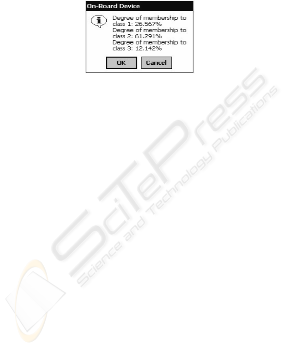
Fig. 1. Fuzzy classification output.
2.1 A Model for UDM Visualisation
We propose a model for the visualisation of the degree of membership of data ele-
ments to classes in order to improve the understanding and interpretation of the algo-
rithm results by users in dynamic mobile environments. Our model will build upon
the work presented in [6], [10] and extend it with a visualisation stage presenting
labelled clusters and data elements, with degree of membership information, to the
user.
An overview of the entire model showing the connections between the clustering,
labelling, classification and visualisation stages is shown in Figure 2. The model
shows the relationships between the data stream processing modules and the visuali-
sation module. The same data stream is used in both the clustering and fuzzy classifi-
cation stages.
In the first stage, the results of the lightweight clustering algorithm are used by the
fuzzy labelling module, along with rules from a knowledge database, to create class
names used for classifying data elements.
In the second stage, the fuzzy classification module calculates a degree of mem-
bership, for each new data element, to each class. The data elements are classified
according to the classes created in stage one. Finally, the visualisation module pre-
sents a display of the classified data elements to the user. The visualisation module
uses the degree of membership information for each data element to create a represen-
tation which displays the information graphically instead of textually.
32
Fig. 2. The combined model for clustering, labelling, classification and visualisation.
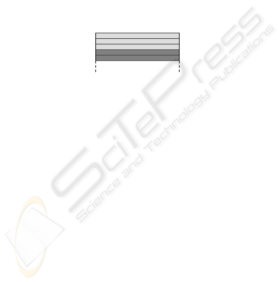
As shown in Figure 1, the output from the fuzzy classification algorithm is pre-
sented to the user in numerical format. For comparison, the same data is presented in
a graphical format in Figure 3. In this graphical format it is easier to see at a glance
that the given data element has a greater degree of membership to one class. In this
situation, the human visual system pre-attentively processes [9] the size and hue of
the ‘slices’ of the pie to distinguish the three classes. Therefore the visual system has
begun processing the graph even before comprehension of the labels has begun.
Fig. 3. Fuzzy classification output as a pie chart.
For example, consider the situation where the user is interested in finding the high-
est degree of membership for the particular data element. In contrast to the numerical
Lightweight Clustering
Fuzzy Labelling
Visualisation
Fuzzy Classification
Knowledge
Base
Data stream
Data stream
Stage One – Creation of clusters for labelling
Stage Two – Using labelled clusters for
classification
Classify
new elements
and visualise
33

output, where each value must be checked, the eye is drawn to the largest slice. Tak-
ing advantage of pre-attentive processing in the visualisation enables the user to es-
sentially filter out the smaller pie slices and find the highest percentage of degree of
membership more quickly.
In order to visualise the degree of membership to classes created by the fuzzy la-
belling algorithm, we propose the following algorithm to present membership per-
centages using relative coverage areas:
1. Let there be n = { CT
1
, CT
2
, …, CT
n
} class types or labelled clusters obtained from
the fuzzy labelling process
2. Let C = { c
1
, c
2
, …, c
n
} be a set of colour codes
3. A colour c
i
, is assigned to represent a particular class type CT
j
where i,j=1..n
4. Let G be the graphical object used in the visualization that is divided into p equally
sized parts
5. Each p will be coloured according to its class type with colour c
i
6. The number of parts of a particular colour, will be equal to the data element’s
degree of membership in that class
7. Parts belonging to a particular class will be grouped to form blocks of colour
Our model will use visual cues, such as size and hue, to convey information to the
user about fuzzy classification of data elements.
This technique can be applicable to various shapes, such as the pie chart in Figure
3 or the coloured boxes used in our proof of concept implementation (see Figure 6).
Each coloured block represents a single data element from the data stream, which
has been processed with the fuzzy classification algorithm. The degree of member-
ship information assigned to the data element is used as a guide to colour the graphi-
cal element.
Consider and example where degree of membership information is given as a per-
centage and the following values are applied to our algorithm; n = 4, p = 100
This means that we have four classes to which data elements can be assigned de-
gree of membership information, and four colours/shades used to represent the
classes. Each graphical object presented on the screen will be divided into 100 equal
sized parts. With regards to colouring, the graphical object will have at least one, and
at most four, differently coloured areas. As we are using percentage information in
our example, and using p = 100, the size of each coloured area will then be directly
proportional to the degree of membership percentages of the given data element.
3 Implementation
For the implementation we use a road safety scenario, where visualisation is used to
alert a driver to vehicles around them which could possibly pose a danger, in order to
give the driver as much time as possible to take action to avoid the danger. We use a
data generator to create data for drivers who are sober, slightly drunk, and very drunk
according to data presented in [15]. This data is used by the lightweight clustering
and fuzzy classification algorithms to produce results which are then visualised.
34
The least drunk class is given the colour green, the slightly drunk class uses the
colour orange, and the very drunk class has the colour red. Consider that each block
is made up of 100 divisions which are coloured according to the relative percentages
of the degree of membership. For example, take the data from Figure 1, where Class
1 represents the sober class, Class 2 represents the slightly drunk class, and Class 3
represents the very drunk class. Using this data we would have 27 divisions coloured
green, 61 divisions coloured orange, and 12 divisions coloured red.
Figure 4 shows an example of how the generated data is applied to the graphical
objects used in our implementation. The figure is shown in shades of grey for better
contrast although our application uses the colours described previously. The top part
of the block is coloured with 3% membership to the sober class (light grey) and 2%
membership to the slightly drunk class (dark grey).
Fig. 4. A block showing divisions and colouring.
We have implemented all of the algorithms and visualisation code using Sun Mi-
crosystems’ Java 2 Mobile Edition (J2ME) language, as it has an abundance of emu-
lators and real world devices available for prototyping and testing.
All code for the implementation has been written using Netbeans 4.1 with the op-
tional Mobility Pack. We have made use of the emulators contained in the Mobility
Pack using the Connected Limited Device Configuration (CLDC) 1.1 and Mobile
Information Device Profile (MIDP) 2.0.
In order to present the visualisation to the user, our implementation makes use of
the graphics features exposed by the Mobile 3D Graphics (M3G) library which is an
optional package for J2ME and runs alongside MIDP. The functionality of the li-
brary can be implemented in software or hardware and is designed for devices with
limited processing power and memory, which makes it ideal for our purposes. Cur-
rently, few devices have dedicated 3D hardware, but as this feature becomes more
widespread it will allow more complex visualisations to be created.
All of the clustering, labelling and classification algorithms behave as they are de-
scribed in [6], [10]. We have also created an implementation of the driver behaviour
data generator necessary to provide appropriate data for the algorithms.
For the implementation of the visualisation module, the screen is divided into a
grid of nine squares, with the centre square representing the driver’s vehicle. The
remaining eight squares represent the area surrounding the vehicle which are coloured
according to the results of the fuzzy classification algorithm. A diagram of this ar-
rangement can be seen in Figure 5.
35
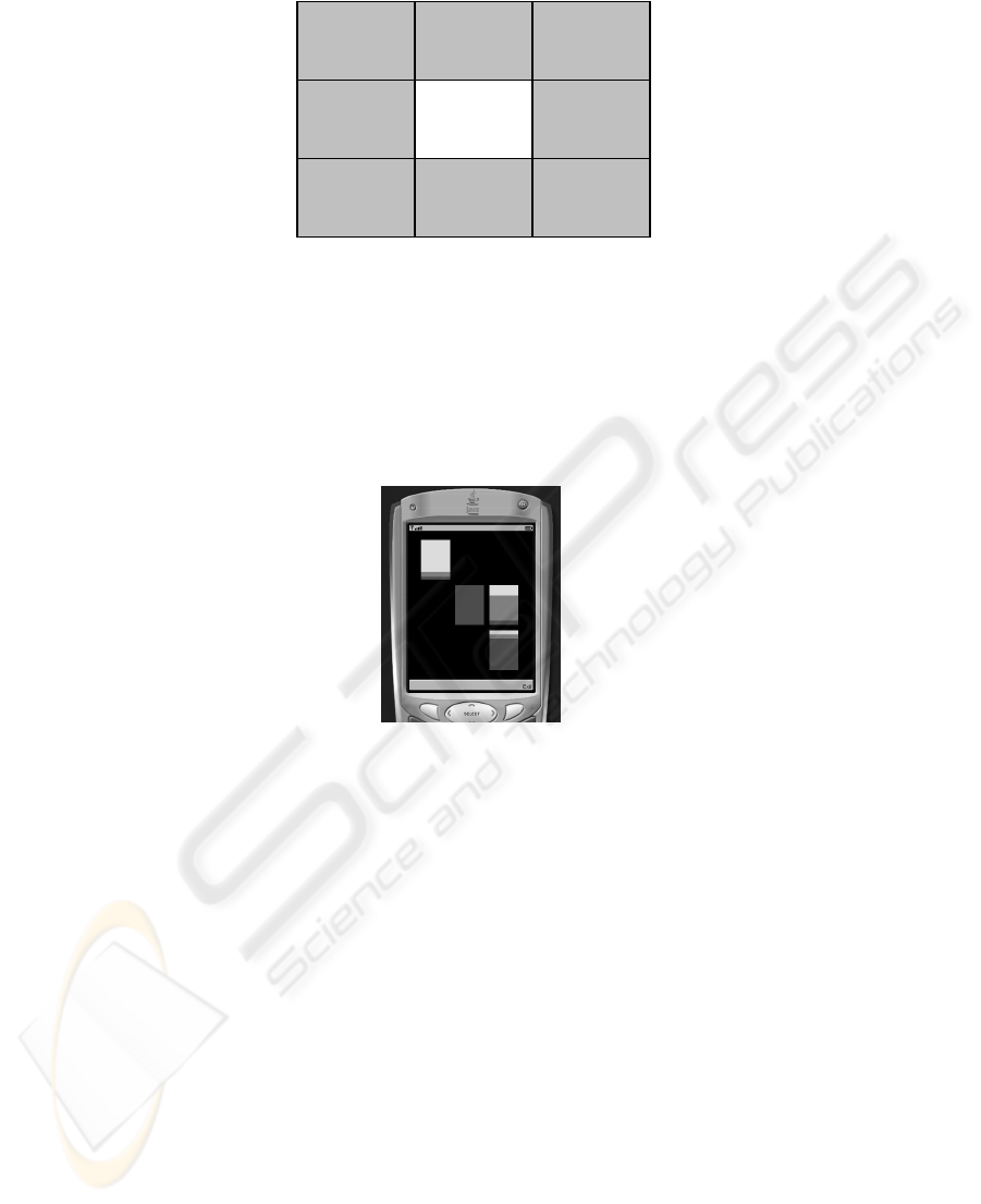
Fig. 5. The arrangement of the driver’s vehicle and other vehicles on the screen of the device.
In order to simulate a dynamic driving environment, a data element or ‘car’ is gen-
erated and randomly placed in one of the surrounding eight squares. This element is
then passed through the fuzzy classification algorithm to produce the degree of mem-
bership information. The screenshot in Figure 6 shows that there is a driver in the
least drunk class in front and to the left, a driver in the medium class to the right, and
a driver in the very drunk class behind and to the right.
Fig. 6. A screenshot of the visualiser application.
The current implementation of the road safety application does not take full advan-
tage of the three-dimensional aspect of the graphics, but 3D was used to ensure the
framework is usable when generalised for future applications.
Although this implementation uses J2ME and the M3G library any language capa-
ble of executing on a handheld device which has a 3D graphics library available
could be used for the implementation. Also, taking application specific visualisation
needs into consideration, a 2D graphics library could also be used.
4 Conclusion and Future Work
In this paper we have presented our model for the visualisation of the results of light-
weight data stream mining clustering and fuzzy classification algorithms using a visu-
alisation framework. This is the first on device UDM visualisation which does not
Driver’s
vehicle
Other
vehicle
Other
vehicle
Other
vehicle
Other
vehicle
Other
vehicle
Other
vehicle
Other
vehicle
Other
vehicle
36

offload any work to external processors. We have implemented both the lightweight
clustering algorithm and the fuzzy classification algorithm and integrated them with
our visualisation module to produce a cohesive application.
The current implementation of the model is a proof of concept and so does not in-
clude many features which would be necessary in a full implementation to take best
advantage of the available hardware.
Clearly, visualising every individual data element being processed by the fuzzy
classification algorithm will incur severe computation costs. Also, the sheer amount
of graphics processing required would reduce the usability of the system due to low
frame rates and update speeds.
To reduce the amount of processing required and to ensure the system runs at in-
teractive frame rates, we propose the use a level of detail (LoD) system for displaying
clusters and data elements. The level of detail system would work as follows:
• Farthest clusters have the cluster centre and weight information shown.
• Middle distance clusters will additionally show the data elements as points.
• The closest cluster will have the cluster centre and weight shown as well as dis-
playing the closest few data elements with full degree of membership information.
Furthermore, we also will:
• Make the visualisation component resource adaptive
• Include other UDM clustering algorithms
• Generalise the visualisation stage to be applicable to a wide range of domains
• Advanced cluster shapes i.e. shapes which encompass all data points associated
with a cluster instead of simple boxes
• A more fully featured user interface to control the application
Acknowledgements
We thank Osnat Horovitz for developing the fuzzy labelling and fuzzy classification
algorithms and for giving us access to the source code of the driver behaviour data
generator.
References
1. Aggarwal, C. C., Han, J., Wang, J., Yu, P. S.: A Framework for Clustering Evolving Data
Streams, Proc. 2003 Int. Conf. on Very Large Data Bases (VLDB'03), Berlin, Germany
(2003)
2. Aggarwal, C. C.: A Framework for Diagnosing Changes in Evolving Data Streams. Pro-
ceedings of the ACM SIGMOD Conference (2003)
3. Aggarwal, C. C.: On Change Diagnosis in Evolving Data Streams. IEEE Transactions on
Knowledge and Data Engineering 17(5), (2005) 587-600
37

4. Babcock, B., Datar, M., Motwani, R., O'Callaghan, L.: Maintaining Variance and k-
Medians over Data Stream Windows, Proceedings of the 2003 ACM Symposium on Prin-
ciples of Database Systems (PODS 2003) (2003)
5. Domingos, P., Hulten, G.: A General Method for Scaling Up Machine Learning Algorithms
and its Application to Clustering, Proceedings of the Eighteenth International Conference
on Machine Learning, Williamstown, MA (2001) 106-113
6. Gaber, M. M., Krishnaswamy, S., Zaslavsky, A.: Cost-Efficient Mining Techniques for
Data Streams, Australasian Workshop on Data Mining and Web Intelligence (DMWI2004),
Dunedin, New Zealand (2004)
7. Gollapudi, S., Sivakumar, D.: Framework and algorithms for trend analysis in massive
temporal data sets, presented at Thirteenth ACM conference on Information and knowledge
management, Washington, D.C., USA (2004)
8. Guha, S., Mishra, N., Motwani, R., O’Callaghan, L.: Clustering data streams, in Proc.
FOCS, (2000) 359-366
9. Healey, C. G., Booth, K. S., Enns, J.: Visualizing Real-Time Multivariate Data Using
Preattentive Processing, ACM Transactions on Modeling and Computer Simulation 5, 3
(1995) 190-221.
10. Horovitz, O., Krishnaswamy, S., and Gaber, M, M.: A Fuzzy Approach for Interpretation
and Application of Ubiquitous Data Stream Clustering, Accepted for publication in the Pro-
ceedings of the Workshop on Knowledge Discovery in Data Streams held in conjunction
with the 16th European Conference on Machine Learning (ECML) and the 9th European
Conference on Principles and Practice of Knowledge Discovery in Databases (PKDD), 3-7
October, Porto, Potugal, Springer Verlag Lecture Notes in Computer Science (LNCS).
(2005)
11. Kargupta, H., Park, B., Pittie, S., Liu, L., Kushraj, D., Sarkar, K.: MobiMine: Monitoring
the Stock Market from a PDA. ACM SIGKDD Explorations, Volume 3, Issue 2. ACM
Press (2002) 37-46
12. Kargupta, H., Bhargava, R., Liu, K., Powers, M., Blair, P., Bushra, S., Dull, J., Sarkar, K.,
Klein, M., Vasa, M., Handy, D.: VEDAS: A Mobile and Distributed Data Stream Mining
System for Real-Time Vehicle Monitoring. Accepted for publication in the Proceedings of
the SIAM International Data Mining Conference, Orlando. (2004)
13. Keim, D. A.: Information visualization and visual data mining. IEEE Transactions On
Visualization And Computer Graphics, 8(1) (2002) 1-8
14. Keim, D. A., Schneidewind, J., Sips, M.: CircleView: a new approach for visualizing time-
related multidimensional data sets. AVI 2004 (2004) 179-182
15. Moskowitz, H., Burns, M., Fiorentino, D., Smiley, A., Zador, P.: Driver Characteristics and
Impairment at Various BACs, Southern California Research Institute (2000)
16. O'Callaghan, L., Mishra, N., Meyerson, A., Guha, S., Motwani, R.: Streaming-data algo-
rithms for high-quality clustering. Proceedings of IEEE International Conference on Data
Engineering (2002)
17. Wegman, E., Marchette, D.: On some techniques for streaming data: A case study of Inter-
net packet headers, Journal of Computational and Graphical Statistics, 12(4) (2003) 893-
914
18. Wong, P. C., Foote, H., Adams, D., Cowley, W., Thomas, J.: Dynamic Visualization of
Transient Data Streams, IEEE Symposium on Information Visualization (2003)
19. Zaki, M. J.: Online, Interactive and Anytime Data Mining, guest editorial for special issue
of SIGKDD Explorations, Volume 3, Issue 2 (2002) i-ii
38
