
CROSS-MEDIA USER INTERFACES FOR CONTROLLING THE
ENTERPRISE
The EAGLE Integrated System
Pedro Campos
Department of Mathematics and Engineering, University of Madeira, Campus Universitário da Penteada
9000-390 Funchal, Portugal
Filipe Sousa, Lucas Pereira, Carlos Perestrelo, Duarte Freitas
Anturio Corporation, R. João Tavira, 4, 2ºA, 9000-075 Funchal, Portugal
Keywords: User-centered design, information visualization, enterprise modeling and visualization, business intelli-
gence, enterprise information systems, decision-support systems.
Abstract: Current Business Intelligence (BI) tools are aimed at providing managers with a way to control and measure
their businesses. However, and despite much research and many commercial and academic prototypes, the
user acceptability of these systems remains challenging. We describe an innovative approach to enhancing
the ease of use and the visualization, control and decision-making of small-to-medium enterprises. Our ap-
proach to the design of BI tools is novel because (a) it combines user-centered design techniques with recent
advances in quantitative information visualization, and (b) it employs several media (webcams, telephones,
interactive maps and sparklines) to provide the user with a more powerful way of business control. We pre-
sent a tool called Eagle which was designed using this approach and was developed in an industrial, real-
world setting. We also describe some principles which were outlined along this case study.
1 INTRODUCTION
Business Intelligence (BI) is defined as the result of
“acquisition, interpretation, collation, assessment,
and exploitation of information” (Davies, 2002, p.
313) in the business domain.
There is currently a trend towards satisfying new
customer needs relating visual business intelligence.
Existing business analysis systems are difficult to
use and visually complicated. There is clearly a need
for user-friendly software applications as well as a
need to control multi-placed business sites, offices
or stores anytime, anywhere.
Our premise is that the key to obtaining more us-
able and useful executive information systems im-
plies providing the executive with the right business
tools, coupled with the right visualizations, using an
interface designed to support the decision tasks effi-
ciently.
In this paper, we describe the approach we took
in the design of the Eagle system, a new BI tool that
integrates several media (live streaming webcams,
conventional, fixed telephones, interactive maps).
Our approach is novel because current BI tools suf-
fer from a lack of appropriate user-centered design
methods: instead of focusing on features, we focused
on the relevant business decision-making tasks. We
also combined user-centered design techniques with
recent advances in quantitative information visuali-
zation to design the Eagle system.
The remaining of this paper is organized as fol-
lows: Section 2 describes some background founda-
tions of our work, namely the need for better BI
tools, sparklines for visualizing intense, quantitative
data, and the usage-centered design process. Section
3 describes related tools and approaches. Section 4
presents both the architecture and the user interface
of the Eagle system which we developed as a proof
of concept for our cross-media, usage-centered ap-
proach to the design of BI tools. Section 5 gathers
some principles we found useful, and that could
guide the effective design of BI tools. Finally, Sec-
129
Campos P., Sousa F., Pereira L., Perestrelo C. and Freitas D. (2007).
CROSS-MEDIA USER INTERFACES FOR CONTROLLING THE ENTERPRISE - The EAGLE Integrated System.
In Proceedings of the Ninth International Conference on Enterprise Information Systems - HCI, pages 129-135
DOI: 10.5220/0002370101290135
Copyright
c
SciTePress
tion 6 draws some conclusions and outlines possible
future work.
2 BACKGROUND
Business Intelligence tools have been the target of
much research since the beginning of the 90s (Lun-
deberg and Sundgren, 1996). The purpose of this
class of systems is to provide managers and execu-
tives with a way to control, measure and obtain in-
formation for decision-making regarding their busi-
nesses. However, the number of companies and ex-
ecutives actually using these systems remains rela-
tively small (Lundeberg and Sundgren, 1996).
According to a recent BI survey (Information-
Week, 2006), a majority of companies report a lim-
ited number of their employees as having access to
BI tools. Only 8% of the surveyed companies report
that half or more of their employees access BI tools.
More importantly, it is expected that BI tools
will be accessed by more than half of the companies’
employees within two years (38% of responses), and
nine out of ten companies report BI spending to be
growing or remaining the same as last year. This
suggests that usability will be a major concern in the
design of the next generation of BI tools.
The design of these systems faces many chal-
lenges: the ability to display large amounts of enter-
prise-wide data, as well as to provide easy-to-use
mechanisms for visualizing and exploring that data
are some of the most difficult ones to tackle (Keim
et al., 2006).
Simplicity, flexibility, accurate representation of
the data (and high-quality, reliable, data) have been
referred to as particularly important factors for the
actual design and development of Executive Infor-
mation Systems (EIS) (Lundeberg and Sundgren,
1996).
This review, along with a more extensive BI
tools literature review reveals the following gaps:
a) existing business intelligence tools suffer from a
lack of visualization and analysis capabilities
(Chung et al., 2005);
b) none of the existing tools allow the user to act,
e.g. call the employee at one of the stores, watch
two stores through a live video stream,
c) none of the existing tools provide the user with a
cross-media, integrated environment for actually
controlling their businesses.
The solution we propose (the Eagle system) aims
at addressing gap (a) by being based on novel visu-
alization techniques particularly effective for busi-
ness data. It addresses gap (b) by using VoIP and
live webcams technology. And finally, it addresses
gap (c) by providing an integrated environment that
allows the user to visualize data, see live images
from desired stores, talk to and hear the employees,
customers, and the overall business environment
along with the traditional information which is dis-
played in conventional BI tools. The Eagle system
we describe in this paper was designed through a
user-centered approach and is being tested in real-
world small-to-medium businesses.
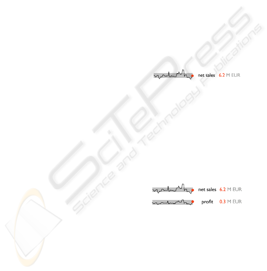
2.1 Sparklines
Sparklines (Tufte, 2006) are “simple, intense, word-
sized graphics”. Figure 1 shows an example of a
sparkline that displays a large set of data in a very
small space. The most recent value of net sales is
linked to the 6.2 number through the use of the red
color. Some context is provided by showing the
normal range of net sales as a grey band.
Figure 1: Sparkline showing intense data in a small space:
the grey band shows normal range of values.
The application of sparklines to financial data is
quite appealing. The essential task of BI tools’ users
is to make decisions, and making decisions implies
making comparisons. Since sparklines are small,
high-resolution data lines (usually embedded in a
wider context comprised of words, diagrams and
images), stacking several of these sparklines to-
gether helps the BI user to quickly detect patterns
and perform fast parallel comparisons. Figure 2
shows a simple example of sparklines stacked to-
gether.
Figure 2: Sparklines can be stacked together to facilitate
fast comparisons between several business metrics.
In terms of BI tools, sparklines are particularly
useful “for tracking and comparing changes over
time, by showing overall trend along with local de-
tail” (Tufte, 2006). In the system we present in this
paper, we added more detail by displaying the ex-
treme values (high-low, least/most recent values).
These values should be displayed directly over the
sparkline, like Figure 3 shows.
ICEIS 2007 - International Conference on Enterprise Information Systems
130

Figure 3: Sparkline showing local values of interest
(high/low least/most recent values).
By providing an upfront, contextualized look at
intense data, sparklines can be particularly effective
in BI tools. In the recent words of Edward Tufte,
upon which most of this research was based, “spar-
kline graphics give us some chance to be approxi-
mately right rather than exactly wrong” (Tufte,
2006).
2.2 Usage-Centered Design
Usage-Centered Design (Constantine and Lock-
wood, 1999) is a model-driven engineering process
essentially based on three simple models: a user
model, a task model, and an interface model.
Usage-Centered Design employs abstract models
that have been finely tuned through experience and
practical, real-world cases to capture and clarify the
essence of users, tasks, and interfaces in the most
expeditious and efficient manner. Regarding users,
the interest lies uniquely in the roles they play in
relation to a system, and the designer tries to capture
the salient and significant aspects of these relation-
ships in the form of an abstract user role model. For
a task model, task cases are employed: these are use
cases defined by “abstract, generalized, technology-
free descriptions” (Constantine and Lockwood,
1999; 2001). For the interface itself, the designer
begins with simple models of interface contents and
maps of navigation paths or other forms of abstract
prototypes (Constantine, 1999) to help achieve the
structure and organization right before becoming
buried in the details of the real user interface.
The analysis and design process we followed,
skipped the interface model and was focused on
gathering information about user needs as well as a
thorough task analysis. In the context of the task
analysis we performed, these were the tasks classi-
fied with the best combination of importance (busi-
ness importance) and frequency (of usage):
- Compare business metrics;
- Compare business metrics between business
sites;
- Compare business metrics against time;
- See and hear business sites (possibly more than
one simultaneously);
- Talk to business sites (possibly more than one
simultaneously);
In addition to the visualization techniques like
sparklines and the usage-centered design process, we
also followed a design philosophy aimed at support-
ing workstyle transitions (Self-Reference). We
adapted our workstyle model to the business execu-
tive needs, and followed a cross-media approach to
the design of BI tools, aimed at supporting the work-
styles of BI tools’ users.
3 RELATED WORK
The Business Intelligence Explorer (Chung et al.,
2005) is a visualization system for browsing a large
number of results related to business Web sites. Its
design was based on a visual framework for knowl-
edge discovery on the Web, which provides an ap-
proach to reducing information overload.
A similar tool called INSYDER (Reiterer et al.,
2000) aims at providing an information assistant for
finding and analysis business information from the
Internet. INSYDER is a system that uses different
agents for crawling the Web, evaluating and visual-
izing the results.
The idea of combining vision and hearing capa-
bilities to the development of financial information
visualization tools is explored by Nesbitt and Bar-
rass (2004). They propose a combined visual and
auditory design for helping traders detect patterns
and predict stock market direction. Their basic moti-
vation for designing a multi-sensory display was to
widen the computer-human bandwidth, which is
slightly different than our approach: we aim at pro-
viding more control capabilities to managers and
executives.
Integrating business intelligence with knowledge
management has also been the target of some re-
searchers. Cody et al. (2002) present their concept of
BIKM, systems that blend BI with Knowledge Man-
agement capabilities and describe two tools that we
have developed to explore their approach – eClassi-
fier, which performs text analysis, and Sapient,
which integrates data and text through an OLAP-
style interaction model.
Attesting the importance of providing managers
with a real-time environment for monitoring and
controlling the enterprise, Sayal and colleagues
(2002) present the Business Process Cockpit (BPC),
a tool that supports real-time monitoring, analysis,
and management of business processes. The BPC
was developed after the analysis of requirements for
this class of tools. Sayal et al. (2002) identified that
it is essential that users can quickly and easily ana-
lyze business-level indicators. Enabling a way for
CROSS-MEDIA USER INTERFACES FOR CONTROLLING THE ENTERPRISE - The EAGLE Integrated System
131
business users to easily define and extract business-
level metrics from execution data, however, meant
only “without writing any code”. In the user-
centered Eagle approach, we do not aim at providing
means to let the user determine the best reports or
the desired visualizations without having to write
code, but instead to provide a tool with proven visu-
alization techniques
Finally, advocating how the usability issues
should be considered in the design of Data Mining
tools, Berzal (2003) proposes to integrate diverse
tools into a framework which should be kept coher-
ent and simple from the user's point of view. The
focus “is usually on complex algorithmic techniques
whose influence is minor when it comes to users’
acceptance of the systems we build” (Berzal, 2003).
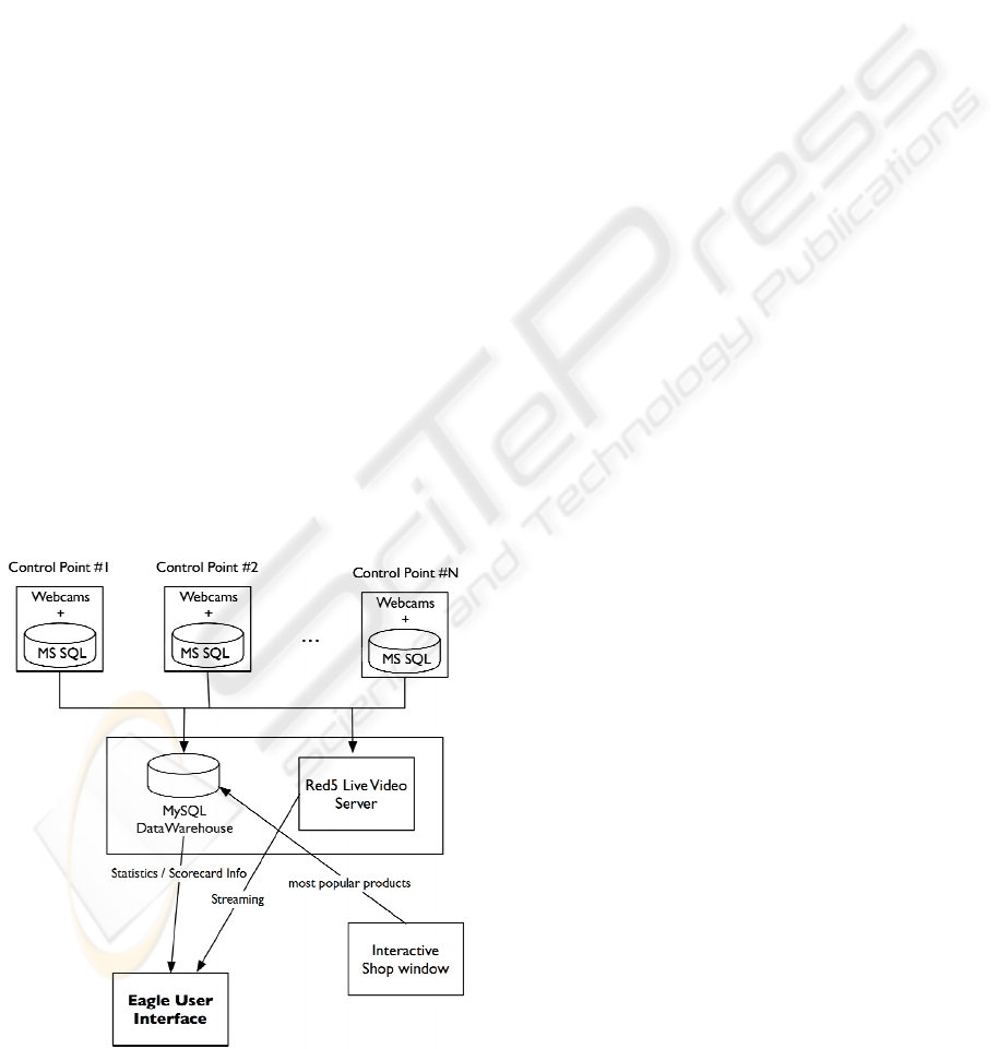
4 THE EAGLE SYSTEM
In this section, we will describe both the architecture
and the user interface of the Eagle system.
4.1 Architecture
The main framework structure is composed by three
main components:
– the multiple control sites on the top of Fig. 2,
– the main server structure on the middle of Fig. 2,
– and the client interfaces on the bottom of Fig. 2
(including possible interactive shop windows).
Figure 4: The Eagle system architecture.
Control Points. The multiple control points can
be defined as workstations, points of sales (POS) or
business sites. Each of these places is a piece of a
network that is aggregated and controlled by Eagle
as one. Each site incorporates a set of IP Network
Cameras and a database with information about the
control point. This information is usually created
and maintained by a local operational system (like
stock management systems or POS). The databases
used in these sites can a have different structure and
brand (although MS SQL is very common, small-to-
medium enterprises often recur to less sophisticated
solutions, like MS Access databases or even Excel
files which are stored locally).
Main Server Structure. The main server struc-
ture includes a minimum of two servers: a MySQL
5.0 database server and an OSFlash Red5 server
(OSFlash Red5, 2006) using the Real-Time Messag-
ing Protocol (RTMP). The MySQL server gathers
data from the control sites and compiles them into
statistical information for the graphical client inter-
face. The gathering of this information is triggered
by the Eagle/Fox clients. The Red5 server awaits
broadcast connections from the control points and
transmits video/voice streaming data to the clients
upon request.
Eagle Client. The Eagle client communicates
with the MySQL server for online data information
and the Red5 server for the media streaming data.
The clients are responsible for managing the online
and offline control points, requesting information
directly to the control point on a minimal basis.
It is assumed that the control points have a dy-
namic IP configuration, so the clients only now the
current IP of the control site after it has logged on to
the Red5 server.
Figure 4 also shows an aspect not yet imple-
mented, but which seems promising: coupling an
interactive shop window (or a touch-screen inside
the shop) to the system could provide the business
user with detailed information about the most popu-
lar products, e.g. the ones most browsed, and during
what times of the day. Regardless of that extra as-
pect, the system is very flexible regarding hardware
requirements: one can use low resolution, USB web-
cams or high resolution wireless IP cams. Any busi-
ness manager with an Internet connection can use
Eagle both as a data visualization tool and as a sur-
veillance system.
4.2 Eagle’s User Interface
The main interface framework is shown in Figure 5
and can be divided in four distinct displays: (1) the
ICEIS 2007 - International Conference on Enterprise Information Systems
132
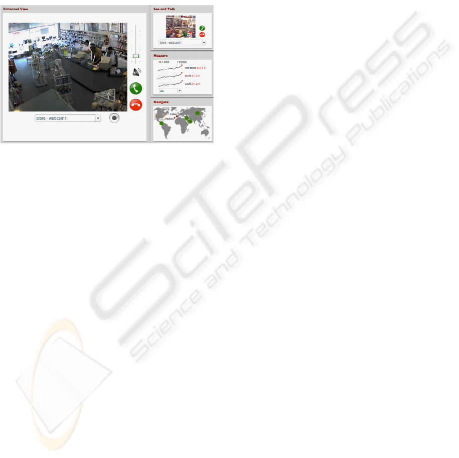
main screen on the left, (2) the right top screen, (3)
the right middle screen, (4) and the right lower
screen. The main framework was developed on
Adobe Flex (Adobe, 2006a) technology. It allowed
us to rapidly develop sparkline charts using the
Chart components, which are usable and easily ex-
tended. It also allowed us to integrate the Red5 live
stream server technology. Also, and because it’s
based on the Flash Player (Adobe, 2006b), resizing
and reuse are simplified, since Flash is vector-based.
Figure 5: A screenshot from the Eagle system.
Main Screen. The main screen enhances the
functionality of one of the three screens on the right
upon selection. If the user selects one of these right
screens, the selected screen is enlarged on the left
main screen with extra functionality options. In Fig-
ure 5, the selected screen is the top right screen,
enlarged in the left main screen. This is a way of
supporting smooth workstyle transitions: the user
may be interested in visualizing live video from one
or more business sites, then rapidly check the spar-
klines to obtain information about net sales or gross
profit from those sites. And if he/she wishes to go
further in detail, then by clicking at the sparklines,
the enhanced view shows in-detail, highly interac-
tive charts.
Right Top Screen. This is the media screen
which incorporates the video and voice functional-
ities. The business site camera view can be selected
in the dropdown box and then shown to the user.
Volume control is also accessible plus an option to
directly call the fixed network telephone line of the
control site.
Right Middle Screen. The statistics screen
shows online data of the selected business site. The
selected business site is the same as the one selected
in the media screen (right top screen). The shown
statistics can include net sales, gross margin, gross
profit, etc. The temporal interval can be selected by
the user through a drop down box in this screen.
This temporal navigation is also aimed at supporting
workstyle transitions (in this case, going smoothly
back and forth in the time dimension).
Right Lower Screen. The control map screen is
used to visualize all the business sites in the network
and to highlight the selected one. Online and offline
sites are presented with differentiated colors. This
screen can be used to select another control point.
The interface functionality can be described by
three main views: (1) the Site Map view, (2) the
Cam View and the (3) Metrics View.
The Cam View. This view is shown to the user
when the right top screen is selected (the media
screen), enhancing with a slide effect to the main
screen (as Figure 5 shows). The main screen incor-
porates the same options as in the right top media
screen, plus a recording functionality.
The Metrics View. This view includes metric
comparing functionalities in time and space – be-
tween sites and across different seasonal time sets.
The Metric view is enable when the right middle
screen is selected, enhancing to the main screen
(whit a sliding effect) the statistics from the cur-
rently selected business site. The main purpose for
this view is to generate intelligent information to
make decisions.
The Site Map View. This view is the default
view when launching the Eagle application. It shows
in the main screen an enhanced and more detailed
map with the business sites in a particular area. If a
particular area is selected in the right lower screen,
then that area is enhanced in detail in the main
screen.
4.3 Stock Management Systems
Synchronization
The MySQL Data Warehouse (DW) retains all up-
dated information about all business sites in a uni-
form matter. So the data warehouse is synchronized
with the databases in the control points following a
data synchronization strategy which is outside the
scope of this paper.
As it is, the information update is triggered by
the client application (Eagle) retrieving daily infor-
mation from the main data warehouse. Then, if an
information updated is needed in the DW, the con-
trol points data servers shall be contacted first to
request the needed information and then stored in a
uniform way in the main MySQL data warehouse
server. To display this information, the application
clients should access directly the main server.
The main data warehouse keeps track of the last
update dates in order to automatically decide when
CROSS-MEDIA USER INTERFACES FOR CONTROLLING THE ENTERPRISE - The EAGLE Integrated System
133

to request an update from the control points. The
time frame between updates is a configurable vari-
able.
Since the control points have a dynamic IP con-
figuration, each client should retrieve the online data
servers IP addresses from the Red5 server on which
they are all connected.
4.4 VoIP Connection to the Local
Phone Network
For the local phone network connection, a partner-
ship with an existing global VoIP service company
can be enabled – (example companies like Skype or
Voipbuster). An interface component was created to
facilitate the Eagle client interface with the partner
company system communication protocol.
The Eagle user is able to use the interface as eas-
ily as the partner company’s original application
client.
Any information about the user logins and pass-
words relating the VoIP service is hidden from the
user in the Eagle application. Such configurations
should only be made on an administrator level.
5 PRINCIPLES FOR BI TOOLS
“Everyone spoke of an information overload, but what
there was in fact was a non-information overload.”
Richard Saul Wurman, What-If, Could-Be (Philadel-
phia, 1976), quoted by E. Tufte.
Following the inspiration of Tufte’s principles
(Tufte, 2006), and after the design of the Eagle sys-
tem, we reflected upon the approach and gathered a
set of principles that should help guide the design of
new BI tools.
Maximize the data-clicks ratio. Also maximize
the data-pixels ratio, within reason. Current BI tools
suffer from usability problems since the number of
mouse-clicks required to achieve a desired visualiza-
tion is too large. Thus tools should be designed in an
essential way that doesn’t penalize the user for ex-
ploring or visualizing the maximum amount of data
as possible.
Erase non-enterprise data user interface com-
ponents. All the information needed to accomplish
the business decision and control tasks should be
available in a WYGIWYN manner (What You Get
Is What You Need). As one can see through the
screenshot of Figure 5, only the relevant interface
elements are shown, e.g. the controls for configura-
tion of the control points’ network like phone num-
bers, metrics from the company’s scorecard, data-
base parameters, all of these are hidden from the
business executive user. Of course the system is
fully customizable and adaptable to any small-to-
medium organization, but the details for that cus-
tomization only appear in the relevant screens.
Integrate enterprise data from several sources
and from several media. Tufte’s principle for the
display of quantitative data, which preaches the in-
tegration of evidence from multiple sources, of mul-
tiple nature (e.g. tables, diagrams integrated with
images, etc.) should also be applied to the design of
interfaces for visualization of business information,
like modern BI tools. One way to achieve this is
proposed in the Eagle system: information about the
most browsed (the most visualized) products in the
interactive shop window is sent to the tool, and the
business executive can see a sparkline or table about
the products which were most seen by shoppers.
This doesn’t have to be implemented in a sophisti-
cated large interactive shop window. A simple
touch-screen or conventional LCD (with a mouse
attached) placed inside the store can invite potential
clients and gather important marketing information.
Show multivariate, multimedia data. This prin-
ciple is also based on Tufte’s. BI tools should com-
bine live video/audio streams from the relevant
business sites with charts, tables and maps of the
company or organization at stake. Providing the user
with a full, high-quality picture of the business is
essential to increase the level of acceptance of BI
tools.
In the Eagle system, financial information like
net sales, gross profit or the top 5 products is shown
alongside with live images of the selected stores.
Geographical information is also shown in the map
view. The aim is not only to integrate information
from various sources, but also to show the integrated
data, whether it’s a video stream, a table of numeric
data, or a set of sparkline graphics.
Provide cross-media ways to control the enter-
prise at stake. Knowledge is useless without a
means of action according to the knowledge. Eagle’s
button for calling up someone through the local
phone network allows the user not only to control
the business but also to act (e.g. ask why there’s so
many clients observing a product, ask to change the
location of a given product or set of products). BI
ICEIS 2007 - International Conference on Enterprise Information Systems
134

tools should be designed not only to show business
information but also to provide means of action.
6 CONCLUSIONS
In this paper, we have shown some design and pro-
gramming details about a new tool called Eagle. We
also presented some design ideas that we applied in
the design of this system. Our research goal is not to
create a sound theory, but instead to provide a proof-
of-concept tool that illustrates some useful ideas
aimed at BI tools’ development. Industrial designers
need practical guidance, not canned solutions: pro-
viding them with adequate design ideas and exam-
ples is therefore an important research objective.
The implementation of the tool is in touch with
the definition of a BI tool, since it is easily coupled
with a web-based interface that is currently being
extended to support data-mining issues, balanced
scorecards and similar tools. A thorough evaluation
of Eagle is being planned, using collaborative us-
ability inspections (Constantine and Lockwood,
1999) as well as formal, quantitative methods. This
will probably shed more light into how business
managers actually use a tool like Eagle.
One of the limitations of our approach is that it
was designed specifically for small-to-medium en-
terprises. However, this class of companies consti-
tutes the vast majority of Portugal’s business organi-
zations, and some of the principles we advocate here
are essentially general design principles. Future
work could include a study on the scalability of our
tool and design ideas.
Future work also includes gathering information
from interactive shop windows into the Eagle appli-
cation. This could allow the visualization and com-
parison of net sales data with the most browsed
products. Another interesting line of research is re-
lated to empirical studies of this kind of BI tools.
With the predictable increase in the dissemination
and usage of this class of systems, effort should be
devoted to usability studies that could shed light into
how they are actually used, and that could bring new
insight into the development of modern BI tools.
REFERENCES
Adobe Flex website, 2006. http://www.adobe.com/flex.
Adobe Flash website, 2006. http://www.adobe.com/flash.
Berzal, F., 2003. Usability Issues in Data Mining Systems.
In Proceedings of the International Conference on En-
terprise Information Systems, ICEIS 2003, Angers,
France.
(Self-Reference)
Chung, W., Chen, H. and Nunamaker, J., 2005. A Visual
Framework for Knowledge Discovery on the Web: An
Empirical Study of Business Intelligence Exploration.
Journal of Management Information Systems / Spring
2005, Vol. 21, No. 4, pp. 57–84.
Cody, W. F., Kreulen, J. T., Krishna, V. and Spangler, W.
S., 2002. The integration of business intelligence and
knowledge management. IBM Systems Journal, Vol.
41, No. 4, 2002.
Constantine, L. and Lockwood, L., 1999. Software for
Use. A Practical Guide to the Models and Methods of
Usage-Centered Design. Addison-Wesley, Reading,
MA, pp. 194-195.
Constantine, L. L. and Lockwood, L. A. D., 2001. Struc-
ture and style in use cases for user interfaces. In M.
van Harmelen, Ed., Object Modeling and User Inter-
face Design. Boston: Addison Wesley.
Davies, P.H.J., 2002. Intelligence, information technology,
and information warfare. Annual Review of Informa-
tion Science and Technology, 36 (2002), 313–352.
Keim, D. A., Mansmann, F., Schneidewind, and Ziegler,
H., 2006. Challenges in Visual Data Analysis. In Pro-
ceedings of Information Visualization (IV’06).
Lundeberg, M. and Sundgren, B. (eds.), 1996. Advancing
your business: People and Information Systems in
Concert. EFI, Stockholm School of Economics, Swe-
den.
Nesbitt, K. and Barrass, S., 2004. Finding Trading Patterns
in Stock Market Data. IEEE Computer Graphics and
Applications, Sep.-Oct. (2004), 45–55.
OSFlash Red5, 2006. An open-source Flash-based media
server, http://osflash.org/red5.
Reiterer, H., Mußler, G., Mann, T. M., and Handschuh, S.
2000. INSYDER – an information assistant for busi-
ness intelligence. In Proceedings of the 23rd Annual
international ACM SIGIR Conference on Research
and Development in information Retrieval, Athens,
Greece, July 24 - 28, 2000.
Sayal, M., Casati, F., Dayal, U. and Shan, M.-C., 2002.
Business Process Cockpit. In Proceedings of the 28th
VLDB Conference, Hong Kong, China. Extended Ab-
stract.
Shneidermann, B., 1996. The eyes have it: a task by data
type taxonomy for information visualizations. In IEEE
Symposium on Visual Languages, pages 336-343.
Tufte, E., 2001. The Visual Display of Quantitative Infor-
mation. Graphics Press, Connecticut, 2
nd
edition.
Tufte, E., 2006. Beautiful Evidence. Graphics Press, Con-
necticut.
CROSS-MEDIA USER INTERFACES FOR CONTROLLING THE ENTERPRISE - The EAGLE Integrated System
135
