
ENCYCLOPEDIA WALKABOUTS WITH VISNOMAD
A New Visualization Tool Designed as an Aid for Textual Exploration
Dominique Thiebaut
Department of Computer Science, Smith College, Northampton, MA, U.S.A.
Larry Owens
History Department, University of Massachusetts, Amherst, MA, U.S.A.
Keywords:
Visualization, Encyclopedia of computer science, Prefuse, Java, Network, Tree.
Abstract:
We present an original visualizer that allows users to travel through the network of pages of an early encyclo-
pedia of computer science. The purpose of this tool is to better understand the relationship between concepts of
computer science at an early stage in the development of the field. The visualizer is written in Java, interfaces
to a database server, and sports two different graphical representations, a tree and a graph that are logically
connected. We present our design goals, our choices of implementations and the challenges encountered.
1 INTRODUCTION
How did the appearance of the Personal Computer
alter the world of computer science? How did the
different areas of research, the technology hot spots
change because of it? What areas of computer orga-
nization and architecture shifted importance because
of the entrance of the PC on the scene? What new
areas of interest and research resulted? Such ques-
tions are interesting for historians of science, and to
help better explore these fugitive and elusive ques-
tions we have designed VisNomad, a visualization
tool that displays graphically the pages of an ency-
clopedia of computer science. This tool is primar-
ily a thought tool (Sugiyama, 2002) for one to nav-
igate the network of the references linking the pages
of Ralston’s Encyclopedia of Computer Science. Two
different versions of the encyclopedia are used, one
published in 1976 (Ralston, 1976) and the other in
1983 (Ralston, 1983), respectively, and fortuitously
bracketing the birth of the PC revolution. The ability
of the human eye to discern patterns (Schneiderman,
1996), clusters, or hotspots in networks makes this
tool a valuable companion for historian explorers.
In this paper we concentrate on the visualization
aspects of this investigation. Interested readers should
see (Owens, 2009) for the report on the historical ex-
ploration.
The data visualized is the alphabetical listing of
entries of both editions of the encyclopedias. Each
entry of the encyclopedia forms an item in our data
set, and the references the entries make to other form
the links between the different entries. Each entry is
accompanied by the number of columns of text as-
sociated with it, the number of references it makes
to other entries, and the number of related subjects.
These quantities provide valuable information as the
full-text electronic version of the pages is not avail-
able.
VisNomad is written in Java, and uses Java Web-
start technology. It can be used as a stand-alone ap-
plication or as an applet accessible on the Web. The
data are stored in an SQL server, and are dynamically
retrieved by the visualizer as users roam the network
of encyclopedic entries.
The visualizer offers three different paths for ex-
ploring the entries of the encyclopedias:
• The first one is a standard keyword search-box (`a
la Google),
• the second one is a three-level alphabetical list of
all the entries forming a tree, with each entry as
the root of a sub tree of entries that are directly
linked to it, and
• the third one is a two-dimensional graph depicting
entries connected by spring-loaded links floating
in a force-field layout.
Figure 1 shows the full visualizer and the different
123
Thiebaut D. and Owens L. (2010).
ENCYCLOPEDIA WALKABOUTS WITH VISNOMAD - A New Visualization Tool Designed as an Aid for Textual Exploration.
In Proceedings of the International Conference on Imaging Theory and Applications and International Conference on Information Visualization Theory
and Applications, pages 123-131
DOI: 10.5220/0002816201230131
Copyright
c
SciTePress
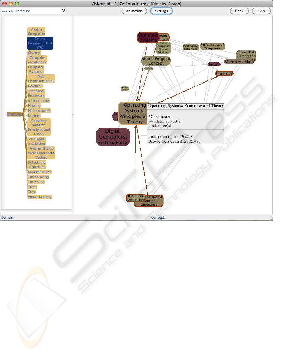
Figure 1: Visualizer window showing the entry for Interrupt, in a hierarchical tree on the left, the graph on the right, and the
search bar at the top.
components.
In the next subsection we present our objectives
for designing VisNomad. The subsection that follows
presents similar and related visualization projects and
highlights the differences with our approach.
1.1 Design Goals
Our design strategy is to create a system where the
user’s attention is taken logically top-down and from
left to right, in a simple but effective “1, 2, 3” ap-
proach where continuity of cognition is maintained.
We also want to follow Shneiderman’s long recom-
mended design guideline (Schneiderman, 1996) for
effective visualization: “Overview first, zoom and fil-
ter, then details-on-demand.”
The result should be a tool that sports Ware’s
stated objectives for effective information visualiza-
tion systems, which are reworded in our context be-
low.
• Comprehension: The visualization must provide
the ability to comprehend how the 400 entries in
the encyclopedia relate to each other, plus how
they aggregate, cluster, and contribute to form a
self-contained body of knowledge.
• Perception: The visualization must reveal proper-
ties of the relationships between computer science
concepts that were not anticipated.
• Quality control: The visualization must make it
easy to discover problems in the data. (This item
is of lower priority for us, as the data set is fairly
small and easy to validate.)
• Detail + Context: The visualization should facil-
itate understanding of small scale features in the
context of the large scale picture of the data.
• Interpretation: The visualization supports hy-
pothesis formation, leading to further investiga-
tion.
Finally, the aesthetics of the visualizer is an impor-
IVAPP 2010 - International Conference on Information Visualization Theory and Applications
124

tant component of its design (Sugiyama, 2002) and a
guiding force during its conception.
1.2 Data
The data are collected from Ralston’s encyclopedias
and consist of 476 entries linked by 2,333 references
for the 1976 edition (Ralston, 1976), and 551 entries
connected by 2,714 references for the second edition
(Ralston, 1983) of 1983. For each entry we also have
the number of columns of text it contains, the number
of references made to other entries, and its number of
related subjects.
1.3 Related Visualizations Projects
A good survey of the various techniques of visualiza-
tions for graphs can be found in (Herman et al., 2000),
and covers many of the types discussed here, includ-
ing force-field layouts, radial graphs, and tree-maps.
A collection of documents connected to each other
by explicit links, such as references, form a Knowl-
edge Management System (Maier, 2007), also referred
to as KM system, or KMS. An encyclopedia is a
knowledge management system. According to Trier
(Trier, 2005), a KMS can include up to four different
types of knowledge entities: process/activities, docu-
ments, individuals, or topics. Our visualizer and its
data fall in the category of a topics KMS. KM focus-
ing on individuals and activities are refereed to as so-
cial networks, and many visualization tools have been
developed and proposed in this area in recent years.
Ontologies are also knowledge management systems,
close enough to our effort to warrant our interest in
visualization projects that target these systems.
Possibly the closest visualizing tool in spirits to
our own is Jellyfish (Horn and Jenett, 2005). It is an
unpublishedproject that has been recognized and doc-
umented by several Web aggregation services, such
as Infovis-wiki.org, which specializes in cataloguing
interesting visualization tools. The Jellyfish Website
states that “[t]he project should be seen as an experi-
ment, which deals with a dynamic interface. The pur-
pose [is] to remove a static, conventional design and
to achieve a playful interface.” Written in Processing
(Fry, 2008), the visualizer is open-source and allows
the user to interact with various “blobs,” or jellyfish,
that float on the screen and represent different areas
of the arts. Clicking on a jellyfish transforms it into
a ring of nodes where each node represents an impor-
tant artist or work of art in a given field. Each field
is represented by a jellyfish. The artists or art works
from a given field, when selected by the user, may be-
come linked to other artists or art-works in other jel-
lyfish, creating a growing network of connected blobs
on the screen. Additional information about graphic
elements is given in the form of pop-ups containing
short text descriptions. While playful, smooth, and
aesthetically pleasing, the visualizer can show only
a small number of jellyfish on the screen. Further-
more the jellyfish can contain only a few tens of nodes
and only explicitly selected relationships are visible,
making the geography of the full network not easily
understandable.
Several viewers presenting networks of words
have also been proposed and are of interest to us.
We select two representative examples, both designed
for the Wordnet project (Fellbaum, 1998): the Visual
Thesaurus, a commercial package, and Wordnet Ex-
plorer.
The Visual Thesaurus made by Thinkmap
(Thinkmap, 2007) is a visualizer that allows users to
specify a word in a search box, and in return dis-
plays a force-field laid out graph. The graph shows
the word and its many derivations and definitions as
nodes connected by edges representing semantic con-
nections. The data mined by the visualizer are ex-
tracted from the Wordnet database (Fellbaum, 1998)
at Princeton. Users interact dynamically with the
graph, moving nodes around, and collapsing and ex-
panding the graph at will, in a very fluid and intu-
itive way. Text boxes containing various definitions
pop up when words are clicked. Thinkmap has also
released several software development kits (SDK) to
help users create similar visualization for her own
data. Unfortunately both the visualizer and the SDK
collection are available only on a commercial basis.
Nevertheless, the Visual Thesaurus presents a pol-
ished interface and is a good example of an effective
word-based visualization worth emulating.
Also mining Princeton’s Wordnet database is
Wordnet Explorer which “applies visualization prin-
ciples to lexical semantics” (Collins, 2006). It is
richer in its offering of visualization types than its
many Wordnet-based counterparts, and allows users
to use spring-loaded, force-field based layouts, ani-
mated radial graphs, and tree-maps to explore words
and semantic associations. This richness of the visu-
alizations reveals the difficulty of presenting in one
visualization the intricacies of the relationship exist-
ing in the data.
Skillmap (Meyer and Spiekermann, 2006) is a
KM system focusing on individuals, their skills, and
showing their organization in a hierarchical struc-
ture. People and skills form nodes of a graph, and
“who-knows-who” and “who-knows-what” relation-
ships form the edges between the nodes. The goal of
this tool is for managers to discover through visual
ENCYCLOPEDIA WALKABOUTS WITH VISNOMAD - A New Visualization Tool Designed as an Aid for Textual
Exploration
125

means possible parallel developments in the same or-
ganization. The choice for displaying the network
of individuals is also a spring-loaded force-field laid
out graph. The interface is smooth and playful, and
written in Java using the Prefuse tool kit (Heer et al.,
2005).
Possibly the most versatile, do-it-yourself visual-
ization system available today is IBM’s Many Eyes
(Viegas et al., 2007), which is a project aimed at creat-
ing out-of-the-box Web-based visualizations that can
be used by researchers to explore data sets in many
different visual forms, with the least amount of pro-
gramming. “The goal of [Many Eyes] is to support
collaboration around visualizations at a large scale
by fostering a social style of data analysis in which
visualizations not only serve as a discovery tool for
individuals but also as a medium to spur discussion
among users.” Many Eyes is a successful attempt at
making visualizing data a simple task for researchers,
and many variants of visualizations are available. Un-
fortunately, Many Eyes does not allow the integration
and linkage on one page of several different visualiza-
tions of the same data set, which is a feature we are
pursuing for our visualizer.
Finally, we mention word trees (Wattenberg and
Viegas, 2008) as an example of a hierarchical ex-
pression of a collection of words or sentences linked
together, visually close to our vertical tree represen-
tation of the links between the encyclopedia entries.
The algorithmics needed for Visnomad is simpler, as
the tree depth is fixed for all entries, while that of
word trees is not, as the trees represent prose.
While all these different projects are rich in fea-
tures we seek, none offers a full set of the ones we
require: open-source code, smooth integration of dif-
ferent views of the data in a linked fashion, and Web
deployment.
We cover our implementation of VisNomad in the
next section, and continue with a section on valida-
tion. We conclude the paper with projected enhance-
ments for the visualizer.
2 THE GRAPHICAL USER
INTERFACE
VisNomad is written in Java and makes extensive
use of the Prefuse tool kit, which we have chosen
for its wide grass-root adoption in many visualiza-
tion projects, and the richness of data representations
it offers, including graphs, force-field layout, fish-eye
views, trees, radial graphs and tree-maps. Also im-
portant for its adoption is its open-source distribution
policy, and the Java platform which makes it possible
to deploy as an applet on the Web, or as a stand-alone
application compatible with all three major comput-
ing platforms.
Our visualizer’s main window is divided into two
areas, as depicted in Figure 1, one vertical, on the
left-hand side, containing a tree, and one more wide
than tall, on the right-hand side, containing a two-
dimensional graph of the network of entries. The tree
is three-levels deep. Its root is a single point, repre-
senting the whole encyclopedia, and all the level-one
nodes, its children, form the alphabetical list of all the
entries in the encyclopedia. Each entry is in turn the
root of a sub-tree containing the alphabetical list of
the entries that either reference this root, or that are
referenced by this root, a concept we revisit in a later
paragraph.
Representing the encyclopedia as a vertical al-
phabetical list (tree) responds to a natural aspiration
for humans to understand and navigate a collection
of terms, and has been suggested by Sugiyama as
a structural rule (Sugiyama, 2002) that should be
adopted for data visualization of this type of infor-
mation.
The tree and the graph provide collaborative and
coordinated views for the user. The tree can be ex-
panded or reduced at will, while entries selected in
the tree can be made to appear in the right panel at the
center of a network showing all their direct neighbors,
as Figure 2 illustrates.
Our goal is to provide users with intuitive and log-
ical paths of exploration in a way not practically pos-
sible with the printed encyclopedia itself. One ap-
proach enables users to search for a particular key
word, reduce the tree to only the subtrees containing
that keyword, and explore any of the visible entries
in their network environment. Another approach al-
lows users to start exploring the encyclopedia by read-
ing the vertical alphabetically organized entries, re-
duce the tree to only the sub-tree of interest and then
display the graph equivalent to the sub-tree. These
two modes of exploration requires the user’s focus to
move from top to bottom, and then left to right, in a
logical and intuitive manner.
Smooth animation accompanies the collapse and
extension of the trees, as well as the organization of
the graph, including zooming in and out, preserving
continuity of cognition.
We now describe the different features of the vi-
sualizer, starting with the data encoding.
2.1 The Data
Each encyclopedia is stored in its own database in the
form of the adjacency matrix of the directed graph
IVAPP 2010 - International Conference on Information Visualization Theory and Applications
126
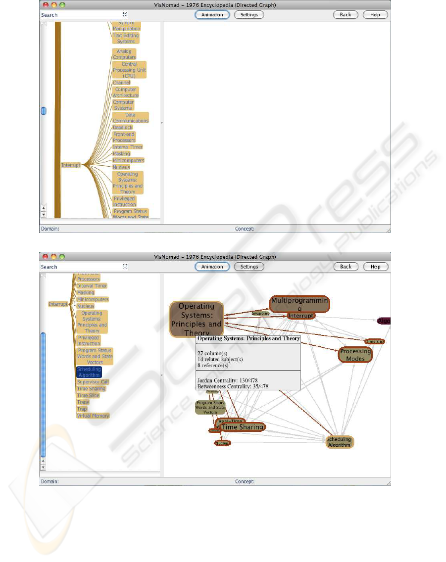
(a) Selecting “Interrupt” in the tree.
(b) Collapsed tree, and expansion of network of entries centered around “Scheduling Algorithm.”
Figure 2: Transitioning left to right: the user selects an entry in the tree, and expands it into a network.
created by all the entries as nodes, and all the refer-
ences between entries as edges.
2.2 Three-level Tree
The user can peruse the tree by adjusting a vertical
slider, and can select one particular sub-tree, rooted
at one of the entries. The leaves of the sub-tree con-
tain not only the entries referenced by the root of the
sub-tree, but also the entries referencing that root. We
have found through experimentation that discovery is
facilitated when we remove the direction from the ref-
erencing action. For example, if the Central Process-
ing Unit page references the Interrupt page, and if in
turns Interrupt references Deadlock, then both Cen-
tral Processing Unit and Deadlock will be listed as
ENCYCLOPEDIA WALKABOUTS WITH VISNOMAD - A New Visualization Tool Designed as an Aid for Textual
Exploration
127
(a) Full Tree (b) Collapsed Tree
Figure 3: Left: the tree as first presented to the user. Right: once the user clicks on one of the children of the interrupt entry.
children of Interrupt sub-tree.
When the user enters a keyword in the search bar,
all the subtrees that do not contain the keyword are
eliminated, leaving only subtrees that contain the key-
word, either in the root or leaf entries. All the actions
pertaining to operations intrinsic to the tree are per-
formed with the left mouse button.
The right mouse button is used to expand a node
of the tree into a spring-loaded graph layout in the
right panel of the window. Note that the above re-
mark about Interrupt, Central Processing Unit, and
Deadlock is true here as well, as the graph is directed.
The graph created is fully interactive, allowing users
to:
• zoom in and out of the graph,
• move the graph around,
• zoom the graph to fit the window,
• move nodes around to untangle the graph,
• click on nodes to automatically add all their miss-
ing neighbors as new nodes, and
• backtrack through the history of node expansion
to return to a previous state of the graph.
Most of these features are leveraged and adapted
from the Prefuse tool-kit which provides many algo-
rithms for these graphic manipulations.
The visual identification of community structures
in the data is effectively enhanced by the resulting
tool.
2.3 Visual Attributes
Several visual attributes adorn the nodes of the tree
and of the graph. For the tree nodes, we use two dif-
ferent colors for the border of each box surrounding
the entry and for the inside of the box. The border
color is used to identify nodes that may contain key-
words, or that have been visited by the user. The in-
side color is taken from a gradient of colors repre-
senting the betweenness centrality (Dekker, 2008) of
each node in the network, with darker colors corre-
sponding to more central nodes, and lighter colors for
peripheral nodes. The border color is used to iden-
tify the nodes that have been visited, creating a vi-
sual path of the exploration. Nodes also temporarily
change border color when they happen to be the node
currently under the mouse pointer, or any one of the
direct neighbors of that node. Highlighting the direct
IVAPP 2010 - International Conference on Information Visualization Theory and Applications
128

neighborhood of a node of interest is an effective way
of identifying neighborhoods.
Another visual attribute controls the size of each
node of the graph. Sugiyama’s semantic rule
(Sugiyama, 2002) sets the size of the nodes to reflect
the number of direct neighbors it has, that is the num-
ber of encyclopedia entries that reference it directly,
or the number of entries it references. With Visnomad
we use the out-degree of each node to control the size
of each node, indicating directly by its size whether
the entry lists many related-subjects in its text.
Finally we mention backtracking as a feature of
the visualizer that was requested by users. Backtrack-
ing allows users to “undo” their last node-expansion
operations in reverse order (LIFO) of trigger. A stack
is used to keep track of the state of the graph at vari-
ous points of the exploration.
2.4 Database Connectivity
Prefuse supports very simple database connectivity.
However, because of strict security issues, Java ap-
plications are extremely restricted in the way they ac-
cess remote resources, such as databases. Such access
requires the use and complex setup of certificates,
which we find prohibitive for our purpose. Instead
we use a Php tunnel, i.e. a Web page in Php that acts
as a CGI script to obtain data from the database. The
Java engine passes Web access requests generated by
the visualizer to the CGI script, and receives back ta-
bles containing entries and links that are rendered as
subtrees or sub-graphs. Masquerading the access to a
remote database as a simple access to a Web URL is
effective and fast. Each of Ralston’s encyclopedias is
stored in its own database, the name of which is either
passed to the applet as a parameter embedded in the
host Web page, or selected at start up. Other param-
eters are passed to the visualizer from the host Web
page, including the color scheme used for rendering
the different data attributes.
In the next section we present an evaluation of our
visualizer.
3 EVALUATION
The constantly evolving and self-adjusting spring em-
bedded visual layout is pleasing to interact with, and
has been shown in published research to receive pos-
itive feedback from users (Meyer and Spiekermann,
2006) (Meyer et al., 2005).
One of the computing limitations is the time com-
plexity of force-based layouts. For a graph of N
nodes connected by E edges, the time complexity is
O(N lnN) or O(E), whichever is greater, making the
display of large graphs of more than a few hundred
nodes impractical and jittery, since animation is used
and many frames are displayed per second. Fortu-
nately, the distance filtering feature we have imple-
mented allows the user to explore large graphs while
showing only a subset of it on the screen, and, over-
all, we have found that long exploration of the graph
remains a pleasant operation for the user.
3.1 Using the Visualizer as an Historical
Tool: Example and Perspective
In this section we report in the use of the tool by its
intended user: a historian. The data reported is sub-
jective, and limited mostly to one individual’s explo-
ration, as well as the presentation of the tool at profes-
sional meetings of the society of historians of science,
most recently (Owens, 2009).
Historians are fascinated by the origins of the per-
sonal computer. Given the fact that our understand-
ing of its origins is influenced by our current van-
tage point (In some sense we cheat in knowing the
end of the story!), we decided to use the first two edi-
tions of Anthony Ralstons authoritative Encyclopedia
of Computer Science and Engineering to explore the
intellectual landscape of computer science at a time
when the PC was just emerging. The first edition of
1976 appeared when virtually no PCs existed, the sec-
ond edition of 1983 two years after the appearance of
the IBM Personal Computer and the beginning of a
period of dramatic growth.
In principle, it seemed possible to acquire a sense
of the disciplinary “lay of the land” by reading both
editions cover to cover, taking note of the “Related
Subjects” listed at the head of each entry. Linkage
groups the near neighborhoods of especially inter-
esting entries were even sketched by hand in this ini-
tial exploration. It became apparent, however, that
exploration of any depth –to second- and third-order
neighborhoods and beyond– was practically impossi-
ble without digitization and the assistance of sophis-
ticated visualization techniques. The development of
VisNomad made it possible not only to visual these
further neighborhoods, but to “walk around” the en-
tire virtual space of these two encyclopedias in a
lively and convenient manner that reveals unantici-
pated perspectives and helps unravel the tangled web
of associations that defined the intellectual landscape
of computing in the 70s and 80s.
Results of this initial reconnaissance have been
encouraging and surprising. In spite of its status as
one of the great inventions of the modern age, in the
company of Watts steam engine, Edisons incandes-
ENCYCLOPEDIA WALKABOUTS WITH VISNOMAD - A New Visualization Tool Designed as an Aid for Textual
Exploration
129
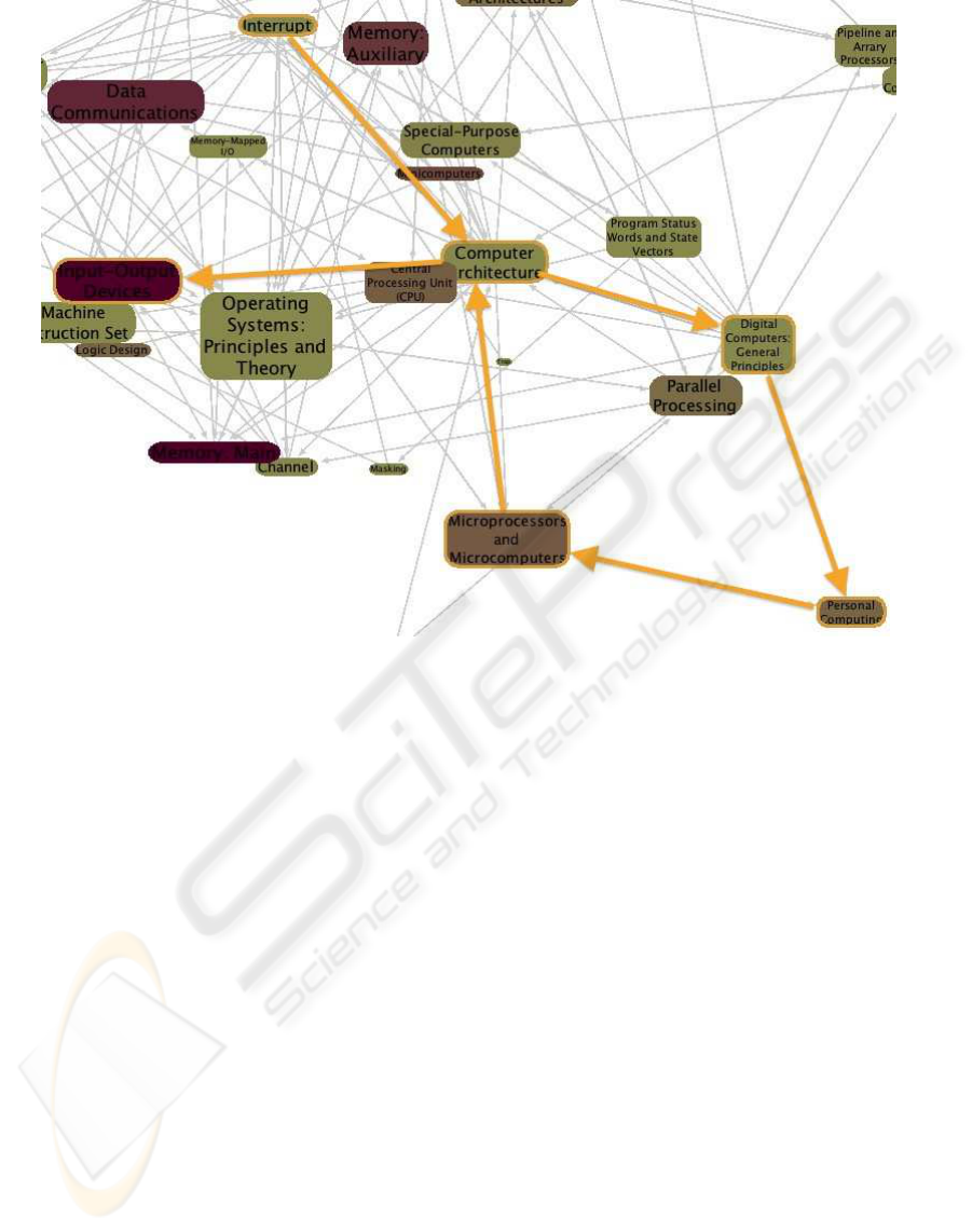
Figure 4: A historian takes a walkabout from Interrupt to Input/Output Devices, traversing the universe of Computer Archi-
tecture.
cent lamp, and the transistor of Bardeen, Shockley,
and Brattain, the PC of recent accounts was nowhere
to be found. What we did find in our promenades
is not the mythical Great Invention or its associated
Great Inventor, but a diffuse and growing fascina-
tion with machines that were becoming smaller, more
powerful, mobile, and user-friendly serving as in-
creasingly intelligent nodes in larger, more elaborate
networks.
This somewhat surprising observation, based on
the virtual exploration that VisNomad has made pos-
sible, suggests an alternative to the master narra-
tive that currently organizes much computing his-
tory. This is a machine-based account that starts
with Babbage and his Analytical Engine, proceeds
to Holleriths punched-card machinery and IBMs of-
fice equipment, before passing on to the stars of
the story, World War Twos ENIAC and its machine
progeny EDVAC, Univac, and a growing family of
mainframes, minis, micros, and, eventually, the per-
sonal computer. The problem with this master nar-
rative is two-fold: first, it ignores the fact that the
ideas and technologies relevant to personal comput-
ing were widely-diffused in the community; and, sec-
ond, it leaves time sharing, the Arpanet, Internet, and
World Wide Web awkwardly positioned on the mar-
gins of the central story.
An alternative account would take its cue from
James Benigers The Control Revolution (Beniger,
1986) and focus on the evolution of technological sys-
tems and networks, beginning with the telegraph, the
railroads, the emergence of universal power systems
like Chicagos Commonwealth Edison at the begin-
ning of the 20th century, AT&Ts national telephone
network, and the SAGE air defense system of the
early Cold War. Within this alternative narrative and
its ramifying networks–from WANs to LANs and the
computerization of office systems, the awkwardness
of the master narrative disappears and the “PC” reap-
pears as a small, smart, and convenient node, a coher-
ent part of a larger story.
4 CONCLUSIONS
We present an original attempt at investigating his-
tory through visualization of the interrelationship that
exist between the entries of an encyclopedia. The ex-
ploration is supported by an interactive and dynamic
visualization written in Java. Users are presented with
two different means of perusing the entries, one hier-
IVAPP 2010 - International Conference on Information Visualization Theory and Applications
130

archical and alphabetically organized, the other two-
dimensional, interactive, and dynamic, presenting the
network of reference patterns existing between the
pages of the encyclopedia, and highlighting clusters,
neighborhoods, entries that are peripherals, or those
that have high degrees of connectivity, and that repre-
sent important subject matters.
Although subjective, our preliminary exploration
of the encyclopedias with the visualizer has shown
that it matches several of Ware’s objectives for effec-
tive visualization, in particular comprehension, per-
ception, and interpretation.
We leverage many features of the Prefuse tool-kit
and implement key recommended design rules that
have been proposed in the literature for effective, aes-
thetic and pleasant visualizations.
This tool is work in progress, and several enhance-
ments and options are planned as a response to early
user feedback. We list below some of the options con-
sidered.
• We implemented both Jordan and betweenness
centrality measures (Dekker, 2008) for each en-
try of the encyclopedia and selected the latter as
the one representing more intuitively the relative
importance of the various computer science con-
cepts present in the encyclopedia. A deeper anal-
ysis of other measures of centrality (such as max-
flow, or closeness centralities (Sugiyama, 2002))
might prove better suited at representing the key
players and the shift of importance that different
editions of the encyclopedia might reveal.
• Obtain the licensing rights to the full-text of the
encyclopedias so that the contents of the entries
can be browsed in the visualizer, either inside a
separate window or panel, or as part of a pop-up
dialog.
• While Prefuse is a fine tool-kit, it is significantly
large, making the download of applets a time-
consuming activity. The development and main-
tenance of Prefuse has stopped, and a new Flash
version of the tool-kit has been released. Flash is
based on ActiveX, runs on a small footprint less
than a megabyte, supports vector graphics, and
many other features that make it integrate seam-
lessly in Web pages. Porting the visualizer to
Flash is a logical step for future development.
REFERENCES
Beniger, J. R. (1986). The Control Revolution: Technologi-
cal and Economic Origins of the Information Society.
Harvard University Press, Cambridge, MA.
Collins, C. (2006). Wordnet explorer: Apply-
ing visualization principles to lexical semantics.
http://www.cs.utoronto.ca/ ccollins/publications/.
Dekker, A. (2008). Centrality in social networks: Theo-
retical and simulation approaches. In SimTect, Mel-
bourne, Australia.
Fellbaum, C., editor (1998). WordNet: An Electronic Lexi-
cal Database. MIT Press, Cambridge, USA, 1st edi-
tion.
Fry, B. (2008). Visualizing Data. O’Reilly Media, Inc.
Heer, J., Card, S. K., and Landay, J. A. (2005). prefuse:
a toolkit for interactive information visualization. In
CHI 05, pages 421–430. ACM Press.
Herman, I., Society, I. C., Melanc¸on, G., and Marshall,
M. S. (2000). Graph visualization and navigation in
information visualization: a survey. IEEE Transac-
tions on Visualization and Computer Graphics, 6:24–
43.
Horn, C. and Jenett, F. (2005). Jellyfish, and encyclopedia
of the arts. http://www.carohorn.de/jellyfish.
Maier, R. (2007). Knowledge Management Systems: Infor-
mation And Communication Technologies for Knowl-
edge Management. Springer, Berlin, 3rd edition.
Meyer, B. and Spiekermann, S. (2006). Skillmap: dynamic
visualization of shared organizational context. pages
528–540.
Meyer, B., Spiekermann, S., and Hertlein, M. (2005).
Skillmap: identification of unrecognized parallel de-
velopments and of communities of practice in dis-
tributed organizations. In First World Congress of
the International Federation for Systems Research
(IFSR2005).
Owens, L. (2009). Reports from computerville: Books, vir-
tual walkabouts, and professional identities. A paper
presented at the Special Workshop on Michael Ma-
honey and the History of Computing(s) at the SHOT
conference, Pittsburgh, PA.
Ralston, A., editor (1976). Encyclopedia of Computer Sci-
ence, 1st Ed. Petrocelli/Charter.
Ralston, A., editor (1983). Encyclopedia of Computer Sci-
ence, 2nd Ed. Van Nostrand Reinhold Co.
Schneiderman, B. (1996). The eyes have it: A task by data
type taxonomy for information visualization. Techni-
cal Report 13, UMD.
Sugiyama, K. (2002). Graph drawing and applications for
software and knowledge engineers. World Scientific,
Singapore.
Thinkmap (2007). The visual thesaurus.
http://www.visualthesaurus. com/.
Trier, M. (2005). A tool for it-supported visualization and
analysis of virtual communication networks in knowl-
edge communities. In Ferstl, O. K., Sinz, E. J., Eckert,
S., and Isselhorst, T., editors, Wirtschaftsinformatik,
pages 963–983. Heidelberg: Physica.
Viegas, F. B., Wattenberg, M., van Ham, F., Kriss, J., and
Mckeon, M. (2007). Manyeyes: a site for visualiza-
tion at internet scale. IEEE Trans Vis Comput Graph,
13(6):1121–1128.
Wattenberg, M. and Viegas, F. B. (2008). The word tree, an
interactive visual concordance.
ENCYCLOPEDIA WALKABOUTS WITH VISNOMAD - A New Visualization Tool Designed as an Aid for Textual
Exploration
131
