UNDERSTANDING CHANGES IN HERITAGE ARCHITECTURE
Can We Provide Tools & Methods for Visual Reasoning?
I. Dudek and J. Y. Blaise
UMR CNRS/MCC 694 MAP, 184 Av. de Luminy, 13 288 Marseille Cedex 09, France
Keywords: Architectural Heritage, Knowledge Modelling, Visual Reasoning, Spatio-temporal Data.
Abstract: When studying heritage architecture, and trying to represent and understand the development of artefacts,
one should not only examine key moments in their evolution, but describe the whole process of their
transformation - thereby correlating contextual causes and architectural consequences. In this contribution,
we introduce a methodological framework of description of architectural changes, the corresponding visual
tools, and finally present elements of evaluation. The results we report show the description framework
favours information discovery: cross-examination of cases, analysis of causal relations, patterns of change,
etc.
1 INTRODUCTION
Historic artefacts are today widely regarded as
landmarks in our cities: physical landmarks as well
as symbolic ones. They act as tangible traces of a
broad, conceptual notion: time passing by, and the
metamorphosis of societies and cultures. And so
when wanting to actually analyse and understand
those artefacts, it is important to figure out that we
deal with history as well as with architecture.
Artefacts tell us how we became who we are, with
successive, wanted or unwanted, transformations
and influences. A scientist’s view over historic
artefacts thereby necessarily integrates
heterogeneous information sets with a strong
predominance of issues typically found in historical
sciences - uncertainties, incompleteness, long ranges
of time, unevenly distributed physical and temporal
stratification.
So the key point here is how can we better link
the objects we study, architectural artefacts, with the
information needed to understand their changes.
Let’s take a quick example: in 1367 a major fire
bursts out in the city of Krakow (Poland), spreads
from roof to roof and causes huge degradations. As a
consequence, a new law is adopted that states a high
wall should from then on separate each dwelling
from the neighbouring edifices so as to avoid “fast
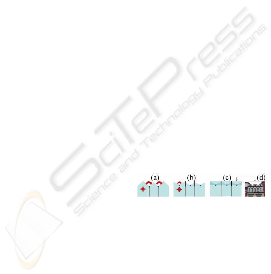
fire propagation through roofs” (Fig. 1a).
As a consequence, the outlook of urban blocks
dramatically changes. Fire walls are built between
edifices, roof slopes are inverted – from outbound to
inbound - with a central gutter for rainwater (Fig 1b)
hidden by a high decorative wall along the street
called attic (Fig 1c).
With time passing by, the wiklerz 1367 rule is
abandoned, but the image of attics remains as a
cultural landmark. New edifices continue to be
designed with high attics although no constructive or
legal reason subsists. So how can we today explain
the presence of attics in Krakow’s cityscape, if not
by mentioning the notion of “fire”, if not by linking
architectural consequences with their historical
causes?
Figure 1: (a) a fire occurring in the first artefact spreads to
others through roofs. (b) new law promotes fire walls in
between dwellings (black) to prevent fires - roofs are
reversed with gutters (blue dot) in the middle of the
façade. (c) in order to hide the new fire roofs decorative
attics are built which remain until now (d).
The idea that artefacts are tangible education is
not new. XIXth century pioneer of architectural
conservation Viollet Le Duc wrote a famous book in
which he uses an imaginary city to recount the
evolution of rules and customs of urban societies
since the end of the Roman Empire.
He thereby underlines how the successive
transformations of artefacts are inherent
consequences of events, trends, facts – i.e. of a
91
Dudek I. and Blaise J. (2010).
UNDERSTANDING CHANGES IN HERITAGE ARCHITECTURE - Can We Provide Tools & Methods for Visual Reasoning?.
In Proceedings of the International Conference on Imaging Theory and Applications and International Conference on Information Visualization Theory
and Applications, pages 91-100
DOI: 10.5220/0002826000910100
Copyright
c
SciTePress

context. The context does not necessarily explain the
architectural solution itself, (like in any art-related
practice) but it helps understanding what causes led
to wanting a new architectural solution.
Our contribution can be seen as an application of
Viollet Le Duc’s vision: we propose a
methodological framework aimed at identifying and
describing causes the consequences of which can be
read on the artefact itself. More precisely, the
lifetime of an artefact is considered as a continuous
chain along which two types of links alternate:
transitions (changes) and states (periods of stability).
In a previous contribution (Dudek and Blaise,
2008a), we introduced this research’s scientific
background, our early ideas on the description of
artefact changes. In this paper, we will first take a
broader but brief look on the scientific background,
and present key aspects of the description grid. We
will then detail how we completed the
methodological framework, its visual tools, and
finally present and discuss the evaluation procedure.
2 BACKGROUND AND
OBJECTIVE
Providing models to handle the dynamics of change
has been, and remains, a hot research topic in
geography or geospatial sciences. Applications
range for instance from the analysis of human
movements (Zhao, 2008) to the visualisation of
physical phenomena (Knopf, 2002). A set of
examples well-known to SVG developers is the
carto.net repository - with for example the classic
Choroplethe map “social patterns of Vienna” by
A.Neumann (Neumann 2005). However these
applications focus on the modelling of dynamics that
have little to do with the very nature of data sets
handled in historic sciences (uncertainties,
incompleteness, varying credibility of sources, etc.).
Furthermore, even when dealing with urban changes
- see for instance (Hagen-Zanker, 2008) - most
approaches use a systematic spatial clustering that
cannot be transferred (without losses in semantics)
to ill-defined architectural spaces. The issue we were
facing when starting this research resembles what
(Hagen-Zanker) identifies as the drawback of
“descriptive models [...] based on static situation”: a
weak understanding of processes and of causal
relations. As mentioned in (Dudek and Blaise,
2008a), little has specifically been done, in the field
of the architectural heritage, in order to describe and
represent visually the time-chain between successive
states or moments in the evolution of artefacts. A.
Renolen’s graphs (Renolen, 1997), where changes in
land areas are visually assessed through synthetic
diagrams, can however be quoted.
Renolen describes and represents territorial
changes: he isolates states and defines events
causing changes – notions that we do implement.
However, his field of application is land areas as
seen by a geographer, and the graphs proposed are
far from being applicable to architectural changes.
Nevertheless his point is a vital one : on one hand he
develops a theoretical model of a dynamic spatial
phenomenon, on the other hand he develops a visual
“language” using metaphors and/or formalisms used
in visualising temporal data (although in a rather
straightforward manner, notably without assessing
duration and intensities, as defined in (Sabol and
Scharl, 2008) or (Blaise and Dudek, 2008b).
Accordingly, our objective ultimately meets two
complementary issues:
describing architectural transformations (i.e. a
knowledge modelling issue),
reasoning visually about those changes on real
cases (i.e. an infovis issue).
Given a robust methodological framework, and
efficient diagrammatic representations as means to
visualise this framework, we expect graphics to help
amplify cognition (Kienreich, 2006) over artefact
changes by uncovering patterns of evolution within a
site or across sites, by underlining uncertainties or
exceptions (“documentary gaps”), by raising
questions about the relative evolution of families of
artefacts (urban houses in this or that quarter of the
city, churches across the city, etc.). In other words,
we intend to try and apply, in what we view as a
visual assessment of architectural changes, E.R
Tufte’s “first principle for the analysis and
presentation of data : show comparisons, contrasts,
differences” (Tufte, 2006).
3 THE DESCRIPTION GRID
We introduced in (Dudek and Blaise, 2008a) a
theoretical description identifying an artefact’s life
cycles as sums of states and transitions. Broadly
speaking, the description grid’s objective is to give
professionals the means to describe, date (with
uncertainty assessment), and order meaningful
events, facts, and elements of context (meaningful -
i.e. needed to understand the artefact’s changes).
This selection of events/facts/elements of context is
our a priori modelling bias (Francis, 1999), based
here on an intersubjective analyses of sources.
We sum up principles, findings and recent
developments of this first step in section 3, before
detailing in sections 4, 6, and 7 the framework’s
IVAPP 2010 - International Conference on Information Visualization Theory and Applications
92
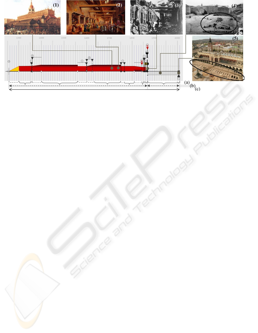
Figure 2: Description grid illustrated on Kramy Bogate (rich stalls), an edifice demolished in the second half of the XIXth
century but with important remains (a whole storey in fact) under the level of the actual market square. Top, (1) to (5),
archival material documenting states and the demolition transition (3). Bottom, (a) states and transitions - (b) life cycles -
and (c) evolution.
completion, evaluation and analysis.
The description grid poses three principles:
Transitions ≠ states - Transitions identify
changes of the artefact - they act as causes. States
correspond to time slots during which no major
transformation occurs.
Evolution = ∑ (life cycles) – An artefact’s
evolution encloses all transitions and states
occurring during its lifetime. But an artefact may
be transformed to the extent that it only remains
as an underground, buried structure. Thus
transitions and states can be grouped into periods
of visible or of concealed existence that we call
life cycles. (Accordingly an artefact’s evolution
may contain several life cycles - think of
Pompeii, once a Roman city, then buried under
ashes, and now living a third life cycle as tourist
sites).
Artefact = ∑ (portions) – Divisibility of an
artefact when it is transformed (an artefact may
be subdivided into portions that live
autonomously).
The proposed description grid identifies seven
transitions and states occurring within a life cycle
(abandon, decay, annexation, demolition,
modification, secession and segmental anaesthesia);
as well as 8 transitions and states starting or ending a
life cycle (creation, extinction, hibernation,
internment, merge, reincarnation, split and
translocation). Tags used to denote these transitions
and states have been chosen as illustrative enough to
let the reader grab their semantics. However, tags
use ethnic languages, and thereby remain somehow
ambiguous, with possible misinterpretations of
notions like hibernation. Accordingly, each
transition / state is denoted by a tag, for
communication purposes, and also defined by non-
ambiguous properties that help the analysts choose
the one transition or state that best fits his needs.
We do not detail this aspect since this paper does
not focus on modelling problems but readers may
find an abstract of these definitions in (Dudek and
Blaise, 2008a). Let’s still give an example: we
define internment as the “Building of a new artefact
over a previous one, the latter remaining underneath
as an inactive, inaccessible portion called a segment,
Internment may be deliberate (ex. preventive
archaeological bury) or unintentional”. In that case
an artefact A is buried underneath a new,
independent artefact called B. Internment requires
that A becomes an inactive and inaccessible portion,
with no physical or functional continuity with B.
3.1 Reasoning Visually about Changes
Basing on the above framework, two linear
diagrammatic representations are proposed, called
diachrograms and variograms. They can be
combined with one another and displayed along with
a time scale that matches the artefact’s evolution.
Diachrograms present the evolution of an artefact
along a time axis. They are composed of a set of
visual indicators representing successive transitions
and states combined into life cycles. They rely on
the classic concept of timeline (Blaise and Dudek,
2008b), with markers that position transitions, states,
and causality assessments along the time scale. It has
to be said that a diachrogram represent an expert’s
view of the artefact: different analyses of the
information gathered on an artefact may lead experts
to propose different chronologies - the diachrogram
then acts as a comparative tool.
Variograms further detail the nature of the
artefact’s transformation by combining in a parallel
UNDERSTANDING CHANGES IN HERITAGE ARCHITECTURE - Can We Provide Tools & Methods for Visual
Reasoning?
93
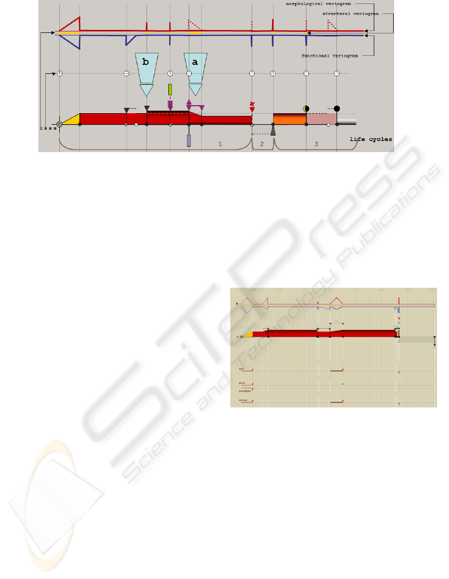
Figure 3: Top: variogram – movements and magnitude indicate periods of morphological, structural or functional changes
and their intensity. Bottom, diachrogram sums up visually life cycles, transitions and states. Beginnning and end of
transformations are marked by a circle (filling identifies certainty of the underlying information). Transformation types are
represented by symbols situated over the dating circles along a vertical line. (a) lasting transition – two dates needed to spot
the period of changes, (b) sudden transition – one date only.
visualisation three categories of changes:
morphological transformation (formal changes
such as stylistic refurbishing, decoration, or
changes in surface, volume),
structural changes (technical changes such as
change of roof material, replacement of sub-
elements such as floors),
functional changes (significant switches in use or
owners).
Variograms help underlining visually coinciding
changes, and stress possible links between these
three aspects. Durations (with their uncertainties) are
visualised, as well as intensity (Fig. 3).
4 VISUALISING CHANGES OF
INDIVIDUAL FEATURES
The evaluation of the variogram + diachrogram
disposal showed its efficiency in underlining and
ordering changes: the disposal gave a good global
vision on successive transition and states (see Dudek
and Blaise, 2008a). However it gave only a global
view: it showed for instance that “a fire occurs at
period p” but did not detail its actual consequences
on the various features of the artefact. We therefore
completed the description grid in order to allow the
visualisation of consequences events have on the
artefact’s individual features (change in size, in
style, in construction material, in owner).
For each category of changes a specific list of
features is proposed, with varying variable types.
For instance, the number of storeys can be given by
an Integer, whereas the stylistic changes require
lexical scales. Visualisation of each feature’s
chronology is combined with variograms and
diachrograms in a linear, timeline-like disposal. The
visual solution, inspired by E.R Tufte “data-ink ratio
principle” (Tufte, 2006), combines a limited number
of elements: lines, dots, colours (Fig. 4,5,6,7).
Figure 4: features chronology (bottom, partial view)
combined with diachrograms and variograms in the SVG
implementation of the framework.
Features we handle are represented by different
variable types. A consistent, easy to read,
visualisation features variations was therefore a
challenge (comparing visually increase in number of
storeys - an integer, and style - a closed lexical
scale,and with owners - an open lexical scale, may
lead to noisy effects such as over-emphasising a
feature because of the lexical scale’s size).
As an answer, we chose to produce for each
feature two different graphics, an activity indicator
that only says “this particular feature changes at
period p” and a feature readout that details the
change. On dynamic loading of the graphics only the
former is displayed. Selecting it commands the opening of
the second (see Fig. 5).
IVAPP 2010 - International Conference on Information Visualization Theory and Applications
94
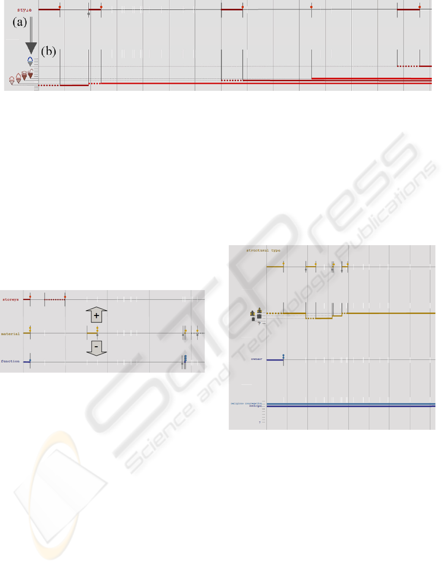
Figure 5: (a) - activity indicator for feature “style”– when selected by the user opens (b) - feature readout (here stylistic
affiliations represented by icons – Romanesque, Gothic, Renaissance, Baroque and neoGothic elements successively appear
during the evolution of the artefact). Thick lines on the activity indicator identify periods when the feature appears. The
continuous lines in the feature readout indicate the feature persists in time (note here that the bottom line – Romanesque
stylistic affiliation – ends with the appearance of gothic elements, a visual indication that the initial structure is not
complemented but replaced).
The activity indicator is displayed first. Its role
is to position changes (with their intensity) along the
timeline, in the most “economic” way possible.
Since variation assessment is represented by an
integer, its visual marker can then be the same for
each feature. Colours indicate the category of
changes to which the properties correspond
(morphological, structural or functional), dots over
the timeline indicate additions and dots under the
timeline indicate losses.
Figure 6: activity indicator – examples for the three
categories of changes. Plus and minus signs indicate here
“’two materials added to the artefacts and one withdrawn”.
As can be noticed on this example, changes in material
reported here had no correlated consequences on number
of storeys or function.
Once an activity is reported by the above activity
indicator, more can be learnt on its nature from the
feature readout. It details the architectural
consequences of changes. Feature readouts have
visual markers that match the specificity of the
underlying variables and - although we tried to keep
a visual consistency by privileging simple lines -
their visual “weight” varies. Legend of the readouts
can use either icons or tags, depending on whether
the lexical scale is closed or not.
The full visualisation of the completed
description grid in definitive combines three tools
for reasoning - diachrograms and variograms that
allow a global view on changes, and features
visualisation disposals that foster comparisons
across features. The whole disposal is designed to
combine vertical readings - “what precisely happens
at period p” – and horizontal readings “ how does a
feature change with time” (Fig. 8). In that sense, the
disposal matches Bertin’s view of graphics as
“visual answer to a question” (Bertin , 1998).
Figure 7: Two feature readouts (example of a church): the
top one uses a list of icons corresponding to canonical
structural types for churches (hall, basilical, pseudo-
basilical), the bottom one a list of tags for the owners.
Note that if the artefact’s structural type does change with
time; its owner remains here the same – a typical pattern
for this family of artefacts.
5 IMPLEMENTATION
This development complements previous works on
the same test field - the medieval heart of Kraków -
presented for instance in (Blaise and Dudek, 2005)
or (Blaise and Dudek, 2007). Accordingly, the
technical platform is here the same:
a description of artefacts as instances of a hierar-
UNDERSTANDING CHANGES IN HERITAGE ARCHITECTURE - Can We Provide Tools & Methods for Visual
Reasoning?
95
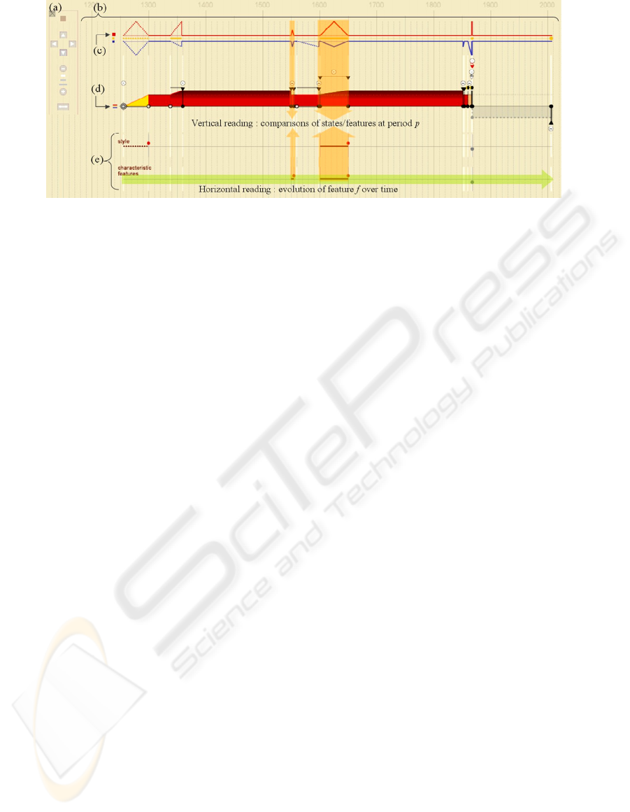
Figure 8: (a) Jscript nested interactive commands (zoom, pan, etc.), (b) time grid, (c) features visualisation open/close
buttons, (d) variogram open/close button (e) feature activity indicators (partial view) - SVG implementation of the
framework.
chy of classes (in the sense of OOP), with
persistence enabled through RDBMS structures,
outputs (may they be visual outputs – 3D VRML
or 2D SVG- or textual outputs –XML) produced
by Perl scripts,
interfaces produced by Perl scripts either as
XHTML (in our first experiments) or as
XML/XSLT datasheets,
Both the evolution of architectural and urban
elements (341 objects, 885 phases studied) and
historical sources used during the investigation (791
sources) have been described. Graphics are dynamic
SVG outputs (see Rathert, 2005). The whole system
is flexible to incremental data update.
6 EVALUATION
In a preliminary evaluation (Dudek and Blaise,
2008a), experts of architectural conservation
working on our field of experimentation considered
that the notions we introduce (i.e. the knowledge
modelling level) are relevant. Still their opinion
could be seen as biased on two aspects: they know
very well the artefacts we have described, and
moreover they know us … It was therefore
important, before trying to conclude on the possible
benefits of the methodological framework, to carry
out a more open evaluation. Is the whole disposal
workable for non-experts? Do non-experts learn
anything about an artefact when handling the
disposal? Do they learn more about how artefacts
change with time by the cross-examination of cases?
Unlike in (Dudek and Blaise, 2008a) where the
focus was put on knowledge modelling issues, we
here focused on understanding to which extent the
tools and method do help reasoning visually about
artefact changes. Accordingly, both the graphics and
the underlying semantics are concerned, with a
series of tests shortly described hereafter.
6.1 The Evaluation Procedure
The evaluation was carried out with two groups:
four students in mechanical engineering (no
background at all in architecture or architectural
conservation), and five students in digital
architecture (PhDs dealing with survey issues
mainly - background in architecture, art or civil
engineering but not in architectural conservation,
with two of them having a background as
archaeologists). The numbers of testers is extremely
limited, and the evaluation therefore does not claim
more than giving us hints on where to go next. The
groups also differ in cultural background (five
nations, from China to Morocco). We gave them a
45‘ introduction to the methodological framework.
We then proposed three successive series of tests:
Memorisation and Reproducibility Tests. We here
tried to evaluate with 14 questions “to which extent
the visual solution is readable” (weight of graphics,
efficiency of the colourisation, readability of the
transition/state successions, etc.). Diachrograms,
variograms and feature visualisation disposals were
projected on a screen for 30 seconds, and then
replaced by a specific question on the graphics’
content (“how many life cycles did you see”, “any
differences between blue and red line of the
variogram”, “redraw the profile of a diachrogram”).
Time was not counted.
Clarification Tests. The disposal uses visual
formalisms that may lead to possible ambiguities:
icons and multilayer feature readouts in particular.
In a short questionnaire (4 questions) groups were
asked to match either icons or sections of feature
readouts with pictures or schemas (see Fig. 9).
IVAPP 2010 - International Conference on Information Visualization Theory and Applications
96
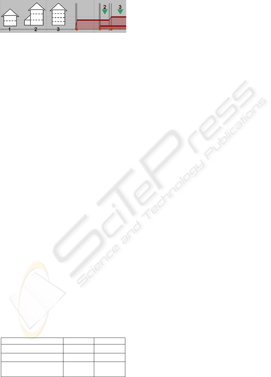
Figure 9: Groups were asked to say which of the three
schemas on the left (1,2,3) does not correspond to section
of the storeys readout (marked here by green arrows).
Exactness, Efficiency and Discovery Tests. We
here tried to evaluate (20 questions) “to which extent
the disposal is workable”. This time each member of
the groups was given a complete real case example
presented as printed material. Questions were
projected on the screen that required testers to
actually read specific information on the graphics
with time counted.
The exactness test questions required only a
good understanding of the disposal, but no
interpretation capacities (questions like “longest
transition”, “number of transition types” are
straightforward once the mechanics of
horizontal/vertical reading is understood). The
efficiency tests required limited interpretation
capacities - properties needed to be cross-examined,
like “find consequences of event E” or “compare
number of changes of features plan and style”.
Finally, the discovery tests questions clearly stepped
out the reading of values and required analytical
reasoning over features and cases (“what relation
can you find between number of storeys and number
of functions?” or “point out and explain a non-
regular functional behaviour among cases”). For this
last test the groups were allowed to compare cases.
6.2 Analysis of the Outputs
Memorisation and Reproducibility Tests. We ana-
lysed the answers with regards to three criteria –
layering and separation (typically necessary to
distinguish transitions and states); reading of values
(such as dates or transition types), identification of
profile (global view on the artefact’s evolution). One
has to keep in mind that testers had to answer
questions using their visual memory. Results in
Table 1 show the percentage of testers who could
give answers.
Table 1: Percentage of testers who gave answers.
criterion 1
s
t
group 2
n
d
group
layering and separation 85,8 % 80,6%
reading of values 73,25 % 71,25%
Identification /
reproduction of profile
69,3% 81,3%
Considering the narrow number of testers,
significant differences between the two groups are
only visible on the last criterion. The first group
(mechanical engineers) shows weaker capacity to
identify and reproduce profiles of diachrograms and
variograms, and was not sensitive to differences in
the weight of graphics. This may be due to
differences in education: the second group practices
drawing on an every day basis. Both groups found
the test equally difficult, and declared a same level
of familiarity with memorisation tests. On the
overall, results show the visual solution is rather
easy to understand and memorise. The readability of
sequences (cause/consequences) is particularly eased
(“layering and separation” criterion) with over 80 %
of testers in both groups that become able to date,
order and reproduce from memory an artefact’s
transformations (new to them, naturally) after having
seen our visualisations on a screen for 30 seconds.
Clarification Tests. Surprisingly (when considering
they declared they know very little about the
architectural heritage), the group of mechanical
engineers has higher overall results (80% vs 61%)
notably on matching styles and their icons (81 % vs
45%), although the other group better identifies
styles on images (80% vs 62 %). It is possible that
this is because mechanical engineers had little
aprioristic knowledge on architectural heritage, and
therefore did not compare icons with previous
images they had.
It is important to also consider here the cultural
diversity of the group, which probably weakens the
tests. Inside each group, results of individuals vary
strongly. In conclusion, these clarification tests lead
to a rather consensual observation: when the
semantics behind graphics is strongly domain-
dependant, one can hardly escape from providing a
good legend.
Exactness, Efficiency and Discovery Tests. With
only three wrong answers out of 90, exactness tests
show that even with a rather short introduction to the
disposal, both groups could rapidly grab its logics.
However testers were asked to show their answers to
monitors before validating them, and so three wrong
answers means here “testers who never could find
the correct answer”.
Monitors counted retries, which average at 0.52
per person and question. The average value however
gives an unfair view: if taking the six best, average
is 0.18 per person and question. This shows some
testers had clearly more difficulties than others, a
problem that may be connected with fluency in
language, but that in all case would require more
investigation.
UNDERSTANDING CHANGES IN HERITAGE ARCHITECTURE - Can We Provide Tools & Methods for Visual
Reasoning?
97
Figure 10: (a) Two diachrograms projected for 30 seconds.
(b), (c) these diachrograms redrawn from memory by
testers (b least performing tester, c best performing one) –
the readability of sequences and their memorisation
appears quite convincing. Time slots are respected, the
nature and duration of changes as well, and in (c) the state
of hibernation of these two examples duly noticed.
In the efficiency tests we added a time
constraint. Results are this time of two wrong
answers out of 90, and the average retry rate falls to
0.26 – 0.11 for the six best. Under time constraint,
testers perform better, which seems to indicate that
although complex at start, the disposal has a fast
learning curve.
The two groups however performed differently
as far as time is concerned: whereas for the first
group answers required for 85 % between 1 and 2
minutes, only 18% of answers required more than 30
seconds in the second group. At this stage it is
reasonable to consider this as a bias in the
monitoring of the tests.
Finally, in the discovery test we allowed no retry.
Wrong answers (including “no answers”) remain at a
reasonable 9 % rate. Furthermore, in 73 % of cases
testers could uncover by themselves a causal relation
or a specific pattern ( topological relation of objects
by observing consequences of fires, horizontal
functional variogram for churches, etc..)
Figure 11: Observing resemblance of the three variograms
above, testers could uncover by themselves the functional
variogram pattern for churches.
7 BENEFITS & LIMITS
Benefits of the method, and here we mean of the
modelling bias itself, and of the visual tools
developed, can be shortly summed up:
Allows performing reasoning tasks on the
evolution of an artefact as a whole.
Allows performing reasoning tasks on feature
changes inside the artefact, and on relation they
may have to the evolution of the artefact as a
whole.
Allows comparing changes on an artefact to the
evolution of neighbouring ones (in space, in
history, in function).
Helps performing reasoning tasks on the
evolution of artefacts even when only qualitative
information are available on their morphology.
Allows non-ordered integration of new pieces of
information.
Does not imply a strong competence in computer
solutions.
Helps to uncover causal relations.
Fosters cross-examination of divergent interpre-
tations (and thereby discussions on how to
interpret historical evidence).
Figure 12: Top line, diachrogram for St Mary’s basilica
seen as a whole and underneath, diachrograms for each of
its sub-parts. Note, vertically, and underlined by a greyish
background under arrow a), how the neo-gothisation
change does not propagate in b) (the two already gothic
towers) and in c) (the baroque portal): artefact changes
must be read at different scales.
Helps underlining tendencies, patterns,
exceptions – in variations of individual features
IVAPP 2010 - International Conference on Information Visualization Theory and Applications
98
of artefacts, in variations of types of artefacts, in
variations of artefacts at a given time slot, or in a
given geographical area.
Uncovers lacking, inconsistent, contradictory
pieces of information.
Can be adapted to various spatial granularity.
What the artefact is, as a whole, is NOT the sum
of what its parts are, accordingly artefact changes
must be read at different scales, each of them
corresponding to alternative sets of information
(Fig12).
It is clear that a number of limits also need to be
quoted, starting with technical ones. Our
implementation is fundamentally a simple one. More
needs to be done in order to implement the context +
focus principle – at this stage basically a zoom+pan
solution. Comparison mechanisms, and switches
between spatial granularities also require further
developments.
But beyond these technical limits, it is important
to mention more fundamental issues, on which our
attention is today drawing:
The time granularity issue – Our unit at this stage
is a year, which is a rather thick granularity. But
the real problem is not to go down to a
granularity of for instance a day: the problem is
that the dating of historical events varies in
nature and in precision. The initial indication we
handle may for instance be “autumn of year
YY”, “first quarter of century CC”, or “morning
of day DD”. Two challenges are therefore
opened: on one hand developing a description
model that would help us give more precision
when possible, but that would also handle
fuzziness; and on the other hand finding a visual
solution that would remain consistent and yet
offer alternative encoding depending on the
nature of the initial indication.
The context assessment issue – performing
reasoning tasks about how artefact changes
implies cross-examining sets of possible causes
that would participate in the emergence of
architectural consequences. A certain number of
these causes have been identified and are already
visualised. But a number of patterns of evolution
are connected to the emergence of a more
general “context” – cultural influences, wanted
or unwanted presence of foreign powers for
instance (Fig. 13). This general context may help
underlining patterns, but it may also help
rethinking the initial data set, with for instance
the nomination of a new Bishop helping to date
with more precision changes on a church for
which we have poorly defined temporal
information.
In addition, the evaluation procedure we have
carried out is undoubtedly a limited one.
Accordingly, future works will focus on evaluating
the framework through more cases and granularity,
on developing better context + focus mechanisms,
and on time granularity / context assessment issues.
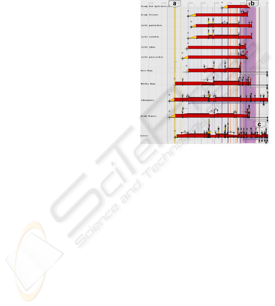
Figure 13: Context assessment helps decoding patterns –
vertical arrow a) corresponds to the Czech presence in
Cracow: a period of development of public edifices (four
bottom lines. Vertical arrow b) corresponds to the
Austrian occupation of southern Poland – a period of
massive extinction on the main square. In c), period
corresponding to a German presence in Poland, a portion
of the town hall’s unused underground structures
(segmental anaesthesia – visible on the diachrogram under
the time axis) is destroyed in order to build an
underground cistern.
8 CONCLUSIONS
Observing that solutions lack when one wants to
recount and sum up the evolution of historic
artefacts (lacks in terms of method of description as
well as of visualisation), we propose and apply a
methodological framework dedicated at a diachronic
reading of architectural changes. The framework
meets two principles for the analysis and
presentation of data quoted by (Tufte, 2006): show
causality, mechanism, explanation, systematic
structure and integrate evidence. The evaluation,
although limited, does provide useful indications:
The framework is usable by non-specialists, with
a fast learning curve,
UNDERSTANDING CHANGES IN HERITAGE ARCHITECTURE - Can We Provide Tools & Methods for Visual
Reasoning?
99

It allows information uncovering and delivers
domain-specific notions (uncertainty for
instance).
It will however be necessary to try out the
framework at other scales before concluding on its
possible extension. Beyond limits reported in section
7, the framework also has more general limits,
inherent to the modelling choices made:
Requires a good analysis of the artefacts before
making any sense, implies to thoroughly describe
the evidence (including by uncertainty
“measurement”) and therefore is of little support
in the early phases of investigations.
Assesses causal relations, it orders in time
sequences, events, consequences, but it only does
that. The disposal is a one-dimensional narrative
disposal: it does not replace spatially and
dimensionally determined disposals, as
mentioned in (Dudek and Blaise, 2008) and
experimented in years (see for instance Blaise,
and Dudek, 2007). Our contribution should not
be seen as an end, but “yet another mean to
perform reasoning tasks” about a data set.
Given these precautions, the results we report
show that visual thinking can fruitfully apply to the
assessment of architectural changes. They also
underline an ongoing research issue in most
historical sciences: the necessity to better combine
space-oriented visual disposals (cartography, 3D
models, etc.) and time-oriented graphics (timelines,
ribbon maps, etc.).
ACKNOWLEDGEMENTS
The authors wish to thank W. Komorowski and T.
Węcławowicz for their feedback and suggestions.
REFERENCES
Bertin, J., 1967-98 Sémiologie graphique; Editions
EHESS, Paris, 2
nd
edition.
Blaise J.Y., Dudek I., 2005. From artefact representation
to information visualisation: genesis of informative
modelling. In SmartGraphics International
Conference, LNCS Volume 3638/2005.
Dudek I., Blaise J.Y., 2007. Visual tools decipher historic
artefacts documentation, In I-KNOW 07, 7
th
International Conference on Knowledge Management,
JUCS (Journal of Universal Computer Science).
Dudek I., Blaise J.Y., 2008a. Visual assessment of
heritage architecture life cycles. In I-KNOW 08, 8
th
International Conference on Knowledge Management,
JUCS (Journal of Universal Computer Science).
Blaise J.Y., Dudek, I., 2008b. Experimenting timelines for
artefacts analysis: from time distribution to
information visualisation. In VSMM 2008, 14
th
International Conference on Virtual Systems and
Multimedia, Digital Heritage, Archeolingua.
Francis, S., 1999. The importance of being abstract. In
ECAADE 1999 Liverpool UK.
Hagen-Zanker, A., 2008. Visualization and classification
of urban change patterns on the basis of state-space
transitions. In 11th International Conference on
Geographic Information Science (AGILE-2008),
ttp://geoanalytics.net/geovis08/a17.pdf.
Kienreich, W., 2006. Information and Knowledge
Visualisation: an oblique view. In MIA Journal Vol0
Numb.1.
Knopf, G.K et al., 2002. Representing high-dimensional
data sets as closed surfaces. In Information
visualization Volume 1 N° 2, Palgrave.
Neumann., A., 2005. Vienna - Social patterns and
structures. From carto.net repository
http://www.carto.net/papers/svg/samples/wien.shtml
(accessed 03 09).
Rathert, N.A., 2005. Knowledge visualisation using
dynamic SVG Charts, In Geroimenko, V., Chen C
(Eds).: Visualizing information using SVG and X3D
Springer.
Renolen, A., 1997. Conceptual modelling and
spatiotemporal information systems : how to model
the real world. In ScanGIS 97.
Sabol, V., Scharl, A., 2008. Visualizing Temporal-
Semantic Relations in Dynamic Information
Landscapes. In 11th International Conference on
Geographic Information Science (AGILE-2008),
Semantic Web Meets Geospatial Applications
Workshop.
Tufte, E.R., 1990-2001. Envisioning information.
Graphics Press, Cheshire.
Tufte, E.R., 2006. Beautiful evidence, Graphics Press,
Cheshire.
Viollet Le Duc, 1878/1978. Histoire d’un hôtel de ville et
d’une cathédrale. Mardaga, Bruxelles.
Zhao, J. et al., 2008. Activities, ringmaps and
geovisualization of large human movement fields. In
Information visualization Volume 7 N°3, Palgrave.
IVAPP 2010 - International Conference on Information Visualization Theory and Applications
100
