
THE VISUALISATION AND EXPLORATION OF
A CURRICULUM KNOWLEDGEBASE
Sebastian Richards and Hilary Dexter
Manchester Medical School, University of Manchester
Keywords: Visualisation, Knowledgebase, Curriculum, Exploration, Navigation.
Abstract: This paper discusses the difficulties associated with the visualisation and navigation of complex, multi-
faceted knowledgebases. The issues are analysed through a case study of the Manchester Medical School
curriculum, with the intention of developing an innovative visualisation tool to enhance the experience of
navigation through such large sets of data. The approach taken to provide a solution involves the use of a
metaphorical representation of the data schema, designed to reduce visual complexity and increase human
usability. User feedback uncovered the need to create a ‘trail’ of related concepts through the
knowledgebase, and provision for such navigation techniques is present in the developed tool. The concept
of domain-specific structural customisation was investigated and led to the suggestion that modification of a
schema towards a more logical and human-friendly abstraction can improve a user’s understanding and
engagement with data.
1 INTRODUCTION
During the development of a tool to aid a team to
maintain and enhance an undergraduate curriculum,
an issue arose concerning the visualisation of the
rich and complex knowledgebase which
underpinned the tool. For the team to engage with
curriculum maintenance and enhancement they
needed to look at large sets of interrelated data
items, retrieved from the knowledgebase. This
presented both conceptual and technical challenges.
The curriculum domain is complex in terms of the
number of types of data and their interrelationships,
and large in terms of the number of instances of
some of the types, making convenient visualisation
of useful selections a pressing requirement. This
paper describes an investigation into the
development of a visualisation tool for such a
knowledgebase. Although developed initially for the
curriculum domain, it is generally applicable to any
area.
The aim of the investigation was to find a way to
avoid the common problems associated with
viewing large, complex sets of data and to produce a
visualisation that depicts an easily digestible view of
a multifaceted structure. The visualisation had to
afford a better understanding of the interrelated
concepts, thereby allowing the user to focus on the
essentials of the amendments to the curriculum. The
case study presented here is the updating and
enhancement of the undergraduate medical
curriculum in Manchester Medical School. The
people involved in this felt that such a tool would
assist in the immediate task of curriculum
enhancement and would also serve to develop the
usability and embedding of the knowledgebase
technology proposed for use general by the core
educators group (Dexter and Davies, 2009).
The approach taken was to find a simple and
intuitive visual metaphor and useful ways of
grouping data. We present here the key ideas behind
the simplification of the visualisation problem, and
address some of the human-computer interaction
(HCI) issues inherent to communicating large data
sets. The visualisation tool, which is under ongoing
development, aims to deliver increased usability and
provide a key set of features:
• To simplify the challenge of gaining a
meaningful understanding of the data
• To help a user easily realise relationships
between concepts
• To discover trails between linked concepts
through the knowledgebase.
168
Richards S. and Dexter H. (2010).
THE VISUALISATION AND EXPLORATION OF A CURRICULUM KNOWLEDGEBASE.
In Proceedings of the 12th International Conference on Enterprise Information Systems - Human-Computer Interaction, pages 168-173
DOI: 10.5220/0002907301680173
Copyright
c
SciTePress

2 KNOWLEDGEBASE
EXPLORATION
Due to the complex nature of a curriculum, the
underlying data structure of the representational
model makes manual exploration difficult. A
common issue is that concepts from the knowledge
domain frequently will have large numbers of many-
to-many interrelationships, giving rise to a high data
density. As a consequence, data visibility diminishes
and an overwhelming number of connections can
prevent a user from easily grasping what the data
actually represents. When viewing such a structure
as text, it is often hard to mentally visualise the data
and gain an understanding into how concepts may be
related (Cleveland, 1993). This difficulty escalates
rapidly with increasing size of a knowledgebase.
The limitations associated with viewing a
knowledgebase at a textual level are often overcome
with the use of a visualisation tool. Frequently,
however, these tools become unusable when the
number of concepts in view becomes too large,
typically maintaining a high visual complexity that
provides both unnecessary and unwanted detail. The
overall effect is a dramatic decrease in data visibility
that ultimately fails to provide the user with any
insight or meaning. The impracticality of such an
approach to visualisation for detailed work, rather
than simply gaining an overall impression, is shown
in Figure 1. The example is taken from (What is an
ontology?, n.d.), and demonstrates a structure of
hierarchical classes populated with many interrelated
individuals. This is a typical ontological structure,
and is comparable to that of the knowledgebase used
in our work with the curriculum knowledgebase,
CRAMPON (Dexter and Davies, 2009). Although
the visualisation offers a depiction of the overall
structure of the ontology, it is not aligned with the
needs that our solution aims to support.
3 REDUCING VISUAL
COMPLEXITY
In the aforementioned curriculum modelling
research (Dexter and Davies, 2009), it was proposed
that a potential method for reducing the apparent
structural complexity of a knowledgebase could be
to use the proven real-world solution of an
underground railway map; this type of adaptation is
used internationally to simplify the ever complex
and multi-dimensional physical constructions
associated with such structures. In the case of the
Figure 1: Typical ontology visualisation.
London Underground map, the introduction of an a-
geographical map has been found to provide an
embedded ‘city-user’ interface, where human
interaction continues far beyond the scope of railway
navigation (Vertesi, 2008). In an instance where a
similar approach was used to create a visualisation
of a complex business process model, feedback was
generally positive (Burkhard and Meier, 2004).
In the proposed map, the types or ‘classes’ of
concepts would be represented as train stations and
the rail lines between them would represent the
relationships between concepts. The user would
select a ‘route’ through the knowledgebase by
choosing sequential stations that were connected by
rail lines, in a manner analogous to selecting routes
across a city. This simplified representation of the
knowledgebase can not only dramatically reduce the
number of elements on view, but also replace an
unwieldy data structure with a symbolic and
recognizable metaphorical one. Although the use of
grouping is found in existing visualisation tools,
conventional approaches typically offer only
temporary benefit whilst a group is collapsed; in
short, it allows for only one level of abstraction to be
used at any one time. This restriction forces a user to
view the knowledgebase either in its entirety or at
group/sub-group level, preventing inter-group
relationships between instances from being shown.
In comparison, the route-mapping approach
enables a user to see the entire knowledgebase
structure through the selection of train stations on
show, with the possible relationships between
instance classes shown by the rail lines between the
stations. Once a user has identified the stations and
routes relevant to the data they are concerned with,
THE VISUALISATION AND EXPLORATION OF A CURRICULUM KNOWLEDGEBASE
169
those can be selected and the relevant instances
listed. This approach offers the user a selection of
the data they may wish to view before it is shown,
rather than displaying all of the data immediately.
By introducing this intermediate stage of filtering,
the knowledgebase can be displayed and navigated
in detail, while avoiding the common pitfall of over-
crowding.
To test the usability and potential of the rail map
metaphor for finding ways though the knowledge
domain, a number of workshops were conducted
with a range of participants, not solely limited to the
target audience of the curriculum teams. In these
workshops, several knowledgebase exploration
interfaces were offered for consideration: a drag-
and-drop user interface (UI), a matrix lookup UI and
the route mapping UI. Rather than displaying the
structure of the knowledgebase directly, the drag-
and-drop interface showed the classes or ‘stations’
and allowed a user to select a sub-set. Although the
interface was not a conventional visualisation of the
data, it offered an intuitive method for creating a
complex query based on the selection of only
relevant classes and relationships. One flaw with this
process however, is the requirement for an
understanding of the knowledgebase structure,
which restricts its use to those with prior experience.
The matrix interface offered the similar approach
of selecting a base class on which to find instances,
as well as selecting the set of classes that each
instance should be related to. This method suffered
from the same pitfalls as the former, by requiring at
least some understanding of the knowledgebase
structure beforehand. From the workshops it became
clear that an unfamiliar user would greatly benefit
from the structure being presented in its entirety. It
was also apparent that users felt positive about
finding useful routes, but they needed a more robust
solution than that offered by the rail map. Since the
rail map would display all of the relationship routes
available between any of the stations at any given
time, it was prone to the same over-complex
appearance of the typical visualisation techniques; a
revision of the metaphor was required.
4 EXTENDING THE METAPHOR
Analysis of the feedback from the workshops led to
a revision of the underground railway metaphor to
something that could offer greater flexibility: an
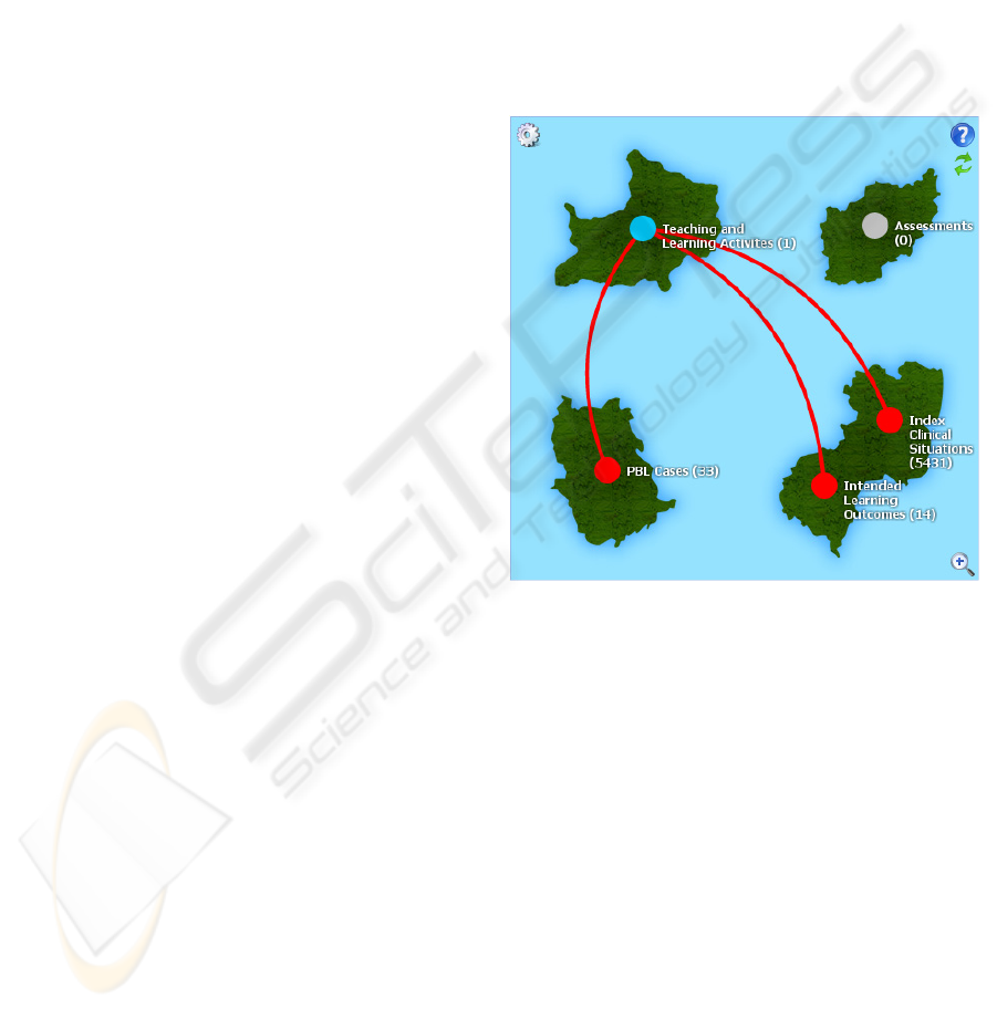
airline’s routes to a set of airports. In this visual
metaphor, airports represent the knowledgebase
classes, and flights represent the associations
between the instances of the classes located at each
airport. This new approach aims to follow a style of
route-mapping commonly found on airline websites;
the example tool by Easy Jet (EasyJet Route Map,
n.d.) shows all of the airports serviced by their
flights, along with the routes from a particular
airport once selected. The characteristic of
displaying only the routes from one airport at any
given time greatly assists in reducing crowding. Had
the entire set of possible flight paths been shown, the
visualisation would have been unclear and unusable.
By using a similar technique to the economy
airlines, a suitable level of visualisation detail was
reached, as shown in Figure 2.
Figure 2: Visualisation using ‘airport’ metaphor.
Although a setting for showing all the routes does
exist within the tool, it is provided only to offer an
overview into the connectedness of the
knowledgebase structure. The instance count at each
airport is shown after its title. Once an airport has
been selected and its routes shown, the numbers at
each of the related airports will change to reflect the
number of related instances. The instances for the
selected airport are displayed in a grid below the
visualisation with any relevant properties. Keyword
filtering can be applied at any airport, allowing a
user to view only the routes from the resulting
instances. The related instances can then be viewed
by selecting the relevant target airport.
In order to make provision for the hierarchical
structure found in many knowledgebases, the notion
of an airport terminal is used to model sub-classes.
Due to the potential over-crowding of these
terminals being drawn on the map, they are shown in
ICEIS 2010 - 12th International Conference on Enterprise Information Systems
170
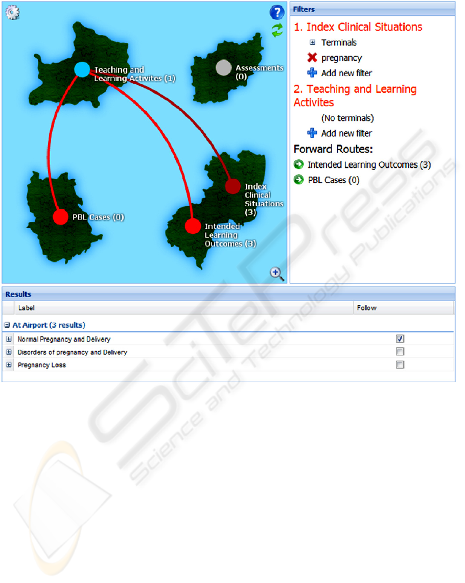
Figure 3: Complete visualisation interface.
a separate panel in the interface. When viewing the
instances of an airport on the grid, the terminals are
shown as collapsible groups. Figure 3 shows the
visualisation tool in its entirety. The right-hand side
panel shows the keyword filter and terminals
control, while the lower section shows the instance
browser. If the user wishes to start a journey with an
instance (or set thereof), they can simply ‘tick’ the
relevant box in the instance browser.
To enhance the visual realism of the metaphor a
number of ‘islands’ are shown on the map, providing
a more realistic feel to the map. Also, the routes
between each airport are drawn as Bezier curves.
5
USER WORKFLOW
A common feature among existing visualisation
tools is the lack of focus for their use (Katifori et al.,
2007). Although maximum flexibility is maintained
through lack of rigid usage specifications, providing
a user with a set of pre-determined workflows can
increase the simplicity of using such a tool. As part
of the workshops used to evaluate the route-mapping
metaphor, a number of workflow patterns were
determined. By establishing the desired workflows
of the target audience, it is possible to produce a
more relevant and usable tool.
Although the needs of individual users are likely
to vary significantly, a commonly identified
requirement was the discovery and realisation of
inter-conceptual relationships. Rather than leaving
the user to attempt the task using an ‘all-or-nothing’
approach, the route-mapping metaphor permits all
levels of abstraction to be used simultaneously. This
is achieved by providing a high-level view of all
airports and a set of instances with relationships
between them (as flights) simultaneously; both the
THE VISUALISATION AND EXPLORATION OF A CURRICULUM KNOWLEDGEBASE
171

individual elements and entire dataset are
observable, along with the relationships or ‘routes’
between them. From this position, a user is able to
assimilate easily information on both the structure
and relatedness of the data within a knowledgebase
at multiple levels.
To further the capabilities of information
discovery, the ability to build a ‘journey’ through a
series of airports makes provision for another crucial
workflow pattern. By building up a trail of inter-
related concepts across a knowledgebase, a user can
generate a view that depicts how even the most
distant elements are connected, thus gaining further
insight into the real meaning of the data. In practice,
this can enable a user to not only see how and where
data is related, but also where it is not. When used in
the domain of a curriculum, this functionality can
assist in highlighting areas of teaching that perhaps
have not been given sufficient coverage, or perhaps
identified as relevant to another part of the
curriculum.
6 STRUCTURAL
MODIFICATION
The application of a visual metaphor to the structure
of a knowledgebase effectively removes any direct
contact between the structure and user. The elevated
mediated view removes the invariably complicated
appearance of data (as demonstrated by Figure 1),
thus introducing an abstract version of the data
model. This intermediate layer can provide a
valuable opportunity to implement domain-specific
logic to the way the visualisation supports
interaction, offering yet another mechanism for
simplification and user guidance. In the case of the
Medical School curriculum, this allowed for parts of
the curriculum not relevant for visualisation to be
omitted. Similarly, the tool was able to display a
modified knowledgebase structure, facilitating the
emulation of a hierarchical structure that existed
logically rather than within the database schema. For
the curriculum visualisation, this was used
specifically to enforce parent-child relationships
where the children were logical sub-components
rather than literal sub-types.
7 PERFORMANCE & USABILITY
Although the original intentions of using an
ontology-based knowledgebase proved both flexible
and convenient, the addition of approximately 7000
elements to the model saw the speed of data retrieval
dramatically decrease to an unacceptable level. This
issue prompted a move away from an ontology
based knowledgebase to a model-driven-architecture
framework, Sculptor (Sculptor, n.d.). This
technology provides a set of re-usable database
interfaces, generated automatically from a domain-
specific representation of the data model. Any
revision to the structure simply requires that the
model is modified and data is migrated following re-
generation.
One crucial downside to this move is the
inability for the visualisation tool to dynamically
determine the structure and possible associations
that exist within the knowledgebase. Instead, the
visualisation tool requires a version of the
knowledgebase schema that can be used to render
the desired model and specify the actions and
relationships for each class. A possible future
development could see a specific version of the
schema created synchronously with the model-
driven generation of the database infrastructure; this
automated step would simply require modification
of the Sculptor generation chain. It is worth noting
that this issue is the result of the choice of database
architecture; the visualisation tool itself is not tied to
any back-end architecture.
8 SUMMARY AND NEXT STEPS
The tool developed during this research provides a
set of solutions for issues commonly experienced in
knowledgebase visualisation. The route-mapping
metaphor offers a comprehensive representation of
raw data structures that is used effectively in
reducing visual complexity. Coupled with the
provision for building a ‘journey’ or ‘trail’ through
the structure, an overall increase in data visibility
and intention is delivered.
Further evaluation of the success and potential of
the tool is planned. The visual metaphor will be
assessed against the metrics and guidelines set out
by (Shneiderman, 1996) and (Burkhard, 2005).
Future use of the tool both within and outside of the
medical domain will provide real-world feedback
from a range of users, outlining possible limitations
and determining potential improvements. In order to
produce a quantifiable assessment of the tool, a set
of activities will be derived to compare the speed of
information discovery to that of an alternative,
rudimentary presentation of the data (e.g. tree
diagram).
ICEIS 2010 - 12th International Conference on Enterprise Information Systems
172

Although a decision to avoid the conventional use of
clustering was made early on, one logical
progression for our visualisation is the ability to
‘zoom in’ on an airport and view its terminals
graphically. This differs from the conventional
approach of displaying an instance graph once a
group is expanded; the suggested development
would only be used to represent hierarchical
structures, ensuring expansion remained on the class
(or airport/terminal) level.
The ability to discover where data may be
unrelated has been beneficial during use in
curriculum exploration. An obvious extension of
functionality would be the provision of a facility to
automatically determine orphan instances; that is,
where an instance of any given class that has no
relationships to other instances where permitted by
the schema. This would provide a unique view of the
data in a way that is atypical of a visualisation tool.
As visualisation of data often provides a useful
output of information, the ability to generate a report
of findings from such a tool would be greatly
beneficial to users performing manual data analysis.
A mechanism for providing such functionality could
perhaps make use of a drag-and-drop interface,
where any object to be included in the report could
simply be dropped into a ‘report bucket’.
Another potential addition is that of a dynamic
context control, in the form of a drop-down box.
This would allow the visualisation to be given a
specific context to display, for example only data
from a particular year. The context would effectively
be a top-level filter on the data, where a
knowledgebase contained a relevant set of instances
that possessed qualitative relationships with
instances in other classes.
ACKNOWLEDGEMENTS
Thanks to Tim Cappelli (Project Manager) for
proposing the visual metaphors and designing the
user workshops.
The CRAMPON project was funded by JISC
1
.
REFERENCES
Burkhard, R. A. (2005) Towards a Framework and a
Model for Knowledge Visualization: Synergies
Between Information and Knowledge Visualization,
Berlin/Heidelberg: Springer.
1
Joint Information Systems Committee.
Burkhard, R. A. and Meier, M. (2004) 'Tube Map:
Evaluation of a Visual Metaphor for Interfunctional
Communication of Complex Projects', Proceedings of
I-KNOW.
Cleveland, W. S. (1993) Visualizing Data, Hobart Press.
Dexter, H. and Davies, I. (2009) 'An ontology-based
curriculum knowledgebase for managing complexity
and change', Ninth IEEE International Conference on
Advanced Learning Technologies.
EasyJet Route Map, [Online], Available: http://
www.easyjet.com/asp/EN/routemap/ [18 Jan 2010].
Katifori, A., Halatsis, C., Lepouras, G., Vassilakis, C. and
Giannopoulou, E. (2007) 'Ontology visualization
methods - a survey', ACM Computing Surveys, vol. 39,
no. 4.
Sculptor, [Online], Available: http://fornax.itemis.de/
confluence/display/fornax/Sculptor+(CSC) [12 Jan
2010].
Shneiderman, B. (1996) 'The Eyes Have It: A Task by
Data Type Taxonomy for Information Visualizations',
Proceedings of the IEEE Symposium on Visual
Languages, pp. 336-343.
Vertesi, J. (2008) 'Mind The Gap: The ‘Tube Map’ as
London’s User Interface', Social Studies of Science,
vol. 98, no. 1, pp. 7-33.
What is an ontology?, [Online], Available: http://
lsdis.cs.uga.edu/projects/glycomics/report/Report2006
.html [3 Jan 2010].
THE VISUALISATION AND EXPLORATION OF A CURRICULUM KNOWLEDGEBASE
173
