
A NEW VISUAL DATA MINING TOOL FOR GVSIG GIS
Romel Vázquez-Rodríguez, Carlos Pérez-Risquet, Inti Y. Gonzalez-Herrera, Alexis Fajardo-Moya
Center of Studies on Informatic, Central University of Las Villas, Santa Clara, Cuba
Juan Carlos Torres-Cantero
Departament of Languages and Informatics Systems, Granada University, Granada, Spain
Keywords: Visual data mining, Scientific visualization, Information visualization, GIS.
Abstract: The integration of scientific visualization (ScVis) techniques into geographic information systems (GIS) is
an innovative alternative for the visual analysis of scientific data. Providing GIS with such tools improves
the analysis and understanding of datasets with very low spatial density and allows to find correlations
between variables in time and space. This paper presents a new visual data mining tool for the GIS gvSIG.
This tool is implemented as a gvSIG module and contains several ScVis techniques for multiparameter data
with a wide range of possibilities for interaction with the data. The developed module is a powerful visual
data mining and data visualization tool to obtain knowledge from multiple datasets in time and space. A real
case study with meteorological data from Villa Clara province (Cuba) is presented, where the implemented
visualization techniques were used to analyze the available datasets. Although it is tested with
meteorological data, the developed module is general and can be used in multiple application fields.
1 INTRODUCTION
The fast development of Geographic Information
Systems (GIS) caused in part by the revolution of
the new information and communication
technologies, has become an essential tool for
analyzing and solving several problems in business,
industry, as well as social and governmental
institutions.
Scientific Visualization (ScVis) has become a
research area of increasing interest in recent years.
This is mainly motivated by the constant increase of
the data volumes generated in multiple application
fields and by the continuous increase in the power of
modern graphics interfaces, which allows to
generate sophisticated images.
In the past two decades, significant progress has
been made in setting up the visualization as a data
exploration tool flexible and easy to use. Visual data
analysis is a new approach that integrates both
human perception and automatic computational
methods, enabling a better understanding and
analysis of large and complex datasets.
One special data class is composed of
multiparameter data (multidimensional data;
multivariate data). Multiparameter data consists of
m-dimensional data of scalar type distributed over
points in the observation space. Many visualization
techniques have been developed for multiparameter
data. The most relevant of them are referenced in
section 2. The flexibility and possibilities of
interaction of these techniques can replace the
shortcomings of the interpolation methods used by
current GIS when working with very low spatial
resolution data.
The integration of ScVis techniques into GIS is
an innovative idea that combines the advantages and
strengths for data analysis of both approaches.
Section 3 discusses the alternatives for the
integration of ScVis techniques into GIS.
Section 4 presents the module developed for the
integration of scientific visualization techniques for
multiparameter data in the gvSIG GIS. This module
was used with meteorological data from the province
of Villa Clara, Cuba; thus showing the effectiveness
of this type of analysis when the spatial resolution of
the data is poor and the time information is wide.
These meteorological data are weather variables
measured from 1977 to 2007 in Villa Clara’s
weather stations. Although this time series is fairly
complete, it only contains information from four
weather stations. By using the multiparameter
visualization techniques developed in this work it is
428
Vázquez-Rodríguez R., Pérez-Risquet C., Gonzalez-Herrera I., Fajardo-Moya A. and Torres-Cantero J..
A NEW VISUAL DATA MINING TOOL FOR GVSIG GIS.
DOI: 10.5220/0003089904280431
In Proceedings of the International Conference on Knowledge Discovery and Information Retrieval (KDIR-2010), pages 428-431
ISBN: 978-989-8425-28-7
Copyright
c
2010 SCITEPRESS (Science and Technology Publications, Lda.)

possible to make an analysis of these data, obtaining
some conclusions about their performance. The
conclusions are presented in the last section of this
paper.
2 MULTIPARAMETER
VISUALIZATION
There is a large number of problems where each data
point contains more than one attribute. These
attributes can be dates, locations or descriptive
values, and may have or not a spatial reference. This
type of data is called multiparameter, and it is
usually found in applications of data mining,
statistics and artificial intelligence (Keim, 2002).
The main goal of multiparameter data
visualization methods is to make representations or
reveal correlations between attributes. There is a
wide range of ScVis techniques, for which several
improvements have also been created. The
techniques can be classified in geometric, icon-based
and pixel-based (Keim, 2000).
3 SCVIS – GIS INTEGRATION
The integration of ScVis techniques into GIS is an
innovative alternative for the visualization of
multiparameter data. Providing GIS with such tools
improves the analysis and understanding of datasets
with very low spatial density and allows to find
correlations between variables in time and space.
The integration of ScVis and GIS, according to
(Rhyne, 1997), is based on 4 methods:
Rudimentary: Minimal data sharing between
GIS and visualization systems.
Operational: Consistency of geospatial data.
Functional: Transparent communication
between GIS and visualization systems.
Merged: Comprehensive toolkit. Tools that
widely involve the 2 disciplines.
The rudimentary method uses minimal data
integration and exchange between both technologies.
The operational method is intended to provide data
consistency, while deleting redundancies between
the two technologies. The functional method
provides transparent communication between the
software environments. The merged approach is
concerned with the development of systems where
the concepts of cartography, GIS and ScVis are
merged in a comprehensive toolkit.
Some early attempts of merged integration
approach are materialized through tools like
GeoVista Studio and Snap-Together Visualization.
Both tools are based on networks of components that
allow the construction of complex workflows
linking components for managing geographic data
formats and different ScVis techniques.
4 GVSIG SCVIS MODULE
The main objective of this work was to build a
multiparameter visualization data module that helps
to obtain knowledge form data measured in the same
time interval with a large amount of records, but
spatially scarce.
The solution consisted of integrating some
multiparameter visualization techniques into a GIS,
in such a way that data could be analyzed by having
a geographical perception of their origin.
An integration by adding a scientific-information
visualization module to a GIS was implemented
allowing the user to prepare projects to be used in a
coordinated visualization. A coordinated
visualization means visualizing, by using scientific
visualization techniques, multiple datasets
corresponding to multiple data points. It is
coordinated because all visualizations are
normalized according to the global extreme values
of every variable of all data points.
These projects can be customized to be
visualized over a vector map of points (point shape
file given by the user) or over a vector map of area
(area shape file used as background of the
visualization); in the latter, the graphics are
displayed over the centroid of the corresponding
area. The techniques that can not be visualized as a
graphic over the map due to space restrictions are
visualized in independent panels, where the
geographical perception is still present.
The GIS selected to be extended with the
scientific visualization module was gvSIG, a
powerful open source GIS from Generalitat
Valenciana. It is a java-based GIS which is very
easy to extend and have very good documentation
for developers. gvSIG have a well-structured class
hierarchy and supports the reading of several
geographical and non geographical formats like
tables.
In order to visualize using a coordinated
visualization in gvSIG, 2 kinds of data are
necessary: geographical and multiparameter data.
The geographical data can include a background
map and a point map, or only a background map,
both as ESRI shape files.
Each data point should match a multiparameter
data file. This extension allows to read
multiparameter data in the table format dbf and arff
A NEW VISUAL DATA MINING TOOL FOR GVSIG GIS
429

file format, that specify metadata like names and
types for every variable of the table. The data in
each data point have to match the number of
variables and records. Missing values are allowed.
The meteorological data collected by the
Meteorological Institute of Villa Clara represent a
time series of each of the variables collected from
1977 to the present. The meteorological variables
are collected over a ten-day period (dekadal), the
variables are: dekadal average mean, maximum and
minimum temperature, dekadal average of mean,
minimum and maximum relative humidity,
cloudiness (dekadal average in 1/8 cover sky),
dekadal mean wind speed, dekadal total rainfall,
dekadal insolation (average daylight hours), dekadal
water vapor pressure and dekadal average
atmospheric pressure. From each of the four weather
stations in the province, there is a time series of 13
variables.
Users can prepare their own multiparameter
dataset for each data point and use a wizard that
helps to customize datasets to be visualized. It
creates a configuration file that is used by the
coordinated visualization module.
There are several ways to visualize data with
multiparameter ScVis techniques. Some of them
allow visualizations over maps, where the
association of the data with the geographical area is
perceived. In particular, ScVis techniques for
multiparameter data do not necessary have to be
associated with a map. However, these techniques
can be applied to all variables in each data point to
obtain correlations between certain variables of
several points. It is possible to use for example,
Parallel coordinates to display the 13x4 (52)
variables corresponding to the 4 meteorological
stations.
Another implementation method is to display
data from each point separately, and show a map
where it is evident to which region each graphic is
related to. This is achieved with an arrow that
connects the region in the map with the visualization
panel and naming each panel with the same name of
the data point file visualized on the map.
Some ScVis techniques for multiparameter data
can be displayed directly over the map. Circle
segments, Recursive pattern, and icon-based
techniques are examples of such techniques (see Fig
1). With icon-based techniques is possible to show
an icon for each data source (a weather station in our
case), which represents the set of variables for an
observation at a given time. Some widgets (sliders,
scroll bars) are used to scroll over the time, changing
the icon on the map accordingly. This permits the
user to study the evolution of the data over time. The
same approach can be used to scroll the data with
respect to other variables.
All these methods were implemented in the
developed module for gvSIG. For example, for non
coordinated visualizations, that is, when the data do
not necessarily have to be associated with a map, the
system allows the user to load a data file to be
analyzed using any of the following techniques:
Parallel coordinates, Andrews graphics, Starfield,
Shape coding, Profile Glyphs, Circle segments,
Recursive patterns. Coordinated visualizations with
maps include the following techniques: Parallel
coordinates (in independent panels), Andrews
graphics (in independent panels), Starfield (a record
at a time), Shape Coding (a record at a time), Profile
Glyphs (a record at a time), Circle segments (all
selected records), Recursive patterns (all selected
records)
In our case study we obtained the best results
with the Recursive patterns technique. It seems to be
a very good technique to carry out spatio-temporal
analysis in GIS.
The developed module allows some
functionalities that are available for all the
techniques: Selecting attributes (only the selected
attributes are shown in the graphic), Selecting a
percentage of the records, Selecting according to an
attribute a range of values (makes a subsample of all
data in a range of values selected for a given
attribute), Showing legends (shows the global color
range for each variable, it takes minimum and
maximum values of all datasets, nominal values are
assigned a different color for each value, some
techniques like Profile glyphs show in the legend a
different color for each attribute), Reorganizing
attributes (a new order of attributes is given)
The ordering by functionality orders all datasets
according to a given attribute. Pixel-based
techniques and icon-based techniques use this
functionality to order all the values using this
attribute. By using the time as the attribute the user
can analyze data over time.
All developed pixel-based techniques also allow
to modify the length of the graphics. These
techniques can be visualized in independent panels
as well as over the map.
The developed geometric techniques were
designed to be visualized in independent panels, one
for each data point. They are also coordinated by the
main configuration panel. The coloring of the
records is showed with a color that is defined by a
given variable.
The ScVis module for gvSIG allows the user to
obtain visual information about the variables. In this
case study, meteorological data from the Villa
KDIR 2010 - International Conference on Knowledge Discovery and Information Retrieval
430
Clara’s four weather stations is analyzed.
The main advantages of using ScVis techniques
with multiparameter data in GIS are the possibilities
of making comparisons, identifying patterns &
correlations, detecting anomalies, variability, and
extracting the different patterns that may occur in
the variables, in such a way that space and time
information can be obtained. Once detected, a
graphical relationship or a hypothesis between
variables or a pattern can be proved by mathematical
methods.
Another advantage provided by the use of such
techniques is the possibility offered by the
developed module of interacting with the data.
The pixel-based technique Recursive pattern
have a special way of interacting with data. This
technique seems to be the most useful for
meteorologist, due to the large amounts of data that
can be shown for each meteorological station and
because data is time-dependent.
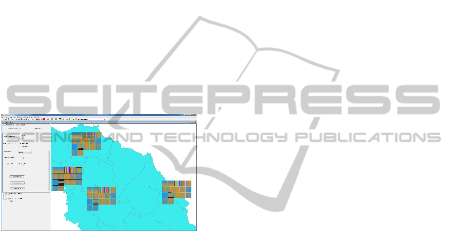
Figure 1: Coordinated visualization with Recursive pattern
over the map, 1080 values for each attribute of the four
weather stations of Villa Clara.
Figure 1 shows the coordinated visualization using
Recursive Pattern. Each station displays its owns
data of the 17 attributes, that is, time attributes like
year, month, dekadal, year-dekadal, and the 13
weather variables. The recursive pattern used in the
picture is (36,1)(1,30) which show a year per row
from left to right (the 36 dekadal average of a year),
and 30 years from top to bottom, 1080 values are
shown for each attribute (small square) and for each
station. It could be clearly seen the behaviour of the
medium, maximum and minimum temperatures of
each station in the fourth, fifth, and sixth square
from left to right and from the top to the bottom. As
expected, lower values can be identified at the
beginning and end of the square from left to right
(blue color), and higher values in the middle (orange
color) which represent the hotter months. Missing
values are represented in black color, that is, the
moments when weather stations did not take
measures. This kind of anomalies can be detected
using this module.
Some regularities stand out after using the
visualization module with the meteorological data.
The 1996-1999 period was analyzed in order to
identify the effects of El Niño in Cuba. The
Recursive Pattern technique was used with the
pattern (36,1) (1,4). This pattern shows the four-year
period. It was concluded that in Santo Domingo: the
maximum and mean temperature are higher in 1997
and 1998. The maximum and mean temperature in
1997 were higher early in the year. In 1998
temperatures were higher during the warmer months.
In Sagua weather station: the maximum and
minimum temperatures are higher in 1997 and 1998.
Temperatures in 1997 were higher early in the year
The minimum temperature in the first three
months of the year is usually higher in Caibarién
than in all other stations. This is because this place is
a coastal area.
5 CONCLUSIONS
In this paper the basic ideas about the ScVis-GIS
integration are discussed.
A real case study with meteorological data from
Villa Clara was presented, where several
multiparameter visualization techniques were
implemented, and some implementation alternatives
were analyzed. A ScVis module was developed and
incorporated into a GIS (gvSIG) by implementing an
approach of integration between these disciplines.
The developed module includes several visualization
techniques, and offers a wide range of possibilities
for interaction with the data.
It should be noted that, although this study was
carried out to solve a real problem of visual analysis
of meteorological data in Villa Clara province, the
developed tools are general.
Future work will focus on extending the
developed module so as to allow the reading of data
in other formats. Also, new multiparameter data
visualization techniques will be added to the
module.
REFERENCES
Keim, D. A. 2000. Designing Pixel-Oriented Visualization
Techniques: Theory and Applications. IEEE Transac-
tions On Visualization and Computer Graphics, 6.
Keim, D. A. 2002. Information Visualization and Visual
Data Mining. IEEE Transactions On Visualization and
Computer Graphics, 7, no. 1.
Rhyne, T. M. 1997. Going Virtual with Geographic Infor-
mation and Scientific Visualization.
A NEW VISUAL DATA MINING TOOL FOR GVSIG GIS
431
