
VISUAL ANALYSIS OF DOCUMENT TRIAGE DATA
Zhao Geng, Robert S. Laramee
Visual Computing Group, Computer Science Department, Swansea University, Swansea, U.K.
Fernando Loizides, George Buchanan
Centre for HCI Design, City University London, London, U.K.
Keywords:
Information visualization, Document triage, Evaluation.
Abstract:
As part of the information seeking process, a large amount of effort is invested in order to study and understand
how information seekers search through documents such that they can assess their relevance. This search and
assessment of document relevance, known as document triage, is an important information seeking process, but
is not yet well understood. Human-computer interaction (HCI) and digital library scientists have undertaken a
series of user studies involving information seeking, collected a large amount of data describing information
seekers’ behavior during document search. Next to this, we have witnessed a rapid increase in the number of
off-the-shelf visualization tools which can benefit document triage study. Here we set out to utilize existing
information visualization techniques and tools in order to gain a better understanding of the large amount of
user-study data collected by HCI and digital library researchers. We describe the range of available tools and
visualizations we use in order to increase our knowledge of document triage. Treemap, parallel coordinates,
stack graph, matrix chart, as well as other visualization methods, prove to be insightful in exploring, analyzing
and presenting user behavior during document triage. Our findings and visualizations are evaluated by HCI
and digital library researchers studying this problem.
1 INTRODUCTION
Document triage is an important stage of the infor-
mation seeking process. It focuses on user behavior
with respect to skimming, evaluating and organizing
documents when searching for information. Various
studies have been conducted (Buchanan and Loizides,
2007; Loizides and Buchanan, 2009) to explore users’
behavior during document triage. Over the course of
these studies, a large amount of qualitative and quan-
titative data is collected. However, understanding and
analyzing this data is difficult in its raw form. Con-
ventionally, these experimental data are analyzed by
statistical methods and simple visualizations, such as
bar charts, line graphs and pie charts. These sim-
ple visualizations are useful, but of limited help for
high dimensional data. Thus, there is a great demand
for summarizing and presenting the data in a more
insightful way that HCI scientists can better utilize.
This motivates the exploitation of more advanced in-
formation visualization techniques. In recent years,
we have witnessed a rapid increase in the number of
visualization tools for general use, such as
XMDV (Ward, 1994), Mondrian (Theus, 2002),
TopCat (Mark Taylor, 2005) and ManyEyes (Viegas
et al., 2007). We carry out an investigation on
how well data collected by HCI and digital library
researchers can be visualized by existing off-the-shelf
information visualization tools and how well each
can be applied. Results show that the amount of time
spent on documents, pages and document features
as depicted by some of our visualizations, such
as the treemap, parallel coordinates, stack graph
and matrix chart can help HCI and digital library
scientists understand and explore user behaviors
during document triage. On the other hand, we also
learn that some of the visualizations, such as the 2D
bar chart, 2D and 3D scatterplot are limited in their
applicability to this problem. The advantages and
disadvantages of the most promising visualization
techniques are compared and evaluated.
In this paper we contribute the following:
• A novel attempt to systematically visualize exper-
imental document triage data studying human be-
151
Geng Z., S. Laramee R., Loizides F. and Buchanan G..
VISUAL ANALYSIS OF DOCUMENT TRIAGE DATA.
DOI: 10.5220/0003320401510163
In Proceedings of the International Conference on Imaging Theory and Applications and International Conference on Information Visualization Theory
and Applications (IVAPP-2011), pages 151-163
ISBN: 978-989-8425-46-1
Copyright
c
2011 SCITEPRESS (Science and Technology Publications, Lda.)

haviors using state-of-the-art information visual-
ization methods.
• We survey the variety of state-of-the-art, off-the-
shelf information visualization tools in order to
help researchers from another domain gain insight
into their experimental data.
• We compare and evaluate the various tools and vi-
sualizations with respect to their effectiveness in
solving a given problem.
• The results of our investigation are evaluated by
HCI and digital library researchers studying doc-
ument triage.
The result of our study also provides the reader
with a concise introduction to free, off-the-shelf infor-
mation visualization applications and their features.
The rest of this paper is organized as follows. In
section 3 we briefly review the past and related work
in the study of document triage. In section 4, we
describe in detail the data collected during the doc-
ument triage study. In section 6, we investigate dif-
ferent visualization techniques from various tools and
evaluate the usefulness of each. Section 7 presents a
summary on the interactivity and scalability of visu-
alization softwares. Section 8 contains feedback from
the domain experts studying this problem. Section 9
wraps up with conclusions and the specifications for
the visualization tools for HCI researchers.
2 EXPLORATORY
SPECIFICATIONS
The data provided by the HCI group, as discussed
in Section 4 is quantitative in nature, including tim-
ings, numerical ratings from participants. The main
aim of a visualization to the HCI researchers is a fast
overview of the data in order to formulate hypothe-
ses on a) relationships between document properties,
times and ratings and b) common recurring patterns
over all the three areas mentioned in part (a). These
can then be tested empirically for validity by statis-
tical significance. Thus far, hypotheses are inferred
before the study by previous results or by observing
the individual behavior of participants as they perform
a specific task. Indeed, many hypotheses are specula-
tive and are sometimes based on curiosity rather than
evidence. We hope that visualizations will greatly de-
crease the time taken to formulate more grounded hy-
potheses and dismiss non substantive data patterns.
Furthermore, we hope to be able to test for patterns
and relationships which may have previously gone
unnoticed without visualization of the information.
3 RELATED WORK
Document triage is a highly manual process, ulti-
mately leading to a relevance decision from the user.
It is unlike the automatic information retrieval pro-
cess where the decision is made by the search en-
gine. The document triage process begins after the
automatic information retrieval process and before in-
depth reading. The usual starting point of the docu-
ment triage process is a results list. Currently, there
is limited further assistance for the information seek-
ers after the information retrieval process. A typical
results list includes a title and a small description of
the contents of the document (whether that is a web-
page or an academic paper). In general, document
triage is a fast process. From previous research we
see that when presented with a results list, informa-
tion seekers will make fast decisions on the relevance
of documents to their information need rather than
scrutinizing the full documents further (Buchanan and
Loizides, 2007). Numerous previous studies have
deciphered document triage behavior of information
seekers (Loizides and Buchanan, 2009; Cool et al.,
1993). Recent work has been geared toward summa-
rization of documents for relevance overview. One
specific area that has been gaining attention is that
of tag clouds for document summarization(Gottron,
2009; Bateman et al., 2008).
Up to now, various visual analysis tools on docu-
ment triage have been developed(Jonker et al., 2005;
Bae et al., 2008). But these tools do not help HCI re-
searchers visualize their user-study data. Because of
the experimental nature of the study, we find it neces-
sary to introduce more advanced existing information
visualization tools to the HCI community, and help
them better present and explore their various data sets.
There are many general purpose information visu-
alization tools developed for industry, such as Eureka,
SpotFire and InfoZoom (Kobsa, 2001). They provide
various interactions for users to enable the ”Visual
Information Seeking Mantra” : overview first, zoom
and filter, details on demand (Keim., 2002; Shneider-
man, 1996). Advanced tools such as OpenViz (Ad-
vanced Visual Systems Inc., 2009) and ILog Discov-
ery (Baudel, 2004), are integrated with multiple visu-
alization techniques to handle complex data sets and
queries. These tools are for commercial use. Our
study focuses on free, off-the-shelf visualization soft-
ware. As stated by Kobsa (Kobsa, 2001), when solv-
ing a specific problem, users, especially from other
domains, might have great difficulties in selecting the
most effective visualizations out of numerous choices.
Also, the task questions posed from the domain ex-
perts often affect how they derive information from
IVAPP 2011 - International Conference on Information Visualization Theory and Applications
152

a visualization (Ziemkiewicz and Kosara, 2008). It is
important to note that although there have been sev-
eral general user-study evaluations of information vi-
sualizations (Kobsa, 2001; Ziemkiewicz and Kosara,
2008). This work presented here is not a general user-
study but a very specialized investigation for a fo-
cused audience, namely, document triage researchers.
Although we do believe the work conducted here can
benefit other users as well. Our work is to facilitate
document triage experts search for visualizations that
benefit most for their experimental data.
4 BACKGROUND:
USER-STUDY DATA
The data sets used in our visualizations, is col-
lected by our collaborated HCI researchers Buchanan
and Loizides from their document triage user-
study (Loizides and Buchanan, 2009). Their exper-
iment aims to investigate the human behaviors in the
process of reading the documents, searching for infor-
mation and evaluating the document relevance. Dur-
ing the study, 20 participants performed document
triage on a closed corpus of electronic PDF docu-
ments, evaluating each for its suitability for two tasks.
Log data of their interactions is captured. The docu-
ments provided for search range from short papers (2
pages) to full journal papers (29 pages). There are 6
documents including TABLET to TABLET5 in Task
1, and 10 documents including HCI to HCI9 in Task
2. In Task 1, the goal is to find material on the in-
terfaces of tablet PC’s. In Task 2, the goal is to find
papers on specific CHI evaluation methods. The par-
ticipants’ ages range from 21 to 28. They are studying
at postgraduate level in computer science discipline,
and all have experience with PDF reader software. In
this section we briefly describe the data collected dur-
ing the study.
1. Pre-study questionnaire: Study participants filled
out a questionnaire before the experiments indicating
their: (1) age, (2) number of years electronic doc-
ument readers have been used, (3) average number
of academic documents triaged per day, (4) average
amount of time per day spent searching documents.
Participants were also asked to rate the importance of
the following document attributes in a range from 1
to 10 ( 1 meaning ”very irrelevant” and 10 meaning
”very relevant”): main title, headings, introduction,
plain text, conclusion, references, images and figures,
highlighted and emphasized text. Participants also in-
dicated their preference for searching on paper versus
that of using a computer.
2. Data recorded for each participant during the study:
Table 1: Abbreviation of document features. Plain text
means a page contains none of features from 1 to 9. Em-
phasized text includes bullet point, bold text, italic text
and underlined text. The abstract, keywords and general
terms are features here, but not included in previous litera-
ture (Loizides and Buchanan, 2009).
Number Features Abbreviation
1 Heading He
2 Abstract Ab
3 Keywords Kw
4 General Term Gt
5 Emphasized Text Em
6 Figure Fi
7 Conclusion Co
8 Reference Re
9 Picture Pi
10 Plain Text Pl
For each participant the total amount of time in 1/5th
of a second accuracy viewing each page of each elec-
tronic document was recorded. From this the total
time viewing each document can be calculated. There
are 10 types of document features appearing in the
study. We abbreviate the document features in order
to optimize the space for visualizations, as shown in
Table 1. During the study, participants’ viewing time
on pages is logged. Although eye-trackers are not
used in the current document triage study, the HCI
researchers still want to see how document features
would potentially influence participants’ reading pat-
terns. Thus the viewing time on document features
is inferred based on HCI researchers’ hypotheses that
more time spent on a page suggests more interest on
the features in that page. The new findings or hy-
potheses obtained then will be used for further experi-
ment design aided by the eye-trackers. The frequency
of document feature on each page can be defined as
F
i,k,q
=
n
i,k,q
N
k,q
, where n
i,k,q
represents the number of
feature i appeared in page k of document q, and N
k,q
represents the total number of all features appeared in
page k of document q.
Thus the viewing time on each feature can be es-
timated as t
i,k,q
= T
k,q
× F
i,k,q
, where T
k,q
represents
the participants’ average viewing time on page k of
document q.
3. Participant rating of document relevance: After
each search task participants were asked to assign
each document a relevance score (1 meaning ”worst”
or very irrelevant and 10 meaning ”best” or most rele-
vant). Also, for each document, the significance of the
following document features is recorded: (1) head-
ings (2) picture (3) figures (4) emphasized text.
VISUAL ANALYSIS OF DOCUMENT TRIAGE DATA
153
5 OBJECTIVE RELEVANCE
METRICS
As part of this investigation we attempt to derive some
objective document relevance metrics based on key
terms’ T F × IDF score in the document (Lee et al.,
1997). These objective metrics may then be used to
gain insight into how effective participants are in their
search for relevant information and can also be com-
pared with subjective metrics. The comparison of ob-
jective and subjective document relevance metrics is
shown in Figure 1 and Figure 2. The details can be
found in the supplementary PDF file (due to space
limitations).
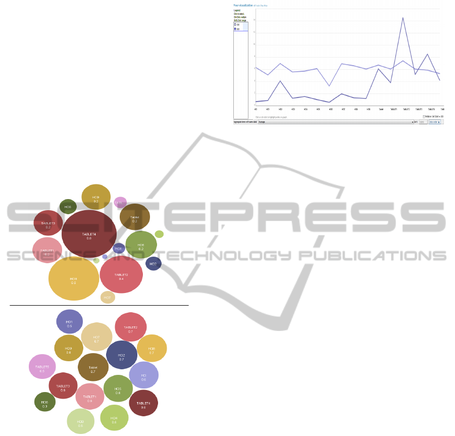
Figure 1: We can plot the subjective and objective rat-
ings described in Section 4 and 5 onto the bubble chart in
ManyEyes (Viegas et al., 2007). As shown in the figure, the
top one presents the objective ratings and the bottom one
shows the subjective ratings. From the bottom bubble chart,
we can observe the difference of scores between documents
is very slight. These two bubble charts highlight the dis-
crepancies between the objective and subjective relevance
metrics.
6 VISUALIZATION
In this section, we utilize various existing visual-
ization techniques and tools to investigate document
triage data. The following list summarizes the tools
and their visualizations we have experimented:
Figure 2: This figure shows the line graph plot of the sub-
jective and objective rating scores. Documents in the order
from HCI to HCI9, TABLET to TABLET6 are mapped to
the x-axis. We can observe that, except documents HCI1,
HCI7, HCI8 and TABLET4, the subjective rating (the line
above) and the objective score (the line below) correspond
in a linear fashion.
• The ManyEyes (Viegas et al., 2007) applica-
tion with the following visualizations: Wordle,
Tag Cloud, TreeMaps, Line Graph, Stack Graph,
Bar Chart, Bubble Chart, Scatterplot, and Matrix
Chart
• The XMDV (Ward, 1994) application with the
following: Parallel Coordinates, Scatterplot Ma-
trix, Star Glyphs and Dimensional Stacking
• The Mondrian (Theus, 2002) application with the
following visualizations: Bar Charts, Histograms,
Parallel Coordinates, Boxplots, Scatterplot Matrix
• The Treemap Application 4.1 (Kobsa, 2004):
TreeMaps
• The Topcat Application (Mark Taylor, 2005): 3D
Scatterplots, Histogram, Sky, Lines and Density
• Microsoft Office 2007 (Microsoft, 2007): 3D Bar-
chart, Radar chart, 3D line graph, 3D Bubble
Chart. Although Excel is a commercial applica-
tion, we include it as an exception because we
have a university license for this product.
• The Tableau Application (Heer et al., 2008): The
free trial version only contains a few basic visual-
izations. Advanced options such as parallel coor-
dinates are not available for use in the free trial.
In the following subsections, we describe the ap-
plications we used along with the visualizations of
document triage data and evaluate the usefulness of
each. We tried over 17 visualizations with several
different variations for a total of 110 images. Each
tool was systematically applied to the same data de-
scribed in Section 4 (Loizides and Buchanan, 2009)
by visualization researchers. For each tool, we (1)
re-formated the data to match the application’s in-
put requirements, (2) tried out each of the visualiza-
IVAPP 2011 - International Conference on Information Visualization Theory and Applications
154
Figure 3: The top image shows the 2D stack graph visualization of document triage data in ManyEyes (Viegas et al., 2007).
The X-axis represents documents in both Task 1 and Task 2. Y-axis represents the average viewing time on each page over all
participants in each document. The strips in different colors represent viewing time trend for individual pages. The number
in every strip indicates the page number. The bottom image illustrates the 3D stack graph plotted on Microsoft Office Excel
2007. The X-axis is mapped to the page number, Y-axis to the viewing time and Z-axis to the documents. Compared with 2D
stack graph, we can gain an overview of all documents’ time and page distribution and compare them more intuitively.
tions offered by the tools, and (3) evaluated the utility
based on the domain expert’s feedback. The visual-
izations are assessed by domain experts - the HCI sci-
entists who carried out the user-study (Loizides and
Buchanan, 2009). Due to space limitations, we can-
not describe every visualization we tried out, but only
those most relevant and beneficial to the investiga-
tion. The beneficial visualizations are able to pro-
vide more insight of the data set and help the HCI
researchers obtain and form new findings and hy-
potheses. We also provide some of the less insight-
ful visualizations as supplementary material. Some of
the less beneficial visualizations include: bar charts,
bubble charts, 2D and 3D scatterplots. We provide
a tour through all of the visualizations in a supple-
mentary video. Each image of visualization, plus
the supplementary video and PDF file, are stored in
its original resolution on the supplementary website
http//cs.swan.ac.uk/∼cszg/docTriage.
6.1 Stack Graph Visualization
The stack graph in ManyEyes is used to visualize the
total change of a group of quantities over time(Viegas
et al., 2007). During the document triage study, HCI
scientists observe that a user’s triage process can pro-
ceed in a linear fashion starting with the first docu-
ment and then reading and scoring every subsequent
document (Buchanan and Loizides, 2007). The se-
quence of documents in Task 1 and 2 can be mapped
to the time parameter of the stack graph. For each
document, we can observe the changes in viewing
time spent on individual pages from top image in Fig-
ure 3. This visualization shows participants spent
most of their time viewing page one. Also, users
spent less time on pages near the end of the docu-
ments. From the peak of each document, we can rank
the documents by viewing time, e.g. HCI receives the
most time and HCI(6) the least. Furthermore, we can
compare individual pages of different documents, su-
VISUAL ANALYSIS OF DOCUMENT TRIAGE DATA
155
Figure 4: This figure shows the treemaps from ManyEyes (Viegas et al., 2007). The top image shows a Task-Document-
Page-Feature hierarchy. The top row of the visualization shows the current tree hierarchy. Each document name in black
bold character is manually annotated. Different colors represent different documents. The document features on each page
are mapped to the leaves of the tree. The bottom image shows a Task-Feature-Document-Page structure. Different colors
represent distinct document features in both tasks. The feature names are manually annotated. The pages that features appear
on are visualized as leaves of the structure.
ch as all pages of TABLET(2) receive more viewing
time than adjacent documents.
The 2D stack graph utilizes the accurate graphical
perception encodings (Cleveland and McGill, 1985),
such as position, length, area, angle slope and color,
to convey multiple data attributes to the user simul-
taneously. Also, an additional variate, namely, doc-
uments, can be included in the visualization as op-
posed to just two dimensions (page and time) in the
bar chart, line graph or pie chart. However too many
pages in this visualization leads to problems such as
very thin strips or degenerate line strips. It’s difficult
to discern the last few pages of longer documents (10
pages more), thus the length of such documents is dif-
ficult to infer.
The problems of degenerate or overlapping strips
can be reduced in the 3D stack graph, which is avail-
able in Microsoft Office Excel 2007, as shown in Fig-
ure 3 bottom. Compared with the 2D stack graph,
the length of each document is clearly shown in 3D
space. Also, we can gain a general trend of partic-
ipants viewing time on documents and pages which
2D stack graph cannot offer. Although the 3D stack
graph suffers from occlusion and perspective distor-
tion (Shneiderman, 2003), with the help of the inter-
action techniques, such as zoom, pan, rotate and shad-
ing, the benefits provided by 3D outweigh the draw-
backs in this particular case.
6.2 Treemap
HCI researchers study how document features influ-
ence user behaviors when searching documents. The
relationship of viewing time between pages and docu-
ment features may unveil user navigation patterns dur-
ing document triage. In order to optimize the space to
display more information, we abbreviate the nodes in
the tree structure. Pg1, Pg2 etc. are page numbers.
TA, TA1 etc. and HC, HC1 etc. represent documents
in Task 1 and 2. The abbreviation of document featu-
IVAPP 2011 - International Conference on Information Visualization Theory and Applications
156
Figure 5: This image shows a matrix chart in ManyEyes (Viegas et al., 2007). Rows are mapped to the document features,
columns to the documents, colors to page number and size of each bar to time. Rows, columns and colors can only accept
categorical data. This visualization depicts four variates at a time and display the general view among the four variates.
Figure 6: This figure shows a combination of bar charts, parallel coordinates and scatterplot matrix in Mondrian (Martin and
Simon, 2008; Theus, 2002). There are five variates in the visualization: task, document, page number, document feature
and viewing time. Plots are fully linked to one another. From these visualizations, we can observe the distribution of the
highlighted feature heading (He) in document and page respectively.
res is given in Table 1. Each page includes features,
such as headings, abstract, pictures, etc. Each fea-
ture is associated with the average viewing time. The
treemap is an alternative representation of tree dia-
gram, introduced by Johnson and Shneiderman (John-
son and Shneiderman, 1991; Shneiderman, 1992).
ManyEyes offers squarified treemaps, which uses
rectangles with an aspect ratio close to 1 and are or-
dered by size (Bruls et al., 2000). It also provides
various navigation such as smooth zooming, hierar-
chy reordering and color mapping for users to interact
with different levels of the tree structure.
We can create the treemap using a Task-
Document-Page-Feature-Time hierarchy. We anno-
tate the document names of treemap visualization re-
sult to indicate the intermediate nodes, as shown on
the top in Figure 4. From this visualization, page one
including its most frequent features, such as abstract
(Ab), keyword (Kw) and headings (He), covers the
most area in all documents except ”HC6”. Partici-
pants almost even out the distribution of their view-
ing time on each document in Task 1 and on some
groups of documents in Task 2, even the documents’
length varies from 5 to 29 pages. We can hypothe-
size that participants’ viewing time is mostly affected
by the page one, not by the document length. With the
treemap, only one level in the tree structure can be dis-
played each time. To compare different variates, we
need to frequently switch between various tree depths,
which is tedious and error-prone. Some authors try to
visualize the changes of hierarchy in treemap(Tu and
Shen, 2007; Blanch and Lecolinet, 2007), but such at-
VISUAL ANALYSIS OF DOCUMENT TRIAGE DATA
157

tempts are not available in the tools presented in this
paper. In order to further explore participants’ view-
ing patterns, we need a visualization which can com-
bine documents, pages and features together in just
one view. This motivates the use of matrix chart in
Section 6.3.
The treemap Task-Document-Page-Feature hier-
archy can be switched to Task-Feature-Document-
Page order. Each task contains several distinct docu-
ment features. Each feature appears in different docu-
ments. We manually annotate the document features,
as shown on the bottom in Figure 4. From this vi-
sualization, we can observe the distribution of doc-
ument features. Visual components, such as figures,
pictures and emphasized texts, have a weaker impact
than headings in terms of their population in docu-
ments and frequency in pages. Compared with Task
2, the area in plain text (Pl) in Task 1 is dramatically
reduced. This is might because featureless pages ap-
pears in 6 documents in Task 2, whereas only in 2 doc-
uments in Task 1. We also observe that pictures and
figures in Task 1 cover much larger proportion than in
Task 2. This is might because such features spread out
in more pages in Task 1 than in Task 2. In order to fur-
ther explore the influence of the feature distribution,
we manually calculate participants’ average viewing
time on documents, and pages with figures, pictures
and plain texts in both tasks. The result shows that on
average, participants spent more time viewing docu-
ments in Task 1 than in Task 2. Moreover, the view-
ing time on pages with figures and pictures is larger
than on pages only contain plain text. From these vi-
sual clues, we can form a hypotheses that pages rich
in visual features, such as pictures and figures, might
draw more attention than pages only containing plain
text from participants. During the analysis, we need
the aggregation method of numerical attributes, for
example the total and average viewing time on vari-
ates appeared in the higher level than features, such
as pages, documents and tasks, should be calculated
and displayed. This function is not supported by the
treemap in ManyEyes, but is supported in TreeMap
4.1 (Kobsa, 2004).
Compared with the stack graph, the treemap is
able to co-relate four variates. It gives the researcher
a clear outline of the elements in question and hierar-
chically classify them regarding importance.
6.3 Matrix Chart Visualization
Matrix chart was introduced by Marsh (Marsh, 1992).
It maintains tabular organization of the data, but us-
ing bars or bubbles to represent each of the ele-
ments in the table. The matrix chart is supported
in ManyEyes (Viegas et al., 2007), and variates can
be mapped to four visual attributes: rows, columns,
size of the bubble or bar and color, as shown on
the in Figure 5 left. We adopt the bar chart for ev-
ery row/column combination, because viewers can
interpret changes in length more accurately than in
area (Cleveland and McGill, 1985). From this visu-
alization, we can gain an overview of four variates
simultaneously. Headings (He) are the most popu-
lar features in most documents and pages. Page one
often does not contain figures and pictures. Docu-
ment ”HC6” jumps out as an outlier which contains
the least pages and document features. We observe
that document ”TABLET2” is rich in visual document
features, such as emphasized text (Em), pictures (Pi)
and figures (Fi). Although this document only has
7 pages, it receives the second largest viewing time
on average from participants. Also, we find page one
in document ”TABLET2” receives less viewing time
than most of the initial pages on other documents.
This might extend our hypotheses drawn from Section
6.2 that participants’ viewing time is not only affected
by the initial page, but also by the existence of visual
document features in pages, such as emphasized text,
pictures and figures. We also notice that pages con-
taining a conclusion (Co) across all documents only
receive little average viewing time from all partici-
pants. This seems to contradict the HCI researchers’
hypotheses, which suggests that participants used to
pay more attention to the document’s conclusion dur-
ing document triage process.
The matrix chart can present the same data set as
treemap. Although it is unable to depict the hierar-
chies, it offers a broad view encompassing all data
attributes (Marsh, 1992). Compared with treemap in
Section 6.2, it provides aggregation to calculate av-
erage and total value on numerical attributes, which
offers more convenience for us to explore the anoma-
lies and patterns among four variates.
6.4 Parallel Coordinates Visualization
Parallel coordinates are used for displaying high-
dimensional data (Inselberg and Dimsdale, 1990).
During the document triage study, for each partici-
pant, the percentage of his viewing time on pages with
pictures, plain text, figures, conclusions and head-
ings is calculated. The percentage of viewing time
on page one and the number of conclusions each par-
ticipant viewed are also recorded. This multivariate
data can be plotted to seven axes on parallel coor-
dinates in XMDV (Ward, 1994). By reordering the
axes, we can find several patterns of value, as shown
in Figure 7 right. There are 20 polylines in the fig-
IVAPP 2011 - International Conference on Information Visualization Theory and Applications
158
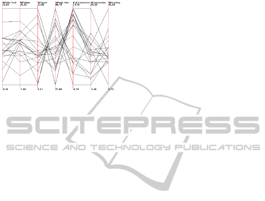
Figure 7: This image shows a parallel coordinates in
XMDV (Ward, 1994). From left to right, the first four axes
show the percentage of each participant’s viewing time on
plain text, pictures, figures and page one respectively. The
last three axes show the number of conclusions each partic-
ipant viewed, percentage of each participant’s viewing time
on conclusions and headings respectively.
ure, each one represents every participant’s reading
behavior on pages with document features. From this
visualization, an inverse correlation between viewing
time on page one and the number of viewed conclu-
sions is clearly revealed. This implies that as partic-
ipants spent more time on page one, they are likely
to overlook the conclusions, and vice versa. Also,
the number of conclusions being viewed and their
received viewing time reveal a correlation. All the
data in viewing time on figures, pictures and page one
show a general trend toward inverse correlations. It
could be page one often does not contain pictures and
figures, as discussed in section 6.3, such that more
time viewing on page one means less time is spent on
figures and pictures.
Parallel coordinates are able to unveil the correla-
tions between the viewing time of conclusions, page
one, figures and pictures: observations we were un-
able to make with previous visualizations. A disad-
vantage of parallel coordinates is that large data might
cause clutter which makes interpretation more diffi-
cult.
6.5 Coordinated, Multiple Views
Visualization
Mondrian is a general purpose information visualiza-
tion system. It allows multiple displays to represent
one data set and links them by brushing and selec-
tion (Theus, 2002; Martin and Simon, 2008). Figure
6 shows 5 coordinated views using bar charts, par-
allel coordinates and scatterplot matrix, on our five-
variate data: task, document, page number, document
feature and viewing time. The viewing time on doc-
uments, pages and features in the three bar charts is
sorted in ascending order. Picture (Pi) and figure (Fi)
nearly have the equal importance. The Page/Time
bar chart reveals that participants focus on the first
few pages, and quickly skip over the last pages. As
we brush heading (He) from parallel coordinates, the
other views are updated. But the multiple views can
only deal with a single table at one time. If we need
to compare the participants subjective score and their
estimated viewing time on the document features, we
have to work in parallel with tables describing the pre-
questionnaire.
The power of the Mondrain is its ability to visu-
alize arbitrary dimensions of the data set separately.
Due to the limitations of screen resolution, multiple
views in Mondrian may be difficult to display and in-
teract on large data set simultaneously. Also, it can
be difficult to infer which combination of visualiza-
tions is suitable and sufficient for HCI researchers to
analyze their experimental data and solve the queries.
6.6 3D Bar Chart Visualization
There are 11 distinct visualization techniques in Mi-
crosoft Excel, including various 3D visualizations for
general use, and each of them has multiple variations.
HCI researchers may use Excel to organize their raw
data, in which arbitrary table columns can be easily
mapped to the visual attributes. As shown in Figure
8, this provides an interesting bird’s-eye overview of
all the participants reading behaviors on documents
and pages in the experiment. From this visualiza-
tion, each individual participant’s reading pattern can
be displayed. But it suffers from occlusion prob-
lems. This might be addressed by the user interac-
tions, such as selection and smooth zooming, rota-
tion, and panning. Although there’s a lot of debate
on 3D interface(Shneiderman, 2003; Teyseyre and
Campo, 2009), considering our data set is semanti-
cally rich which contains documents, pages, partici-
pants and viewing time, we believe that the 3D bar
chart is a way to further explore the individual partic-
ipant’s reading pattern provided that the software is
able to offer enough interaction support.
7 A BRIEF SUMMARY OF
INTERACTIONS THE TOOLS
Our goal in this paper is not a general compari-
son of information visualization tools, but rather a
specialized comparison dedicated solely to the in-
vestigation of document triage data. The benefi-
VISUAL ANALYSIS OF DOCUMENT TRIAGE DATA
159
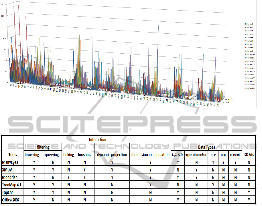
Figure 8: This figure display an overview of all 20 participants’ status during the experiment in EXCEL 2007 (Microsoft,
2007). The X-axis is mapped to the document, Y-axis to the participants and Z-axis is the time spent on viewing documents.
This visualization provides an interesting overview of the data.
Figure 9: For each tool, we summarize its interaction techniques and supported data types. In addition, whether a tool contains
3D visualizations is also recorded. In every cell of the table, ”Y” denotes the specific interaction or data type is supported in
that tool, ”N” denotes such interaction or data type is not supported.
cial visualization tools presented in this paper are
XMDV (Ward, 1994), Mondrian (Martin and Simon,
2008), ManyEyes (Viegas et al., 2007), TreeMap
4.1 (Kobsa, 2004), TopCat (Mark Taylor, 2005) and
Microsoft Excel 2007 (Microsoft, 2007). They pro-
vide a variety of visualizations and integrate with dif-
ferent interaction options. These interaction designs
of each tool are systematically applied to every visu-
alization component within that tool. According to
the taxonomy of Shneiderman (Shneiderman, 1996)
and Keim (Keim., 2002), data types to be visualized
can be categorized as 1-, 2-, 3-dimensional (color is
mostly used to depict the third dimension in most
of the tools), hyper-dimensional, text, tree and net-
work data. In addition, based on Keim (Keim., 2002)
and Kosara et al (Kosara et al., 2003)’s work and the
need for visual exploration on document triage data,
the most frequently used interaction techniques in-
clude filtering, brushing, linking, dimension manip-
ulation, (Here the dimension manipulation includes
dimension reduction and re-ordering options.) and
dynamic projection. The filtering can be achieved
by either a direct selection of desired subset (brows-
ing) or by a specification of properties of the de-
sired subsets (querying) (Keim., 2002). The dynamic
projection refers to dynamically change the projec-
tion of multi-dimensional data, such as Matrix Chart
in ManyEyes, and Scatterplot Matrix in XMDV and
Mondrian (Ward, 1994; Theus, 2002). In this section,
we present a brief summary for the tools introduced
in this paper. Our summary is based on the tools’ in-
teraction designs and the scalability to various data
types, as shown in Table 9.
ManyEyes is able to handle all those listed data
types except for high dimensional data. During the
document triage study, data gathered would usually
be from an excel spreadsheet, XML document or a
text file. Many-eyes provides a good precedent to
IVAPP 2011 - International Conference on Information Visualization Theory and Applications
160

build upon regarding raw data input for custom visu-
alizations. Since ManyEyes is deployed on the web, it
saves a lot of time for the user during software instal-
lation and configuration compared with other desktop
applications. To use this application, all we need is a
username and password. In terms of ease of use, the
ManyEyes is no doubt the best out of the six tools to
our investigation. However, because of the social and
collaborative nature, the data uploaded in ManyEyes
will become visible to the public. This limits its usage
with respect to the data privacy.
XMDV and Mondrian, as complements to
ManyEyes, are proficient in visualizing high dimen-
sional data. XMDV features interactive, proximity-
based clustering, which is effective for reducing the
clutter caused by large data sets. But the structure-
based bushing can be complicated to use for HCI
researchers. Mondrian offers the coordinated mul-
tiple views (CMV) which effectively unveil differ-
ent facets of the data. Compared with XMDV, it
provides greater choice of visualizations. Not only
high-dimensional data, Mondrian is quite effective in
plotting large, low-dimensional data as well. Also,
the input data format in Mondrian is more flexible.
However, except changing the alpha value, Mon-
drian does not provide more advanced clutter reduc-
tion techniques, such as the clustering offered by
XMDV (Ward, 1994).
The TreeMap 4.1 (Kobsa, 2004) is specifically
designed to implement the treemap. Compared with
ManyEyes, it offers much more interaction options,
such as numerical aggregation, various layouts, fil-
tering and etc. However, with respect to the aes-
thetic feel of the visualization, the HCI experts prefer
ManyEyes which provides more aesthetically pleas-
ing color coding and the animation when traversing
through the different hierarchies.
Excel and TopCat are the only tools offering the
3D visualization through the tools presented in this
paper. Although there is a lot of debate on 3D visu-
alization (Shneiderman, 2003), it’s surprising that the
HCI researchers show more preference in 3D scatter-
plot and bar chart shown in Figures 8 and 3. How-
ever, in order to completely exploit the potential of
3D visualizations, the interaction supports are very
important. Although changing the viewing perspec-
tive, such as rotation, zooming and pan, are provided
in Excel and TopCat, the shading, which can effec-
tively depict the depth information, is missing in both
tools.
The first factor that became apparent is that no one
visualization or tool on its own can identify all pat-
terns and behaviors needed to be tested. Also, from
the Table 9, we can see that no tool is able to sup-
port all of the data types and interactions. Further-
more, some visualizations like the bubble chart can
cause the researcher to miss patterns and make false
inference, such as introduced in Section 8. In light of
this, it would be reasonable for a bespoke tool to in-
clude several visualizations in parallel. Therefore, a
coordinated multiple view application allowing for a)
several visualizations of the same data and b) one vi-
sualization with different data sets is needed. Ideally,
visualizations for the document triage data would in-
clude: the line graph, 3D stack graph, treemaps and
parallel coordinates.
Overall, visualizations are underused in the HCI
community as a means of interacting with extracted
data sets. In this research we have explored the ways
in which the visualizations enrich the exploration of
relationships between different data sets of the same
study. As an exploratory tool, using these visual-
izations provides insight into hypotheses formulation
about our data that is not evident from raw material.
It is the aim of future work to apply the visualiza-
tions presented here, as well as further visualizations
to not only explore the deciphering of the raw data,
but to also assist users performing triage in making
inferences about their material.
8 DOMAIN EXPERT REVIEW
We, the domain experts, are impressed to see a mul-
titude of visualizations that can represent our data.
What became immediately evident was the ease and
speed at which these visualizations could be pro-
duced. We systematically went through the visualiza-
tions identifying the immediate inferences that would
have been possible before statistical analysis, but also
factors that may obfuscate useful hypotheses from be-
ing formed. Analysis thus far has relied on statistical
scrutiny such as t-tests. Although these are necessary
for verifying a relationship or pattern they do not pro-
vide good means for exploration of the data. Here, we
discuss the most significant observations and compare
some of the visualizations presented in the paper.
The first visualization that caught our attention
was the bubble chart in Figure 1 which compared
the participants’ subjective scores for the relevance of
the documents with the (TFxIDF) (Lee et al., 1997)
scores. By simply viewing the bubble chart visual-
ization we are mistakenly led to think that due to the
unevenness of the size of the bubbles, that there is no
correlation between the occurrence of popular terms
in the documents and the participant rankings. We
note that this is a test that was not performed when
looking at the data without the help of visualizations.
VISUAL ANALYSIS OF DOCUMENT TRIAGE DATA
161

We were surprised to then observe the line graph vi-
sualization in Figure 2 which revealed a relationship
between term occurrence and document ratings. It
seems that, although the sizes of the subjective bub-
bles in the first visualization were a different size than
the objective bubbles, the size proportion between the
corresponding documents in each category has a pos-
itive correlation. We can see from this that the bub-
ble visualization would be useful to our work when
comparing two groups, but care needs to be taken to
match the correct type of variables for the two groups.
Due to this limitation and risk of misinterpretation of
the data it is deemed quite difficult to apply the bubble
chart visualization to effective exploratory research in
our work. We are however, convinced that the line
graph visualization can produce much more accurate
overviews of relations between groups and patterns.
Closely related in information representation is
the treemap visualization in Figure 4. The flexibil-
ity that this visualization offers in manually changing
the hierarchy of the data to be processed gives it an
advantage. Furthermore, the representation areas give
a much clearer means of comparing features and tim-
ings. However, as hypothesized from this visualiza-
tion, it lacks specific detail. For this visualization to
be successful at providing useful specific information
to an HCI researcher would need further interaction
capabilities.
Another beneficial representation of the data is
found on the 3D stack graph in Figure 3. Beyond giv-
ing more information that the closely related 2D stack
graph (which basically gives us the average values of
all the pages) it allows us to detect further interesting
behaviors worth exploring. For example, we notice
the importance of the first page, but also the steady de-
cline in attention as the page count increases. We also
observe the peaks close to the ends which requires
further scrutiny, but also that the decline in attention
is mostly steady. The ’anomalies’ in the decline at-
test to one of two things: a) a sharp drop in attention
on a specific point in the document or b) an increased
amount of attention. We can therefore infer that fur-
ther features also attract attention and test for the im-
pact each feature has on attention.
One of the most interesting visualizations we
came across was that of parallel coordinates on the
right in Figure 7. The features of a document and the
influence they have time wise on participants consti-
tutes a very important part of our data pool. This vi-
sualization gives us a clear image as to the percentage
of time spent on those features in an-easy-to-compare
format. Although there is great potential for this spe-
cific visualization, we do have two criticisms. The
first is regarding the upper and lower limit of the ver-
tical axis. For every feature the maximum percent-
age time is set to the upper limit and therefore giving
a false comparison between the feature values. This
should be remedied in order to facilitate clearer com-
parative abilities. Another improvement which would
increase comparative ability between data sets would
be to be able to produce superimposed average values,
standard deviations and multiple side by side visual-
izations of data sets.
9 CONCLUSIONS AND FUTURE
WORK
We have surveyed a range of off-the-shelf, freely
available information visualization tools for the visual
analysis and investigation of document triage. Al-
though there are many options available, only a se-
lected few visualizations are useful for this particular
application. The beneficial visualizations are able to
reveal the relationship and get more insight among the
document triage experimental data sets, which have
high dimensions and contain both categorical and nu-
merical data types. In this paper, we have carried out
the exploratory tasks on these data sets. A range of
less beneficial visualizations, and the full set of all vi-
sualizations are provided via a supplementary mate-
rial and video stored in our url. Our study also serves
as a useful tool for readers interested in gaining an
overview of existing, free, state-of-the-art informa-
tion visualization tools. We also report positive and
constructive feedback from experts in the HCI and
digital library domain. Since summarized represen-
tations of documents rely heavily on text presented to
the user. In the future, we will focus on another inter-
esting visualization that has potential in the document
triage process, namely the text visualization, such as
Wordle (Viegas et al., 2009), which allows for high-
lighting the most frequently occurring terms hinting
at the importance of the document to the information
need of a seeker.
REFERENCES
Advanced Visual Systems Inc. (2009). OpenViz. 300 Fifth
Avenue,Waltham, MA 02451. http://www.avs.com.
Bae, S., Hsieh, H., Kim, D., Marshall, C., Meintanis, K.,
Moore, M., Zacchi, A., and Shipman, F. (2008). Sup-
porting Document Triage via Annotation-based Visu-
alizations. In Proceedings of the American Society
for Information Science and Technology, volume 45,
pages 1–16.
Bateman, S., Gutwin, C., and Nacenta, M. (2008). Seeing
Things in the Clouds: The Effect of Visual Features
IVAPP 2011 - International Conference on Information Visualization Theory and Applications
162

on Tag Cloud Selections. In Proceedings of the nine-
teenth ACM conference on Hypertext and hypermedia,
pages 193–202, New York, NY, USA. ACM.
Baudel, T. (2004). Browsing Through an Information Visu-
alization Design Space. In Proceedings of ACM CHI
Conference on Human Factors in Computing Systems,
volume 2 of Demonstrations, pages 765–766.
Blanch, R. and Lecolinet, E. (2007). Browsing Zoomable
Treemaps: Structure-Aware Multi-Scale Navigation
Techniques. IEEE Transactions on Visualization and
Computer Graphics, 13(6):1248–1253.
Bruls, M., Huizing, K., and van Wijk, J. J. (2000). Squar-
ified Treemaps. In Proceedings of Joint Eurograph-
ics/IEEE TVCG symposium Visualization, pages 33–
42.
Buchanan, G. and Loizides, F. (2007). Investigating
Document Triage On Paper And Electronic Me-
dia. In Proceedings of the European Conference on
Research and advanced Technology for Digital Li-
braries, 4675:416–427.
Cleveland, W. S. and McGill, R. (1985). Graphical Percep-
tion and Graphical Methods for Analyzing Scientific
Data. Science, 229(4716):828–833.
Cool, C., Belkin, N. J., Frieder, O., and Kantor, P. (1993).
Characteristics of Texts Affecting Relevance Judg-
ments. In In 14th National Online Meeting, pages
77–84.
Gottron, T. (2009). Document Word Clouds: Visualising
Web Documents as Tag Clouds to Aid Users in Rele-
vance Decisions. In Research and Advanced Technol-
ogy for Digital Libraries, 13th European Conference,
Proceedings, volume 5714 of Lecture Notes in Com-
puter Science, pages 94–105. Springer.
Heer, J., Mackinlay, J. D., Stolte, C., and Agrawala, M.
(2008). Graphical Histories for Visualization: Sup-
porting Analysis, Communication, and Evaluation.
IEEE Transactions on Visualization and Computer
Graphics, 14(6):1189–1196.
Inselberg, A. and Dimsdale, B. (1990). Parallel Coordi-
nates: A Tool for Visualizing Multi-dimensional Ge-
ometry. In Proceedings of IEEE Visualization, pages
361–378.
Johnson, B. and Shneiderman, B. (1991). Tree Maps: A
Space-Filling Approach to the Visualization of Hierar-
chical Information Structures. In Proceedings of IEEE
Visualization, pages 284–291.
Jonker, D., Wright, W., Schroh, D., Proulx, P., and Cort, B.
(2005). Information Triage With Trist. In Proceedings
of Intelligence Analysis, pages 1–6.
Keim., D. A. (2002). Information Visualization and Visual
Data Mining. IEEE Transactions on Visualization and
Computer Graphics, 8:1–8.
Kobsa, A. (2001). An Empirical Comparison of Three
Commercial Information Visualization Systems. In
Proceedings of IEEE Symposium on Information Vi-
sualization, San Diego, CA, pages 123–130.
Kobsa, A. (2004). User Experiments with Tree Visualiza-
tion Systems. In Proceedings of IEEE Symposium
on Information Visualization, pages 9–16. IEEE Com-
puter Society.
Kosara, R., Hauser, H., and Gresh, D. (2003). An Interac-
tion View on Information Visualization. In Proceed-
ings of Eurographics, pages 123–137.
Lee, D. L., Chuang, H., and Seamons, K. E. (1997). Doc-
ument Ranking and the Vector-Space Model. IEEE
Software, 14(2):67–75.
Loizides, F. and Buchanan, G. (2009). An Empirical Study
of User Navigation during Document Triage. In Pro-
ceedings of Research and Advanced Technology for
Digital Libraries, 13th European Conference, volume
5714 of Lecture Notes in Computer Science, pages
138–149. Springer.
Mark Taylor (2005). TOPCAT - Tool for OPerations on
Catalogues And Tables Version 3.4-3. Starlink devel-
opment.
Marsh, S. (1992). The Interactive Matrix Chart. ACM
SIGCHI Bulletin, 24(4):32–38.
Martin, T. and Simon, U. (2008). Interactive Graphics for
Data Analysis: Principles and Examples (Computer
Science and Data Analysis). Chapman & Hall/CRC.
Microsoft (2007). Microsoft Office Excel 2007 product
guide. Microsoft office.
Shneiderman, B. (1992). Tree Visualization With
Treemaps: a 2-d Space-filling Approach. ACM Trans-
actions on Graphics, 11(1):92–99.
Shneiderman, B. (1996). The Eyes Have It: A Task by
Data Type Taxonomy for Information Visualizations.
In Proceedings of IEEE Symposium on Visual Lan-
guages, pages 336–343.
Shneiderman, B. (2003). Why Not Make Interfaces Bet-
ter than 3D Reality? IEEE Computer Graphics and
Applications, 23(6):12–15.
Teyseyre, A. R. and Campo, M. R. (2009). An Overview
of 3D Software Visualization. IEEE Transactions on
Visualization and Computer Graphics, 15(1):87–105.
Theus, M. (2002). Interactive Data Visualization Using
Mondrian. Journal of Statistical Software, 7(11):1–9.
Tu, Y. and Shen, H.-W. (2007). Visualizing Changes
of Hierarchical Data using Treemaps. IEEE Trans-
actions on Visualization and Computer Graphics,
13(6):1286–1293.
Viegas, F. B., Wattenberg, M., and Feinberg, J. (2009). Par-
ticipatory Visualization with Wordle. IEEE Trans-
actions on Visualization and Computer Graphics,
15(6):1137–1144.
Viegas, F. B., Wattenberg, M., van Ham, F., Kriss, J., and
Mckeon, M. (2007). ManyEyes: A Site for Visualiza-
tion at Internet Scale. IEEE Transactions on Visual-
ization and Computer Graphics, 13(6):1121–1128.
Ward, M. O. (1994). XmdvTool: Integrating Multiple
Methods for Visualizing Multivariate Data. In Pro-
ceedings of IEEE on Visualization, pages 326–336.
IEEE Computer Society Press.
Ziemkiewicz, C. and Kosara, R. (2008). The Shaping
of Information by Visual Metaphors. IEEE Trans-
actions on Visualization and Computer Graphics,
14(6):1269–1276.
VISUAL ANALYSIS OF DOCUMENT TRIAGE DATA
163
