
VISUALIZING DYNAMIC QUANTITATIVE DATA IN HIERARCHIES
TimeEdgeTrees: Attaching Dynamic Weights to Tree Edges
Michael Burch and Daniel Weiskopf
VISUS, University of Stuttgart, Stuttgart, Germany
Keywords:
Hierarchy visualization, Time-series data.
Abstract:
In this paper we introduce a technique for visualizing the dynamics of quantitative data in static hierarchical
structures. We exploit the straight links of orthogonal tree diagrams as a timeline on which we visually encode
dynamic quantitative information. We use color coding and varying thicknesses to represent the time-varying
data. Bimodal data can also be displayed by exploiting both sides of the time axes simultaneously. Our
TimeEdgeTrees tool allows us to explore dynamic quantitative data in tree diagrams by interactive data filter-
ing and zooming. The spatial proximity of neighboring hierarchically structured elements allows us to easily
explore trends, countertrends, periodicity, temporal shifts, or anomalies during the evolution synchronously.
Interactive features such as expanding or collapsing of subhierarchies additionally help to detect the afore-
mentioned phenomena on different levels of granularity. The usefulness of our visualization technique is
illustrated by water level data acquired at more than 450 measurement stations along German rivers for 768
points in time.
1 INTRODUCTION
The most common visual metaphors for representing
hierachical kind of data are node-link representations
that encode the hierarchical objects as some kind of
circular or rectangular glyphs and the parent-child re-
lationships as links connecting the related hierarchical
elements. There are alternative approaches that avoid
explicit links, e.g., layered icicle diagrams (Andrews
and Heidegger, 1998; Stasko and Zhang, 2000; Yang
et al., 2003), tree-maps (Shneiderman, 1992), or in-
dented outline plots (Burch et al., 2010).
All these diagrams have more or less proved to be
useful for visually encoding static hierarchical data.
These are able to show parent-child relationships in
a single view and additional quantitative information
by color coding of nodes or sizes of rectangular boxes
as it is typical for tree-map representations.
In this paper, we focus on the problem of com-
paring dynamic quantitative data for all hierarchi-
cal entities—inner nodes as well as leaf nodes—
simultaneously. We introduce a representation where
each link of an orthogonal node-link tree diagram is
divided into as many segments as are necessary to dis-
play the different time steps in the hierarchical data.
Color coding and varying thicknesses are used to vi-
sually distinguish differently evolving branches in a
tree over time.
With our diagrams we intend to explore dynamic
quantitative data in a hierarchy for the following be-
haviors on different levels of granularity:
• Trends. Quantitative information behaves sim-
ilarly for a group of hierarchical entities, that
means, the metric for all entities shows a grow-
ing or shrinking behavior in the same or a nearly
similar way in the same time interval.
• Countertrends. Quantitative information be-
haves differently or even in opposite direction for
a group of hierarchical entities in the same time
interval.
• Periodicity. The data shows some kind of peri-
odic behavior: there are repeating patterns in the
time-varying data with the same period length.
• Temporal Shifts and Scale. The dynamic quanti-
tative data shows the same characteristics for cer-
tain hierarchical entities but with a temporal dis-
tance or at a different scale.
• Anomalies. There is some kind of strange or un-
expected behavior in the dynamic data such as
missing data points or values outside a trend be-
havior.
The most natural way to visualize time-series data
177
Burch M. and Weiskopf D..
VISUALIZING DYNAMIC QUANTITATIVE DATA IN HIERARCHIES - TimeEdgeTrees: Attaching Dynamic Weights to Tree Edges.
DOI: 10.5220/0003323901770186
In Proceedings of the International Conference on Imaging Theory and Applications and International Conference on Information Visualization Theory
and Applications (IVAPP-2011), pages 177-186
ISBN: 978-989-8425-46-1
Copyright
c
2011 SCITEPRESS (Science and Technology Publications, Lda.)

is by mapping the dynamics of the data to time that is
represented by an animated sequence of diagrams. In
general, it is difficult for human viewers to remember
all visual properties of all elements in an animation
because of their limited short-term memory (Ware,
2008). As a possible solution to this problem, they
might have to let play the animation several times
until they understand the dynamic data. Visualizing
the hierarchical organization of the dynamic data in
the same animation increases the cognitive load for a
viewer immensely.
To overcome these problems we use a static rep-
resentation of the time-series data instead. To allow
better exploration of the visualized data, interaction
methods can be applied to the visualization to browse
through large data sets with high complexity of the
hierarchy or a large number of time steps. As addi-
tional features, the dynamic quantitative data can be
shown in a bimodal fashion or in a logarithmic scale.
Representing all these visual dimensions at once is at
least very difficult or even impossible in animated di-
agrams.
We show the usefulness of the visualization
technique by visually exploring a data set from
a web site that contains time-varying water level
data (PEGELONLINE, 2010). We requested water
level data for 768 points in time at more than 450
measurement stations along German rivers.
2 RELATED WORK
The TimeEdgeTrees visualization is inspired by or-
thogonal node-link diagrams for representing hierar-
chies. The main benefit of those diagrams is that
they already contain straight links that are exploited
as timeline representations.
2.1 Static Hierarchy Visualization
In general, there is a huge body of previous research
on the visualization of static hierarchies (McGuffin
and Robert, 2009). For instance, (Battista et al.,
1999), (Herman et al., 2000), and (Reingold and Til-
ford, 1981) use conventional node-link diagrams to
depict relationships between hierarchically ordered
elements. Several variations exist for node-link rep-
resentations that make use of differently oriented di-
agrams. Attaching an attribute to all of the nodes—
for example a text label—using node-link diagrams
may lead to overlaps in the display and visual clutter.
Moreover, a simultaneous comparison of all attributes
is problematic since these are not aligned in the same
way in such a diagram. A similar problem occurs
when showing quantitative information for each of the
nodes in the diagram.
Radial node-link approaches organize tree nodes
on concentric circles, where the radii of the circles
depend on the depths of the corresponding nodes in
the tree (Battista et al., 1999; Herman et al., 2000;
Eades, 1992). On the one hand, this technique leads
to a more efficient usage of space; on the other hand,
it is more difficult to judge if a set of nodes belongs
to the same hierarchy level. This apparent drawback
of radial diagrams can be explained by the fact that
the human visual system can judge positions along a
common scale with a lower error rate than positions
along identical but non-aligned scales, as demon-
strated in graphical perception studies by (Cleveland
and McGill, 1986). Balloon or bubble tree layouts are
another strategy to display hierarchical data as node-
link diagrams: they represent the hierarchical struc-
ture in a clear way but do not scale for large and deep
trees (Herman et al., 2000; Grivet et al., 2006). As
another drawback, it is difficult to attach an attribute
to each tree node for comparisons between hierarchy
levels.
Tree-maps (Shneiderman, 1992) are a space-
filling alternative for displaying hierarchies. One
drawback of tree-maps is the fact that hierarchi-
cal relationships between parent and child nodes are
hardly perceived in deeply nested hierarchical struc-
tures. Nesting can be indicated by borders or lines of
varying thickness—at the cost of additionally needed
screen space. Tree-maps are an excellent choice when
encoding quantitative data attached to hierarchy lev-
els. However, showing dynamic quantitative data in
the tree-map boxes makes comparisons between sin-
gle hierarchical entities difficult. In many cases, the
tree-map boxes are scaled down to pixel-based graph-
ical elements and hence, a timeline representation is
not possible in a static tree-map.
Layered icicle plots require substantial amount of
image space: they use as much area for parent nodes
as the sum of all their related child nodes together. A
benefit of this representation is that the structure of the
displayed hierarchy can be grasped easily and more-
over, this type of diagram scales to very large and
deep trees. Variations of this idea are known as Infor-
mation Slices (Andrews and Heidegger, 1998), Sun-
burst (Stasko and Zhang, 2000), and InterRing (Yang
et al., 2003). These diagrams make use of polar co-
ordinates, which may lead to misinterpretations of
nodes that all have the same depth in the hierarchy.
As another drawback, all icicle-oriented techniques
require separation lines between adjacent elements al-
lowing differences in hierarchy levels and nodes to be
perceived.
IVAPP 2011 - International Conference on Information Visualization Theory and Applications
178

Indented outline approaches (Burch et al., 2010)
can be scaled down to pixel-based and indented line
plots to represent the hierarchical structure. This ap-
proach has the benefit that attributes can easily be at-
tached to all of the nodes in the represented hierarchy
and aligned to allow better comparisons. (Burch et al.,
2010) showed in a user study that indented outline ap-
proaches for visualizing hierarchies do not have sig-
nificant benefits over conventional rooted node-link
diagrams with respect to typical exploration tasks in
hierarchies but can be easily learned after a short ex-
planation time of just ten minutes.
2.2 Visualization of Timelines
Our approach is similar to the concept of sparklines
(Tufte, 1990). Sparklines show trends, countertrends,
periodic behaviors, temporal shifts, and also anoma-
lies of quantitative time-varying data, such as average
temperature or stock market activity, in a simple and
condensed way. A group of sparklines is often placed
close to each other as elements of small multiples. We
extend this concept by adding a hierarchical structure
to the set of sparklines that supports the exploration
of time-varying data on different levels of granularity
as well.
There exists only little work on the representa-
tion of dynamic quantitative data in hierarchies. The
TimeTree technique (Card et al., 2006) allows the user
to explore a changing hierarchy, encoding the infor-
mation about each element at each time step in the
corresponding node of the tree represented as a node-
link diagram. A time sliding function can be used to
interactively browse and search organizational hierar-
chies over time. However, only one static diagram
can be explored at a time. In contrast, the TimeEd-
geTrees can show the whole dynamic data or at least
a large portion of it in a static view, which preserves
one’s mental map of the data. (Tu and Shen, 2007)
use a different visual metaphor to represent changes
of hierarchical data. They introduce a new tree-map
layout algorithm to reduce abrupt layout changes and
produce consistent visual patterns.
The Timeline Trees technique (Burch et al., 2008)
and its radial counterpart TimeRadarTrees (Burch and
Diehl, 2008) make use of node-link diagrams attached
to a matrix-like representation that shows evolving
quantitative data in a timeline. Additionally, relations
are shown among commonly changed hierarchical en-
tities by a thumbnail view. The drawback of these di-
agrams is that timelines are only visible for leaf nodes
but not for inner nodes, and that they show the time-
lines in a different view than the hierarchy itself.
(Hadlak et al., 2010) describe a way to embed hi-
erarchies into regions of a map display by using a
point-based layout. The dynamics in the data is vi-
sually encoded by layering and animations.
3 TimeEdgeTrees
The TimeEdgeTrees approach relies on the oberser-
vation that the visual metaphor of node-link diagrams
for hierarchical data already contains straight lines
connecting related hierarchical elements. These lines
can easily be exploited as timelines to visually encode
the dynamics of quantitative data. Each link is divided
into as many segments as time steps have to be rep-
resented simultaneously. Additionally, each segment
is color coded with respect to the strength of the hi-
erarchical entity at the point in time. If the strengths
vary in some kind of exponential fashion, a logarith-
mic color scale can also be used to make the differ-
ences between smaller values more apparent. If the
user is interested in small and large deviations from
mean values, a bimodal color scale may also be ap-
plied. For this, we additionally exploit both sides of
each timeline.
3.1 Data Model
We model an information hierarchy as a tree T =
(V, E), where V denotes a set of vertex-function pairs
V = {(v
1
, f
1
), (v
2
, f
2
), . . . , (v
n
, f
n
)}
with f
i
: N −→ R. The set E ⊆ V × V contains
the parent-child relationships of the hierarchy. The
functions f
i
map discrete time steps to real valued
numbers—the quantitative data for each node v
i
at
each point in time. A single time step can be iden-
tified by a unique number j ∈ N, i.e. the set of all
discrete time steps {t
j
| 1 ≤ j ≤ n, j ∈ N} has a natu-
ral order.
We define the arithmetic means f
i
of some func-
tion f
i
in an interval [t
l
, t
m
] as
f
i
:=
∑
m
j=l
f
i
( j)
m − l + 1
Later, we need f
i
to transform the representation into
the bimodal mode.
3.2 Encoding of Time-varying Data
The dynamic quantitative data is initially represented
in a color coded segmentation of each link depending
on the number of time steps.
Figure 1 shows an example of dynamic data vi-
sualization in an orthogonal node-link diagram. We
VISUALIZING DYNAMIC QUANTITATIVE DATA IN HIERARCHIES
- TimeEdgeTrees: Attaching Dynamic Weights to Tree Edges
179
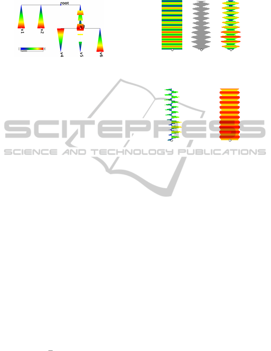
Figure 1: An orthogonal node-link diagram with addition-
ally color coded timelines and varying thicknesses showing
21 time steps of dynamic quantitative data at each of the
links.
choose an orthogonal layout since the timelines on
each hierarchy level with the same depth are aligned
in a common scale; this layout is best suited when
judging and comparing differently sized rectangu-
lar boxes for each time step (Cleveland and McGill,
1986). Throughout this paper, we use color coding
by vegetation scale: smaller values are represented in
blue, larger ones in green to yellow, and the largest
ones in red. The timeline for a node v ∈ V always
starts where the corresponding link is entering the par-
ent node and chronologically leads to the respective
node v ∈ V .
Using color coding as the only visual feature
makes efficient use of space, but as a drawback, indi-
vidual colors cannot be perfectly differentiated when
there are too many colors and when those are hardly
differing (Ware, 2008). For this reason, the TimeEd-
geTrees tool additionally supports visual encoding
by varying thicknesses to improve the perception of
weakly changing metric values when following a link
with the eye.
Figure 2 illustrates our approach for just one node
of a tree. In Figure 2 (a), we use color coding to
show the evolution of quantitative data over time.
Figure 2 (b) depicts encoding by varying thickness,
which makes differences in the single data points ap-
parent. Typically, we combine both features—color
coding and varying thickness—to encode dynamic
quantitative data because similar patterns in differ-
ently located tree branches can be better detected and
compared when visualizing the data in this way, see
Figure 2 (c). Furthermore, color coded diagrams are
aesthetically appealing.
The data can also be displayed in bimodal mode,
i.e., we divide the data values into two separate cat-
egories where each is displayed on one side of each
time axis. For the river level data, we first subtract
the arithmetic means f
i
from all other values. Nega-
tive values are displayed on the left part of the time
axis and positive values on the right side. Figure 3 (a)
shows the same dynamic quantitative data as in Fig-
(a) (b) (c)
Figure 2: Different representations for dynamic quantitative
data: (a) color coding only; (b) varying thickness without
color coding; (c) combination of both.
(a) (b)
Figure 3: Dynamic data may also be displayed in (a) bi-
modal mode or (b) logarithmic mode.
ure 2 in the bimodal mode. One can see that the data
behaves differently on both sides of the axis. The bi-
modal mode has another advantage: the display space
may be used more efficiently and a bimodal color cod-
ing might additionally strengthen the visual appear-
ance of the diagram.
A logarithmic scale allows a comparison of the
quantitative data points even if they differ to a very
large extent. Figure 3 (b) shows an example of a log-
arithmic scale. One can easily see that there are only
small differences at the peaks and their neighboring
data points.
3.3 Node-link Layouts
Apart from orthogonal node-link layout, many other
layouts exist. In this section, we discuss the pros and
cons of them with respect to aesthetic tree drawing
criteria, space-efficiency, and the suitability for typi-
cal exploration tasks for this kind of data.
• Rooted Tree. The rooted tree diagram is the most
common way to visualize a hierarchy. The root
of the hierarchy is the topmost node in the rep-
resentation and the root nodes of the subtrees are
located on layers depending on the depth of the
subhierarchy in the tree, see Figure 4 (a). Rooted
trees can also be arranged from bottom to top,
from left to right, or from right to left.
• Orthogonal Tree. Using orthogonal bends for the
IVAPP 2011 - International Conference on Information Visualization Theory and Applications
180
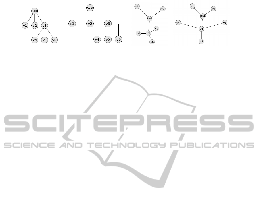
(a) (b) (c) (d)
Figure 4: Node-link tree diagrams may be laid out in a variety of styles: (a) rooted tree diagram; (b) orthogonal tree diagram;
(c) bubble tree diagram; (d) radial tree diagram.
Table 1: Several criteria for the discussed node-link layouts (+ = good, o = average, - = bad).
Space- Comparability Hierarchy Exploration of
Technique Efficiency of Timelines Structure Deeper Levels
Rooted tree diagram - o + o
Orthogonal tree diagram - + o o
Bubble tree diagram - - o -
Radial tree diagram + - o +
links leads to an orthogonal tree diagram that is
best suited to compare the timelines of all hierar-
chical elements simultaneously, see Figure 4 (b).
• Bubble Tree. Another strategy to visualize trees
is by a bubble or balloon tree layout that recur-
sively represents subtrees on circles whose cir-
cle center lies somewhere on the circumference of
the circle representing the parent node, see Fig-
ure 4 (c).
• Radial Tree. A radial tree visualization positions
the root node in the center of a circle. Child nodes
on the same depth of the hierarchy are located on
circles with the same radius, where the radius lin-
early depends on the depth of each hierarchical
element in the tree, see Figure 4 (d).
Table 1 gives an overview of several criteria for
these node-link layouts and shows if a certain tech-
nique meets the criterion (+) or not (-) or if it cannot
be classified clearly (o). In this table, we briefly sum-
marize four different criteria for visualizing dynamic
quantitative data in hierarchies by means of several
node-link layouts. Radial diagrams are the most
space-efficient layout since trees normally grow ex-
ponentially with depth. The rooted tree layout is best
when exploring the hierarchical structure whereas or-
thogonal layouts allow for better comparisons of the
dynamic data since the timelines are aligned as com-
mon scales. The least useful type of diagram for this
visualization task is the bubble tree layout since there
the hierarchical structure is not as well expressed and
the smaller circular shapes for deeper trees lead to
timelines that are differing in length, orientation, and
scale. This again leads to problems when exploring
and comparing temporal shifts in the dynamic data.
3.4 Dynamic Behavior Analysis
As already discussed in Section 1, dynamic quanti-
tative data may show different behaviors for a list of
certain subhierarchies or hierarchical entities such as
trends, countertrends, periodicity, temporal shifts, or
anomalies. Figure 5 illustrates how the novel tech-
nique can be used to explore time-varying quantita-
tive data for these phenomena and for a group of hier-
archical entities at the same time.
In Figure 5 (a), all branches are evolving with the
same characteristic, hence, we would classify this be-
havior as a typical trend in dynamic data. Figure 5 (b)
shows that some hierarchical entities are evolving in
the opposite direction, a phenomenon that we would
classify as a countertrend with respect to the dynamic
data of other tree branches. In Figure 5 (c), there is
some kind of periodic behavior for all subhierarchies
in a similar way. The same pattern is reoccuring after
the same time interval again and again. Figure 5 (d)
shows that the same pattern or subpattern reappears in
all hierarchical entities but each after some delay. Fi-
nally, Figure 5 (e) shows an anomaly. Some branches
seem to evolve in a trend behavior whereas single
hierarchical entities are showing gaps in their time-
series data. Furthermore, some data points are miss-
ing or are error-prone.
In Section 4, we apply our technique to a data set
that contains water level data of German rivers. This
data set is well suited to explain all the behaviors of
dynamic data described above.
VISUALIZING DYNAMIC QUANTITATIVE DATA IN HIERARCHIES
- TimeEdgeTrees: Attaching Dynamic Weights to Tree Edges
181
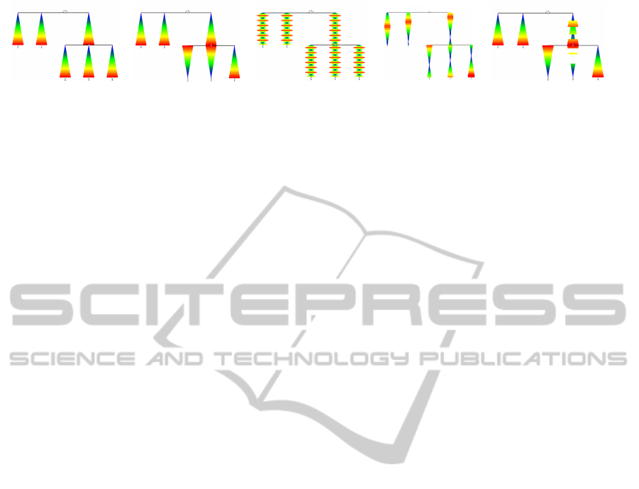
(a) (b) (c) (d) (e)
Figure 5: The dynamic quantitative data may show five different types of behaviors: (a) trends; (b) countertrends; (c) period-
icity; (d) temporal shifts; (e) anomaly.
3.5 Interactive Features
The visualization tool supports certain interactive fea-
tures that can be used to manipulate the hierarchical
data. Generally, we follow the visualization seek-
ing mantra of Ben Shneiderman: Overview first,
zoom and filter, then details-on-demand (Bederson
and Shneiderman, 2003).
• Expanding and Collapsing of Subhierarchies.
By clicking on a node its corresponding subtree
is collapsed. If it is already collapsed it will be
expanded again.
• Selecting Specific Time Intervals. Only rele-
vant intervals in the evolution can be selected
and hence, the remaining time-varying quantita-
tive data can be represented in more detail.
• Weight Filtering. To support the viewer in com-
paring the quantitative information, only those
line segments are color coded that lie in between
the selected weight interval. All other values are
grayed out.
• Geometric Zooming. The tree diagram can be
scaled up/down by mouse drag and drop.
• Apply Color Coding. Different color codings can
be applied and tested if explorative tasks become
easier.
• Thickness Slider. The thickness of line segments
can interactively be changed.
• Labeling. To minimize visual clutter, text labels
can be represented in a vertical or horizontal ar-
rangement or as some kind of spiral representation
around each corresponding node.
• Details-on-Demand. Moving the mouse cursor
over a node or a timeline gives additional textual
information about the object in focus.
4 APPLICATION EXAMPLE
To show the usefulness of our novel technique we
applied it to a data set that contains the water levels
of more than 450 measurement stations at the larger
rivers in Germany. The river system itself is a good
example of a naturally structured hierarchy formed
by natural processes over several thousand years. A
measurement of the water level is taken every hour in
the time period from September 3rd, 2010 until Oc-
tober 4th, 2010. A simultaneous representation of all
water levels at each point in time with an additional
hierarchy is very difficult but can give many insights
about the behavior of the water level movements and
the water level minima and maxima over time.
4.1 Dynamic River Tides
The measurement stations are ordered from left to
right with respect to their location at the river. The
stations are ordered starting with the one closest to the
source and ending with the one closest to the mouth
into a larger river or into the sea. If a smaller river
flows into a larger one its subhierarchy is visually dis-
played between the corresponding measurement sta-
tions. This spatial proximity allows us to explore if
the water levels of river subsystems influence the wa-
ter levels of the larger rivers or vice versa.
Figure 6 presents an overview of the whole data
set in an orthogonal tree layout. We use a vegeta-
tion color scale to distinguish the water levels at each
point in time. The more red a color is the higher is the
water level at this point in time. Green color means
normal water level and blue color indicates that the
water level is below normal. Points in time where no
data is available are grayed out. Since the values often
differ to a high extent we initially apply a logarithmic
color scale.
The first observation that one can make from Fig-
ure 6 is the hierarchical information that is explicitly
given by the orthogonal diagram. The root level ex-
presses that all rivers flow into one of several possible
seas; that information can be obtained by inspecting
the three elements at the first level of the hierarchy—
the North Sea, the Baltic Sea, and the Black Sea.
Even if this diagram hides most of the details,
it may let us observe some interesting phenomena.
Some of the water levels show periodic behavior. This
phenomenon is the result of the heavy tides of the
North Sea, which have a period length of approxi-
IVAPP 2011 - International Conference on Information Visualization Theory and Applications
182
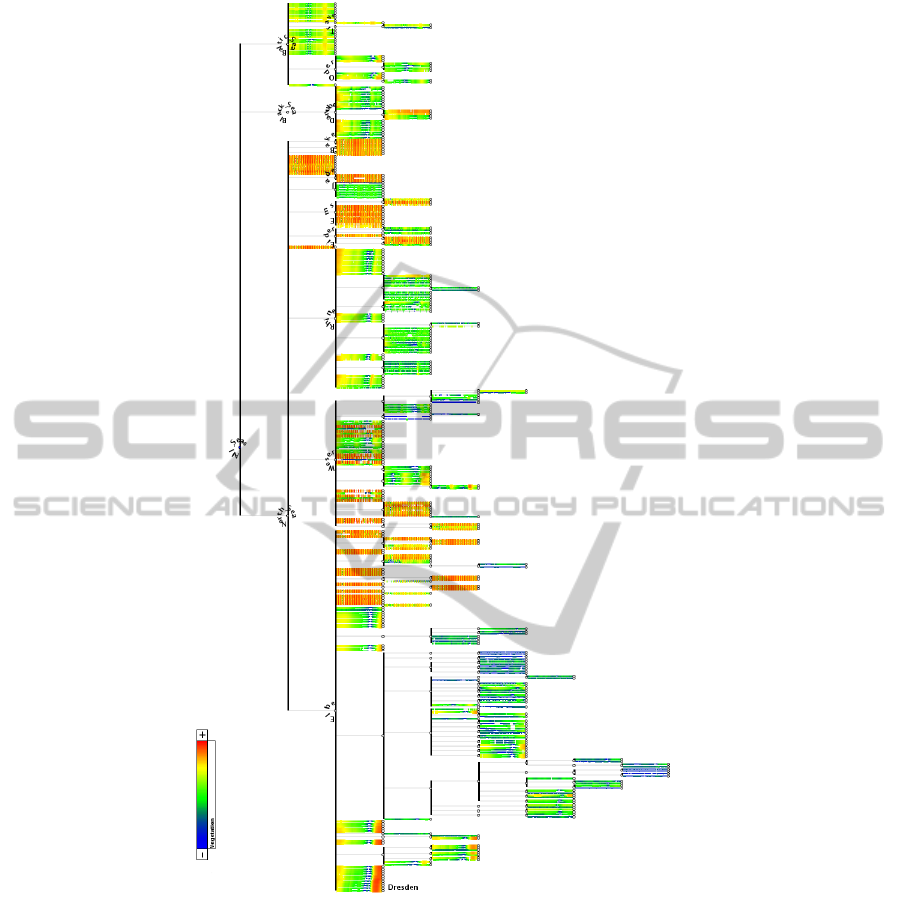
Figure 6: A visualization of dynamic water level data of the larger rivers in Germany and their hierarchical structure can give
interesting insight in the evolution of the water behavior on different levels of granularity.
mately twelve and a half hours. Even the times and
amplitudes of the tides at the measurement stations
differ, from time to time, which depends on the com-
bined effects of the gravitational forces exerted by the
moon and the sun and the rotation of the earth.
Some subsystems show a pattern that crosses each
measurement station with a temporal shift. This is
apparently visible for the rivers Elbe on the left hand
side and the river Rhine close to the center of Figure 6.
A detail-on-demand request for the river Elbe shows
that the water level near the city of Dresden is more
than four meters above normal height. The temporal
shift shows that the cities and villages downward the
river have to be aware of high watermarks and flood-
ing in the near future.
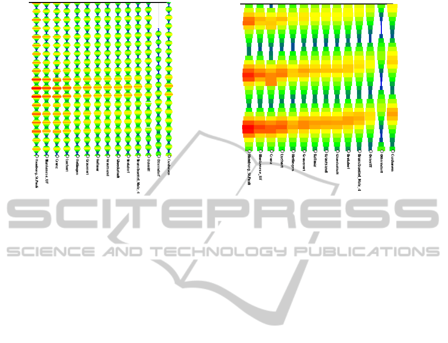
For Figure 7, we filter the river hierarchy for the
river Rhine and all of its confluents, which include
the river Neckar, the river Main, the river Lahn, and
the river Mosel, which again has a confluent, the river
Saar. We can easily see that there are 24 main mea-
surement stations along the river Rhine. Around the
26th of September, there is a larger flood wave above
the normal water level at the measurement station If-
fezheim. In the next days, the flood wave is passing
VISUALIZING DYNAMIC QUANTITATIVE DATA IN HIERARCHIES
- TimeEdgeTrees: Attaching Dynamic Weights to Tree Edges
183
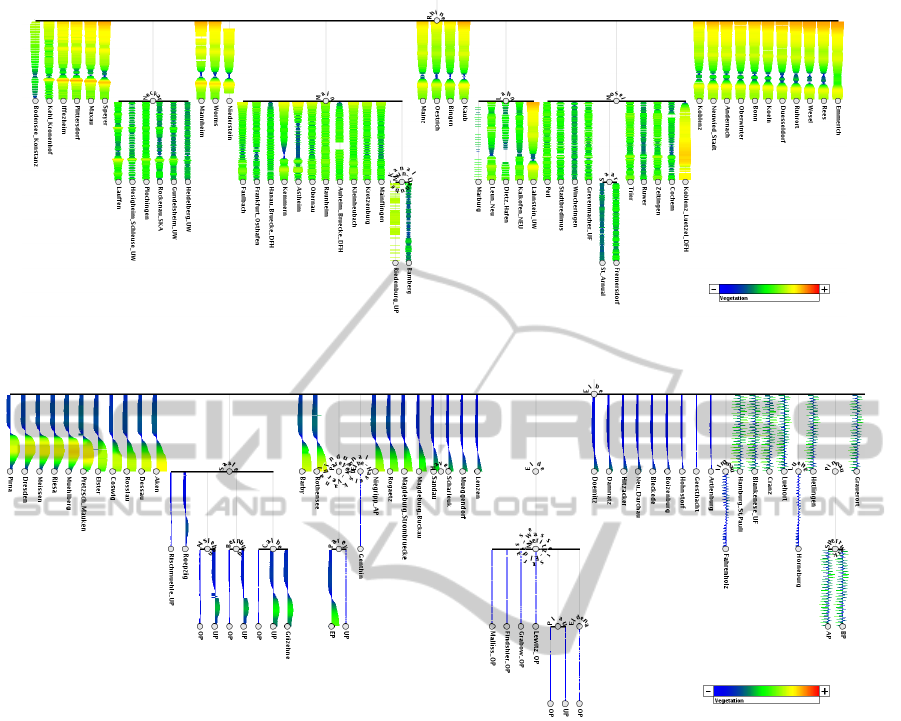
Figure 7: A visualization of the water level data for the river Rhine can uncover interesting phenomena: waves with different
amplitudes are crossing the measurement points with a temporal shift and their amplitude shows a decreasing behavior.
Figure 8: A representation of dynamic water level data for the river Elbe shows different behaviors: one big wave is crossing
the measurement stations near the source of the river, whereas the measured data at the mouth to the North Sea shows periodic
behavior because of the large tides there.
the other stations subsequently but is weakening over
time. This can be detected by inspecting the changing
color from an orange color over yellow into a yellow-
ish green.
The confluents of the river Rhine do not show
this large flood wave behavior apart from two ex-
ceptions. The stations Lahnstein-UW and Koblenz-
Luetzel-DFH can be classified as anomalies. Al-
though the water levels are low overall, these two
measurement stations have high water levels. A closer
look at the hierarchy reveals that the rivers Lahn and
Mosel are converging there into the river Rhine and
hence, are above normal all the time.
Another interesting water level behavior can be
seen at the river Elbe, see Figure 8. Here, we ap-
plied the bimodal mode that makes use of both sides
of the time axes. The left hand side represents wa-
ter levels below the normal level, whereas the right
hand side shows the water levels above the normal
water level. The measurement stations seem to fall
into two categories if we inspect the left and the right
parts of the figure in more detail. Again, the yellow
color and the larger thickness on the right hand side of
each axis give us the insight that a flooding is cross-
ing each of the stations over time. If we have a closer
look at the data visualized for the first five measure-
ment stations, we can easily see that the amplitude at
the beginning of the flood wave color coded in yellow
remains constant and only the wave’s length is grow-
ing. The flooding has not reached the measurement
stations near the mouth to the North Sea.
The second category of dynamic data behavior can
be seen on the right hand side of Figure 8. The data
values show periodic behavior caused by the high and
low tides of the North Sea and the spatial proximity
of the measurement stations to the North Sea.
Figure 9 (a) shows that even the high and low
tides differ with respect to the size of their ampli-
IVAPP 2011 - International Conference on Information Visualization Theory and Applications
184
(a) (b)
Figure 9: The tides of the North Sea show some kind of periodic behavior and: (a) the amplitudes of high and low tides are
also changing; (b) temporal shifts can be detected when just showing dynamic data for one and a half day.
tudes from time to time. Furthermore, a temporal shift
in the wave pattern can be detected easily, see Fig-
ure 9 (b). Interesting is the fact that the station Ham-
burg St. Pauli has the highest tides even though the
station is the furthest away from the North Sea among
all the stations with periodic water level behavior.
5 CONCLUSIONS
In this paper, we demonstrated how the visual
metaphor of node-link diagrams may be used to dis-
play a hierarchy with additional dynamic quantitative
data. Straight links that encode parent-child relations
can easily be interpreted as a timeline starting at the
parent node and ending at the child node. The link is
divided into as many line segments as time steps have
to be visualized. Color coding is used to show the
strength of the hierarchical entities for each time step.
We conjecture that using orthogonal layout is best
suited for representing this kind of data since only
there the timelines in each subhierarchy are aligned
and hence, allow for direct comparisons of dynamic
data between single hierarchical entities. Possible al-
ternative layouts such as the traditional rooted tree
from top to bottom, radial diagrams, and bubble trees
have also been discussed.
We have applied the technique to a data set that
contains water level data for German rivers acquired
between September 3rd, 2010 and October 4th, 2010
at more than 450 measurement stations.
The visualization tool supports interactive features
such as expanding or collapsing of subhierarchies,
selecting time intervals, weight filtering, details-on-
demand and the like.
In the future, we plan to apply the tool to differ-
ent application domains, for example software evolu-
tion data and we also plan to evaluate the visualization
technique by a user study.
ACKNOWLEDGEMENTS
We would like to thank Pegelonline (PEGELON-
LINE, 2010) for providing the river level data set.
This work was funded by DFG as part of the Prior-
ity Program “Scalable Visual Analytics” (SPP 1335).
REFERENCES
Andrews, K. and Heidegger, H. (1998). Information slices:
Visualising and exploring large hierarchies using cas-
cading, semi-circular discs. In IEEE Information Visu-
alization Symposium (InfoVis ’98), Late Breaking Hot
Topics, pages 9–12.
Battista, G. D., Eades, P., Tamassia, R., and Tollis, I. G.
(1999). Graph Drawing: Algorithms for the Visual-
ization of Graphs. Prentice Hall, Upper Saddle River,
NJ.
Bederson, B. B. and Shneiderman, B. (2003). The Craft of
Information Visualization: Readings and Reflections.
Morgan Kaufmann, San Francisco, CA.
Burch, M., Beck, F., and Diehl, S. (2008). Timeline Trees:
Visualizing sequences of transactions in information
VISUALIZING DYNAMIC QUANTITATIVE DATA IN HIERARCHIES
- TimeEdgeTrees: Attaching Dynamic Weights to Tree Edges
185

hierarchies. In International Working Conference on
Advanced Visual Interfaces (AVI ’08), pages 75–82.
Burch, M. and Diehl, S. (2008). TimeRadarTrees: Visualiz-
ing dynamic compound digraphs. Computer Graphics
Forum, 27(3):823–830.
Burch, M., Raschke, M., and Weiskopf, D. (2010). Indented
pixel tree plots. In International Symposium on Visual
Computing (ISVC ’10), pages 338–349.
Card, S. K., Suh, B., Pendleton, B. A., Heer, J., and Bodnar,
J. W. (2006). Time Tree: Exploring time changing
hierarchies. In IEEE Symposium on Visual Analytics
Science and Technology (VAST ’06), pages 3–10.
Cleveland, W. S. and McGill, R. (1986). An experiment in
graphical perception. International Journal of Man-
Machine Studies, 25(5):491–501.
Eades, P. (1992). Drawing free trees. Bulletin of the Institute
for Combinatorics and its Applications, 5(2):10–36.
Grivet, S., Auber, D., Domenger, J. P., and Melanc¸on, G.
(2006). Bubble tree drawing algorithm. In Woj-
ciechowski, K., Smolka, B., Palus, H., Kozera, R. S.,
Skarbek, W., and Noakes, L., editors, Computer Vi-
sion and Graphics, pages 633–641, Dordrecht, The
Netherlands. Springer.
Hadlak, S., Tominski, C., Schulz, H.-J., and Schumann, H.
(2010). Visualization of hierarchies in space and time.
In Workshop on Geospatial Visual Analytics: Focus on
Time at the AGILE International Conference on Geo-
graphic Information Science.
Herman, I., Melanc¸on, G., and Marshall, M. S. (2000).
Graph visualization and navigation in information vi-
sualization: A survey. IEEE Transaction on Visualiza-
tion and Computer Graphics, 6(1):24–43.
McGuffin, M. J. and Robert, J.-M. (2009). Quantify-
ing the space-efficiency of 2D graphical represen-
tations of trees. Information Visualization. DOI:
10.1057/ivs.2009.4.
PEGELONLINE (2010). Gew
¨
asserkundliches Information-
ssystem der Wasser- und Schifffahrtsverwaltung des
Bundes. http://www.pegelonline.wsv.de.
Reingold, E. M. and Tilford, J. S. (1981). Tidier drawings
of trees. IEEE Transactions on Software Engineering,
7(2):223–228.
Shneiderman, B. (1992). Tree visualization with tree-maps:
2-d space-filling approach. ACM Transactions on
Graphics, 11(1):92–99.
Stasko, J. T. and Zhang, E. (2000). Focus+context display
and navigation techniques for enhancing radial, space-
filling hierarchy visualizations. In IEEE Symposium
on Information Visualization (InfoVis ’00), pages 57–
66.
Tu, Y. and Shen, H.-W. (2007). Visualizing changes of hi-
erarchical data using treemaps. IEEE Transactions on
Visualization and Computer Graphics, 13(6):1286–
1293.
Tufte, E. R. (1990). Envisioning Information. Graphics
Press, Cheshire, CT.
Ware, C. (2008). Visual Thinking for Design. Morgan Kauf-
man, Burlington, MA.
Yang, J., Ward, M. O., Rundensteiner, E. A., and Patro, A.
(2003). InterRing: a visual interface for navigating
and manipulating hierarchies. Information Visualiza-
tion, 2(1):16–30.
IVAPP 2011 - International Conference on Information Visualization Theory and Applications
186
