
DEVELOPMENT PROCESS AND EVALUATION
OF THE ONTOLOGY VISUALIZATION TOOL KNOOCKS
A Case Study
Simone Kriglstein
Faculty of Computer Science, University of Vienna, Vienna, Austria
G
¨
unter Wallner
Institute of Art and Technology, University of Applied Arts Vienna, Vienna, Austria
Keywords:
Ontology visualization, OWL Lite, Knoocks , Usability evaluation, Comparison study.
Abstract:
Ontologies were becoming popular in various communities and disciplines over the past few years. The
reason for their popularity is that they allow to specify concepts and their interconnections of a domain which
are understandable by computers and by people. However without visualizations, ontologies - especially large
ones - would be hard to comprehend by users. Visualizations are essential because they make ontologies with
their structure more manageable. Furthermore, visualization tools are helpful to analyze the interconnections
between concepts. For an effective usage of such visualization tools, it is necessary that the design is easy
to understand, provides a good overview about the structure and allows fast access to detail information.
Furthermore, it is necessary to consider the domain for which the ontology is developed along with its users
and their needs. This paper presents the development process of Knoocks – a visualization tool for OWL
Lite ontologies – where users were already involved during the process to improve the usability of the tool.
Moreover, the presented case study underlines the importance of repeated usability evaluations during the
development process to identify weak points of the design and missing features which are relevant for the
intended users.
1 INTRODUCTION
Ontologies define concepts and relations which can
be used as a skeletal foundation to model and to repre-
sent knowledge of a domain (Fensel, 2001; Swartout
et al., 1997). OWL (W3C, 2010) is among the most
popular languages to describe ontologies. The com-
ponents of OWL ontologies are: classes, instances
and properties. Classes present the relevant concepts
and describe the abstract model of the domain. For
every class, instances present individual objects of
this class and properties represent relationships be-
tween instances (object properties) or they relate in-
stances to datatypes (datatype properties). Ontologies
make knowledge more accessible and therefore they
are becoming popular in various communities and
disciplines. The study of (Cardoso, 2007) shows that
the vast majority of the participants use ontologies to
share and to communicate information between peo-
ple or software agents. However, ontologies can con-
tain a large number of classes and instances. The re-
sults of the Cardoso’s survey also show that 44% of
the participants worked with ontologies which typi-
cally contained between 100 and 1000 classes.
To make ontologies more manageable and under-
standable for humans, different ontology visualiza-
tion tools were developed over the past few years
(see e.g., (Katifori et al., 2007; Lanzenberger et al.,
2009)). Visualizations allow users to see and ana-
lyze the structure and dependencies within ontolo-
gies in a transparent way or allow them to detect
new information which they were not aware of be-
fore (Saraiya et al., 2005). Furthermore, graphical
representations of ontologies can also be helpful to
support users in their decisions. For example, they
allow domain experts to control if the concepts and
their dependencies are correctly implemented and to
decide if modifications will be necessary. For an ef-
187
Kriglstein S. and Wallner G..
DEVELOPMENT PROCESS AND EVALUATION OF THE ONTOLOGY VISUALIZATION TOOL KNOOCKS - A Case Study.
DOI: 10.5220/0003324101870197
In Proceedings of the International Conference on Imaging Theory and Applications and International Conference on Information Visualization Theory
and Applications (IVAPP-2011), pages 187-197
ISBN: 978-989-8425-46-1
Copyright
c
2011 SCITEPRESS (Science and Technology Publications, Lda.)

fective usage of such tools, it is necessary to consider
requirements which are relevant for ontology visu-
alization (e.g., (Kriglstein, 2009; Noy and McGuin-
ness, 2001)). For example, it is essential that the vi-
sualization allows users to efficiently compare sub-
classes and their instances with each other. In addi-
tion to these requirements, it is important to consider
potential users and the concepts of the domain dur-
ing the development process to make sure that the
visualization satisfies users’ needs, tasks and expec-
tations. Therefore, strategies of human computer in-
teraction (e.g., usability studies) were becoming more
and more popular for the evaluation of visualizations
over the past few years (Kulyk et al., 2006; North,
2006). The study of (Kriglstein, 2009) has shown that
the participants used many different ontology visual-
ization tools for their work. This may be due to the
wide variety of applications and forms of ontologies
which reflects that different users have different needs
and that different domain specific tasks exist. Further-
more, many of the existing tools focus either primar-
ily on the visualization of relationships and properties
between classes (e.g., OntoViz) or on the hierarchi-
cal structure (e.g., CropCircles) and instances (e.g.,
treemap view of Jambalaya). This restriction on cer-
tain elements of the ontology limits ontology experts
but on the other hand allows domain users to use such
tools for specifics tasks (as shown in Section 4).
Based on these observations we developed an on-
tology visualization tool – called Knoocks – to inte-
grate the information of classes, instances and prop-
erties in one single tool to allow users to analyze
OWL Lite ontologies more easily. For this purpose,
Knoocks provides an overview, which allows users
to observe relationships on the class level, to ana-
lyze classes with their subclasses and to see the dis-
tribution of instances within the ontology. In addi-
tion to the overview, Knoocks also contains a detail
view, which concentrates on the visualization of in-
stances in connection with their classes and proper-
ties. Many visualization tools also have a technical
interfaces which makes them only understandable for
ontology experts which have a lot of experience with
these tools (e.g., abbreviations for the drawing set-
tings in OntoViz). However, it is essential to find out
what different user groups expect from the visualiza-
tion and in which context the visualization approach
can support them. Our intention was to develop an on-
tology visualization which is suitable for both groups:
ontology experts (users who develop and maintain the
ontology) and domain users (users who only want in-
formation about the concepts of their domain).
In this paper we present the development process
of Knoocks and its evaluation with focus on usability
as well as comparison studies with other visualiza-
tion tools. The remainder of this paper is structured
as follows. Section 2 gives a short overview of vi-
sualization approaches for ontologies and Section 3
presents the four iterations of the development pro-
cess of Knoocks. Section 4 presents the evaluation
as well as a discussion of the results. The paper is
concluded in Section 5.
2 RELATED WORK
A number of visualization tools for OWL ontolo-
gies were developed in the past few years. These
tools adapted well-known information visualization
techniques. For example, several of the existing vi-
sualization tools (e.g., TGVizTab (Alani, 2003) and
OntoViz (Sintek, 2010) which are both plug-ins for
Prot
´
eg
´
e (Stanford Center for Biomedical Informat-
ics Research, 2010)) present subclass-of relationships
and object properties between concepts as node-link
visualizations. Node-link representations are an in-
tuitive way to make interconnections within the on-
tology transparent. However, if the graph contains a
large number of classes, instances and relationships, it
can happen that the graph becomes overcrowded and
therefore the analysis of the ontology is more difficult.
In contrast to the node-link representation, container
approaches are often used if the focus of the ontology
visualization is on the instances and on the hierarchi-
cal structure. For example, CropCircles (Wang and
Parsia, 2006) visualizes subclasses as circles which
are nested inside the circle of their parent class. Sim-
ilar to the node-link representation, it is not easy for
the user to get a quick overview with a container ap-
proach if the ontology contains a large number of in-
stances or classes. A combination of node-link ap-
proaches and container approaches is another possi-
bility to visualize ontologies. For example, Jambal-
aya (Storey et al., 2010), which is also a plug-in for
Prot
´
eg
´
e, provides different views with different visu-
alization techniques. In addition to views which rep-
resent the relationships between the concepts purely
as node-link representation, one view provides the
adapted treemap approach of (Shneiderman, 1992)
which allows users to rapidly jump between classes
or instances. Another view uses a nested graph to
visualize classes and their instances and a node-link
approach to display object properties.
IVAPP 2011 - International Conference on Information Visualization Theory and Applications
188

3 DEVELOPMENT PROCESS
For the development of Knoocks we considered us-
ability and interface design aspects (International Or-
ganization for Standardization, 2006; Nielson, 1994;
Shneiderman, 1998) as well as specific ontology vi-
sualization requirements. These requirements – as
listed below – are based on a user requirement analy-
sis with ontology experts (Kriglstein, 2009) and liter-
ature studies (e.g., (Noy and McGuinness, 2001)).
Visibility of the Structure. The visualized structure
should support effective management of ontologies.
It should be possible to compare subtrees with each
other and to see the size and depth of each subtree.
The visualization should allow users to quickly scan
all information with minimal cognitive effort.
Visibility of Classes. Because classes describe the
concepts of the ontology, it is essential to get a good
overview of them and to understand the relations be-
tween the concepts. The visualization should unmis-
takably distinguish between different classes.
Visibility of Instances. Based on the fact that in-
stances represent data and therefore are often more
important to the end-user than the underlying con-
cept, the visualization should also consider in-
stances. It should obviously visualize which classes
contain which instances.
Visibility of Relationships. The visualization
should clearly show the defined interconnections
between the classes and their instances. For good
differentiations between the relationships, it is
necessary to represent the different types in a
distinguishable way (e.g., every type has its own
color).
Our main objective in the design of Knoocks was
to improve the accessibility of instances and simulta-
neously allow users to grasp and analyze the struc-
ture and interconnections of OWL Lite ontologies.
We use a combination of a container approach for in-
stances to represent the hierarchical structure and a
node-link approach for object properties. Therefore,
the basic structure of Knoocks is similar to the Ici-
cle Plot concept (Kruskal and Landwehr, 1983) and is
inspired by container approaches to represent the in-
stances within their classes. The major advantage of
the Icicle Plot is that the clustering of objects is easily
noticeable (Kruskal and Landwehr, 1983). The study
of (Barlow and Neville, 2001) shows that the partic-
ipants’ performance with the Icicle Plot was equiva-
lent to the node-link representations. They stated that
the orientation (top-to-bottom or left-to-right) of the
Icicle Plot approach was familiar to them, because a
similar orientation is also used by common node-link
approaches. For the representation of instances, we
were also inspired by intended lists, because the list
representation is familiar to the user and allows quick
scanning of the elements without overlapping. For the
representation of non-hierarchical relationships (ob-
ject properties) we adopted node-link representations.
Although they need more space in general than other
approaches (e.g., treemap), they are a very intuitive
way to show the connections between two nodes. This
allows users to clearly differentiate between hierar-
chical and non-hierarchical relationships. In contrast
to existing ontology visualization approaches like, for
example, Jambalaya or TGVizTab which either focus
on a high-level view of the ontology or on details of
individual nodes, it was important for us to visual-
ize both views simultaneously. Although, Jambalaya
has the possibility to choose between different visu-
alizations only one visualization is visible at a time
and switching between them requires recalculations
which can be cumbersome if the ontology is large.
The development of the latest version of Knoocks
– as of this writing – required four iteration cycles.
The iteration cycles are influenced by the findings of
the evaluations that are described in more detail in
Section 4.
3.1 First Iteration Cycle
In the first iteration cycle, we concentrated on the
design of the representation of subclass-of relation-
ships and instances (for details see (Kriglstein and
Motschnig-Pitrik, 2008)). A block (see Figure 1) is
the main entity in our approach. Such a block is con-
structed for each class which is directly connected to
OWL:Thing. It is basically a logical container that
groups classes, which are connected by subclass-of
relationships, in a hierarchical left to right manner. In
other words, a class c
s
placed to the right of another
class c
p
is a subclass of c
p
. The instances of a class
are listed within their class and thereby users see the
instances of every class directly without overlapping.
If an instance belongs to multiple classes (multiple in-
heritance) then the instance is listed in each respective
class. The size of a rectangle depends on the size of
its subclasses and the number of contained instances.
3.2 Second Iteration Cycle
After the basic block structure was well-received by
the users (see Section 4) we implemented the two
views – overview and detail view. Depending on
which of the two views is from more interest, the user
can select which one will be displayed in the main
window (cf. C in Figure 1) and which one will be
DEVELOPMENT PROCESS AND EVALUATION OF THE ONTOLOGY VISUALIZATION TOOL KNOOCKS - A
Case Study
189
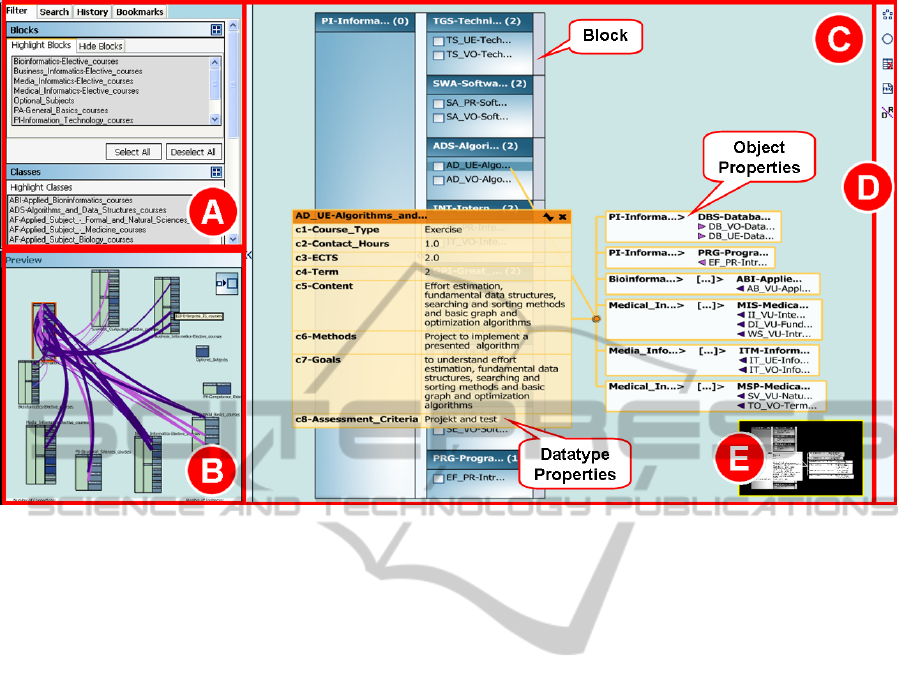
Figure 1: The fourth and current version: (A) toolbox which includes the search/filter, history and bookmark functions, (B)
preview window, (C) main window, (D) toolbar and (E) thumbnail.
shown in the preview window (B in Figure 1).
The overview (in Figure 1 currently located in the
preview window) shows all blocks arranged in a radial
pattern and is well suited to grasp the overall struc-
ture of the ontology. Colored curves depict the re-
lations (object properties) between instances. These
curves are actually meta-edges, because they bundle
relations according to common classes and property
type (reflected by the color of the curve) to avoid clut-
tering the view with a lot of individual curves. The
thickness of the curve corresponds to the number of
contained relations. If the mouse moves over a line,
a relation table with all connected instances appears.
To get a better view, it is possible to select which re-
lationship types are visible and which are not.
After clicking on a block in the overview, its detail
view is presented in the other window and only rela-
tionships, which are relevant for this block, are visi-
ble. The detail view only shows one block at a time
and therefore can be used to closely examine the indi-
vidual instances with their associated properties. The
detail view shows the instances of every class. Click-
ing on an instance opens separate tables for datatype
properties and object properties (which can also be
seen in Figure 1). The object property table allows to
directly jump to a connected instance, which means
that the detail view is automatically focused on the re-
spective instance. The direction of the relationship is
presented as arrow symbol and the color of the sym-
bols reflects the type of the relationship. A thumb-
nail (see E in Figure 1) of the block in the lower-right
corner helps to see the structure of the whole block
and allows to navigate quickly within the detail view.
The length of texts is restricted to a certain number
of characters, otherwise the text is truncated with ”...”
and tooltips show the full text. Of course, users can
switch the views between the large and the small win-
dow to enlarge the view, which is of more interest.
Furthermore, the impression of hierarchy – one
of the elementary concerns by users – was improved
by adding arrows between subclasses. These arrows
also allow to expand and collapse the underlying sub-
classes which further improved the understanding of
the left-to-right hierarchy.
3.3 Third Iteration Cycle
Based on the results of the user study of the second
version we included several modifications. For ex-
ample, double-clicking on a block will now automat-
ically open the detail view of this block in the main
window. Formerly, this was only possible with a spe-
cific switch button located in the upper-right corner
of the small window. The intensity of the color of a
class in the overview reflects the number of contained
instances. Another modification is that the relation
table can also be pinned down after the user clicks
on the associated curve in the overview. The color
IVAPP 2011 - International Conference on Information Visualization Theory and Applications
190
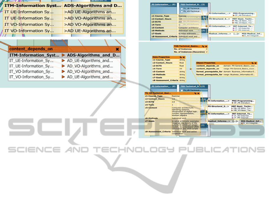
Figure 2: Comparison between the object property table
from the second version (top) and the redesigned table from
the fourth version (below).
of the relation table header and of the arrows corre-
sponds now to the color of the object property (Figure
2 shows the modifications in detail). Each table was
extended with a close button (one of the major confu-
sions in the second version). Furthermore, blocks in
the overview can also be individually arranged by the
user in case they are not satisfied with the automatic
circular alignment.
Additionally, we extended the prototype with his-
tory, bookmarks, search and filter functions (see A
in Figure 1) as well as a setting window which al-
lows, for example, to set the maximum text length.
The history function records every jump from one in-
stance/class to another instance/class and allows users
to track their progression through the ontology. Fur-
thermore, bookmarks allow users to select instances
that are of interest and to jump back to them at any-
time. Additionally to the object property filter, user
can also highlight blocks and classes to quickly lo-
cate them or they can be hidden if they are not from
special interest. Furthermore, a new search function
allows users to find specific instances or classes of the
ontology. For a thorough description of the third ver-
sion see also (Kriglstein and Wallner, 2010).
3.4 Fourth Iteration Cycle
In the last iteration cycle, we extended Knoocks with
additional features for better user support which will
be discussed in detail in the following. One of the
main concerns in the evaluation of the third prototype,
in regard to the datatype property table was that the
table does not list the internal datatype (e.g., integer
or string) of a property. This issue has not been ad-
dressed by domain users so far but we agree that this
is an important information for ontology developers
and they can now be accessed via tooltips if the mouse
Figure 3: Comparison between the previous version
(above), where text entries were truncated if they exceeded
a certain length and the current version (below) which now
shows the complete entries. Note also the new header of the
property table which now shows the name of the instance or
class it belongs to and buttons to collapse and to close the
table. To enhance readability the opacity of the tables has
been reduced. The lower image also shows the new class
information tables which were not available in the previous
version.
is placed over the name of the property. The ontol-
ogy developers also complained that it is not possi-
ble to retrieve general information of a class, in par-
ticular information about contained datatype and ob-
ject properties. This information is now accessible by
clicking on the class name itself which did not have an
effect previously. Furthermore, the internal datatypes
for each datatype property are shown. This way it
is now possible to inspect all datatype properties as-
signed to a class, because previously only datatype
properties which really had a value assigned were vis-
ible in the datatype property table of the instance.
In the previous version long texts were truncated
in tables and the complete text was only shown in a
tooltip if the mouse was placed over such an entry.
Whereas our intention was to avoid that a single table
occupies too much space this proved to be inapplica-
ble in same cases, especially if all values of a property
start with a certain substring. Users were therefore
not able to differentiate the values without accessing
the tooltip and therefore had a hard time to remember
which property has which value. The revised version
gives the user the possibility to expand or collapse the
tables to review the complete text or to minimize it
DEVELOPMENT PROCESS AND EVALUATION OF THE ONTOLOGY VISUALIZATION TOOL KNOOCKS - A
Case Study
191
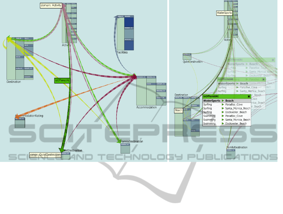
Figure 4: Left: Domain/range relationships are visualized as curved arrows which point from the domain to the range. The
direction is further accentuated by varying the width of the curve from thin (domain) to thick (range). As it is the case with
object properties curves (right image), the color reflects the property type. Hovering the mouse over such a curve shows the
name of the property, the domain and the range. Right: Clicking on a curve opens a table which shows all relations between
instances of the two connected classes. As schematically shown these tables can be moved along the curve.
(see Figure 3 for a comparison). As can be seen in
Figure 3, the new table also displays the name of the
instance to which the table belongs and, next to it, a
close button. These changes were introduced because,
if multiple tables were open, users lost track which ta-
bles belonged to which entity.
In regard to the overview some minor changes
have been introduced. Relation tables can now be
moved along a curve which allows users to avoid
overlapping to a certain degree and simultaneously
ensures that the connection between curve and table
does not get broken (see Figure 4, right). These ta-
bles can now also be closed by clicking on the re-
spective curve to provide consistency with the possi-
bilities how tables can be closed in the detail view.
Furthermore, a button to restore the radial layout has
been added to the vertical menu bar. The previous
version had a major drawback, because connections
between classes were only shown if there existed at
least one object property which connected two of their
instances. There was no possibility to view the un-
derlying domain/range constraints of the classes. To
resolve the problem, another level of abstraction was
added to the overview, which shows the domain/range
relations as curved arrows (see Figure 4, left).
Another major distinction to the previous version
is a context sensitive menu which can be opened in
the main window with the right mouse button. This
menu makes it, for example, possible to highlight or
hide blocks or classes directly in the view and there-
fore allows users to perform some tasks more fluently
because they do not have to switch their attention be-
tween the toolbox and the visualization.
Although users were already satisfied with the
available search possibilities, they had some sugges-
tions for improving the way the search results are pre-
sented. So far, search results were displayed in a list-
box with classes written in boldface to easily differen-
tiate them from instances. Clicking on a search result
automatically centered the detail view on the respec-
tive entity in question and highlighted it with a yellow
border. However, if the entity was located in a hid-
den block nothing was shown in the detail view which
led to confusion among users. We now indicate enti-
ties located in hidden blocks to remedy the problem.
In addition, entities in highlighted blocks or classes
are colored to signalize that they may be from greater
significance to the user. Furthermore, we refined the
navigation of the tool by supporting keyboard short-
cuts for important functions, like search and for the
new screenshot function. Navigation in the detail
view is now also possible by dragging the mouse (and
IVAPP 2011 - International Conference on Information Visualization Theory and Applications
192

with the arrow keys), because we observed that most
users tried at first to navigate this way instead with
the thumbnail view in the lower right corner. Finally,
the colors of the object properties are now definable
by the user, because this way they can accentuate spe-
cific properties by assigning appropriate colors.
4 EVALUATION
The main motivation to conduct user tests was to find
out more about the usability of the developed proto-
type in each iteration cycle to make sure that the de-
velopment goes into the right direction and to com-
pare Knoocks with other visualization tools. The
evaluation of the first prototype in the early develop-
ment phase of Knoocks served as an initial test in-
strument to find out the advantages and drawbacks
of the representation of the hierarchical structure and
their instances in comparison with other visualiza-
tions techniques. The focus of the user tests of the
later prototypes was to detect usability problems and
to compare Knoocks with other visualization tools.
Furthermore, results of the evaluation were analyzed
to find out which functionalities need further im-
provements and to check if users missed important
features.
4.1 Methods
For the evaluation, a combination of the following
methods was used: task scenarios, observations in
combination with thinking aloud, questionnaires and
semi-structured interviews.
To test the efficiency of Knoocks and to compare
it with other tools, users had to solve several tasks
which were based on scenarios. The focus of one set
of tasks was the identification of specific instances
and their datatype properties. Another set of tasks
concentrated mainly on the dependencies between in-
stances and between classes. To evaluate the structure
of blocks, we asked them to identify, which blocks
have the most/least classes or which classes contain
the most instances. Although certain core tasks stayed
the same for each prototype (e.g., which instances
has a certain class, find a specific instance) additional
tasks were introduced in each iteration because of the
increasing number of features (e.g., find a specific in-
stance with a certain datatype property). Users had as
much time as they needed to solve the tasks with each
tool. While users solved the tasks, they were observed
and encouraged to think aloud to make their behavior
and decisions more transparent.
In addition to the observation of the subjects and
thinking aloud protocols, they were also asked to state
how helpful the visualization was for executing each
task. For this purpose, we applied a 7-point Likert
scale (Likert, 1932) from ”not helpful” to ”very help-
ful”. Furthermore, subjects were asked to explain
their decisions and to give suggestions for possible
improvements. After the subjects had finished their
tasks, they rated the design of the graphical represen-
tation (e.g., bad or good color combination) and they
were asked about the strengths and weaknesses of the
visualization.
For the evaluation of the second and fourth proto-
type, we additionally adapted the usability question-
naire, as defined by (Pr
¨
umper, 1999). The usabil-
ity questionnaire was originally developed to evaluate
software prototypes in regard to the seven dialog prin-
ciples of ISONORM 9241/110 (International Organi-
zation for Standardization, 2006): suitability for the
tasks, self-descriptiveness, controllability, conformity
with user expectations, error tolerance, suitability for
individualization and suitability for learning. In gen-
eral, the questionnaire includes five items for each of
the seven principles and has a 7-point bi-polar format
from ”- - -” (very negative) to ”+++” (very positive).
Not all items are relevant or meaningful for the vi-
sualization and therefore we only used items, which
reflect the scope of the visualization.
The motivation to compare Knoocks with other
visualization tools was to detect advantages as well
as drawbacks between the tools. Furthermore, it was
interesting to analyze how well the users interacted
with the different visualization approaches. For the
comparison studies, we have chosen the following vi-
sualization approaches: CropCircles, TGVizTab, On-
toViz and the nested graph view of Jambalaya. Crop-
Circles is a container approach, which represents the
subclass-of relationships between classes as nested
circles. Our motivation to compare Knoocks with
CropCircles was the different representation of the hi-
erarchical structure of the classes. In contrast to Crop-
Circles, TGVizTab and OntoViz visualize the struc-
ture of ontologies as node-link representation. Both
approaches represent classes and instances as nodes
and subclass-of relationships and the object properties
as edges. The reason to compare Knoocks with Jam-
balaya was their similarity, because the nested graph
view of Jambalaya presents the hierarchical structure
with its instances as container approach and the object
properties as node-link representation. To make the
results comparable, the subjects solved similar tasks
for each tool. Additionally, the order of tasks and
tools was changed for each testing session to avoid
that a specific order influences the results.
Before the participants started with the tasks, they
DEVELOPMENT PROCESS AND EVALUATION OF THE ONTOLOGY VISUALIZATION TOOL KNOOCKS - A
Case Study
193

got a short introduction to the most important func-
tionalities of the tools. After the subjects had fin-
ished their tests, we asked them which visualization
they preferred in regard to their expectations and user
friendliness (specifically, which tool was most help-
ful, which one was the most understandable tool and
which tool met their expectations best).
4.2 Sample
For the evaluations we used an ontology that defines
a bachelor of computer science curriculum which in-
cludes 86 classes, 122 instances, 2 object properties
and 8 datatype properties. We used such a kind of on-
tology because we were able to get a large number of
participants in that particular domain. Contrary, it was
very hard to get participants in other domains, espe-
cially experts (e.g., in medicine). Furthermore, it sup-
ported the ongoing efforts at our university to make
the curriculum structure more transparent for students
and lecturers.
Motivated to evaluate the fundamental idea and to
detect misinterpretations or unclear elements of the
visualization, we tested Knoocks with potential users
of the domain and with ontology developers. In each
iteration cycle we used different subjects to make sure
that previous experiences with Knoocks do not influ-
ence the results.
First Iteration Cycle. The findings of the first eval-
uation are based on six students and the testing ses-
sions for each participant took about 40 minutes. For
the comparison study in the first iteration cycle, the
participants solved similar tasks with CropCircles
and the nested graph view of Jambalaya.
Second Iteration Cycle. The results of the second
evaluation are based on 22 participants (15 students
and 7 lecturers). The testing sessions for each par-
ticipant took about 90 minutes.
Third Iteration Cycle. Three ontology developers
evaluated the prototype in regard to usability and
functionality. Although this is a rather small num-
ber of participants, we received valuable qualitative
feedback and the testing sessions for each partici-
pant took about 180 minutes. For the comparison
study, we chose TGVizTab and the nested graph
view of Jambalaya.
Fourth Iteration Cycle. The prototype were evalu-
ated by 16 subjects (9 students and 7 lecturers) and
the testing sessions for each participant took about
120 minutes which include also the comparisons
with Jambalaya and OntoViz.
4.3 Results
In general, the findings of the observation and think-
ing aloud protocols showed that the concepts of
Knoocks and especially the hierarchical layout of
the blocks was clear and immediately understand-
able. Furthermore, they rated the color combination
as good and found the design well-balanced. The fol-
lowing strengths of Knoocks were named most fre-
quently during the user tests:
Clear Overview and Detail View. The layout of
blocks allowed to quickly see the subclasses and
the instances of classes. Furthermore, the switching
between the overview and the detail view, the
circular arrangement of blocks in the overview and
the visibility of both views at the same time were
named as helpful to get a good overview about the
ontology.
Easy to Learn and Understand. The participants
found Knoocks and its functionalities intuitive, easy
to learn and to memorize.
Clear Structure and Relationship Views. The rep-
resentations of object properties in the overview was
clear and gave a fast impression of the relationships
of the ontology. The visualization of properties of
an instance in the detail view gave them a clear
overview about the dependencies between the in-
stances.
Additional Support for Analysis. The different fil-
ter and search possibilities, as introduced in version
three, were mentioned as very helpful, e.g., to find
specific instances or classes or to set the users’ fo-
cus on specific blocks or object properties. The vi-
sual coding was named as a further strength, e.g.,
the color coding to present the number of instances
or the thickness coding to visualize the number of
connections between classes.
These strengths conform with the expectations
of almost all participants which they have in re-
gard to ontology visualization tools and are also in
accordance with the revealed user expectations in
(Kriglstein, 2009).
The following sections discuss the findings of the
usability study and comparison study between the
three tools in detail.
4.3.1 Usability Evaluation
Although the results of the user tests showed that the
subjects rated Knoocks in each stage predominantly
positive, the modifications, which were based on the
detected usability problems, were the reasons for no-
ticeable improvements in Knoocks’ usability in each
IVAPP 2011 - International Conference on Information Visualization Theory and Applications
194
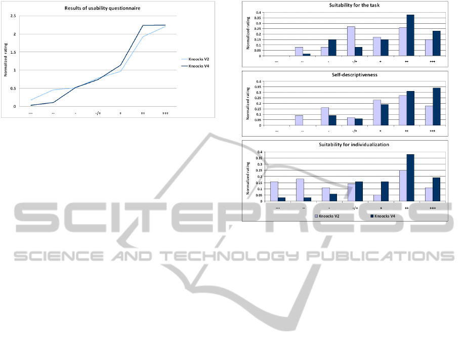
Figure 5: Normalized results of the rating of the seven di-
alog principles from ”- - -” (very negative) to ”+++” (very
positive) for the second and fourth prototype.
stage. The findings which are listed below are not ex-
haustive but were the most relevant ones for the fur-
ther development process.
First Iteration Cycle. The elementary problem was
that the direction of the hierarchy was ambiguous.
However, the block structure allowed them to get a
quick overview and to locate instances without prob-
lems.
Second Iteration Cycle. During the second evalua-
tion we observed that users tried to double-click on
a block to enlarge it. This maybe the case, because
the icon of the switch-button was not clear enough
for many participants. However, they appreciated
the possibility to choose which view is shown in the
main window. It was intuitive for them, to click on
an instance to retrieve detail information (object and
datatype properties). Though, most of the users had
problems to close the details again, because there
was no explicit close button. Most of them found the
truncated texts annoying, especially if multiple in-
stances began with the same letters as it was the case
in our test ontology. The representation of properties
was well received by the participants, because it al-
lowed them to compare different instances in regard
to their properties. This was further supported by the
possibility to drag and drop these tables. One of the
most missed features was a search function, because
they stated that currently the tool is nice for brows-
ing but is not suitable for finding a specific instance.
As further improvement, they stated they would like
to be able to also move/highlight/hide blocks in the
overview.
Third Iteration Cycle. The changes were well re-
ceived by the users. However, ontology experts
complained that information about the internal types
(integer, string, etc.) of datatype properties is miss-
ing. They also missed general information about
a class, like the number of contained instances or
which object properties are supported by this class.
Figure 6: Normalized values of the rating of three dialog
principles for the second and fourth version.
The search results were partly confusing because the
list representation made no difference between hid-
den, highlighted or normal blocks.
Fourth Iteration Cycle. Although the node-link
representation of object properties and that the
thickness of their curves reflects the number of
connections was clear, several subjects stated that
the thickness alone is insufficient with increasing
number of represented relationships. Therefore
they would prefer to additionally see the number of
connections as label for each curve. Furthermore,
they found that the color coding of classes to show
the number of instances is a good way to quickly get
an overview of the distribution of instances within
the ontology. The possibility to jump between
instances and their highlighting was noted as very
helpful. However, more than half of the subjects
missed the highlighting of instances or classes in
the detail view, because the time, which showed
the highlighting, was too short or the instance in
question was occluded by open properties. All
participants found the search function very helpful,
especially because it allowed them to find instances
or classes which conform to a specific datatype
property (e.g., to find all courses which were held in
the third term).
The improvement of the usability was further un-
derlined by the results of the usability questionnaire,
as can be seen in Figure 5. A closer look at the differ-
ent dialog principles shows that the participants rated
the fourth prototype better than the second, especially
DEVELOPMENT PROCESS AND EVALUATION OF THE ONTOLOGY VISUALIZATION TOOL KNOOCKS - A
Case Study
195

in regard to the following three principles (see also
Figure 6 for details):
Suitability for the Task. Reasons for the better rat-
ing are the new filter and search function. Moreover,
the handling of the fourth version was rated as eas-
ier, because of the additional support of keyboard
shortcuts, the modifications of the property repre-
sentations and the context sensitive menu.
Self-descriptiveness. Relevant improvements,
amongst others, are that the complete text in the
datatype property tables is now visible at first
glance, that the name of the instance along with a
close button is presented in the property table and
that a double click on a block automatically opens
the detail view in the main window.
Suitability for Individualization. The possibility to
move blocks and relation tables individually, to cus-
tomize colors for object properties and to set the
maximum label length are reasons for the better rat-
ing of the fourth version.
4.3.2 Comparison Study
For the comparison studies different kind of tasks had
to be solved by the participants. This would include
tasks like: find a specific instance, identify dependen-
cies of an instance, find out which instances belong
to a certain class or identify to which class a specific
subclass belongs to. Table 1 summarizes which Tools
have been used for the comparison in which iteration
of the development process.
The comparison studies showed that most subjects
found that Knoocks was easy to learn and provided
a better general overview about the ontology and its
object properties than the other tested tools. For ex-
ample, the hierarchical representation of the classes
as nested circles in CropCircles was for the subjects
hard to understand in the beginning and the perfor-
mance to find a specific class was lower as with Jam-
balaya or Knoocks. Although the participants liked
the design of Jambalaya, it was rather difficult for
them to get a general overview and to find specific
classes or instances in case of the nested graph lay-
out. Reasons were that the labels of the instances
and classes overlapped and the zooming function was
rated as difficult to handle. However, zooming was
necessary to compare different subclasses from differ-
ent levels. Furthermore, the subjects found it harder to
distinguish between hierarchical and non-hierarchical
relationships in TGVizTab, because of missing visual
differentiations. The missing visual differentiations
between non-hierarchical relationships were also the
reason why the subjects had problems to distinguish
Table 1: Tools which have been used for the comparison of
Knoocks at the different stages of development. In iteration
2 no comparison study was carried because the evaluation
concentrated mainly on usability issues.
Iteration CropCircles Jambalaya OntoViz TGVizTab
1 × ×
3 × ×
4 × ×
the different object property types in OntoViz. Fur-
thermore, they found it hard to memorize the abbrevi-
ations for the drawing settings in OntoViz.
In summary, the comparison studies showed that
tools with a rather technical interface (OntoViz and
TGVizTab) had been rated lower than the ones with a
more accessible interface (Jambalaya and Knoocks).
This was also confirmed by the ranking of the tools
in regard to user friendliness and expectations which
yielded the following results the last iteration circle.
79% ranked Knoocks on the first place, whereas 18%
ranked Jambalaya on the first place. However, 78%
voted Jambalaya on the second place followed by
Knoocks with 11%. OntoViz on the other hand was
ranked on the third place by 95% of all participants.
5 CONCLUSIONS
Visualizations support users to generate knowledge
about the presented data and make the ontology more
understandable and manageable. To make the work
with ontologies more effective, the needs of users
play an essential role for the design of the visualiza-
tion. Usability evaluations of visualizations help to
get feedback what works well and what needs further
improvements. However, only one usability test at
the end of the development process is often not suf-
ficient. The involvement of potential users during the
development process allowed us to integrate feedback
immediately which was very valuable to keep the de-
velopment on the right track.
This paper presented the development process of
the ontology visualization tool called Knoocks and
its evaluation with focus on usability and comparison
studies with other visualization tools. Knoocks allows
users to analyze the structure of classes with their in-
stances and properties in one single tool. The tool is
primarily developed for users who want information
about concepts of their domain as well as for users
who develop and maintain the ontology. The case
study demonstrated that modifications based on the
results of the user tests for each iteration cycle of the
development process had a positive impact on the us-
ability. This significantly simplified working with the
visualization tool. The comparison between Knoocks
IVAPP 2011 - International Conference on Information Visualization Theory and Applications
196

with CropCircles, OntoViz, Jambalaya and TGVizTab
showed that the handling of OntoViz caused most
problems. Although, participants liked the nested
graph view in Jambalaya, most of them preferred the
layout of Knoocks. Reasons were that Jambalaya
only visualizes one set of subclasses or instances for
a class in more detail and that the visualization eas-
ily overcrowds with an increasing number of object
properties. One participant also explicitly noted that
the handling and functionalities of Jambalaya seemed
more complex than the handling and functionalities of
Knoocks. The results of the comparative study with
these tools emphasize the significance of the usability
in regard to the handling and rating of the tools.
One of our next steps is to verify how the re-
quested functionalities or design elements which were
difficult to understand (e.g., to add labels for show-
ing the number of connections between classes in the
overview) in the fourth prototype can be included in
the next version. Knoocks is currently being devel-
oped as a plug-in for Prot
´
eg
´
e to combine our visu-
alization approach with the editing functionality of
Prot
´
eg
´
e.
REFERENCES
Alani, H. (2003). Tgviztab: An ontology visualization
extension for prot
´
eg
´
e. In Knowledge Capture (K-
Cap’03). Workshop on Visualization Information in
Knowledge Engineering.
Barlow, T. and Neville, P. (2001). A comparison of 2-d vi-
sualizations of hierarchies. In Proc. of the IEEE Sym-
posium on Information Visualization 2001, page 131.
IEEE Computer Society.
Cardoso, J. (2007). The semantic web vision: Where are
we? Intelligent Systems, 22(5):84–88.
Fensel, D. (2001). Ontologies: a silver bullet for knowledge
management and electronic commerce. Springer-
Verlag New York, Inc.
International Organization for Standardization (2006). Iso
9241-110:2006 ergonomics of human-system interac-
tion – part 110: Dialogue principles.
Katifori, A., Halatsis, C., Lepouras, G., Vassilakis, C.,
and Giannopoulou, E. (2007). Ontology visualization
methods—a survey. ACM Comput. Surv., 39(4):10.
Kriglstein, S. (2009). User requirements analysis on on-
tology visualization. In International Conference on
Complex, Intelligent and Software Intensive Systems.
2nd International Workshop on Ontology Alignment
and Visualization, pages 694–699. IEEE Computer
Society.
Kriglstein, S. and Motschnig-Pitrik, R. (2008). Knoocks:
New visualization approach for ontologies. In Proc.
of the International Conference on Information Visu-
alization, pages 163–168. IEEE Computer Society.
Kriglstein, S. and Wallner, G. (2010). Knoocks - a visual-
ization approach for owl lite ontologies. In Interna-
tional Conference on Complex, Intelligent and Soft-
ware Intensive Systems. 3rd International Workshop
on Ontology Alignment and Visualization, pages 950–
955. IEEE Computer Society.
Kruskal, J. and Landwehr, J. (1983). Icicle plots: Better dis-
plays for hierarchical clustering. The American Statis-
tician, 37(2):162–168.
Kulyk, O. A., Kosara, R., Urquiza-Fuentes, J., and Wassink,
I. H. C. (2006). Human-centered aspects. In A. Ker-
ren, A. E. and Meyer, J., editors, Human-Centered Vi-
sualization Environments, pages 13–75. Springer.
Lanzenberger, M., Sampson, J., and Rester, M. (2009). Vi-
sualization in ontology tools. In Proc. of the Interna-
tional Conference on Complex, Intelligent and Soft-
ware Intensive Systems. 2nd International Workshop
on Ontology Alignment and Visualization, pages 705–
711. IEEE Computer Society.
Likert, R. (1932). A technique for the measurement of atti-
tudes. Archives of Psychology, 22(140):1–55.
Nielson, J. (1994). Usability Engineering. Morgan Kauf-
mann.
North, C. (2006). Toward measuring visualization insight.
IEEE Comput. Graph. Appl., 26(3):6–9.
Noy, N. F. and McGuinness, D. L. (2001). Ontology devel-
opment 101: A guide to creating your first ontology.
Technical report, Stanford Knowledge Systems Labo-
ratory and Stanford Medical Informatics.
Pr
¨
umper, J. (1999). ‘ test it: Isonorm 9241/10. In
Proc. of HCI International (the 8th International
Conference on Human-Computer Interaction) on
Human-Computer Interaction: Ergonomics and User
Interfaces-Volume I, pages 1028–1032. L. Erlbaum
Associates Inc.
Saraiya, P., North, C., and Duca, K. (2005). An insight-
based methodology for evaluating bioinformatics vi-
sualizations. IEEE Transactions on Visualization and
Computer Graphics, 11(4):443–456.
Shneiderman, B. (1992). Tree visualization with tree-maps:
2-d space-filling approach. ACM Trans. Graph.,
11(1):92–99.
Shneiderman, B. (1998). Designing the User Interface. Ad-
dison Wesley, 3 edition.
Sintek, M. (2010). Ontoviz. http://protegewiki.stanford.
edu/index.php/OntoViz, Accessed 16.03.10.
Stanford Center for Biomedical Informatics Research
(2010). Prot
´
eg
´
e project. http://protege.stanford.edu,
Accessed 29.01.2010.
Storey, M. A., Callendar, C., Lintern, R., Ernst,
N., and Best, C. (2010). Jambalaya.
http://protegewiki.stanford.edu/index.php/Jambalaya,
Accessed 17.03.10.
Swartout, B., Patil, R., Knight, K., and Russ, T. (1997).
Toward distributed use of large-scale ontologies. In
Proc. of the AAAI97 Spring Symposium Series, Work-
shop on Ontological Engineering, pages 138–148.
AAAI Press.
W3C (2010). Owl web ontology language guide.
http://www.w3.org/TR/owl-guide/.
Wang, T. D. and Parsia, B. (2006). Cropcircles: Topol-
ogy sensitive visualization of owl class hierarchies. In
Proc. of the 5th International Conference on Semantic
Web, pages 695–708.
DEVELOPMENT PROCESS AND EVALUATION OF THE ONTOLOGY VISUALIZATION TOOL KNOOCKS - A
Case Study
197
