
VISUAL ANALYTICS OF MULTIMODAL BIOLOGICAL DATA
Hendrik Rohn, Christian Klukas
Leibniz Institute of Plant Genetics and Crop Plant Research (IPK), Gatersleben, Germany
Falk Schreiber
Leibniz Institute of Plant Genetics and Crop Plant Research (IPK), Gatersleben, Germany
Institute of Computer Science, Martin Luther University, Halle-Wittenberg, Germany
Keywords:
Visual analytics, Biological data, Integrative visualization.
Abstract:
Biological data is measured in increasing quantity and quality, resulting in data describing biological systems
from different perspectives. Based on data integration methods, visual data mining and visual analytics can
be used to promote the understanding of combined biological data and facilitate the exploration process. In
this paper a number of view types are presented and integrated into a comprehensive software tool, in order
to support researchers in visualizing flexible combinations of multimodal biological data and to create inte-
grated views on comprehensive datasets spanning multiple “omics” areas. A number of interaction techniques
accompany these views, enabling the efficient exploration of the data.
1 BACKGROUND
1.1 Introduction
Modern data acquisition methods facilitate re-
searchers to obtain data of biological systems in in-
creasing quantity and quality. This data describes
biological systems at different resolutions and from
different perspectives, facilitating a comprehensive
view onto the biological system. Especially of im-
portance are the “omics” areas such as the genome,
proteome and metabolome, which are gathered in ex-
ponentially increasing amounts. In addition, modern
image acquisition methods make it possible to obtain
spatial information, such as volumetric- and image-
based data. Structural and process information such
as metabolic networks is used to describe biological
systems from a mechanistic perspective. As all data
represents different views onto the same object, data
integration methods aim in bringing all available data
of one system together into one application.
Data integration of such diverse data types is an
ongoing research area. For example, it can be im-
plemented by the approach described in (Rohn et al.,
2009). Powerful tools are needed to be able to under-
stand complex and flexible combinations of systems
biological data. These tools are based on advanced
visual data mining and analysis methods which reveal
the relations of real-world-data of biological systems
and are therefore essential for systems biological re-
search. In this paper we present a suitable set of vi-
sualization and interaction methods of combined bio-
logical data enabling researchers to visually analyze,
explore and navigate through combined omics-data,
networks, images and volumes.
1.2 Data Integration
The model for representing the biological data, which
is used for data integration, was described in (Rohn
et al., 2009). It contains four types of biologi-
cal data (called measurements): “simple measure-
ments” representing numeric measurement data ob-
tained for the areas genomics, transcriptomics, pro-
teomics and metabolomics, “images” representing
two-dimensional spatial information, “volumes” rep-
resenting three-dimensional spatial data and “net-
works” describing structural properties of biological
systems. The data model enables to specify annota-
tion information of measurements. This meta data de-
scribes further information about each measurement,
such as experiment coordinator, genotype and species
of the investigated organism, developmental stages
and spatial attributes. By using the annotation, one
256
Rohn H., Klukas C. and Schreiber F..
VISUAL ANALYTICS OF MULTIMODAL BIOLOGICAL DATA.
DOI: 10.5220/0003354202560261
In Proceedings of the International Conference on Imaging Theory and Applications and International Conference on Information Visualization Theory
and Applications (IVAPP-2011), pages 256-261
ISBN: 978-989-8425-46-1
Copyright
c
2011 SCITEPRESS (Science and Technology Publications, Lda.)
a: simple
measurement
c: image
d: volume
b: network
aa
bb dd
cc
ab
ab
ad bc
cd
bd
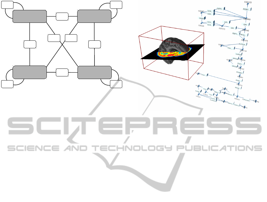
Figure 1: The structure of the MappingGraph, adapted
from (Rohn et al., 2009). Four nodes contain all integrated
measurements. Measurements may be flexibly combined
into a mapping, represented as a new node in the Mapping-
Graph. For example, “bb” represents the mapping of im-
ages onto images and the node “bd” represents a mapping
of networks onto volumes. Note, that more mappings are
possible, e. g. “abc”.
is able to bring measurements from different experi-
ments into context of each other and explore their re-
lations.
The data integration is mainly based on a graph
structure called MappingGraph (see also Figure 1).
All data integrated in the system is split into the four
measurement types and all measurements of one type
are cumulated in one of four special nodes in the
MappingGraph. By selecting any number of nodes
in the MappingGraph, the user combines the selected
measurements in a so-called mapping. Mappings are
combined measurements and represented as a new
node in the MappingGraph. As such nodes they
may serve as a source for new data mapping proce-
dures. These mappings can be visualized in multi-
farious ways, including interactions to modify view
attributes and manipulate data.
2 METHODS
To be able to explore combined measurements, dif-
ferent views are presented in this section. They are
designed to visualize different combinations of multi-
modal biological data. The views provide several in-
teraction possibilities in order to be able to alter view
properties and manipulate the underlying data.
2.1 3-D View
The 3-D View makes it possible to visualize all four
measurement types in three dimensions.
Figure 2: Screenshot of the 3-D View visualizing a three-
dimensional human brain volume, a two-dimensional PET
image in the human brain and the human glycolysis path-
way in three-dimensional space.
The most computationally demanding visualiza-
tion is to render typical volumetric data sets (< 50
million voxels) at interactive frame rates in three
dimensions. This rendering is achieved based on
SPECTUS3D (McGonigle, 2006), a slice-based vol-
ume renderer (Swan and Yagel, 1993). The rendering
algorithm generates a stack of planes through the vol-
ume in three orthogonal directions and aligns these
planes in the three-dimensional space. Therefore, in-
stead of visualizing single voxels, three orthogonal
aligned pixels represent one voxel. Transparency ef-
fects are applied to the planes and can be changed us-
ing sliders. Besides the general plane transparency,
single planes may be highlighted (by setting the plane
opaque) and cut-offs accomplished (by setting a set
of planes fully transparent). In case of a gray-value
volume, a set of color maps can be applied permit-
ting to highlight interesting regions or to generate an
appealing appearance (Moodley and Murrell, 2004).
Segmented volumes are also supported by highlight-
ing or hiding segments in reaction to user input. These
segments may serve as a backbone for spatial naviga-
tion, e. g. selecting a tissue to trigger the visualization
of the corresponding tissue-specific pathway. Some
planes may be skipped to achieve higher frame rates
or stretched to implement non-isotropic voxels.
Similar to the planes used for rendering volumet-
ric data, images are visualized by applying the image
data onto a textured plane. Images may be resized on
user request and texture transparency can be applied.
Segmented images work the same way as volumes, as
the user is able to select segments and hide or delete
these segments.
VISUAL ANALYTICS OF MULTIMODAL BIOLOGICAL DATA
257
Networks can also be represented in the 3-D View.
Nodes are implemented as spheres, cuboids or cylin-
ders, whereas edges are represented either by a cone
and a cylinder or, at user choice, as a primitive line.
Both graph-element types support transparency and
changing of colors. The three-dimensional represen-
tation of networks support also visualization of omics
data, similar to the diagrams in the graph view. At the
moment, omics data is mapped to nodes and visual-
ized using embedded diagrams.
All measurement representations may be rotated
and translated as needed. An example screenshot is
shown in Figure 2.
2.2 Graph View
The Graph View visualizes data of the types network
and simple measurement in two dimensions.
In contrast to image based pathway visualization
systems, such as KEGG (Kanehisa and Goto, 2000)
and MAPMAN (Thimm et al., 2004), dynamic edit-
ing of networks is supported. It is possible to con-
struct or edit networks manually with integrated edi-
tor functions. The visualization of experimental data
within the network context is implemented by embed-
ding line or bar charts inside the network nodes or by
positioning these diagrams on top of the graph edges.
The drawing style of the diagrams may be interac-
tively modified with a number of parameters such as
series colors, the display of range or category labels,
and line widths. Besides networks, the view is able
to visualize experiment data as hierarchies (Klukas
and Schreiber, 2010; Sharbel et al., 2010), by relat-
ing them to functional categories such as Gene Ontol-
ogy (Ashburner et al., 2000) and the KEGG BRITE
hierarchy (Kanehisa et al., 2006). Graphs may be ex-
ported as a website, containing diagrams and click-
able graph-elements, which may link to web-entries
in databases.
The Graph View supports an interaction tech-
nique, similar to the one described in (Klukas and
Schreiber, 2007). There, KEGG pathways may be
collapsed into a pathway overview-node. All edges
to and from these collapsed nodes will then point to
the overview-node, instead of single graph-elements.
Expanding such an overview-node results in replace-
ment of the node by the pathway’s graph-elements
and resetting the edges to the correct elements. In
our case, every network may be collapsed into an
overview-node and expanded again. To improve lu-
cidity, all edges between two networks are bundled
together, similar to the method described in (Gansner
and Koren, 2007; Holten and Wijk, 2009). This edge
bundling facilitates visual tracking of single edges,
Figure 3: Screenshot of the Graph View visualizing net-
works in two dimensions. Networks may be expanded and
collapsed and omics data may be mapped to the graph-
elements. Note the edge bundling caused be expanding
overview-nodes.
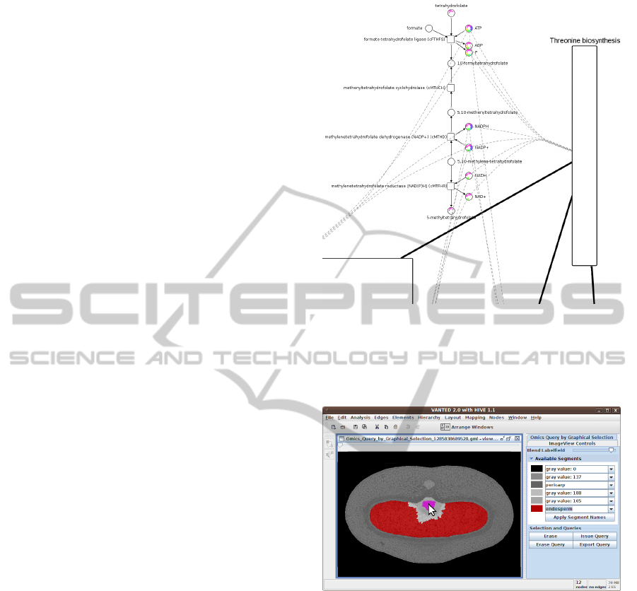
Figure 4: Screenshot of the Image View visualizing a seg-
mented barley cross-section in two dimensions. The la-
belfield is blended with the source image and one segment
is highlighted in red. The user also selected a region (ma-
genta) for graphical querying.
but at the same time maintains a good overview of
the general trend of network interconnections.
An example screenshot is shown in Figure 3.
2.3 Image View
The Image View is able to visualize data of the types
volumes and images in two dimensions.
Images are displayed by drawing the pixels di-
rectly onto the screen and may be scaled to fit differ-
ent monitor sizes. Segmentation information display
is supported by utilizing a blending effect between
IVAPP 2011 - International Conference on Information Visualization Theory and Applications
258
the source image and the labelfield image. The user
may choose the blending factor in order to observe
the real image, the labelfield or both at the same time.
This can be used to check the segmentation quality
or to look up the corresponding segment for single
pixels. The Image View is able to handle a stack of
images by providing a slider, which determines the
displayed image, similar to the approach described
by (Abramoff et al., 2004). If the images share for
example a spatial or temporal relation, dragging the
slider helps to catch these relations during the anima-
tion. Volumetric data is represented as a stack of im-
ages, which is generated by traversing the volume in
z-direction.
A special interaction technique is the intuitive
graphical triggering of spatial queries based on seg-
mentation information, similar to (Davidson et al.,
1997): The user is able to select a spatial region of
the image by drawing with the mouse directly onto
the image. All regions covered by this operation are
highlighted and analyzed in order to trigger a query in
the integrated data, resulting in a set of measurements
present in this segment.
An example screenshot of the Image View is
shown in Figure 4.
2.4 Additional Views
Besides the three presented commonly used views
there are a number of other views, which are usually
strongly use case oriented or work only for predefined
measurement combinations. In the following we de-
scribe three of these view types, but many more are
possible.
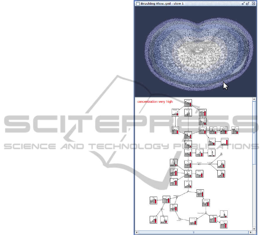
2.4.1 Brushing View
This view enables users to utilize the interaction tech-
nique brushing (Eick and Wills, 1995) in order to ex-
plore spatial related experimental datasets. It is di-
vided into two parts: One part visualizes a segmented
image, which will be used as the navigational back-
bone. The other part comprises a Graph View, show-
ing a network and associated simple measurements.
The user is able to hover the mouse over the image
segments of interest. The network visualization re-
acts to this events by highlighting or displaying only
data, which was measured in this corresponding seg-
ment. A biological use case for this view is to investi-
gate two-dimensional distribution of metabolic mea-
surements in an interactive way: If biologists are in-
terested in the state of the metabolism during the ex-
position in different oxygenic environments, the two-
dimensional oxygen distribution may serve as navi-
gational backbone for highlighting the corresponding
Figure 5: Screenshot of the Brushing View visualizing a
barley cross-section (together with spatial oxygen distribu-
tion) and a network with mapped measurements. The user
selects oxygen concentrations by hovering the mouse over
the image, triggering the highlighting of measurement data
in the network, which is specific for the selected oxygen
level. Note that the spatial concentration was discretized
into four specific oxygen levels, relating to the oxygenic
conditions of the measurement data.
data. An example screenshot for this view is shown
in Figure 5.
2.4.2 Scatterplot View
This view enables users to observe potentially corre-
lated substances. A matrix is build up by adding all
measurements of pairwise substances to each element
of the matrix. These elements are displayed in a well-
known scatterplot visualization, by plotting points for
VISUAL ANALYTICS OF MULTIMODAL BIOLOGICAL DATA
259
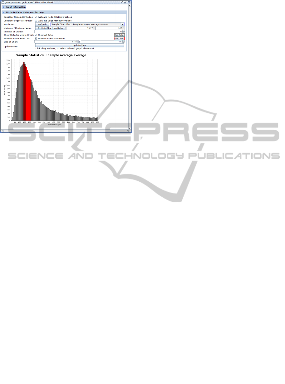
Figure 6: Screenshot of the Statistics View visualizing hu-
man gene expression rate values mapped onto a network as
a histogram. The user is able to select parts of the data (red
bars) and this selection will also be applied to the underly-
ing network.
pairwise measurement values. These displayed data
points may have different colors, indicating measure-
ments of different conditions.
2.4.3 Statistics View
The last view is depicted in Figure 6. This view shows
the distribution of graph-element attribute values as a
histogram. This view can be used to visually inspect
graph properties or experimental data mapped onto
networks. An example is the investigation of compre-
hensive gene expression data sets in order to perform
a quality check by recognizing the distribution of the
data, or by selecting and removing outlier values.
3 CONCLUSIONS
We described a number of views, which enables do-
main scientists to visualize and analyze integrated and
flexibly combined biological data of different types.
Interaction techniques were developed to support do-
main scientists to visually explore their data. Many
of the described techniques and views are already im-
plemented in the HIVE add-on for VANTED. The next
version of the add-on will provide users all described
features. A video showing the described views and in-
teraction techniques is available at http://vanted.ipk-
gatersleben.de/hive ivapp11.
The set of visualization and interaction tools are
at the moment used in cooperation with domain ex-
perts, in order to create different integrated views
on datasets consisting of large-scale gene-expression
data, metabolic time-series data, microscopy im-
ages, photographs, volumes derived from NMR Spec-
troscopy and KEGG metabolic pathways. We were
not yet able to exploit the full capabilities of the pre-
sented approaches, as it is hard to find comprehensive
experimental datasets of the same origin, biological
material and methods, which would ideally cover all
of the supported data domains at the same time. We
are giving the tools into the hands of researchers in or-
der to overcome this limitation. Based on their com-
ments and experiences in using the system we will
iteratively improve and extend the system as well as
the underlying methods, promoting the realization of
complex biological use cases.
ACKNOWLEDGEMENTS
This work was partly supported by grant BMBF
0315044A
REFERENCES
Abramoff, M., Magelhaes, P., and Ram, S. (2004). Image
processing with ImageJ. Biophotonics International,
11:36–42.
Ashburner, M., Ball, C., Blake, J., Botstein, D., Butler, H.,
Cherry, J., Davis, A., Dolinski, K., Dwight, S., Ep-
pig, J., et al. (2000). Gene ontology: tool for the uni-
fication of biology. The Gene Ontology Consortium.
Nature Genetics, 25(1):25–29.
Davidson, D., Bard, J., Brune, R., Burgerc, A., Dubreuil,
C., Hill, W., Kaufman, M., Quinn, J., Stark, M., and
Baldock, R. (1997). The mouse atlas and graphical
gene-expression database. Seminars in Cell & Devel-
opmental Biology, 8(5):509–517.
Eick, S. G. and Wills, G. J. (1995). High interaction
graphics. European Journal of Operations Research,
81(3):445–459.
Gansner, E. R. and Koren, Y. (2007). Improved circular lay-
outs. Lecture Notes in Computer Science, 4372:386–
398.
Holten, D. and Wijk, J. J. V. (2009). Force-directed edge
bundling for graph visualization. Computer Graphics
Forum, 28(3):983–990.
Kanehisa, M. and Goto, S. (2000). KEGG: Kyoto encyclo-
pedia of genes and genomes. Nucleic Acids Research,
28(1):27–30.
Kanehisa, M., Goto, S., Hattori, M., Aoki-Kinoshita, K. F.,
Itoh, M., Kawashima, S., Katayama, T., Araki, M.,
IVAPP 2011 - International Conference on Information Visualization Theory and Applications
260

and Hirakawa, M. (2006). From genomics to chemi-
cal genomics: new developments in KEGG. Nucleic
Acids Research, 34:D354–D357.
Klukas, C. and Schreiber, F. (2007). Dynamic exploration
and editing of KEGG pathway diagrams. Bioinfor-
matics, 23(3):344–350.
Klukas, C. and Schreiber, F. (2010). Integration of -omics
data and networks for biomedical research. Journal of
Integrative Bioinformatics, 7(2):112.1–6.
McGonigle, J. (2006). Java and 3D interactive image dis-
play. Master’s thesis, University of Aberdeen.
Moodley, K. and Murrell, H. (2004). A colour-map plu-
gin for the open source, Java based, image process-
ing package, ImageJ. Computers & Geosciences,
30(6):609–618.
Rohn, H., Klukas, C., and Schreiber, F. (2009). Integration
and visualisation of multimodal biological data. Lec-
ture Notes in Informatics, 157:105–115.
Sharbel, T. F., Voigt, M. L., Corral, J. M., Galla, G., Kum-
lehn, J., Klukas, C., Schreiber, F., Vogel, H., and
Rotter, B. (2010). Apomictic and sexual ovules of
Boechera display heterochronic global gene expres-
sion patterns. The Plant Cell, 22(3):655–671.
Swan, E. and Yagel, R. (1993). Slice-based volume ren-
dering. Technical report, The Advanced Computing
Center for the Arts and Design, The Ohio State Uni-
versity.
Thimm, O., Bl
¨
asing, O., Gibon, Y., Nagel, A., Meyer, S.,
Kr
¨
uger, P., Selbig, J., M
¨
uller, L. A., Rhee, S. Y., and
Stitt, M. (2004). MAPMAN: a user-driven tool to dis-
play genomics data sets onto diagrams of metabolic
pathways and other biological processes. The Plant
Journal, 37:914–939.
VISUAL ANALYTICS OF MULTIMODAL BIOLOGICAL DATA
261
