
TOWARD A POST-SERIALITY MAP OF TV SERIES
Visualizing the New TV Seriality System with Protovis
Pier Giuseppe Mariconda and Stefano Perna
Department of Communication, University of Salerno, Via Ponte Don Melillo, Fisciano, SA, Italy
Keyword: Cultural Analysis, Serials, Visualization, Protovis.
Abstract: The aim of this work is to visualize some information resulted from an analysis on 60 series from the top
rated ones in the 2001-2010 decade. Arc-Diagram is presented as an overview of the TV series co-actor
network. Airing networks and ratings are highlighted in the circular graph. Major insights are discussed.
1 INTRODUCTION
The visualization based study of TV series data is
interesting for several reasons:
The first one is that most people know about
them and can relate them to movies and actors, so,
when it is presented with a visualization of serials
data, they will try to find their favorite series and
actors, identify series of potential interest or explore
the complex co-actor relationships among actors.
The second one is that the built dataset has some
rich information on each TV series allowing for a
wide variety of data, it is sufficiently clean and easy
to update so further analysis can be done without
using semantic matching techniques.
The third one is that with this work we hope to
communicate the power of the visualization, and
more generally of the computer based approach to a
traditional field of humanities research, the
sociology of culture.
In this, as in other fields of humanities research,
visualizations can be more than eye candy, rather it
can be used as an analysis tool through which
quickly obtain new insights.
For some years now several authors and scholars
(Manovich, 2007, 2010) have begun to show a
serious interest in the use of interactive visualization
as a tool for humanistic research: in 2007 at the
campus of University of California, San Diego
(UCSD) was established Software Studies Initiative
led by Lev Manovich; one year later NEH (National
Endowment for Humanities) announced a new
“Humanities High-Performance Computing”
(HHPC) initiative that WAS based on similar
insights. Manovich called this approach "Cultural
Analytics", a methodology through which "cultural
data" could be analyzed with the instruments of
quantitative research, of statistics and computational
information visualization. Quantitative analysis is
not new to humanistic research, as sociology from
its beginnings employed quantitative methodologies.
What's new is the huge amount of "cultural traces"
(Manovich, 2010) which are stored in digital
archives and, for this reason, IT may be subjected to
computational analysis for showing overall trends
and models. If computational quantitative analysis
and visualization is quite normal in the hard science
and in the new media communities, more traditional
humanistic disciplines as theory of culture or
semiotics are not familiar with this kind of
instruments.
An important exception (and a fundamental
inspiration for our work) is Franco Moretti's
approach to literary history (Moretti, 2005): his
“Graphs, maps and trees” is an impressive
demonstration of the power of quantitative
visualization in the analysis of qualitative subjects
(as the history of literature). Moretti claims that
these instruments could give to humanistic research
what he calls a "distant reading", an opportunity for
an overall view of very complex cultural process
(e.g. the rise of novel in Europe across three
centuries). Other similar approaches are beginning to
emerge, as well as visualization tools and computer-
based experiments in the humanities began to be
developed. Some notable examples are: in literary
field Literature Fingerprints (Keim, Oelke, 2007),
TextArc (Paley, 2002) and BibleViz (Harrison,
2008) in sociology worthy of note is the work based
262
Giuseppe Mariconda P. and Perna S..
TOWARD A POST-SERIALITY MAP OF TV SERIES - Visualizing the New TV Seriality System with Protovis.
DOI: 10.5220/0003355702620265
In Proceedings of the International Conference on Imaging Theory and Applications and International Conference on Information Visualization Theory
and Applications (IVAPP-2011), pages 262-265
ISBN: 978-989-8425-46-1
Copyright
c
2011 SCITEPRESS (Science and Technology Publications, Lda.)

on some theories of (Latour, 2005), Cartography of
Controversies (Venturini, 2008) in which the
visualization is used as a tool for sociological
analysis. In the context of the actual spreading of
information over the web and on digital archives,
humanistic researchers have the opportunity to
manage large sets of data for cultural analysis and
for the interpretation of large cultural trends in what
Jurij Lotman called the "Semiosphere" (Lotman,
2001). Now we can gain a "distant reading" with the
help of computational analysis of data and
interactive visualization.
2 VISUALIZATION IN
HUMANITIES RESEARCH:
TOOL AND PURPOSE FOR A
"DISTANT READING".
PROJECT DETAILS
2.1 TV Series as a Major Cultural
Process in the Contemporary
Semiosphere
In this study we try to apply the paradigm of cultural
analytics and of "distant reading" to an important
part of the contemporary culture industry: the
American TV series system. Many sociologist and
critics recognized the importance of TV series in the
contemporary media system. In Italy sociologist as
Alberto Abbruzzese (2001) and Sergio Brancato
(2007) analyzed deeply this evolution. They claim
that TV is a formidable device that characterized
daily life and the social construction of the "reality
principle" for the entire second half of the twentieth
century. Today it appears in a state of profound
transformation of its original statutes and it seems
involved in the dynamics of "demassification" that
involves contemporary society as a whole. TV
traditional genres - typical of the general strategy of
a mass medium facing the domestic space and the
system of relations existing between his subjects -
make it increasingly difficult to withstand the impact
of cultural changes initiated “by” the advent of the
Web. Among the traditional television formats only
fiction can still operate on the level of relationship
with the public, renewing that particular narrative
function which is strong from its origins and that
give reasons for the success in the context of
consumption of aesthetic forms. The narratives of
the television drama evolve within a media
framework governed by the logic of scheduling, as
to say from a grid that orders the time of TV flow in
relation to the personal needs of the audience as well
as the strategies of the advertising market. Even
more evidently, the deep meaning of TV
consumption is built not so much on the originality
of the texts, but on their ability to attract the public
through the choreography of repetition, the ritual
return to the already known. In This sense TV series
represent the real incarnation of the deep sense of
the contemporary televisual consumption and
production. Especially in the USA - with great
frequency and intensity - the TV-series or sit-coms
are the real laboratory in which the redefinition of
the writing work processes and the audiovisual
declination of digital technologies take shape.
How to map this broad cultural system - a system
in which different kinds of actors interrelate and
conflict (e.g. TV Networks, audience, advertising,
writers, actors, genres, etc.)?
2.2 Mapping the System of Seriality in
TV
2.2.1 Data Sources
The purpose of this project is to make a visualization
about some aspects of the new television series
system that Brancato (2007) calls post-serial system.
The data set used in this study is related to 60 TV
series and is about ranking, rating, longevity, cast
members and some information about the production
(network, crew, etc.).
Data have been obtained both from the databases
of companies specialized in the measurement of
rating and audience as The Nielsen Company
(http://www.nielsen.com/) and from UGC based
sites as Wikipedia (http:// en.wikipedia.org) and
TV.com (http://www.tv.com/).
2.2.2 Details of Data
The 60 TV series analyzed have been selected
according to the ranking from the list of the “100
most appreciated TV series in the 2001 - 2010
decade” drawn up by TV.com users. In choosing the
60 more meaningful series we have used the ranking
index rather than rating in order to include in our
analysis some series, diffused through pay TV
channels and that have been watched by a smaller
number of persons, due to economic concerns; the
audience rating we have used in our analysis is the
average rating of all seasons of airing; in the matter
of the series started before 2001 the longevity data
was calculated by the airing of the first season
TOWARD A POST-SERIALITY MAP OF TV SERIES - Visualizing the New TV Seriality System with Protovis
263
premiere.
2.2.3 Visualizations Explanation
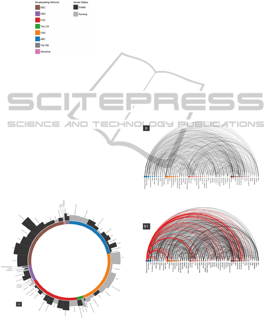
Figure 1: Legend.
Legend: the legend at the center of poster refers to
the visualizations A1, A2, A3 and A4.
Visualization A: the information is displayed on
two levels:
- the internal level consists of a donut-chart
graph that represents the distribution of the audience
aggregated according to the airing network of all the
series. The colored sectors represent the distribution
of audience related to television networks under
investigation. Each color represents a TV network
(see legend);
- the outer layer consists of a sunburst graph in
which the height of each blocks represents the
longevity (or else the number of seasons of each
series), and the width of these indicates the average
number of viewers for each series. Always referring
to the blocks, the dark gray indicates an ended series
while the light gray indicates a still on air series.
Figure 2: Visualization A.
Visualization B. This visualization consists of a
node-arc diagram, a layout already developed by
other authors (Harrison, 2008; Wattemberg, 2002).
The nodes, arranged on the horizontal line, represent
the TV series, size and color of each node indicate,
respectively, the rating (average level of audience)
and the broadcasting network (see legend). The arcs
(links between nodes) indicate human relationships
among series (cast sharing or crew sharing), the
stroke of the arcs changes in proportion to the
number of relationships existing between the two
linked knots.
Interaction. The visualization B is originally
developed for digital media insofar as it provides the
opportunity to interact with the information
displayed, highlighting the links starting from a
single node selected by mouse-over. B1 reproduce a
"snapshot" captured on the interactive version of B
in which a node has been activated by an
hypothetical user. The interactive version of this
visual artifact is available at: http://dsc.
unisa.it/disind/proj/SAR_map.html
Figure 3: Visualization B.
Figure 4: Visualization B1 - Example of interaction.
2.2.4 Design and Production
All the visualizations presented in this work were
made with Protovis (http://vis.stanford.edu/
protovis/), a visualization toolkit for JavaScript
developed by Mike Bostock and Jeff Heer of the
Stanford Visualization Group (http://vis.stanford.
edu/), with help from Vadim Ogievetsky (Bostock,
IVAPP 2011 - International Conference on Information Visualization Theory and Applications
264

Heer, 2009).
We have processed the data following the seven
steps stressed by (Ben Fry, 2008) in his work on
visualization. This path consists of seven stages:
1.Acquire - 2.Parse - 3.Filter - 4.Mine - 5.Represent
- 6. Refine - 7.Interact:
1 - the acquisition phase was carried out
manually writing out the data from the sources cited
above, in some spreadsheets;
2 - the parsing was made using open source
spreadsheet application (Calc, included in
Openoffice Suite);
3 - the filtering stage involved the exclusion of
the negligible samples (in order to this analysis) and
some adjustment on the wrongly reported values;
4 - mining is consisted in reporting data gotten in
the earlier stages in a JavaScript file
5 - in the representation step two different sketch
were generated with Protovis using as data source
the JavaScript file created in 4th step;
6 - the refinement was made by acting directly
on the Protovis html and JavaScript related files by
an open source code editor (notepad++);
7 - the interaction phase was in part already
developed during the 5st stage and, afterwards
completed by uploading the project on the server.
3 CONCLUSIONS
This work is the first step of an ongoing project.
Further developments include the application of this
kind of analysis and visualization to the actual
contents (audio and video) of TV-series and in the
correlation of these semantic data to quantitative
data types and categories.
This analysis reveals some interesting insights.
First we see that the TV series aired on the same
network tend to have a similar number of spectators.
Notwithstanding the difference in the dataset and the
type of analysis, the two visualizations must be
viewed in relation: if visualization A shows how the
universe of the TV series is divided and segmented
according to market and consumption logic, typical
of large television networks, visualization B,
contrariwise, shows a dense set of correlations that
suggest a deeply interconnected world, so the Tv
series universe emerges as united and unified,
regardless of the commercial logic of the single
network. For example, visualization B shows a
dense network of cooperation between the products
aired by different networks.
Another insight revealed by the analysis of
audience datas (visualization A) concerns the
proportion between the number of viewers and
longevity of the series. On large networks free-to-air
longevity is directly linked to the number of
spectators and to its stability over time, instead pay-
TV networks keep on air for a longer time even
niche products (e.g. Dexter, Weeds, Californication).
This new prospective model of analysis could be
the basis for a new cultural analysis (Manovich,
2007) of the television system as an agency of
cultural dissemination.
REFERENCES
Abbruzzese, A. (2001). Forme estetiche e società di
massa: arte e pubblico nell'età del capitalismo.
Venezia: Marsilio.
Bostock, M., Heer, J. (2009). Protovis: A
GraphicalToolkit for Visualization. TVCG’09 15, 6,
1121-1128.
Brancato, S. (2007). Senza fine: immaginario e scrittura
della fiction seriale in Italia. Napoli: Liguori.
Fry, B. (2008). Visualizing data. O'Reilly Media, Inc.
Harrison, C. (2008) Visualizing the Bible. http://www.c
hrisharrison.net/projects/bibleviz.
Keim, D. A., Oelke, D. (2007). Literature fingerprinting:
A new method for visual literary analysis. In IEEE
Symposium on Visual Analytics and Technology
(VAST 2007), pages 115–122.
Latour, B. (2005) Reassembling the Social: An
Introduction to Actor-network-theory. Oxford, Oxford
University Press.
Lotman, Y. (1990). Universe of the Mind: A Semiotic
Theory of Culture. Bloomington, IN: Indiana
University Press.
Manovich, L. (2007). Cultural Analytics: Analysis and
Visualizations of Large Cultural Data Sets,
Unpublished manuscript. Retrieved October 15, 2010
from http://lab.softwarestudies.com
Manovich, L. (2009). How to Follow Global Digital
Cultures, or Cultural Analytics for Beginners. In K.
Becker & F. Stalder (Eds), Deep Search: The Politics
of Search beyond Google, London: Transaction
Publishers.
Manovich, L. (2010). Software culture. Milano: Olivares.
Moretti, F. (2005). Graphs, Maps, Trees. Absract Models
for a Literary History. London and New York: Verso.
Paley, W. B. (2002) TextArc: Showing Word Frequency
and Distribution in Text. Poster presented at IEEE
Symposium on Information Visualization 2002.
Venturini, T. (2008) Introducing the cartography of
controversies in Etnografia e ricerca qualitativa, vol.
3, 2008.
Wattenberg, M. (2002) Arc Diagrams: Visualizing
Structure in Strings, Proceedings of the IEEE
Symposium on Information Visualization, Boston,
MA, October 28-29, 2002 pp. 110-116.
TOWARD A POST-SERIALITY MAP OF TV SERIES - Visualizing the New TV Seriality System with Protovis
265
