
TOP-DOWN DATA ANALYSIS WITH TREEMAPS
Martijn Tennekes and Edwin de Jonge
Statistics Netherlands (CBS), P.0.Box 4481, 6401 CZ Heerlen, The Netherlands
Keywords:
Treemaps, Official statistics.
Abstract:
Statistics Netherlands produces statistics about the economic activity in The Netherlands. These statistics
are based on survey data and administrative sources, such as value added tax (VAT). A recent trend in the
production of official statistics is to use a top-down analysis, which means that analysts first analyze high
level aggregated data, and then zoom in on a more detailed level when necessary. In this paper, we discuss
how treemap visualizations can be used for this top-down approach. We use comparison treemaps and density
treemaps. Finally, we introduce a method to visualize confidence intervals in treemaps.
1 INTRODUCTION
Statistics Netherlands produces statistics about the
economic activity in The Netherlands. These statis-
tics are based on survey data and administrative
sources, such as value added tax (VAT).
Before these data sources can be used to make
proper estimations of the economy in The Nether-
lands, the quality of the data has to determined. For
administrative data sources, a quality framework is
proposed by (Daas et al., 2010). This framework con-
tains topics as usability of the data, delivery issues
and metadata aspects. Those topics do not have to be
applied to survey data that is collected by Statistics
Netherlands, since these surveys are already designed
for the aimed purpose of Statistics Netherlands.
The quality assessment of survey data consists of
the determination of the accuracy and range of the
values, occurrence of missing values, etc. For large
survey datasets it is a time consuming job to check
the individual values of each respondent, and correct
them if necessary. A more efficient way is to use a
top-down approach (Aelen and Smit, 2009); (Hack-
ing, 2009): start with analyzing aggregated data, and
in case of an unexpected outcome, zoom in to the spe-
cific value(s) that cause(s) the unexpected outcome.
Data analysts should determine whether the value(s)
are correct.
In this paper, we discuss how treemap visualisa-
tions can be used to support the top-down approach of
data analysis. A treemap is a space-filling visualiza-
tion of hierarchically structured data. In this paper, we
use the traditional rectangular treemaps, where one
rectangle is proportionally divided into smaller rect-
angles. A recent study of rectangular treemaps car-
ried out by (Kong et al., 2010) indicates that treemaps
are good at visualizing hierarchically structured data.
Treemaps are useful for this top-down approach
for two main reasons. First, data analysts should look
at relative rather than absolute values. Treemaps en-
able data analysts to compare the sizes of the rectan-
gles and focus their attention. Furthermore, treemaps
can be used to show unexpected data by the coloring
of the rectangles.
Second, treemaps depict hierarchically structured
data. Economic data collected by surveys can be
hierarchically structured according to the Statistical
Classification of Economic Activities in the Euro-
pean Community (NACE), a tree-structured classifi-
cation system. For instance, the division of the to-
tal turnover generated by all active enterprises in The
Netherlands among economic sectors can be visual-
ized with a treemap. This enables data analysts to
study data from the highest aggregation level, and if
necessary, zoom in to a specific aggregation group.
We apply the proposed methods to the Structural
Business Statistics (SBS), which is the largest busi-
ness survey of Statistics Netherlands. We imple-
mented the treemaps as a package in , since this
is the leading programming language for statistical
computing. We use the ordered treemap algorithm
(Bederson et al., 2002), and for the coloring of the
rectangles, we use the color scales from (Brewer et al.,
2003). All examples of treemaps in this paper are
based on real, anonymized SBS data from 2006 and
2007.
236
Tennekes M. and de Jonge E..
TOP-DOWN DATA ANALYSIS WITH TREEMAPS.
DOI: 10.5220/0003368102360241
In Proceedings of the International Conference on Imaging Theory and Applications and International Conference on Information Visualization Theory
and Applications (IVAPP-2011), pages 236-241
ISBN: 978-989-8425-46-1
Copyright
c
2011 SCITEPRESS (Science and Technology Publications, Lda.)

This paper is outlined as follows. First, we dis-
cuss the traditional and the new top-down approach
to analyse survey data from SBS. In section 3 we ap-
ply treemaps to compare the data with the data from
previous period. For this purpose, we use a diverg-
ing color scale to indicate increase or decrease. In
section 4 we apply treemaps to analyze the relation-
ship between two variables. For this purpose we use
a sequential color scale to indicate densities. In sec-
tion 5, we propose a method to visualize confidence
intervals in treemaps. Finally, in section 6, we provide
concluding remarks.
2 TOP-DOWN APPROACH
The Structural Business Statistics annually receives
data from approximately 50,000 respondents. This
survey contains all kinds of data from economic en-
terprises. Topics that appear on the questionnaires
are turnover, number of persons employed, total pur-
chases, financial result, et cetera. The goal of the SBS
is to make proper estimations of the total economy in
The Netherlands. Concretely, this means that estima-
tions are made of the main variables on national level.
Before estimations of the economy in The Nether-
lands can be made, the survey data has to be analyzed
and edited. Usually, there are many data errors and
inconsistencies: for instance, when the wages and
salaries are not in line with the number of persons
employed. Other errors that frequently occur are the
so-called thousand errors (respondents fill in the real
value instead of the asked value in thousands), classi-
fication errors and inconsistencies with other sources.
The last mentioned type of error usually boils down
to the comparison of turnover from the survey and
turnover from the value added tax (VAT) register.
Traditionally, data analysts correct the data of the
enterprises one by one using tables and spreadsheets.
For this purpose, they use available data of the pre-
vious year, and data from monthly or quarterly based
statistics. Although this method of data editing and
analysis probably results in good quality data, it is not
very efficient. This is mainly due to the time that data
analysts spend with correcting errors that do not in-
fluence the outcomes (i.e., estimations about the over-
all Dutch economy). For instance, small errors in the
data of small enterprises will certainly not influence
the outcomes.
A better, more efficient way is to use a top-down
approach (Aelen and Smit, 2009). Data analysts that
use this approach start with the analysis of aggregated
data. If an (influential) aggregation group has a suspi-
cious value, data analysts can zoom in on this group
to detect and correct possible errors in the underlying
data that caused the suspicious outcome. In this way,
only the most influential errors are corrected. Errors
that are not influential do not have influence on the
outcomes, and therefore they do not have to be cor-
rected.
This top-down approach is currently being imple-
mented at Statistics Netherlands in several statistic
production processes. For this purpose, a software
tool has been developed by (Hacking, 2009). Stan-
dard methods such as spreadsheets, scatter plots, and
bar charts have been implemented, but other visual-
ization methods can be included as well.
3 COMPARISON TREEMAPS
A treemap is a two-dimensional visualization of hi-
erarchical data. A two-dimensional object that rep-
resents a root variable, is divided among smaller ob-
jects that represent the children, which can be divided
among the grandchildren, et cetera. The objects are
usually rectangles, but they can have other shapes
as well (see (Vliegen et al., 2006) and (Balzer and
Deussen, 2005)). Treemaps have been developed in
the 1990’s with the application of visualizing space
usage on hard disks. For an introduction and historic
overview, we refer to (Shneiderman, 1992).
The rectangles in a treemap are characterized by
two aesthetics: size and color. The sizes are derived
from the proportions of the main variable. The colors
can be used in several ways. In this section, we use
the colors to show the difference of recent data with
the data of the previous period. We refer to treemaps
with this color usage as comparison treemaps.
The main purpose of comparison treemaps is
to detect disruptive or unexpected changes in time.
These changes can be real events, but often are in-
dicators for data errors. Both cases are of interest:
are changes taking place in one industry? Is it a big
or small effect compared to other industries? These
questions can be quickly assessed using comparison
treemaps.
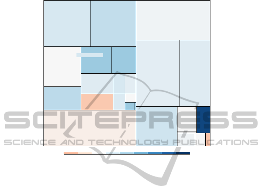
Figure 1 shows the estimated value added (at fac-
tor cost) of all active enterprises in The Netherlands.
The sizes of the rectangles correspond to the total
value added of the different sectors. We use a diver-
gent color scale to indicate the growth (or shrinkage)
with respect to the previous year. White is used for
values that didn’t change, blue for increasing and red
for decreasing values.
Notice that the data visualized in Figure 1 is hi-
erarchically structured. More specifically, the data is
aggregated by the highest two hierarchical levels of
TOP-DOWN DATA ANALYSIS WITH TREEMAPS
237
Growth w.r.t. last year
−20% −10% 0% 10% 20% 30% 40% 50% 60%
Total value added
Chemicals,
chemical products
Coke, petroleum
products, and
nuclear fuel
Electrical and
optical equipment
Food, beverages,
and tobacco
Machinery and
equipment n.e.c.
Metals and
metal products
N.e.c.
Other
non−metallic
mineral
products
Pulp, paper,
publishing,
and printing
Rubber
and
plastic
products
Textiles
and textile
products
Transport
equipment
Wood and
wood
products
Construction
Electricity, gas,
water supply
Health
and
social
work
Hotels and
restaurants
Other
community,
social and
personal
services
Real estate, renting,
business activities
Transportation, storage, communication
Wholesale and retail trade
Manufacturing
Mining and
quarrying
Figure 1: Comparison treemap: colors indicate changes in time.
the NACE classification system of economic activity.
Only the sectors manufacturing and Mining and quar-
rying contain objects (i.e. subsectors) in the second
highest hierarchical level. It is possible to show more
hierarchical levels, but in this example it would create
a visual clutter.
Using this treemap, data analysts can quickly
judge whether the data seem to be correct. If for in-
stance the loss in the subsector electrical and optical
equipment of the sector manufacturing is unexpected,
data analysts can zoom in to this subsector to find out
which enterprise(s) cause(s) this loss.
In our implementation, the number of rectangles
that can be shown is unlimited. However, the text of
each rectangle is only printed if it fits inside this rect-
angle and if it does not conflict too much with text of
higher hierarchically structured rectangles.
4 DENSITY TREEMAPS
In comparison treemaps colors are used to indicate
changes in time. Colors can also be used to visualize
a second variable by mapping the second variable to
a color scale. A more natural way is to use density
colors. In this section, we discuss treemaps in which
density colors are used. We refer to these treemaps as
density treemaps.
A population density map is an example of a the-
matic map using colors. The density colors are deter-
mined by the number of persons per squared kilome-
ter. Each pixel in a density map indicates an area of a
certain fixed size. The darker the color of this pixel,
the more people are living in this area.
In thematic cartography, colorized maps (choro-
pleths) may only be made with densities. The under-
lying reason is that human perception combines the
size of the area of a region with its colorization. Us-
ing a density for colorization results in more truthful
perception of the value for that region. This reasoning
also holds for treemaps.
An example of a density treemap is shown in Fig-
ure 2. The main variable, the estimated number of
persons employed, determines the sizes of the rectan-
gles. The colors indicate how much turnover is gen-
erated per person employed. The darker the color,
the higher this amount. Intuitively, one can under-
stand this treemap by interpreting each pixel as one
person employed. Each person carries a bag of cash
(the turnover per person employed) and the larger this
bag, the darker the color.
By this treemap, analysts can intuitively observe
how turnover is related to the number of persons em-
IVAPP 2011 - International Conference on Information Visualization Theory and Applications
238
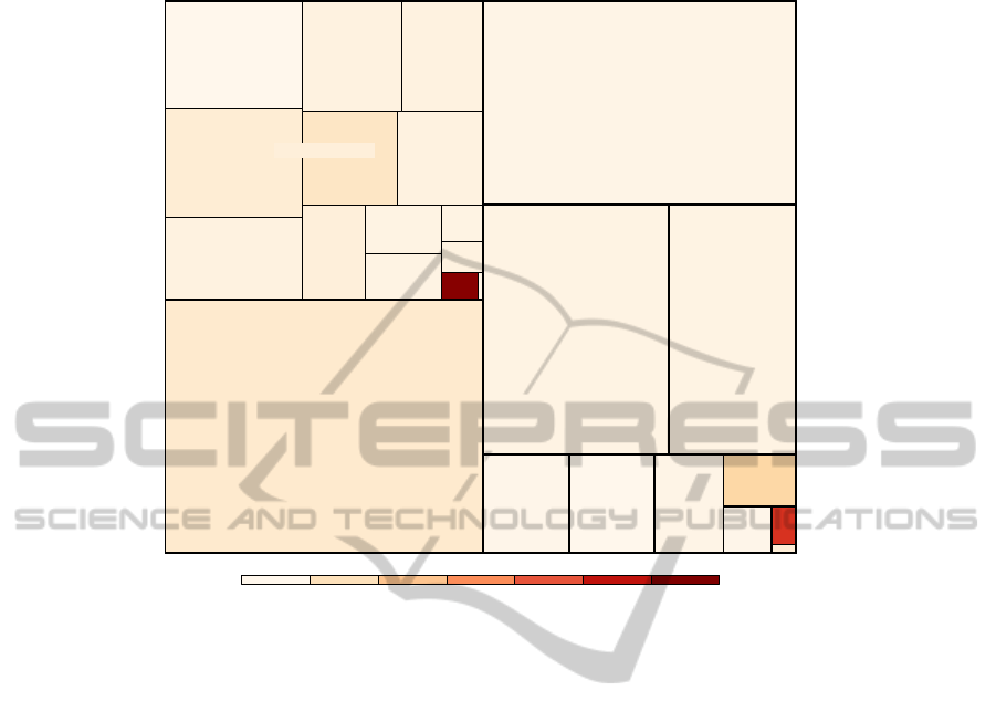
Turnover (in millions) per person employed
0 1 2 3 4 5 6
Number of persons employed
Electrical
and optical
equipment
Food, beverages,
and tobacco
Machinery and
equipment
n.e.c.
Metals and
metal products
N.e.c.
Other non−metallic
mineral products
Pulp, paper,
publishing,
and printing
Rubber and
plastic
products
Textiles
and textile
products
Transport
equipment
Wood and
wood
products
Other
Agriculture
Construction
Electricity,
gas, water
supply
Health and
social work
Hotels and
restaurants
Other
community,
social and
personal
services
Real estate, renting, business activities
Transportation,
storage, communication
Wholesale and retail trade
Manufacturing
Figure 2: Density treemap: colors depict densities.
ployed. For instance, they can easily observe that
although only a very small part of the people em-
ployed are working in the sector manufacturing-coke,
petroleum products, and nuclear fuel (the dark red
rectangle in the middle), these sectors generates rel-
atively much turnover. Some sectors, for instance the
sector health and social work, generate relatively less
turnover.
The ‘inverse’ of this treemap is shown in Fig-
ure 3. Here, the sizes are determined by the estimated
turnover, and the colors indicate how many persons
are employed per one million euro of turnover. Each
pixel in this treemap can be seen as a fixed amount
of turnover, and the color of each pixel can be inter-
preted as how many persons employed are needed to
generate this amount of turnover.
Observe that the roles of the sectors health and
social work and manufacturing-coke, petroleum prod-
ucts, and nuclear fuel are interchanged. Which of the
two opposite treemaps should preferably be used, de-
pends on the objective of the analysis.
Many other quantitative variables can be intu-
itively visualized by density treemaps, for instance
the number of persons employed versus the person-
nel costs.
Data analysts can use density treemaps to study
the relationship between two variables. With knowl-
edge and experience about the data, they are able to
judge the correctness of the data. Further, they can
compare density treemaps with those of the previous
period. If a rectangle looks suspicious, they can zoom
in to find out whether the underlying data is current
but unexpected, or contains errors that can be fixed.
5 VISUALIZING CONFIDENCE
INTERVALS
The visualized data are estimations for the popula-
tion of active Dutch enterprises. This population con-
tains roughly 800,000 enterprises. Since the estima-
tions are based on response data from enterprises, it
is very important to analyse the confidence intervals.
An estimation with a very narrow confidence interval
is more reliable than an estimation with a very wide
confidence interval.
We plot the lower and upper bound of a confidence
interval as two dashed rectangles. This is illustrated in
Figure 4. We decided to plot the confidence rectangles
of only one estimation rectangle (that is, the selected
one) at a time, since plotting the confidence of all es-
TOP-DOWN DATA ANALYSIS WITH TREEMAPS
239
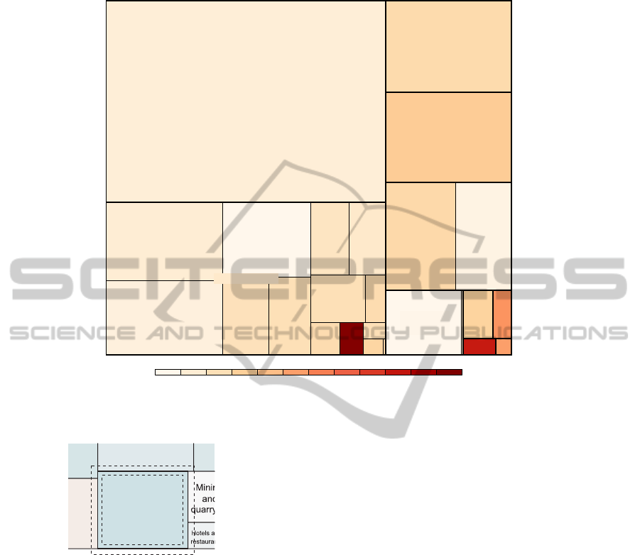
Number of persons employed per one million euro turnover
0 2 4 6 8 10 12 14 16 18 20 22
Turnover
Chemicals,
chemical products
Coke, petroleum
products, and
nuclear fuel
Electrical
and
optical
equipment
Food, beverages,
and tobacco
Machinery
and
equipment
n.e.c.
Metals and
metal
products
N.e.c.
Other
non−metallic
mineral
products
Pulp, paper,
publishing,
and printing
Rubber
and
plastic
products
Textiles
and textile
products
Transport
equipment
Construction
Electricity,
gas, water
supply
Health and
social work
Other
community,
social and
personal
services
Real estate, renting,
business activities
Transportation,
storage, communication
Wholesale and retail trade
Manufacturing
Mining and
quarrying
Figure 3: The ‘inverse’ density treemap.
Electricity, gas,
water supply
Figure 4: Visualization of a confidence interval.
timation rectangles results in a visual clutter.
6 CONCLUSIONS AND FUTURE
WORK
In this paper, we applied treemaps to the analy-
sis of business statistics data. We applied compari-
son treemaps to detect changes in time, and density
treemaps to study the relationship between two vari-
ables. Further, we proposed a method to visualize
confidence intervals.
The top-down approach for data analysis is in-
creasingly used at Official Statistics. Besides tradi-
tional visualization methods such as scatter plots and
bar charts, treemaps are, in our opinion, very useful
for this purpose. Our proposed treemap methods can
be applied to the analysis of business statistics, but
also to the analysis of other statistics where a top-
down approach is used.
For future research, we would like to further de-
velop our methods, especially regarding interactivity.
Moreover, we would like to set up an in-depth case
study of data editing to evaluate our proposed meth-
ods. We would like to find out whether our proposed
methods lead to more efficient data editing, while pre-
serving or improving the quality of the edited data.
REFERENCES
Aelen, F. and Smit, R. (2009). Towards an efficient data
editing strategy for economic statistics at statistics
netherlands. European Establishment Statistics Work-
shop.
Balzer, M. and Deussen, O. (2005). Voronoi Treemaps. In
Proceedings of IEEE Symposium on Information Vi-
sualization 2005, pages 49–56.
Bederson, B. B., Shneiderman, B., and Wattenberg, M.
(2002). Ordered and quantum treemaps: Making ef-
fective use of 2D space to display hierarchies. ACM
Trans. Graph., 21(4):833–854.
IVAPP 2011 - International Conference on Information Visualization Theory and Applications
240

Brewer, C. A., Hatchard, G. W., and Harrower, M. A.
(2003). Colorbrewer in print: A catalog of color
schemes for maps. Cartography and Geographic In-
formation Science, 1:5–32.
Daas, P., Ossen, S., and Tennekes, M. (2010). Determi-
nation of administrative data quality: Recent results
and new developments. In Proceedings of Q2010 Eu-
ropean Conference on Quality in Official Statistics.
Statistics Finland and Eurostat.
Hacking, W. (2009). Macro-selection and micro-editing: a
prototype. In IBUC 2009 12
th
International Blaise
Users Conference, pages 118–125.
Kong, N., Heer, J., and Argrawala, M. (2010). Perceptual
guidelines for creating rectangular treemaps. IEEE
Transactions on Visualization and Computer Graph-
ics, 16(6):990–998.
Shneiderman, B. (1992). Tree visualization with treemaps.
a 2d space-filling approach. ACM Trans. Graph.,
11(1):92–99.
Vliegen, R., Wijk, J. v., and Linden, E. J. v. d. (2006). Visu-
alizing business data with generalized treemaps. IEEE
Transactions on Visualization and Computer Graph-
ics, 12(5):789–796.
TOP-DOWN DATA ANALYSIS WITH TREEMAPS
241
