
TOWARD AUTOMATIC GENERATION OF SPARQL RESULT
SET VISUALIZATIONS
A Use Case in Service Monitoring
Marcello Leida
1
, Du Xiaofeng
2
, Paul Taylor
3
and Basim Majeed
1
1
EBTIC (Etisalat BT Innovation Center), Khalifa University, P.O. Box 127788, Abu Dhabi, U.A.E.
2
School of Computer Science, University of Birmingham, Birmingham, U.K.
3
BT Innovate & Design, Adastral Park, Martlesham Heath, Ipswich, U.K.
Keywords:
Data visualization, Ontologies, RDF, SPARQL, Rules, Logic reasoning, Service monitoring.
Abstract:
The problem of representing RDF data using charts, dashboards, maps and so on has become pressing, in
particular to prove the value of the Semantic Web to enhance the analysis of business data. State of the art
solutions focus on mapping query results to a specific chart type or view and then manually writing the pro-
cedure that creates the final dashboard, but whenever a different visualization model is required, the mapping
process needs to be repeated. In this paper we propose a semi-automatic approach that generates various charts
from SPARQL queries over data represented as RDF graphs, we introduce and describe the generic approach
and present a use case scenario in the context of service monitoring.
1 INTRODUCTION
The idea of the web as a huge knowledge base, com-
posed of highly interconnected graphs, where arcs
and nodes have their well-defined, machine under-
standable semantics is indeed extremely appealing
and the growing interest around projects like Linked
Open Data (LOD)
1
confirms this trend.
Enterprises have sensed the potential improve-
ment in their Business Intelligence (BI) capabilities
that the information in the Web could leverage: the
use of virtually infinite information in the web that
can be coupled with internal resources in order to
improve the quality of analytical and reporting tools.
The key challenge is how to present the information
in a format that is understandable, and at an appropri-
ate level of granularity to identify benefits and to in-
form strategic, tactical and operational decisions. Put
simply, presenting the information in the manner that
makes it the most useful for the target audience.
Ideally, a BI system should be able to take visu-
alization requests and then generate appropriate dash-
boards on demand.
In this paper, we propose an ontology-based,
semantic-aware, data annotation and visualization
method to produce charts, diagrams and graphs from
1
http://linkeddata.org/
a SPARQL query. As use case we apply our method to
produce dynamic dashboards concerned with Service
Level Agreements (SLAs). Additional information is
added to the query and to the visualization libraries in
order to automatically or semi-automatically (in case
more than one choice is possible) associate the appro-
priate visualizations to query results.
The paper is structured as follows: Section 2
presents the related work on the field of SPARQL
query visualization. Section 3 is the main section of
the paper, where our approach is presented. Section
4 presents an application of our technique to visualiz-
ing Service Monitoring information. The paper con-
cludes with Section 5 where final considerations are
presented together with the future directions.
2 RELATED WORK
Dynamic visualization of information is a very broad
problem: we discuss the problem in the field of BI,
however our approach is suitable for the visualization
of SPARQL queries in any context.
Many solutions based on graphs, trees, tree maps,
crop circles and similar are presented in detail in a
survey (Katifori et al., 2007) which extensively de-
scribes implementations and different visualization
181
Leida M., Xiaofeng D., Taylor P. and Majeed B..
TOWARD AUTOMATIC GENERATION OF SPARQL RESULT SET VISUALIZATIONS - A Use Case in Service Monitoring.
DOI: 10.5220/0003487701810186
In Proceedings of the International Conference on e-Business (ICE-B-2011), pages 181-186
ISBN: 978-989-8425-70-6
Copyright
c
2011 SCITEPRESS (Science and Technology Publications, Lda.)
techniques used to visualize RDF graphs. The prob-
lem with these techniques is that they are oriented to-
wards a structural visualization of the graph and they
have no practical utility in a BI environment, where
the user expects to work with dashboards, charts and
tables. As proposed in (Leida et al., 2010), there is a
need for more sophisticated methods for visualizing
SPARQL query result sets, in order to fully utilize the
advantages of RDF data representation, especially its
flexibility.
The only recent approach, which follows the re-
search direction indicated by (Leida et al., 2010)
is SPARQL Web Page (SWP) (Knublauch, 2010a).
SWP is an RDF-based framework used to describe
user interfaces for rendering semantic web data.
It links RDF resources, extracted using SPARQL
queries, with user interface descriptions that can be
rendered as HTML. Together with its extension li-
brary UISPIN Charts (Knublauch, 2010b), SWP al-
lows developers to bind the results of a SPARQL
query into a set of a charts from Google Visualiza-
tion API
2
. SWP is an important step toward the user-
friendly presentation of Semantic Web data, espe-
cially in the field of SPARQL queries, where there is
little previous work. Howeverone of the major limita-
tions of SWP is that requires specific code to be writ-
ten to generate and display the desired chart. There is
not an automatic or semi-automatic procedure to infer
the most suitable chart from the query.
In Section 3 we present a system where for each
SPARQL query, a set of suitable charts are generated
automatically for the user to choose from.
3 AUTOMATIC APPROACH TO
VISUALIZATION OF SPARQL
QUERY RESULTS
In this section, we propose a method that is able to
automatically infer the type of the results returned by
a query in order to associate it with an appropriate
visualization method for that specific result set.
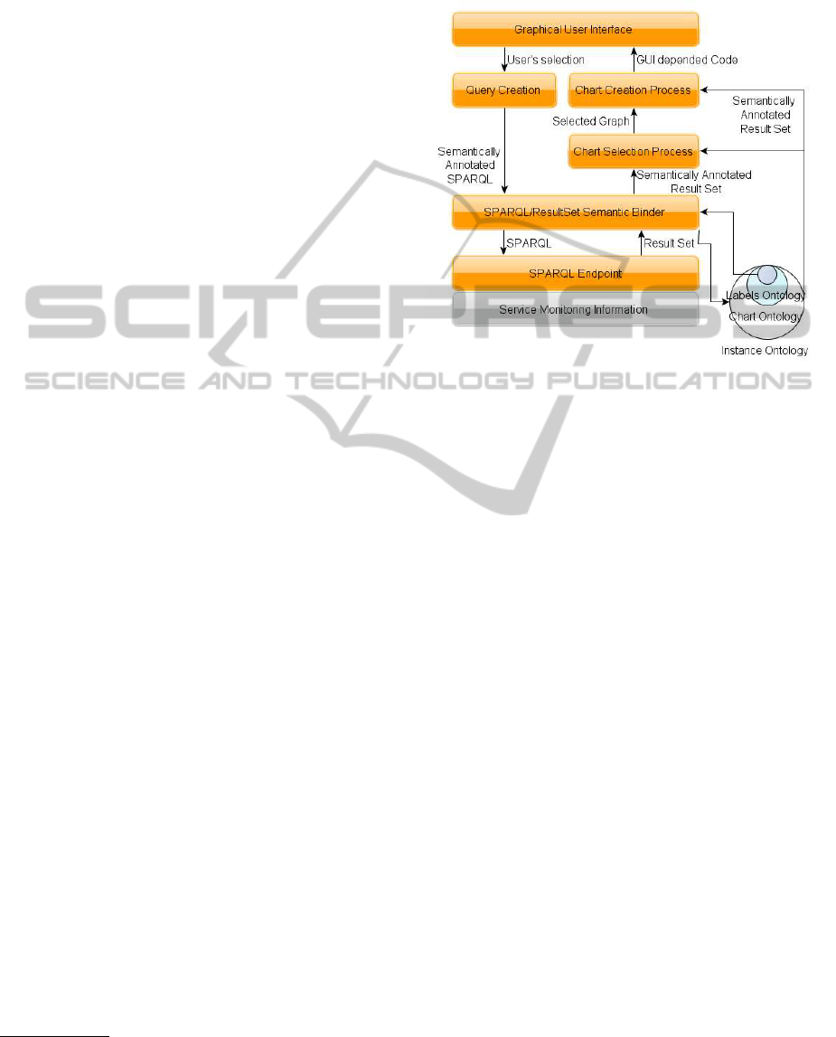
The overall process is illustrated in Figure 1: the
user, by interacting with the dashboard will generate
a SPARQL query that will be analyzed and semanti-
cally annotated with information related to the types
of the variables in the result set. This information is
then used in an inference process which exploits these
annotations in order to select a visualization method
that suits the given result set. Once the visualization
method has been selected, a server-side (application
dependent)process will use the informationgenerated
2
http://code.google.com/apis/charttools/index.html
in the previous steps (SPARQL result set and the vi-
sualization method) in order to create the final chart
for the user.
Figure 1: The proposed Chart Generation process flow.
3.1 Label Ontology
In order to automatically infer the type of the elements
returned by a SPARQL query we need to provide a se-
mantic description the result set returned by the query.
This semantic description is defined as an ontology
(the Label Ontology in Figure 1), which provides a
semantically rich description of the variables in the
query. The Label Ontology is a hierarchical model
that has a top concept called
Label
, which identifies
the most generic type of variable. The other concepts
extend and specialize the
Label
concept: therefore
we have
String
,
Data
,
Number
,
Currency
,
Country
,
Location
concepts.
In the fully automated case a matching function
is used to analyze the result set and associate the vari-
ables with the appropriate concept from the Label On-
tology. For example, if a regular expression was as-
sociated with each Label type, the matching function
could link the variables that match these regular ex-
pressions with the related Label type.
3.2 Chart Ontology
After the matching process we describe now the Chart
Ontology, which defines the core of our approach. It
contains a concept
ResultSet
with a {
1:n
} relation
(called
elements
) with the concept
Label
(and all its
sub concepts) from the Label Ontology.
The concept
ResultSet
is linked with the con-
cept
VisualizationMethod
from the Chart Ontol-
ICE-B 2011 - International Conference on e-Business
182

ogy, which has several sub-concepts defining different
types of charts:
BarChart
,
PieChart
,
LineChart
,
Scatter
,
Map
,
TimeLine
; with attributes that define
specific parameters for the visualization library used
(Google Visualization API, Yahoo UI Charts
3
or Ex-
ibit
4
).
The main element of this ontology is the
visualizationCode
property associated with each
VisualizationMethod
. This property is extremely
important because it contains the code template that
our system will use to generate the final chart. The
content of this property depends on the chosen li-
brary; as for example, in case of Google Visualization
API, the value of
visualizationCode
for a vertical
bar chart will be the template of a JavaScript function
as shown in Table 1.
google.load(’visualization’, ’1’,
{packages: [’corechart’]});
function drawVisualization() {
var data = new google.visualization.DataTable();
var raw_data = [%{Start_Repeat}%[%{Label1.Value}%,
%{Number.Value}%]%{End_Repeat}%];
var label= [%{Label2.Value}%];
%{Start_Repeat}%
data.addColumn(%{Label1.Type}%,%{Label1.Value}%);
%{End_Repeat}%
for (var i = 0; i < raw_data.length; ++i) {
data.addColumn(%{Number.Type}%,raw_data[i][0]);
}
data.addRows(label.length);
for (var j = 0; j < label.length; ++j) {
data.setValue(j, 0, label [j].toString());
}
for (var i = 0; i < raw_data.length; ++i) {
for (var j = 1; j <
raw_data[i].length; ++j) {
data.setValue(j-1, i+1, raw_data[i][j]);
}}
new google.visualization.BarChart(
document.getElementById(’visualization’)).
draw(data,
{title:’Bar Chart’, width:600, height:400,
vAxis: {title: %{Label1.Name}%},
hAxis: {title: %{Number.Name}%}});}
google.setOnLoadCallback(drawVisualization);
Listing 1: The generalised JavaScript template for a Google
Bar Chart.
As previously introduced, the result set returned
by a SPARQL query is represented, in our process, by
an instance of the concept
ResultSet
and the vari-
ables are represented by the instances of the concept
Label
related to it. The
.Name
and
.Type
proper-
ties of the concept
Label
represent the name of the
variable and the data type respectively. These values
3
http://developer.yahoo.com/yui/3/charts/
4
http://www.simile-widgets.org/exhibit/
are then extracted from the Chart Ontology and re-
placed in the code template. On the other hand, the
.Value
string, is replaced recursively with the val-
ues contained in the result set of the initial SPARQL
query. In case the chart is associated with a result
set that has more than one
Label
element of same
.Type
we use a number in order to distinguish be-
tween them. The elements
%
{
Start Repeat
}
%
and
%
{
End Repeat
}
%
identifies part of code that need to
be replicated every time a value is replaced.
For each type of chart that the visualization li-
brary can generate, an instance of each of the sub con-
cepts of
VisualizationMethod
is created, with the
required parameters set, code template. This is then
stored in the ontology.
3.3 Inference Process
The ontologies discussed so far are defined using
OWL-DL (a subset of the Web Ontology Language
(OWL) (Dean et al., 2004) based on Description Log-
ics) and SWRL (Semantic Web Rule Language) (Hor-
rocks et al., 2004); these two W3C standard defi-
nitions, allow the definition of rules and logic con-
straints for ontologies.
In order to make use of the information stored in
the Label and Chart Ontologies, we use an hybrid so-
lution, mixing logical inference with DL-Safe (Motik
et al., 2005) forward chaining rules. The logical in-
ference process consists of translating the semantics
of the RDF, RDFS (RDF Schema) (Brickley et al.,
2004) and OWL-DL syntax into inferred triples that
can fire rules that otherwise would remain inactive.
For example, the
SubClassOf
predicate used to de-
fine sub concept relations is used to infer that each
instance of the concept
TimeLine
is also an instance
of a
VisualizationMethod
, in the same way an in-
stance of the concept
Country
is also an instance of
the concept
Location
and therefore also an instance
of the concept
Label
.
Using OWL-DL, it is possible to define Equiv-
alent Concepts, which are defined using appropri-
ate logical restrictions. For example, we can define
an equivalent concept
TemporalResultSet
as a sub
concept of
ResultSet
by restricting the types of el-
ements in
ResultSet
to labels representing temporal
information:
TemporalResultSet ≡ ∃elements.Time∧ (1)
≥ 2elements.Label
Fully this means that a temporal result set has at least
one element of type
Time
and at least an additional
element that represents the value at that point in time.
The inference process will be used to re-classify
the existing concept instances into the hierarchy
TOWARD AUTOMATIC GENERATION OF SPARQL RESULT SET VISUALIZATIONS - A Use Case in Service
Monitoring
183

and appropriate equivalent concepts. Once infer-
ence is completed, the rule engine will apply the
SWRL rules, to create instances of the relation
visualizeWith
, which defines which visualization
method should be used to visualize a particular result
set. An example of a rule that generates this kind of
relation will be:
TemporalResultSet(?r) ∧ TimeLine(?t) (2)
→ visualizeWith(?r, ?t)
ResultSet(?r) ∧ PieChart(?v)∧ (3)
elements(?r, ?e) ∧ Percentage(?e)
→ visualizeWith(?r, ?v)
A third ontology, called the Instance Ontology,
which imports the two ontologies described above, is
then created. This contains the instances of the con-
cepts defined in the two imported ontologies. The
instances in the new ontology are defined specifi-
cally for the application environment. Every time a
SPARQL query is executed its result set is associated
with an identifier and stored as a new instance of the
concept
ResultSet
.
Once these rules and equivalent concepts have
been finalized an automatic inference process (e.g.
supported by Pellet reasoner (Parsia and Sirin, 2004))
can be executed on the Instance Ontology. This
will add additional statements regarding the instances
of the ontology, then a rule engine (in our case
we still use Pellet reasoner because it also supports
SWRL rules) applies the rules in order to associate
the
ResultSets
with the possible visualizations.
3.4 Chart Creation Process
Once the instances of the various
ResultSets
have
been associated with one or more instances of
VisualizationMethod
and stored in the Instance
Ontology, this ontology is processed by the chart cre-
ation process (Figure 1) which makes use of existing
graphical libraries to generate the chart for the user
interface.
The first step is to extract the visualization code
(which has been introduced in Section 3.2); this can
be extracted with a SPARQL query on the relation
visualizeWith
.
In the case where more than one visualization
method is returned, the user will have the option to
switch between all the possible charts, once the de-
fault chart is created and displayed. An alternative
will be to create all the charts associated with a result
set or to define a specific selection method to extract
the most meaningful chart.
The second step is to define a process that will
use the visualization code extracted during the pre-
vious step. How to use the code stored in the
visualizationCode
property, it depends on the vi-
sualization library that has been selected, this aspect
relates to the specific implementation of the system
and is therefore extremely flexible. In this approach
we do not want to put any constraint on the technol-
ogy to use: as an example Java, PHP, Ruby can all be
used to process the code template and replace the key-
words between
%
{}
%
and return the final JavaScript
code that can be submitted to the Google Visualiza-
tion API which will then create the selected chart.
4 USE CASE: SERVICE
MONITOR VISUALIZATION
In this section, we discuss how we applied our method
to a web service monitoring application in order to
dynamically visualize monitoring data from different
SLA perspectives.
The function of the monitoring application is to
collect information about web services and store it
into a database for further analysis. However, col-
lecting information is not the ultimate purpose, the
data needs to be processed and analysed in order to
show whether the monitored services are compliant
with pre-agreed SLAs. Previously, the analytical re-
sults were presented using Oracle BI
TM
through dash-
boards. As discussed before, this solution is lacking
in flexibility, especially when the end users want to
see different aspects of an SLA, such as service avail-
ability, response time, and error rate, and those as-
pects cannot be represented using the same diagrams
or charts.
We now apply the newly proposed method to this
scenario to examine how the preexisting situation can
be improved.
4.1 Expose Data to Visualize as RDF
The monitoring data is stored in a relational database.
The system can monitor web services either directly
through SOAP messages or through an Enterprise
Service Bus (ESB), there is a separate table which
stores monitoring data for each method. To generate
the dashboard, we would need to manually construct a
SQL query to collect the required data, and then save
it into Oracle BI.
To apply our proposed method, we first need to
convert the relational data model into a semantic data
model in RDF (Hayes and McBride, 2004) and RDFS
(Brickley et al., 2004). (The RDFS part of the model
ICE-B 2011 - International Conference on e-Business
184
is used to describe the relational data structure. The
RDF part of the model is to describe the records in
each table). This was done using a translator (Sahoo
et al., 2009) such as D2R (Bizer, 2004) to provide
then mapping between the database and RDF.
4.2 Create the Instance Ontology
Once the service monitoring information is acces-
sible through a SPARQL endpoint it is possible to
query the monitoring information using an appropri-
ate SPARQL query.
The query is stored in the Instance Ontology by
defining the set of variables in the
SELECT
declaration
as an instance of the concept
ResultSet
in the Chart
Ontology, with the respective concepts in the Label
Ontology.
In our use case, there are three variables that com-
pose the result set:
serviceEndPoint
,
messageType
and
countMessageType
. By analysing the result set
for each one of the variables by checking the type
of the value returned manually, we generated the in-
stance of
ResultSet
from the Instance Ontology and
all of the instances of related concepts.
The instances are therefore defined as:
ResultSet(ResultSet1), Integer(Number1) (4)
Label(Label1), URI(Label2)
name(Number1, countMessageType)
name(Label1, messageType)
name(Label2, serviceEndPoint)
element(ResultSet1, Number1)
element(ResultSet1, Label1), element(ResultSet1, Label2)
Instances of the
VisualizationMethod
concept
are also defined. We create an instance of the visual-
ization method for each of the chart types (more pre-
cisely for each different configuration), for example:
BarChart(GoogleBarChart1) (5)
visualizationCode(GoogleBarChart1,
’func...);’
)
TimeLine(GoogleTimeLine1)
visualizationCode(GoogleTimeLine1,
’func...);’
)
LineChart(GoogleLineChart1)
visualizationCode(GoogleLineChart1,
’func...);’
)
ScatteredChart(GoogleScattered1)
visualizationCode(GoogleScattered1,
’func...);’
)
Each instance also defines the content of the ad-
ditional properties specific of the selected library,
an an example in the case of Google Chart API
the property
visualizationCode
of the concept
VisualizationMethod
, will contain the template of
the JavaScript code that is required to create the chart
(as an example the templates in Table 1 for the in-
stances
GoogleBarChart1
).
Once the instances of the visualization methods
and results sets concepts have been created and stored
in the Instance Ontology, it is possible to execute the
inference process. As already described in the pre-
vious section this inference process relates instances
of
ResultSet
to
VisualizationMethod
with the
visualizeWith
relation to produce the following:
visualizeWith(ResultSet1, GoogleLineChart1) (6)
visualizeWith(ResultSet2, GoogleBarChart1)
4.3 Generate the Final Charts
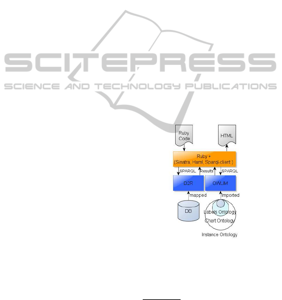
For this case we used Ruby as the enabling technol-
ogy to process the various SPARQL result sets and
generate the final charts.
The stack used in this case is illustrated in Figure
2: it contains a Ruby runtime, including Sinatra, haml
and sparql-client Ruby gems
5
. For SPARQL end-
points we use OWLIM
6
for the three ontologies (La-
bel, Chart and Instance) supporting our system and
D2R
7
to create a virtual RDF-graph of the database.
Figure 2: The set up of the system used in this scenario.
To generate the HMTL page containing the Chart,
the first step is to extract the visualization code from
the
visualizationCode
property. This code is
then processed by the ruby stack described to create
HTML output containing the JavaScript function to
generate the chart.
5
http://rubygems.org/gems
6
http://www.ontotext.com/owlim/
7
http://www.w3.org/2001/sw/wiki/D2RServer
TOWARD AUTOMATIC GENERATION OF SPARQL RESULT SET VISUALIZATIONS - A Use Case in Service
Monitoring
185

The execution of all the code described so far will
generate an HTML page showing the chart in Figure
3, which in our system replaces the chart in the dash-
board.
Figure 3: The Google Bar Chart generated by our system.
The use case described so far is a simple case but
gave us good feedback on the quality of the proposed
system.
In order to have higher degree of flexibility in the
generation of the JavaScript code, and especially in
enhancing the quality of the fully automated chart
generation process we believe that the use of more
modular languages such as Java is a better solution.
We plan to implement a first prototype using Java,
together with Pellet reasoner, Sesame
8
and Apache
Tomcat as server-side technology to generate the re-
quired JavaScript.
5 CONCLUSIONS
In this paper we have presented a promising ap-
proach for the automatic generation of charts from a
SPARQL query. The system exploits inference pro-
cesses in order to generate an appropriate chart that
can be used to visualize the result set returned by a
specific SPARQL query. An application of this ap-
proach in the field of service monitoring has been pre-
sented.
The major benefit of our approach is the automatic
on-the-fly generation of charts without the need for
manual mapping between visualization and data stor-
age layers (as would be required in current BI sys-
tems).
Future work will consider extending the scenario
presented in this paper to the implementation of a
generic framework, which is able to automatically
create charts and dashboards in a generic context.
Additional work will be to capture user interaction
with the chart in order to automatically generate new
SPARQL queries that will consequently lead to new
8
http://www.openrdf.org
views of the data, this future direction will be espe-
cially interesting in the case where the data to analyze
can be linked to an external data such as Linked Data.
Our approach is particularly relevant in that case,
as the queries that can be submitted can not be pre-
dicted at design time because of the high dimensional-
ity and the highly connected nature of the data. This,
in turn, may lead to the visualization of data that ini-
tially was considered irrelevant, which is a situation
that current BI systems can not handle.
REFERENCES
Bizer, C. (2004). D2rq - treating non-rdf databases as virtual
rdf graphs. In In Proceedings of the 3rd International
Semantic Web Conference (ISWC2004.
Brickley, D., Guha, R., and McBride, B. (2004). Rdf vo-
cabulary description language 1.0: Rdf schema. Rec-
ommendation, W3C.
Dean, M., Schreiber, G., Bechhofer, S., van Harmelen, F.,
Hendler, J., Horrocks, I., McGuinness, D. L., Patel-
Schneider, P. F., and Stein, L. A. (2004). Owl web on-
tology language reference. Recommendation, W3C.
Hayes, P. and McBride, B. (2004). Resource description
framework (rdf). Recommendation, W3C.
Horrocks, I., Patel-Schneider, P. F., Boley, H., Tabet, S.,
Grosof, B., and Dean, M. (2004). Swrl: A semantic
web rule language combining owl and ruleml. Mem-
ber submission, W3C.
Katifori, A., Halatsis, C., Lepouras, G., Vassilakis, C.,
and Giannopoulou, E. (2007). Ontology visualization
methods, a survey. ACM Comput. Surv., 39.
Knublauch, H. (2010a). Sparql web pages (swp, aka
uispin). Technical report, TopQuadrant.
Knublauch, H. (2010b). Uispin - charts. Technical report,
TopQuadrant.
Leida, M., Afzal, A., and Majeed, B. (2010). Outlines for
dynamic visualization of semantic web data. In OTM
2010 Workshops, volume 6428 of Lecture Notes in
Computer Science, pages 170–179. Springer Berlin /
Heidelberg.
Motik, B., Sattler, U., and Studer, R. (2005). Query answer-
ing for owl-dl with rules. Web Semant., 3:41–60.
Parsia, B. and Sirin, E. (2004). Pellet: An owl dl rea-
soner. In 3rd International Semantic Web Conference
(ISWC2004).
Sahoo, S. S., Halb, W., Hellmann, S., Idehen, K., Jr, T. T.,
Auer, S., Sequeda, J., and Ezzat, A. (2009). A sur-
vey of current approaches for mapping of relational
databases to rdf.
ICE-B 2011 - International Conference on e-Business
186
