
EVALUATION OF A BUNDLING TECHNIQUE FOR PARALLEL
COORDINATES
Julian Heinrich
1
, Yuan Luo
2
, Arthur E. Kirkpatrick
2
and Daniel Weiskopf
1
1
VISUS, University of Stuttgart, Stuttgart, Germany
2
GrUVi (Graphics, Usability, and Visualization) Lab, School of Computing Science, Simon Fraser University,
Burnaby, Canada
Keywords:
Visualization Techniques, Parallel Coordinates, Cluster Visualization, Evaluation.
Abstract:
We present a controlled user study evaluating the effectiveness of bundled curve representations in parallel-
coordinates plots. Replacing the traditional C
0
polygonal lines by C
1
continuous piecewise B´ezier curves
makes it easier to visually trace data points through each coordinate axis. The resulting B´ezier curves can then
be bundled to visualize data with given cluster structures. Our results show that: 1) compared to polygonal
lines, bundled curves are equally capable of revealing correlations between neighboring data attributes; 2) the
geometric cues of bundles can be effective in displaying cluster information.
1 INTRODUCTION
Parallel coordinates are a popular technique for trans-
forming multidimensional data into a 2D image (In-
selberg, 1985; Inselberg and Dimsdale, 1990). The
m-dimensional data items are represented as 2D lines
crossing m parallel axes, each axis corresponding
to one dimension of the original data. This tech-
nique has been incorporated into several data visual-
ization and analysis tools, including XLSTAT
1
and
GGobi (Cook and Swayne, 2003). However, expe-
rience has shown several problems with the tradi-
tional parallel-coordinates technique. First, the zig-
zagging polygonal lines (or polylines, for short) used
for data representation are only C
0
continuous. They
generally lose visual continuation across the parallel-
coordinates axes, making it difficult to follow lines
that share a common point along an axis—this is
known as the cross-over problem. Second, when two
or more data points havethe same or similar values for
a subset of the attributes, the corresponding polylines
may overlap and clutter the visualization. This artifact
may occur even for medium-sized datasets with a few
thousand points. Finally, clusters and related internal
structure of the data are not represented in the geom-
etry of the plot, except for implicit visual clustering
based on proximity of polylines at the axes.
Several solutions have been proposed for these pr-
1
http://www.xlstat.com
oblems. The cross-over problem has been mitigated
by replacing polylines with smooth curves (Theisel,
2000; Graham and Kennedy, 2003; Moustafa and
Wegman, 2006; Yuan et al., 2009; Holten and van
Wijk, 2010) that interpolate the original values at the
axes. Cluster perception in parallel coordinates has
been facilitated using edge bundling (Holten, 2006;
Zhou et al., 2008; McDonnell and Mueller, 2008;
Heinrich et al., 2011b), where curves of the same
cluster are grouped geometrically. In contrast to
the traditional color-coding of clusters, the resulting
curve bundles also reduce visual clutter by freeing up
plot space to provide an overview of the data.
While variants of polylines and curves have been
evaluated (see Table 1), no prior study evaluated the
joint effect of these two features on the perception of
clusters and correlations. To fill this gap, we con-
ducted a controlled user study to compare the effec-
tiveness of polylines and curve bundling with respect
to cluster perception and correlation judgment.
The study showed that curve bundling maintains
the users’ ability to recognize correlation between
data attributes, a traditional strength of parallel co-
ordinates. Furthermore, for revealing clusters to the
user, curve bundling is at least on par with color cod-
ing, the traditional way of representing clusters. Fig-
ure 1 compares the polyline version of parallel coor-
dinates with a version using bundled curves.
594
Heinrich J., Luo Y., E. Kirkpatrick A. and Weiskopf D..
EVALUATION OF A BUNDLING TECHNIQUE FOR PARALLEL COORDINATES.
DOI: 10.5220/0003821205940602
In Proceedings of the International Conference on Computer Graphics Theory and Applications (IVAPP-2012), pages 594-602
ISBN: 978-989-8565-02-0
Copyright
c
2012 SCITEPRESS (Science and Technology Publications, Lda.)
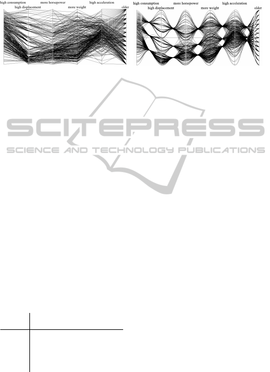
(a) (b)
Figure 1: The cars (Ramos and Donoho, 1983) data displayed as (a) polyline and (b) and bundled plots (Heinrich et al.,
2011b). Data are clustered by number of engine cylinders (4, 6, or 8). In the bundled plot, bundling was β = 0.95 and
cluster centroids were plotted at their projected values on the bundle axis. The adjectives above each value axis indicate the
interpretation of values closer to the axis top.
2 RELATED WORK
In parallel-coordinates visualization, points in m-
dimensional space are represented as lines crossing
m parallel axes in 2D, so there is no inherent limit on
dimensionality. The process of discovering multivari-
ate relations in a dataset is transformed to a 2D pat-
tern recognition problem. Parallel coordinates were
introduced by Inselberg (Inselberg, 1985; Inselberg
and Dimsdale, 1990; Inselberg, 2009), and extended
by Wegman (Wegman, 1990).
Traditional parallel coordinates suffer from sev-
eral problems, especially for large datasets. One is-
sue is the potentially heavy over-plotting of lines, re-
sulting in visual clutter. A proposed remedy is to
replace fully opaque, rasterized lines by a density
representation of the plotted lines (Miller and Weg-
man, 1991; Wegman and Luo, 1997). This idea has
been adopted for frequency plots (Rodrigues et al.,
2003), gray-scale mappings in density plots (Artero
et al., 2004), and high-precision textures in combina-
tion with transfer functions (Johansson et al., 2005).
For continuous data, line density can also be com-
puted analytically using an appropriate reconstruction
kernel (Heinrich and Weiskopf, 2009) or by splat-
ting (Heinrich et al., 2011a).
Table 1: Evaluations of parallel coordinates.
Correlation Cluster
Identification
Polylines (Li et al., 2010) (Holten and van
Wijk, 2010)
Curves
This paper (Holten and van
Wijk, 2010)
Bundling
This paper This paper
The cross-over problem for polylines arises when
two or more lines share common points on an axis.
Several authors have solved this by using smooth
curves. Theisel (Theisel, 2000) proposes a cubic
B-splines model, while Graham and Kennedy (Gra-
ham and Kennedy, 2003) choose a quadratic or cu-
bic curve for a particular section depending on the
shape formed by that section and the two adjacent
sections. Moustafa and Wegman (Moustafa and Weg-
man, 2006) build smooth curves by replacing the
piecewise linear interpolation of polylines by inter-
polation via higher-order sinusoidal functions. Oth-
ers (Holten and van Wijk, 2010; Heinrich et al.,
2011b) add a parameter to the spline-based mod-
els (Graham and Kennedy, 2003; Yuan et al., 2009)
to control the amount of smoothing. All these tech-
niques guarantee curve smoothness, alleviating the
cross-over problem by giving different trajectories to
points that intersect at an axis. This allows the an-
alyst to reliably connect the curves on either side of
the axis.
Visual clutter can also be reduced by prepro-
cessing the data with a clustering algorithm (Jain
and Dubes, 1988). The clusters can then be dis-
played by extensions of parallel coordinates (Fua
et al., 1999; Wegman and Luo, 1997; Berthold
and Hall, 2003). Whereas early clustering work
focused on reducing the amount of displayed data
by displaying only markers of entire clusters, re-
cent work has instead focused on displaying all the
data and revealing details of the internal structure of
clusters. Johansson et al. (Johansson et al., 2005)
combine specific transfer functions for density plots
with feature animation, showing both an overview
of the data and the inner structure of its clusters.
Novotny and Hauser (Novotny and Hauser, 2006)
extend such cluster-based parallel-coordinates visu-
EVALUATION OF A BUNDLING TECHNIQUE FOR PARALLEL COORDINATES
595

alization to additionally display outliers and trends.
Zhou et al. (Zhou et al., 2009) detect clusters by splat-
ting lines and applying a Gaussian weight to proxi-
mate lines.
Other approaches use geometric proximityof lines
or curves to represent clusters in parallel coordi-
nates (Zhou et al., 2008; McDonnell and Mueller,
2008; Heinrich et al., 2011b). Zhou et al. (Zhou
et al., 2008) deform traditional polylines by apply-
ing attracting and repelling forces. By construction,
their method is based on proximity between the ini-
tial polylines and, thus, achieves an implicit, yet fixed
type of clustering. Their method emphasizes the
proximity of the polylines, rather than showing exter-
nally provided clusters. Moreover, their visual clus-
tering is based on a piecewise model: the vicinity
of polylines between two neighboring data axes (or
dimensions) of the parallel-coordinates plot governs
the visual clustering between those two data dimen-
sions; other pairs of neighboring data dimensions are
clustered independently. Therefore, high-dimensional
data is not clustered on a per-data-point level, but
based on pairs of data dimensions. The resulting vi-
sual clustering is thus sensitive to the order of data
dimensions in the parallel-coordinates plot.
Holten introduced edge bundling of tree lay-
outs (Holten, 2006). McDonnell and Mueller (Mc-
Donnell and Mueller, 2008) built on this idea, devel-
oping a geometric, spline-based approach to comput-
ing visual bundling. Their technique targets illustra-
tive parallel-coordinate plots, using visual simplifica-
tion and non-photorealistic rendering techniques such
as silhouette lines, halos, and shadows. Details of
the internal structure of data points within clusters as
well as correlation are not a focus of their research.
Moreover, cluster membership information is based
on color coding.
For the user study conducted in this paper, we use
a complementary, geometry-based visualization of
clusters that we describe in a technical report (Hein-
rich et al., 2011b). This method improves upon
the proximity-based parallel-coordinates techniques
of McDonnell and Mueller (McDonnell and Mueller,
2008) and Zhou et al. (Zhou et al., 2008) in the fol-
lowing ways. First, it makes better use of the avail-
able screen space by re-distributing visually clustered
curves in a uniform way. Therefore, there is much
less overlap in the important parts of the plots—in the
regions between two data axes, where users identify
correlation of data points. In addition, overdraw and
cluttering issues are reduced by this redistribution.
Second, C
1
continuity of the curved lines across data
axes is guaranteed, addressing the cross-over prob-
lem. For a detailed description of the algorithm and
its parameters to control the visualization process, we
refer to the paper by Heinrich et al. (Heinrich et al.,
2011b).
There have been few previous papers providing
user studies on parallel coordinates. Li et al. (Li et al.,
2010) compare polyline parallel coordinates and scat-
terplots. Lanzenberger et al. (Lanzenberger et al.,
2005) investigate the effectiveness of stardinates and
parallel-coordinates plots applied to an example data
set with psychotherapeuticdata. Henley et al. (Henley
et al., 2007) evaluate scatterplots and parallel coordi-
nates for the task of comparing genomic sequences.
A tiled parallel-coordinates technique for visualizing
time-varying multichannel EEG data is studied by ten
Caat and Roerdink (Caat and Maurits, 2007). Jo-
hansson et al. (Johansson et al., 2008) investigate the
amount of noise that may be present in parallel coor-
dinates such that patterns can still be received. Holten
and van Wijk (Holten and van Wijk, 2010) evaluate
cluster identification performance for curved and an-
imated parallel coordinates, among others. While Li
and van Wijk (Li et al., 2010) examined the visualiza-
tion of correlation for linear parallel coordinates and
Holten and van Wijk (Holten and van Wijk, 2010) the
visualization of clusters, our user study aims at eval-
uating the impact of bundling and curves to the judg-
ment of correlation and the detection of clusters.
Finally, there seems to be no literature concerning
the evaluation of bundling at all.
3 USER STUDY
To comparethe effectiveness of polylines and bundled
curves, we performed a user study. Observers were
asked to estimate (a) correlations and (b) the num-
ber of clusters, in datasets represented using polylines
and bundled curves. We expected that bundled curves
would support correlation estimation at least as well
as polylines do, and that bundled curves would sup-
port superior estimation of the number of clusters.
3.1 Overview
In designing the experiment, we were subject to the
constraint that we needed to estimate performance by
analysts skilled both in an underlying domain and at
interpreting parallel coordinates a given type, polyline
or bundled curves. Such users are not merely difficult
to find, for the case of bundled curves they do not yet
exist. We addressed this constraint with an approach
often used for visualization user studies. Specifically
we:
IVAPP 2012 - International Conference on Information Visualization Theory and Applications
596

1. Recruited participants who had little to no experi-
ence with either form of parallel coordinates. We
gave the participants a short tutorial on strategies
for estimating correlationsin parallel plots of each
style. This created a pool of participants equally
skilled at reading both styles, somewhere between
novice and intermediate skill.
2. Used data sets generated solely according to spec-
ified probability distributions, with no underlying
semantics. This ensured that no participant would
be able to apply domain knowledge to interpret
the plots.
We used accuracy as the sole dependent measure
and did not record time. We argue that this untimed
task matches the context in which data analysts typ-
ically use parallel coordinates, taking enough time
to consider their data in depth. This choice empha-
sized that participants take as long as necessary to
make their best estimate. It also minimized fatigue by
allowing participants to rest whenever they wished,
without regard for their score. This choice also elim-
inated the potential confound of different participants
adopting different speed-accuracy tradeoffs, because
accuracy was uniformly emphasized.
Given the limited experience of the participants
with the two styles of plot, we do not believe that
timing data would provide any useful comparison be-
tween the styles. Comparative timing data would
only be informative with testers who were well-
experienced with the methods, working on data sets
for which they had domain expertise.
The curve styles were compared for two tasks, es-
timating correlation and estimating number of clus-
ters. The tasks were performed in a fixed order for
every participant, with participants estimating corre-
lation first. This design permits more direct interpre-
tation of the results because all participants performed
each task with a fixed level of prior experience. In
particular, their experience reading plots in the corre-
lation task would carry over to enhance their perfor-
mance in the cluster estimation task.
By contrast, a design that counterbalanced task or-
der would have split participants’ prior experience, in-
creasing the variance and making the results harder to
interpret. Given that a counterbalanced design would
only protect against the case that doing the correla-
tion estimate first would differentially advantage one
curve style, a prospect we consider highly unlikely,
we chose a fixed task order for its more straightfor-
ward interpretation.
3.2 Design
The study design was single-factor,two-level, and wi-
thin-subjects. Observers viewed two data series. The
first was always the correlation estimation series, the
second the cluster estimation series. Within each se-
ries, line style was a blocked factor, with all trials per-
formed first in one line style, then the other. Order
of the two line styles was counterbalanced across par-
ticipants, with participants randomly assigned to the
order. Dependent measures, computed separately for
each series, were the Pearson correlation r between
the actual dataset correlation and the correlation es-
timated by participants, and the Fleiss κ measure of
agreement amongst participants.
The visualization used for the study requires two
parameters to be set. The parameter α defines the
smoothness of a curve while the bundling strength β
controls the extent to which a curve is pulled towards
the centroid of its cluster (Heinrich et al., 2011b). Be-
fore running the full study, we ran a pilot study with
five participants to determine the best values of these
parameters. The values β = 0.8 and α = 1/6 achieved
the best balance of correlation detection and cluster
visualization. These values were used for the bundled
plots in both series of trials.
3.2.1 Participants
A convenience sample of 14 participants (9 men,
5 women, ages 23–37) was recruited from graduate
students in computing science and engineering sci-
ence at Simon Fraser University. Of these 14, 2 had
previously used polyline parallel coordinates, 8 had
experience with some form of information visualiza-
tion but had never used parallel coordinates, and 4
had never used any visualization software. Volunteers
were paid CDN$20.
3.2.2 Procedure for the Session
Participants first answered a brief series of questions
assessing their level of experience with information
visualization and computers in general. They were
next tested for any color deficiencies using a Web-
based test
2
. All 14 participants had acceptable color
vision. They next read a tutorial on the basic prin-
ciples of parallel coordinates and their instantiation
in polylines and bundled curves. The tutorial defined
correlation and gave examples of positive and nega-
tive correlation using both line types.
Participants then began the first series of trials, in
which they estimated correlations. Immediately after
completing that series, participants began the second
series, in which they estimated the number of clusters
2
http://www.healthcommunities.com/color-vision-
deficiency/color-blindness-test.shtml
EVALUATION OF A BUNDLING TECHNIQUE FOR PARALLEL COORDINATES
597

in plots. After completing the second series, they in-
dicated which line style they preferred and answered
a short list of open-ended questions about their expe-
rience during the study.
Participants were allowed to take as long as they
wished on each trial. Total time to complete the ses-
sion varied widely, from 50 to 110 minutes. Most par-
ticipants completed the study in less than 90 minutes.
3.3 First Series: Estimating
Correlations
In the correlation estimation trials, participants
viewed a series of datasets in 2D parallel coordinates
(i.e., with two data dimensions and two main parallel-
coordinates axes), plotted in either polylines or bun-
dled curves. For each plot, the user was asked to
categorize the correlation as “strong negative correla-
tion”, “negative correlation”, “no correlation”, “posi-
tive correlation”, or “strong positive correlation”.
3.3.1 Procedure
Before starting each line style, participants read a
short tutorial on estimating correlations in that style.
For polylines, the tutorial suggested looking for
whether the lines crossed or not, the distribution of
line crossings (whether only in the middle or dis-
tributed throughout the range), and the overall shape
of the plot. For bundled curves, the tutorial suggested
looking at the width of the middle band and the over-
all shape of the plot. For each style, the tutorial pre-
sented example plots of all seven degrees of correla-
tion. To map the seven values of actual correlation to
the five categories of user response, the tutorial rec-
ommended reporting z values of −1.0 and −0.5 as
both “negatively correlated”, and similarly for +0.5
and +1.0.
Participants began each line style with a training
session. The training session presented one plot of
each correlation level in the given style. Participants
estimated the correlation and were then told which
answers would have been appropriate for the dataset.
Since there were seven levels of correlation but only
five levels of user response, two possible answers
were suggested for every example. After estimating
all seven practice correlations, a page was displayed
reminding participants of the strategies for estimating
correlation for this plot style. Users pressed a button
to start the first experimental trial.
Experimental trials had the same interface as the
practice trials, but provided no feedback about the ac-
tual correlation. When the participant was satisfied
with their estimate for the current trial, they pressed a
button to start the next.
3.3.2 Trial Data
Three groups of seven datasets were generated, each
with n = 40 data pairs. The pairs were generated from
normally distributed random series x and y, selected to
ensure that each set of 40 pairs had the given correla-
tion coefficient. Each group of datasets had exactly
one set for each level
z = −1.5, −1.0, −0.5, 0.0, +0.5, +1.0, +1.5,
where z is the Fisher transform of the correlation.
These were the same levels of correlation used in prior
work (Li et al., 2010). One group of datasets was
always used for the training phase. The remaining
14 datasets were each used twice, once for each line
style. Within each line style, order of datasets varied
randomly for each participant.
The bundled curve representationrequired two ad-
ditional parameters for each data point: the directions
of the line leaving each axis. These are not required
for polyline plots, where the direction of the line leav-
ing an axis is independent of the direction the line en-
tered that axis from the other side. However, the exit
direction of bundled curves is affected by the direc-
tion of the line entering from the other side, due to
the C
1
continuity requirement. Pilot tests showed that
if all curves entered the axes at a constant horizon-
tal direction, observers used the consistent bending
of curves at the axes as a cue to estimate correlation.
Since this cue would not occur in actual use of bun-
dled curves, which would in fact enter their axes at
varying angles, the direction at which each curve en-
tered each axis was randomly perturbed. This random
perturbation likely made correlation detection slightly
more difficult for bundled curves than it would be in
practice, where entry to the axes would vary but not
be random.
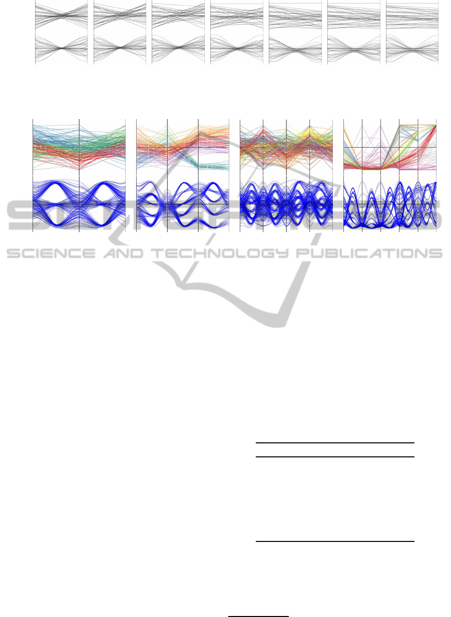
Figure 2 illustrates example datasets with all seven
different correlation coefficients used for the exper-
imental trials. The top row shows polyline plots and
the bottom row shows bundled curveplots. The Fisher
transform of correlation is shown below each plot.
3.4 Second Series: Estimating Clusters
In the cluster estimation trials, participants viewed
a series of clustered datasets in parallel coordinates
ranging from two to six dimensions, plotted in either
polylines or bundled curves. Clustering was indicated
by color (for polyline plots) and bundling (for bundled
curve plots). Color Brewer (Harrower and Brewer,
2003) was used to define effective color maps for the
IVAPP 2012 - International Conference on Information Visualization Theory and Applications
598
Polylines
Curves
−1.5 −1.0 −0.5
0
+0.5 +1.0 +1.5
Figure 2: One of the three sets of plots used in the correlation estimation series. The correlation, specified in Fisher z, is
shown below each plot.
Colored
poly-
lines
Bundled
curves
3 5 7
9
Figure 3: Representative plots used in the cluster estimation series: polyline plots with color coding of clusters (top row), and
bundled curve plots as described in (Heinrich et al., 2011b) (bottom row). From left to right, the data sets are g160 (number
of k-means clusters k = 3), iris (k = 5), g200 (k = 7), and netperf (k = 9).
polyline plots. For each plot, the user was asked to
estimate the number of clusters.
3.4.1 Procedure
Before starting the series, participants read a descrip-
tion of how clusters are represented in both line styles.
They then began working with either polyline plots or
bundled curve plots, depending upon which order had
been assigned. They practiced estimating the num-
ber of clusters in three trial plots, with five, three, and
eight clusters. Figure 3 shows typical examples of
such plots. After each training trial, the correct num-
ber of clusters was reported. After the three training
trials, a page redisplayed the three datasets and the
number of clusters in each. Users pressed a button to
start the first experimental trial.
Experimental trials had the same interface as the
training trials, but provided no feedback about the ac-
tual number of clusters. After entering their estimate
for the clusters, participants pressed a button to move
on to the next trial. Once they had completed a series
in one line style, they did the training and experimen-
tal trials for the next style.
3.4.2 Trial Data
Trial datasets were created from three real-world and
three synthetic datasets (Table 2). The real-world
datasets are popular test datasets, taken from the
Xmdv Web page
3
. The synthetic datasets were gener-
ated by sampling normally distributed series, selected
to ensure the required correlation across each dimen-
sion. Each of the 6 datasets was then clustered by
the k-means technique into k = 3, 5, 7, and 9 clusters.
This series of 24 datasets was plotted using both line
styles. Within each series, the order of trials varied
randomly for each user.
Table 2: Datasets for the Cluster Estimation Series (d is the
number of dimensions, n is the number of data points).
Name d n Source
iris 4 150 Botany
netperf 6 179 Computer Science
htong 4 365 Earth Science
g40 2 40 Synthetic
g160 3 160 Synthetic
g200 5 200 Synthetic
3.5 Results
Figure 4 shows the distribution of participants’ re-
sponses for the correlation estimation series. There
3
http://davis.wpi.edu/xmdv/datasets.html
EVALUATION OF A BUNDLING TECHNIQUE FOR PARALLEL COORDINATES
599
was a strong linear correlation between partici-
pants’ estimates and actual correlation for polylines
and bundled curves (both r = 0.90). Considering
the estimates for positive and negative correlations
separately, estimates for negative correlations were
stronger (r = 0.75 for polylines, r = 0.79 for bundled
curves, difference of the equivalent z-scores ∆z =
0.10) than for positive correlations (r = 0.55 for poly-
lines, r = 0.39 for bundled curves, ∆z = −0.21).
Agreement amongst participants was moderate
(κ = 0.43 for polylines, κ = 0.41 for bundled curves).
The results for polylines are comparable to those of
Li and van Wijk (Li et al., 2010).
For all comparisons the one-sided width of a 95%
confidence interval, which is entirely determined by
the sample size of 14, is ∆z
95%
= 0.59. All the ∆z
scores presented above were substantially within this
bound, indicating that none of the differences was sta-
tistically significant.
Actual correlation (Fisher z ) Actual correlation (Fisher z )
User estimated z
(a) Polyline plots. (b) Curve plots.
Figure 4: Distribution of responses for the estimated cor-
relations of 2D parallel coordinates for polyline plots and
bundled curve plots. Circle radius represents the frequency
with which participants estimated a correlation strength for
each actual correlation.
Figure 5 shows the distribution of participants’ re-
sponses for the cluster estimation series. The overall
correlation is strong for both line styles (r = 0.92 for
polylines, r = 0.96 for bundled curves, ∆z = 0.36).
The correlations were much stronger for datasets with
three or five clusters (r = 0.98 for both line styles)
than those with seven or nine clusters (r = 0.41 for
polylines, r = 0.68 for bundled curves, ∆z = 0.39).
As with the correlation estimation series, all ∆z values
were substantially below 0.59, indicating that none of
the differences was statistically significant.
Agreement amongst participants for cluster esti-
mation was slightly higher for bundled curves (κ =
0.65) than for polylines (κ = 0.56). Each line style
had higher agreement than their corresponding levels
for correlation estimation.
3.6 Discussion
The results for the two series of plots demonstrate im-
Number of clusters Number of clusters
User estimate of number
(a) Colored polyline plots. (b) Bundled curve plots.
Figure 5: Distribution of responses for the estimated num-
ber of clusters in parallel-coordinates plots in two line
styles. Circle radius represents the frequency with which
participants estimated a dataset to have a given number of
clusters.
portant strengths of the bundled curve representation.
The correlation estimation series demonstrates that
correlation is as readily recognizable when parallel
coordinates are rendered in bundled curves as when
rendered in polylines. This result is not obvious.
Polyline plots provide a clear focal point for estimat-
ing correlations: the width of the center region is an
excellent indicator of correlation, with strong nega-
tive correlations producing a narrow center region and
strong positive correlations producing a wide center
region. In contrast, bundled curve plots by definition
draw the curves into one or more narrow center re-
gions. The width of those regions is only mildly deter-
mined by the correlation of the dataset. Yet bundled
curves nonetheless provided sufficient cues (width of
center region, shape of lines) that participants could
estimate correlation from bundled curves as readily
as from polylines.
The cluster counting series demonstrates that
viewers could identify clusters through their bundles.
This is not surprising, as bundling provides a strong
cue of cluster identity. Participants likely determined
cluster membership by looking at the bundle axes,
where bundling has its strongest effect. In effect, a
bundled curve plot uses different regions to geomet-
rically represent the spread and the clustering of the
dataset. The spread of values for a cluster is rep-
resented at the value axis. The cluster identity of a
datum is represented at the bundle axis. In contrast,
polylines provide no geometric representation of clus-
ter membership, so it must be represented using a dif-
ferent cue, color. Whereas polylines provide only cor-
relation information in the inter-axis regions, bundled
curves use that region to display correlation, number
of clusters, and cluster membership—a much more
effective use of the space.
The geometric representation of cluster and distri-
IVAPP 2012 - International Conference on Information Visualization Theory and Applications
600

bution must be simultaneous if the analyst is to com-
pare the distributions of the different clusters. The
bundling and C
1
continuity of bundled curves are es-
sential for this comparison to occur, for these fea-
tures allow the viewer to be aware of both clusters
and distribution simultaneously. Bundling exploits
the Gestalt principle of proximity, visually grouping
the lines of a cluster in the middle of the plot. C
1
con-
tinuity exploits the Gestalt principle of continuity to
maintain this visual grouping on the value axes, where
the distribution is represented. This allows the viewer
to compare the distributions of different clusters. As a
secondary benefit, the C
1
continuity allows this clus-
ter identification to be maintained across value axes,
the membership reinforced at each bundle axis.
The same bundling strength was used for both
the correlation and the cluster counting series. This
demonstrates that each task can be achieved without
sacrificing the other.
4 CONCLUSIONS AND FUTURE
WORK
The user study conducted in this work supports the
following conclusions: Firstly, curve bundling is ef-
fective in displaying clustering information purely
based on geometry. Secondly, with a properly cho-
sen bundling strength, bundled curve plots retain the
same strength as polyline plots in revealing correla-
tions between visualized variables. Hence one of the
core aspects of analysis using parallel coordinates car-
ries over using bundling.
The high effectiveness of curved plots compared
with polyline plots was not obvious. The results of
our user study might trigger further perceptual in-
vestigations of variants of parallel-coordinates plots.
It could be the case that other forms of parallel-
coordinates plots might be even more effective than
bundled curves—not only for cluster visualization but
other applications.
ACKNOWLEDGEMENTS
In parts, this work was supported by DFG within SFB
716 / D.5.
REFERENCES
Artero, A. O., de Oliveira, M. C. F., and Levkowitz, H.
(2004). Uncovering clusters in crowded parallel coor-
dinates visualizations. In IEEE Symposium on Infor-
mation Visualization, pages 81–88. IEEE Computer
Society.
Berthold, M. R. and Hall, L. O. (2003). Visualizing fuzzy
points in parallel coordinates. IEEE Transactions on
Fuzzy Systems, 11:369–374.
Caat, M. T. and Maurits, N. M. (2007). Design and evalu-
ation of tiled parallel coordinate visualization of mul-
tichannel EEG data. IEEE Transactions on Visualiza-
tion and Computer Graphics, 13(1):70–79.
Cook, D. and Swayne, D. F. (2003). Interactive and Dy-
namic Graphics for Data Analysis: With Examples
Using R and GGobi. Springer.
Fua, Y.-H., Ward, M. O., and Rundensteiner, E. A. (1999).
Hierarchical parallel coordinates for exploration of
large datasets. In IEEE Visualization, pages 43–50.
IEEE Computer Society.
Graham, M. and Kennedy, J. (2003). Using curves to en-
hance parallel coordinate visualisations. In Interna-
tional Conference on Information Visualization (IV),
pages 10–16. IEEE Computer Society.
Harrower, M. A. and Brewer, C. A. (2003). Color-
Brewer.org: an online tool for selecting color schemes
for maps. The Cartographic Journal, 40(1):27–37.
Heinrich, J., Bachthaler, S., and Weiskopf, D. (2011a).
Progressive splatting of continuous scatterplots and
parallel coordinates. Computer Graphics Forum,
30(3):653–662.
Heinrich, J., Luo, Y., Kirkpatrick, A. E., Zhang, H., and
Weiskopf, D. (2011b). Evaluation of a bundling tech-
nique for parallel coordinates. Technical Report Com-
puter Science TR-2011-08, Visualization Research
Center, University of Stuttgart.
Heinrich, J. and Weiskopf, D. (2009). Continuous parallel
coordinates. IEEE Transactions on Visualization and
Computer Graphics, 15(6):1531–1538.
Henley, M., Hagen, M., and Bergeron, R. D. (2007). Eval-
uating two visualization techniques for genome com-
parison. In International Conference on Information
Visualization (IV), pages 551–558. IEEE Computer
Society.
Holten, D. (2006). Hierarchical edge bundles: Visualiza-
tion of adjacency relations in hierarchical data. IEEE
Transactions on Visualization and Computer Graph-
ics, 12(5):741–748.
Holten, D. and van Wijk, J. J. (2010). Evaluation of cluster
identification performance for different PCP variants.
Computer Graphics Forum, 29(3):793–802.
Inselberg, A. (1985). The plane with parallel coordinates.
The Visual Computer, 1(2):69–92.
Inselberg, A. (2009). Parallel Coordinates: Visual Multidi-
mensional Geometry and Its Applications. Springer,
New York.
Inselberg, A. and Dimsdale, B. (1990). Parallel coordinates:
A tool for visualizing multi-dimensional geometry. In
IEEE Visualization, pages 361–378. IEEE Computer
Society.
Jain, A. K. and Dubes, R. C. (1988). Algorithms for Clus-
tering Data. Prentice-Hall, Upper Saddle River, NJ.
EVALUATION OF A BUNDLING TECHNIQUE FOR PARALLEL COORDINATES
601

Johansson, J., Forsell, C., Lind, M., and Cooper, M. (2008).
Perceiving patterns in parallel coordinates: determin-
ing thresholds for identification of relationships. In-
formation Visualization, 7(2):152–162.
Johansson, J., Ljung, P., Jern, M., and Cooper, M. (2005).
Revealing structure within clustered parallel coordi-
nates displays. In IEEE Symposium on Information
Visualization, pages 125–132. IEEE Computer Soci-
ety.
Lanzenberger, M., Miksch, S., and Pohl, M. (2005). Ex-
ploring highly structured data: a comparative study of
stardinates and parallel coordinates. In International
Conference on Information Visualization (IV), pages
312–320. IEEE Computer Society.
Li, J., Martens, J.-B., and van Wijk, J. J. (2010). Judging
correlation from scatterplots and parallel coordinate
plots. Information Visualization, 9(1):13–30.
McDonnell, K. T. and Mueller, K. (2008). Illustrative
parallel coordinates. Computer Graphics Forum,
27(3):1031–1038.
Miller, J. J. and Wegman, E. J. (1991). Construction of
line densities for parallel coordinate plots. In Buja,
A. and Tukey, P., editors, Computing and Graphics in
Statistics, pages 107–123. Springer, New York.
Moustafa, R. and Wegman, E. (2006). Multivariate con-
tinuous data – parallel coordinates. In Unwin, A.,
Theus, M., and Hofmann, H., editors, Graphics of
Large Datasets: Visualizing a Million, pages 143–
156. Springer, New York.
Novotny, M. and Hauser, H. (2006). Outlier-preserving
focus+context visualization in parallel coordinates.
IEEE Transactions on Visualization and Computer
Graphics, 12(5):893–900.
Ramos, E. and Donoho, D. (1983). 1983 ASA data exposi-
tion dataset. In CMU Dataset Archive. CMU.
Rodrigues, Jr., J. F., Traina, A. J. M., and Traina, Jr., C.
(2003). Frequency plot and relevance plot to enhance
visual data exploration. In Symposium on Computer
Graphics and Image Processing (SIBGRAPI), pages
117–124. IEEE Computer Society.
Theisel, H. (2000). Higher order parallel coordinates.
In Workshop on Vision, Modeling, and Visualization,
pages 415–420.
Wegman, E. (1990). Hyperdimensional data analysis using
parallel coordinates. Journal of the American Statisti-
cal Association, 411(85):664.
Wegman, E. J. and Luo, Q. (1997). High dimensional clus-
tering using parallel coordinates and the grand tour.
In Classification and Knowledge Organization, pages
93–102.
Yuan, X., Guo, P., Xiao, H., Zhou, H., and Qu, H.
(2009). Scattering points in parallel coordinates. IEEE
Transactions on Visualization and Computer Graph-
ics, 15(6):1001–1008.
Zhou, H., Cui, W., Qu, H., Wu, Y., Yuan, X., and Zhuo,
W. (2009). Splatting the lines in parallel coordinates.
Computer Graphics Forum, 28(3):759–766.
Zhou, H., Yuan, X., Qu, H., Cui, W., and Chen, B. (2008).
Visual clustering in parallel coordinates. Computer
Graphics Forum, 27(3):1047–1054.
IVAPP 2012 - International Conference on Information Visualization Theory and Applications
602
