
VINCENT
Visualization of Network Centralities
Andreas Kerren, Harald K
¨
ostinger and Bj
¨
orn Zimmer
Linnaeus University, School of Computer Science, Physics and Mathematics (DFM), ISOVIS Group
Vejdes Plats 7, 351 95 V
¨
axj
¨
o, Sweden
Keywords:
Centralities, Network Analysis, Visualization, Biological Networks, Graph Drawing, Coordinated Views.
Abstract:
The use of network centralities in the field of network analysis plays an important role when the relative impor-
tance of nodes within the network topology should be rated. A single network can easily be represented by the
use of standard graph drawing algorithms, but not only the exploration of one centrality might be important:
the comparison of two or more of them is often crucial for a better understanding. When visualizing the com-
parison of several network centralities, we are facing new problems of how to show them in a meaningful way.
For instance, we want to be able to track all the changes of centralities in the networks as well as to display
the single networks as best as possible. In the life sciences, centrality measures help scientists to understand
the underlying biological processes and have been successfully applied to different biological networks. The
aim of this paper is to present a novel system for the interactive visualization of biochemical networks and its
centralities. Researchers can focus on the exploration of the centrality values including the network structure
without dealing with visual clutter or occlusions of nodes. Simultaneously, filtering based on statistical data
concerning the network elements and centrality values supports this.
1 INTRODUCTION
In Information Visualization or Graph Drawing, there
are many different approaches to visualize complex
networks that support various exploration methods.
Such networks (or graphs) can be drawn, for example,
by using standard graph drawing algorithms (Di Bat-
tista et al., 1999; Jia et al., 2008). In case of social
networks and their visual analysis based on any graph
representation, important tasks are the identification
of communities and central actors as well as the anal-
ysis of roles and positions (Henry et al., 2007). Those
tasks allow researchers to find the most relevant parts
and correlations in social networks.
Another example are biochemical networks,
which are representations of biological processes,
such as metabolism, the regulation of genes, or the in-
teraction of proteins. They have been of strong inter-
est in the last few years and are crucial for a compre-
hensive understanding of living beings (Jusufi et al.,
2011; Albrecht et al., 2010). In this paper, we focus
on this application field. In the life sciences, centrality
measures help scientists to understand the underlying
biological processes and have been successfully ap-
plied to different biological networks. Network cent-
rality analysis measures the relative importance of
nodes in a network based on their connectivity within
the network structure (Dwyer et al., 2006; Kosch
¨
utzki
and Schreiber, 2004). Applications in biological net-
works can be found at the investigation of protein-
protein interaction networks (PPI) or transcriptional
regulatory networks (TR) (Kosch
¨
utzki and Schreiber,
2004). Typical tasks for such network analysis by the
use of centrality values are: (a) finding nodes with
high centrality values, since those are more likely of
interest to the researcher; (b) finding nodes with low
centrality values to hide them, since they are of less
importance; (c) finding nodes with high values in sev-
eral centralities (comparisons of values over many
nodes). Especially the latter task is challenging, be-
cause important problems arise when visualizing it.
For example: How to visualize the data in a way that
researchers can get the most meaning out of it? How
enabling the user to keep track of centrality changes
within the network? How to minimize occlusions and
visual clutter? Or how to build a flexible solution in
order to deal with a large number of centrality values
at the same time?
The aim of our work is to overcome the aforemen-
tioned problems and to develop a new solution of vi-
703
Kerren A., Köstinger H. and Zimmer B..
VINCENT - Visualization of Network Centralities.
DOI: 10.5220/0003822207030712
In Proceedings of the International Conference on Computer Graphics Theory and Applications (IVAPP-2012), pages 703-712
ISBN: 978-989-8565-02-0
Copyright
c
2012 SCITEPRESS (Science and Technology Publications, Lda.)

sualizing networks together with its centralities. We
introduce a new visual representation of networks and
their centrality values in a circular view. Analyses can
then be focused on the exploration of the centrality
values including the network structure, without deal-
ing with visual clutter or occlusions of nodes. Filter-
ing based on statistical data concerning the network
elements and centrality values supports this and helps
keeping the network itself readable. Hereby, the com-
parability of the nodes is one of most important goals
to fulfill, followed by the minimization of visual clut-
ter and occlusions.
The remainder of this paper is organized as fol-
lows. The next two sections provide a brief overview
of network analysis and network centrality concepts
and motivate their importance for visual network
analysis on the basis of biological networks. Related
work and actual challenges of the visual analysis of
network centralities are summarized too. To address
those problems, our tool ViNCent is introduced in
Section 4. Here, the system and its design are ex-
plained in detail. An explicit description of the meth-
ods and approaches used to solve the described prob-
lems is given too. Section 5 exemplifies the interac-
tion design of our tool based on a small use case sce-
nario. A discussion at the end of this section summa-
rizes advantages and disadvantages of our tool. The
conclusion and future work section deals with possi-
ble improvements of the tool and planed further work.
2 BACKGROUND
This section provides additional background informa-
tion to facilitate the understanding of the rest of the
paper. First, a brief introduction into graphs is given
including the most important definitions.
A graph provides information about single ele-
ments and relationships between those. A (simple)
graph G = (V, E) consists of a finite set of vertices
(or nodes) V and a set of edges E ⊆ {(u, v)|u, v ∈
V, u 6= v}. An edge e = (u, v) in the graph G con-
nects two nodes u and v. Two nodes u and v are said
to be incident with the edge e = (u, v) and adjacent to
each other. The degree d(u) of a node u is defined as
the number of edges incident to this node u. Further-
more, we can define a walk on a graph as described
as follows: let (e
1
, ..., e
k
) be a sequence of edges in a
graph G = (V, E). This sequence is called a walk if
there are nodes v
0
, ..., v
k
such that e
i
= (v
i−1
, v
i
) for
i = 1, ..., k. If the edges e
i
and the nodes v
i
are pair-
wise distinct respectively, then the walk is called a
path. The length of a walk/path is given by its num-
ber of edges, i.e., k = |(e
1
, ..., e
k
)|. A shortest path
between two nodes u, v is a path with minimal length.
The distance (dist(u, v)) between two nodes u, v is the
length of a shortest path between them. (Jusufi et al.,
2010; G
¨
org et al., 2007; Di Battista et al., 1999)
2.1 Network Analysis
In the sciences, huge networks are used to model
structural relationships of various types. Therefore,
network analyses for social, biological or computer
sciences become more important as well to support a
better understanding of the underlying network struc-
tures (Newman, 2010). The following paragraphs
deal with network analysis and identify important
tasks by means of biological networks.
Analysis of Biological Networks. Junker et al.
state in their work: “structural analysis of networks
can lead to new insights into biological systems
and is a helpful method for proposing new hypothe-
ses” (Junker et al., 2006). For structural analysis,
several techniques exist: analysis of the global net-
work structure, network motifs (i.e., small subnet-
works, which occur more often within the whole net-
work), network clustering, and network centralities.
The latter technique uses far more information about
the network than just the relationships and neighbor-
hood of nodes. In fact, this technique uses centrali-
ties of nodes to rank the elements in the network ac-
cording to a given importance concept (Junker et al.,
2006). The following Subsection 2.2 discusses net-
work centralities in general and how they are calcu-
lated. A presentation of suitable visualization tech-
niques follows in Section 3.
2.2 Network Centralities
A network centrality C is a function that assigns a
value C(u) to a node u ∈ V of a given graph G =
(V, E). In order to compare network centralities ac-
cording to their importance, u is more important than
v iff C(u) > C(v) (Kosch
¨
utzki and Schreiber, 2004;
Dwyer et al., 2006). Network centralities are used
for a better understanding of complex processes in
networks. In the life sciences, centrality measures
are useful to understand biological processes. They
are therefore applied to biological networks and then
explored. The following two sample centralities are
typically used by scientists to receive further meaning
of networks (Junker et al., 2006; Dwyer et al., 2006;
Kosch
¨
utzki and Schreiber, 2004):
Eccentricity C
ecc
: This network centrality is cal-
culated by using the distance between nodes in the
IVAPP 2012 - International Conference on Information Visualization Theory and Applications
704

graph. The eccentricity ecc of a node u is defined
as ecc(u) := max
u∈V
dist(u, v) and the corresponding
centrality as C
ecc
(u) :=
1
ecc(u)
. More central nodes
have therefore a higher value of C
ecc
.
Random Walk Betweenness C
r
: Betweenness cen-
tralities model communication paths in networks and
measure the extent to which a node lies on paths be-
tween other nodes. For C
r
, the centrality of a vertex
w is equal to the number of times that a random walk
from u to v goes through w, averaged over all u and
v (Newman, 2003).
The actual calculation of centralities is not complex.
Even for large-scale networks, this can be done very
fast and be cached to speed up a later interactive ex-
ploration. The complexities of the individual central-
ities range from O(n) to O((n + m)n
2
) (Kosch
¨
utzki
and Schreiber, 2004).
The problem of choosing the right centralities dif-
fers from network to network. For the computation of
suitable centralities, data about the functional prop-
erties of networks is often missing. This data would
allow to choose the “right” centrality measures, which
show the important parts of the network. Therefore,
this analysis is usually done by visually comparing
the centrality values on the networks (Dwyer et al.,
2006).
3 RELATED WORK
In this section, we provide a short overview of related
work in context of the visualization of network cen-
tralities. Additionally, we outline the most important
challenges. Because of space limitations, we restrict
ourselves to a brief presentation of tools in biochem-
ical network visualization and refer to the survey pa-
per (Albrecht et al., 2010) and the book (Junker and
Schreiber, 2008). For the field of social networks, we
refer to the work (Correa and Ma, 2011).
The visualization of network centralities was not
much discussed in the literature so far. Typical meth-
ods, as stated by Dwyer et al. (Dwyer et al., 2006),
are the use of correlations, scatter plots, and paral-
lel coordinates. The problem with these solutions is,
that they have disadvantages when used for biologi-
cal networks, since correlations of centralities might
occur anyway. The most important issue is not only
to show that there are correlations, but to show where
those correlations occur within the network. In their
work, Dwyer et al. present three new techniques to
visualize network centralities as described in the fol-
lowing (Dwyer et al., 2006).
3D Parallel Coordinates-based Comparison.
This method is based on parallel coordinates to
visualize multivariate data. Standard approaches
typically deal with two dimensions. This one uses
3D to stack visual representations of a network
according to one centrality into the third dimension.
Thus, each 2D plane contains the information for a
particular centrality. 3D Parallel Coordinates-based
Comparison gives a good overview of the centrality
values within the network and about how many nodes
fall into a certain value range (Dwyer et al., 2006).
However, this approach does not reveal the actual
network structure.
Orbit-based Comparison. Arranging nodes in an
orbit-based visualization has some advantages over
the previous approach: the network topology is shown
and thus the relationships between the nodes can be
identified. In more detail, for each centrality a new
2D orbit-based plane is added to the 3D drawing. The
ordering of the planes takes the edge crossing min-
imization and the minimization of inter-plane edge
lengths into account (Dwyer et al., 2006). As a single
orbit provides information about the centrality val-
ues and as the network structure can be seen, this ap-
proach outperforms the previous one when revealing
both structure and centrality values. Drawbacks are
occlusions in the middle of the orbits, and it is hard
to keep track of changes within the single centrality
measures.
Hierarchy-based Comparison. This approach is
conceptually similar compared to the 3D parallel co-
ordinates approach, but it divides the nodes according
to their centrality values into layers. Those layers are
then drawn as horizontal lines, having an ordering on
the line as well. This could be, for example, a de-
creasing centrality value from the left to the right. The
top layers in the visualization are considered to show
larger centrality values. There might be even connect-
ing edges between nodes on the same layer. Filtering
and thresholds are used to reduce visual clutter be-
tween two planes (Dwyer et al., 2006).
CentiBiN. Junker et al. present a different approach
with the CentiBiN tool (Junker et al., 2006). Cen-
tiBiN uses standard node-link diagrams based on a
set of graph drawing algorithms. In addition to the
displayed graph, single centrality values are displayed
next to the visualization in a table. Interactions with
the table, like selecting certain centrality values, are
coordinated with the network visualization as well.
So, it allows the user to locate certain values within
the network. Simple histograms are used to compare
data. CentiBiN has advantages with respect to the
VINCENT - Visualization of Network Centralities
705

amount of available centralities, as it can calculate up
to 17 centrality measures for networks.
CentiScaPe. This tool is able to compute several
network centralities and provides analyses of exist-
ing relationships between user data (based on experi-
ments) and centrality values computed by CentiScaPe
itself (Scardoni et al., 2009). It was implemented as
Cytoscape plugin and supports even large input net-
works. However, the supported interactive visualiza-
tions are restricted.
Challenges. All aforementioned tools and ap-
proaches solve the problem of network analysis ac-
cording to centrality values. But there is still space for
improvements, such as a better arrangement of nodes
and planes, avoiding occlusions and visual clutter, vi-
sualizing structure and centralities simultaneously, or
introducing new interaction and filter techniques.
4 VINCENT
ViNCent —short for Visualization of Network
Centralities—solves most of the problems addressed
in the previous Subsection 3 by using a radial graph
drawing approach (Kerren and K
¨
ostinger, 2011).
Each network node is represented by a small quad-
rangle that is positioned on a circle. Its connections
to the other nodes (i.e., the edges) are laid out inside
of this circle. Figure 1 shows an example of such a
radial layout in its center: it is easy to see how nodes
are interconnected and how many connections a node
has. Features like edge bundling and degree marking,
as described later in Section 4.2, support the user
in finding important relationships between nodes as
well as highly or lowly connected nodes.
Before we describe single features of our tool,
we give an overview of the overall design and ar-
chitecture. ViNCent provides multiple, coordinated
views on the input data (mainly by using the Prefuse
toolkit (Heer et al., 2005)), see Figure 1. They are
briefly discussed in the following.
Settings Panel. The user can change the visual ap-
pearance of the tool, generate random network and
centrality data for testing purposes, etc. via the con-
trols in the settings panel.
Circle View. The circular network drawing in the
center displays the nodes, their centrality values, and
the graph structure itself. Therefore, this view pro-
vides an overview of the complexity of the entire net-
work and supports the user to get the main actors at
a first glance. Our tool offers two possible layouts
of a node’s centrality representation (called centrality
bar in this paper): traditional stacked bars and maxi-
mum value stacking. Whereas for traditional stacking
the single bars corresponding to centrality values are
immediately stacked onto each other, the maximum
value stacking starts all bars from the level of the max-
imum value of the current centrality, thus providing a
better comparability of relative centrality values. Fig-
ure 1 shows the differences between the two modes.
Histogram View. One individual histogram pro-
vides a statistical overview of a centrality’s values.
Thus, the histograms help the user to better under-
stand the distributions of centrality values over all
nodes.
Centrality Hover View. The single centrality bars
are not only displayed in the circle view; a selected
bar is redundantly visualized together with detailed
information about the corresponding node’s central-
ity values, i.e., centrality name, relative percentage,
and absolute value. Figure 1 shows this view display-
ing data of the currently hovered node 44 in the lower
right area of the main window.
4.1 Interaction-concepts in ViNCent
The aforementioned views provide the user with the
possibility of doing further interactions, such as hov-
ering bars and filtering out data based on the distribu-
tion of centrality values as well as the network topol-
ogy.
4.1.1 Linking and Brushing
ViNCent makes extensive use of linking and brushing
features (Keim, 2002; Roberts, 2007) to connect cer-
tain data objects in the visualization. Hovering fea-
tures are introduced to highlight elements and show
cross-connections:
Hovering in the Circle View. The main focus of
the user is usually on the circle view in the center,
cf. Figure 1. Hovering nodes in this window leads to
an activation of the connected nodes (their neighbor-
hood), the connecting edges, and the corresponding
labels. By the use of the settings panel, the user can
control how many hierarchy levels in the network the
highlighting spreads out in the view. This feature of
highlight spreading highlights nodes and correspond-
ing edges weaker and weaker depending on the hier-
archy level.
Hovering in the Histograms View. To show the
user which nodes fall into which certain range of data
IVAPP 2012 - International Conference on Information Visualization Theory and Applications
706
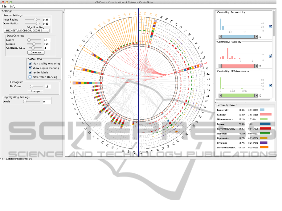
Figure 1: Overview of the ViNCent tool. The center view shows the radial drawing of a network. The two possible drawing
modes (normal stacked bars (left half) and maximum value stacking (right half)) are shown as overlay (split by the blue line).
To the right, the corresponding histograms of the network centralities are shown (top) as well as more detailed information
about the currently selected node 44 (bottom). Histograms can be used to filter the views. To the left, the settings panel allows
the user to change tool parameters and to generate data sets for testing purposes.
values according to one centrality measure, hover-
ing an individual histogram bar highlights the corre-
sponding nodes in the circle view as well. Thus, the
user can check in more detail, which nodes are related
to a histogram bin and would be affected by filtering
them out.
4.1.2 Filtering and Dynamic Queries
The exploration of big datasets is mostly not possible
without filtering of data and dynamic queries (Shnei-
derman, 1994). ViNCent uses several approaches to
allow the user to filter out data and therefore to re-
duce the dataset to a smaller amount of nodes. In this
way, filters support the user in fulfilling his/her tasks
more efficiently. Since the centrality data correlated
to the network is multidimensional, we decided to use
an approach that was originally realized by Attribute
Explorer (Tweedie et al., 1994). It maps each node
attribute (i.e., its centrality values) to a histogram.
Filtering processes in ViNCent are based on the
distribution of centrality values over the nodes. In our
case, filtering out nodes means filtering out the corre-
sponding edges in the circular view as well in order to
clear the center of the visualization up and to reduce
the visual clutter. Hereby, ViNCent supports four dif-
ferent filter options:
Filtering based on Histogram Bars. The first pos-
sibility is to filter out elements belonging to a specific
bar of a histogram. By clicking the bar, the corre-
sponding elements in the circle view are hidden. The
bar in the histogram is therefore marked in light gray
color, which symbolizes that this bar has been filtered
out, see Figure 2(c).
Filtering based on Histogram Sliders. Another
way of hiding elements is to apply the range sliders
below each histogram. Figure 1 (right) shows ex-
amples of range sliders for several centralities. By
sliding from the left or right, the amount of dis-
played nodes decreases corresponding to the elimi-
nated elements in the dataset. This method is useful
to quickly filter out minimum and maximum values
of histograms.
Filtering based on Single Nodes. As the filters pre-
sented before act on the whole set, they affect more
nodes at once. But to filter out single nodes from
the view, our penultimate filter option can be use-
ful, which is based on single nodes. A right-click
VINCENT - Visualization of Network Centralities
707
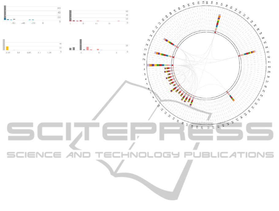
(a) ’Centroid’ C
cen
. (b) ’Degree’ C
deg
.
(c) ’Eccentricity’ C
ecc
. (d) ’Radiality’ C
rad
.
Figure 2: Histograms for four different centralities. Fig-
ure 2(c) has an active filter on the first bar, shown in light
gray. This active filter spreads to the other histograms, dis-
played in dark gray.
on nodes in the circle view causes that they disappear
from the view. Renewed right-clicking brings them
up again.
Hiding Centralities from the Circle View. Some-
times, certain centrality values—and therefore the
whole centrality—have no further meaning for the ex-
ploration of the dataset. For instance, if all nodes have
the same centrality value. In this case, the central-
ity can be hidden by deselection of the corresponding
visibility check box, see Figure 1 (right).
Filter Propagation. Filtering out elements affects
directly the circle view; Figure 3 shows the results of
filtering processes performed by the user. Thus, di-
rect feedback based on such actions is provided to the
user. But to better keep track of already eliminated
elements, they are marked in the histograms as light
gray bars, when the filter is applied directly on this
histogram. The bars are marked in dark gray, when
the filter spreads from another active filter in a differ-
ent histogram. This filter propagation gives the user a
more precise feedback of how certain centrality val-
ues are related to each other, cp. Figure 2.
4.2 Implementation Aspects
The advantages of our tool are its capabilities con-
cerning the interactive exploration of the nodes and
the display of a number of different centrality values
at the same time. These features are mainly achieved
by the circular arrangement of nodes and the addi-
tional edge bundling approaches done in the middle
of the circle view. The latter support the user in find-
ing connections between nodes and showing if nodes
are highly or lowly connected. In the following, we
discuss the most important technical aspects of these
features.
For the circular arrangement of the nodes, the en-
tire available space in the view is taken for drawing
Figure 3: Active filter on the network. Nodes have been fil-
tered out by using different filter options of the histograms.
The active eccentricity histogram bar filter eliminated all
nodes having a low value in this centrality. As Figure 2(c)
shows, about 55 nodes are affected by this active filter.
the inner circular disk and the outer circular ring. Be-
tween both, the nodes are added and represented as
small squares. Their degree is represented by a color
gradient from light-red to dark-red (connection degree
marker) and their centrality values as bar drawings
on the outer ring. The arrangement is done by sim-
ply dividing the whole 360
◦
circle into single-angle
steps, used to define the positions of the nodes. In
order to distinguish between single centrality values,
a specific color schema is employed. ViNCent uses
a color schema provided by ColorBrewer (Brewer, 3
22). Thus, a centrality gets assigned a specific color
from this schema which is consistently used in all
views.
Graph drawing techniques usually have to deal
with occlusions and visual clutter when it comes to
more dense graphs. This is prevalently the case in
the area of network analysis, especially for biolog-
ical networks. In order to reduce visual complex-
ity in our views, the circular arrangement of nodes
avoids occlusions of them. However, there is still the
problem of visual clutter in the center of the circle
view where the connecting edges are located. One
technique to solve this problem is hierarchical edge
bundling (Holten, 2006). It basically follows a simple
principle: visually bundling adjacency edges together
analogous to the way electrical wires and/or network
cables are merged into bundles along their joint path.
ViNCent deals with graphs as well, but our tool draws
all nodes to the outside of the circle. Therefore, no hi-
IVAPP 2012 - International Conference on Information Visualization Theory and Applications
708

erarchy can be used in its center to perform standard
edge bundling based on the inner hierarchy. Instead,
ViNCent supports four different edge bundling modes
that are explicitly described in the thesis (K
¨
ostinger,
2011). Similar approaches exist in the literature, such
as those described in (Correa et al., 2008).
4.2.1 Plug-in: CentiBiN
ViNCent is actually not limited to a certain field of
application. It can handle every network, if it is rep-
resented in GraphML container format. Our tool also
accepts precomputed (numeric) centrality values that
are stored in the input file as additional attributes.
Then, ViNCent can directly visualize the multivariate
network without any preprocessing steps. An excerpt
from such an extended GraphML file is given in the
following:
...
<key id="Centroid" for="node"
attr.name="Centroid" attr.type="double">
<default>0.0</default>
</key>
...
To support more application domains—especially
biological network analysis—ViNCent uses the Cen-
tiBiN plug-in (Junker et al., 2006) that calculates up to
17 network centralities for biological networks. After
loading the input graph in GraphML format, the Cen-
tiBiN plug-in can calculate a user-specified number
of centralities on directed and undirected graphs, e.g.,
degree, eccentricity, etc. Then, ViNCent visualizes
the input graph together with the computed centrality
values. Additionally, the user can export all data into
an extended GraphML file. Thus, users are able to
reload the network together with its centrality values
without recalculation. Note that not every centrality
measure can be applied to every graph, since there
are preconditions a graph has to fulfill in order to cal-
culate the values. These can be simplicity, connect-
edness and loop-freeness (Junker et al., 2006). One
example is the Eigenvector-centrality whose imple-
mentation in CentiBiN requires that the input graph
has to be loop-free.
5 USE-CASE SCENARIO AND
DISCUSSION
Before we discuss the pros and cons of ViNCent, a
short use-case scenario shows how the tool can be
used for biological network analysis. It is described
in the following section.
5.1 Use-case Scenario
We use the release 2005-01-26 of the Mus muscu-
lus dataset from the Database of Interacting Proteins
(DIP) (Salwinski et al., 2004) as an example for in-
vestigating biological networks. It describes protein-
protein interactions (PPI) of the house mouse and
consists of 49 nodes and 54 edges. The aim is to find
the most important proteins by visualizing their net-
work centralities with our tool.
Figure 4(a) shows the selected dataset for this use-
case. Protein 320N, which has the highest overall cen-
trality values, is selected and its adjacent proteins are
highlighted. Detailed centrality numbers for the se-
lected protein are displayed in the hover panel on the
bottom right part of the figure. However in this case,
most of the adjacent proteins of 320N have low cen-
trality values and might not be of interest.
As already discussed before, centrality values are
usually used to identify the importance of proteins in
a biological network. To find other important hubs
in the network, the user may modify the range slider
filters to hide all nodes with a small centrality value,
by sliding a bar from the left to the right until only a
small number of proteins remain for the selected cen-
trality value. For our use-case, the betweenness cen-
trality has been chosen as it relies on the overall net-
work topology. High values of this centrality indicate
central proteins in a PPI-network.
Figure 4(b) shows an example, where the purple
colored Current Flow Betweenness (equivalent to the
Random Walk Betweenness discussed in Section 2.2)
has been adjusted. Protein 369N, which is the cellular
tumor antigen p53, is selected here, as it has one of the
highest betweenness values and most of the remain-
ing visible nodes are adjacent to this protein and have
high centrality values as well. Therefore, they could
be important actors in the Mus musculus dataset. For
instance, the adjacent protein 24169N, a tumor sup-
pressor protein, might represent an important hub in
the PPI-network and could be an interesting candidate
for further investigation.
This small example shows an application of cen-
trality measures in biological networks and how ViN-
Cent can solve analysis problems by visualizing the
networks interactively.
5.2 Discussion
Our visualization tool combines different approaches
to overcome the difficulties when visualizing network
centralities. It provides a new way of visualizing cen-
trality values within a network by the use of a circular
arrangement, and therefore, it minimizes visual clut-
VINCENT - Visualization of Network Centralities
709
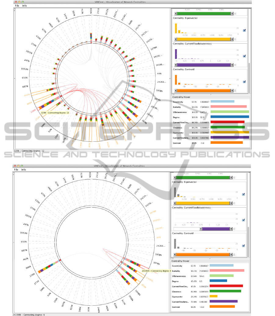
(a) Protein 320N was selected for further consideration.
(b) Filtered view using histogram sliders of the ViNCent tool, showing the top proteins found by adjusting the
CurrentFlowBetweenness. The first few bars of the other centralities are marked in dark gray, indicating that
the corresponding nodes are already filtered out by the applied filter.
Figure 4: Use-case scenario of ViNCent. Filtering out important proteins in the Mus musculus dataset.
ter and occlusions of nodes. The usage of stacked
bars attached to the outside of the node representa-
tions gives the user the possibility to discover poten-
tially important nodes (e.g., with high centrality val-
ues) at a first glance. The visual representation of the
degree marking additionally supports this approach.
Another feature of ViNCent, which improves in-
teractive exploration, is the way of filtering out data.
IVAPP 2012 - International Conference on Information Visualization Theory and Applications
710

By the use of histograms and thus the underlying dis-
tributions of network centrality values, the user can
quickly get an overview and filter out unimportant
data with a few clicks. The concepts of bar filtering,
range sliders and single-node filtering allow the user
to filter out any combination of nodes. This leads to
less visual clutter in the drawing. We briefly summa-
rize the advantages in the following and highlight the
most important drawbacks:
Pros: Advantages are the circular arrangement
of nodes, which leads to less visual clutter and allows
the visualization of many nodes up to a few hundred.
Other advantages are the filter possibilities that facil-
itate the exploration of networks and support the user
in filtering out less important data at a first glance.
The presented example shows how easy filters can
be applied and how powerful they are when the user
wants to reduce the amount of displayed data.
Cons: Current drawbacks are the lack of linking
and brushing between histograms when hovering sin-
gle bars (only already filtered out data is linked and
brushed) and the missing visual links from the cir-
cle view to the histogram windows (so far, just hover-
ing in histograms highlights nodes in the circle view).
Especially the last issue would enhance the filter pos-
sibilities even more (e.g., hovering nodes in the cir-
cle view would show the location of the node in the
histogram). Another drawback is the current perfor-
mance: when dealing with a lot of data, the perfor-
mance of the tool is not sufficient to maintain the full
interaction possibilities. Linking and brushing fea-
tures are then lacking of immediate feedback and lead
to bad refreshing results for filtering tasks.
6 CONCLUSIONS AND FUTURE
WORK
ViNCent can be used for any kind of network explo-
ration and any kind of centrality visualization as long
as the preconditions for the calculation of centrality
values are met. Thus, it also supports a better un-
derstanding of multivariate networks. Compared to
related tools, ViNCent performs well in visualizing
centrality values for nodes, as it provides a direct vi-
sual feedback by the use of different types of stacked
bars. ViNCent still reveals the network structure and
makes it therefore possible to follow paths in a net-
work too. A number of interaction concepts support
the mentioned features.
The tool scales well up to a few hundred nodes,
depending on the available screen size and resolution.
The size of the inner circle limits the number of nodes.
However, there are features that are not implemented
yet, such as the linking and brushing issue discussed
in the previous section. In the following, we discuss
possible future work by indicating further improve-
ments.
An important future feature are new edge bundling
modes, since they would lead to less visual clutter
in the circle view. There is a lot of work for edge
bundling in graphs, such as (Holten, 2006; Holten
and van Wijk, 2009). As some approaches do not
rely on any further structure in the center of the cir-
cle view, they would be applicable to solve the edge
bundling problem for ViNCent. As the computation
of bundling edges is done in one single point so far,
additional bundling modes could be introduced into
the system.
Closely related to the problem of edge bundling is
the arrangement of nodes on the circle itself. Depend-
ing on the node positions, edge bundling may produce
better results. For this problem, one could take re-
sults of network analyses into account, like informa-
tion concerning cliques or communities, single actors,
or the density of the graph at certain positions. This
information is useful to decide how nodes should be
arranged along the circle, because based on this, we
could calculate the possible amount of edge crossings.
So far, ViNCent uses the Prefuse toolkit (Heer
et al., 2005) to render our visualizations. As
this toolkit relies on Java2D instead of faster Java
OpenGL implementations, the tool has some per-
formance issues. Changing to a faster visualization
toolkit may lead to better results.
Finally, the tool should be tested and evaluated
with more complex biological networks and difficult
tasks as well to clearly figure out problems of the cho-
sen interaction and visualization techniques.
ACKNOWLEDGEMENTS
The authors wish to thank Ilir Jusufi, ISOVIS Group,
Linnaeus University, as well as Falk Schreiber, Leib-
niz Institute of Plant Genetics and Crop Plant Re-
search (IPK), Germany, for many constructive com-
ments and their contributions to the system.
REFERENCES
Albrecht, M., Kerren, A., Klein, K., Kohlbacher, O.,
Mutzel, P., Paul, W., Schreiber, F., and Wybrow, M.
(2010). On open problems in biological network visu-
alization. In Proc. International Symposium on Graph
Drawing (GD ’09), volume 5849 of LNCS, pages
256–267. Springer.
VINCENT - Visualization of Network Centralities
711

Brewer, C. A. (last accessed: 2011-03-22). ColorBrewer.
http://colorbrewer2.org/, 2nd edition.
Correa, C. D., Crnovrsanin, T., Muelder, C., Shen, Z., Arm-
strong, R., Shearer, J., and Ma, K.-L. (2008). Cell
phone mini challenge award: Intuitive social network
graphs visual analytics of cell phone data using mo-
bivis and ontovis. In Visual Analytics Science and
Technology, 2008. VAST ’08. IEEE Symposium on,
pages 211 –212.
Correa, C. D. and Ma, K.-L. (2011). Visualizing social net-
works. In Aggarwal, C., editor, Social Network Data
Analytics, pages 307–326. Springer.
Di Battista, G., Eades, P., Tamassia, R., and Tollis, I. G.
(1999). Graph Drawing: Algorithms for the Visual-
ization of Graphs. Prentice Hall.
Dwyer, T., Hong, S.-H., Kosch
¨
utzki, D., Schreiber, F., and
Xu, K. (2006). Visual analysis of network centralities.
In Misue, K., Sugiyama, K., and Tanaka, J., editors,
Proceedings of the 2006 Asia-Pacific Symposium on
Information Visualisation (APVis’06), pages 189–198,
Darlinghurst, Australia. Australian Computer Soci-
ety, ACM International Conference Proceeding Se-
ries, vol. 164.
G
¨
org, C., Pohl, M., Qeli, E., and Xu, K. (2007). Visual Rep-
resentations. In Kerren, A., Ebert, A., and Meyer, J.,
editors, Human-Centered Visualization Environments,
LNCS Tutorial 4417, pages 163–230. Springer.
Heer, J., Card, S. K., and Landay, J. A. (2005). Prefuse:
a toolkit for interactive information visualization. In
Proceedings of the SIGCHI conference on Human fac-
tors in computing systems, CHI ’05, pages 421–430,
New York, NY, USA. ACM.
Henry, N., Fekete, J.-D., and Mcguffin, M. J. (2007). Node-
trix: a hybrid visualization of social networks. IEEE
Transactions on Visualization and Computer Graph-
ics (IEEE Visualization Conference and IEEE Con-
ference on Information Visualization) Proceedings,
13:1302–1309.
Holten, D. (2006). Hierarchical edge bundles: Visualiza-
tion of adjacency relations in hierarchical data. IEEE
Transactions on Visualization and Computer Graph-
ics, 12(5).
Holten, D. and van Wijk, J. J. (2009). Force-directed edge
bundling for graph visualization. IEEE-VGTC Sym-
posium on Visualization 2009, 28(3).
Jia, Y., Hoberock, J., Garland, M., and John C. Hart, Mem-
ber, I.-C. (2008). On the visualization of social and
other scale-free networks. IEEE Transactions on Visu-
alization and Computer Graphics, 14(6):1285–1292.
Junker, B., Koschutzki, D., and Schreiber, F. (2006). Explo-
ration of biological network centralities with centibin.
BMC Bioinformatics, 7(1):219.
Junker, B. H. and Schreiber, F. (2008). Analysis of Biologi-
cal Networks. Wiley Series on Bioinformatics, Com-
putational Techniques and Engineering. Wiley.
Jusufi, I., Dingjie, Y., and Kerren, A. (2010). The network
lens: Interactive exploration of multivariate networks
using visual filtering. In Information Visualisation
(IV), 2010 14th International Conference, pages 35 –
42.
Jusufi, I., Klukas, C., Kerren, A., and Schreiber, F. (2011).
Guiding the interactive exploration of metabolic path-
way interconnections. Information Visualization. (to
appear).
Keim, D. A. (2002). Information visualization and visual
data mining. IEEE Transaction on Visualization and
Computer Graphics, 8(1):1–8.
Kerren, A. and K
¨
ostinger, H. (2011). Interactive explo-
ration and analysis of network centralities. Interactive
Poster, EuroVis 11, Bergen, Norway.
Kosch
¨
utzki, D. and Schreiber, F. (2004). Comparison of
centralities for biological networks. In R. Giegerich,
J. S., editor, Proc. German Conf. Bioinformatics
(GCB04), pages 199–206.
K
¨
ostinger, H. (2011). Vincent – visualization of network
centralities. Master’s thesis, Linnaeus University,
School of Computer Science, Physics and Mathemat-
ics, V
¨
axj
¨
o, Sweden.
Newman, M. E. J. (2003). A measure of betweenness
centrality based on random walks. arXiv cond-
mat/0309045.
Newman, M. E. J. (2010). Networks: An Introduction. Ox-
ford University Press.
Roberts, J. C. (2007). State of the art: Coordinated &
multiple views in exploratory visualization. In Pro-
ceedings of the Fifth International Conference on Co-
ordinated and Multiple Views in Exploratory Visual-
ization, pages 61–71, Washington, DC, USA. IEEE
Computer Society.
Salwinski, L., Miller, C. S., Smith, A. J., Pettit, F. K.,
Bowie, J. U., and Eisenberg, D. (2004). The database
of interacting proteins: 2004 update. Nucleic Acids
Research, 32(1):449–451.
Scardoni, G., Petterlini, M., and Laudanna, C. (2009). Ana-
lyzing biological network parameters with centiscape.
Bioinformatics, 25(21):2857–2859.
Shneiderman, B. (1994). Dynamic queries for visual infor-
mation seeking. IEEE Software, 11:70–77.
Tweedie, L., Spence, B., Williams, D., and Bhogal, R.
(1994). The attribute explorer. CHI’94 - Celebrating
Interdependence, pages 435–436.
IVAPP 2012 - International Conference on Information Visualization Theory and Applications
712
