
CONSTRUCTING VISUALIZATIONS WITH INFOVIS TOOLS
An Evaluation from a User Perspective
Kostas Pantazos and Soren Lauesen
Software Development Group, IT-University Of Copenhagen, Rued Langgaards Vej 7, Copenhagen, Denmark
Keywords:
Information Visualization, Tools, Toolkits, Evaluation, User Perspective.
Abstract:
Several information visualization toolkits and tools have been developed to facilitate users work. However,
evaluation studies for these toolkits and tools from a user perspective have been overlooked. In this paper, we
evaluate 13 information visualization toolkits and tools developed in the last 10 years from a user perspective.
For each user type (novice, savvy and expert), we investigated the toolkits and tools using 5 dimensions.
This study shows that tools for savvy users—users with basic programming skills and domain knowledge—
are lacking, and these users should be supported with more tools to construct advanced visualizations. We
outline our approach to how savvy users can be engaged more in the development process and construct
advanced visualizations. Information visualization community should focus more on moving the boundary of
constructing advanced visualizations from expert users towards savvy users.
1 INTRODUCTION
Several Information Visualization (InfoVis) toolkits
and tools ((Fekete, 2004), (Bederson et al., 2004),
(Heer et al., 2005), (Bostock et al., 2011), (Spot-
fire, 2011), (Tableau, 2011), (Omniscope, 2011)) have
been developed, especially in the last decade. The
purpose is to enhance the visualization development
process, provide better presentation of data, and lead
users towards novel simple and advanced visualiza-
tions. However, constructing meaningful visualiza-
tions is not an easy task for users, considering their
programming skills. Heer et al. (2008) categorize
users in three groups: Novice Users are the ones
with no programming skills but they have the domain
knowledge and basically interact with predefined vi-
sualizations; Expert Users are users with very good
programming skills who construct advanced visual-
izations and have no domain knowledge; and Savvy
Users, who have some basic programming skills and
an understanding of the domain. Savvy users act as
an intermediate between novice and expert users, try-
ing to bridge the gap between domain expertise and
programming knowledge.
The vast variety of data types, user tasks and
needs, etc., premises that “one visualization does not
fit all”. Therefore, researchers seek new approaches
to construct novel advanced visualizations. Advanced
visualizations is a broad definition, but in this paper,
we refer to advanced visualizations as those that use
position, size, shape and color for data and are pro-
grammatically constructed (e.g. LifeLines (Plaisant
et al., 1998), SparkClouds (Lee et al., 2010), Life-
Flow (Wongsuphasawat et al., 2011)).
In this paper, we investigate 13 InfoVis toolkits
and tools, and compare to what extent they can be
used by the user. Our findings show that savvy users
are neglected by academia and industry, although they
are often the most valuable users. To make use of
their domain and programming knowledge, new ap-
proaches and tools should be developed. Novice
users, the main target of commercial tools, are lim-
ited to the predefined visualization templates, and ex-
pert users are assisted mainly by academia with flexi-
ble and customizable libraries. Finally, we outline our
approach to how savvy users can be engaged more in
the development process and construct advanced vi-
sualizations.
2 RELATED WORK
Heer et al. (2008) discuss how new audiences can
participate in creation and collaboration of visualiza-
tions. Based on user skills, the authors categorize
them in three groups: novice, savvy and expert users.
For each user type, authors focus on two main aspects
of InfoVis tools: exploration-analysis and communi-
731
Pantazos K. and Lauesen S..
CONSTRUCTING VISUALIZATIONS WITH INFOVIS TOOLS - An Evaluation from a User Perspective.
DOI: 10.5220/0003860507310736
In Proceedings of the International Conference on Computer Graphics Theory and Applications (IVAPP-2012), pages 731-736
ISBN: 978-989-8565-02-0
Copyright
c
2012 SCITEPRESS (Science and Technology Publications, Lda.)

cation. Although, the authors present some tools as-
sociated with each group, they mainly focus on the
collaborative visualization aspect rather than on the
construction process of the visualizations.
A recent study (Grammel et al., 2010) investigates
how novice users construct visualizations and reflects
on how to overcome the barrier of visualization exper-
tise. Their finding shows that there is a need for tools
that facilitate novice users in selecting appropriate vi-
sualizations and engaging them in an iterative process
to refine visualizations. Although this study provides
insights for novice users, it does not evaluate toolkits
and tools from the novice-user perspective. Our work
focuses on all types of users and to what extent they
can use the existing toolkits and tools.
Wohlfart et al. (2008) evaluated four InfoVis tools
investigating their capabilities in visualizing tempo-
ral data. Their findings showed that existing tools
are limited in visualizing temporal data and future re-
search should focus in this field. However, this study
does not compare the tools from a user perspective,
neither how visualizations are constructed.
3 COMPARISON SETTING
3.1 InfoVis Toolkits and Tools
In our study, we selected 13 toolkits and tools de-
veloped in the last decade from academia and indus-
try. We searched on the web for commercial Info-
Vis tools, and selected six most well-known tools in
the field: Spotfire (Spotfire, 2011), Tableau (Tableau,
2011), Omniscope (Omniscope, 2011), MS Excel
(Excel, 2011), Google Chart Tools (Google-Chart-
Tools, 2011) and Many Eyes (Viegas et al., 2007).
Secondly, we used ACM Portal and IEEE website to
find InfoVis tools and toolkits. Initially, we ranked
the results based on the total number of citations,
and then we selected only the appropriate ones by
reading the abstracts. Finally, we read all the pa-
pers and we selected the five most appropriate toolk-
its: Prefuse (Heer et al., 2005), The InfoVis Toolkit
(Fekete, 2004), Piccolo (Bederson et al., 2004), Proto-
vis (Bostock and Heer, 2009) and Improvise (Weaver,
2004). During the process of reviewing the existing
literature, we identified two more visualization toolk-
its —Processing (Processing, 2011) and Flare (Flare,
2011). Due to the fact that Proccesing uses its own
programming language and has a development envi-
roment, and Flare is written in ActionScript, we de-
cided to use these tools in our evaluation as well.
Due to time constraints, we chose only these toolk-
its and tools, which we believe are a good represen-
tative sample from academia and industry. Some of
the tools identified in our study, which are not in-
cluded in this evaluation, but readers may be inter-
ested are: D3 (Bostock et al., 2011), Obvious (Fekete
et al., 2011), Dave (Vrachnos and Jimoyiannis, 2008),
ComVis (Matkovic et al., 2008), Mondrian (Lienhard
et al., 2007) and Jazz (Bederson et al., 2000).
3.2 Comparison Dimensions
In this study, we investigated how information visu-
alizations are constructed by the user. Below, we
present 5 dimensions that we used to evaluate each
toolkit and tool: (1) Who constructs the visualization;
(2) What type of visualizations can the user construct;
(3) Does it support construction of advanced visual-
izations; (4) How are visualizations specified and cre-
ated; (5) Does it have a development environment?
We investigated these dimensions for each type of
user: novice, savvy and expert.
4 EVALUATION
4.1 Prefuse
Prefuse (Heer et al., 2005) was created at University
of Berkley and is developed in Java. Visualizations
in Prefuse are constructed using a set of finer-grained
building blocks and specifying operators that define
the layout and behavior of these blocks. This toolkit
is used by expert users, who are skilled java pro-
grammers. Expert users can develop simple and ad-
vanced visualizations programmatically. This toolkit
can be integrated in an Integrated Development Envi-
ronments (IDE), such as Eclipse, but this integration
does not support features such as drag and drop, what-
you-see-is-what-you-get (WYSIWYG) panel, and so
forth. The purpose of this tool is to facilitate ex-
pert users work. However, the user has to have a
good knowledge of the toolkit; otherwise complexity
may arise even for programmers (Bostock and Heer,
2009). In conclusion, savvy and novice users cannot
use this toolkit to construct visualizations.
4.2 The InfoVis Toolkit
The InfoVis Toolkit (Fekete, 2004), developed at Uni-
versity of Paris-Sud, is another Java based visualiza-
tion toolkit that uses several interactive components
to construct visualizations, for instance range sliders.
Providing a consistent framework, the InfoVis toolkit
IVAPP 2012 - International Conference on Information Visualization Theory and Applications
732
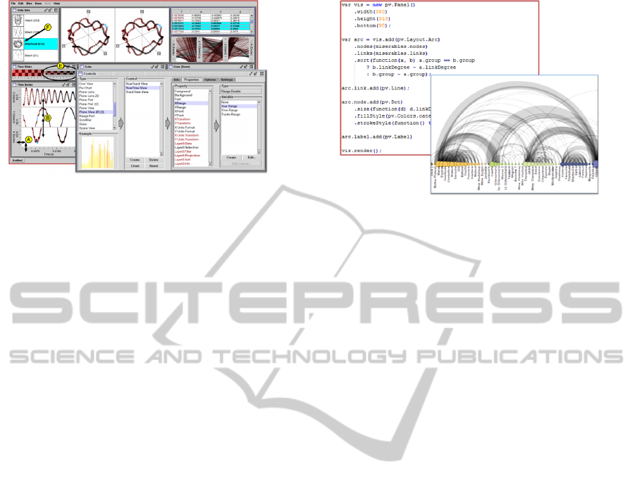
Figure 1: Improvise development environment.
assists expert users in constructing simple and ad-
vanced visualizations, which are specified program-
matically. Moreover, it allows expert users to ex-
tend the toolkit with new components and integrate
visualization techniques into interactive applications.
However, creating and customizing visualizations re-
quires experienced programmers. Consequently, this
toolkit is not appropriate for savvy and novice users.
Finally, the InfoVis toolkit, similar to Prefuse(Heer
et al., 2005), does not have a specialized development
environment, but it can be integrated in IDE such as
Eclipse.
4.3 Piccolo
Piccolo (Bederson et al., 2004) was developed at Uni-
versity of Maryland and has a version in Java and C#.
This toolkit is mainly used for developing graphical
applications with rich user interfaces. Piccolo sup-
ports the development of information visualizations
indirectly, as it does not support visualization tech-
niques (Heer et al., 2005). Nevertheless, novel visu-
alizations such as LifeFlow (Wongsuphasawat et al.,
2011) are based on this toolkit. Users can use vi-
sualization functionalities and components, such as
zooming, animation and range slider. This toolkit can
be used only by expert users, and the fact that it does
not support visualization techniques directly, it makes
it more challenging even for expert users. Similar to
the previous two toolkits, this toolkit does not have a
specialized development environment either.
4.4 Flare
This visualization toolkit is the successor of Prefuse
(Heer et al., 2005), but is written in ActionScript.
Flare (2011) supports expert users with a number of
simple and advanced visualizations. To construct a
visualization, expert users need to specify in Action-
Script the properties of the visual objects (e.g., posi-
tion, shape, color), and sequential commands to cre-
Figure 2: An arc diagram using Protovis.
ate the visualization. Skillful programmers can also
define new operators and visual objects. However,
advanced programming knowledge is required. Flare
can be integrated in Adobe Flex IDE and it does not
come with a specialized IDE. This toolkit cannot sup-
port novice or savvy users in constructing advanced
visualizations.
4.5 Improvise
Improvise (Weaver, 2004) is a visualization toolkit
for creating multi-view coordination visualizations
for relational data. It was developed at University of
Wisconsin Madison, and is written in Java. Expert
and savvy users can create visualizations by specify-
ing expressions for simple shared-object coordination
mechanism. Shared-objects in Improvise are graphi-
cal attributes such as color, font, etc. Improvise has
a specialized development environment where users
can create views by adding frames, controls, defining
variables and attaching data using the lexicon work
area (a central repository where information related to
the data and database are saved) . Users can construct
simple and advanced visualizations based on the pre-
defined controls. Finally, this tool can be used by
savvy users. Figure 1 shows a screenshot of Impro-
vise.
4.6 Processing
Processing was developed initially “to teach funda-
mentals of computer programming within a visual
context” to newcomers, but it has grown into a more
complete tool for constructing images, animations
and interactions (Processing, 2011). Processing has
a development environment, where expert users can
type the specification for a visualization and preview
the results. The development environment is similar
to a regular IDE. To create a visualization, users have
to know another programming language, Processing.
CONSTRUCTING VISUALIZATIONS WITH INFOVIS TOOLS - An Evaluation from a User Perspective
733
As a result, this tool is used only by expert users, or
non-programmers who pursue a programmer carrier.
4.7 Protovis
Protovis (Bostock and Heer, 2009), developed at
Stanford University, supports expert users to con-
struct visualizations using its domain specific lan-
guage. Designers can combine primitive graphical
controls, called marks, bind them to data, and spec-
ify visual properties. Protovis is implemented in
JavaScript, and events can be attached to a mark using
anonymous functions. In Protovis, expert users can
create simple and advanced visualizations. The au-
thors of Protovis have compared the specifications for
a simple pie chart in Protovis, Processing and Flare,
showing that the visualization in Protovis is specified
in fewer lines of code. Protovis does not have a spe-
cialized development environment to support visual-
ization creation. Constructing visualizations in Pro-
tovis may be a potential solution for savvy users due
to the simplicity of the specifications. Figure 2 shows
an arc diagram and a part of the specifications for this
visualization.
4.8 MS Excel
MS Excel is a spreadsheet program that allows users
to analyze and visualize data (Excel, 2011). With sim-
ple steps, users can construct visualizations based on
predefined templates (e.g. bar chart, pie chart, etc.).
MS Excel users can specify spreadsheet formulas or
use standard widgets to construct visualizations in the
worksheet area. However, advanced visualizations
cannot be constructed by novice users, or by savvy
users. Expert users can construct advanced visualiza-
tions by means of Macros, which can be integrated in
MS Excel.
4.9 Tableau
Tableau (2011) is a commercial visualization tool, the
successor of Polaris (Stolte and Hanrahan, 2000) de-
veloped at Stanford University. Tableau allows all
types of users to create visualizations by dragging and
dropping fields onto axis shelves (vertical and hori-
zontal areas) and using visual specifications. Tableau
uses VizQL (Hanrahan, 2006), an algebraic specifi-
cation language, to create views based on predefined
templates and bind data to them. Further, it has a
powerful interactive development environment where
users can interact, filter, sort data and create interac-
tive dashboards. The main users of this tool are novice
users. However, they may encounter some challenges
Figure 3: Evaluation results.
during the learning phase, such as mapping data to
visual objects. Tableau is a “black box” system. As
a result, expert users do not have access to the ker-
nel of the system and it is not possible to extend the
system. Therefore, users can not construct advanced
visualizations that are not supported by the tool.
4.10 Spotfire
Spotfire (2011) is another commercial tool for data vi-
sualizations. It supports users with a number of visu-
alization techniques, who can interact with the devel-
opment environment and create visualizations based
on predefined ones. Once they have selected the data
and chosen the type of visualization, the tool gen-
erates automatically the visualization. Furthermore,
users can create dashboards, by combining different
visualizations (bar chart, scatter plot, etc) in a single
screen. As in Tableau, users can not create advanced
visualizations except from the predefined ones.
4.11 Omniscope
Omniscope (2011) is in the same category as Tableau
and Spotfire, and shares similar features such as inter-
active dashboard, etc. Although it can be used by all
types of users, the main scope of this tool is to support
novice users in constructing visualizations, as Spot-
fire and Tableau do. Visualizations are constructed
based on predefined templates. Novel advanced visu-
alizations cannot be constructed with this tool. Expert
users can not extend the system with new controls or
functionalities, as it is a “black box” system.
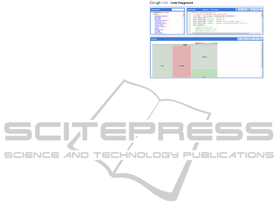
4.12 Google Chart Tools
Google Chart Tools (2011) is a library written in
JavaScript that provides several predefined simple
(e.g. line chart, scatter chart, etc.) and advanced
chart types (e.g. Image multi color bar chart, Mo-
tion Chart Time Formats, etc.). Visualizations can be
IVAPP 2012 - International Conference on Information Visualization Theory and Applications
734
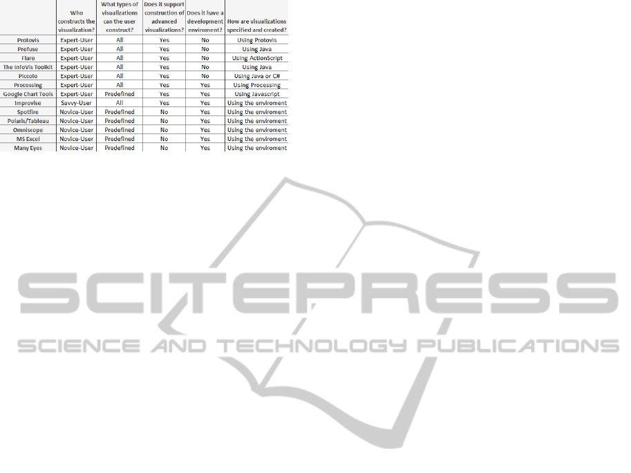
Figure 4: Evaluation results.
constructed by expert users in the web-based develop-
ment environment named Code Playground, Figure 3.
The Code Playground environment increases the like-
lihood of attracting savvy users, who may find this
approach easier to understand and use. In addition,
Google Chart Tools has the Live Chart Playground to
test charts already created in the Code Playground. In
this one, the user can change some parameters and
see how the visualization changes. Expert and savvy
users are limited to predefined templates and func-
tions, and cannot construct novel advanced visualiza-
tions.
4.13 Many Eyes
Many Eyes (Viegas et al., 2007), developed at IBM
Research Center, is a web-based visualization plat-
form mainly for novice users. In Many Eyes, visual-
izations are implemented in Java Applets. Users con-
struct a visualization in three steps: upload a dataset;
choose a visualization from predefined ones; cus-
tomize and publish the visualization. Many Eyes au-
tomatically generates and shows the visualization on
the screen. Visualizations other than predefined ones
are not supported.
5 RESULTS
Figure 4 summarizes the results of our evaluation.
Our findings show that academia focuses mainly on
supporting expert users to construct novel advanced
visualizations. On the other hand, industry markets
their products towards novice users, assisting them
with predefined visualization templates. Although
both communities can benefit from engaging savvy
users in constructing better advanced visualizations,
savvy users are neglected and not supported as novice
and expert users are. Our study shows that only one
toolkit, Improvise (Weaver, 2004), may support savvy
users in constructing advanced visualizations. A po-
tential toolkit for savvy users may be Protovis (Bo-
stock and Heer, 2009), due to the simplicity of its
domain specific language. Finally, the results show
that novice users are supplied with interactive envi-
ronments where they can drag and drop, get real-time
feedback, filter, sort and so forth.
Although there is a need for more creativity in the
InfoVis field, existing savvy users can not utilize their
knowledge and construct novel visualizations. As a
result, the InfoVis community should investigate how
savvy users can construct advanced visualizations.
We are developing a solution that deals with the
dimensions in this way: (1) Who Constructs the Vi-
sualization? We aim savvy users who will be able to
utilize both the domain knwoledge and their program-
ming skills to produce novel visualizations. (2) How
are Visualizations Specified and Created? Users
can use building-blocks and specify spreadsheet-like
formulas that link building-blocks. Spreadsheet for-
mulas have proved to be a successful approach among
programmers as well as non-programmers (Burnett
et al., 2001). They experiment with them in the de-
velopment environment and deploy them to novice
users. (3) What Type of Visualizations can the User
Construct? Simple and advanced visualizations can
be constructed using relational data, or data trans-
formed into a relational format. (4) Does it Support
Construction of Advanced Visualizations? Spec-
ifying spreadsheet-like formulas, which allow prop-
erties such as color, position etc. to be data depen-
dent, and using building blocks, we believe that savvy
users will be able to combine them in innovative and
advanced visualizations. For instance, SparkClouds
(Lee et al., 2010) can be composed by combining a
SparkLine block with a WordCloud block. (5) Does
it have a Development Environment? We are devel-
oping a specialized development environment where
savvy users can drag and drop building blocks, spec-
ify formulas with intellisense, see results live, etc.
The development environment facilitates users work,
and our evaluation clearly shows that all tools for
novice users have one.
To summarize, our goal is to move the boundary in
constructing advanced visualization from a program-
ming style towards a more expressive style for non-
programmers, by means of spreadsheet-like formu-
las. In addition, we believe that a specialized devel-
opment environment will facilitate savvy users’ work
even more.
6 CONCLUSIONS
In this paper, we evaluated 13 popular InfoVis toolk-
its and tools from a user perspective. This study
CONSTRUCTING VISUALIZATIONS WITH INFOVIS TOOLS - An Evaluation from a User Perspective
735

concludes that present tools do not support savvy
users—users with basic programming skills and do-
main knowledge—in constructing advanced visual-
izations, although their role is crucial. They need dif-
ferent visualization tools to construct advanced visu-
alizations. This study can serve as a brief introduction
to newcomers in the InfoVis area. For a deeper un-
derstanding, we encourage them to refer to the refer-
ences mentioned in this paper. Moving the boundary
of constructing advanced visualizations from expert
users towards savvy users is a research area that re-
quires more the attention of the InfoVis community.
REFERENCES
Bederson, B. B., Grosjean, J., and Meyer, J. (2004). Toolkit
design for interactive structured graphics. IEEE Trans.
Softw. Eng., 30:535–546.
Bederson, B. B., Meyer, J., and Good, L. (2000). Jazz: an
extensible zoomable user interface graphics toolkit in
java. In Proceedings of the 13th annual ACM sympo-
sium on User interface software and technology, UIST
’00, pages 171–180, New York, NY, USA. ACM.
Bostock, M. and Heer, J. (2009). Protovis: A graphical
toolkit for visualization. Visualization and Computer
Graphics, IEEE Transactions on, 15(6):1121 –1128.
Bostock, M., Ogievetsky, V., and Heer, J. (2011). D3:
Data-driven documents. IEEE Trans. Visualization &
Comp. Graphics (Proc. InfoVis).
Burnett, M., Atwood, J., Walpole Djang, R., Reichwein, J.,
Gottfried, H., and Yang, S. (2001). Forms/3: A first-
order visual language to explore the boundaries of the
spreadsheet paradigm. J. Funct. Program., 11:155–
206.
Excel, M. (2011). http://office.microsoft.com/en-us/excel/.
Accessed August, 2011.
Fekete, J.-D. (2004). The infovis toolkit. In Information
Visualization, 2004. INFOVIS 2004. IEEE Symposium
on, pages 167 –174.
Fekete, J.-D., Hemery, P.-L., Baudel, T., and Wood, J.
(2011). Obvious: A meta-toolkit to encapsulate in-
formation visualization toolkits — one toolkit to bind
them all. In Visual Analytics Science and Technology
(VAST), 2011 IEEE Conference on, pages 91 –100.
Flare (2011). http://flare.prefuse.org/. Accessed August,
2011.
Google-Chart-Tools (2011). http://code.google.com/
apis/chart/. Accessed August, 2011.
Grammel, L., Tory, M., and Storey, M.-A. (2010). How
information visualization novices construct visualiza-
tions. IEEE Transactions on Visualization and Com-
puter Graphics, 16:943–952.
Hanrahan, P. (2006). Vizql: a language for query, analysis
and visualization. In Proceedings of the 2006 ACM
SIGMOD international conference on Management of
data, SIGMOD ’06, pages 721–721, New York, NY,
USA. ACM.
Heer, J., Card, S. K., and Landay, J. A. (2005). prefuse:
a toolkit for interactive information visualization. In
Proceedings of the SIGCHI conference on Human fac-
tors in computing systems, CHI ’05, pages 421–430,
New York, NY, USA. ACM.
Lee, B., Riche, N. H., Karlson, A. K., and Carpendale,
S. (2010). Sparkclouds: Visualizing trends in tag
clouds. IEEE Transactions on Visualization and Com-
puter Graphics, 16:1182–1189.
Lienhard, A., Kuhn, A., and Greevy, O. (2007). Rapid pro-
totyping of visualizations using mondrian. In Visual-
izing Software for Understanding and Analysis, 2007.
VISSOFT 2007. 4th IEEE International Workshop on,
pages 67 –70.
Matkovic, K., Freiler, W., Gracanin, D., and Hauser, H.
(2008). Comvis: A coordinated multiple views sys-
tem for prototyping new visualization technology. In
Information Visualisation, 2008. IV 08. 12th Interna-
tional Conference, pages 215 –220.
Omniscope, V. (2011). http://www.visokio.com/. Accessed
August, 2011.
Plaisant, C., Mushlin, R., Snyder, A., Li, J., Heller, D.,
Shneiderman, B., and Colorado, K. P. (1998). Life-
lines: Using visualization to enhance navigation and
analysis of patient records. In In Proceedings of the
1998 American Medical Informatic Association An-
nual Fall Symposium, pages 76–80.
Processing (2011). http://www.processing.com/. Accessed
August, 2011.
Spotfire (2011). http://spotfire.tibco.com/. Accessed Au-
gust, 2011.
Stolte, C. and Hanrahan, P. (2000). Polaris: a system for
query, analysis and visualization of multi-dimensional
relational databases. In Information Visualization,
2000. InfoVis 2000. IEEE Symposium on, pages 5 –
14.
Tableau (2011). http://www.tableausoftware.com/. Ac-
cessed August, 2011.
Viegas, F. B., Wattenberg, M., van Ham, F., Kriss, J., and
McKeon, M. (2007). Manyeyes: a site for visualiza-
tion at internet scale. IEEE Transactions on Visualiza-
tion and Computer Graphics, 13:1121–1128.
Vrachnos, E. and Jimoyiannis, A. (2008). Dave: A dynamic
algorithm visualization environment for novice learn-
ers. In Advanced Learning Technologies, 2008. ICALT
’08. Eighth IEEE International Conference on, pages
319 –323.
Weaver, C. (2004). Building highly-coordinated visualiza-
tions in improvise. In Proceedings of the IEEE Sym-
posium on Information Visualization, pages 159–166,
Washington, DC, USA. IEEE Computer Society.
Wongsuphasawat, K., Guerra G
´
omez, J. A., Plaisant, C.,
Wang, T. D., Taieb-Maimon, M., and Shneiderman,
B. (2011). Lifeflow: visualizing an overview of event
sequences. In Proceedings of the 2011 annual con-
ference on Human factors in computing systems, CHI
’11, pages 1747–1756, New York, NY, USA. ACM.
IVAPP 2012 - International Conference on Information Visualization Theory and Applications
736
