
Visualizing User Interface Events
Event Stream Summarization through Signs
Vagner Figueredo de Santana and Maria Cecília Calani Baranauskas
Institute of Computing, University of Campinas (UNICAMP), Albert Einstein Av., 1251, Campinas, Brazil
Keywords: Semiotics, User Interface Events, Visualization of Usage Data, Log Visualization, Event Icons, Icon
Library, Image Library, User Interface Evaluation, Usability Evaluation, Accessibility Evaluation, Web
Usage Mining.
Abstract: Effective visual representation is related to how people interpret signs created to carry specific information.
In the last years many user interface evaluation tools are considering detailed usage data to represent users’
actions. The volume of data gathered is leading developers to represent usage in a summarized way through
graphical representations. If visual components used to represent complex data are not effective, then
graphics used to summarize data may turn the interpretation of complex terms even harder. This work
presents a study about graphical representations for user interface (UI) events and contributes with the
validation of usage graph visualization and an open set of signs to support the summarization of client-side
logs. The study involved 28 Information Technology specialists, potential users of UI evaluation tools.
From the results one expects that evaluation tool developers, evaluators, and Web usage miners can reuse
the validated usage graph representation and proposed set of signs to represent usage data in a summarized
way.
1 INTRODUCTION
The evaluation of user interface (UI) is a key task
when developing information systems and is part of
a number of Software Engineering development
processes. UI evaluation represents a way of
verifying whether the whole system is
communicating effectively and efficiently with
users. In the Web, the heterogeneity of UIs and the
wide range of UI elements that designers can use
when composing UIs reinforce the role of UI
evaluation.
Website evaluation can be made remotely or
non-remotely. Non-remote evaluation requires
participants to move to some controlled environment
(e.g., usability laboratory) while remote evaluation
allows participant and evaluator to be separated in
space and time, without requiring them to move to a
controlled environment (Ivory and Hearst, 2001).
Thus, remote evaluation allows users to participate
in an evaluation from anywhere, a key characteristic
when evaluators want to consider accessibility or
mobile devices.
Events can be defined as effects resulting from
user’s or system’s action. They may occur at client-
side or at server-side and often the collection of
these events is called, respectively, client-side logs
and server-side logs (Santana and Baranauskas,
2010a).
In the last decade, website evaluation tools using
server-side data (i.e., based on Web server logs)
became popular. They are used to analyze a number
of metrics such as page-views, visited Web pages,
referrers, landing pages, etc. Examples of tools that
use server-side data are: Web Utilization Miner
(Spiliopoulou and Faulstich, 1999), WebSift (Web
Site Information Filter) (Cooley et al., 2000),
WebQuilt (Hong et al., 2001), LumberJack (Chi et
al., 2002), WebCANVAS (Cadez et al., 2003), and
DCW (Descubridor de Conhecimento en la Web)
(Domenech and Lorenzo, 2007).
On the other hand, data capture at client-side
allows evaluators to discover more precisely how a
UI is used, since one page-view may be represented
by a stream of hundred of events representing the
user’s behavior. This characteristic makes client-side
data a more adequate source to represent details of
the interaction of users with UIs. However, using
this data source also brings challenges concerning
logging, transferring, summarizing, and presenting
logged event streams. Examples of tools that use
client-side data are: WebRemUSINE (Web Remote
78
Figueredo de Santana V. and Calani Baranauskas M..
Visualizing User Interface Events - Event Stream Summarization through Signs.
DOI: 10.5220/0003989500780085
In Proceedings of the 14th International Conference on Enterprise Information Systems (ICEIS-2012), pages 78-85
ISBN: 978-989-8565-12-9
Copyright
c
2012 SCITEPRESS (Science and Technology Publications, Lda.)

User Interface Evaluator) (Paganelli and Paternò,
2002), WAUTER (Web Automatic Usability Testing
Environment) (Balbo et al., 2005), MouseTrack
(Arroyo et al., 2006), MultiModalWebRemUSINE
(Paternò et al., 2006), UsaProxy (Atterer and
Schmidt, 2007), WebInSitu (Bigham et al., 2007),
Google Analytics (Google, 2009), WELFIT (Web
Event Logger and Flow Identification Tool)
(Santana and Baranauskas, 2010), WebHint (Vargas
et al., 2010), and WUP (Web Usability Probe) (Carta
et al., 2011).
Considering the presented evaluation tools, it is
possible to verify that there is a trend in the last
decade towards the use of client-side logs as data
source. In addition, the summarization of the
captured data appears as vital task in order to get the
behavior data contained in hundreds of log lines.
The literature counts on works that deal with the
issue of representing behavioral data. The visual
representation commonly considered in these works
is via graphs, which allows the visualization of
patterns (through edges’ attributes) and actions
performed by users (through nodes’ attributes)
(Santana and Baranauskas, 2010b; Spiliopoulou and
Faulstich, 1999). In addition, Mutzel and Eades
(2002) reinforce that graphs are the most common
form of visualization provided by software.
In the context of evaluation tools, evaluators
should easily grasp users’ behavior when analyzing
tools’ reports. Usage graph is a type of report
containing a directed cyclic graph in which nodes
represent events occurred in a Web page and edges
represent the sequence in which events had occurred
(Santana and Baranauskas, 2010a). A usage graph
representation was proposed in Santana and
Baranauskas (2010b) after a comparison considering
different representations of behavior through graphs.
In the mentioned study authors presented that the
maximum number of nodes is given by the product
of the total Web page elements and the number of
events tracked, not depending on the number of
tracked sessions. The presented solution is a graph
containing only textual data, which makes it difficult
for an evaluator to analyze a usage graph
representing thousands of events. In addition, such
usage graphs require evaluators to know all events
represented in the nodes, which usually is not the
case as we will detail in Section 4.
Considering the previous mentioned works and
trends as main motivators, our research aims at
presenting such usage graphs in an efficient manner,
converting as many textual information as possible
into signs. Thus, the main goal of this work is to
represent events through the use of icons. According
to Peirce (1974), icons are the only way of directly
communicating an idea.
The Peirce’s Semiotics counts on deep studies
regarding signs. Moreover, Peirce presents rich
taxonomies and different and efficient ways of
classifying signs in a precise way. The thorough
study of signs made by Peirce corroborates the use
of his works as the main theoretical reference.
In this context, this work’s contributes with the
validation of a usage graph representation and the
proposal of a set of signs to represent UI events. The
set is open and is available for the HCI (Human-
Computer Interaction) community at http://argos.
nied.unicamp.br:8888/welfit/images/. The set was
designed, evaluated, and validated. These phases
will be detailed in the following sections. Regarding
the evaluation of the designed signs, works of Rubin
(1994) and Wainer (2007) guided methodologically
the experiment design, forms composition, bias
avoidance, and conduction of evaluations.
This work is organized as follows: the next
section summarizes the theoretical basis and the
rational of the proposed signs; section 3 details the
evaluation methodology; section 4 presents the
results, and section 5 concludes and shows further
directions.
2 BACKGROUND
It is not difficult to find open icon libraries for
developing websites or GUI (Graphical User
Interface), but there is no such availability of open
library to represent UI events, indicating the need of
such set of icons. A popular example of icon library
is the Open Icon Library (2010). It is a consolidated
source of icons for people to customize UI. It offers
a free resource for developers looking for icons to
use in their free/open projects and has more than
10,000 icons; none of them refers to UI events.
This work is theoretically grounded on Peirce’s
Semiotics. Semiotics can be defined as the discipline
that studies signs and systems of signs. A sign (or
representamen) is something that, under certain
aspect, represents something to somebody, i.e.,
creates – in the mind of a person – an equivalent or a
more developed sign (interpretant). Sign represents
an object, not obligatorily in all of its aspects, giving
an idea of the represented object (Peirce, 1974).
Peirce presents properties and details signs based
on trichotomies. This work follows the most
important trichotomy in which a sign can be
classified as an icon, an index, or a symbol. The icon
(Figure 1, A) is a sign that refers to the object as a
VisualizingUserInterfaceEvents-EventStreamSummarizationthroughSigns
79
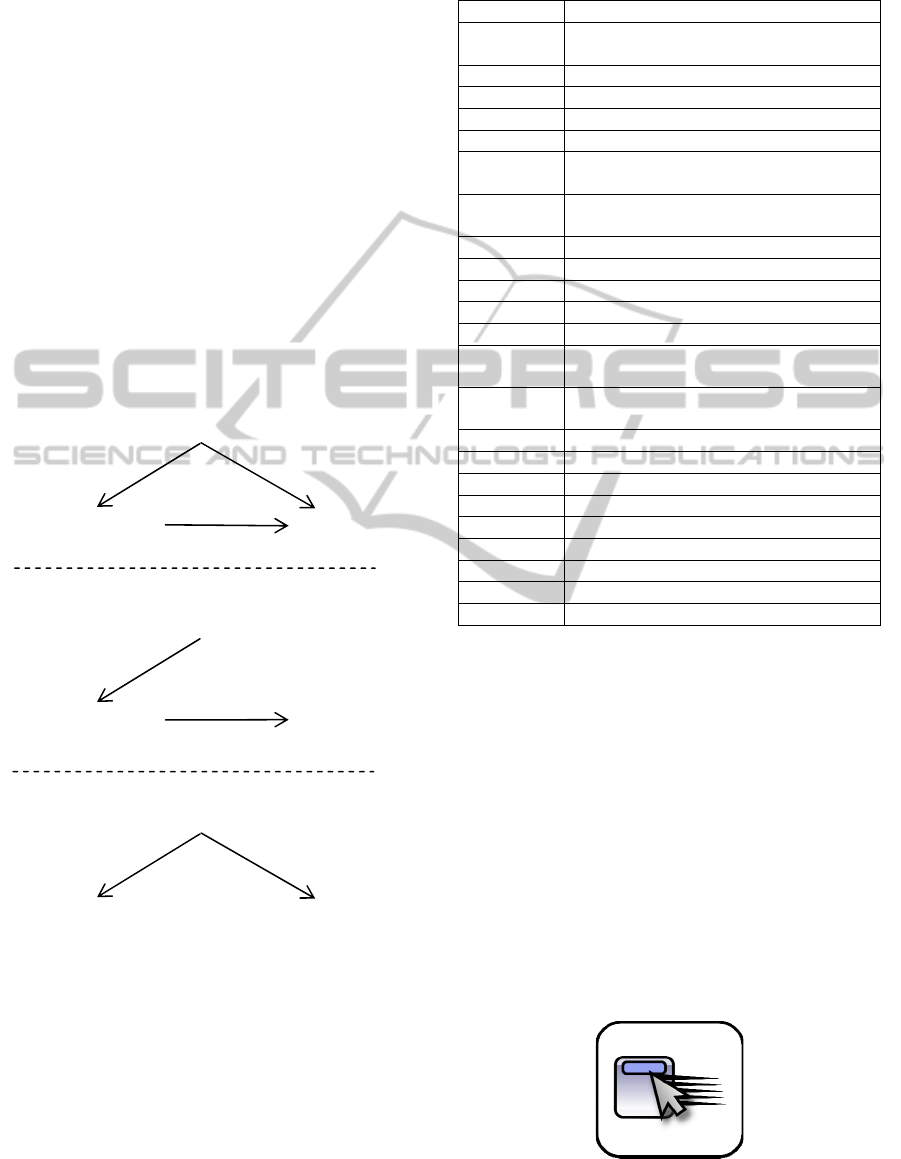
result of representamen’s characteristics. From its
observation it is possible to discover characteristics
of the object being represented. For example, a
house drawing presenting its main characteristics
(i.e., walls, door, and roof) in simple lines refers to
the proper house object. The index (Figure 1, B) is a
sign that refers to the object that it denotes as if the
representamen was directly affected by the Object.
An index has the cause-effect relationship between
object and representamen and can also be seen as an
organic pair between the representamen and the
object. For example, when seeing smoke coming
from a chimney the smoke is the effect that makes
you think about what caused it. The symbol (Figure
1, C) is a sign that refers to the object it denotes by
virtue of an established convention, law, or rule. For
example, a road sign presenting the letter ‘P’ may
indicate, by an established convention, a parking lot
(Peirce, 1974; Rocha and Baranauskas, 2003).
Figure 1: Relationship of terms of the trichotomy that
defines: icon (A), index (B), and symbol (C).
Considering the chosen data source, the signs
proposed to represent UI events are based on
standard events (Table 1).
Bearing in mind that the only way of directly
communicating an idea is through an icon (Peirce,
1974) and that reports displayed to evaluators should
present the big picture of users’ behavior (Santana
and Baranauskas, 2010), then the rationale of the
Table 1: Standard UI events considered in the study
(W3Schools, 2011).
Event Triggered when...
Abort the loading of a document or an image is
cancelled
Blur an element loses focus
Change the content of a field changes
Click the mouse clicks an object
Dblclick the mouse double-clicks an object
Dragdrop an element is dragged and dropped in a
new position
Error an error occurs when loading a
document or an image
Focus an element gets focus
Keydown a keyboard key is pressed
Keypress a keyboard key is pressed or held down
Keyup a keyboard key is released
Load a Web page or image is finished loading
Mousedow
n
a mouse button is pressed
Mousemov
e
the mouse is moved
Mouseout the mouse is moved off an element
Mouseover the mouse is moved over an element
Mouseup a mouse button is released
Move a window is moved
Resize a window or frame is resized
Reset all the content filled in a form is deleted
Select a text is selected
Submit a form is submitted
Unload the user exits the Web page
design of the signs to represent UI events focused
first in creating effective icons. Then, in case of
signs failing to be represented as icons, the fall
backs were index, and, lastly, symbol.
It is worth mentioning that events related to
concrete actions of users that are at users’ and
evaluators’ sight were easier to represent as icons
(e.g., click). However, signs representing events
triggered by the browser (e.g., load) or as direct
consequence of events triggered by users (e.g.,
change) were harder to represent as icons, falling
back to symbolic or indexical representations. The
relationship among these UI events and the classes
of sign considered resulted in a mapping that
supports the creation of new signs and it will be
presented in the results section.
Figure 2: The Sign representing the mouseover event.
I
nterpretan
t
Objec
t
Representamen
A)
I
nterpretan
t
Objec
t
Representamen
B)
I
nterpretan
t
Objec
t
Representamen
C)
ICEIS2012-14thInternationalConferenceonEnterpriseInformationSystems
80
The creation of the signs involved a base element
to represent a window-like abstract UI element, as
presented in Figure 2.
UI events are commonly related to movements
just performed. Thus, in order to represent them
graphically, photographic streaking effect presented
by McCloud (1994) was added in order to represent
movements, actions performed, and state change
(Figure 2).
In order to build other signs, the base UI element
was combined with elements inspired in well known
UI components (e.g., pointer and hand) and personal
computer hardware (e.g., mouse and keyboard keys).
However, some events are not triggered directly by
users, for instance, load and abort. This reinforces
the need of evaluating signs in order to represent this
kind of events to evaluators.
3 EXPERIMENT DESIGN
The first set of signs was analyzed in an evaluation
counting on 15 participants of a graduate discipline
on Special Topics on HCI. The second set of
redesigned signs counted on 13 participants of a
graduate discipline on Design Patterns. Both of the
classes were formed by software engineers that are
potential users of such signs representing UI events.
There is no intersection or contact among these
participants in order to avoid bias related to previous
experience considering the interpretation of the
evaluated signs, reports, and evaluation forms.
The second evaluation was done 9 months later,
based on results of the first evaluation; this means
that the signs were redesigned based on results of the
first evaluation and then checked in the second
evaluation. These two groups of participants were
chosen because their profiles are part of the target
population considered (i.e., potential users of UI
evaluation tools). They are researchers, students, and
professionals that would use an evaluation tool to
analyze users’ behavior.
The evaluations had three printed forms (A, B,
and C) and a questionnaire to verify the
representations used in the usage graph report. With
these forms we also gathered data concerning
gender, age, and profession of the participants. The
instruments are detailed as follows.
Form A investigates the activity of interpretation
of signs without context; this means that the signs
were not presented in a meaningful order. The form
has a 4 x 6 table containing the 23 proposed signs in
random order, since some of them have a direct
relationship (e.g., keydown-keypress) and placing
them together or in alphabetical order might
influence results. Along with each sign there was a
bracket gap to be filled with an index representing
the filling order and a gap to be filled with the
meaning that the sign has for the user (e.g., the gaps
pair [_] _____ could be filled as [1] click ).
Regarding instructions, the form A asked
participants to write down the meaning of each
image.
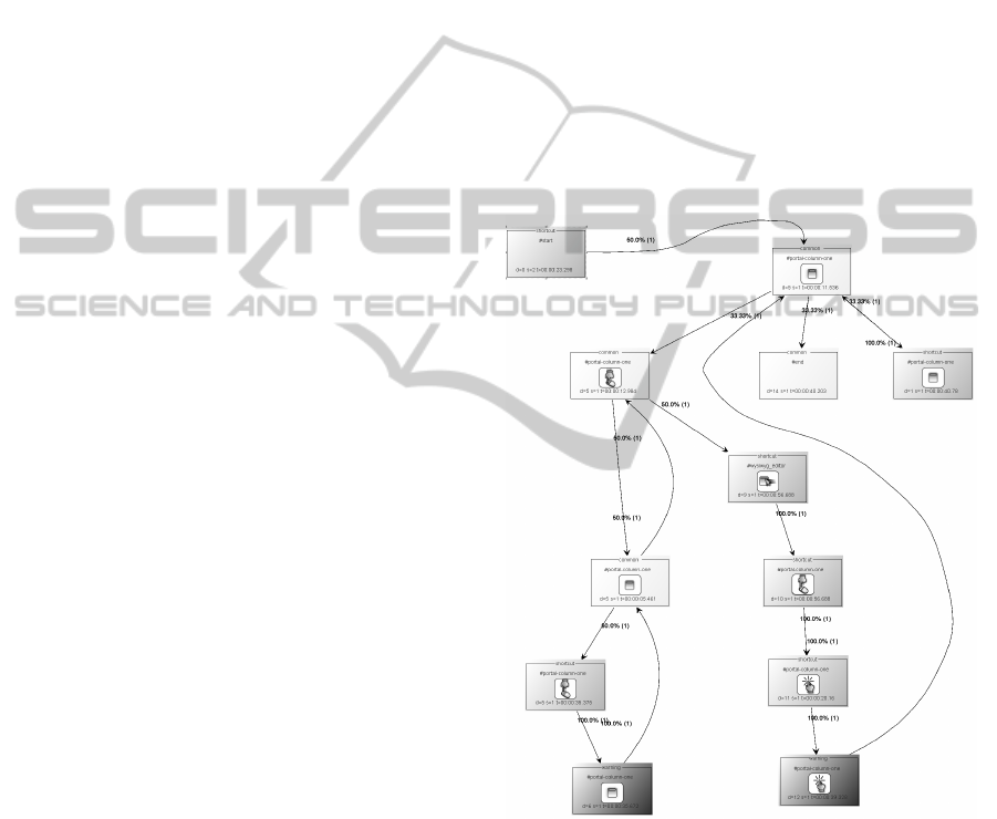
Form B focuses on presenting to participants a
usage graph report representing a real usage of a
Web page being evaluated by WELFIT (Santana and
Baranauskas, 2010), one of the studied tools that
considers detailed data. In the form B the
participants were asked to write down the meaning
of the usage graph report representing the usage
(Figure 3). In other words, they were asked to
identify the meaning of signs in a situated context.
Figure 3: Overview of the usage graph that was part of the
form B, representing the evaluated signs in a situated
context.
The usage graph report uses the proposed signs
in logical and meaningful sequence (e.g., blur-focus,
keydown-keypress-keyup, mousemove-click). The
usage graph was designed to help the identification
of the detailed interaction of users with UI elements.
Regarding instructions, the form B asked
participants to describe what might have happened
during the usage represented in the usage graph. It is
VisualizingUserInterfaceEvents-EventStreamSummarizationthroughSigns
81
worth mentioning that Figure 3 was resized in order
to present the whole usage graph, just as would
occur when using an evaluation tool if zoomed out;
in this case the textual information are almost
unreadable, but the signs can be identified. This
example presents another context that motivates this
study.
Form C was given to participants only after
finishing forms A and B. The form C was used as a
matching exercise between the signs and their
intended meanings, using the indexes that
participants had filled in the form A. This was done
in order to verify the accuracy of the signs in a
context of an Information System in which they will
count on a legend to get signs actual meanings.
The final questionnaire was presented in order to
try to identify weak points in the representation
contained in the form B concerning information
added to nodes.
The procedure of each of the two evaluations
was the following: 1) At the first moment, half of the
students (plus/minus one) received first the form A
and then (10 minutes later) the form B. This group
of students is referred from now on as group AB;
2) The other half received first the form B then the
form A, referred from now on as group BA. This
was done in order to verify the influence when
participants were trying to identify signs’ meaning
without context (before the usage graph report
containing the signs in a meaningful order) and vice
versa; 3) Lastly, once both groups had filled up the
forms that were given, then all participants received
the form C and the questionnaire.
4 RESULTS AND DISCUSSION
The accuracy was measured considering the term
filled by participants in the form A and if they
matched the designer’s pragmatics. If the term filled
by respondents refers, in an unambiguous way, to
the action/event being represented, then the sign was
considered successful in communicating its meaning
to the participant. For instance, one participant filled
the term ‘click’ for the mouseup sign; then it was
counted as not successful because there is another
event named ‘click’. Other participant filled the term
with ‘release mouse’; this was counted as successful.
Table 2 presents the summary of evaluations and
accuracy of signs. Considering participants’
answers, the mean of answers that met the meaning
of the event being represented, for each participant,
were: in the 1
st
evaluation, 61.74% (standard
deviation (s) of 19.11%); and in the 2
nd
evaluation
65.22% (s=15.68%). The low mean and high
standard deviation of right answers per participant
might be related to the following points: the strict
and unambiguous analysis performed regarding the
terms filled by participants, since some participants
left blanks or filled the same term for more than one
event; and, the difficulty of participants in defining
events triggered by the browser.
Taking into account signs’ accuracy, we obtained
the following means: in the 1
st
evaluation, 62.61%
(s=27.02%); and in the 2
nd
evaluation, 64.88%
(s=25.28%). These results represented a small
improvement considering redesigned signs.
Table 2: Summary of evaluations’ results.
Attribute 1
st
evaluation 2
nd
evaluation
Participants 15 participants
(12 males,
3 females)
13 participants
(7 males,
6 females)
Mean age 28.35 years
(s = 6.1 years)
28.09 years
(s = 4.41 years)
Right definition
for sign per
participant
(Total)
61.74%
(s = 19.11%)
65.22%
(s = 15.68%)
Mean accuracy
of signs
62.61%
(s = 27.02%)
64.88%
(s = 25.28%)
Mean of correct
matches between
sign and event
meaning (Total)
78.26%
(s = 15.68%)
77.26%
(s = 15.18%)
Mean of correct
interpretations of
the usage graph
40% 61.54%
Table 3: Examples of redesign results.
Event
1
st
evaluation 2
nd
evaluation
Sign Accur. Sign Accur.
Click 33.33%
61.54%
Dblclic
k
33.33%
46.15%
Select 40.00%
69.23%
The best results (accuracy > mean accuracy + s)
were related to the signs representing the events: in
the 1
st
evaluation, abort, mousemove, mousedown,
and submit; and in the 2
nd
evaluation, abort, error,
mousedown, and submit.
The worst results (accuracy < mean accuracy - s)
ICEIS2012-14thInternationalConferenceonEnterpriseInformationSystems
82

were related to signs representing the events: in the
1
st
evaluation, change, click, dblclick, error, focus,
and unload; and in the 2
nd
evaluation, change,
mouseover, mouseout, and unload.
In the last case, unload and change events were
also present, revealing the most difficult events to be
represented, this difficulty on designing them will be
discussed in the next section.
Regarding lack of responses, the first evaluation
had 4 empty fields (in the 15 forms A), two of them
referring to the change and unload events. In the
second evaluation, the 13 forms A had 8 empty
fields, two of them referring to dblclick event.
Regarding the order in which gaps were filled in
form A, it is possible to check what signs had
quicker interpretation from the users. The signs
defined first by the users were related to the
following events: in the 1
st
evaluation, abort, resize,
dragdrop, and mousemove; and in the 2
nd
evaluation,
abort, unload, dragdrop, and reset.
The last ones defined, indicating that their
meanings were harder to grasp, were: in the 1
st
evaluation, mouseover, move, focus, and mouseup;
and in the 2
nd
evaluation, dblclick, focus, mouseover,
and mouseup.
Referring to the validation of the usage graph as
summarized representation of event stream data (i.e.,
form B) an improvement was also obtained. In the
1
st
evaluation the usage graph was correctly
interpreted by 6 out of 15 participants (3 from group
AB and 3 from group BA). The main problem in the
descriptions filled by participants was related to the
click event, since 6 out of 9 participants that
interpreted the usage graph differently from what
was expected informed that the click event was
something referred to an ‘mark as favorite’ action.
This reinforces our rationale in combining the two
types of evaluation presented in this work, i.e., the
signs seen in isolation and within the usage graph. In
the 2
nd
evaluation the usage graph was correctly
interpreted by 8 out of 13 participants (4 from group
AB and 4 from BA group). The main issue here was
related to the fact that each usage graph node was
thought as referring to a Web page, which usually
occur in evaluation tools considering page-view as
the navigational unit. Table 3 presents samples of
redesigned signs that helped in improving these
results.
Considering form C, which was used to mach the
event meanings with signs of the sheet A, as a
matching terms exercise, the successful matching
had a mean of 78.26% (s=15.68%) per respondent;
and in the second evaluation the result was 77.26%
(s=19.40%). This reveals that if the system using
these signs was using a legend, no significant
improvement should be expected. According to this
point and to the amount of information present in a
usage graph, it seems more adequate to consider tool
tips than legend for the elements present in the usage
graph. This suggestion was also made by some
participants through the questionnaires.
The results obtained from the 1
st
and 2
nd
evaluations lead to some hypothesis considering the
improvement of the signs in isolation and the usage
graph. The hypothesis for the improvement in the
accuracy of signs is that the redesign eliminated
some of the elements that were leading to the
misunderstanding on mapping signs to proper
events, e.g., the click sign that was revoking the star
element used in many websites for rating/ranking
and the select sign that, after redesign, is
representing more clearly the ongoing action. In
addition, the hypothesis for the noteworthy
improvement of the correct interpretation of usage
graphs is that the redesigned signs improved the
understanding of the whole graph and, consequently,
the usage context. This point was reinforced by the
fact that evaluators were not aware of all standard
events of Web UIs, thus the interpretation of signs in
a usage graph helps in decoding the signs
considering the meaning of the whole context.
It was possible to check the differences regarding
the evaluation of usage graphs and the interpretation
for each single sign’s meaning. Hence, the accuracy
of signs is a key factor on understanding the entire
usage graph. This outcome points out that, as
presented before, interpreting the whole usage graph
is easier than understanding the signs without
context. However, it was also verified that
improving single elements that compose the whole
usage graph impacts significantly in grasping the
meaning of the usage graph. In sum, the mean
accuracy of signs improvement from 62.61% to
64.88% impacted on the improvement of the correct
interpretation of the usage graph from 40.00% to
61.54%.
The difficulty of designing accurate signs was
more present when referring to events that are
distant from evaluators’ perspective, i.e., is not part
of the daily work of evaluators that do not work
daily with Web pages event handlers
. Consequently,
it was harder to obtain a representamen to stand for
such actions that, in turn, creates the desired
interpretant in the mind of the participants. This was
observed in different cases (e.g., unload and change
events). In addition, after analyzing why some signs
obtained better accuracy than others based on
evaluations and on the Semiotics, we found a
VisualizingUserInterfaceEvents-EventStreamSummarizationthroughSigns
83
correlation considering the trichotomy and the
categories of UI events. From that correlation, we
present a mapping among the classes of signs and
the three categories found (Table 4).
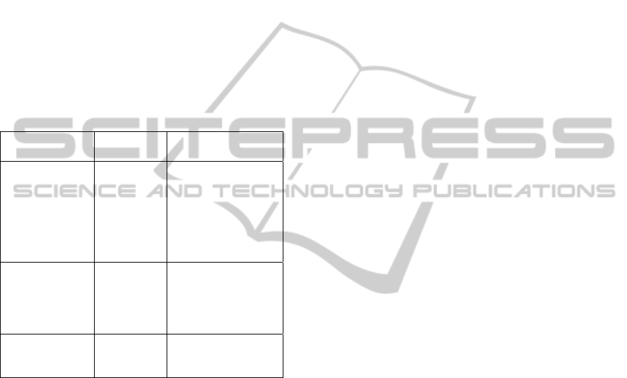
The three categories are related to events that are
directly triggered by users, triggered as a result of
events triggered by users, and events triggered by
the browser as its natural functioning (i.e., without
any direct connection with users events). The
mapping can be used as a guide to design and
organize new signs for representing client-side
single events, composed events, and abstract events,
since there are tools that consider this kind of client-
side event abstractions, for example, Google
Analytics (2009) and WUP (Carta et al., 2010).
Table 4: Mapping relating events according to their
sources and the candidate class of Sign to represent it.
Candidate
Class of Sign
Event
category
UI events
Icon
Direct
users
actions
click, dblclick,
keydown, keypress,
keyup, mousedown,
mousemove,
mouseout,
mouseover, and
mouseup
Index
Effect of
users’
actions or
abstract
events
change, dragdrop,
move, resize, reset,
select, and submit
Symbol
Browser
functioning
abort, blur, error,
focus, load, and
unload
5 CONCLUSIONS
Several user interface evaluation tools are collecting
detailed usage data to represent users’ actions. The
volume of information demands a summarized way
of presenting data through graphical representations.
This paper presented a study on how to graphically
represent detailed users’ actions occurred at client-
side, grounded on the Peirce’s Semiotics. The
proposed set of signs is a first approach to deal with
the problem of the inexistence of an open library to
represent UI events. The set of signs, now available
to the Human-Computer Interface community
at http://argos.nied.unicamp.br:8888/welfit/images/,
was analyzed in order to adequately represent end
users’ behaviors to evaluators, achieving an
accuracy that is close to the matching terms
accuracy. In addition, the proposed signs were
applied in a validation of usage graphs as a way of
summarizing event stream data for evaluators.
A mapping of signs was presented, combining
events, events categories, and candidate classes of
signs to represent them. The mapping illustrates the
complexity one has to deal with when designing
icons in the context of usage visualization,
especially when designing signs representing events
that are not direct effects of users’ actions. Thus, the
mapping proposed may help designers who want to
create signs for new UI events, guiding them in
terms of what kind of sign to use and where to focus
the pragmatics concerning the event to be
represented.
The set of developed signs can be reused by
other evaluation tools in order to represent users’
behavior. Tools are gathering and presenting
detailed usage data year after year, thus the HCI
community is welcome to improve it.
Future works involve distributing the online
versions of the forms and questionnaires used in this
work to the community in order to allow the
improvement of the proposed signs in large scale
and to include new signs for events that are
appearing along with emerging technologies (e.g.,
touch displays).
Finally, the complexity of UI is growing but
events compose a defined set. Thus, in the very low
level, UI events change a lot less than UIs, since
they are coupled with technologies not with the use
designers and developers make of it. New events are
slowly appearing as those triggered by
accelerometers. Even though, these new events can
all be translated into signs and reported through
usage graphs for analysis. Hence, a study regarding
events of modern UIs and mobile applications are
also considered for future work.
ACKNOWLEDGEMENTS
We thank all participants, colleagues that helped in
the evaluations, and FAPESP - Fundação de
Amparo à Pesquisa do Estado de São Paulo (grant
#2009/10186-9) and CNPq through the EcoWeb
Project (#560044/2010-0) for supporting this
research.
REFERENCES
Arroyo, E., Selker, T., Wei, W. 2006. Usability tool for
analysis of web designs using mouse tracks. In
Proceedings of ACM CHI 2006 Conference on Human
ICEIS2012-14thInternationalConferenceonEnterpriseInformationSystems
84

Factors in Computing Systems, Work-in-progress, vol.
2, pp 484–489, http://doi.acm.org/10.1145/1125451.1
125557.
Atterer, R., Schmidt, A. 2007. Tracking the interaction of
users with Ajax applications for usability testing. In
Rosson, M.B., Gilmore, D.J. (eds) CHI, ACM, pp
1347–1350, http://doi.acm.org/10.1145/1240624.1240
828.
Balbo, S., Goschnick, S., Tong, D., Paris, C. 2005.
Leading web usability evaluations to WAUTER. In
AusWeb05 - Australian World Wide Web Conference.
Bigham, J. P., Cavender, A., Brudvik, J. T., Wobbrock, J.
O., Ladner, R. E. 2007. Webinsitu: a comparative
analysis of blind and sighted browsing behavior. In
Pontelli E, Trewin S (eds) ASSETS, ACM, pp 51–58,
http://doi.acm.org/10.1145/1296843.1296854.
Cadez, I. V., Heckerman, D., Smyth, P., Meek, C., White,
S. 2003. Model-based clustering and visualization of
navigation patterns on a Web site. In Data Mining and
Knowledge Discovery.
Carta, T., Paternò, F., Santana, V. F. 2011. Web Usability
Probe: A Tool for Supporting Remote Usability. In
INTERACT 2011.
Chi, E. H., Rosien, A., Heer, J. 2002. Lumberjack:
Intelligent discovery and analysis of web user track
composition. In WEBKDD, Springer, Lecture Notes in
Computer Science, vol. 2703, pp 1–16, http:/springer
link.metapress.com/open.asp?genre=article&issn=030
2-9743&volume=2703&spage=1.
Cooley, R., Tan, P. N., Srivastava, J. 2000. Discovery of
interesting usage patterns from Web data. In Lecture
Notes in Computer Science 1836:163–182, http://
link.springer-ny.com/link/service/series/0558/bibs/183
6/18360163.htm.
Domenech, J. M., Lorenzo, J. 2007. A tool for web usage
mining. In Intelligent Data Engineering and
Automated Learning - IDEAL 2007, 8th International
Conference, Birmingham, UK, December 16-19,
2007, Proceedings, Springer, Lecture Notes in
Computer Science, vol 4881, pp 695–704, http://dx.
doi.org/10.1007/978-3-540-77226-2_70.
Google. 2009. Google analytics. http://www.google.com
/analytics.
Hong, J. I., Heer, J., Waterson, S., Landay, J. A. 2001.
Webquilt: A proxy-based approach to remote web
usability testing. In ACM Transactions on Information
Systems 19(3): 263–285, http://doi.acm.org/10.1145/
502115.502118.
Ivory, M. Y., Hearst, M. A. 2001. The State of Art in
Automating Usability Evaluation of User Interfaces. In
ACM Comput. Surv. vol. 33, 470--516. ACM.
McCloud, Scott (1994) Understanding Comics: The
Invisible Art. HarperPerennial.
Mutzel, P., Eades, P. 2002. Graphs in Software
Visualization. In Software Visualization. LCNS, 2269,
285-294.
Open Icon Library (2010) Open Icon Library: free/open
icons. http://openiconlibrary.sourceforge.net
Paganelli, L., Paternò, F. 2002. Intelligent analysis of user
interactions with web applications. In IUI ’02:
Proceedings of the 7th international conference on
Intelligent user interfaces, ACM, New York, NY,
USA, pp 111–118, DOI http://doi.acm.org/10.1145/50
2716.502735.
Paternò, F., Piruzza, A., Santoro, C. 2006. Remote web
usability evaluation exploiting multimodal information
on user behavior. In CADUI, Springer, pp 287–298,
http://dx.doi.org/10.1007/978-1-4020-5820-2.
Peirce, C. S. 1974. Collected Papers of Charles sanders
Peirce. Vols. 1-6. C. Harshorme and P. Weiss (eds.)
Cambridge: Harvard University Press.
Rocha, H. V., Baranauskas, M. C. C. 2003. Design e
Avaliação de Interfaces Humano-Computador.
Campinas, SP; NIED/UNICAMP.
Rubin, J. 1994. Handbook of Usability Testing: How to
Plan, Design, and Conduct Effective Tests. John Wiley
& Sons, Inc. New York, NY, USA.
Santana, V. F., Baranauskas M. C. C. 2008. An
asynchronous client-side event logger model. In
Technical Report IC-08-28. IC-UNICAMP. http://
www.ic.unicamp.br/~reltech/2008/08-28.pdf.
Santana, V. F., Baranauskas M. C. C. 2010a. Bringing
users of a digital divide context to website evaluation
using WELFIT. In IX Simpósio de Fatores Humanos
em Sistemas Computacionais (IHC 2010).
Santana, V. F., Baranauskas, M. C. C. 2010b.
Summarizing Observational Client-side Data to
Reveal Web Usage Patterns. In Proceedings of the
2010 ACM Symposium on Applied Computing. New
York: ACM. v. 2. p. 1219-1223.
Spiliopoulou, M., Faulstich, L. C. 1999. WUM: A tool for
Web utilization analysis. In Lecture Notes in
Computer Science 1590:184–203.
Vargas, A., Weffers, H., Rocha, H. V. 2010. A method for
remote and semi-automatic usability evaluation of
web-based applications through users behavior
analysis. In MB '10 Proceedings of the 7th
International Conference on Methods and Techniques
in Behavioral Research. ACM New York, NY, USA.
W3Schools (2011) HTML DOM Event Object. http://
www.w3schools.com/jsref/dom_obj_event.asp
Wainer, J. 2007. Métodos de pesquisa quantitativa e
qualitativa para a Ciência da Computação. In Capítulo
5. Jornadas de Atualização em Informática (JAI).
VisualizingUserInterfaceEvents-EventStreamSummarizationthroughSigns
85
