
Visualization of Bioinformatics Workflows for Ease of Understanding
and Design Activities
H. V. Byelas and M. A. Swertz
Genomics Coordination Center, Department of Genetics, University Medical Center Groningen,
University of Groningen, Groningen, The Netherlands
Keywords:
Bioinformatics: Workflow Management System, Life Science Workflows, Workflow Visualization.
Abstract:
Bioinformatics analyses are growing in size and complexity. They are often described as workflows, with the
workflow specifications also becoming more complex due to the diversity of data, tools, and computational
resources involved. A number of workflow management systems (WMS) have been developed recently to
help bioinformaticians in their workflow design activities. Many of these WMS visualize workflows as graphs,
where the nodes are analysis steps and the edges are interactions and constraints between analysis steps. These
graphs usually represent a data flow of the analysis. We know that in software visualization, similar graphs are
used to show a data flow in software systems. However, the WMS do not use any widely accepted standards for
workflow visualization, particularly not in the bioinformatics domain. As a result, workflows are visualized
in different ways in different WMS and workflows describing the same analysis look different in different
WMS. Furthermore, the visualization techniques used in WMS for bioinformatics are quite limited. Here, we
argue that applying some of the visual analytics methods and techniques used in software field, such as UML
(unified modelling language) diagrams combined with quality metrics, can help to enhance understanding and
sharing of the workflow, and ease workflow analysis and design activities.
1 INTRODUCTION
Software structure has been depicted with design di-
agrams since the very start of computer program-
ming (Diehl, 2007). Furthermore, control-flow
graphs (Goldstine and von Neumann, 1947) were
among the first kinds of software diagrams and are
very similar to the data-flow graphs used in the bioin-
formatics domain. Every diagram typically empha-
sises a particular aspect of a software system, such
as a software static model or the time ordering of
messages between software components. Still, many
diagram elements of a diverse nature can occur in
the same diagram. An effective system understand-
ing requires ways to correlate diagram elements and
software metrics, which represent software quality at-
tributes, in a single view.
Visualizations that combine software structure
and software attributes are arguably among the most
universal types of software visualizations, and among
the first that were proposed in the history of software
visualization (Diehl, 2007; Spence, 2007). A good
understanding of the structure of a potentially large,
complex, and relatively unfamiliar software system is
best served by visualizing the structure.
Adding attributes such as ”quality” metrics to
this picture helps correlate the various quantita-
tive insights with structural and architectural in-
sights (Lanza and Marinescu, 2006). In some cases,
software designers also identify and use groups of el-
ements in the system analysis without constructing a
separate diagram. These group of elements can also
have their own group-level metrics (Byelas and Telea,
2009).
An increase of size and complexity in bioinfor-
matics analyses means there is now a need to use
advanced visualization techniques to depict analysis
structure and workflow ”quality” metrics. If the struc-
ture of the analysis is represented by the graph, both
graph nodes and relations can accommodate several
”quality” metrics. These metrics can also be defined
at different levels of detail, such as groups of graph el-
ements or sub-members of them. Furthermore, work-
flow visualization should be unified in some way to
improve workflow sharing between people and inter-
changing between different WMS. Some attempts to
support workflows interoperability were done in the
SHIWA project (SHIWA, 2012), however, to the best
116
V. Byelas H. and A. Swertz M..
Visualization of Bioinformatics Workflows for Ease of Understanding and Design Activities.
DOI: 10.5220/0004195301160121
In Proceedings of the International Conference on Bioinformatics Models, Methods and Algorithms (BIOINFORMATICS-2013), pages 116-121
ISBN: 978-989-8565-35-8
Copyright
c
2013 SCITEPRESS (Science and Technology Publications, Lda.)
of our knowledge, a question of the visual workflow
representation was not addressed in that project.
After interviewing the final WMS users in our
team, which are researchers and Ph.D. students, we
identified main ”quality” metrics for bioinformatics
workflows, that they are interested in:
• a number of parallel executions of workflow ele-
ments, which is usually the case if the workflow
is developed to run in a computational cluster or
grid;
• sizes of input and output data;
• an analysis execution time;
• tools used in an analysis, their dependencies and
the operation systems used;
• resources required to run an analysis (e.g. CPU,
RAM, storage requirements).
Besides showing these workflow attributes to-
gether with the workflow structure, users want to see
workflow behaviour and evolution. We identified sev-
eral views on workflows, which are most required in
Life sciences. These are:
1. a structural overview of workflow elements show-
ing or hiding ”quality” metrics; and zooming into
to a particular element or a group thereof and its
dependencies combined with ”quality” metrics;
2. an overview of how different parameters influence
the results of analysis; and it is often the case,
when bioinformatics workflows should be re-run
many times with different analysis parameters;
3. a workflow evolution view, showing what ele-
ments were introduced or removed, when and who
made these changes;
4. a run-time execution monitor, which shows the
workflow progress information; and a statistical
overview of workflow runs, success/failure rates,
use of tools and user statistics.
The first three views are the design views and
the last one is the execution view of the workflow.
All these views should be readily understandable and
scalable.
Here, we first give some examples of visualiza-
tions used in the WMS and specific for bioinformat-
ics and in generic WMS (Section 2). Then, we dis-
cuss visualization techniques to show software struc-
ture combined with software metrics (Section 3). Fi-
nally, we present our conclusions and outline poten-
tial directions for future work (Section 4).
2 WORKFLOW VISUALIZATION
IN POPULAR WMS
Galaxy (Blankenberg and Taylor, 2007) is one of the
popular WMS for bioinformatics. It is a web envi-
ronment, where users can create workflows by com-
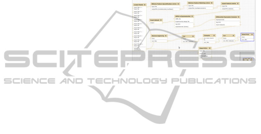
bining a large variety of bioinformatics tools. Figure
1 shows an example of the proteomics workflow cre-
ated and used by Berend Hoekman.
Figure 1: An example of a workflow visualization in
Galaxy (Blankenberg and Taylor, 2007).
The workflow graph represents the data flow of the
proteomics analysis used in the University Medical
Centre Groningen (UMCG), Netherlands. The graph
edges connect analysis steps from the workflow input
(in the left-top corner) to output (in the left-bottom)
showing the data flow. Input and output data files are
listed in the body of the graph node icons. If you
are not an expert in this workflow, it is difficult to
evaluate a run time for the whole analysis, sizes of
data, complexity of tools configuration etc. There is
no visual difference between the workflow elements
and it is difficult to distinguish those elements that are
data nodes (i.e. workflow inputs/outputs) or process-
ing analysis operations. Furthermore, parallelism in
workflow design/execution can be shown in Galaxy
by creating separate workflow nodes (i.e. one node
per every parallel execution of the workflow element),
that is a good solution if we consider up few parallel
execution. However, this solution does not work with
hundreds or thousands or parallel executions of the
workflow element.
Another popular generic WMS is Taverna (Oinn
and Greenwood, 2005). This is a suite of tools to de-
sign and execute workflows. It allows users to inte-
grate third-party software tools, which are described
as web services, into workflows. An example of a
simple workflow that retrieves a weather forecast for
a specified city is shown in Figure 2.
A workflows is presented as graphs constructed
using the Taverna visual language. This graph (Fig.
2) also shows the data flow from top to bottom. Here,
colours are used to show the nature of graph elements.
We can clearly distinguish between data elements and
VisualizationofBioinformaticsWorkflowsforEaseofUnderstandingandDesignActivities
117
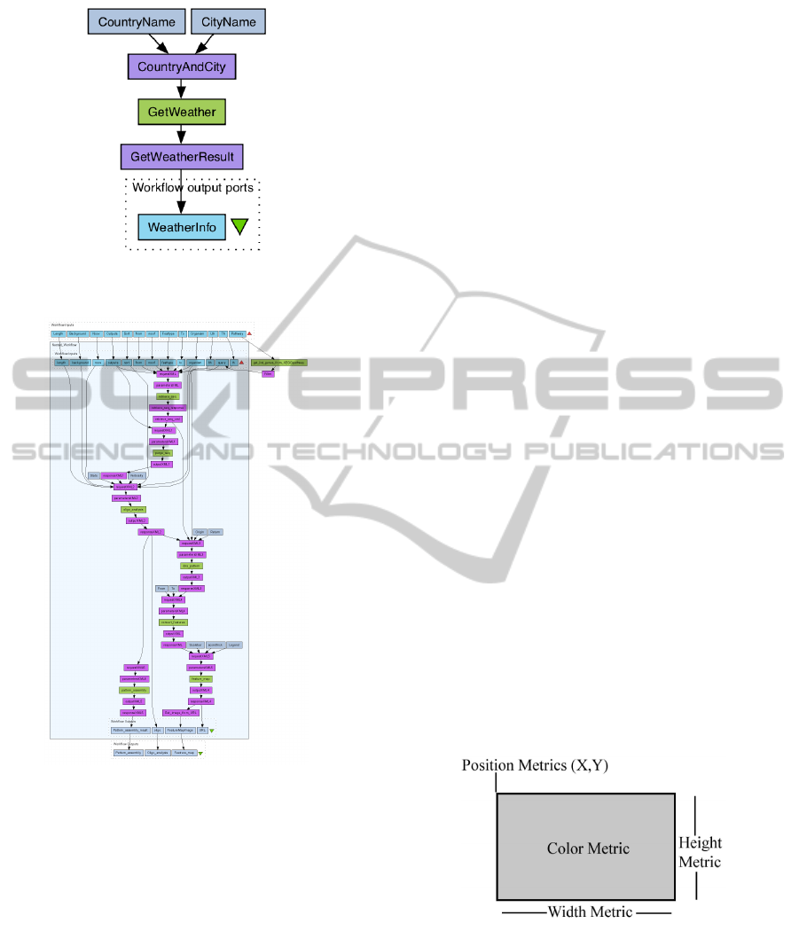
Figure 2: An example of a workflow visualization in Tav-
erna (Oinn and Greenwood, 2005).
Figure 3: An example of a nested workflow in Taverna
(Oinn and Greenwood, 2005).
Taverna services, although, the colour pattern is not
really intuitive.
Workflows in Taverna can have conditional
branches and loops, which are not widely used in
bioinformatics, where actual analysis scripts can con-
tain conditional statements as a part of the analy-
sis script. In Taverna, workflows can also be nested
into other workflows, which makes the workflows re-
usable and easier to maintain. An example of a larger
workflow with nesting (developed by Eric Vervisch)
with nesting is show in Figure 3. Here, the nested
workflow is surrounded by a rectangle and an addi-
tional operation is shown outside of it. This operation
can be e.g. a special input data preparation We can
treat this rectangle as showing one ”quality” metric of
the elements in it, but the analysis properties of the
workflow elements can not be seen in such a work-
flow diagram.
3 TECHNIQUES THAT CAN
ENHANCE VISUALIZATION OF
WORKFLOW STRUCTURE
Since there are so many structure-and-attribute vi-
sualizations, we outline here the main common fea-
tures that can be re-used in workflow visualizations
for bioinformatics, and we present their strengths or
limitations. From our own experience, most such vi-
sualizations share two design elements:
• structure: software structure is typically depicted
by using a node-and-link graph metaphor, where
nodes are software entities, e.g. functions, classes,
components, or packages, and links are the rele-
vant (sub)set of considered relations, e.g. function
calls, data dependencies, associations, or inheri-
tance relations.
• attributes: software attributes are usually depicted
by mapping them to a visual attribute of the cor-
responding nodes or links in the structure visual-
ization. Visual attributes that can be used to show
software attributes are the position, size, shape,
colour, texture, lighting, line size, and annotations
of diagram elements.
The same node-and-link graph metaphor is used
for workflow visualizations, particularly in bioinfor-
matics. Below we discuss which visual attributes can
be re-used in bioinformatics workflow visualization.
Figure 4: Using visual mapping to visualize ”quality” met-
rics (Lanza and Ducasse, 2002).
In the lightweight software visualization frame-
work, CodeCrawler (Lanza and Ducasse, 2002),
”quality” metrics are visualized by mapping them to
the colour, height, width, and position of the element
box icons (Figure 4). With these few visual attributes,
it is possible to show, for example, analysis run time,
BIOINFORMATICS2013-InternationalConferenceonBioinformaticsModels,MethodsandAlgorithms
118
sizes of input/output data, and CPU/memory require-
ments, combined with the workflow structure. Hence,
the user can immediately get an idea about the re-
quirements for running these workflow analysis steps.
Figure 5: An example of a large software system in Code-
Crawler (Lanza and Ducasse, 2002).
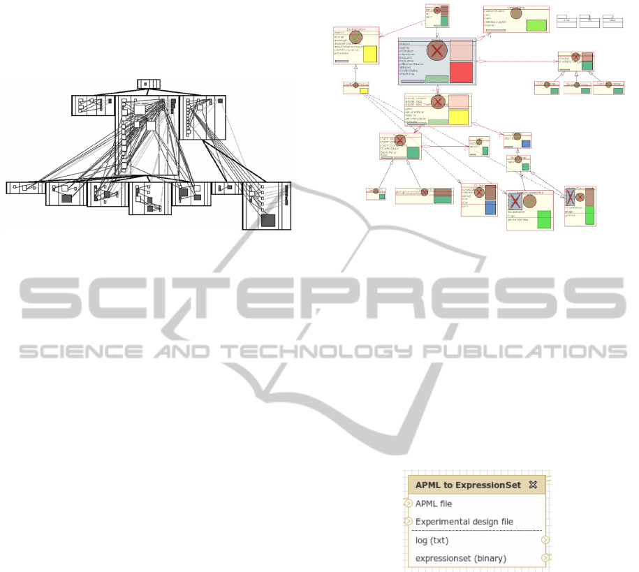
An example of a large software system visualized
in CodeCrawler is shown in Figure 5. The system is
divided into several modules, which are surrounded
by rectangles. Here, a user can immediately see the
division and spot outliers, which are shown as bigger
rectangles with or without a colour. The same method
can be applied to show large workflows that consist of
many nested smaller workflows, and to emphasise the
most computationally intensive steps. Visualization
of both the analysis tool dependencies and the work-
flow structure can be combined into the same diagram
using the method proposed in CodeCrawler method.
Another software visualization and exploration
tool, MetricView (Termeer et al., 2005), combines
traditional UML diagram visualization with metrics
visualization. In contrast to the technique discussed
above, MetricView uses existing and familiar to soft-
ware engineers UML diagrams as a basis for software
structure visualization 6. It follows the given dia-
grams layout and the positions and sizes of the dia-
gram elements are not changed. This has an important
advantage, because changing the diagram layout can
destroy the users ”mental map” and severely reduce
how easily it can be understood; this is a well known
fact in information visualization (see e.g. (Spence,
2006)). MetricView supports the visualization of met-
rics defined on UML diagram elements. Metrics can
have boolean and numeric values; they are shown as
icons, drawn atop of the UML elements for which the
respective metrics are available.
Reusing this technique in workflow visualization
allows a smooth transition from the familiar struc-
tural representation of a workflow, as used in Galaxy
for example, to enhance the visualization of work-
flow with quality metrics. Metric icons simply take
the space given by the Galaxy workflow diagram lay-
out. In other words, metric information is added to
Figure 6: An example of 2D UML class diagram visualized
with MetricView. (Termeer et al., 2005).
diagrams in a non-intrusive way and users keep their
”mental map” of the diagrams they are accustomed to
work with.
The technique proposed in MetricView can usu-
ally be applied to show the attributes that are related
to the whole workflow element. Besides visualization
on the workflow element level, the metric lens visu-
alization technique (Byelas and Telea, 2008) can be
used to show metrics on members of the workflow el-
ements. Let us look at a Galaxy visualization of a
workflow element in Figure 7.
Figure 7: An example of workflow element visualized with
Galaxy. (Blankenberg and Taylor, 2007).
An example workflow element has two inputs (i.e.
APML file and Experiment design file) and two out-
puts (i.e. log and expressionset). However, users are
not given any information about the sizes of these in-
puts/outputs or their nature from only the names. The
task becomes even more complex, if users want to see
not a single workflow element, but the whole work-
flow or a part of it, and if they want to see the metric-
metric and metric-structure correlations of workflow
elements. To achieve this, the metric lens techniques
(Byelas and Telea, 2008) can be reused. It combines a
classical UML viewer with a visualization of method-
level metrics using an enhanced version of the well-
known table-lens technique (Rao and Card, 1994).
The basis of the metric lens technique is a tra-
ditional UML class diagram, which displays all its
VisualizationofBioinformaticsWorkflowsforEaseofUnderstandingandDesignActivities
119
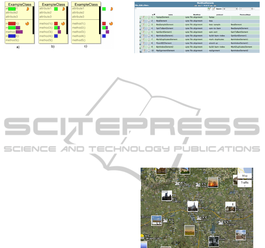
Figure 8: Metric layout options in of metric lens (Byelas
and Telea, 2008).
data members within each class frame (see Figure 8).
Atop of this image, the metrics are displayed follow-
ing a table model, where the rows are methods and the
columns are metrics.
The metric icon table can be placed within the
class frames (Fig. 8 a,b), which yields a compact lay-
out but does not allow users to read the method names,
or on the right side of the class frames (Fig. 8 c),
which does not occlude the method names displayed
but yields a less compact layout. Different zooming
mechanisms allow users to focus on a specific dia-
grams subsystem, and to smoothly navigate between
seeing the entire contents of each class, as a set of
coloured bar graphs, and seeing the individual signa-
tures and names of methods and members. The same
technique can be applied to navigate through the the
workflow graph diagrams to spot the metric distri-
bution of workflow element members and any met-
ric value outliers, and help in the task of correlating
such outliers among themselves and with the work-
flow structure.
4 CONCLUSIONS
We have presented a number of techniques that can
be used to enhance visual analyses of workflows in
WMS for bioinformatics, such as Galaxy or Taverna.
We have reported some of the differences and lim-
itations in these visualization techniques as used in
these two WMS. We have also shown that there is no
unified visual representation of workflows used in the
bioinformatics domain. However, the same data flow
graphs can be used to describe workflows visually.
Recently, we added workflow management to the
existing data management built with the MOLGE-
NIS system (Swertz and Jansen, 2007) and (Swertz
and Jansen, 2010) to combine computational and data
management into a single system (Byelas and Swertz,
2011) and (Byelas and Swertz, 2012). We use MOL-
GENIS to auto-generate web-user interfaces for bi-
ologists and program interfaces for bioinformaticians
from a data model described in XML. Having the
database background generated from the model web
Figure 9: Showing workflow structure in the MOLGENIS
framework (Byelas and Swertz, 2011).
user interface, it is not surprising that we chose to use
a simple table to show the workflow structure 9.
In the future, we will investigate ways of using the
visualization techniques described above for work-
flow visualisation. We are planning to visualise a
workflow as a data flow graph as in Galaxy, but we
want to advance its visualization by adding ”quality”
metrics. As the result, we expect to achieve a mul-
tiscale visualization similar to ones, that is used in
geographical data visualization systems, such as e.g.
Google Maps (Google Inc., 2012). In such a way,
workflow ”quality” metrics can be shown instead of
photos and temperature in Figure 10.
Figure 10: An example of multiscale visualization from
Google Maps (Google Inc., 2012).
In this paper, we describe techniques which can
enhance visual analysis of workflow structure. Be-
sides, we want to enable users to get insight into
workflow behaviour (run workflows, understand how
parameters influence their output and refine the pa-
rameter space to achieve desired results) and evolu-
tion (detecting workflow changes over time). For
behaviour, we will adapt multidimentional scaling
(Borg and Groenen, 2005) and parallel coordinates
(Inselberg, 2009). For evolution, we will use time-
lines (Grafton and Rosenberg, 2010) visualizations to
show how workflow structure and parameters change
in time. Finally, we are planning to validate these vi-
sualization approaches by case studies on real-world
workflows, that we use in our analyses.
BIOINFORMATICS2013-InternationalConferenceonBioinformaticsModels,MethodsandAlgorithms
120

REFERENCES
Blankenberg, D. and Taylor, J. (2007). A framework for col-
laborative analysis of encode data: making large-scale
analyses biologist-friendly. Genome Res., 17:6:960 –
4.
Borg, I. and Groenen, P. (2005). Modern Multidimensional
Scaling: theory and applications (2nd ed.). New York:
Springer-Verlag.
Byelas, H. and Swertz, M. (2011). Towards a molgenis
based computational framework. in proceedings of
the 19th EUROMICRO International Conference on
Parallel, Distributed and Network-Based Computing,
pages 331–339.
Byelas, H. and Swertz, M. (2012). Introducing data prove-
nance and error handling for ngs workflows within the
molgenis computational framework. in proceedings of
the BIOSTEC BIOINFORMATICS-2012 conference,
pages 42–50.
Byelas, H. and Telea, A. (2008). The metric lens: Visu-
alizing metrics and structure on software diagrams.
in Proceedings of the 16th Working Conference on
Reverse Engineering, Antwerp, Belgium, pages 339–
340.
Byelas, H. and Telea, A. (2009). Visualizing metrics on
areas of interest in software architecture diagrams. in
Proceedings of the Pacific Visualization Symposium,
Beijing, China, pages 33–40.
Diehl, S. (2007). Software Visualization - Visualizing
the Structure, Behaviour, and Evolution of Software.
Springer.
Goldstine, H. and von Neumann, J. (1947). Planning and
coding of problems for an electronic computing in-
strument. Part II, volume I of a report prepared for
the U.S. Army Ord. Dept.
Google Inc. (2012). Google maps. http://maps.google.com/.
Grafton, A. and Rosenberg, D. (2010). Cartographies of
Time: A History of the Timeline. Princeton Architec-
tural Press.
Inselberg, A. (2009). Parallel Coordinates: VISUAL Multi-
dimensional Geometry and its Applications. Springer.
Lanza, M. and Ducasse, S. (2002). Understanding software
evolution using a combination of software visualiza-
tion and software metrics. In Proc. of LMO.
Lanza, M. and Marinescu, R. (2006). Object-Oriented Met-
rics in Practice - Using Software Metrics to Charac-
terize, Evaluate, and Improve the Design of Object-
Oriented Systems. Springer.
Oinn, T. and Greenwood, M. (2005). Taverna: lessons in
creating a workflow environment for the life sciences.
Concurrency and Computation: Practice and Experi-
ence, 18:10:1067 – 1100.
Rao, R. and Card, S. (1994). The table lens: Merging graph-
ical and symbolic representations in an interactive fo-
cus+context visualization for tabular information. In
Proc. CHI, pages 222–230. ACM.
SHIWA (2012). Sharing interoperable workflows for
large-scale scientific simulations on available dcis.
http://www.shiwa-workflow.eu/.
Spence, R. (2006). Information Visualization. ACM. Press.
Spence, R. (2007). Information Visualization: Design for
Interaction (2
nd
ed.). Prentice Hall.
Swertz, M. and Jansen, R. (2007). Beyond standardization:
dynamic software infrastructures for systems biology.
Nature Reviews Genetics, 8:3:235–43.
Swertz, M. and Jansen, R. (2010). The molgenis toolkit:
rapid prototyping of biosoftware at the push of a but-
ton. BMC Bioinformatics, 11:12.
Termeer, M., Lange, C., Telea, A., and Chaudron, M.
(2005). Visual exploration of combined architectural
and metric information. In Proc. VISSOFT, pages 21–
26. IEEE Press.
VisualizationofBioinformaticsWorkflowsforEaseofUnderstandingandDesignActivities
121
