
Data Visualisation and Statistical Analysis within the Decision
Making Process
Jamie Mahoney
Centre for Educational Research and Development, University of Lincoln, Lincoln, U.K.
Keywords:
Data Visualisation, Statistical Analysis.
Abstract:
Large amounts of data are collected and stored within universities, but little is done to reuse this data to
support decision making processes. This paper discusses the use of data visualisation and statistical analysis
as methods of making sense of the collected data, analysing it to assess the effects of historical institutional
decisions and discusses the use of such techniques to aid decision making processes.
1 INTRODUCTION
Within institutions such as universities, large amounts
of data are produced and consumed during the course
of an academic year. However, the data is not fully
utilised or explored; often it is neglected, becomes
useless and, in time, becomes nothing more than data
dumps (Keim, 2002). Take, for instance, collections
of data associated with awards (programmes of study
for a degree) offered by a university. Data is collected
and stored relating to the details of each award, the
constituent modules (individual units of study) that
make up the award, students and staff associated with
the award, examinations and assessments for each
award as well as numerous other data sources. Very
little is done with this data, other than to repackage it
into various formats for student handbooks or valida-
tion exercises, for example.
With such a large amount of data being collected
and stored, manual textual exploration of the datamay
be insufficient in order to explore the data in a use-
ful and meaningful manner (Keim, 2002; Gilbert and
Auber, 2010). Visualisation tools and methods are
progressively being used in a variety of situations, in
order to explore and explain large amounts of data
(Bastian et al., 2009; Bertschi et al., 2011). Through
data visualisation, this large amount of data can be
analysed more fully, in order to exploit the data being
stored and to progress through the data-information-
knowledge continuum (Masud et al., 2010), turning
silos of data into useful information and from there,
into knowledge. By visualising and analysing the
vast amounts of data collected by institutions such as
universities, the impact of previous decisions can be
seen; these same principles can then be applied proac-
tively, to visualise and assess the potential impact that
certain decisions may have.
This paper documents the process of utilising data
visualisation methods and the statistics associated
with the visualisations in order to make sense of his-
torical data sets. Having shown how these visuali-
sation methods and statistics make sense of, and re-
flect changes in, the past, similar concepts could then
be explored in order to assess the impact of possible
future changes, thus improving the decision making
process (Robertson, 1990).
2 DATA VISUALISATION
In order to show the extent to which data visualisa-
tion and analysis is useful within the institution, data
was only collected from existing data sources that are
available to staff in a variety of formats. Working in
this manner has two benefits to the investigative pro-
cess. Firstly, less time is spent working on ways to
collect the data from other sources that are disparate
and in formats that are difficult to work with. Sec-
ondly, this is data that is accessible to members of
staff at the institution, with very little work required.
By using this data, the focus remains on how data that
the institution already has at its disposal can be used,
rather than focusing on methods of collating disparate
data sources.
2.1 Description of Data
Sufficient data was available through the reporting
system for seven academic years (1st Sep - 31st Aug),
starting with the academic year 2006 - 2007 through
to 2012 - 2013. At the time of writing, reliable data
489
Mahoney J..
Data Visualisation and Statistical Analysis within the Decision Making Process.
DOI: 10.5220/0004212604890494
In Proceedings of the International Conference on Computer Graphics Theory and Applications and International Conference on Information
Visualization Theory and Applications (IVAPP-2013), pages 489-494
ISBN: 978-989-8565-46-4
Copyright
c
2013 SCITEPRESS (Science and Technology Publications, Lda.)

(in sufficient quantity) was only available one year
in advance. For each academic year, data was col-
lected relating to each award (degree course) offered
by the university, the modules (or units) that make up
these awards, along with the faculties or departments
that were responsible for the delivery of each module.
With the introduction of new awards and old awards
being phased out, the amount of data collected dif-
fers from year to year. The amount of data collected
varies from 13,000 rows in 2006/07 to 27,000 rows
for 2012/13, with student numbers varying between
9,600 and 11,700. Each row is representative of the
relationship between one award and one module, i.e
one award made up of ten modules would be repre-
sented by ten rows.
2.2 Data Visualisation Principles
Each of the data visualisations have been created
based on principles taken from ‘The Visual Display
of Quantitative Information’ (Tufte, 2001). Based on
this, successful data visualisations should:
1. Show the data.
2. Make those viewing the visualisation think about
the data, rather than the design of the visualisation
or the technology used to construct it.
3. Avoid distorting the data.
4. Present a large amount of data in a small space.
5. Make large datasets coherent and easier to under-
stand.
6. Allow and encourage the comparison of different
pieces of information.
7. Allow the data to be viewed at several levels of
detail (or granularity).
8. Serve a clear purpose, be that description, explo-
ration, tabulation or decoration.
9. Allow the close integration of the visualisation
with a statistical or verbal description.
2.3 Initial Visualisations
In order to show the scale of relationships between
elements of the data, a network-graph visualisation
showing relationships between modules of study was
created for each of the academic years present in the
data.
Within the graphs, each module delivered by the
university is represented by a node. For each pair of
modules that are delivered on the same award an edge
is formed between the corresponding pair of nodes.
Further to this, groups of edges that represent the de-
livery of modules on the same course are then colour
coded. Each node was also labelled with its mod-
ule code identifier, in order to convey more meaning
through the visualisation. By doing so, the depth of
the data being represented is better reflected in the vi-
sualisation of the data. Figure 1 shows a small section
of one of these visualisations.
Figure 1: Part of an initial network visualization, showing
the relationships between modules of study.
With the amount of data being represented in the
visualisations, it becomes hard to show individual re-
lationships between modules, but the overall pattern
of relationships across the university becomes evi-
dent. Whilst these particular visualisations in their
current state provide little use within decision making
processes, theyserve as a method of showingthe scale
and complexity of the data being worked with. An un-
derstanding and knowledge of the scale and complex-
ity of the data would still be useful for those work-
ing with it and making changes to the provision of
courses.
These initial visualisations did, however, provide
insight into possible refinements of the data being
used and also which areas to focus on in future vi-
sualisation work.
Taking a highly-granular view of the data, shows
the scale of relationships across the university as a
whole. In practice, modules may share more in com-
mon that just the awards they are delivered on, this is
something that would need to be explored fully in fur-
ther work. Whilst showing the relationships between
modules, the visualisations also show the potential for
adverse effects when changes are made to a module.
IVAPP2013-InternationalConferenceonInformationVisualizationTheoryandApplications
490
It is likely that some awards rely heavily on one mod-
ule for delivering a key learning outcome. Making an
alteration to a module may have no consequences for
four of the five awards it is delivered on, but may have
serious consequences for the fifth.
Reducing the granularity of the data, it would also
be useful to see links between the awards offered
by the university and further to this, between depart-
ments and colleges within the institution. This would
also improve the process of being able to view the
visualisation as a whole - the scale of the original vi-
sualisations make it difficult to read the node labels
whilst viewing the visualisation in its entirety. Cre-
ating visualisations of differing granularity would al-
low the user to view the data from a highly-abstracted
level and ‘zoom in’ as required.
2.4 Refinement of Data and Scope of
Follow-up Visualizations
Through the creation of the exploratory data visual-
isations, it became apparent that a potential major
audience for these data visualisations would be cur-
riculum planners within the university. Presenting the
data in this way makes it more usable; although the
data was already available, data availability does not
necessarily equate to data usability (Burkhard, 2005).
In terms of refinement of the data being used, only
awards and modules that are active (recruiting stu-
dents) and full-time have been included in the follow-
ing work. By refining the data, the complexity of the
main body of courses delivered at the university can
be shown more clearly; the clear portrayal of complex
data is a desired outcome, in order to make data visu-
alisation a useful tool in the decision making process
(Tufte, 2001).
2.5 Visualising Relationships between
Awards
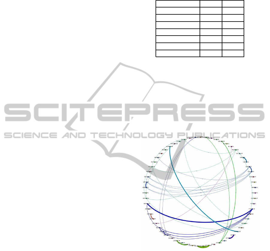
Refining the data as discussed previously, and query-
ing the data as to show the relationships between each
award, greatly reduced the amount of nodes and edges
in each network. Table 1, below, summarises the
amount of edges and nodes for each network.
In a similar fashion to the original visualisations,
each node is representative of an award offered at
the university. Each node is labelled with the unique
award code, rather than the full degree title in order to
reduce clutter in the image.
Adding the magnitude of the relationships also
helps to clarify the relationship between the awards,
by adding detail (Tufte, 1990). These magnitudes
are based solely on the amount of modules that each
Table 1: Quantities of entities represented in network visu-
alisations.
Academic Year Nodes Edges
2006 - 2007 28 26
2007 - 2008 38 29
2008 - 2009 34 17
2009 - 2010 37 15
2010 - 2011 50 36
2011 - 2012 74 53
2012 - 2013 63 41
pair of awards have in common. To add further de-
tail to the visualisations, the nodes in the network are
grouped by their owning departments, and the links
between nodes colour coded in order to represent the
different departments within the institution.
Figure 2 is a visualisation showing relation-
ships between awards offered at the university, with
weighted and colour-coded edges. Edges are also
labelled, showing a numerical representation of the
amount of links between awards.
Figure 2: An example of a circular network layout showing
relationships between awards.
These visualisations could be viewed in chrono-
logical order, to show the changing relationships be-
tween awards as the structure of the university and the
awards that it offers to students change over time.
3 STATISTICAL ANALYSIS OF
NETWORK GRAPHS
This section deals with the use of statistical analysis
to aid the understanding of data presented in data vi-
sualisations. As the visualisations have been network
DataVisualisationandStatisticalAnalysiswithintheDecisionMakingProcess
491
graphs, definitions of various statistical measures are
outlined and applied to this specific context and then
the results explored.
3.1 Definitions
There are many figures and statistics that can be
derived from network graphs, taking these generic
definitions and applying them to the domain of the
data being visualised, the following definitions can be
used:
• Mean Weighted Degree of Nodes - The mean
amount of modules shared between that award
and other awards.
• Graph Density - The amount of connections per
award when compared to the total amount of
awards in the network.
• Modularity - A higher modularity suggests that
awards are very highly connected with specific
other awards, but have very few connections to
other awards in the network. A very high modu-
larity would suggest that a group of awards shared
a lot of modules between themselves.
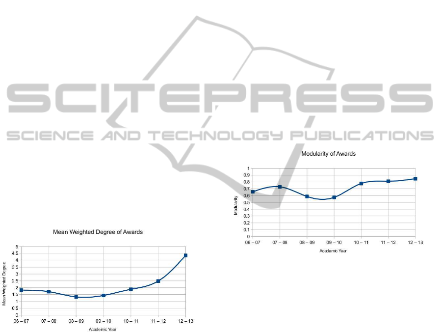
3.2 Mean Weighted Degree of Nodes
Plotting the mean weighted degree (see Figure 3),
shows a changing trend over the past seven years.
Figure 3: Mean weighted degree of awards, shown over the
course of seven academic years.
Figure 3 shows a definite drop in the mean
weighted degree of awards from the 2007/08 aca-
demic year to 2008/09. This shows the mean
amount of links between awards dropping consider-
ably (around 22 percent). Combining this data with
information relating to changes in the university, it
becomes apparent that this drop in the mean weighted
degree occurs when the university began to reorgan-
ise the delivery of degree awards. Prior to 2007, an
academic year consisted of 120 points of study bro-
ken down into 12 or 24 point modules, depending on
whether the module was delivered over a single or
two semesters. From 2007, a new system was intro-
duced, in a phased process, where new students would
take 120 points of study, broken down into 15 and 30
points modules. As a standard, full-time degree takes
three years to complete, there was a two year period
where both forms of study were being undertaken by
different cohorts of students.
From the highest point on the first portion of the
graph, to this point in the new weighting, there is an
increase of over 36 percent in the amount of joins be-
tween awards offered at the university. This shows
that (assuming an increase in mean weighted degree is
good in terms of curriculum design) the provision has
been improved through the restructuring of awards
during the alteration of module weightings.
3.3 Network Modularity
Another statistical measure that appears to have been
heavily influenced by changes in the structure of the
university is the modularity of the awards, shown in
Figure 4.
Figure 4: Modularity of awards, shown over the course of
seven academic years.
A high modularity value shows that the awards are
forming into self-contained clusters, with connections
predominantlywithin the cluster, and few connections
to other clusters or outliers. As shown in Figure 4, the
modularity of awards in 2006 - 2007 was relatively
high, this figure continues to rise, before dropping
for two consecutive years as the weighting of mod-
ules at the university goes through a period of change.
As the change is fully implemented, the modularity
rises significantly and continues to rise from 2010 -
2011 through to 2012 - 2013. This would suggest
that (though not necessarily the case) either by design
or good fortune, the awards offered at the university
are starting to form into more easily-identified self-
contained groups, perhaps areas of specialism. This
point is interesting to note, as the institution has gone
through a period of change, in terms of how depart-
ments within the university are organised.
There is, however, an issue with using network
IVAPP2013-InternationalConferenceonInformationVisualizationTheoryandApplications
492

modularity as a standalone indicator, primarily due
to there being a ‘resolution threshold’, beneath which
smaller clusterings of nodes become ‘invisible’ (For-
tunato and Barth´elemy, 2007; Kumpula et al., 2007).
Combining multiple statistical indicators in order to
get a richer and more reliable indication of the state
of the network is discussed in a later sub-section.
3.4 Network Graph Density
The density of the network shows the mean amount
of connections between nodes as a proportion of the
maximum amount of connections available, with val-
ues ranging between 0 and 1. A value of 1, or a ‘com-
plete graph’ shows that each node in the network is
connected toevery other node; witha value of 0 show-
ing no connections at all between nodes.
In this context, neither a value of 0 or 1 would
be desirable, further work would be required in order
to determine, if possible, an ideal value of range of
values.
Figure 5: The density of award networks, shown over the
course of seven academic years.
Figure 5 shows a dramatic decrease in graph den-
sity from the academic year 2006 - 2007 to 2007-2008
before an eventual decrease over the next five aca-
demic years. It has become evident that this statis-
tical measure is perhaps not best suited for use as an
indicator when considering the relationships between
awards, but may be better suited to networks where
relationships are more extensive, i.e. the original vi-
sualisations showing module relationships. The intro-
duction of one or two new awards would have a fairly
substantial impact on the density of the awards graph
and may misrepresent the true effects of introducing
the new awards.
3.5 Combining Statistical Measures
Whilst the statistical measures discussed previously
are useful indicators of the effects of changes to the
provision of degrees and the structure of the institu-
tion, combining the measures may help to provide a
fuller understanding of the potential impact of deci-
sions made in the future.
Take for instance, a situation in which the impact
of making decision X is being assessed. By show-
ing the altered data in network form and analysing
the statistics, the impact can be judged. For example,
if the changes were to result in an increase in mod-
ularity, yet a decrease in the mean weighted degree,
then this would suggest that, whilst distinct groups of
awards or modules were being formed, they are quite
likely to be forming small, highly separated clusters.
This could then be used to help determineif the course
of action being decided upon may produce positive
and desired results.
3.6 Evaluation of Statistical Analysis
A selection of statistical measures of network graphs
have been highlighted and contextualised. These have
been explored in more detail, and changes in the in-
stitution used to explain clear changes in the trends
being shown in the statistics. This demonstrates that
these metrics can be used to show the impact that
changes to the institution can have on these figures.
This suggests that these same principles can be used
proactively in the decision-making process to show
the resulting impact of various potential decisions.
4 CONCLUSIONS AND FURTHER
WORK
Through the process of exploring large and com-
plex data sets, it has been shown that data visualisa-
tions are a useful tool in improving understanding of
data. These initial exploratory data visualisations also
prove useful in helping to determine potential uses
and users of data visualisations in later work.
By refining the data in order to focus on the as-
sumed requirements of those expected to use the vi-
sualisations, the scale of data being presented is re-
duced somewhat, resulting in clearer visualisations.
However, this is not always beneficial as some sta-
tistical measures become distorted or almost useless
when used on data with a low level of granularity.
The full extent of relationships between modules
and awards would have to be explored in order to
show users a true representation. It would be inappro-
priate to use representations of incomplete data to aid
in decisions. By collecting more data relating to each
aspect of these awards and modules that can be used
to link them, an application can be builtthat allows the
data to be interacted with during the decision making
process, showing the impact of potential alterations to
DataVisualisationandStatisticalAnalysiswithintheDecisionMakingProcess
493

individual elements. This application would allow the
user to view the data being presented at varying lev-
els of granularity, similar to the ways in which some
of the data has been presented in this paper. By do-
ing so and allowing the user to change the structure
of the data that is presented to them, the various ef-
fects of making seemingly small changes to the pro-
vision of education within the university can be easily
displayed. By doing so, the decision making process
could be made more efficient and effective. A case-
study approach would allow the evaluationof both the
proposed interactive visualisations and the statistical
analysis. The monitoring and assessment of ongoing
business processes plays an important role in the con-
tinuity of organisations (Rinderle et al., 2006); the in-
tegration of data visualisation and statistical analysis
into the decision making process would help the pro-
cess of reviewing and assessing the impact of deci-
sions made within the institution.
ACKNOWLEDGEMENTS
The work described in this paper was carried out as
part of a JISC-funded project, under the ‘Course Data:
Making the Most of Course Information’funding call.
REFERENCES
Bastian, M., Heymann, S., and Jacomy, M. (2009). Gephi:
An open source software for exploring and manipu-
lating networks. International AAAI Conference on
Weblogs and Social Media.
Bertschi, S., Bresciani, S., Crawford, T., R, G., Kienreich,
W., Lindner, M., Sabol, V., and Moere, A. (2011).
What is knowledge visualization? perspectives on an
emerging discipline. 15th International Conference
on Information Visualization, pages 329–336.
Burkhard, R. (2005). Knowledge Visualization: The Use of
Complementary Visual Representations for the Trans-
fer of Knowledge – A Model, a Framework, and Four
New Approaches. PhD thesis, Swiss Federal Institute
of Technology (ETH Zurich).
Fortunato, S. and Barth´elemy, M. (2007). Resolution limit
in community detection. Proceedings of the National
Academy of Sciences of the United States of America,
104(1):36–41.
Gilbert, F. and Auber, D. (2010). From database to graph
visualization. 14th International Conference Informa-
tion Visualization, pages 128–133.
Keim, D. (2002). Information visualization and visual
data mining. IEEE Transactions on Visualization and
Computer Graphics, 7(1):1–8.
Kumpula, J., Saram¨aki, J., Kaski, K., and Kertesz, J. (2007).
Limited resolution in complex network community
detection with potts model approach. The European
Physics Journal B, 56(1):41–45.
Masud, L., Valsecchi, F., and Ciuccarellia, P. (2010). From
data to knowledge - visualizations as transformation
processes within the data - information - knowledge
continuum. 14th International Conference Informa-
tion Visualization, pages 445 – 499.
Rinderle, S., Bobrik, R., Reichert, M., and Bauer, T.
(2006). Business process visualizaiton - use cases,
challenges, solutions. Proceedings of the Eighth Inter-
national Conference on Enterprise Information Sys-
tems (ICEIS’06): Information System Analysis and
Specification, pages 204 – 211.
Robertson, P. (1990). A methodology for scientific data vi-
sualisation : Choosing representations based on a nat-
ural scene paradigm. Proceedings of the First IEEE
Conference on Visulaisation, pages 114–123.
Tufte, E. R. (1990). Envisioning Information. Graphic Press
USA.
Tufte, E. R. (2001). The Visual Display of Quantitative In-
formation. Graphic Press USA, 2nd edition.
IVAPP2013-InternationalConferenceonInformationVisualizationTheoryandApplications
494
