
Supporting Strategic Planning with Interactive Visualization
A Case Study of Patient Flow through a Large Hospital
Dominique Brodbeck
1
, Markus Degen
1
and Andreas Walter
2
1
University of Applied Sciences and Arts Northwestern Switzerland, Brugg, Switzerland
2
Inselspital, Bern University Hospital, Bern, Switzerland
Keywords:
Clinical Informatics, Visual Analytics, Patient Flow.
Abstract:
Hospitals collect large amounts of data during their daily operation. Next to its immediate primary purpose,
this data also contains implicit information that can be used to improve clinical and administrative processes.
We present a case study of how strategic infrastructure planning can be supported by the analysis of enriched
patient flow through a hospital. Data from various hospital information systems was collected, enriched with
topographical and organizational data, and integrated into a coherent data store. Common analysis tools and
methods do not support exploration and sense-making well for such large and complex problems. We therefore
developed a highly interactive visual analytics application that offers various views onto the data, and provides
fast access to details in order to show them in context. The analysts were able to validate their experiences,
confirm hypotheses and generate new insights. As a result, several sub-systems of clinics were identified that
will play a central role on the future hospital campus. This approach was successful enough that we envision
to extend it towards other process optimization tasks in hospitals.
1 INTRODUCTION
Adoption of information technology in health care
has been slow (Jha et al., 2009), (American Hospital
Association, 2007), but increasingly health care in-
stitutions such as hospitals collect and manage large
amounts of data. Next to its eventual use in sup-
porting clinical care, the data is also largely used
for administrative purposes such as billing, schedul-
ing, or resource planning (Chaudhry et al., 2006).
While there are commercial hospital information sys-
tems that perform the core of the data management,
there are typically many additional independent sys-
tems that are designed to support a specific medical
procedure, with a unique patient id often being the
only link between them.
For typical strategic planning tasks, this setup
allows to answer questions such as how many pa-
tients were treated in the cardiology department last
year. More complex questions require queries across
several of the systems and along different dimen-
sions: Which departments have many transfers be-
tween each other? Are there unusual transfers into
other departments that deviate from this trend, and
how are the involved patients characterized? Is this
effect seasonal? If the data is enriched even more, for
example with external data like geographic location
of departments, weather conditions, etc. then further
investigations become feasible (Alapont et al., 2005).
Even if all the data is available for answering
such questions, it is typically large, distributed and
only weakly related. Standard tools for analysis of
such data sets are limited, and new approaches are
needed (Cuzzocrea et al., 2011). These characteris-
tics and the related technology and issues have be-
come known as big data. Definitions of big data vary
(Laney, 2001), (Zikopoulos and Eaton, 2011) but data
from hospital information systems often share many
of these aspects. (Van der Aalst, 2012) argues that X-
raying business processes in this huge amount of data,
through the application of clever mining algorithms,
can be used to gain valuable insights for future strate-
gic planning of organizations.
In this paper, we present a case study where we
collected, combined, and enriched data from a large
university hospital, and used interactive visualization
to access, analyze, and interpret the data to support
strategic infrastructure planning.
Hospital sites are developed in an evolutionary
manner over a long time span. This leads to phys-
ical and organizational layouts of the facilities that
are usually not optimal anymore after a certain while.
85
Brodbeck D., Degen M. and Walter A..
Supporting Strategic Planning with Interactive Visualization - A Case Study of Patient Flow through a Large Hospital.
DOI: 10.5220/0004244000850093
In Proceedings of the International Conference on Health Informatics (HEALTHINF-2013), pages 85-93
ISBN: 978-989-8565-37-2
Copyright
c
2013 SCITEPRESS (Science and Technology Publications, Lda.)

Strategic planning with time horizons of 25 years and
more provides the opportunity to correct this degen-
eration, and optimize the layout when the campus is
enlarged, new facilities are built, or old ones replaced.
The optimal configuration of departments, their
organizational units and technical facilities is not al-
ways evident. Questions such as “where should the
emergency department be placed, and if we locate it in
a new building, do we need an additional radiology fa-
cility?” should be answered based on evidence and in-
sights rather than intuition, subjective opinions, or ob-
solete experience. The idea therefore was to use past
real data to identify existing clusters of organizational
units that are related based on what they actually do,
and not on where they are placed in the organization
chart. With these insights, it should be possible to
define future sub-systems of organizational units and
medical functions, optimized for efficiency. These
new sub-systems can then be characterized again with
the past data for further analysis and communication
to stakeholders.
In this case study we built such a system based on the
following hypotheses:
• The core questions that arise in strategic planning
of hospital infrastructure can be answered by us-
ing the flow of patients between organizational
units as core data, and enriching it with additional
data about cost and performance of medical pro-
cedures
• The nature of the problem requires an exploratory
approach, since the novel combination and repre-
sentation of the data will likely lead to the emer-
gence of new insights and hypotheses.
In the following, we present our approach that con-
sists of two parts:
• Aggregate as much data from the various hospi-
tal information systems as possible, and make it
available in a flexible format
• Provide highly interactive access to and visualiza-
tion of this information to support exploration and
interpretation
2 METHODS
2.1 Data Aggregation
Large hospitals, and in particular university hospitals,
typically have a heterogeneous IT-infrastructure due
to the fact, that the different clinics are rather au-
tonomous and have different needs for the type of data
to store. Often data of one clinic (i.e., orthopedics) is
stored in a specific IT system only used by that spe-
cific clinic. To cover specific needs for research, clin-
ics often develop their own applications that are used
to store additional research related information. Usu-
ally this data can be linked to the patient’s electronic
health record by using the patient id or the case id as
key, but otherwise data integration is complicated fur-
ther and indirect clues must be found.
The design of our data store was heavily influ-
enced by the two central dimensions of future queries:
Multi-scale: Case data has to be aggregated into sev-
eral layers to allow drill-down from the hospital
level (e.g., number of patient-days per year) to
specific organizational units (e.g., is there a sea-
sonal pattern in patients visits to the pneumol-
ogy clinic?), and to individual patient cases (e.g.,
chronology of visits to the radiology department
for one specific case).
Multi-aspect: The system shall be able to view the
data from different aspects, ranging from the lin-
ear temporal view (e.g., chronological view of all
events in a patient case), to a two-dimensional
geographic map (e.g., where should the radiol-
ogy department be placed on a campus to mini-
mize travel distances for patients?), to the network
topology of relationships between organizational
units (e.g., which units transfer the most patient
between each other).
In our project, information from several sources was
used and linked:
• Inter-organizational transfer histories of station-
ary patients.
• Case attributes (e.g., diagnosis, treatment, diagno-
sis related group (DRG)) of stationary cases.
• Times of surgeries (timestamps at the cut and at
the end of suturing).
• Transfers to ambulatory facilities (i.e., radiology
department).
• Hierarchical organization of the hospital.
• Physical layout of the organizational units of the
hospital.
While cleaning and integrating the data, we faced
the typical problems that arise during data wrangling
(Kandel et al., 2011), confounded by the privacy is-
sues inherent in medical data.
The input data was gathered from numerous CSV
formatted database table exports. No input files con-
tained personal information about the patients, and
the exports were performed by the hospitals IT staff
to ensure patient privacy. No live connection was es-
tablished to the hospital IT infrastructure. In the data
HEALTHINF2013-InternationalConferenceonHealthInformatics
86
aggregation step, the data from the different systems
and queries were interwoven, mostly by taking the pa-
tient id or the case id as a key. Many precautions,
filtering and post-processing steps were taken to en-
rich the data and at the same time to ensure, that the
resulting data was consistent (i.e., post-surgical trans-
fers from one clinic to another had to be suppressed in
a few specific cases where, although the transfer was
present in the input data, in the real world none took
place). The output of the data aggregation step con-
sists of a few files in human readable CSV format. As
a side effect, we were able to use simple text manipu-
lation tools (e.g., sed, sort, grep, and python scripts) to
filter and generate subsets of the enriched data, which
was in turn used by the hospital to perform plausibil-
ity checks on their data.
Overall, we collected one full year of data from
40 clinics comprising 300 organizational units that
treated 40000 cases from 30000 stationery patients,
with 320000 transfers between the organizational
units.
Standard transactional databases do not typically
offer the high data access performance and the ver-
satile data types that highly interactive multi-view vi-
sualization applications require (Keim et al., 2010).
We therefore build up a dedicated optimized and in-
terlinked in-memory data structure that is created on
start-up of the analytics application. This approach
leads to a slightly prolonged start-up time, but enables
the implementation of the fast and highly responsive
user interface described in the next section.
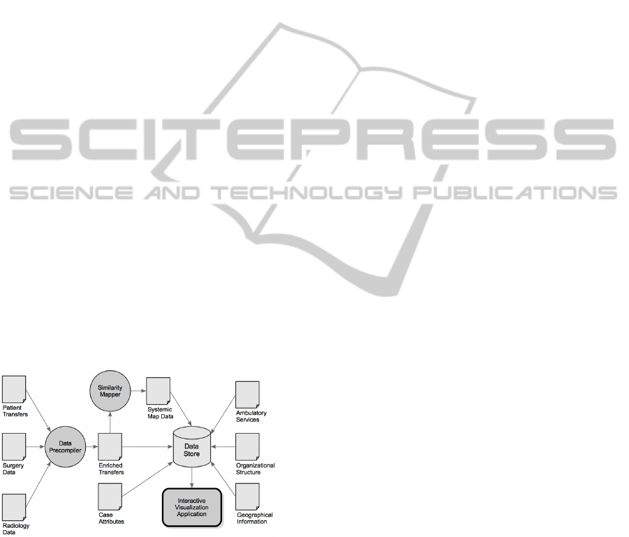
The data aggregation process is shown in Figure 1.
Figure 1: In the data aggregation step information from sev-
eral sources is enriched and integrated.
2.2 Visual Analytics
With all the data integrated and available, the next
challenge was to render it usable for the planning ex-
perts. The amount and complexity of the data made
it impractical to use common analysis tools such
as spreadsheets and standard methods from statistics
with static graphs. For the type of problems found
in our case study, analysts often only have vague no-
tions of what they are looking for (“I know it when I
see it”). It is therefore crucial to make the data visi-
ble from various angles, and to provide highly inter-
active tools to identify interesting patterns and access
details in context. Visual Analytics is a set of methods
and technologies from a field defined as the formation
of abstract visual metaphors in combination with hu-
man interaction that enables detection of the expected
and discovery of the unexpected within massive, dy-
namically changing information spaces (Wong and
Thomas, 2004).
Based on this approach, we developed a visual an-
alytics application to support analysts in making sense
of the collected data. The application offers four prin-
cipal views (Figure 2):
• Organizational: shows the organizational struc-
ture and how the actual medical activities shape
the administrative space.
• Systemic: reveals the operational structure as it
emerges from patients flowing through the hospi-
tal.
• Topographical: shows the actual physical situa-
tion as a structure that evolved through many in-
dividual decisions.
• Chronological: adds the dynamic view on how
events and quantities change over time.
2.2.1 Organizational View
The organizational view ((Figure 2), top left) uses
a circular layout to arrange all the major clinics of
the hospital. Circular layouts have proven effective
to show genetic sequences and relationships between
genomic positions (Krzywinski et al., 2009). We
adapted this technique to show the flow of patients in
relation to the organizational structure of the hospital.
The outer circle shows how many patients enter
(blue bars) or exit (red bars) a clinic from outside
of the hospital. The inner circle represents the size
of the clinic, as measured by the number of individ-
ual cases that passes through that clinic, mapped to
the thickness of the black bar. The combined bi-
directional flow of patients between two clinics is
shown as a curved line, whose thickness is propor-
tional to the number of transfers. The lines are drawn
semi-transparent to mitigate occlusion problems. The
order of the clinics around the circle can be adapted
(by department, size, alphabet, etc.) to the current
question.
To reveal further information we follow the prin-
ciple of detail on demand (Shneiderman, 1996). If a
clinic is probed (hover with the mouse cursor) then
SupportingStrategicPlanningwithInteractiveVisualization-ACaseStudyofPatientFlowthroughaLargeHospital
87
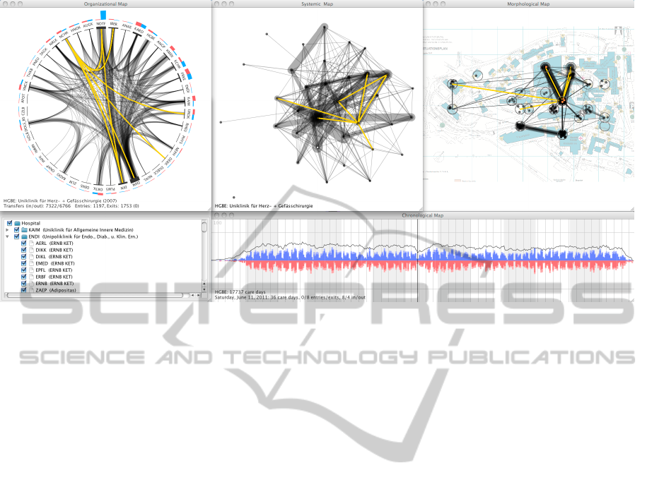
Figure 2: The principal views of the visual analytics application: organizational, systemic, topographic (top row), and chrono-
logical (bottom right). All views are coordinated through brushing and linking to support exploration. Filters (bottom left)
can be used to limit the display to certain organizational units. The yellow lines represent the trajectory of a single case treated
for abdominal metastasis during a four week stay at the hospital.
all the incoming or outgoing transfers from that clinic
are overlaid (Figure 5). If a clinic is selected then only
the transfers to and from that clinic are shown and all
the others suppressed (Figure 6). Probing now shows
quantitative information about the number of transfers
from the selected clinic to the probed one.
2.2.2 Systemic View
The movement of patients between clinics effectively
creates a network of relationships, where clinics that
move more patients between them are closer, or more
similar, than clinics with fewer or no transfers.
To make this network visible we employ a mul-
tidimensional scaling algorithm. Multidimensional
scaling is a family of methods that turns informa-
tion about the similarity of objects into geomet-
ric positions in such a way that, as best as possi-
ble, similar objects are close together and dissimi-
lar ones far apart. It is particularly well suited for
our data because it is able to reproduce non-linear
high-dimensional structures in a lower-dimensional
(i.e., two-dimensional) geometric representation (i.e.,
points on a plane).
Our algorithm is implemented as a spring-mass
model where the clinics are modeled as masses that
are connected pairwise with springs whose resting
length is proportional to the strength of the relation-
ship between the clinics.
Starting with a random layout, the positions adapt
with each iteration and settle into a (hopefully global)
minimum. The algorithm uses several optimizations
to avoid local minima and improve subjective layout
quality, and was inspired by (Chalmers, 1996).
Once the positions of the clinics on what we now
call the systemic view are determined, the transfers
are represented analogous to the organizational view
in order to emphasize their complementary aspect
(Figure 2, top center).
2.2.3 Topographical View
The topographical view (Figure 2, top right) shows
the patient transfers on a geographical representation
of the current hospital campus. The clinics can not
be represented as single units like in the other views,
since the various organizational sub-units of a clinic
are not typically located in a single physical location.
Distinct locations are therefore symbolized as circles
and the organizational sub-units at this location are
represented as filled dots within this circle. The lay-
out within a circle is randomized and the dots drawn
transparently. This visualization scales well with the
greatly varying number of units at a single location.
2.2.4 Chronological View
The time-dependent behavior of the system is shown
in the chronological view (Figure 2, bottom right).
The in- and out-transfers for each day are shown
as a mirrored stacked bar chart. The dark hues in
the center close to the time axis show the transfers
HEALTHINF2013-InternationalConferenceonHealthInformatics
88
from (blue, pointing up) and to (red, pointing down)
other clinics, whereas the external entries and exits
are stacked on top and shown in light hues. Internal
and external transfers can also be shown separately
depending on the question, and the mirroring makes
it easy to spot imbalances between in- and out-flows.
The net flow for each day is cumulated and over-
plotted as a black line. This essentially shows the
number of patients that are present in a clinic on a par-
ticular day, which can be integrated to compute care
days.
2.2.5 Interaction
All the views are coordinated through brushing and
linking (Buja et al., 1991), meaning that an action
in one view (e.g., probing, selection) is immediately
reflected in all the other views. It has been shown
that interfaces designed around multiple coordinated
views are effective when users need access to details
in addition to getting the overview (North and Shnei-
derman, 2000). They bring benefits of improved user
performance, discovery of unforeseen relationships,
and integration by interaction in addition to integra-
tion by visual design (Shneiderman, 1996).
In order to rationalize and interpret the insights
and hypotheses generated with the four principal
views, it is necessary to drill-down to the level of
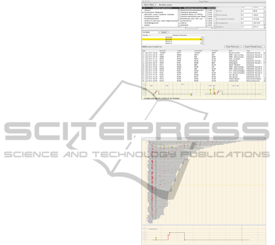
individual cases. Cases can be filtered either by or-
ganizational unit that they have visited on their jour-
ney through the hospital, or by various categorical or
numerical case attributes (e.g., destination after dis-
charge, diagnosis, length of stay). When a case is se-
lected from the list of filtered results, its details are
shown both as a table of transfers, as well as a visual-
ization of the whole case history (Figure 3), showing
admission, surgeries, radiology procedures, ambula-
tory visits, and transfers between organizational units
(vertical axis) on a time-line (horizontal axis). At the
same time, the transfers of the selected case are high-
lighted (yellow) in the main views (Figure 2).
In a separate view it is also possible to show all
the filtered cases at the same time. In order to display
several hundred case histories in parallel, their rep-
resentation is condensed to a single line that is only
one pixel high, but still preserves the essential infor-
mation about the case history. Figure 4 shows all the
cases that were classified under the DRG “craniotomy
with complex procedure”. Lengths of stays vary from
2 to 30 days, with the catalog average defined at 10.1
days. A large number of cases follow the same pat-
tern (surgery on the second day and a transfer on the
third), but deviations from this pattern can easily be
spotted and further investigated.
Figure 3: Cases can be filtered by various attributes (top).
Individual cases in the filter result can be examined in de-
tail in a table that lists each single transfer (center), or in a
visualization of the whole case history (bottom).
Figure 4: All the filtered cases can be displayed in parallel
to find pattens of similarity, or outliers. Case histories are
condensed to a single line representation. This image shows
the variation in procedures and duration of all cases for a
particular DRG, in this example “craniotomy”.
3 RESULTS
The organizational view (Figure 2, top left) shows
the overview of how patients flow through the hos-
pital, and serves as the starting point for analysis. The
outer ring shows that by far the most patients enter
(blue bars) the hospital through the emergency de-
partment (NOTF), followed by gynecology (FRKE),
pediatric surgery (KCHK), and cardiology (KARD).
The clinic for pediatric surgery has a negative bal-
ance for entries/exits (red bars) which means that like
in the emergency department, patients enter the hos-
SupportingStrategicPlanningwithInteractiveVisualization-ACaseStudyofPatientFlowthroughaLargeHospital
89

pital through this unit but then get transferred into
other units. The opposite is the case for the chil-
dren’s clinic, suggesting a typical path for pediatric
patients. This is indeed the case, since the clinic for
pediatric surgery also operates an emergency room for
children, which accounts for most of these transfers.
Another feature that pops out is that while the clinic
for gynecology has many external entries and exits, it
has very few internal transfers. This is due to most
of the women giving birth without further complica-
tions.
Looking at the transfers on the inside of the circle,
it becomes obvious that the institute for diagnostic,
interventional and pediatric radiology (DIPR) plays
an important role. Highlighting all the transfers that
go out of DIPR (Figure 5) shows that it is a service
center for many of the hospital’s clinics.
Figure 5: Incoming or outgoing (red) transfers can be high-
lighted to reveal relationships between clinics. The radiol-
ogy department (DIPR) plays the role of a service center
and is highly connected to the other clinics.
Further examination shows a less pronounced but
similar pattern for the cardiology clinic (Figure 6).
About 17% of its transfers are from and to the clinic
for internal medicine (KAIM) and about the same
for the clinics of cardiovascular surgery (HGBE), and
neurology (NRLK).
The topographical view in Figure 7 with the car-
diology clinic highlighted shows that its sub-units are
spread across the whole campus in three different lo-
cations, which gives rise to further questions (e.g.,
level-of detail for analysis).
The systemic view reveals a number of interesting
features of the way that the clinics are related based
on the actual flow of patients. In Figure 8 we can
Figure 6: Limiting the view to only transfers that go in or
out of one specific organizational unit show that the car-
diology clinic (KARD) is also exhibiting a service center
characteristic.
Figure 7: The organizational sub-units of the cardiology
clinic are spread across the hospital campus in three dif-
ferent locations.
see a dense core of highly related clinics in the cen-
ter, surrounded by a ring of clinics with a less central
role, and finally followed by a number of clinics that
are very peripheral (e.g., clinics of hematology, osteo-
porosis, oncology, infectiology).
Analysis of the logarithmic histogram of transfer
counts showed distinct transitions at thresholds of 300
and 1000 transfers. Figure 9 shows how these thresh-
olds partition the map into three areas. The institute
for diagnostic, interventional and pediatric radiology
DIPR (highlighted in blue) again plays a central role
and sits at the center of the hospital system.
If we limit the view to clinics that have at least
1000 transfers with any of the other clinics, four
groups emerge (Figure 10). At the core we have the
emergency department (intersection between groups
A and B). Group A encompasses the radiology at
the center, and clinics such as cardiology, abdomi-
HEALTHINF2013-InternationalConferenceonHealthInformatics
90

Figure 8: The systemic view shows a core of highly con-
nected clinics surrounded by six clinics that only play a pe-
ripheral role.
Figure 9: We found two distinct thresholds at 300 and 1000
transfers per clinic that partition the map into three areas.
The radiology department (blue) sits at the very center of
the system.
nal medicine, orthopedic surgery, or internal medicine
surrounding it. Group B also connects to the emer-
gency department, but groups around clinics such as
neuroradiology, intensive medicine, neurology, neu-
rosurgery, or immunology and allergology. Groups
C (radio-oncology and oncology wards) and D (chil-
dren’s clinic and pediatric surgery) are somewhat sep-
arate and less central.
The chronological view provides a view of the pa-
tient flow across time. Looking at the whole hospital
(Figure 11, top), it can be seen that the number of pa-
Figure 10: These clinics make up the core of the hospital
system, as measured by the number of patients that they ex-
change (<1000 per clinic per year). Four groups can be dis-
tinguished and serve as the basis for defining sub-systems
that are central to the future hospital infrastructure.
tients who stay at the hospital is quite constant (black
line), with only minimal seasonal effects. The oscil-
lation pattern is due to the fact, that surgeries tend to
take place at the beginning of the week (peaks) and
patient discharge takes place preferentially before the
weekend (lows).
If we look at the emergency department shown in
Figure 11 (bottom left), we can see that only a small
number of patients stay at this department for a long
time (black line) but there are a lot of patients enter-
ing directly from outside the hospital (light blue bars)
and are transferred to other clinics within the hospital
(dark red bars).
Figure 11 (bottom right) shows the radiology de-
partment. The black line stays at zero because no pa-
tients stay overnight in this clinic. This department
adds to the weekly pattern found in the overall hos-
pital view, since planned interventions are not per-
formed during the weekend.
4 DISCUSSION
The application was developed in an incremental way.
Starting with tables and simple views, diagrams were
refined, new views added, and interactive functional-
ity increased. With each iteration, the understanding
of the relationships in the hospital system was deep-
ened, and the potential for optimizations identified.
In their daily work, people develop an intuition for
the relations in a system. The view of the observers
SupportingStrategicPlanningwithInteractiveVisualization-ACaseStudyofPatientFlowthroughaLargeHospital
91
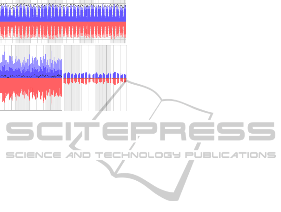
Figure 11: Extracts from the chronological view. The pa-
tient flow for the overall hospital (top) shows a weekly pat-
tern but no seasonal variations. The flow in (blue) and out
(red) of the emergency department (bottom left) shows no
chronological pattern. About two thirds of the patients enter
from outside (light hues) but most of them get transferred to
other clinics (dark hues). Few patients stay overnight (black
line). No patients stay at the radiology department (bottom
right) and nothing happens there on weekends. Gridlines
denote weeks, with months shown as alternating shaded
backgrounds.
however is often limited to their sphere of action. The
dependencies on the next or next-to-next source of in-
fluence are not taken into account sufficiently. Our
analysis with this application however allowed us to
gain an overview of the big picture of the hospital
system. The details were validated by experiences of
specific experts, but we also gained new insights that
went beyond particular knowledge.
By making the flow of patients visible, we were
able to contrast the hierarchical organizational struc-
ture with the actual implemented working relation-
ships. This showed the difference between the op-
erational structures that developed through medical
consequences, and the theoretically defined organiza-
tional structure. Based on this difference, we were
able to describe new sub-systems and identify an or-
ganizational form that corresponds to the current ac-
tual needs.
It was not really a surprise for instance, that the
core functions of a hospital such as emergency de-
partment, operating rooms, and diagnostic functions
appeared in the center of the system, but it was not
expected to be so pronounced. A new insight was the
role of the cardiology clinic as an important service
center for diagnostics. This lead to the decision to
also assign it a central role on the campus. Also new
was the interpretation of the role of the clinic for in-
ternal medicine as being primarily a receiving station
for the emergency room, with the further distribution
into the specialized clinics taking place only one or
two days later.
In summary, we confirmed our two hypotheses,
namely that enriched patient flow data reveals inter-
esting insights into various aspects of a hospital, and
that an exploratory approach to analytics, enabled by
interactive visualization, leads to insights that can not
be gained with standard or automated statistical meth-
ods.
5 FUTURE WORK
The current application was primarily built to gain in-
sights into the strategic planning of a new and evolv-
ing hospital campus (e.g., which clinics should be
placed where to minimize the travel distances for pa-
tients and optimize logistics).
Since the application provides access to various
aspects of a hospital, from high-level overview to in-
dividual treatments within a single case with just a
few clicks, it also has large potential for controlling
tasks and other purposes. We plan to enrich the data
with further treatment cost and performance data, to
support process analysis in the DRG-based manage-
ment context that is currently introduced in our coun-
try. If successful, then one will need to investigate the
possibility of a direct connection to the various hos-
pital information systems in order to obtain real-time
data without compromising the privacy issues.
Another direction of future work is to scale-up the
system to support the planning and controlling of re-
gional, jointly administered hospital clusters, by inte-
grating data from several hospitals. Some of the algo-
rithms and views can be directly scaled-up, but others
will have to be adapted or developed specifically to
address additional issues.
During the analysis and interpretation of the data,
the need came up to find clusters of similar patient
paths through the hospital. This opens interesting
research questions about measures of similarity, and
how to find the balance between automated mining
and human-guided visual analysis.
REFERENCES
Alapont, J., Bella-Sanju
´
an, A., Ferri, C., Hern
´
andez-Orallo,
J., Llopis-Llopis, J. D., and Ram
´
ırez-Quintana, M. J.
(2005). Specialised tools for automating data mining
for hospital management. In In Proc. First East Euro-
pean Conference on Health Care Modelling and Com-
putation, pages 7–19.
HEALTHINF2013-InternationalConferenceonHealthInformatics
92

American Hospital Association (2007). Continued
Progress: Hospital Use of Information Technology.
American Hospital Association.
Buja, A., McDonald, J. A., Michalak, J., and Stuetzle, W.
(1991). Interactive data visualization using focusing
and linking. In Proceedings of the 2nd conference
on Visualization ’91, VIS ’91, pages 156–163, Los
Alamitos, CA, USA. IEEE Computer Society Press.
Chalmers, M. (1996). A linear iteration time layout algo-
rithm for visualising high-dimensional data. In Pro-
ceedings of the 7th conference on Visualization ’96,
VIS ’96, pages 127–ff., Los Alamitos, CA, USA.
IEEE Computer Society Press.
Chaudhry, B., Wang, J., Wu, S., Maglione, M., Mojica, W.,
Roth, E., Morton, S. C., and Shekelle, P. G. (2006).
Systematic review: impact of health information tech-
nology on quality, efficiency, and costs of medical
care. Ann Intern Med, 144(10):742–752.
Cuzzocrea, A., Song, I.-Y., and Davis, K. C. (2011). An-
alytics over large-scale multidimensional data: the
big data revolution! In Proceedings of the ACM
14th international workshop on Data Warehousing
and OLAP, DOLAP ’11, pages 101–104, New York,
NY, USA. ACM.
Jha, A. K., DesRoches, C. M., Campbell, E. G., Donelan,
K., Rao, S. R., Ferris, T. G., Shields, A., Rosen-
baum, S., and Blumenthal, D. (2009). Use of elec-
tronic health records in U.S. hospitals. N Engl J Med,
360(16):1628–1638.
Kandel, S., Heer, J., Plaisant, C., Kennedy, J., van Ham,
F., Riche, N. H., Weaver, C., Lee, B., Brodbeck, D.,
and Buono, P. (2011). Research directions in data
wrangling: Visualizations and transformations for us-
able and credible data. Information Visualization,
10(4):271–288.
Keim, D. A., Kohlhammer, J., Ellis, G., and Mansmann, F.,
editors (2010). Mastering The Information Age - Solv-
ing Problems with Visual Analytics. Eurographics.
Krzywinski, M. I., Schein, J. E., Birol, I., Connors, J., Gas-
coyne, R., Horsman, D., Jones, S. J., and Marra, M. A.
(2009). Circos: An information aesthetic for compar-
ative genomics. Genome Research.
Laney, D. (2001). 3d data management: Con-
trolling data volume, velocity, and vari-
ety. application delivery strategies. Avail-
able online at http://blogs.gartner.com/doug-
laney/files/2012/01/ad949-3D-Data-Management-
Controlling-Data-Volume-Velocity-and-Variety.pdf
Visited on August, 22th, 2012.
North, C. and Shneiderman, B. (2000). Snap-together vi-
sualization: Can users construct and operate coordi-
nated views? Intl. Journal of Human-Computer Stud-
ies, Academic Press, 53(5):715–739.
Shneiderman, B. (1996). The eyes have it: A task by data
type taxonomy for information visualizations. In Pro-
ceedings of the 1996 IEEE Symposium on Visual Lan-
guages, VL ’96, pages 336–, Washington, DC, USA.
IEEE Computer Society.
Van der Aalst, W. M. P. (2012). Process mining. Communi-
cations of the ACM, 55(8):7683.
Wong, P. C. and Thomas, J. (2004). Visual analytics. Com-
puter Graphics and Applications, IEEE, 24(5):20 –
21.
Zikopoulos, P. and Eaton, C. (2011). Understand-
ing Big Data: Analytics for Enterprise Class
Hadoop and Streaming Data. McGraw-Hill Compa-
nies,Incorporated.
SupportingStrategicPlanningwithInteractiveVisualization-ACaseStudyofPatientFlowthroughaLargeHospital
93
