
Telecommunications Customers Churn Monitoring using Flow Maps
and Cartogram Visualization
David L. Garc´ıa,
`
Angela Nebot and Alfredo Vellido
Dept. de Llenguatges i Sistemes Inform`atics, Universitat Polit`ecnica de Catalunya - Barcelona TECH
C. Jordi Girona, 1-3, 08034, Barcelona, Spain
Keywords:
Visualization, Cartogram, Flow Maps, Generative Topographic Mapping, Churn, Telecommunications market.
Abstract:
Telecommunication companies compete in increasingly aggressive markets. Avoiding customer defection, or
churn, should be at the core of successful management in such context. These companies store and manage
abundant customer usage data. Their analysis using advanced techniques can be a source of valuable insight
into customers’ behavior over time. Exploratory data visualization can help in this task. Many important
contributions to multivariate data visualization using nonlinear techniques have recently been made. In this
paper, we analyze a database of customer landline telephone usage in Brazil. These data are first visualized
using a nonlinear manifold learning model, Generative Topographic Mapping (GTM). This visualization is
enhanced using a cartogram technique, inspired in geographical representation methods, that reintroduces the
local nonlinear distortion into the representation space. Yet another geographical information visualization
technique, namely the Flow Maps, is then used to visualize customer migrations over time periods in the
GTM data representation space. The experimental results shown in this paper provide evidence to support that
the use of these methods can assist experts in the process of useful knowledge extraction, with an impact on
customer retention management strategies.
1 INTRODUCTION
Telecommunication companies fight in very competi-
tive markets. In the current global situation of eco-
nomical crisis, this competition is even fiercer and
customer management becomes a key to gain com-
petitive advantage. Avoiding customer defection (also
known as churn) and ensuring the retention of the
most valuable customers should be at the core of suc-
cessful management in such context. These telecom-
munication companies could achieve strategic advan-
tages by proactively using the customer data they
gather, whose analysis using advanced techniques
should be a source of insight into their customers’ be-
havior over time that helped them to prevent churn
and to enhance retention (Hadden et al., 2007).
In this brief paper, we analyze a database of
telephone customers from one such telecommunica-
tions company, using several visualization techniques
associated to a nonlinear dimensionality reduction
(NLDR) method. The visualization of multivariate
data (MVD) for usable knowledge generation requires
both the use of pattern recognition (PR) techniques
and the use of methods that guarantee the human in-
terpretability of those PR techniques (Vellido et al.,
2011; Vellido et al., 2012b).
The use of PR for MVD visualization becomes
an extreme form of data dimensionality reduction
(DR). This unavoidably entails some level of informa-
tion loss, and the faithfulness of the low-dimensional
MVD representation is limited by the radical simpli-
fication of the observed data. Many popular DR tech-
niques for visualization belong to the feature extrac-
tion (FE) category and are linear in nature. A com-
mon example of FE is Principal Component Analysis
-PCA (Jolliffe, 2002)-, which lacks flexibility and can
be negatively affected by noise, but, in compensation,
is easy to interpret on the basis of the original coordi-
nates, making it a very practical method.
Many important contributions to MVD visualiza-
tion based on NLDR methods have been proposed
over the last decade (Lee and Verleysen, 2007) and,
more in particular, NLDR techniques of the manifold
learning family. Manifold learning attempts to de-
scribe MVD through nonlinear low-dimensionalman-
ifolds embedded in the observed data space. Exam-
ples include the popular Self-Organizing Maps -SOM
(Kohonen, 2000)- and their probabilistic counterpart,
Generative Topographic Mapping -GTM (Bishop
et al., 1998)-. The latter is a manifold-constrained
mixture model of the latent variable family. It pro-
vides both MVD visualization and vector quanti-
451
García D., Nebot À. and Vellido A..
Telecommunications Customers Churn Monitoring using Flow Maps and Cartogram Visualization.
DOI: 10.5220/0004270804510460
In Proceedings of the International Conference on Computer Graphics Theory and Applications and International Conference on Information
Visualization Theory and Applications (IVAPP-2013), pages 451-460
ISBN: 978-989-8565-46-4
Copyright
c
2013 SCITEPRESS (Science and Technology Publications, Lda.)

zation through the definition of manifold-embedded
data prototypes (cluster centroids).
The nonlinearity of these methods induces differ-
ent levels of local distortion in the mapping of the data
from the observed space into their visualization space.
This means that points which are distant in the ob-
served data space may end up being represented as
closely placed in the visualization space and the other
way around, through processes of compression and
stretching of the manifold. Such effects can also be
seen as the result of a local magnification process.
The introduction of local distortion means that
NLDR data representation is very flexible, but also
that the resulting data visualization is less straightfor-
ward to interpret, given that the coordinates of visual
representation are no longer linear combinations of
the original data features.
Here, we present two methods inspired in the rep-
resentation of geographical information that should
help to improve the interpretability of the GTM
NLDR method outcome. The first one, namely the
Cartogram, is a method that will help us to explicitly
reintroduce the distortion created by the GTM into
its low-dimensional MVD visualization. Cartograms,
also known as density-equalizing maps (Tobler, 2004;
Gastner and Newman, 2004), were originally devised
as geographic maps in which the sizes of regions
are in proportion to underlying quantities such as
their population density. They have of late become
popular through web resources such as Worldmap-
per
1
. The Cartogram retains the interpretability of
the maps while distorting them, but always retaining
the continuity of the map internal and external bor-
ders. Here, we extrapolate from geographical maps
to the GTM visualization maps, replacing geography-
related quantities by quantities reflecting the mapping
distortion introduced by GTM.
The second method is the Flow Map. Flow
Maps were originally devised to visualize geography-
related evolution patterns such as, for instance, pop-
ulation migrations (Slocum, 1998) and have be-
come increasingly sophisticated from a computational
viewpoint (Buchin et al., 2011). Given that the ana-
lyzed database contains information over time, we use
Flow Maps to analyze the customer migrations over
the GTM visualization map, aiming to detect foci of
potential customer churn.
As reflected in the experiments reported in this
paper, the use of both methods helps increasing
the interpretability of the visualization of the ana-
lyzed database, thus assisting in the process of use-
ful knowledge extraction that could have a practical
impact on customer retention management strategies.
1
http://www.worldmapper.org
2 METHODS
2.1 Generative Topographic Mapping
Latent variable models (LVM) define MVD through
a set of latent variables (Bishop, 1998). More specif-
ically, an LVM expresses the distribution p(x) of the
variables x
1
,...,x
D
of a dataset X in terms of a smaller
number of latent variables u
1
,...,u
L
where L < D.
Generative Topographic Mapping (Bishop et al.,
1998) is an LVM for MVD visualization, in which a
finite number of latent points k = 1,... , K are mapped
into the observed data space, each of them defining a
prototype point. This prototype is the image of the
former according to a mapping function that takes
the form of a generalized regression model, so that
each of the D-dimensional prototypes, y
k
, is defined
as y
k
= WΦ(u
k
),
where Φ is a set of M nonlinear basis functions
φ
m
, and W is a D× M matrix of adaptive weight pa-
rameters w
dm
, each associated to a basis function m
and to an observed data variable d.
The prototype vector y
k
can be seen as a repre-
sentative of those data points x
n
which are closer to
it than to any other prototype and, thus, can also be
seen as a cluster centroid. GTM performs a type of
vector quantization that is similar to that of the popu-
lar SOM method. The set of prototypes belongs to
a smooth manifold that wraps around the observed
data X = {x
n
}
N
n=1
. The conditional distribution of
the observed data variables, given the latent variables,
p(x|u), involves a noise model with variance β
−1
:
p(x|u,W,β) = (
β
2π
)
D/2
exp{−
β
2
D
∑
d=1
(x
d
− y
d
(u))
2
},
(1)
From this, we can integrate the latent variables out
(marginalize) to obtain an analytical expression for
the likelihood of the model. The adaptive parameters
of the model can thus be optimized within a maxi-
mum likelihood framework. Details of this procedure
can be found elsewhere (Bishop et al., 1998).
For data visualization, we use one of the partial
results obtained in the maximization step of the EM
algorithm: A direct application of Bayes’ theorem
allows inverting the mapping from latent space to
observed data space and thus obtain the conditional
probability of each latent point in the visualization
space given each observed data point, in the form:
p(u
k
|x
n
) =
p(x
n
|u
k
,W,β)
∑
K
k
′
=1
p(x
n
|u
k
′
,W,β)
. (2)
This probability, also know as the responsibility of
each latent point for the generation of each observed
IVAPP2013-InternationalConferenceonInformationVisualizationTheoryandApplications
452

data point, r
kn
≡ p(u
k
|x
n
), can be used to obtain
data visualization in the form of either a posterior
mode projection of x
n
: k
mode
n
= argmax
{k
n
}
r
kn
(which
implies assigning each observed data point to that
latent point with the highest responsibility for its
generation), or a posterior mean projection u
mean
n
=
∑
K
k=1
r
kn
u
k
(in which the observed data point is placed
at a location in the latent space continuum resulting
from a responsibility-weighted combination of all la-
tent point locations).
2.2 Magnification Factors for the GTM
The probabilistic definition of GTM allows the quan-
tification of the distortion caused by the nonlinear
mapping process over the latent (visualization) space.
This distortion is known as Magnification Factors
(MF) (Bishop et al., 1997). The relationship be-
tween a differential area dA (for a 2-D visualization)
in latent space and the corresponding area element in
the GTM-generated manifold, dA
′
, can be expressed
as dA = JdA
′
, where J is the Jacobian of the map-
ping transformation. This Jacobian can be written in
terms of the derivatives of the basis functions φ
m
as
dA/dA
′
= J = det
1
2
(Ψ
T
W
T
WΨ), where Ψ is a M×2
matrix with elements ϕ
mi
= ∂φ
m
/∂u
i
and u
i
is the i
th
coordinate (i = 1,2) of a latent point.
2.3 Density-equalizing Cartograms
Cartograms are cartography maps in which specific
areas, delimited by borders, are locally distorted to re-
flect locally-varying underlying quantities of interest,
such as population density. The geometrical distor-
tion of cartograms takes (in 2-D) the form of a contin-
uous transformation from an original plane to a trans-
formed one, so that a vector x = (x
1
,x
2
) in the former
is mapped into the latter according to x → T(x), in
such a way that the Jacobian of the transformation is
proportional to an underlying distorting variable d:
∂(T
x
1
,T
x
2
)
∂(x
1
,x
2
)
∝ d. (3)
A method for the creation of cartograms based on
the physics principle of linear diffusion processes was
proposed in (Gastner and Newman, 2004). In this
method, the distorting variable d is let to diffuse over
the map over time so that the final result, for t → ∞,
is a map of uniform distortion in which the original
locations have shifted according to the process, while
preserving the integrity of the existing borders.
The current density C follows the gradient of the
distortion ∇d and can be written as product of the
current flow velocity v and the distortion itself, so
that C = −∇d = v(x,t)d(x,t). The standard diffusion
equation takes the form ∇
2
d−
∂d
∂t
= 0,
which has to be solved for distortion d(x,t), as-
suming that the initial condition corresponds to each
map fragment being assigned its value of the dis-
torting variable. Thus, the distortion diffusion ve-
locity can be calculated as v(x,t) = −
∇d
d
and, from
it, the map location shift as a result of which the
cartogram is actually generated can be calculated as
△x =
R
t
0
v(x,t
′
)dt
′
.
To avoid arbitrary diffusion through the overall
boundary of a map, the latter is assumed to be sur-
rounded by an area in which the distortion has a value
equal to the mean distortion of the complete map.
This guarantees a constant total map area.
2.4 Cartogram Visualization
of the GTM Magnification Factors
In the following experiments, the GTM latent visu-
alization map is transformed into a Cartogram using
the square regular grid formed by the lattice of la-
tent points u
k
as map internal boundaries and assum-
ing that the level of distortion in the space beyond
this square is uniform and equal to the mean distor-
tion over the complete map, which is 1/K
∑
K
k=1
J(u
k
),
where J = det
1
2
(Ψ
T
W
T
WΨ). It is also assumed
that the level of distortion within each of the lattice
squares associated to u
k
is itself uniform. We recently
used a similar approach for a Batch-SOM model in
(Tosi and Vellido, 2012).
The method, as applied in this study, can be sum-
marized as the following succession of steps, which
are further detailed in (Vellido et al., 2012a):
• GTM model initialization, including: The defini-
tion of a latent square grid of K points and the
initialization of the model parameters according
to a standard PCA-based procedure described in
(Bishop et al., 1998).
• GTM iterative training: using a maximum likeli-
hood approach.
• Calculation of the posterior mean and mode pro-
jections for all data points, as described in section
2.1, for data visualization.
• Cartogram generation, including: The description
of the GTM latent grid as a pixelated image in
which each node of the latent space is assigned
a square of p × p pixels; the calculation, from
the model training results, of the MF for each
pixel location in the latent space; the assignment
of distortion values (average 1/K
∑
K
k=1
J(u
k
); the
iterative calculation of the MF distortion velocity
TelecommunicationsCustomersChurnMonitoringusingFlowMapsandCartogramVisualization
453

and the correspondinglocation shift for each pixel
of the map, until obtaining the final Cartogram;
and the location shift calculation for the posterior
mean projections of the data points and position-
ing of these shifted projections in the Cartogram.
2.5 Flow Maps for the Visualization
of Customer Migrations in GTM
As with Cartograms, we propose that the use of Flow
Maps could be extrapolated to NLDR visualization
methods, so that they could be used to describe the
evolution over time of individual data point positions
on the visual representation space of these methods
and, particularly, of GTM. This type of visualization
can be specially suitable for tracking the behavioural
evolution of individual customers, anticipating the
possibility and potential cost of their defection.
A method for the generation of Flow Maps us-
ing hierarchical clustering was recently proposed in
(Phan et al., 2005). Its algorithm operates through
six differentiated stages, including layout adjustment,
primary and rooted clustering, spatial layout, edge
routing and rendering. These stages, as applied to the
GTM representation, are as follows: 1) Layout ad-
justment, enforcing a minimum separation distance
among the nodes (in our case, each of the squares
in the GTM lattice corresponding to individual latent
points in the visualization space); 2) Primary cluster-
ing: merging of flow edges that share destinations, ob-
tained by agglomerative hierarchical clustering. The
resulting binary tree describes the branching struc-
ture of the Flow Map; 3) Rooted clustering, gener-
ated such that the root of the Flow Map is the root
of the tree; 4) Spatial layout, which actually defines
the flow hierarchical tree from the rooted hierarchi-
cal cluster solution; 5) Edge routing, in which edges
are re-routed around the bounding boxes within the
same hierarchical cluster to avoid unwanted crosses;
6) Rendering, in which each flow edge in the visu-
alization map of GTM is rendered as a catmull-rom
spline, generating an interpolation between the nodes
of the spatial layout hierarchical tree. Their width is
proportional to the magnitude of the flow.
3 MATERIALS
For the experiments reported in the next section, a
proprietary database containing telephone usage in-
formation corresponding to a total of 57,442 small
and medium-size Brazilian companies, all of them
customers of the main landline telephony telecommu-
nications company in S˜ao Paulo (Brazil), was used.
The information was acquired over two consecutive
periods (non-overlapping with holidays): Period 1
(P1), from June to December 2003, and Period 2 (P2),
from March to August, 2004.
The following 14 data features, which character-
ize landline usage, were considered for analysis: v1.
Percentage of local landline outcoming calls; v2. Per-
centage of outcoming state landline calls (Brazil is
formed by 26 states, each with different telephone
tariffs according to call destination); v3. Percent-
age of outcoming out-of-state landline calls; v4. Per-
centage of outcoming international landline calls; v5.
Percentage of outcoming calls to mobile phones; v6.
Percentage of incoming local landline reverse-charge
calls; v7. Percentage of incoming state reverse-charge
landline calls; v8. Percentage of incoming out-of-
state reverse-charge landline calls; v9. Percentage
of incoming mobile phone reverse-charge calls; v10.
Percentage of calls within standard time slot (8:00-
10:00h and 14:00-16:00h); v11. Percentage of calls
in differential time slot (10:00-14:00h and 16:00-
18:00h); v12. Percentage of calls within mixed time
slot (calls that begin and end in different time slots);
v13. Percentage of calls within reduced-tariff time
slot (18:00-24:00h); v14. Percentage of calls within
super reduced-tariff time slot (00:00-06:00h).
Beyond these 14 data features, used to build the
GTM model, further customer information was used
for profiling the clustering results. It included: cus-
tomer commercial margin, churn occurrence, cus-
tomer ownership of added-value services (AVS), time
as a company customer, EANC code (Economic Ac-
tivities National Classification) and number of em-
ployees in the customer company.
4 EXPERIMENTS
Our approach to the exploratory visualization of the
available Brazilian telecommunications database re-
lies on three basic assumptions, supported by previ-
ous preliminary research (Garc´ıa et al., 2007b), that
can be expressed as follows:
1. Different customer service usage patterns deter-
mine different levels of churn propensity.
2. The identification of customer migration routes
between two consecutive time periods is possi-
ble. These routes maybe either negative: towards
representation space areas of lower value for the
company and, eventually, churn; or positive: to-
wards representation space areas of higher value
for the company and higher customer fidelity.
3. In the absence of promotional actions, customers’
IVAPP2013-InternationalConferenceonInformationVisualizationTheoryandApplications
454

usage behaviortends to remain stable. This entails
lack of migration or migrations towards neigh-
bouring areas in the visual representation space.
The visual exploratory analysis of the reported ex-
periments aims to identify potential customer churn
routes through the combination of three processes:
1. The visualization of customer usage patterns
through the nonlinear mapping onto a 2-D repre-
sentation space using GTM.
2. The enhancement of this visualization using Car-
togram representation.
3. The visual representation of customers’ transi-
tions over periods using Flow Maps, aiming to
discover potential churn and customer retention
routes over the GTM visual representation map.
The experimental settings corresponding to the
GTM models and the Flow Maps are first described.
This is followed by a presentation and discussion of
the results of the analysis of the Brazilian telecommu-
nications database described in section 3.
4.1 Experimental Setup
As described in section 2.4, the adaptive parameters
of the GTM model were initialized according to a
standard procedure described in (Bishop et al., 1998):
The weight matrix W was defined so as to minimize
the difference between the prototype vectors y
k
and
the vectors that would be generated in the observed
space by a partial PCA process. The inverse vari-
ance parameter β was initialized as the inverse of the
3
rd
PCA eigenvalue. This initialization procedure has
been shown to be reliable while avoiding the lack of
replicability that might result from the random initial-
ization of parameters.
Different GTM lattice sizes were explored but, in
the end, a trade-off between detail (which would be
proportional to the size of the lattice) and practical
visual interpretability had to be achieved. For the an-
alyzed data, it was found that a suitable layout was a
10× 10 grid for the GTM lattice. This was chosen for
all the reported experiments.
In the reported experiments, the GTM input to the
Flow Map algorithm included: The GTM map lay-
out, in the form of a regular visualization lattice built
from the discrete sampling of the latent space; The
GTM model for periods P1 and P2, in the form of the
assignment of each data point (customer) to a given
lattice node (cluster); the flow from the P1 to the P2
visual representations, in the form of cumulative cus-
tomer information for each of the lattice nodes.
4.2 Results
The data described in section 3 were first mapped into
the standard GTM model. Data from period P1 are
represented in Figure 1 and data from period P2, in
Figure 2. Figures 1 and 2 (top-left) show all data as
mapped into the 2-D GTM visualization space con-
tinuum, according to their posterior mean projection,
which was described in section 2.1.
The images in Figures 1 and 2 (top-right) repre-
sent the same data over the same space, but this time
using the posterior mode projection, so that the vi-
sualization informs of which of the 100 GTM nodes
each of the data points is assigned to. The relative
size of each square is proportional to the ratio of data
mapped into that node. As a result, areas filled with
(relatively) big squares usually correspond to areas of
the mapping with high data density.
The local distortion introduced by the nonlinear
mapping, as represented by the MFs described in sec-
tion 2.2, is color-coded in Figures 1 and 2 (bottom-
left), and this is again represented in the same 10× 10
visualization grid. Note that this representation is the
same for both periods (both figures) because we are
mapping the data from the second period in the model
generated by the first one. This quantification of the
local mapping distortion in the form of MFs is then
explicitly reintroduced in the visualization space of
posterior mean projections through the Cartograms in
Figures 1 and 2 (bottom-right).
Once this basic representation is established, we
build on it by adding further customer profiling in-
formation. As listed in section 3, this includes com-
mercial margin, AVS on portfolio, time as a company
customer, EANC code and number of employees in
the customer company. This helped us to establish
a market-meaningful comparison between periods P1
and P2, in order to identify map areas of commercial
interest. The following quantities are visualized in the
posterior mode projection maps of Figure 3:
1. Percentage of churn, defined as:
churn
i
= (A
i
/µ
i
)100
where A
i
is the number of customers mapped into
node i that abandoned the company between peri-
ods P1 and P2; and µ
i
is the average of customers
over the two periods in that node
2
. It is visualized
in Figure 3 (top-left).
2. Percentage of stable customers, defined as
stab
i
= (S
i
/µ
i
)100
where S
i
is the number of customers that remained
in node i between P1 and P2. It is visualized in
Figure 3 (top-right).
2
This calculation of churn is common business practice.
TelecommunicationsCustomersChurnMonitoringusingFlowMapsandCartogramVisualization
455
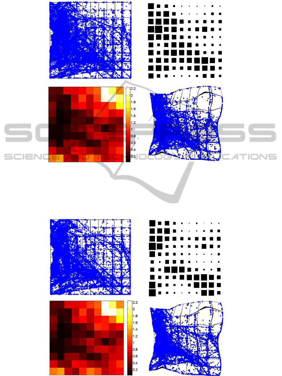
Figure 1: Basic MVD visualization over the GTM representation map for the data corresponding to period P1. Top left)
Posterior mean projection of the data. Each dot is a customer represented over the continuum of the latent space. Top right)
Posterior mode projection of the data. Each customer is assigned to a GTM node (represented as a square) over a discrete
representation map. The relative size of each square is proportional to the ratio of customers assigned to that node to the
total number of customers. Bottom left) Values of the MF for each GTM node, represented as a color map on the discrete
latent space of the model. Bottom right) Cartogram representation of the posterior mean projection of the data in which the
distortion is proportional to the MF.
Figure 2: Basic MVD visualization over the GTM representation map for the data corresponding to period P2, as in Figure 1.
IVAPP2013-InternationalConferenceonInformationVisualizationTheoryandApplications
456
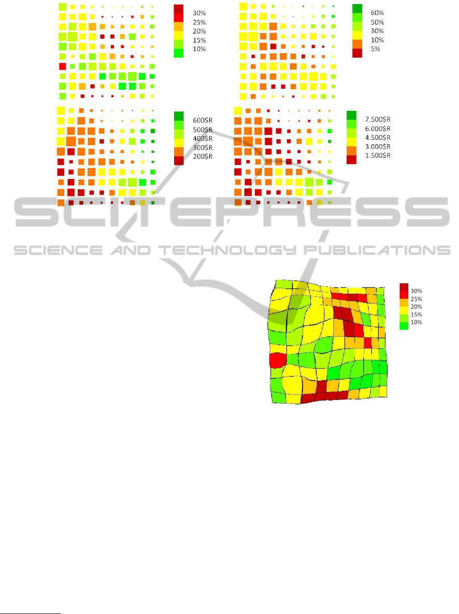
Figure 3: Visualization of profiling parameters over the posterior mode projection of the data in the GTM representation
space, using color maps. Top left) Visualization of the percentage of churn. Top right) Visualization of the percentage of
stable customers. Bottom left) Visualization of customers’ commercial margin. Bottom right) Visualization of customers’
LTV.
3. The previous quantities helped us to identify po-
tential departure gates for customers and cus-
tomer strongholds, but did not clarify their value.
For that, we calculated and visualized (in Fig-
ure 3, bottom-left) the commercial margin of each
GTM node, defined as the average commercial
margin of the customers mapped into it.
4. Finally, we visualized in Figure 3 (bottom-right)
the life-time value (LTV) of a GTM node i, cal-
culated as the commercial margin of the node di-
vided by its percentage of churn
3
.
The visualization of the percentage of churn per
node without direct information of the absolute num-
ber of churners may not be intuitive enough. At this
point, we suggest using the concept of Cartogram
to reintroduce the absolute number of churners into
the visualization space. That is, instead of distorting
the GTM according to the MF as in Figures 1 and
2 (bottom-right), we suggest distorting it directly ac-
cording to the absolute number of customers aban-
doning the service provider company from a given
node. The result can be seen in Figure 4.
Each GTM node or micro-cluster is not, by itself,
too actionable from a marketing viewpoint. We thus
further grouped these micro-clusters into market seg-
ments using the well-know K-means algorithm (Jain,
2010). See details of this procedure in (Garc´ıa et al.,
2007a; Garc´ıa et al., 2007b). The obtained market
3
This is, again, common business practice.
Figure 4: Cartogram of the percentage of churn of Figure 3
(top-right), where the distortion is proportional to the total
number of churning customers in each node.
segments are displayed in Figure 5.
Once this overall market characterization by seg-
ments was achieved, we turned our attention to the
customer base transition between periods P1 and P2.
For that, we overlaid the GTM-based visualization
with the migration of customers between GTM nodes,
as visualized using Flow Maps. For the sake of
brevity, this is illustrated in Figure 6 with the migra-
tion for just a couple of GTM nodes.
4.3 Discussion
Figure 1 provides different visualizations of the
57,422 analyzed customers from P1 in their GTM
TelecommunicationsCustomersChurnMonitoringusingFlowMapsandCartogramVisualization
457
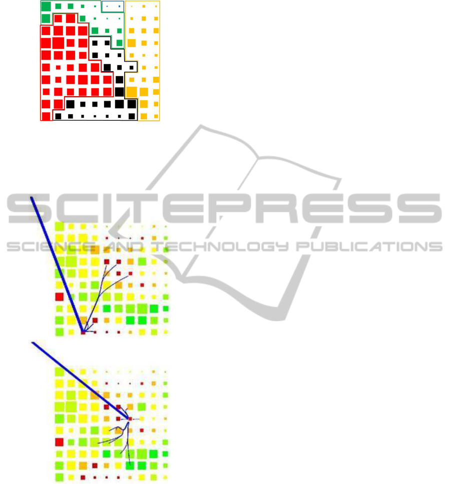
Figure 5: Segmentation of the analyzed customers accord-
ing to a procedure that uses K-means to agglomerate the ba-
sic clustering results of GTM. The resulting five segments
are color-coded: red for Locals, green for Street Force, yel-
low for Nationals, blue for Providers, and black for SoHo.
Figure 6: Flow Maps for two specific GTM nodes displayed
on top of the posterior mode projection of the data in the
GTM representation space, using a color map to represent
percentage of churn. The lines moving away of the map
represent the churn, whereas the lines between GTM nodes
represent the migrations of the remaining customers. The
width of the lines is proportional to the ratio of customers
migrating to a given arrival node, to the total number of
customers in the departure node. Top) a node of the SoHo
segment in which the migration pattern reflects the failure of
a commercial action. Bottom) a node from a different area
of the SoHo segment in which the migration pattern reflects
this time the success of a different commercial action.
representation maps. The most detailed one is the
posterior mean projection in Figure 1 (top-left). The
big size of the data set makes this representation
rather obscure and uninformative. It reflects a com-
mon trait to be found in customer usage data, which
is an apparent absence of global grouping structure
and densely populated representation areas gently and
gradually connected to less densely populated ones,
without neat borders between them.
Given that these maps represent customer usage, it
is perhaps not surprising that the main and rather in-
distinct data concentration corresponds to a majority
of customers showing a very standard service usage,
strongly mediated by outgoing local, within-state and
mobile calls (which constitute the 95% of all calls).
This visual information becomes much more op-
erational using the posterior mode projection map
shown in Figure 1 (top-right), in which the relative
ratios of customer assignment to each GTM node pro-
vide insights into a somehow richer cluster structure.
The comparison of periods P1 and P2 in Figures 1 and
2 is illustrative: the mean projection does not show
any clear differences, whereas the mode projection at
least shows that P2 has led to slightly more clearly
differentiated groupings than P1.
The areas of high-data density usually undergo lit-
tle distortion in the nonlinear mapping generated by
GTM. This effect is clearly reflected in the MF maps
of Figures 1 and 2 (bottom left), where densely data
populated areas correspond to low magnification (dis-
tortion). On the contrary, more sparsely populated ar-
eas correspond to high magnifications, suggesting the
diversity of the less standard customers (and, thus, the
existence of potentially interesting market segments).
This uneven customer distribution is neatly cap-
tured by the Cartograms in Figures 1 and 2 (bottom
right), in which the data from standard customers be-
come more concentrated than in the standard mean
projection, whereas the less standard ones occupy an
expanded visualization area that reflects their original
diversity more faithfully.
So far, visualizations have only hinted about the
general structure of the data. A richer insight can be
obtained from the GTM maps of Figure 3, describing
the significant local variations of percentage of churn,
percentage of stable customers, commercial margin
and LTV. The percentage of churn map in Figure 3
(top-left) reveals large variations between different ar-
eas of the map, from values close to 0% to values over
30%. These results corroborate the initial hypothesis
that different service usage patterns can determine the
level of propensity to churn.
Three areas of high churn (dark red nodes) were
identified and singled out for further investigation:
IVAPP2013-InternationalConferenceonInformationVisualizationTheoryandApplications
458

• The individual node in the first map column from
the left and seventh row from the top is charac-
terized by a very low overall service usage, con-
sisting mostly of companies either close to liqui-
dation for economical reasons, or that were about
to replace the telephone service provider by their
own mobile call center.
• The second churn area in the low part of the
map, sparsely populated and occupying the cen-
ter of the last two rows, consists of companies for
which the reduction of mobile phone tariffs and
their landline/mobile calls mix made the transition
from landline to mobile specially attractive.
• The third churn area, also sparsely populated and
occupying most of the central part of the top half
of the map, corresponds to customers attracted by
call plans offered by telecommunication compa-
nies specialized in long-distance calls.
The cartogram of the churn map distorted ac-
cording to the absolute number of churners in each
node, shown in Figure 4, provides complementary
visualization that reveals that the third churn region
described in the previous paragraph includes more
churners than the others, which suggests the adequacy
of a marketing action that prioritized campaigns to
counter the luring effect of those carried out by com-
panies specialized in long-distance services.
Even if the focus of this study is on the analysis
of churn and on the detection of churn gates of cus-
tomer departure, market knowledge can also be ac-
quired from the exploration of those customers that
do not vary the usage pattern over the studied periods
and, thus, do not vary their location over the visual-
ization map. Figure 3 (top right) reveals that the most
stable customers (in green) are located at the top and
bottom right corners of the GTM map, which means
that they are clearly separated from the bulk of the
customer sample. These are mostly nationwide op-
erating companies with a varied communication mix,
that is, companies that have incoming and outgoing
calls to all destinations and covering all time bands.
Interestingly, telecommunications companies do not
have competitive offers that match this usage pattern.
A perhaps more valuable information can be ob-
tained from the similar, but not equivalent, commer-
cial margin and LTV representation maps in Fig-
ure 3 (bottom-left and right, respectively). The cus-
tomer departure gates, or GTM nodes with high
churn, are important per se, but this importance must
be weighted by the commercial value of the cus-
tomers assigned to them. Marketing preventive ac-
tions must prioritize big churning areas of high com-
mercial value. Fortunately for the service provider,
most of the areas of high churn had relatively low
commercial and LTV value for the analyzed data.
Often, service providers require a less detailed
market segmentation than the one provided, for in-
stance, by the reported 10 × 10 GTM representation.
The 5-segment solution resulting from the application
of K-means as a post-processing of the GTM results,
reported in Figure 5, can be characterized as follows:
• Locals (54.4%): Companies that, essentially, per-
form local tasks in standard working hours.
• Nationals (17.4%): Companies with national
reach and a mix of local, national and interna-
tional calls, made during standard working hours.
• Street Force (9.8%): Companies with mobile em-
ployees (sales force, maintenance services, mes-
sengers, etc.), with whom they mostly communi-
cate through incoming and outgoing mobile calls.
• SoHo (18.3%): Self-employed workers that use
their telephone line both for work-related and per-
sonal calls.
• Providers (0.2%): Companies with plenty of free-
call customer service lines, including services and
care providers, public companies, etc.
Useful market insight can be obtained by tracking
customers as they evolve, from period P1 to period
P2, through the five obtained segments. More than
50% of total churn had its origin in the Locals seg-
ment (which decreases by more than 10%, with rele-
vant migrations towards the SoHo -9.06%- and Street
Force -6.37%-, both with high levels of churn). The
reason for this is the strong competition between mo-
bile and long-distance providers for this segment. On
the opposite side, the Nationals and Providers seg-
ments show the lowest mobility (75.46% and 72.63%
of segment permanence, in turn), due to the difficulty
for providers other than those specialized in their pro-
files to offer sustainable competitive plans.
Although this high-level segment vision of the
market allows the practical implementation of com-
mercial actions, it still misses the fine grain of the lo-
cal migration characteristics over the GTM visualiza-
tion map. This can be fully appreciated through the
use of Flow Maps, as in Figure 6. One was obtained
for each of the 100 nodes of the GTM map, but, for
brevity, only two of them are shown in this figure to
illustrate the interest of this visualization method.
The overall inspection of the Flow Maps corrobo-
rated the initial assumption that, in most cases, migra-
tions happen between neighbouring nodes, whereas
brisk jumps over distant locations in the GTM map
do not abound. This reflects that the changes in cus-
tomer usage patterns are, in this case, mostly gradual.
TelecommunicationsCustomersChurnMonitoringusingFlowMapsandCartogramVisualization
459

This does not preclude major changes, such as, for in-
stance, those illustrated by Figure 6 (top), in which
transitions are towards GTM nodes that, even if dis-
tant, share a rather high churn rate. In this particu-
lar case, the abrupt evolution was motivated by inad-
equate commercial actions (indiscriminate landline-
to-mobile call card gifts) that artificially modified the
usage profile without modifying the underlying cus-
tomer behaviour and propensity to churn.
Figure 6 (bottom) singles out the opposite case
of an adequate commercial action that took part of
the customers away from churn regions. In the illus-
trated example, a friend numbers campaign allowed
transferring part of the landline-to-mobile usage into
landline-to-landline usage, increasing customer usage
stability, commercial margin and LTV as a result.
5 CONCLUSIONS
The analysis of business information often requires
the use of exploratory data mining techniques.
Amongst them, MVD visualization is likely to pro-
vide invaluable insights for knowledge discovery. In
the world of telecommunication services providers,
the discovery of adequate models for the analysis
of customer churn has become paramount for the
achievement of competitive advantage. In the current
study, we have proposed a novel method of MVD vi-
sualization that combines the flexibility of the GTM
nonlinear manifold learning model with the abili-
ties of two visualization techniques from the field of
geographical representation: Cartograms and Flow
Maps. A number of experiments with a large database
of telecommunication customers have illustrated the
usefulness and actionability of the proposed MVD vi-
sualization method. High churn areas, or customer
departure gates, have been visually identified in a
manner that allows their description in terms of cus-
tomer usage and, thus, the implementation of com-
mercial campaigns oriented to increase customer re-
tention. Importantly, the method has also provided
a detailed visualization of customer migration routes,
which should enable preventive marketing actions to
avoid churn.
REFERENCES
Bishop, C. M. (1998). Latent variable models, pages 371–
404. Learning in Graphical Models. M.I.T. Press.
Bishop, C. M., Svens´en, M., and Williams, C. K. I. (1997).
Magnification factors for the GTM algorithm. In IEE
Fifth International Conference on Artificial Neural
Networks, pages 64–69. IEE.
Bishop, C. M., Svens´en, M., and Williams, C. K. I. (1998).
GTM: The Generative Topographic Mapping. Neural
Computation, 10(1):215–234.
Buchin, K., , Speckmann, B., and Verbeek, K. (2011). Flow
map layout via spiral trees. IEEE Trans. on Visualiza-
tion and Computer Graphics, 17(12):2536–2544.
Garc´ıa, D. L., Vellido, A., and Nebot, A. (2007a). Find-
ing relevant features for the churn analysis-oriented
segmentation of a telecommunications market. In
IEEE SICO 2007, II Simposio de Inteligencia Com-
putacional, pages 301–310. Thomson.
Garc´ıa, D. L., Vellido, A., and Nebot, A. (2007b). Identi-
fication of churn routes in the Brazilian telecommuni-
cations market. In ESANN’07, pages 585–590.
Gastner, M. T. and Newman, M. E. J. (2004). Diffusion-
based method for producing density-equalizing maps.
Proceedings of the National Academy of Sciences,
101(20):7499–7504.
Hadden, J., Tiwari, A., Roy, R., and Ruta, D. (2007). Com-
puter assisted customer churn management: State-of-
the-art and future trends. Computers and Operations
Research, 34(10):2902–2917.
Jain, A. K. (2010). Data clustering: 50 years beyond k-
means. Pattern Recognition Letters, 31(8):651–666.
Jolliffe, I. T. (2002). Principal Component Analysis.
Springer Series in Statistics. Springer Verlag.
Kohonen, T. (2000). Self-Organizing Maps. Information
Science Series. Springer Verlag, 3rd edition.
Lee, J. A. and Verleysen, M. (2007). Nonlinear Dimension-
ality Reduction. Information Science and Statistics.
Springer Verlag.
Phan, D., Xiao, L., Yeh, R., Hanrahan, P., and Winograd,
T. (2005). Flow Map Layout. In InfoVis’05, pages
219–224. IEEE.
Slocum, T. A. (1998). Thematic Cartography and Visual-
ization. Prentice Hall, New Jersey, U.S.A.
Tobler, W. R. (2004). Thirty-five years of computer car-
tograms. Annals of the Association of American Ge-
ographers, 94:58–73.
Tosi, A. and Vellido, A. (2012). Cartogram representation
of the batch-SOM magnification factor. In ESANN’12,
pages 203–208. d-side pub.
Vellido, A., Garc´ıa, D., and Nebot, A. (2012a). Car-
togram visualization for nonlinear manifold learning
models. Data Mining and Knowledge Discovery, doi:
10.1007/s10618-012-0294-6.
Vellido, A., Mart´ın, J. D., and Lisboa, P. J. G. (2012b).
Making machine learning models interpretable. In
ESANN’12, pages 163–172. d-side pub.
Vellido, A., Mart´ın, J. D., Rossi, F., and Lisboa, P. J. G.
(2011). Seeing is believing: The importance of visu-
alization in real-world machine learning applications.
In ESANN’11, pages 219–226. d-side pub.
IVAPP2013-InternationalConferenceonInformationVisualizationTheoryandApplications
460
