
The Inspector
A Cognitive Artefact for Visual Mapping
Mohammad A. Kuhail, Soren Lauesen and Kostas Pantazos
Software Development Group, IT University of Copenhagen, Rued Langgaards Vej 7, Copenhagen, Denmark
Keywords:
Visual Mapping, Inspector, Cognitive Artefacts, Information Visualization Tools, Custom Visualizations.
Abstract:
Existing custom visualization tools provide cognitive artefacts that can reduce the cognitive barriers designers
encounter in visual mapping, mapping data to visual primitives (e.g. ellipse, rectangle) and their properties
(e.g. colour, size.) However, our experience with designers shows that the existing artefacts are insufficient.
In particular, designers struggle to understand the relationship between visual primitives, their properties, and
data. Moreover, it is hard to verify the correctness of the visual mappings. In response, we developed a new
cognitive artefact, the inspector, that explicitly shows the data behind visual primitive and their properties. We
evaluated the impact of the inspector on usability with seven designers. The result shows that the inspector
reduced usability problems and helped designers verify the visual mappings.
1 INTRODUCTION
Visual mapping is important for achieving visualiza-
tion expressiveness, showing the facts in the data and
no other facts (Sears and Jacko, 2007). Yet it remains
problematic for designers, particularly novice ones
when they implement standard visualizations (Gram-
mel et al., 2011). They find it hard to map data to
visual properties (Heer et al., 2008).
No similar study has been carried out to investi-
gate problems designers encounter in implementing
visual mappings of custom visualizations, visualiza-
tions that use position, size, shape, colour, and orien-
tation to show data. However, unlike standard visual-
izations (e.g. bar chart), custom visualizations cannot
be created by selecting predefined visualization tem-
plates and mapping data to the templates. They are
tailored to a specific need.
Despite our attempt to assist designers in visual
mapping with the Uvis tool (Lauesen, 2009), usabil-
ity studies with Uvis show that designers struggle to
understand the link between the visual structures and
the data behind. As an example, some designers could
not learn how to make a visual property represent
data. Others could not confirm that their mappings
were correct. We believe such obstacles could result
in inappropriate visual mappings. In turn, this could
hinder analysis and result in misleading conclusions.
This problem is not addressed by present visualization
tools.
As a solution, we developed the inspector on top
of Uvis, a data grid that shows the data behind vi-
sual objects. Further, it shows the data values of the
visual properties and sub-expressions used to spec-
ify the properties. To evaluate the inspector, we con-
ducted a preliminarily evaluation to study the impact
of the inspector on usability with seven savvy design-
ers, designers without advanced IT skills. The results
show that the inspector reduced usability problems
and helped designers verify the correctness of their
solutions. Further, it improved task completion time
and visualization quality.
2 RELATED WORK
For the purpose of comparison, we look at how visual-
ization tools of two categories (standard and custom)
address visual mapping.
2.1 Standard Visualization Tools
One of the most famous tools for creating standard
visualizations (e.g. bar charts) are charting tools such
as MS Excel and Google spreadsheets (Spreadsheets,
2012). They are easy to use, and designers can cre-
ate visualizations that correspond to pre-defined tem-
plates with a few clicks.
Visual mappings are made by selecting the data
525
Kuhail M., Lauesen S. and Pantazos K..
The Inspector - A Cognitive Artefact for Visual Mapping.
DOI: 10.5220/0004302105250534
In Proceedings of the International Conference on Computer Graphics Theory and Applications and International Conference on Information
Visualization Theory and Applications (IVAPP-2013), pages 525-534
ISBN: 978-989-8565-46-4
Copyright
c
2013 SCITEPRESS (Science and Technology Publications, Lda.)

cells to be visualized and choosing a visualization that
shows it. Designers do not have full control over how
visual objects show data. It is automatically handled
by the system.
Charting tools allow designers to view the under-
lying data of a visualization. For instance, when the
designer selects a visual object, the underlying data
get highlighted. However, the designer cannot view a
particular data item behind a particular visual object.
Some data analytic tools such as Spotfire (Spot-
fire, 2012) and Tableau (Tableau, 2012) allow more
data exploration than charting tools. They provide
more visualization templates and functionalities. For
instance, they allow conditional colouring and sizing.
Like charting tools, visual mappings are made by
selecting predefined visualizations for selected data,
but also changing some settings for selected visual ob-
jects such as ”Size by” or ”Colour by”. Designers can
see a connection between the visual objects and the
data by adding a data sheet tab. The highlighted rows
correspond to the selected visual objects.
To sum up, standard visualization tools can show
the connection between visual objects and the under-
lying data. However, since designers are not supposed
to create their own visual mappings, the tools do not
provide information about the calculations behind the
visual mappings. For instance, a bar in a chart shows
data, but the tool does not show how mathematically
this calculation was made, nor the concrete values of
the bar heights.
2.2 Custom Visualization Tools
The research community has produced several visu-
alization toolkits that support custom visualizations.
Examples include InfoVis (Fekete, 2004), Improvise,
Prefuse (Heer et al., 2005), Flare (Fla, 2009), Proto-
vis, D3 (Bostock et al., 2011), and Uvis. Only a few
of these tools (Improvise, Protovis, Uvis) use devel-
opment environments that assist designers in visual
mapping. The tools with development environments
use declarative expressions for visual mapping de-
spite some differences in approach. The expressions
can be mathematical, logical, conditional, or a com-
bination, and can refer to elements of data (e.g. fields
) to make visual properties show data.
Improvise is a visualization system that mainly
supports coordinated visualizations. Improvise assists
designers in creating the expressions. For instance,
designers choose possible sub-expressions (e.g. logi-
cal, mathematical, data fields) from combo boxes and
lists. As a result, the expression is shown as a tree.
Furthermore, Improvise provides a visual feedback.
The changes in expressions are immediately reflected
on the visualization.
Protovis is a JavaScript-based visualization toolkit
that can be extended with a development environment
called Protoviewer (Akasaka, 2011). Protoviewer al-
lows designers to view the to-be-visualized data (ar-
rays). Like Improvise, Protoviewer provides a visual
feedback. The visualization is updated as a result of
changing visual mappings. Furthermore, designers
can select a visual object, and view the values of po-
sition visual properties.
Uvis is a visualization tool that allows designers
to combine visual objects and specify their properties
with spreadsheet-like expressions (formulas).
Uvis environment assists the designers in visual
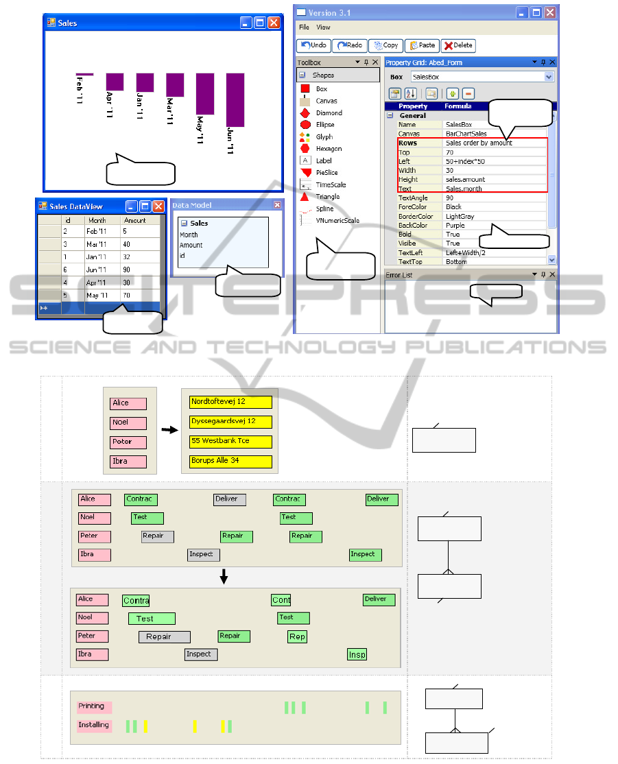
mapping. The environment consists of six panels
(Figure 1) : toolbox, property grid, visualization
form, data model, error list, and table view. The tool-
box is a list of the available visual objects. The prop-
erty grid shows the properties that control the appear-
ance of the visual objects. The visualization form is
the visualization the designer builds. The data model
is the structure of the raw data (that data the designer
wants to visualize.) The error list shows the problems
with the visualization specifications. The table view
is a feature that allows designers to view a sample of
the raw data on demand. To view a table sample, the
designer clicks a table box in the data model. This
feature helps designers getting familiar with the data
they want to visualize.
Figure 1 shows a snapshot of creating a bar chart
with Uvis environment. The formulas in the property
grid bind the bars to data and specify the height. More
details about Uvis formulas and the environment can
be found at (Kuhail and Lauesen, 2012; Kuhail et al.,
2012; Pantazos et al., 2013).
To sum up, Improvise, Protoviewer, and Uvis as-
sist designers in two ways: First, they provide design-
ers with data they need to create an expression (e.g.
available data fields, available properties.) Second,
they provide a visual feedback. However, none of the
tools explicitly shows the relationship between data,
visual objects, and its properties.
3 USABILITY STUDIES
Prior to designing the inspector, we usability tested
the development environment of Uvis to identify us-
ability problems relevant to visual mappings. The
results revealed a few problems not addressed by
present tool environments.
This section briefly presents the usability study
settings, and provides a summary of the qualitative
and quantitative results of the studies.
IVAPP2013-InternationalConferenceonInformationVisualizationTheoryandApplications
526
Toolbox
(visual objects)
Property grid
Error list
Data model
Table view
Expressions
(formulas)
Visualization
Figure 1: Uvis environment.
Employee
ID, name, address
Task 1
Task 2
Employee
ID, name, address
Activity
start, duration, status, name
Project
Activity
Code, name
start, duration, name
status
Task 3
Figure 2: Usability test tasks.
3.1 Participants’ Background
We recruited five participants. All of them, except
for one, were non-programmers. The skills of the
non-programmers varied from bare knowledge of IT
(e.g. knowledge of MS Word ) to some knowledge of
spreadsheet formulas. The participants did not have
prior knowledge of the Uvis approach and had never
TheInspector-ACognitiveArtefactforVisualMapping
527

used the environment.
Although testing with five participants does not
give statistical significance, it reveals the usability
problems that most users will encounter (Lauesen,
2005). This ”formative evaluation” is claimed to im-
prove the tool (Nielsen, 1993).
3.2 Procedure and Tasks
We trained the participants using a textual tutorial,
and asked them to carry three tasks out while think-
ing aloud. The data sets in the real tests were dif-
ferent from the ones shown to them. They were told
the visualizations shown to them in the task are just
examples.
One of the authors noted the observed usability
problems. The documentation of the usability studies
can be found at (Studies, 2012).
The tasks evaluate basic visual mapping tech-
niques such as showing data by shape, text, size, etc.
Figure 2 shows the task as well as the data tables
behind them.
• Task 1. The pink vertical list shows employee
names. Make the list show their addresses instead
and make the list yellow.
• Task 2. The visualization shows the employee
activities in a certain period of time (See data
model). Make the activities width represent the
activity duration, also show the planned activities
in green, and the cancelled ones in grey.
Task 3. Create a visualization that shows the
projects and their activities. The activities are po-
sitioned according to a time scale, and the projects
they belong to. Change the task colour based on
its status. If the status is done, make the task
green. Otherwise, make it yellow.
In order to check the participant’s understanding
of visual mappings, we asked them the following
questions after they finished working on the tasks:
• Question 1 - asked after task 1: What data are
the employee labels showing? Where do the data
come from?
Concept Checked. The question checks whether
the participants understand the relationship be-
tween a visual object and the data row it is rep-
resenting.
• Question 2 - asked after task 2: Can you explain
how the width of the activity represent the activity
duration?
Concept Checked. The question checks whether
the participants understand how a visual property
is calculated.
Table 1: Usability test tasks. T=Time measured in minutes,
Q= Quality of the solution on a 0-10 scale.
Quality
(0-10)
Time
(m)
T: 15
Q: 10
T: 8
Q: 5
5
T: 9
Q: 5
T: 9
Q: 5
4
µ : 9.6
σ : 0.5
µ : 1
σ : 2.2
µ : 10
σ : 4.1
Summary
µ : 10.4
σ : 4.4
µ : 12
σ : 3.1
µ : 7.3
σ : 3
Participants
T: 8
Q: 5
Task 3
321
T: 8.5
Q: 9
T: 2
Q: 10
T: 13
Q: 10
T: 7
Q: 10
T: 15
Q: 8.5
T: 10
Q: 10
Task 2
Task 1
• Question 3 - asked after task 1,2, and 3: Can you
confirm that your solution is correct?
Concept Checked. The question checks whether
the participants can verify their visual mappings
(the expressions they defined to make visual prop-
erties show data).
3.2.1 Quantitative Results
Table 1 shows the completion time (T) as well as
the solution quality (Q) for the tasks. The quality of
the solution was measured by taking the average of
the following two measurements: The specifications
of the solution compared against the optimal speci-
fications, and the solution visual outcome compared
against the required visual outcome.
Only one participant made it to task 3. The rest
just carried out two tasks. The majority of the par-
ticipants, particularly the non-programmers, did not
perform well in the tasks.
3.2.2 Qualitative Results
We summarize the qualitative results based on the
participants’ thinking aloud and the answers to un-
derstanding questions as well as the observations we
made while they carried out the tasks.
• Problem 1: Understanding the Connection be-
tween Visual Objects and Data. Although it was
explained in the tutorial, many participants could
not precisely understand the relationship between
visual objects and data. For instance, one partici-
pant said in answering question 1, ”the visual ob-
jects come from the table somehow. I do not know
exactly how”.
• Problem 2: Specifying Visual Objects One by
One. Most participants thought they needed to
type the field value for each visual object rather
than specifying a reference (connection) from the
visual objects to the data fields.
• Problem 3: Understanding How Visual Prop-
erties are Calculated. Most participants could
IVAPP2013-InternationalConferenceonInformationVisualizationTheoryandApplications
528
Selected
visual object
Inspector
Highlighted data
row behind the
visual object
Property
Grid
Figure 3: The inspector showing the relationship between a visual object and a data row.
not exactly describe how a visual property could
show the data.
• Problem 4: Inability to Check the Visualiza-
tion Correctness. The participants were not con-
fident about what they were doing. Surprisingly
one participant came up with the right expression
for task 2 but changed her mind because she did
not see a visual difference. Hence, she undid her
solution and ended up writing up the wrong solu-
tion.
We believe an important cause of this problem is
that the participants had to imagine the relationship
between the visual objects and the data. Things were
not made explicit for them. They had to work out the
connection themselves.
4 SOLUTION - THE INSPECTOR
The main purpose of the inspector is to reduce the
problems we identified in the usability studies. Prior
to designing the inspector, we thought we could solve
the problems with better explanation. We usability
tested again with a better tutorial. This improved the
designer performance slightly but the problems re-
mained. Hence, we decided an additional cognitive
artefact was needed to support the designers. We it-
eratively designed the artefact. Some ideas were pro-
posed and abandoned because they did not improve
the designer’s performance. For instance, we added a
third column in the property grid that allows the de-
signer to see the data behind a single visual object.
Gradually with the help of designers, the princi-
ples of the inspector shaped up. The principles are
explained using examples in the following sections.
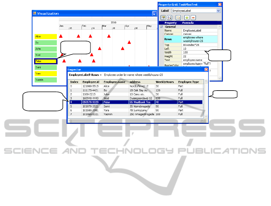
4.1 Connection between Visual Objects
and Data
Figure 3 shows a visualization in Uvis environment.
For space reasons, we only show three parts of the
environment: the visualization, the property grid, and
the inspector. The visualization shows tasks of em-
ployees in the period of time from 1st January 2010
to 30th May 2010. The visualization consists of a
time scale on the top, a set of employee labels on the
left, and the employee tasks as triangles mapped to
the time scale.
The designer selected (clicked) a label showing
employee Peter (Figure 3). The inspector highlighted
the data row behind the label.
According to the expression connecting the labels
to data (Rows property), only employees who work
more than 25 hours per week should be shown. To
confirm that the expression is correct, the designer can
sort (click) the WeeklyHours field in the inspector to
check if there are values less than 25.
Principle. The inspector allows the designers to view
the relationship between a visual object and the un-
derlying data. Selection can be done both ways. De-
signers can select rows in the inspector and the cor-
responding visual objects are highlighted and vice
versa. When the underlying data changes (due to a
change in the expression connecting the visual objects
to data), the data in the inspector is updated immedi-
ately.
TheInspector-ACognitiveArtefactforVisualMapping
529
Selected
visual object
Selected visual
property
Figure 4: The inspector showing the relationship between a
visual property expression and data.
To help designers find abnormal data in a large
data set, the designers can sort on any column in an
ascending or descending manner.
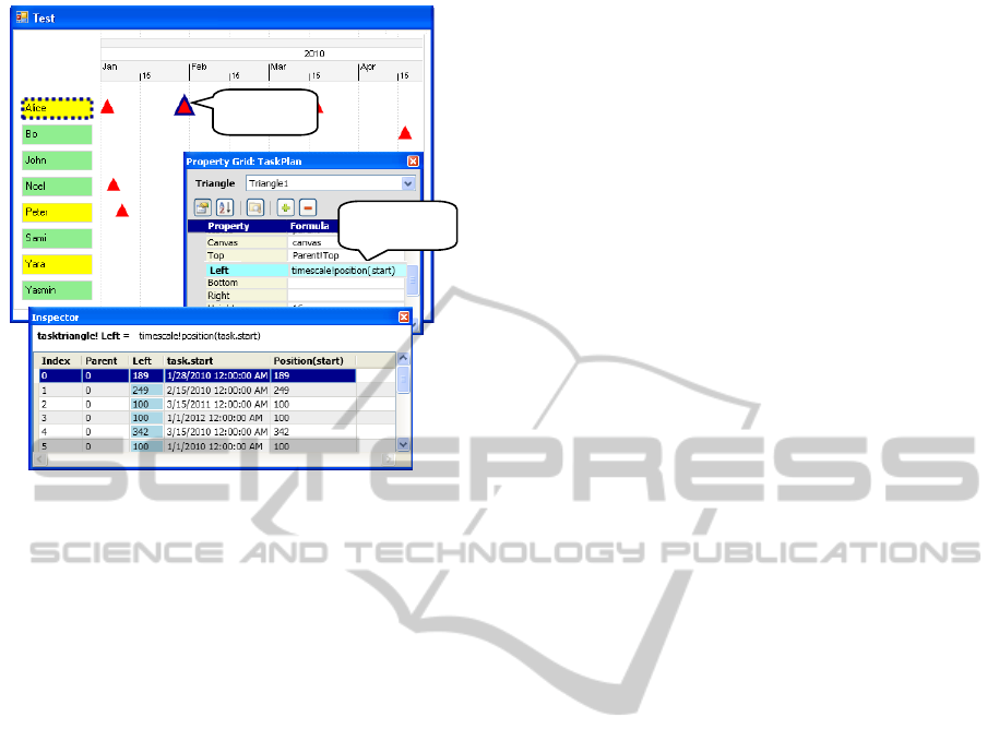
4.2 Connection between Visual
Properties and Data
Figure 4 shows that the designer has selected (clicked)
a triangle ( TaskTriangle) representing Alice’s task
on 28th January 2010 and the Left property that posi-
tions the triangle according to the time scale.
The Left property of the TaskTriangle
visual object is defined by an expression
(timeScale!Position(Task.Start)).
The inspector breaks the expression down
into two sub-expressions: Task.Start and
timescale!Position(Task.Start), and shows
the values of the sub-expressions as well as the index
of each TaskTriangle object in the bundle. 0.15cm
Principle. The inspector allows the designer to view
the details of the visual property mappings and the
data behind them. This has a potential of improving
the designer’s understanding of how visual mappings
are calculated based on data.
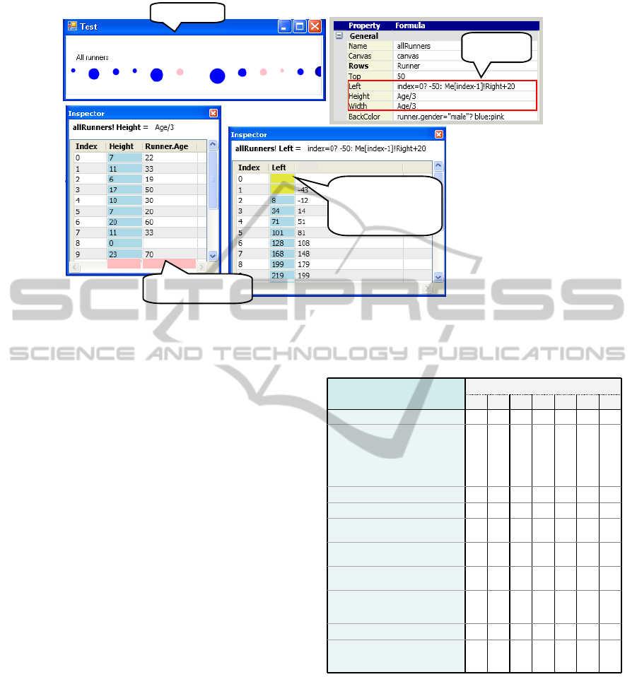
4.3 Problematic Data Values
Figure 5 shows ellipses representing charity marathon
runners. The size of the ellipses represent the run-
ners age. The Left formula results in negative values
for the first two instances. As a result, the instances
could be fully or partly out of view. Hence, the in-
spector shows the values in yellow as a warning. If
the designer did not intend for this to happen, a visual
feedback would not help. Only concrete values can
reveal such a problem.
The Height and Width formulas are identical, and
they refer to field Age. For runner Laura, the value is
null. The default values for Height and Width in this
case are 0, but the inspector shows the null value in
red so that the designer is aware. 0.15cm
Principle. In the world of programming, values such
as null and division by zero can be problematic. This
applies to the visualization world, and the inspector
highlights these values in light red (erroneous values).
We we also consider values that could cause visual
objects to be out of view or invisible such as negative
values for position and size properties. These values
are highlighted in yellow (warning). The highlighting
colours can be changed by the designer.
5 EVALUATION
We provide two evaluations for the inspector, a theo-
retical one based on relevant dimensions of cognitive
dimensions of notations (CDs) (Green, 1989) , and an
experimental one based on a preliminary evaluation
study with seven designers.
5.1 Theoretical Evaluation
We selected the dimensions of hidden dependencies,
progressive feedback, and visibility to evaluate the in-
spector. The selected dimensions are considered im-
portant for exploratory tasks (Green and Blackwell,
1998). The task of implementing custom visualiza-
tions is exploratory because the designer is not of-
ten sure about the desired end. It is a combination
of modifying and adding to an existing visualization.
According to Green, it is desirable to have few
hidden dependencies, high progressive evaluation and
visibility for exploratory tasks (Green and Blackwell,
1998).
• Hidden Dependencies. The hidden dependen-
cies dimension assesses whether dependencies be-
tween entities are hidden or visible.
The inspector explicitly shows which particular
visual property depends on which field, and which
visual object depends on which data row. As a
result, the inspector reduces hidden dependencies
between the visual objects, their properties and
the mapped data.
• Progressive Evaluation. The progressive evalua-
tion dimension assesses how easy it is to evaluate
IVAPP2013-InternationalConferenceonInformationVisualizationTheoryandApplications
530
Expressions
(formulas)
Visualization
null0
-50
-32
Me[index-1]!Right
Negative Left values
might result in partly
invisible visual
object (warning)
The data field value
is null (error)
Figure 5: The inspector showing irregular values in red and yellow.
and obtain feedback on an incomplete task.
Although custom visualization tools provide vi-
sual feedback (WYSIWYG), it can be insufficient
in some cases. For instance, cases where some vi-
sual objects are out of view. Hence, the inspector
can bridge that gap with concrete values behind
the visual objects and properties.
• Visibility. The visibility dimension assesses the
ability to view a component easily. The inspector
improves the visibility since it makes more infor-
mation visible to the designer. For instance, the
data and values behind visual objects and proper-
ties can be needed when the designer is verifying
the visualization.
5.2 Experimental Evaluation
We carried out a preliminary evaluation study with
seven designers to evaluate the effect of the inspec-
tor on the ease of learning of visualization creation.
5.2.1 Participant Background
All the participants were non-programmers. They had
no prior knowledge of the Uvis formulas, and had
never used Uvis environment. Table 2 shows the par-
ticipant skills.
5.2.2 Procedure
Each evaluation study lasted 2 hours on average. The
studies were carried out at a lab. The participants
Table 2: The participant skills.
Familiar with advanced
spreadsheet formulas (e.g. SUM,
MAX, AND )
Familiar with basic math
sequences
Familiar with basic algebraic
equations
Loan manager
29
7
student
student
businessman
student
student
volunteer
Position
271860222228
Age
Familiar with basic spreadsheet
formulas (e.g. +, * )
Knows how to interpret simple
visualizations (e.g. line chart, pie
chart)
6
5
4
Participants
Profile
Familiar with logical expressions
321
Familiar with ER models
Know what a database table is
were divided into two groups: participants 1, 2, 3 and
4 belong to group A while participants 5, 6, and 7 be-
long to group B. Participants in group A used Uvis
with the inspector while participants in group B used
a Uvis version that did not have the inspector. Each
participant viewed two screens. One screen showed a
power-point based step-by-step tutorial available , and
the other showed the Uvis environment. The tutorials
for both groups were identical except that the group A
tutorial explained about the inspector. Each designer
was asked to view the tutorial, do what it says. The
tutorial is divided into sections, at the end of which,
TheInspector-ACognitiveArtefactforVisualMapping
531
Task 1
Task 2
Sales
ID, name,
address
Runner
Name, age,
gender, citizen
Task 3
Passenger
Type, males,
females.
Task 4
City
HighReading
LowReading
country, name
Date,
temperature
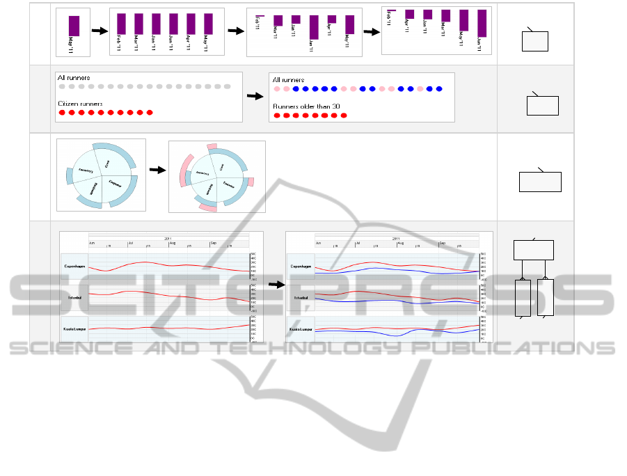
Figure 6: The evaluation tasks.
designers were given a task to work on their own, but
they could go back to the tutorial and/or example so-
lutions.
To evaluate the impact of the inspector on usabil-
ity, we observed the usability problems in both groups
and tested the understandability with questions. Fur-
ther, we measured completion time (T) and the qual-
ity of the solution (Q). The quality of the solution was
measured in the same way it was measured in the us-
ability studies.
The documentation can be found at (Evaluation,
2012).
5.2.3 Tasks
The tasks were designed to meet three criteria: First,
the visual tasks should cover different custom visu-
alizations. Second, all the tasks should vary in com-
plexity. Third, together with the evaluation study, the
tasks should not take more than two hours.
• Task 1. The bars (on top of each other) show
a company’s monthly sales. Position bar charts
representing monthly sales like a horizontal list,
make the bar heights represent the monthly sales,
and order them based on the sales.
• Task 2. The ellipses on the top show all runners in
a marathon. The ones on the bottom show runners
that are citizens. For the ellipses on top, make
the male runners blue, and the female ones pink.
For the ellipses on the bottom, show only runners
older than 30.
• Task 3. A pie chart shows several classes of pas-
sengers (e.g. crew, emperor, etc.). The male pas-
sengers are shown on the top as light blue pie
slices. Show female passengers on the top as pink
pie slices.
• Task 4. The red curves represent the high read-
ings of the weather in three cities in a period of
time. Show the low readings as blue lines.
5.2.4 Questions
The questions were designed to collect qualitative in-
formation about the usefulness of the inspector.
• Questions that were Asked to Both Groups:
– Question 1 - asked after all tasks: Are you con-
fident that your solution produce the expected
outcomes described in the tasks?
– Question 2 - asked after tasks 1 and 2: Can
you explain where the data in the visualization
come from?
– Question 4 - asked after task 3: Can you ex-
plain how the curve position has been calcu-
lated?
• Questions that were Asked to Group A:
– Question 5 - asked in the end of the study: Did
you find the inspector helpful? Why?
IVAPP2013-InternationalConferenceonInformationVisualizationTheoryandApplications
532
T: 11
Q: 5
T: 23
Q: 4
T: 8.1
Q: 5
T: 14
Q: 7
4
µ : 6.7
σ : 4
µ : 4
σ : 1.7
µ : 6
σ : 1.7
µ : 6
σ : 1.7
GB
µ : 12.7
σ : 0.5
µ : 13.3
σ : 1.2
µ : 13.3
σ : 1.2
µ : 24.3
σ : 1.2
GB
Quality (0-10)Time (m)
T: 13
Q: 9
T: 14
Q: 5
T: 14
Q: 5
T: 25
Q: 7
7
T: 12
Q: 2
T: 12
Q: 2
T: 12
Q: 8
T: 23
Q: 4
6
GB Participants
(without the inspector)
T: 13
Q: 9
T: 14
Q: 5
T: 14
Q: 5
T: 25
Q: 7
5
µ : 8.3
σ : 2.2
µ : 7.4
σ : 2.7
T: 6.4
Q: 10
T: 7.6
Q: 9
T: 4.6
Q: 9
Task 4
GA
µ : 8.3
σ : 2.9
µ : 8
σ : 2.2
µ : 9
σ : 1.5
Summary
µ : 13.5
σ : 7.2
µ : 6.2
σ : 2.2
µ : 9.8
σ : 3.9
GA
GA Participants
(with the inspector)
T: 9.3
Q: 10
T: 15.3
Q: 9
T: 6.6
Q: 10
Task 3
321
T: 4.7
Q: 9
T: 7.6
Q: 10
T: 4
Q: 10
T: 5.5
Q: 10
T: 8.3
Q: 8
T: 12.4
Q: 10
Task 2
Task 1
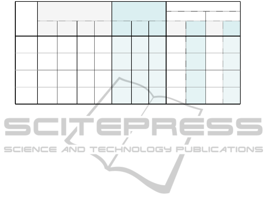
Figure 7: Evaluation Quantitative results. T=Time, Q=Solution quality, GA=Group A, and GB=Group B.
– Question 6 - asked in the end of the study: How
often did you use the inspector on average per
task?
5.2.5 Results
Quantitative Results. Figure 7 provides an overview
of the quantitative results of the evaluation. In all
tasks, participants in group A (participants that used
the inspector) had better solution quality than partic-
ipants in group B (participants that did not use the
inspector). Except for task 3, participants in group A
completed their tasks in shorter time than participants
in group B. In task 3, most group B participants gave
up before they could come up with a complete solu-
tion.
Qualitative Results. The qualitative results can be
summarized as follows:
• Participants in group A found the inspector help-
ful as it gave them feedback and confirmation of
their solution. Our observations show that the par-
ticipants looked at the inspector whenever the vi-
sual mappings changed.
• When asked after the end of each task about
whether they are confident about their solution,
two participants in group A looked at the inspector
first to check the visual mappings and answered
”yes”. The participants in group B were hesitant
to say yes. Instead the answers were ”I guess so”
and ”Maybe so”.
• Group B participants found it hard to explain the
relationship between data, visual objects, and vi-
sual properties. On the contrary, group A partici-
pants could easily use the inspector to explain the
relationship. For instance, they pointed at a se-
lected visual object (e.g. ellipse) and the underly-
ing row in the inspector.
6 CONCLUSIONS AND FUTURE
WORK
In this paper, we showed that there is a gap in custom
visualization tools, the connection between visual ob-
jects, properties, and data is not explicit. We argued
that the inspector bridges that gap by explicitly show-
ing data behind the visual objects and the properties.
Our theoretical evaluation shows that the inspector
reduces hidden dependencies and improves progres-
sive evaluation and visibility. Our preliminary evalu-
ation with designers shows that the inspector helps de-
signers verify the visual mappings and improves time
completion and solution quality.
We plan on evaluating the inspector with more
participants. Furthermore, we plan on testing the im-
pact of the inspector on more cases. For instance, vi-
sual objects showing hierarchical data (e.g. graphs),
visualizations with data that has problematic values
(e.g. null values).
We also plan on evaluating the scalability of the
inspector using visualizations of large data sets. If the
current version of the inspector does not scale, what
additions are needed to accommodate a large number
of data? Could showing data in several pages suffice?
Do we need to integrate a search mechanism? This
needs to be investigated in depth and evaluated with
designers.
TheInspector-ACognitiveArtefactforVisualMapping
533

ACKNOWLEDGEMENTS
The authors would like to thank Lars Grammel, Prof.
Margaret-Anne Storey, Prof. Daniel German, and the
CHISEL lab team members for their contributions to
the inspector idea.
REFERENCES
(2009). Flare - data visualization for the web. URL:
http://flare.prefuse.org/. Accessed September, 2012.
Akasaka, R. (2011). Protoviewer: a web-based visual de-
sign environment for protovis. In ACM SIGGRAPH
2011 Posters, SIGGRAPH ’11, pages 85:1–85:1, New
York, NY, USA. ACM.
Bostock, M., Ogievetsky, V., and Heer, J. (2011). D
3
data-
driven documents. IEEE Trans. Vis. Comput. Graph.,
17(12):2301–2309.
Evaluation (2012). URL:
http://itu.dk/people/moak/Inspector/EStudies.PDF.
Accessed September, 2012.
Fekete, J.-D. (2004). The infovis toolkit. In INFOVIS, pages
167–174.
Grammel, L., Tory, M., and Storey, M.-A. D. (2011).
Erratum to ”how information visualization novices
construct visualizations”. IEEE Trans. Vis. Comput.
Graph., 17(2):260.
Green, T. and Blackwell, A. (1998). Cognitive dimensions
of information artefacts: a tutorial. T.R.G. Green and
A.F. Blackwell, 1(2).
Green, T. R. G. (1989). Cognitive dimensions of notations.
In Proceedings of the fifth conference of the British
Computer Society, Human-Computer Interaction Spe-
cialist Group on People and computers V, pages 443–
460, New York, NY, USA. Cambridge University
Press.
Heer, J., Card, S. K., and Landay, J. A. (2005). prefuse:
a toolkit for interactive information visualization. In
CHI, pages 421–430.
Heer, J., van Ham, F., Carpendale, S., Weaver, C., and
Isenberg, P. (2008). Creation and collaboration: En-
gaging new audiences for information visualization.
In Kerren, A., Stasko, J., Fekete, J.-D., and North,
C., editors, Information Visualization, volume 4950
of Lecture Notes in Computer Science, pages 92–133.
Springer Berlin / Heidelberg.
Kuhail, M. A. and Lauesen, S. (2012). Customizable vi-
sualizations with formula-linked building blocks. In
GRAPP/IVAPP, pages 768–771.
Kuhail, M. A., Pandazo, K., and Lauesen, S. (2012). Cus-
tomizable time-oriented visualizations. In ISVC (2),
pages 668–677.
Lauesen, S. (2005). User Interface Design: A Software En-
gineering Perspective. Addison-Wesley.
Lauesen, S. (2009). Uvis for unified data visual-
ization. URL: http://www.itu.dk/people/slauesen/S-
EHR/UnifiedDataVisualization.pdf. Accessed Au-
gust, 2012.
Nielsen, J. (1993). Usability Engineering. Academic Press,
Inc.
Pantazos, K., Kuhail, M. A., Lauesen, S., and Xu, S. (2013).
uVis Studio: An Integrated Development Environ-
ment for Visualization. In Proc. SPIE, Visualization
and Data Analysis 2013, number 8654-21.
Sears, A. and Jacko, J. A. (2007). The Human-Computer
Interaction Handbook: Fundamentals, Evolving Tech-
nologies and Emerging Applications. CRC Press.
Spotfire (2012). URL: http://spotfire.tibco.com/. Accessed
July, 2012.
Spreadsheets, G. (2012). URL:
http://www.google.com/google-d-s/spreadsheets/.
Accessed September, 2012.
Studies (2012). URL:
http://itu.dk/people/moak/Inspector/UStudies.PDF.
Accessed September, 2012.
Tableau (2012). URL: http://www.tableausoftware.com/.
Accessed July, 2012.
IVAPP2013-InternationalConferenceonInformationVisualizationTheoryandApplications
534
