
The User Interface of a Medical First Aid Application
A Close-to-Realistic Usability Study with the Smartphone Application “Defi Now!”
Karin Harbusch and Janine Paschke
Department of Computer Science, University of Koblenz-Landau, Koblenz, Germany
Keywords: First aid, Cardiopulmonary Resuscitation, CPR, Automatic External Defibrillator, AED, Bystander Effect,
Smartphone App, Usability Study, Induced Emotion, Software-ergonomics, Human-computer Interaction.
Abstract: Several smartphone applications are available to support the delivery of medical first aid, in particular car-
diopulmonary resuscitation (CPR), by untrained people. These apps support passers-by witnessing an emer-
gency situation, or enable brushing up basic knowledge of first aid. Moreover, they inform about publicly
available automatic external defibrillators (AEDs) and allow users to add the location of new devices. In
this paper, we describe features of various first aid apps currently on the market. In order to find out whether
or not these apps can really be helpful in emergency situations, we conducted a usability study with 74 par-
ticipants who used the “Defi Now!” app. In order to simulate “realistic” conditions where the user is agitat-
ed—as is the case when rescuing a person suffering from cardiac arrest—we induced fear by a psychologi-
cally recommended method. Based on data from a questionnaire and video recordings, we discuss strong
and weak points of “Defi Now!”. The app was judged to be very helpful for medically untrained people.
Nonetheless, our observations suggest several improvements to the user interface.
1 INTRODUCTION
According to the Federal German Health Infor-
mation System (http://www.gbe-bund.de), sudden
cardiac arrest due to ischemic heart disease is the
most common cause of death in most Western coun-
tries, and a major cause of hospital admissions. In
the U.S., the number of deaths due to Sudden Cardi-
ac Death exceeds 250,000 annually.
In case of cardiac arrest, immediate help is es-
sential and defibrillation is mostly inevitable; to this
purpose, automatic external defibrillators (AEDs)
are currently provided at many public places. Aver-
age survival rates of 30% for defibrillation by first
responders within 3 to 5 minutes are reported by
http://www.heart.org/HEARTORG/. The chance of
survival decreases by 10% per minute when no help
is provided (e.g., Cummins et al., 1985). Hence,
everybody who owns a feature phone or smartphone
is obliged to call for help on site. Moreover, passers-
by should administer first aid, especially cardiopul-
monary resuscitation (CPR)—a procedure helping to
restore blood circulation and to preserve intact brain
function—, when a person is suffering from cardiac
arrest or shows no vital signs. CPR (either per-
formed as compression-only without mouth-to-
mouth or with mouth-to-mouth respiration) is a
manual treatment, indicated until further treatment,
such as defibrillation, is available.
But in such a precarious situation, the bystander-
effect (Darley and Latané, 1968) is more likely to be
observed than immediate help, i.e. the phenomenon
that, in case of an emergency, individuals are less
willing to offer help the more bystanders are present.
This diffusion of responsibility results in waiting for
someone else to take command. Furthermore, by-
standers tend to belittle the existing emergency since
no one has intervened so far. Thus, they judge that
no emergency is at hand and help is not necessary.
The most common cause for the denial of assistance,
however, might be the fear to fail or to be ridiculed.
This fear discourages many people to help, especial-
ly when they are unable to judge the gravity of the
situation (e.g., Jörg, 2012). To what extent can a
smartphone application (app) help passers-by not to
become bystanders but rescuers?
In the next section, we summarize desirable fea-
tures of existing first aid smartphone applications.
In order to find out whether or not these apps can
really be helpful in an emergency case, we investi-
gated the usability of the “Defi Now!” app with 74
participants. In order to simulate the stress that is
91
Harbusch K. and Paschke J..
The User Interface of a Medical First Aid Application - A Close-to-Realistic Usability Study with the Smartphone Application “Defi Now!”.
DOI: 10.5220/0004441100910098
In Proceedings of the 15th International Conference on Enterprise Information Systems (ICEIS-2013), pages 91-98
ISBN: 978-989-8565-61-7
Copyright
c
2013 SCITEPRESS (Science and Technology Publications, Lda.)
typically experienced by untrained individuals who
are helping a person suffering from cardiac arrest,
we applied induced agitation. In Section 3, we pre-
sent the results of our study. Basically, the app was
judged to be very helpful. However, our observa-
tions during the experimental sessions suggest sev-
eral software-ergonomic improvements in support of
the rescuers (cf. Section 4). In Section 5, we draw
conclusions and address future work.
2 FIRST AID APPS
A search for “first aid” applications in the markets
Google play and ITunes of the two main operating
systems for smartphones yields more than 1,000
applications. However, this number includes enter-
tainment applications such as a gamers’ guide for
“World of Warcraft”. Here, we list six apps that
focus on first aid in case of cardiac arrest and are
available in Austria, France, Germany, Switzerland,
or the United States:
Defi Graz (www.madison.at (Austria); interface
only in German);
Arrêt Cardiaque 2.0 (www.associationrmcbfm. fr
(France); multilingual interface);
AED Locator (www.aedlocator.org (Germany); in
German);
Defi Now! (definow.org (Germany); multilingual
interface);
Herzsicher (www.herzsicher.ch (Switzerland); in
German);
PulsePoint (pulsepoint.org (United States); in
English).
First, we outline the main features of “Defi
Now!” (Lange, 2011), the system we evaluated in
our study (Section 3). Then, we complement the list
of desired features with best practices from the other
apps, and recommend improvements that can yield
an optimal interface for a cardiac arrest first aid app
(Section 4).
The interface language of “Defi Now!” is auto-
matically adjusted to the user’s phone settings. For
example, if the user has chosen English as preferred
language, the app appears in English as well. When
opened, the app displays three options:
1. Emergency call;
2. First aid measures;
3. Find an AED.
Pressing the button “Emergency Call” automati-
cally activates the national emergency phone num-
ber adapted to the user’s whereabouts. However, the
button does not immediately dial the emergency
number because the rescuer has to confirm first by
pressing “Yes” in response to the question whether
they actually want to place the emergency call—in
order to avoid hoax calls.
While placing the call, the current address is dis-
played to the user so that foreigners (and nervous
rescuers) can easily provide the location’s precise
address (in Germany, GPS data are not automatical-
ly sent).
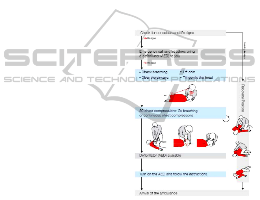
By pressing the button “First Aid Measures”,
first aid procedures are displayed in the form of
diagrams (Figure 1), separately for patients showing
vital signs (right branch from topmost node) and
patients showing no vital signs (left branch).
Figure 1: “Defi Now!” guideline for administering first
aid.
If the patient shows no vital signs, the rescuer re-
ceives information on how to perform cardiopulmo-
nary resuscitation (CPR). A metronome provides
audio support for a resuscitation beat of 100 times
per minute, with an option to administer mouth-to-
mouth/nose respiration. The user selects the desired
action by scrolling to the bottom of the page, where
two options are presented (see Figure 2): pressing a
text button, which activates the standard rhythm of
100 beats per minute, or pressing a settings wheel.
The latter option enables the user to choose the arti-
ICEIS2013-15thInternationalConferenceonEnterpriseInformationSystems
92
ficial respiration option, which activates a spoken
command telling the rescuer when to breath (two
times breathing after every sequence of 30 beats).
Figure 2: Select the metronome beat and the setting for
artificial respiration.
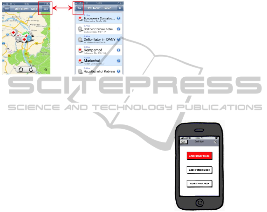
Activating the third item of the opening screen by
pressing the button “Find an AED” enables the
search for AED locations on an interactive map.
Four types of icons may appear (cf. the pins in the
center of the left panel of Figure 6):
1. A red cross on white background indicates a
place where medical staff is available;
2. Green lightning icons denote verified AEDs;
3. Grey lightning icons stand for still unconfirmed
AEDs;
4. Blue lightning icons refer to AED locations re-
trieved by the database “AED-Kataster”.
In order to update this database, the user can add
a new AED device (not discussed here due to
space limitations).
Now, we sum up desirable features present in the
abovementioned apps but not in “Defi Now!”. Sev-
eral other systems (e.g. “Herzsicher” and “Pulse-
Point”) provide a tab(ulator)-based interface (see
Figure 3), where all available functions are perma-
nently visible/selectable. This dialogue style avoids
error-prone search for, and navigation to, the desired
menu item. Therefore, in our study, we evaluate how
easy it is for “Defi Now!” users to deal with non-
tabulator-based navigation.
“Defi Graz” and “Arrêt Cardiaque 2.0” support
first aid in a more graphical manner (see Figure 4)
that might be easier to follow than a more textual
instruction such as in “Defi Now!”. Therefore, in our
study, we asked the participants how comprehensi-
ble they found the instructions given in the dia-
grams.
All non-German systems allow for easier emer-
gency call functions due to automatic location of the
smartphone.
‘Map’ ‘AEDs’ ‘Help’ ‘Add’ ‘More’
Figure 3: Top-Level Choice Menu in “Herzsicher” Exem-
plifying a Tabulator-based Interface.
Figure 4: Upper panel: Graphically supported first aid
instructions in “Defi Graz”; Lower panel: CPR details in
“Arrêt Cardiaque 2.0”.
“Arrêt Cardiaque 2.0” provides social-network
integration. The app may be connected with the
user’s Facebook and/or Twitter account to share the
AED they registered with their network. The inte-
gration of social media might serve as a fast way of
distributing information about AEDs to a great num-
ber of users. Hence it might promote public aware-
ness of this important information. The more people
are aware of such critical issues, the greater the
likelihood they also want to learn how to act in an
emergency instead of functioning only as bystand-
ers.
In “Arrêt Cardiaque 2.0” and “PulsePoint”, users
can register as first responders. If a cardiac arrest
occurs in the vicinity of a first responder, this person
is sent a notification in case of a cardiac arrest near-
TheUserInterfaceofaMedicalFirstAidApplication-AClose-to-RealisticUsabilityStudywiththeSmartphone
ApplicationDefiNow
93

by. For example if a cardiac arrest occurs in a shop-
ping center, it might be possible that a subscriber of
such an emergency notification may be in the same
building or in the neighborhood. In “PulsePoint”, the
thus alarmed rescuer receives a route description to
the location of the patient.
“PulsePoint” provides additional functionality
for emergency situations other than cardiac arrest.
Via a tab labeled “Incidents”, the user can ask for an
overview of all fire department emergencies occur-
ring at the current moment. A “Photos” tab provides
a photo gallery of major incidents from firedepart-
ment.org. Users may scroll through the gallery and
select photos they want to view. A “Radio” button
enables a streaming radio feed from the dispatch
center of the fire department.
3 THE USABILITY STUDY
WITH DEFI NOW!
Some of the features we outlined above (e.g.,
graphics) are obviously very suitable to make a first
aid app supportive for a rescuer. However, more
detailed insights into unexpected problems require a
usability study (see, e.g., Nielsen, 1994).
3.1 Method
The participants were tested in individual sessions.
They were seated at a desk, with an iPhone 3GS
(iOS 6.0.1) with the preinstalled “Defi Now!” app in
front of them, and carried out the tasks listed in our
questionnaire (see Section 3.2). Their actions were
recorded via a camcorder (Plawa DV-4 SD-
Camcorder; image resolution 4.0 MP), which was
focused on the iPhone’s display, thus ensuring ano-
nymity of the participants. The videos were used to
reconstruct the handling of the application, and to
survey the errors made during task execution.
We tested 74 participants, 35 female and 39 are
male; for their age distribution, see Figure 5. Nine of
them had been, or still were, students of computer
science at our campus, where we had run a pilot
study in an observation lab. Another eight partici-
pants were doctors or qualified medical employees.
The other 57 participants had different occupations,
such as fitness trainer, banker or steel mill worker.
Four participants had experienced a heart attack
themselves before; one of them even had suffered
from a sudden cardiac arrest and had to be resusci-
tated. All but the students were recruited as patients
in the waiting room of a doctor’s office or as cus-
tomers of a fitness center where we had reserved a
separate room to perform the experiment.
Figure 5: Age and gender distribution of the participants.
When witnessing an emergency situation such as
cardiac arrest, bystanders and rescuers usually show
signs of emotional stress, for example trembling
hands. In order to simulate this stress, we applied a
psychological technique to induce agitation (see,
e.g., Otto, 2000). Watching a short sequence of a
movie can elicit high levels of agitation in test par-
ticipants due to the high attention and the intensive
experience tied to watching a film clip (e.g., Gross
and Levenson, 1995); (Hewig et al., 2005); (Schlei-
cher, 2009). For our experiment, we selected a film
clip from the movie “The Shining” (1980), showing
a playing child who heads towards a closed hotel
room door. The viewer gets the feeling that some-
thing terrifying is lurking behind the closed door
(see also Hewig et al., 2005 on this fragment).
In order to study the effect of agitation, a random
selection of 54 of our participants watched the film
clip before using the app. The remaining 20 partici-
pants functioned as a control group and did not view
the film clip. Age, gender, ethnic background, etc.,
distributions in the two groups were comparable.
3.2 Questionnaire
The initial section of our questionnaire consisted of
questions concerning factors known to influence
precision of task execution (cf. Schleicher, 2009).
The participants had to state their personal condition
with respect of discomforts (e.g., high blood pres-
sure and/or use of medication). Moreover, they la-
beled their emotional state (Happiness, Grief, Fear,
Disgust, or No Emotion). They could also add a label
for the emotion they experienced if none of the pre-
defined ones matched. Additionally, they stated their
personal condition as good, relaxed, nervous, anx-
ious, tired, or ill-tempered.
The next part of the questionnaire consisted of
nine tasks, covering all features of the application
ICEIS2013-15thInternationalConferenceonEnterpriseInformationSystems
94

“Defi Now!” to be carried out during the test. After
each task, the participants had to judge the presenta-
tion of a given task by means of a five-point rating-
scale, ranging from 1=”not understandable at all”
to 5=”completely understandable” (cf. Rohrmann,
1978). Moreover, they could spontaneously mention
what they (dis-)liked about the task. For each of the
individual tasks we measured the time it took to
perform them.
The last part of the questionnaire consisted of
various general questions to the participant: Whether
they owned a smartphone themselves; whether they
find spoken instructions in the app helpful, especial-
ly with respect to administering first aid. Further-
more, they were asked whether/when they attended
their last first aid course, and whether they judged a
first aid app useful in case of emergencies such as
cardiac arrest.
3.3 Results
As regards the influence of stress, we could not
observe any significant effect on the execution of the
“Defi Now!” tasks. This is in spite of the fact that
the film clip induced emotional states comparable to
those reported by Schleicher (2009). In our study,
17% indicated they did not feel any emotion while
watching the clip. However, the intended emotion
was evoked in 70 % of the participants. We found no
significant differences between the student group,
the medically trained personal and the other partici-
pants. They all had similar problems with the same
features of the user interface.
Let us first describe the answers to the questions
about personal factors with influence on precision of
task execution. With respect to their physical condi-
tion, 84% declared they did not suffer from any
health problems. From the 16% who mentioned
health problems, one participant used tranquillizers,
two had a common cold, five are high-blood-
pressure patients and three had problems with their
cervical spine. Analysis of the video data and the
participants’ behavior, lead to the conclusion that
some discomforts as well as specific medication
could affect a person’s performance. The participant
who used tranquillizers, for example, seemed dis-
tracted and agitated. Those who suffered from hy-
pertension did not show signs of nervousness. How-
ever, the physical condition of a participant had no
influence on their emotional state.
With respect to their current emotional state,
59% stated they felt good, 15% stated they were
relaxed and 14% were nervous. Five participants
(7%) declared they were tired and another two felt
anxious (3%). None of the participants answered
they were ill-tempered.
Now we sum up the observations recorded dur-
ing performing specific task with the app. (Due to
space, we focus here on first aid and finding an
AED). When the test participants were asked to open
the function “First Aid Measures” and to review the
diagrams with first aid procedures, 57% stated that
they knew which first aid step to perform next, at all
times. Only 12% felt uncertain about possible next
steps, 19% judged the diagrams as unsuitable and
wanted more detailed instructions. On the other
hand, 64% declared the diagrams suitable for learn-
ing, since they immediately understood the proper
sequence of first aid procedures to be carried out in
case of an emergency.
When asked whether they saw the circular sym-
bol in the diagram (cf. the lower right corner of the
box in the middle of the diagram in Figure 1), 64%
of the participants denied. 21% searched for the
mentioned symbol on request and found it after an
average of 7.6 seconds. Merely 16% of the partici-
pants had detected the circular symbol spontaneous-
ly. (Notice that the circle indicates the need to exe-
cute the corresponding measure repeatedly; without
repetition, CPR is ineffective.) Twelve participants
stated here that they would appreciate spoken state-
ments or a combination of speech and graphics/text.
Eight participants criticized the wording used in the
diagrams. The medical term “Compressions of the
thorax” was often judged as too technical. Seven
participants stated they had rather seen more
graphics and less text. One of them remarked that
“assembly instructions guide primarily via graphics
and not via text. If they would consist mainly of text,
people would probably not read it.”
Two of the participants who were doctors, com-
mented that the diagrams did not indicate that the
movement of the patient’s head should be a reclina-
tion, not a rotation. (If this movement is not per-
formed correctly, respiration cannot be performed
effectively).
Nevertheless, the most salient point of criticism
was the fact that the user has to exit the first aid
guidelines when placing an emergency call. Six
participants voiced the idea that the feature of plac-
ing an emergency phone call should be integrated
directly into the diagram of first aid measures, pos-
sibly visualized as a button at the onset of these
guidelines.
The App “Defi Now!” contains a metronome for
the user to set CPR rhythm (number of thorax com-
pression per minute) and CPR mode (with or with-
TheUserInterfaceofaMedicalFirstAidApplication-AClose-to-RealisticUsabilityStudywiththeSmartphone
ApplicationDefiNow
95

out artificial respiration). During this task, the users
were prompted to activate the metronome’s acoustic
signal supporting the pace of thorax compressions,
and then to stop the signal. This task proved to be
error-prone. Only 32% of the participants recognized
the trigger of the metronome immediately when they
scrolled to the bottom of the diagram (cf. Figure 2).
41% had more difficulties and pressed the button
predefining the resuscitation beat only after an aver-
age of 6.3 seconds. 5% initiated the beat after more
than 10 seconds and 23% saw the trigger only after
instruction. Overall, 58% expressed the desire for
more directions given by the application itself. 47%
suggested that the trigger should be placed at a dif-
ferent place, for example directly next to the
graphics depicting the CPR procedure.
If not stopped manually, the metronome keeps
producing the beats. When asked to stop the acoustic
signal, 47% were able to fulfill this task within 3.2
seconds. Nevertheless 41% required 5 seconds or
longer to pause the metronome. 65% criticized the
button label shown while the metronome was active.
While the beats go on, no label referring to stopping
it is visible; instead, in case of artificial respiration,
the button shows the number of beats passed by
since the last breathing.
Several participants voiced misgivings regarding
controllability, since it took them quite some time to
find the trigger setting the resuscitation beat and
then to stop it again. Some participants criticized
that a user probably would not even expect a metro-
nome to set the CPR rhythm, if they had not been
made aware of the availability of this feature. Ten
participants suggested highlighting the metronome
trigger, for example by labeling it more clearly,
giving it a different color or adjusting the button
size.
One of the participants’ tasks was to change the
settings for CPR execution; that is, to indicate
whether the 100 beats per second should be inter-
rupted, after every 30 beats, by the spoken command
to apply mouth-to-mouth respiration (two breath-
ings: 30:2). 47% declared they immediately recog-
nized the button referring to the setting of resuscita-
tion beats (cf. Figure 2). 53% experienced difficul-
ties fulfilling the task of changing the CPR mode
(with or without artificial respiration). 26% of the
participants held the opinion that this facility for
alteration was not relevant, whereas 74% found it
important. Six participants criticized that the settings
button was insufficiently salient and desired a more
obvious labeling, for example a written identifica-
tion of the function of the button.
Three participants (medics) remarked that the du-
ration of time scheduled for mouth-to-mouth respira-
tion, which is set to three seconds, might not suffice
because the rescuer has to change body position
when starting artificial respiration. Several partici-
pants (medical personnel and laymen) remarked that
the option to alter CPR mode might in fact be ob-
structive and counterproductive. They argued that a
user might be overchallenged by the options of car-
diac-only resuscitation vs. CPR with mouth-to
mouth respiration. For them, a precise instruction
preinstalled in the application would be preferable.
One user opposed to the fact that the metronome
stops as soon as the user quits the menu section
“First Aid Measures” and, for example, returns to
the map searching for an AED. The rescuer is unable
to adjust CPR to the pace preset by the metronome
while seeking an AED. They might also not be able
to keep pace with the metronome rhythm, which
might entail severe consequences, as stated before.
(Other passers-by might happen to have the “Defi
Now!” application installed on their smartphones,
and activate the beat there.)
To sum up the findings regarding the second top-
level menu item, the task of setting the CPR mode
brought several problems to light concerning opera-
bility. Several participants were not satisfied with
the implementation of features such as the labels on
the buttons referring to the starting/stopping of the
resuscitation beat and CPR mode. They evaluated
these features as being not self-explanatory and
expected clearer labels for better usability. Moreover
they were not satisfied with the controllability since
it took them quite some time to find the trigger start-
ing the metronome settings—in about 70% of the
cases it took more than 6 seconds to get the acoustic
signal started. Many participants said that in case of
an emergency, they would waste time searching for
those specific functions, and remarked that these
should be implemented in a more eye-catching and
better comprehensible manner.
The test of the third top-level menu item “Find
an AED” unveiled several unfulfilled user expecta-
tion as regards the user interface. The app shows
either a tabular view or an interactive map, depend-
ing on which icon in the upper panel is selected (in
the upper panel of Figure 6, see the highlighted
buttons serving to switch between the two option).
41% of the participants stated they expected to find
this function within the menu section concerned with
adding a new AED location; 54% expected the tabu-
lar view under “Find an AED”. Seven participants
commented on the tabular-view button. In their
opinion, a written labeling would have marked the
ICEIS2013-15thInternationalConferenceonEnterpriseInformationSystems
96
function clearer. Three participants voiced the idea
that the tabular view might be displayed before re-
vealing the map. This might facilitate the under-
standing of which AED location is the nearest, as
indicated by the distance value.
Figure 6: Switching map to list presentation of AEDs.
With respect to overall navigation, the app some-
times violated user expectations; e.g. the “Back”
button occurs in the lower panel although it is usual-
ly located in the upper left corner (in iPhones).
Unclear icons in unexpected positions increase oper-
ating time. An example is the “Information” button
for the types of AEDs. Although the icon “i” in a
circle is well chosen, its small size, its grey back-
ground color and its position in the lower right cor-
ner (see the left screen shot of Figure 6) made it
unfindable to nearly all participants.
Due to space, we only address two questions
from section 3 of the questionnaire here. 71% of the
participants agreed that “Defi Now!” is appropriate
when administering first aid in an emergency. How-
ever, 7% stated that the app might distract inexperi-
enced users who are unfamiliar with the app. Thus,
eliciting interest in first aid procedures without the
stress elicited by the emergency situation is an im-
portant issue.
Familiarity with first aid procedures did not cor-
relate with execution time of the tasks—opposite to
what one might have expected; according to the
questionnaire, 2 test subjects had never taken any
first aid course; 25 had followed a course less than 3
years ago; 11 less than 10 years ago; and, 35 partici-
pants more than 10 years ago.
4 OPTIMIZATING
THE USER INTERFACE
Based on our user study with “Defi Now!” and best
practice in other smartphone apps, we recommend
some easily attainable improvements for a first aid
user interface and illustrate them with mock-ups.
In view of German law, the installation dialog
could ask the user, as soon as the system has been
loaded, for permission to localize the smartphone;
this would provide for automatic emergency calls (of
course, after confirmation by the user). This feature
would also enable automatic route descriptions to
the next AED automatically, as in PulsePoint. The
app “Arrêt Cardiaque 2.0” suggests another very
desirable feature. “Defi Now!” should be embedded
in social network environments so that knowledge
about its availability can spread faster and wider.
In order to highlight all available functions, we
propose a three-part start menu (see Figure 7) where
the “Emergency mode” button is pre-selected as
default in order not to waste time selecting it under
time pressure. The second item can be an “Explora-
tion mode”, inviting smartphone owners to try out
and to learn about first aid and nearby AED loca-
tions in their spare time. The possibility of adding
new AEDs can become more prominent when it is
listed in the start-up menu (as third item).
Figure 7: Mock-up of the start menu.
Given the observed confusion when navigating, we
propose a tab-based surface (Figure 8) as used in
several other first aid apps (Section 2). Red color
indicates which tab is currently active. Moreover,
the emergency call tab (which in Germany is 112—
but should be adapted automatically to the user’s
current whereabouts) could become grey after being
used once.
The way first aid measures are presented could
receive better graphical support (as in Figure 4) and
be underpinned with spoken instructions (to be acti-
vated, for instance, by touching an image in the
overview). This issue should be worked out in col-
laboration with medical experts in order to avoid
TheUserInterfaceofaMedicalFirstAidApplication-AClose-to-RealisticUsabilityStudywiththeSmartphone
ApplicationDefiNow
97
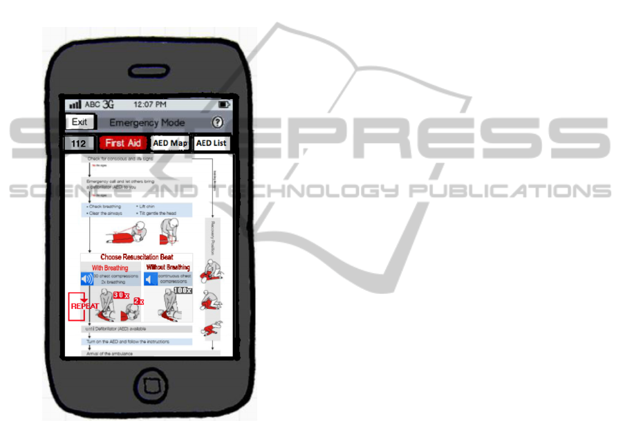
ambiguity in the provided images and to select the
best CPR mode (e.g., based on survival rates report-
ed in a study by Bohm et al., 2007). Crucially, the
CPR instructions should be visible permanently
together with a nearby change-mode button. Alterna-
tively, the two CPR modes could be directly associ-
ated with the CPR box in the diagrams, recognizable
as push buttons (see the grey areas with loudspeaker
symbols in Figure 8). Switching audio on and off
should be possible in a way familiar to many pro-
spective users.
Figure 8: Mock-up illustrating always-visible tab-
navigation and improved first-aid diagrams.
5 CONCLUSIONS
We have outlined the functionality provided by
various apps aiming to support the delivery of first
aid to persons suffering from cardiac arrest, in cir-
cumstances where immediate help is essential and
defibrillation is virtually inevitable. We reported the
results of a close-to-realistic usability study with the
German “Defi Now!” app. Most of the participants
estimated that the app would be helpful in emergen-
cy cases. We recommended some improvements
based on best practices in various other first aid apps
and on our own observations during the usability
study.
First aid apps can increase their usefulness if
they offer easily accessible opportunities for learn-
ing and exploration. They should enable smartphone
owners to refresh their knowledge of first aid
measures, thus being better able to administer first
aid spontaneously when witnessing an emergency.
As for future work, this suggests the development of
first aid training apps that invite to dry-run first aid
procedures in a challenging manner.
REFERENCES
Cummins, R. O., Eisenberg, M. S., Hallstrom, A. P., &
Litwin, P. E. 1985. Survival of out-of-hospital cardiac
arrest with early initiation of cardiopulmonary resusci-
tation. The American Journal of Emergency Medicine,
3, 114-119.
Darley, J. M & Latané, J. M. 1968. Bystander Intervention
in Emergencies: Diffusion of Responsibility. Journal
of Personality and Social Psychology, 8, 377-383.
Gross, J. J. & Levenson, R. W. 1995. Emotion Elicitation
Using Films. In Cognition & Emotion, 9, 87-108.
Hewig, J., Hagemann, D., Seifert, J., Gollwitzer, M.,
Naumann, E., & Bartussek, D. 2005. A revised film
set for the induction of basic emotions. Cognition and
Emotion, 19, 1095-1109.
Jörg, G. 2012. Warum Menschen anderen nicht helfen.
See http://www.fh-heidelberg.de/?id=5236
Lange, T. 2011. Entwicklung eines Defibrillator-Verzeich-
nisses mit zugehöriger Smartphone-Applikation. Di-
ploma Thesis, University of Koblenz-Landau.
Bohm, K., Rosenqvist, M., Herlitz, J. Hollenberg, H. &
Svennson, L. 2007. Survival is similar after standard
treatment and chest compression only in out-of-
hospital bystander cardiopulmonary resuscitation.
Cicrulation, 116, 2908-2912.
Nielsen, J. 1994. Usability Engineering. Boston: Academ-
ic Press.
Otto, J. H. 2000. Methoden der Emotionsforschung:
Induktionsverfahren. In Otto, J.H.,
Emotionspsychologie, pp. 395-408. Weinheim: Beltz.
Rohrmann, B. 1978. Empirische Studien zur Entwicklung
von Antwortskalen für die sozialwissenschaftliche
Forschung. Sozialpsychologie, 9, 222-245.
Schleicher, R. 2009. Emotionen & Peripherpher-
physiologie. Lengerich: Pabst Science Publishers.
ICEIS2013-15thInternationalConferenceonEnterpriseInformationSystems
98
