Assessment of User Experience with Responsive Web Applications
using Expert Method and Cognitive Walkthrough
A Case Study
Malgorzata Plechawska-Wojcik
1
, Sergio Lujan Mora
2
and Lukasz Wojcik
3
1
Institute of Computer Science, Lublin University of Technology, Nadbystrzycka 36b, Lublin, Poland
2
Deparment of Software and Computing Systems, Universidad de Alicante, Alicante, Spain
3
Karo-Studio s.c., Lublin, Poland
Keywords: Responsive Web Design, GUI Usability, User Experience, Expert Analysis, Cognitive Walkthrough.
Abstract: The paper presents a case study of Responsive web design GUI quality testing. The case study use specially
designed web page and the adjusted testing procedure. The procedure is based on the expert method and
cognitive walkthrough and is adjusted to web pages created using Responsive web design. The paper
outlines contain the method description and results including questionnaire summary and experts opinion.
The most important users remarks concerning GUI adjusting to different devices are also presented.
1 INTRODUCTION
According to a recent research (Mitchell et al.,
2012), more than three-quarters of U.S. adults (77%)
own laptop or desktop computers. However, the
computer market has stabilized for the last four
years, and what is growing now instead is the mobile
market. Nearly 44% of U.S. adults own
smartphones, and 18% of U.S. adults own tablets.
This wide and rapid adoption of smart phones and
tablets has shifted how U.S. people consume web
content, and according to another study (comScore,
2012), mobile phones and tablets accounted for a
combined 13.3 percent of total web page views in
August 2012, nearly doubling their share of traffic in
just one year. For many people, mobile devices are
the last thing they touch before they go to sleep, and
the first thing they use when they wake up. Users
move from one device to another device smoothly
and in patterns that cannot be predicted. The
boundaries of the way people use the Web are
blurring very fast.
Therefore, nowadays it is more important than
never to design cross-channel websites (Resmini and
Rosati, 2011), websites prepared to be accessed from
a myriad of different devices. It is clear that
continuity between platforms is quite important, but
due to the lack of some features in some devices, it
is totally impossible to offer the same experience
between devices: the user experience must change
with each device. Websites must be prepared to
adapt to different users’ scenarios. It has also an
economical effect, because it can be calculated as
the cost of time losses by users (Milosz and Milosz,
2005).
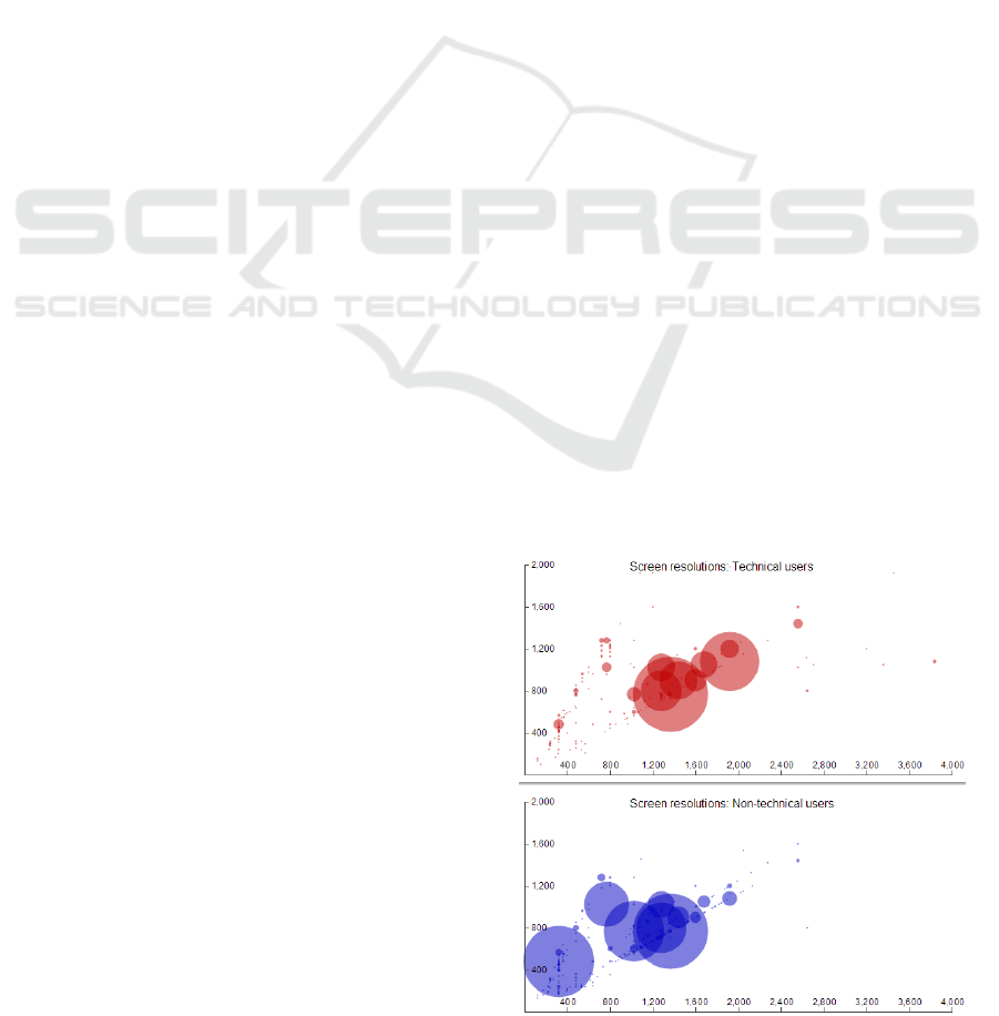
Figure 1: Screen dimensions for a sample of technical
& non-technical users (Davies, 2013).
For example, a simple survey of screen sizes
111
Plechawska-Wojcik M., Lujan Mora S. and Wojcik L..
Assessment of User Experience with Responsive Web Applications using Expert Method and Cognitive Walkthrough - A Case Study.
DOI: 10.5220/0004443001110118
In Proceedings of the 15th International Conference on Enterprise Information Systems (ICEIS-2013), pages 111-118
ISBN: 978-989-8565-61-7
Copyright
c
2013 SCITEPRESS (Science and Technology Publications, Lda.)

carried out in January 2013 (Davies, 2013) showed
that there is no average screen resolution, as it can
be seen in the scattered plot shown in Figure 1. This
plot displays screen dimensions used by two groups
of users, technical and non-technical users, and
vertical scale is screen height, whereas horizontal
scale is screen width. The survey was based on a
sample of 5,000 unique visitors to two different
websites: one aimed to technical users, and another
aimed to non-technical users. The results of this
survey confirm the importance of making a web
page look good at different screen resolutions. And
what is worst, the number of devices with the ability
to access Internet and surf the Web is increasing day
by day. This is just the beginning of a new era of
access to the Internet and the Web. No one knows
which devices will be used by users to access the
Internet and the Web in the future, so websites
should be prepared to be compatible with a plethora
of current and new devices.
Therefore, nowadays it is needed to design web
sites for different users’ scenarios, not for different
screens. Besides, the users’ interaction patterns also
change from one device to another device, and
websites should adapt to these changes.
The current solution to this problem is to use
“Responsive Web Design” (RWD), a new web
design technique that has become very popular
during the last two years. However, due to the
novelty of this technique, it is not clear if it can
santisfy the same user experience when applied to
different elements in a web page. The goal of this
paper is to assess the differences of user experience
when this technique is used to adapt a website to
different users’ scenarios.
Two methods are applied to assess user
experience in a controlled experiment: expert
analysis and cognitive walkthrough were adapted to
rate the GUI and the user experience on different
kind of devices.
The rest of the paper is structured as follows.
Section 2 provides a brief introduction to responsive
web design. Section 3 contains the description of the
method applied in the case study. The method is
based on the expert analysis and cognitive
walkthrough. Section 4 presents the RWD web
application, which was used to perform the case
study. Section 5 provides the details of the case
study. It contains the description of the analysis
process and presents the results of the case study
using both methods: expert analysis and cognitive
walkthrough. Conclustions are presented in
Section 6.
2 RESPONSIVE WEB DESIGN
Responsive web design is a term coined by Ethan
Marcotte in his seminal article in 2010 (Marcotte,
2010). The following year, Ehan Marcotte wrote his
book “Responsive Web Design” (Marcotte, 2011),
in which he explored new techniques and proposed
some design patterns. .net magazine, one of the most
famous magazines between professional and
amateur web designers, declared “responsive
design” as the second development trend of the year
2012 (Grannell, 2012).
The goal of RWD is to deliver a quality
experience to users no matter how large or small the
display they use is. But RWD is not only about
changing the way elements are displayed in a web
page: RWD is also about how to provide easy
reading and navigation with a minimum of resizing,
panning, and scrolling across a wide range of
different devices.
Responsive web design mixes three different
techniques, fluid grids, flexible images, and media
queries, all of them based on the use of CSS
(Cascading Stylesheets).
The RWD techniques have been compiled in
design patterns, common solutions to different
design problems (Wroblewski, 2012; Frost, 2013).
For example, there are layout patterns, navigation
patterns, menu patterns, form patterns, etc.
3 APPLIED METHOD
GUI of the responsive design web page needs to be
checked and tested by users working on different
type of devices. The site designed in this way should
be adjusted to different kind of screen resolutions
(computer monitors, smart phones, tablets, etc). It
should be readable with a minimum of resizing,
panning, and scrolling.
To check users’ viewing experience GUI quality
evaluating methods might be used. During such case
study users experience also needs to be regarded.
Novice users interacting with a system for the
first time prefer simple actions and ease of learning
(Shneiderman, 1998), but their behavior and work
quality changes as their experience with the system
increases. This is an important point of view when
evaluating GUI quality over time, but to setup such
a study requires observation over time and lots of
resources (Phung, 2007), which are often hard or
even impossible to obtain.
An expert analysis in combination with cognitive
walkthrough seems to be the most reliable method
ICEIS2013-15thInternationalConferenceonEnterpriseInformationSystems
112

for assessment of responsive design web page GUI
quality. As it is shown in the studies (Krug, 2000) in
most cases group of several experts using the
adequate methodology is able to detect and correct
over 85% of errors in software – this applies also to
errors in GUI quality. It should be noted that testing
can never completely identify all the defects within
software (Pan, 1999).
Expert analysis is one of the most widely used
method for application testing. Experts, while using
the application, check predefined areas. Those areas
are defined to help to examine application
compliance with interface design guidelines (such as
Nielsen-Molich heuristics (Nielsen and Molich,
1990)) and to detect potential problems.
Each of those predefined areas can be divided
into several more detailed sub-areas. What is more,
they usually have detailed questions assigned to help
experts to cover more important aspects of GUI
quality (Laskowski, 2012).
Simplified cognitive walkthrough is one of the
expert methods of usability and GUI quality testing.
It emphasizes the ease of interface learning as well
as viewing experience during the initial contact with
the system (Laskowski, 2012). This method might
be successfully used in combination with the expert
analysis method.
This method is based on few tasks, which user
will perform during his work with an application
(e.g. making a purchase) (Wharton et al., 1994).
Each task is divided into individual steps. In the case
study the analysis was performed according to the
following three questions:
Does the user know what to do during the
analyzed step?
If the action performed by user is correct, is he
aware of it?
If the action performed by user is correct, does
he feel he is getting closer to reach the goal?
The difficulty of each step is usually evaluated
using a Likert scale of 1 to 5, with 1 meaning ‘very
easy’, 5 – ‘very difficult’.
3.1 Proposed Criteria for GUI Quality
Assessment
The web page was tested with the method using the
expert analysis and cognitive walkthrough.
The expert analysis criteria consist of the
detailed list of areas and subareas with questions
assigned to each point. The list is a modified version
of the list called “LUT list” which we proposed in
(Milosz et al., 2013). Modification consists in
adjusting sections concerning different devices and
resolutions. The group of main areas contains:
Application interface, Navigation, Data structure
and Data input. Detail list of questions is presented
in Table 2 in the paper’s results sections. Table 1
presents the grading scale used to assess each
evaluated assessed area.
Table 1: The grading scale applied to the LUT list.
Grade Description
1
Critical usability errors were observed,
p
reventing normal usage or discouraging
user from using the application.
2
Serious usability issues were encountered,
which may prevent most users from tas
k
realization.
3
Minor usability issues were observed,
which if accumulated may have negative
impact on user performance.
4
Single minor usability issues were
observed, which may have negative impac
t
on user work quality (e.g. poor readability).
5
N
o usability issues influencing either use
r
p
erformance or work quality were
identified.
The cognitive walkthrough involves three
scenarios containing tasks to perform. They are:
Run the web page, find the specified article
Find and display the specified photo in the
gallery
Fill out the data form
Users need to performed those task and answer
several questions. They are:
The type of used device
The screen resolution
The type of web browser
Number of moves to accomplish the task
Number of mistakes
Additional remarks
The results of analysis performed using those
two methods presents the users experience and GUI
quality of prepared responsive design web page.
4 THE APPLICATION
The example web page was created using
Foundation framework dedicated to responsive web
design. The web page should be readable with a
minimum of resizing, panning, and scrolling. It was
created to present user interface navigation
mechanism and to get know users viewing
experience.
AssessmentofUserExperiencewithResponsiveWebApplicationsusingExpertMethodandCognitiveWalkthrough-A
CaseStudy
113

Figure 2: Sample screenshot of the web page (source: own work).
Figure 3: Sample mockup of the home page (source: own work).
ICEIS2013-15thInternationalConferenceonEnterpriseInformationSystems
114
The web page does not have extensive functionality.
It contains several main sections:
Articles – extended thematic articles including
photos.
Gallery – several galleries each containing
a collection of photos.
Form – typical web form composed of several
questions.
The home page contains news shortcuts and links
to the remaining contents of the page.
The menu is placed on the left side. Mobile and
smart phone users, however, can see the menu at the
top of the screen to make it more readable.
Figure 2 presents an example page screen
containing the section of articles. Figure 2a) presents
a screenshot taken on a computer and figure 2b) – on
a mobile phone. The same page is displayed slightly
different at those devices. The location and look of
menu is different as well as the size of figures.
Differences between web pages adjusted to
computers and to mobile phones can be also seen in
Figure 3. It presents mockups of the two chosen web
pages. Figure 3a) and Figure 3a) present mockup
dedicated to computers and tablets with resolution of
minimal width 768 px.
The page is always adjusted to the screen
resolution, so horizontal scroll is never displayed.
The menu dedicated to mobile phones also differs –
it has a form of the dropdown list and it is located at
the top of the web page. Menu dedicated to higher
screen resolution devices has the form of list and it
is located at the left side of the web page. Also the
size and location of figures is different.
The goal of the useful, high quality GUI is to
adjust the web page look to the screen. Differences
between web pages dedicated to computers and to
mobile devices are designed to improve the user
experience on different devices.
5 THE CASE STUDY
The presented case study describes the analysis of
created web page. The analysis was conducted by
experts experienced with GUI quality analysis.
5.1 The Analysis Process
The case study was composed of two steps. The first
one is an expert analysis, the second one – the
cognitive walkthrough. Both analyses were
performed using the survey.
The first section analyzes the GUI quality,
divided into four areas: Application interface,
Navigation, Data structure and Data input.
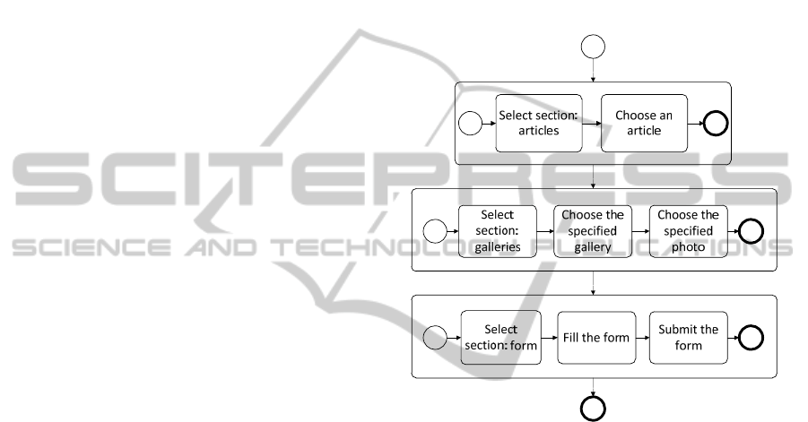
The second section is the cognitive walkthrough
based on three tasks presented in Figure 4 – in
BPMN (Business Process Modelling Notation)
process. Users have to: (1) find specified article, (2)
find the gallery and display specified photo, (3) fill
and submit data form. After tasks completion, users
were asked to fill the questionnaire regarding their
viewing experiences. What is more, they were also
asked about number of moves and mistakes.
Figure 4: The testing process (source: own work).
5.2 The Expert Analysis Results
The most important issues concerning interface
quality are organized by following areas:
Application interface, Navigation, Data structure and
Data input.
Experts performed the analysis using smart
phones (40%), tablets (10%) as well as desktop
computers (30%) and notebooks (20%). Using
diversified screen sizes enables to check how the
application adapts to different resolutions.
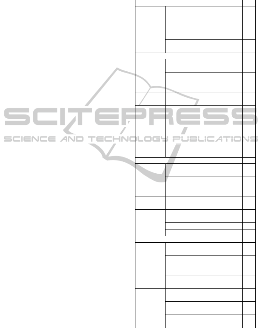
The detailed results are presented in Table 1. The
general assessment is estimated at 4.3.
5.2.1 Application Interface
The overall assessment of the application interface is
good (Table 1, section Application interface). The
layout occurred to be readable and coherent.
Arrangements of fonts, colours and elements were
assessed high regardless of the resolution device.
AssessmentofUserExperiencewithResponsiveWebApplicationsusingExpertMethodandCognitiveWalkthrough-A
CaseStudy
115
Experts rated it as 4.8. Application interface is
adjusted to presented data. No horizontal scroll is
displayed, pictures and text are always visible.
However, the mobile view is long and it makes user
to perform multiple swiping. Mobile devices and
different resolutions adjustment was assessed well –
respectively 4.3 and 4.6.
The application interface was also assessed as
supportive (4.3) and consistent (4.2). Most of
available options are visible and accessible. Minor
interface errors like small spelling mistakes did not
affect user experience significantly. Another slight
error is that text and labels are not standardize well –
one can find inconsistencies in the sections names.
All labels should be made cohesive and aligned in
terms of the nomenclature and presentation. This
would help to better manage the space and improve
readability.
5.2.2 Navigation
This area considers several subareas, such as Ease of
use, Menu hierarchy, Navigation structure and
Screen elements (Table 1, section Navigation).
The general rate of the navigation area is high
(4.4). Access to all page elements is easy and
intuitive (4.9). The menu was also assessed as easy
to use for all type of devices. It is important to notice
the menu is separately adjusted to different screen
resolutions. In all cases it was proved to be well
designed (4.7). However, the localization of menu
was assessed at 3.9 and its hierarchy – at 3.7.
The navigation structure seems to be easy and
intuitive (4.4). It is also well adjusted to different
screen resolution (4.7). All screen elements were
also assessed to be supportive (4.6). However, some
elements were disabled or working improperly,
especially on the mobile version.
The arrangement of most of sections is intuitive
and proper. Section elements are standardized and
visually grouped, but stronger highlights would
additionally improve the navigation.
It is easy to navigate the site and perform such
tasks as articles and galleries browsing. However,
there is no searching option, which would help to
navigate the site and to find required data.
5.2.3 Data Structure
This subarea of the Data structure area are: Ease of
use, Information hierarchy and Information structure
(Table 1, section Data structure).
Table 1: The expert analysis results (LUT list).
Application interface 4.44
Layout
Is the la
y
out readable? 4.8
Is it adjusted to different
resolutions?
4.3
Is it adjusted to mobile devices? 4.6
Is it consistent? 4.3
Does it support task
implementation?
4.2
Navigation 4.38
Ease of use
Is the access to all elements of
menu eas
y
and intuitive?
4.9
Is the use of menu eas
y
? 4.7
Is the localization of menu
intuitive?
3.9
Menu
hierarchy
Isn’t the menu hierarchy too
complicated?
3.7
Navigation
structure
Is the navigation structure
intuitive and understandable for
users?
4.4
Is the navigation well adjusted
to the screen resolution?
4.7
Is it well
p
lanned? 4.1
Screen
elements
Do they support the navigation? 4.6
Data structure 4.49
Ease of use
Is the access to all sections of an
application eas
y
and intuitive?
4.8
Is the access to all functions of
an application easy and
intuitive?
4.4
Information
hierarchy
Isn’t the information hierarchy
too complicated?
3.9
Information
structure
Is the information structure
understandable?
4.7
Is it consistent? 4.7
Is it well planned? 4.4
Data input 3,99
Data
Is the data validated by the form
elements?
3.3
Do the forms have elements
acting as hints for the input data
(e.
g
. on format or data ran
g
e)?
3.1
Can an average user fill in the
form easil
y
?
4.5
Forms
Are they designed in a readable
wa
y
?
4.5
Are they adjusted to the mobile
devices?
4.1
Do they allow user to input all
of the necessar
y
data?
4.4
The data structure was rated as easy to use.
Experts had no problems to access to all data and
ICEIS2013-15thInternationalConferenceonEnterpriseInformationSystems
116
functionalities (4.8). The information hierarchy
occurred to be simple and understandable (4.7).
The web page content was found to be consistent
(4.7) and well planned (4.3).
Conventions applied to data and labels are
coherent. Consistent naming convention is applied.
5.2.4 Data Input
The Data input regards Data and Form sections
(Table 1, section Data input). The overall
assessment of this area is 4.
The data validation needs for improvements
(3.3). Application should not accept all data formats.
What is more, form’s elements do not have hints and
additional user help (3.1). On the other hand, the
form is intuitive and its elements do not need to be
described in detail.
While filling the form it is possible to choose
a keyboard instead of a mouse. Forms were assigned
to be constructed in readable, intuitive way (4.5).
They are also well adjusted to different screen
resolution, especially of mobile devices (4.1).
However, some form elements were inaccessible on
mobiles phones and needed to be additionally
adjusted. It was concluded, that forms allow user to
input all necessary data.
Web forms work properly and react on user’s
activities. However, the application should offer
more forms of help such as tooltips or pop-up
messages. It is also necessary to add improved form
validation.
5.3 The Cognitive Walkthrough
Each of prepared tasks was performed by experts
working on different devices. This approach enables
to check the ability to accomplish tasks at different
resolutions and using different navigation methods.
Those differences, however, influence on results in
that way, that it spreads the number of performed
moves.
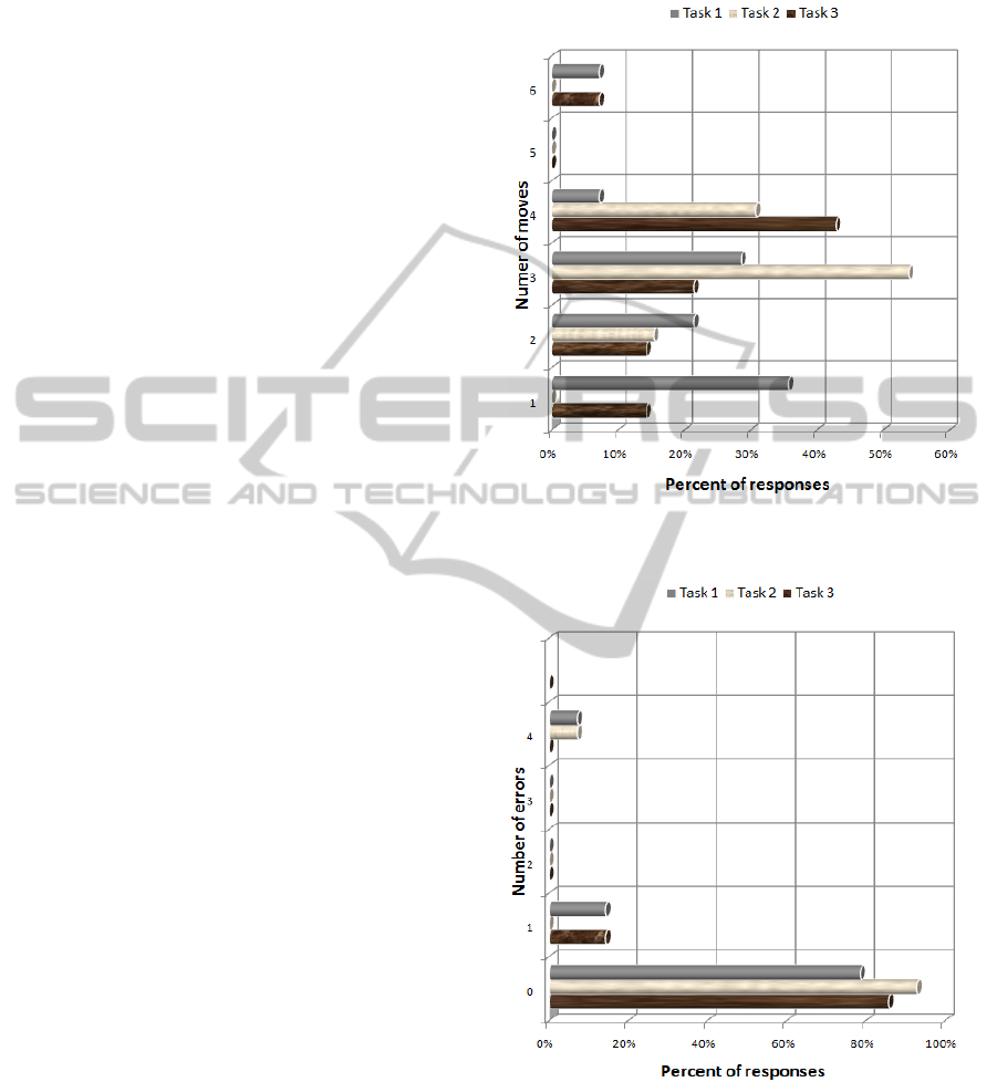
Figure 5 presents the number of moves
performed in, respectively, task no. 1, 2 and 3.
Task 1 could be performed using at least 2-3
moves, depending on the used device. Users
responds, however, range from one to six moves.
What is more, the most of responses regarding
number of done mistakes were set to 0 (Figure 6). It
means that task execution has not caused many
problems.
Similar conclusions might be drawn from tasks
no. 2 and 3. Low number of declared errors shows,
that the interface created using responsive design
occurred to meet the requirements.
Figure 5: The number of moves needed to perform case
study tasks (source: own work).
Figure 6: The number of errors done during performing
case study tasks (source: own work).
The case study gave also answers to the stated
questions. Users knew what to do during the
analyzed step, because similar numbers of users
moves and low number of errors show, that the tasks
were clearly understood and users didn’t face serious
problems. Users generally were also aware of their
AssessmentofUserExperiencewithResponsiveWebApplicationsusingExpertMethodandCognitiveWalkthrough-A
CaseStudy
117

progress and tasks completion. In few cases slight
navigation problems were faced by users. However,
they did not have a large impact on the general
assessment.
6 CONCLUSIONS
The main goal of the presented case study was to
assess capabilities of Responsive Web Design
(RWD) and to determine the user experience of
RWD web pages. The case study was based on two
methods (expert analysis and cognitive walkthrough)
applied on web experienced users using different
devices like computers, smart phones, tablets.
Obtained results confirm the effectiveness of
RWD. Low number of errors and quickly completed
tasks prove that RWD can be successfully applied in
practice.
Responsive web design enables to create web
pages, which can be viewed on different devices in
similar way. Of course, due to devices
diversification, it is impossible to obtain exactly the
same web page look and user experience on all
devices. However, the exact page look is no more
desired result. The aim is to adapt the page to
different users’ scenarios, not for different screens.
Website needs to adapt to users’ interaction patterns
changes.
Responsive web design helps to obtain this goal.
Users do not need to install anything extra or to set
any properties. They can use one common interface.
However, one should be aware that the only
thing certain about the future is that web design is
not predictable. Its development will alway be
adjusted to the technology and device trends.
ACKNOWLEDGEMENTS
This research has been supported by the project
“GUI usability and accessibility: exchanging
knowledge and experiences (AUKEE)” established
in the frame of Leonardo da Vinci (LdV) Lifelong
Learning Programme in Partnerships action.
REFERENCES
comScore., 2012. Mobile Phones and Tablets Now
Account for 1 in 8 U.S. Internet Page Views.
comScore. Internet: http://
www.comscoredatamine.com/2012/10/mobile-phones-
and-tablets-now-account-for-1-in-8-u-s-internet-page-
views/. (Visited 2/2/2013).
Davies, D., 2013. A simple survey of screen sizes.
Internet: http://my.opera.com/ODIN/blog/2013/01/
17/a-simple-survey-of-screen-sizes. (Visited
2/2/2013).
Frost, B., 2013. This is Responsive. Internet:
http://bradfrost.github.com/this-is-responsive/.
(Visited 2/2/2013).
Grannell, C., 2012. 15 top web design and development
trends for 2012. .net magazine. Internet:
http://www.netmagazine.com/features/15-top-web-
design-and-development-trends-2012. (Visited
2/2/2013).
Krug, S., 2000. Don't Make Me Think! A Common Sense
Approach to Web Usability. Que, New York.
Laskowski, M., 2012. Proposals for application interface
testing methods. Informatyka Automatyka Pomiary w
Gospodarce i Ochronie Środowiska 4b/2012: 21–24
(in Polish).
Marcotte, E., 2010. Responsive Web Design. A list apart,
issue 306. Internet: http://alistapart.com/
article/responsive-web-design. (Visited 2/2/2013).
Marcotte, E., 2011. Responsive Web Design. A Book
Apart.
Milosz M., Milosz E., 2005. Hidden Costs of IT Skills
Ignorance. Vilnius University, Information Sciences,
vol. 34, pp. 30-34.
Milosz M., Plechawska-Wojcik M., Borys M., Laskowski
M., 2013. Quality Improvement of ERP System GUI
Using Expert Method: a Case Study, 6th International
Conference on Human System Interaction, in print.
Mitchell, A., Rosenstiel, T., Christian. L., 2012. Mobile
Devices and News Consumption: Some Good Signs
for Journalism. The State of the News Media. Internet:
http://stateofthemedia.org/2012/mobile-devices-and-
news-consumption-some-good-signs-for-journalism/.
(Visited 2/2/2013).
Nielsen, J., Molich, R., 1990. Heuristic evaluation of user
interfaces, Proc. ACM CHI'90 Conf., 249-256.
Pan, J., 1999. Software Testing. http://
www.ece.cmu.edu/~koopman/des_s99/sw_testing.
(Visited 10/2/2013).
Phung, Q. M., 2007. Identifying Usability Problems in
relation to User Experience with System and Tests,
http://projekter.aau.dk/projekter/files/61070563/11810582
53.pdf. (Visited 10/2/2013).
Resmini, A., Rosati, L., 2011. Pervasive Information
Architecture: Designing Cross-Channel User
Experiences. Morgan Kaufmann Publishers.
Shneiderman, B., 1998. Designing the user interface.
Addison-Wesley Longman.
Wharton, C., et al., 1994. The cognitive walkthrough
method: A practitioner’s guide. Usability inspection
methods. New York, NY: John Wiley & Sons Inc.
Wroblewski, L., 2012. Multi-Device Layout Patterns.
Internet: http://www.lukew.com/ff/entry.asp?1514.
(Visited 2/2/2013).
ICEIS2013-15thInternationalConferenceonEnterpriseInformationSystems
118
