
Visual Analysis of Time-dependent Multivariate Data from Dairy
Farming Industry
Lorenzo Di Silvestro
1
, Michael Burch
2
, Margherita Caccamo
3
, Daniel Weiskopf
2
, Fabian Beck
2
and
Giovanni Gallo
1
1
Department of Mathematics and Computer Science (DMI), University of Catania, Catania, Italy
2
Visualization Research Center (VISUS), University of Stuttgart, Stuttgart, Germany
3
Consorzio Ricerca Filiera Lattiero-Casearia (CoRFiLaC), Ragusa, Italy
Keywords:
Time-Dependent Multivariate Data, Multiple Timelines, Visual Analytics, Statistical Graphics, Dairy Science.
Abstract:
This paper addresses the problem of analyzing data collected by the dairy industry with the aim of optimizing
the cattle-breeding management and maximizing profit in the production of milk. The amount of multivariate
data from daily records constantly increases due to the employment of modern systems in farm management,
requiring a method to show trends and insights in data for a rapid analysis. We have designed a visual analytics
system to analyze time-varying data. Well-known visualization techniques for multivariate data are used next
to novel methods that show the intrinsic multiple timeline nature of these data as well as the linear and cyclic
time behavior. Seasonal and monthly effects on production of milk are displayed by aggregating data values
on a cow-relative timeline. Basic statistics on data values are dynamically calculated and a density plot is used
to quantify the reliability of a dataset. A qualitative expert user study conducted with animal researchers shows
that the system is an important means to identify anomalies in data collected and to understand dominant data
patterns, such as clusters of samples and outliers. The evaluation is complemented by a case study with two
datasets from the field of dairy science.
1 INTRODUCTION
To increase the competitiveness of the dairy sector
in the national economy, the dairy industry focuses
on improving farm management. The information
on farm productivity to support management on dairy
farms is often collected by Dairy Herd Improvements
agencies. Dairy farmers are usually visited once per
month, during a day called test-day. Information on
the herd such as breeding events, gender, and weight
of new-born calves is collected. In addition, the milk
production of each cow is measured and a milk sam-
ple is gathered to determine the fat and protein con-
tent, as well as somatic cell count.
Test-day records represent a valuable resource for
animal researchers, but as data sources become larger,
the analysis and exploration of patterns in data be-
comes more complex, representing a critical bottle-
neck in analytic reasoning. To address these prob-
lems, a visual analytics approach can be used to let
users explore their data and interact with them with
the aim to find interesting insights and eventually data
anomalies and formulate hypotheses. Techniques that
support the production and dissemination of analysis
results may help researchers communicate to a variety
of audiences.
In this paper, we present an interactive system to
analyze time-dependent multivariate data. A suite
of visual analytics tools is designed for animal re-
searchers, allowing them to perform an in-depth study
of data in order to develop and explore their hypothe-
ses. Since test-day records are multivariate data with
an intrinsic time-varying nature, we devise techniques
that are capable of representing linear and cyclic time
behavior simultaneously, for example, by showing
seasonal and monthly effects. Furthermore, a density
plot is included to let the user evaluate the reliability
of each dataset. Our system design is characterized by
its conceptual simplicity that intends to be an easy-to-
use tool for researchers with no background in visual
analytics.
The utility of our system and its visualization
methods are evaluated by a qualitative user study with
domain experts and demonstrated in a case study.
Two datasets from the dairy industry in Sicily (Italy)
are used. In Sicily, approximately 125,000 dairy cat-
99
Di Silvestro L., Burch M., Caccamo M., Weiskopf D., Beck F. and Gallo G..
Visual Analysis of Time-Dependent Multivariate Data from Dairy Farming Industry.
DOI: 10.5220/0004652600990106
In Proceedings of the 5th International Conference on Information Visualization Theory and Applications (IVAPP-2014), pages 99-106
ISBN: 978-989-758-005-5
Copyright
c
2014 SCITEPRESS (Science and Technology Publications, Lda.)
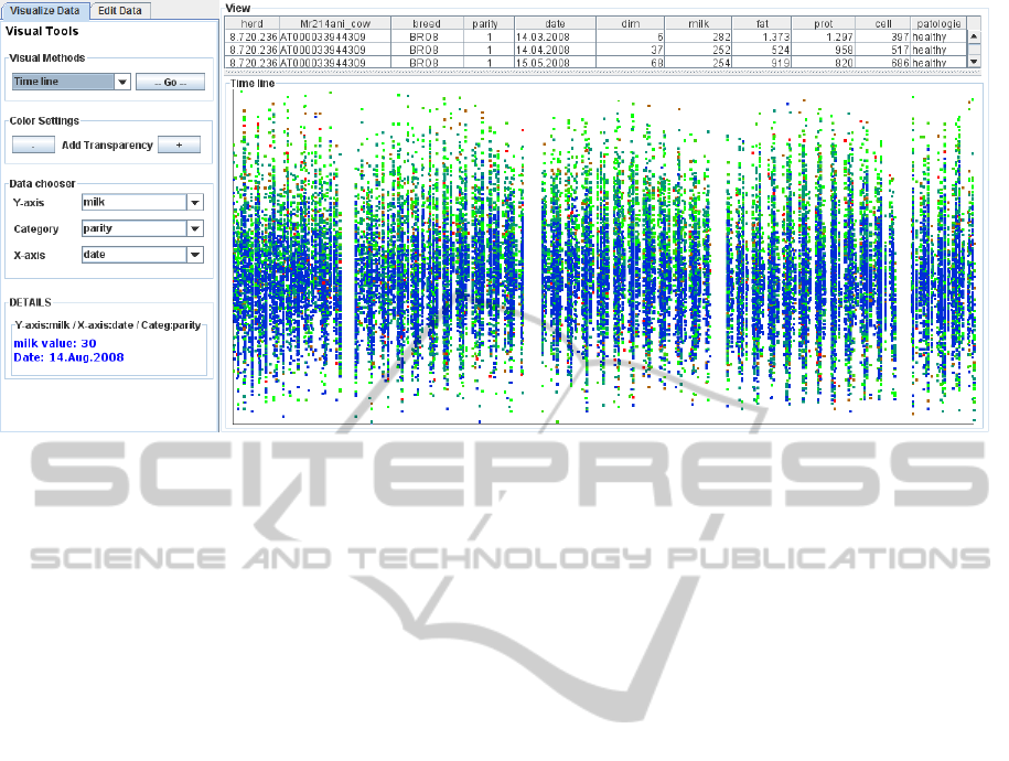
Figure 1: System overview. Raw data are shown in tabular form. In the bottom part, the view shows a scatter plot of
selected data. The production of milk is shown for each day (absolute timeline). In this example, the parity value (number
of lactations) is used as category. During the first parity, milk production is lower than in the next and the data value range is
narrower. Missing data points follow a regular pattern (recurring blank vertical stripes) that reflects the lack of data samples
collected during summer vacation (August).
tle are raised. Compared to other regions such as
those in Northern Italy, smaller traditional and less
modernized farms are present that have to deal with
hot climate, higher costs of feed and energy. Around
62% of Sicilian milk is produced in Ragusa province,
representing therefore the most important production
center for the dairy sector in Sicily. In 1996, the dairy
research center CorFiLaC was established to support
the development of the dairy sector in Ragusa (Cac-
camo, 2012). The datasets provided by CorFiLaC
and used for our case study cover the typical range
of (varying) sample rate and time span in which data
are collected.
2 RELATED WORK
As our system was designed to analyze different as-
pects of the same dataset, it merges visualization
methods from several application domains. In this
section, relevant topics from several areas will be cov-
ered, according to the different aspect of data analysis
on which the user wants to focus.
2.1 Animal Research and Dairy
Industry Domain
One of the main topics investigated by animal re-
searchers is the study of movement of individual or-
ganisms or groups of animals. There is an increas-
ing interest in movement ecology. Accordingly, there
are a few examples of visualization and visual an-
alytics research geared toward data from movement
ecology. Grundy et al. (2009) exploit data obtained
through tri-axial accelerometers to trace movement of
wild animals. They make use of interactive spherical
scatterplots and spherical histograms instead of the
2D time-series plots commonly used to study accel-
eration data.
Visual analytics is also used to study and model
epidemic spread in herds. Afzal et al. (2011) present
a suite of predictive visual analytics tools to model
the spread of Rift Valley Fever through a simulated
mosquito and cattle population in Texas.
However, we see only very little previous visual-
ization work on animal research related to the dairy
industry. In fact, there is almost no previous pa-
per in which visualization tools and visual analytics
methods would be used on milk production records
or other data from dairy industry. The only excep-
tion known to us is the work of Galligan, who cre-
ated Cowpad (Galligan, 2007), a suite of web tools
to present analytical problems commonly occurring
on dairy herds. Simple interfaces let the user evaluate
the effect of changing variables in the process of dairy
farm management. However, these tools do not use
any advanced visualization or interaction technique to
represent data involved in the simulation, only curve
diagrams and gauge metaphors are proposed.
With this paper, we want to fill this gap in the liter-
ature, adopting visual analytics methods for this par-
ticular application domain.
IVAPP2014-InternationalConferenceonInformationVisualizationTheoryandApplications
100

2.2 Time-Varying Data Visualization
For animal researchers, it is important to investigate
how various factors on dairy production change over
time. Data used for this contribution have a temporal
dimension that makes it possible to highlight monthly,
seasonal, and annual trends.
For time-dependent data, there is a large collection
of different visualization techniques for different pur-
poses of data exploration and depending on the char-
acteristics of the temporal structure. Following the
taxonomy by Aigner et al. (2011), dairy production
datasets exhibit a quite specific structure: they show a
dual structure of time, both linear and cyclic.
Van Wijk and Van Selow (1999) present a system
to identify patterns and trends on multiple time scales
simultaneously. It allows the visualization of univari-
ate time-series on different levels of aggregation by
clustering similar daily data patterns. We use different
levels of aggregation to visualize two different time-
lines at once. Spiral approaches are a way to visualize
large datasets and to support the identification of peri-
odic structures in data. Previous solutions (Carlis and
Konstan, 1998; Weber et al., 2001), however, are not
suitable in cases in which the cyclic trends of data are
not perfectly periodic, or the period is not known but
subject to specific seasonal effects.
To the best of our knowledge, no previous work
addresses the problem of visualizing linear and cyclic
time data simultaneously.
3 APPLICATION BACKGROUND
Data on farm productivity is often collected by Dairy
Herd Improvements (DHI) agencies. Milk production
of each cow is measured and a milk sample is ana-
lyzed to determine fat and protein content, and so-
matic cell count. These records are then processed
and analyzed centrally (i.e., on DHI computers) by
taking into account information generated during pre-
vious test-days at both herd and individual cow level.
A few days after the test-day, the farmer receives a re-
port containing information collected during the test-
day. This report may also contain management infor-
mation on individual cows and the herd as a whole.
The information from the report can then be used by
the farmer (or milk and cheese producer) for making
decisions focusing on the improvement of farm man-
agement practices (Caccamo, 2012).
Although DHI data and information can con-
tribute to improve management practices, the ben-
efits only come about if the farm managers and/or
the animal researchers that work as advisors at DHI
spend considerable effort for analyzing the incoming
information. This process can be time-consuming and
complex due to the large amount of data.
3.1 305-Days Lactation Yield and
Test-Day Models
Milk recording is recognized as a valuable means for
breeding and herd management worldwide. Further-
more, these records are also used to perform a genetic
evaluation for dairy production traits. The genetic
evaluation of dairy sires and cows has been based on
the analysis of the 305-day lactation yield for many
years. It uses the total amount of milk produced dur-
ing a lactation (or milking) period. Usually, a dairy
cow lactates for about 10 months (∼305 days) each
year before it dries up prior to giving birth to its next
calf. The ideal method to estimate the 305-days lac-
tation yield is to measure the amount of milk and
milk components of each cow on a daily basis for
10 months after calving. However, one sample of
milk is usually taken monthly for each cow. As stated
by Schaeffer and Burnside (1976), a common method
of predicting 305-days yield is to compute the average
production between two tests, multiply by the number
of days between tests, and accumulate this quantity
after each report. If the interval between two tests is
much longer than 30 days, erroneous predictions of
this value could result. Several methods have been
developed to improve the prediction of 305-day lacta-
tion yield. The term lactation curve is used to refer to
the curve representing the rate of milk secretion with
advance in lactation.
After two decades, animal researchers started to
use test-day yields for genetic evaluation rather than
305-days yield. By definition, a test-day (TD) model
is a method of evaluating daily production of milk,
fat, protein and somatic cell count considering effects
for each test-day instead of one set of fixed effects
over the lactation. The TD model estimates lactation
curves and their changes.
In the early 1990’s, Ptak and Schaeffer (1993)
identified some drawback in the new approach, such
as the need to store all of the individual test-day
yields on every cow, or the higher computational
time needed to calculate a genetic evaluation by us-
ing more values per cow instead of only one.
Within less than a decade, test-day models have
been adopted in several countries. Test-day models
are often used to perform national genetic evaluations
for dairy cattle. Estimation of genetic, environmen-
tal, and herd effects can be used to predict future pro-
ductions on individual cows. Deviation between pre-
dicted and actual production could be used to detect
VisualAnalysisofTime-DependentMultivariateDatafromDairyFarmingIndustry
101

a disease at an early stage, i.e., before the cow shows
clinical signs. Therefore, animal researchers need a
system to identify abnormalities in lactation curves.
Nowadays, the storage of big amounts of data or
the computational resources needed to handle these
data do not represent a problem anymore. It is pos-
sible to use the complete set of test-day records col-
lected over the years. Researchers can work directly
on those data with no use of statistical or mathemati-
cal models that could lead to loss of precision or erro-
neous predictions.
3.2 Multiple Timelines
The challenge for dairy producers is to interpret and
utilize data from dairy production properly to improve
decision making. Milk production data have an intrin-
sic dual timeline nature. Usually, lactation is repre-
sented according to a “cow-related” timeline: a curve
shows the quantity of produced milk changing over
time, from the day of calving to the moment in which
the cow is dried off, and milking ceases. About sixty
days later, one year after the birth of her previous calf,
a cow will calve again, starting a new parity (period
of lactation).
Since the “cow-relative” behavior is most im-
portant for temporal analysis, that relative time—
represented as day-in-milk—is of highest relevance
for analysis. Parities represent cyclic time characteris-
tics in the data because the parities progress similarly.
If one analyzes a single parity, there is linear time be-
havior within that parity. However, there is another
temporal aspect that needs to be taken into account:
the absolute time of the yearly calendar. Possible sea-
sonal effects on production of milk and milk compo-
nents ratio are due to yearly cyclic effects. However,
within the year, we consider calendar dates as linear
time because there are no weekly or daily effects on
milk production data.
In this paper, a method to show and analyze the
dual nature of time, with respect to the linear and
cyclic time behavior is presented.
4 SYSTEM OVERVIEW
In our system, several visualization methods are used.
Well-known approaches are used besides some new
techniques for visualizing two coexisting timelines si-
multaneously. The aim of the tool is to assist ani-
mal researchers in all the phases of their analysis pro-
cess. A preliminary analysis could be performed for
a data cleaning phase; then a deeper exploration lets
the user study different aspects of the data, compar-
ing different views. To address multivariate and time-
dependent data visualization, we designed our system
to support several, complementary views. The user
can choose from a list of four different views (see be-
low for details).
It is possible to load and handle any kind of multi-
variate dataset with the constraint that a field contain-
ing a date (or time) must be included. Data are loaded
and shown in a tabular form similar to spreadsheets
and application programs that animal researchers are
used to work with.
4.1 Scatter Plots
One of the visualization methods in the system is
based on scatter plots. In this way, multivariate data
can be shown, such as the attributes milk production,
fat contents, protein values, and their time depen-
dency. Any data field can be used as x-axis and y-axis.
A third data field can be used as a category to accord-
ingly color each data point in the scatter plot. In this
way, the colored scatter plot can show three data di-
mensions. If the category field chosen contains labels
that assign classes (categorical data), the user is asked
to select a color for each label. Otherwise data points
are colored automatically using a color scheme se-
lected by the user from a suggested list. Furthermore,
it is possible to filter data by category values. When
a burst of aggregated data points overlaps making the
scatter plot difficult to understand, transparency can
be used to reduce visual clutter. Moving the mouse
pointer over the plot, details on data points are dis-
played next to the view. Figure 1 shows the scatter
plot, and the side panel. This panel is used for choos-
ing data to plot, and environment settings.
4.2 Statistic Metrics and Density Plots
A line chart of mean values as well as standard devia-
tion can be superimposed on the scatter plot diagram,
showing aggregated statistical quantities. Moreover,
the density of data samples in the dataset for each
y-axis value is calculated and shown as a histogram.
The histogram allows the user to assess the quality of
the original data indirectly; less density is related to
higher variability of the data samples in that region.
Therefore, the combination of density diagram with
other diagrams allows us to include a measure of un-
certainty in the overall visualization.
A low-pass filter can be used to smooth the line
plots and density plots. The user can increase or de-
crease width of the low-pass filter interactively. In
Figure 2, a dataset is displayed in which the density
IVAPP2014-InternationalConferenceonInformationVisualizationTheoryandApplications
102
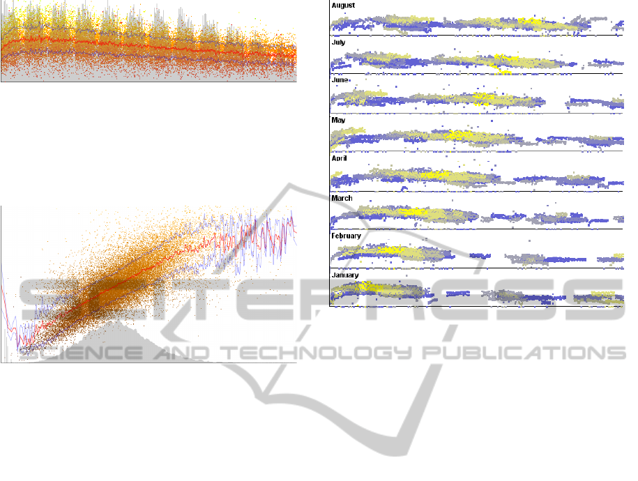
Figure 2: Statistics on time-varying multivariate data. The
value of produced milk for each day-in-milk is shown. Scat-
ter plot points are colored according to the value of fat con-
tained in the sample of milk. The curve of density of sam-
ples in the dataset is represented in gray. The red line indi-
cates the mean value of quantity of milk and the blue lines
the standard deviation.
Figure 3: Relation between the quantity of milk (x-axis)
and the percentage of protein (y-axis). Data points are col-
ored according to the percentage of fat in milk samples
(lighter color for higher values). The density plot shows
that the number of samples for milk quantity follows a nor-
mal distribution.
of data samples varies over time following a regular
pattern: more samples are collected in certain days
of the month. As shown in Figure 3, the density plot
can be used to recognize that samples are normally
distributed for a certain random variable (milk in this
example).
4.3 Multiple Timelines View
We present two methods for showing multiple time-
lines simultaneously. As discussed in Section 3.2, the
different temporal data characteristics make it diffi-
cult to analyze the temporal effects. In particular, de-
pending on the focal point of analysis, cyclic and lin-
ear as well as relative and absolute time play a role.
For analysts, it is useful to highlight cyclic data pat-
terns as well as to point out differences between dif-
ferent periods of time. The first method aggregates
data points for different periods of time over the rel-
ative timeline. Multiple scatter plots share the same
x-axis that represents the relative timeline. A plot is
shown for each period of the absolute timeline. The
user can choose the time period to use from a list to
aggregate data and build up a stacked view of several
plots. It is possible to create a plot for each season,
Figure 4: The value of produced milk for each day-in-milk
(relative timeline). The absolute timeline (date) is shown
by aggregating monthly data. Data points are colored from
blue to yellow according to the parity. In first parities milk
production is lower. Stacked scatter plots highlight differ-
ences in milk production and in data sampling: a (shifting)
gap in data points for a certain period in day-in-milk is vis-
ible.
month, or year. In Figure 4, stacked scatter plots are
shown for different months. This method helps iden-
tify frequent patterns in data points or highlight cyclic
behavior, but it is difficult to draw a comparison be-
tween data values at the same relative time point in
different plots.
The second method uses a single plot: different
line charts are drawn, representing the mean value
curve for aggregated data on different time intervals.
In this view, each plot shares the same coordinate sys-
tem, so that the line charts are aligned. Thus, it is sim-
pler to identify differences in the curve of values for
different time periods.
5 CASE STUDY
We demonstrate the usefulness of our approach for
two datasets with different features from the same ap-
plication area. Data used for our study was provided
by CoRFiLaC dairy research center.
The analysis was conducted with an expert that
was familiar with the datasets. During our study, hy-
potheses made by the domain expert were confirmed
with the visual analytics approach, and the implemen-
VisualAnalysisofTime-DependentMultivariateDatafromDairyFarmingIndustry
103
tation of new features was suggested in the sense of a
formative process.
Data used for our study were collected and used
by animal researchers to assist farmers in the man-
agement of dairy herds. The first dataset (Dataset 1)
contains 175,689 records on 6,468 cows from over 40
herds. Samples were taken monthly at the test-day,
for over 10 years. Each record provides the follow-
ing information: identification number of the herd and
the cow, breed of the cow, number of lactation (also
called parity), date of the test-day, days-in-milk (i.e.,
the number of days between the calving of the current
parity and the test-day), yield of milk, fat and protein
contents, detected pathology associated with the test-
day.
The second dataset (Dataset 2) used contains data
collected from one farm only, i.e., one herd. At
this farm, production data are collected in autonomy,
without the support of a DHI agency. It is a modern
farm in which data are collected almost daily. Data
records regard a single herd of 90 high production
cows that continue to produce a sufficient quantity of
milk for 11 months after calving (5 to 395 days-in-
milk).
5.1 Analysis Process
The analysis started by showing an overview of data
contained in Dataset 1 (see Figure 1). By using the
absolute timeline (date of test-day), a recurring gap is
evident in data sampling. This gap can be explained
by the period of vacation that was observed in the
farm during years prior to 2010 in Sicily.
Colors were used to mark data points according
to the detected pathology associated with the test-day.
Different views allowed us to spot significant changes
in the overall shape of curves, from which we could
derive some insights. A slight loss in milk produc-
tion was recognized for cows suffering from masti-
tis, when using the relative timeline (days-in-milk).
When using the absolute timeline, we noticed a lack
of registered sick cows before 2005. The density plot
revealed evident changes in number of data samples
over time. In the dataset, an increase in data collected
in the last years could be recognized, which we at-
tributed to the employment of modern systems in farm
management. By showing data according to the days-
in-milk (see Figure 2), a regular pattern in the density
plot could be highlighted. Usually, the same group of
agents from the DHI agency visits all the farms in the
same area, scheduling one visit per month for each
one. Thus, each peak in the density plot corresponds
to the recording day (test-day) in the biggest farm of
the area.
(a)
(b)
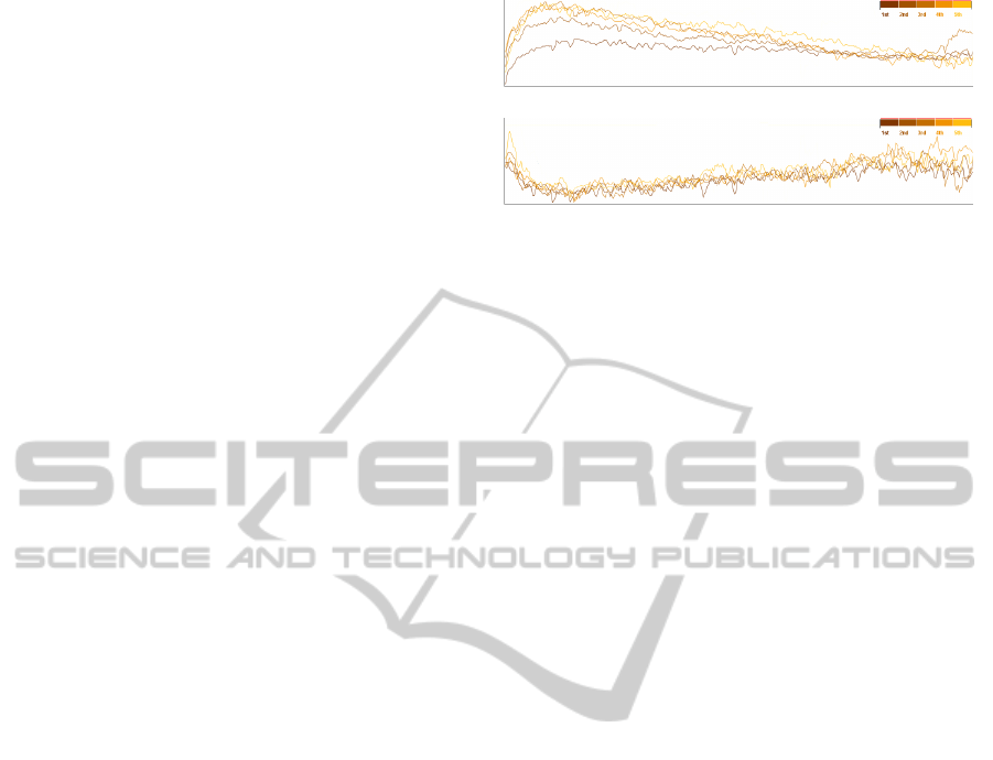
Figure 5: Multiple line plots highlight differences in lac-
tation curve (a) and fat contents (b) for five parities. The
quantity of fat decreases during the peak of milk produc-
tion. The shape of the fat curve is equal for different pari-
ties, whereas the shape of the lactation curve changes over
parities.
During the first analysis phase, the system turned
out to be a useful and fast means for data cleaning—
on top of direct visual analysis.
The multiple timeline views were used to find dif-
ferences in milk production for different seasons. In
winter, cows generally produce more milk than in
spring, but no evident differences could be identified
for different months. By plotting stacked data points
for each month, some data points in the August plot
are shown, which is an anomaly in data recording that
could be confirmed after the session.
During the analysis process, some new features
were suggested by the domain expert. The possibil-
ity to aggregate data and to visualize different plots
according to the breed and the parity number were
added in response to the expert’s comments. By
showing different curves for breeds, it is possible to
find out which cow variety is more productive and
how milk composition between different stocks dif-
fers. Different lactation curves for each parity confirm
well-known theories. Figure 5 shows different curves
for the first 5 parities in the data from Dataset 2. The
domain expert also asked to re-align data according
to the beginning of the lactation period, so that it is
possible to find differences in the lactation curve de-
pending on the moment of calving.
6 EXPERT EVALUATION
The analysis of the feedback by potential target users
describes preferences concerning views and features
of the tool, and helps us improve the software to meet
users’ needs. We were mostly interested in follow-
ing the natural process of hypothesis building and
problem-solving adopted by the animal researchers.
To achieve this goal, it is fundamental to let the do-
main experts operate in their workplace as explained
IVAPP2014-InternationalConferenceonInformationVisualizationTheoryandApplications
104
(a) (b) (c) (d) (e) (f)
(g) (h) (i) (j) (k) (l)
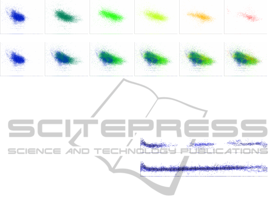
Figure 6: Scatter plots show the relation between quantity of milk (x-axis) and percentage of fat (y-axis). Data points are
colored according to the parity. These image series shows different uses of the interactive filter. Figures (a)–(f) show data
for different parities (1 to 6). In Figures (g)–(l), the first endpoint is constantly set to parity 1 and the width of the interval is
sequentially increased, to add data points from the next parity to the plot. Milk-fat correlation is different between the first
two parities and the next ones. From the third parity, the percentage of fat decreases, while the production of milk increases.
The number of data points falls off in last parities because most of the cows became less productive, removed from the dairy
herd, and marketed for beef, around the age of four.
by Dunbar and Dunbar (1999) proposing in-vivo stud-
ies. For our study, we adopted the pair analytics
approach. This method generates verbal data about
thought processes in a naturalistic human-to-human
interaction with visual analytic tools. It requires two
participants, a Subject Matter Expert and a Visual An-
alytics Expert (Arias-Hernandez et al., 2011).
Every study session was performed by using a
VoIP software for communication and each audio ses-
sion was recorded. An application for remote desktop
control was used to operate on a computer in the IT
laboratory at CorFiLaC. The three volunteers worked
directly on the computer used for the user study.
During a preliminary group session, the partici-
pants were informed about the procedure and the vol-
untary nature of the experiment. Afterwards, a private
study session was performed with each of the partici-
pants left alone in the IT laboratory. For each session,
the remote desktop was video recorded. Each session
was performed in conjunction with a Visual Analytics
Expert that was able to control the remote computer
by using mouse and keyboard. He was disheartened to
control remotely the system and let the Subject Mat-
ter Expert use it. The Visual Analytics Expert was
instead encouraged to talk with the animal researcher
and ask for comments and the motivation behind ev-
ery choice made to perform the requested tasks.
At the beginning of the private session, the vol-
unteer was asked to inspect the overview of a subset
of records from Dataset 1 (in Figure 1). The analysis
performed by the domain expert during the case study
was used as ground truth to evaluate the correctness of
the volunteers’ answers. The first task was to explain
the missing value pattern in the scatter plot. The sec-
(a)
(b)
Figure 7: (a) Fat content for day-in-milk during fall. (b) Fat
content for day-in-milk for parity started in fall. Data points
are colored from black to blue for the first three parities.
Missing samples visible in (a) that can affect the analysis
task are avoided by aligning data points on the season of
calving, as shown in (b).
ond task was to freely comment the data points cloud
according to the color coding used to produce the plot.
Then, the participant was asked to freely use the
visual analytics approach on Dataset 2.
Each study session took about 90 minutes for each
participant. During the session, the experimenter an-
notated the user’s behavior, preferred view, and in-
teraction methods to complement audio and video
recording that were analyzed afterwards for the qual-
itative analysis of the system usage sessions.
For the qualitative user study, three domain ex-
perts from CorFiLaC (Sicily), i.e., potential target
users, were asked to use our system.
The simple tasks assigned were used to evaluate
the effort required to understand the plots. Two of the
participants readily explained the lack of data points
and the regular pattern followed.
The second task involved the comprehension of
the color coding used to mark data points accord-
ing to the parity. None of the participants had any
VisualAnalysisofTime-DependentMultivariateDatafromDairyFarmingIndustry
105

difficulties working with this task. Their comments
revealed that they took advantage of using color to
highlight different data behaviors. Initial difficulties
to correctly interpret the scatter plot were overcome
with the help of the Visual Analytics Expert.
User opinions on ease of use and utility of our sys-
tem were collected by the questionnaires sent to the
domain expert after the user study sessions. The an-
swers show that the overall user experience with the
system was positive. The participants identified the
multiple timelines view as the most useful when line
charts are used. They also found the possibility to
use the same view to highlight differences for differ-
ent parity or breed interesting, referring to the features
suggested by the domain expert involved in the case
study. In particular, they indicated as an important
means for analysis the possibility to re-align data on
the day of calving. This method helps obtain informa-
tion on the shape of complete curves, not considering
gaps in data sampling as shown in Figure 7.
Each of them preferred to use line plots to com-
pare the lactation curve shape, but they used scatter
plots to identify anomalies in the data, such as gaps
in data sampling of artificial data values. They recog-
nized the system as a means for simple graph creation,
in order to show analysis results to farmers.
In the free comments section of the question-
naires, each of them asked to filter data interactively,
without recurring to the editing interface of the sys-
tem. An interactive filter was later implemented and
the usage is shown in Figure 6.
7 CONCLUSION AND FUTURE
WORK
We used a visual analytics approach to support animal
researchers in analyzing multivariate time-varying
data. The system is designed to address the needs of
the domain experts. By using real-world data from
the dairy industry, we could prove the utility of the
system as a means of identifying anomalies for a data
cleaning phase, and as a tool for hypothesis building.
Besides, an expert user study showed that researchers
without background knowledge of visual analytics
methods are able to adopt the system quickly.
For proper interpretation of lactation curves, milk
production information has to be related to man-
agement practices and environmental conditions that
might affect lactation curves. The individual cow
level data have to be analyzed besides herd level data.
The possibility to handle this kind of data could be
added to our system in future work. Also, differ-
ent case studies could be conducted on datasets from
other domains. The multiple timeline nature of the
data from dairy science might be present in other data
as well, and the system might be applicable there, too.
Finally, the expert user study could be extended by in-
cluding a larger group of domain experts.
REFERENCES
Afzal, S., Maciejewski, R., and Ebert, D. (2011). Visual an-
alytics decision support environment for epidemic mod-
eling and response evaluation. In Proceedings of the
IEEE Conference on Visual Analytics Science and Tech-
nology (VAST), pages 191–200.
Aigner, W., Miksch, S., Schumann, H., and Tominski, C.
(2011). Visualization of Time-Oriented Data. Human-
Computer Interaction Series. Springer.
Arias-Hernandez, R., Kaastra, L. T., Green, T. M., and
Fisher, B. (2011). Pair analytics: Capturing reasoning
processes in collaborative visual analytics. In Proceed-
ings of the 44th Hawaii International Conference on Sys-
tem Sciences (HICSS), pages 1–10.
Caccamo, M. (2012). Management Parameters from the
Random Regressions Testday Model to Advice Farmers
on Cow Nutrition. publisher.
Carlis, J. V. and Konstan, J. A. (1998). Interactive visualiza-
tion of serial periodic data. In Proceedings of the ACM
Symposium on User Interface Software and Technology
(UIST), pages 29–38.
Dunbar, K. and Dunbar, K. (1999). Scientists build mod-
els invivo science as a window on the science mind. In
Model-Based Reasoning in Scientific Discovery, pages
85–99. Kluwer Academic/Plenum Publishers.
Galligan, D. (2007). Cowpad – Visual Analyt-
ics. http://cahpwww.vet.upenn.edu/node/89. Ac-
cessed: 22/02/2013.
Grundy, E., Jones, M. W., Laramee, R. S., Wilson, R. P.,
and Shepard, E. L. C. (2009). Visualisation of sensor
data from animal movement. Computer Graphics Forum,
28(3):815–822.
Ptak, E. and Schaeffer, L. (1993). Use of test day yields
for genetic evaluation of dairy sires and cows. Livestock
Production Science, 34(1):23–34.
Schaeffer, L. R. and Burnside, E. B. (1976). Estimating the
shape of the lactation curve. Canadian Journal of Animal
Science, 56(2):157–170.
Van Wijk, J. J. and Van Selow, E. R. (1999). Cluster and
calendar based visualization of time series data. In Pro-
ceedings of the 1999 IEEE Symposium on Information
Visualization, pages 4–9.
Weber, M., Alexa, M., and M
¨
uller, W. (2001). Visualizing
time-series on spirals. In Proceedings of the IEEE Sym-
posium on Information Visualization, pages 7–13.
IVAPP2014-InternationalConferenceonInformationVisualizationTheoryandApplications
106
