
Uncertainty Estimation and Visualization of Wind in Weather Forecasts
B
˚
ard Fjukstad
1,2
, John Markus Bjørndalen
1
and Otto Anshus
1
1
Department of computer science, University of Tromsø, Tromsø, Norway
2
Norwegian Meteorological Institute, Tromsø, Tromsø, Norway
Keywords:
Numerical Models, Weather Forecasting, Distributed Computation, Scientific Visualization.
Abstract:
The Collaborative Symbiotic Weather Forecasting system, CSWF, let individual users do on-demand small-
region, short-term, and very high-resolution forecasts. When the regions have some overlap, a symbiotic
forecast can be produced based on the individual forecasts from each region. Small differences in where the
center of the region is located when there is complex terrain in the region, leads to significant differences in
the forecasted values of wind speed and direction. These differences reflect the uncertainty of the numerical
model. This paper describes two different ways of presenting these differences using a traditional map based
approach on a laptop and a display wall, and an augmented reality approach on a tablet. The approaches have
their distinct advantages and disadvantages depending on the actual use and requirements of the user.
1 INTRODUCTION
Visualization of uncertainty in weather forecasts are
often done using a colored range around a mean value
on a curve, or a mean value with some number repre-
senting the expected variation around this value. This
works well for single value parameters, like temper-
ature or snow depth. For parameters represented by
two values like wind where both speed and wind di-
rection has uncertainties, avoiding clutter in the visu-
alization may limit the methods used.
This paper studies using two different ways of
visualizing uncertainty of wind forecasts computed
by the Collaborative Symbiotic Weather Forecasts
(CSWF) system on a 2D map. The CSWF system use
a professional fully featured and widely used numer-
ical atmospheric model, the WRF (Michalakes et al.,
2002), set up to produce a forecast for a small area,
e.g., a few kilometers across, and for a short time pe-
riod, e.g., 6 hours. Previous work has documented
that when using background meteorological data from
national weather services, a single CSWF forecast can
be computed on-demand in a few minutes on a typi-
cal multi-core 2012 model year PC (Fjukstad et al.,
2013). Compared to pre-computed forecasts from
weather services, the CSWF system gives a user ac-
cess to all result parameters of a forecast. Conse-
quently, a user can do highly customized visualiza-
tions.
While a user always can produce a forecast lo-
cally, the CSWF system can also collect forecasts
from other CSWF systems. The forecasts are amalga-
mated into a symbiotic forecast with the uncertainty
estimates. The CSWF system amalgamates differ-
ent users’ forecasts when they are for areas with only
slightly different geographical centers. The small dif-
ference in center locations can result in significant dif-
ferences in the model representation of the topogra-
phy. This can result in significant differences in the
forecasts. The differences can be seen as representing
the uncertainty of a single forecast. This uncertainty
is most typically largest in areas with complex terrain,
like the area around the city of Tromsø, Norway, with
fjords and steep mountains.
Uncertainty in meteorological data has been ex-
plored in many ways. The ensemble prediction sys-
tem, EPS (Molteni et al., 1996), and probability fore-
casting have made several types of visualization part
of the standard toolkit for weather services. One ex-
ample is the spaghetti diagrams
1
where one isoline in
a contoured map is shown for several EPS forecasts at
the same time.
This paper reports on a few forecast visualization
approaches for wind forecasts and their suitability on
computers ranging from a tablet, a PC, to a large high-
resolution tiled display wall. The wind forecasts are
of small areas, for a short period of time, and where
the user is situated within the forecasted area.
1
http://tinyurl.com/pj6owmx
321
Fjukstad B., Bjørndalen J. and Anshus O..
Uncertainty Estimation and Visualization of Wind in Weather Forecasts.
DOI: 10.5220/0004660603210328
In Proceedings of the 5th International Conference on Information Visualization Theory and Applications (IVAPP-2014), pages 321-328
ISBN: 978-989-758-005-5
Copyright
c
2014 SCITEPRESS (Science and Technology Publications, Lda.)

The first approach for visualizing uncertainty is
similar to a wind rose, alternatively using individual
glyphs for what can be labeled as wind chaos. Wind
is described by at least two dimensions, direction and
speed, and both are be visualized at the same time on a
map. The visualization is complicated because the in-
dividual forecasts done by the CSWF systems usually
have slightly different grid placements, and therefore
each wind forecast have slightly different locations.
The second option is labeled wind immersion.
Wind is visualized from the viewpoint of a user stand-
ing within the forecast area. Using a tablet with a for-
ward looking camera and sensors for geographical lo-
cation, tilt, pitch and direction, the location and view
window of the camera can be quite accurately deter-
mined. A user points the camera in any direction, and
can see the output from the camera on the tablet dis-
play with the corresponding wind forecast overlaid.
2 RELATED WORK
Uncertainly visualization of 2D vector flow have been
subject to research by many groups. Isolines or iso-
surfaces may be extended for showing uncertainties
(Pothkow and Hege, 2011). In this paper two ap-
proaches are used. Either Tukey (Tukey, 1977) type
box plots for time series or glyph based (Wittenbrink
et al., 1996; Hlawatsch et al., 2011) for 2D maps.
Lodha et. al (Lodha et al., 1996) presents glyphs as
one of several ways of visualizing uncertainty. The
method used depends on the source of the uncertainty,
ie. observations with measurements errors, position-
ing errors or temporal uncertainties.
Wind roses
2
are often used for describing the vari-
ations of wind direction and speed at a location. The
wind direction are often limited to a small sett of sec-
tors, the number of occurrences in each sector are
used for the length of the plot and colors for indica-
tion frequencies of different wind speeds. Two differ-
ent datasets from the same location can also be com-
bined into one plot, as in (Carvalho et al., 2012). An
overview of some uncertainty visualization is found in
(Brodlie, 2008; Brodlie et al., 2012). In (MacEachren,
1992) several ways of visualizing bivariate data is ex-
plored, including the need to visualize both the origi-
nating data and the uncertainty at the same time. This
is useful when when visualizing uncertainty in wind
forecasts because both direction and wind speed have
their independent uncertainties that needs to be visu-
alized at the same time.
2
http://www.wcc.nrcs.usda.gov/climate/windrose.html
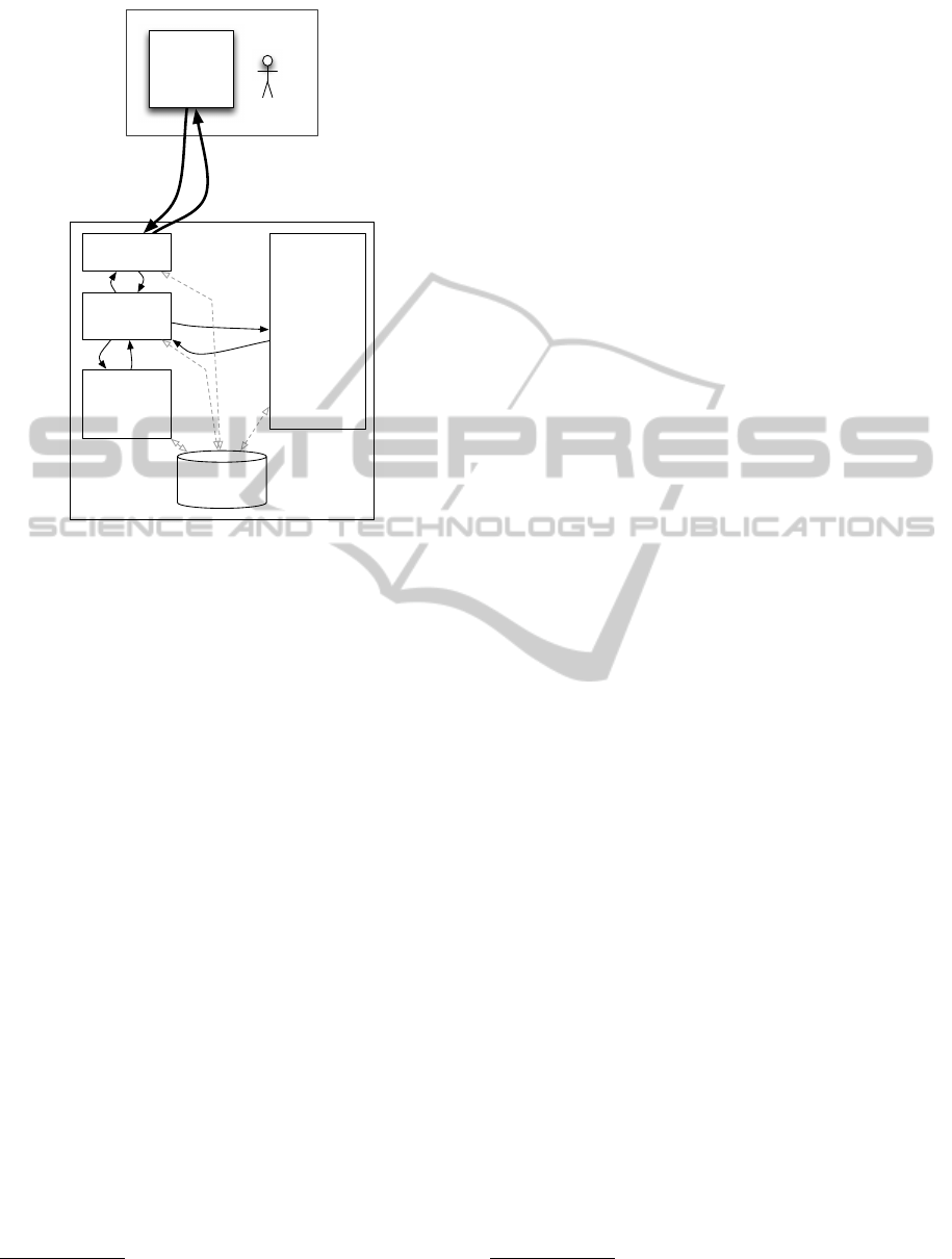
3 ARCHITECTURE
The CSWF systems is architected around two abstrac-
tions; The forecast abstraction and the forecast pre-
sentation abstraction. Due to the very different capa-
bilities of different devices it was found to be ben-
eficial to separate the forecasts themselves from the
presentation. The architecture is illustrated in Figure
1.
Forecast
Presentation
Forecasts
Local
Forecast
Collaborators
Forecasts
Amalgamated
Forecast
Figure 1: The CSWF system architecture.
The forecast abstraction deals with everything
about production, collaboration, processing and stor-
age of local forecasts, forecasts from collaborating
users and amalgamated forecasts. This abstraction en-
capsulates the most computing intensive parts of the
system and are meant to be located on one or more
stationary computers under the users control.
The forecast presentation abstraction provides the
user interface to the CSWF system. This part of the
system is highly dependent on the actual device used.
The prototype uses applications on many different de-
vices from mobile telephones to large Display walls.
4 DESIGN
The design of the CSWF system is based on a client-
server model. The server is assumed located on a
computer under the user’s full control and is assumed
to be accessible from all the users devices. The design
is illustrated in Figure 2.
The user’s device communicates with the fore-
cast abstraction frontend using HTTP and a REST-full
(Fielding, 2000) API. This simplifies both the server
and the client, as no state is maintained when commu-
nicating between devices and the server.
The functionality of the home server is partitioned
into separate parts allowing for incremental develop-
ment and maintenance of the parts. Simple service
level agreements, SLA’s between the parts have been
written allowing for independent development. The
IVAPP2014-InternationalConferenceonInformationVisualizationTheoryandApplications
322
Forecast Presentation Abstraction
Client
Application
Forecast Abstraction
Synchronous
request for
forecast
Reply with
URL
to forecast
Local
Forecast
Computation
Forecast
Amalgament
Forecast
Data
Collaboration
System
Frontend
Home server
User device
Figure 2: This CSWF system design.
design also allows for the various parts of the home
server to be executed on different computers. The ex-
ecution of the numerical atmospheric model is most
likely to be done on a dedicated stationary desktop
computer, preferably with many CPUs and/or many
cores. Part of the pre-processing and preparing for vi-
sualization also requires a standard desktop computer.
5 IMPLEMENTATION
The CSWF system is a set of multi-threaded pro-
cesses. Each sub-system comprises of one or several
processes. All server processes are compiled for run-
ning on either Linux or OS X. The 3.4 version of the
WRF atmospheric model is compiled for running on a
Linux computer. When executing the CSWF system
on an OS X computer, we either compute the WRF
model on the same machine using a virtualized Linux
environment or on a separate Linux computer.
Many of the services are so lightweight that they
can even be executed on a Raspberry Pi
3
computer.
This does not include the WRF model and some of
the pre-visualization production.
The CSWF system prototype supports a limited
number of data types. The WRF model results are
stored as NetCDF files
4
. Some of the presentation ap-
3
http://www.raspberrypi.org/
4
http://www.unidata.ucar.edu/software/netcdf/
plications use KML files
5
. Other applications use im-
ages, HTML pages and simple text files. Most such
files are generated as part of the local forecast produc-
tion.
Applications for the forecast presentation abstrac-
tion have been implemented for a small range of plat-
forms and operating systems. This include applica-
tions for iPhones, iPads, mobile device web browsers,
web browsers on laptops or stationary devices and
also a simple data conversion programs to create data
usable in the standard visualizing desktop applica-
tion DIANA (Martinsen et al., 2005) developed by the
Norwegian Meteorological Institute.
The forecast presentation application is written in
Objective C for iPhones/iPads. Javascript is used to
visualize forecasts in a browser. For special devices
like a display wall, we used C++ and Python to visual-
ize the forecasts. C and Python was used for the other
processes and for controlling purposes. The WRF at-
mospheric model is mostly written in Fortran, using
MPI for internal communication.
5.1 Firewall and NAT
Access to a CSWF system at home from a roaming
mobile device is complicated because the home net-
works are often behind firewalls, and use network ad-
dress translation, NAT. The CSWF system can be ac-
cessed from devices on external networks using NAT
traversal techniques (M
¨
uller et al., 2010). In the pro-
totype, no techniques for NAT traversal are used. The
CSWF system is expected to be accessible by cor-
rect setup of firewalls, possibly using Simple Network
Management Protocol (SNMP) and Universal Plug &
Play (UPnP).
5.2 Background Data
Forecast presentation applications can request fore-
casts for any small geographical area for a 6-hour pe-
riod. The prototype is limited to an area including
Scandinavia because of limitations in disk space for
the background topographical and other data. Global
coverage of these static background data sets is freely
available, and takes around 10 GB of storage at the
current spatial resolution. With this background data
the user will have the potential of creating forecast for
anywhere on the globe. Background meteorological
data is available from many sources. The prototype
uses the global dataset from NOAA’s NOMAD
6
ser-
vice.
5
https://developers.google.com/kml/documentation/
6
http://nomads.ncep.noaa.gov/
UncertaintyEstimationandVisualizationofWindinWeatherForecasts
323
6 USER APPLICATIONS
Several prototype forecast presentation applications
for Linux, OS X and iOS have been created. Some of
these are described briefly in the following sections.
Each user will be able to use the applications on var-
ious platforms to specify and adjust the visualization
of the meteorological parameters for various specific
purposes.
The following sections presents some of the ap-
plications with focus on visualizing uncertainty in
weather forecasts from the CSWF system. All appli-
cations exist as prototypes and most are in daily use.
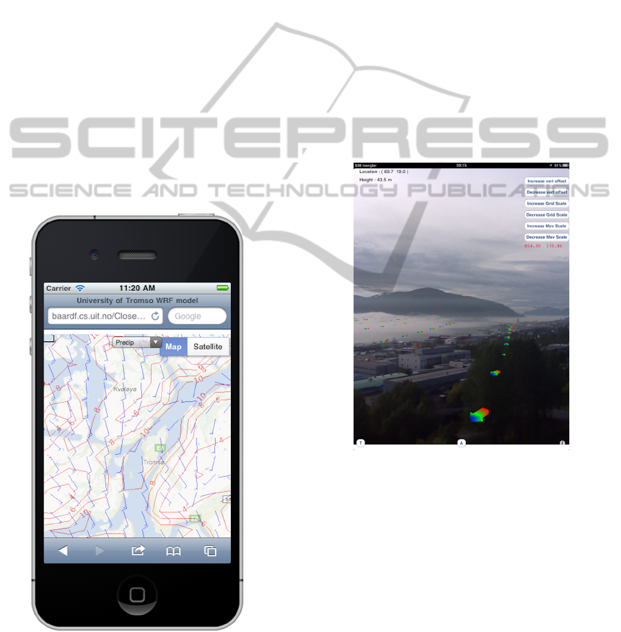
6.1 iPhone and iPad
To visualize forecasts in 2D and on typical mobile
platforms, a browser on the forecast presentation de-
vice is used. The browser runs a small Javascript vi-
sualization script that uses the Google Maps API. The
script pulls in image tiles from CSWF and renders
them on the presentation device. See Figure 3.
Figure 3: An example showing wind and temperature on a
smart phone.
An application for a tablet that shows the current
view of the back facing camera overlaid with meteo-
rological information have also been created. Using
data from the GPS, the compass and the accelerom-
eters on the device, we know where the device is lo-
cated, which way the camera is facing and the tilt of
the device.
The user can request a forecast centered on the
GPS location of a tablet, and then explore the weather
forecast by pointing the tablet’s camera into the sur-
rounding landscape to study on the tablets display the
weather forecast superimposed with the camera im-
age.
To view data from another location, the user must
physically move around. A screen shot of the applica-
tion with two different types of visualization is shown
in Figures 4 and 5. This application uses a device
with a screen size usable for detailed visualization.
The device has communication capabilities sufficient
to receive the data in KML format, and has the pro-
cessing power to do the visualization on the device.
Figure 4: Screenshot of tablet with camera and an example
of overlaid meteorological information
6.2 Home Computer
Data from the CSWF system can be visualized in a
browser or in standard visualization applications, like
the DIANA system. Visualizing the uncertainty in the
forecasts from the CSWF system can be done using
two slightly different techniques. On is utilizing all
forecast for a specific time in a classical wind rose
where the length of each arrow represents the wind
speed, and the direction represent the wind direction.
See Figure 6. Here all the forecasts are relocated to
the nearest grid point in the local forecast produced
IVAPP2014-InternationalConferenceonInformationVisualizationTheoryandApplications
324
Figure 5: Screenshot of tablet with streamlines with colored
points that can be animated to illustrate wind speed.
bye the user. All 28 available forecasts are used in the
figure.
symb−a−00 WIND.SYMB (+6) 2013−02−11 18 UTC
symb−a−02 WIND.SYMB (+6) 2013−02−11 18 UTC
symb−a−04 WIND.SYMB (+6) 2013−02−11 18 UTC
symb−a−06 WIND.SYMB (+6) 2013−02−11 18 UTC
symb−a−08 WIND.SYMB (+6) 2013−02−11 18 UTC
symb−a−10 WIND.SYMB (+6) 2013−02−11 18 UTC
symb−a−12 WIND.SYMB (+6) 2013−02−11 18 UTC
symb−a−14 WIND.SYMB (+6) 2013−02−11 18 UTC
symb−a−16 WIND.SYMB (+6) 2013−02−11 18 UTC
symb−a−18 WIND.SYMB (+6) 2013−02−11 18 UTC
symb−a−20 WIND.SYMB (+6) 2013−02−11 18 UTC
Monday 2013−02−11 18 UTC
Figure 6: Many forecasts visualized as a classical wind rose
using individual glyphs for each forecasts originating in the
same location using the local forecast grid. A legend outside
the shown area on the figure shows the length-to-speed.
One other way of illustrating the uncertainty of the
small number of forecasts is illustrated in Figure 7.
Here a small number of forecast are visualized using
the original grid from each forecast. The length rep-
resents the wind speed and the direction the wind di-
rection. As can be seen this can very easily get very
crowded and only 10 different forecasts are used in
this figure.
6.3 Display Wall
The TromsøDisplay Wall (Anshus et al., 2013) con-
sists of 28 PCs driving 28 projectors for a total screen
symb−p−20 WIND.SYMB (+6) 2013−02−11 18 UTC
symb−p−18 WIND.SYMB (+6) 2013−02−11 18 UTC
symb−p−16 WIND.SYMB (+6) 2013−02−11 18 UTC
symb−p−14 WIND.SYMB (+6) 2013−02−11 18 UTC
symb−p−12 WIND.SYMB (+6) 2013−02−11 18 UTC
symb−p−10 WIND.SYMB (+6) 2013−02−11 18 UTC
symb−p−08 WIND.SYMB (+6) 2013−02−11 18 UTC
symb−p−06 WIND.SYMB (+6) 2013−02−11 18 UTC
symb−p−04 WIND.SYMB (+6) 2013−02−11 18 UTC
symb−p−02 WIND.SYMB (+6) 2013−02−11 18 UTC
symb−p−00 WIND.SYMB (+6) 2013−02−11 18 UTC
Monday 2013−02−11 18 UTC
Figure 7: Many forecasts visualized on the same time. Indi-
vidual glyphs for each forecast originating in each forecasts
grid. A legend outside the shown area on the figure shows
the length-to-speed.
size of 22Mpixels. Applications can be executed on
a PC utilizing a very large virtual VNC frame buffer
(Stødle et al., 2007) used by the 28 viewers in the
driving PCs.
Using the DIANA system allows for utilizing the
whole display for visualizing all forecasts as illus-
trated in Figure 8. One example where the very large
pixel count is used for visualizing many individual
forecasts at the same time is illustrated in Figure 9.
Figure 8: The DIANA application used on the display wall
Figure 9: Example of many forecasts at the same time on a
large display wall.
UncertaintyEstimationandVisualizationofWindinWeatherForecasts
325

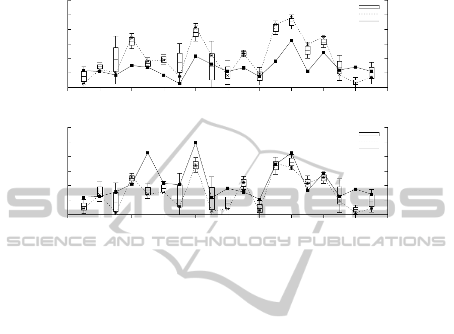
7 RESULTS
The prototype of the CSWF system demonstrates
that individually produced numerical weather fore-
casts can be combined for a better estimation of some
of the uncertainties in the forecasts. The combined
forecasts and the uncertainty estimation can be illus-
trated with Figure 10. The figure shows the observed
wind speeds at two measuring stations approximately
3 km from each other. The observed wind speed is
a solid curve. The figures also show the locally pro-
duced forecast with the dashed curve. The collabo-
rative exchanged forecasts with 27 other CSWF sys-
tems randomly spread around the location of the lo-
cal forecasts are collected, and the mean and stan-
dard deviation of the wind speed is calculated for
each point in the local forecast grid. This symbi-
otic forecast is illustrated in the Figure using a box
plot/candlestick form showing the box for ± one stan-
dard deviation, and the whiskers for ± two standard
deviations. The Figure contains 6 hour forecasts and
observations valid at 18 UTC each day.
The top part of Figure 10 shows the results from
station on top of the Island in an area with high trees.
The forecast model predicts often to strong wind.
This is the expected performance of the WRF model
in an area with increased ground-induced turbulence
from the trees.
The bottom part of Figure 10 shows the results
from the Tromsø airport. The wind gauge is situated
in an open field by the runway. The forecast model
has better skill at this station. This is also the ex-
pected performance of the model. The observed wind
speed in the lower part of the figure is clearly outside
the range from the CSWF system in only three of 19
days, and the mean of the CSWF forecasts better than
the single local forecast on all but one, days.
8 DISCUSSION
We compared actual observed values for wind speed
and direction with a single as well as a symbiotic fore-
cast. A single forecast typically does not quite match
reality. However, it is relatively close. This is a val-
idation that it is meaningful to do even a single fore-
cast, and that the approach used by CSWF to do so
is sound meteorologically. The WRF model used by
CSWF have earlier also been independently validated
(Carvalho et al., 2012). A symbiotic forecast more
often matches the actual wind than a single forecast.
Only rarely is the actual observed wind significantly
outside the uncertainty range of the symbiotic fore-
casts. A way of illustrating a single and a symbiotic
forecast against observed wind speed and directions,
is given in Figure 10. The figure visualizes the un-
certainty and distribution of the uncertainty using a
candlestick/box plot type visualization.
In Figure 10 a set of forecasts of wind speed, is
compared against the observed wind speed at a spe-
cific point in time, which is a very strict comparison.
The single local forecasts have some skill in forecast-
ing the wind speed, and the combined forecasts from
the CSWF system have even better skill.
When validating high-resolution numerical mod-
els, it is a problem that the spatial resolution may be
better than the resolution of some of the meta-data as-
sociated with the observation. In our case, the actual
geographical location of the measuring point for wind
speed at the airport was not the location given by the
meta-data. For historical reasons the location of the
meteorological stations at airports have been listed as
the location of the barometer. However, in our case
this was approximate one kilometer from the location
of the wind sensor.
Visualizing a set of forecasts from the CSWF sys-
tem using the DIANA application on a desktop com-
puter and on the large display wall illustrates the ef-
fect of the display size on the usability of the visu-
alization. The wind rose-like approach illustrated in
Figure 6 was judged as usable on both devices. The
compact form easily visualizes the complete set of 28
forecasts and the effectively illustrates uncertainty in
both wind speed and direction. The main difference
between the desktop computer and the display wall is
that on the display wall a larger area can be viewed
at the same time. A more compact glyph integrating
both variation and spread could also have been used.
Since this approach will display all forecasts, outliers
that would be masked using aggregate glyphs, are eas-
ily recognized. This is particularly noticeable in loca-
tions with large variation in wind direction. Using in-
dividual glyphs for each forecasts also allows the user
to identify possible specific dangerous combinations
of wind speed and direction, that may be masked us-
ing an aggregated glyph. The wind rose method will
of cause increase the burden on the user to interpret
the plots correctly compared to aggregated glyphs.
However, using the wind chaos approach illus-
trated in Figure 7 is very different on the two de-
vices. On the desktop, only a few of the 28 avail-
able forecasts could be usefully visualized at the same
time. With 28 forecasts simultaneously visualized,
the desktop display simply filled up with arrows, and
no pattern could be discerned. The much larger num-
ber of pixels available on the display wall allows for
much more information and allowed for all 28 fore-
casts to be shown while it was still possible to iden-
IVAPP2014-InternationalConferenceonInformationVisualizationTheoryandApplications
326
0
2
4
6
8
10
12
0 2 4 6 8 10 12 14 16 18 20
Windspeed m/s
Day, June 2013
90450 TROMSO
Symbiotic Forecasts
Local forecast
Observations
0
2
4
6
8
10
12
0 2 4 6 8 10 12 14 16 18 20
Windspeed m/s
Day, June 2013
90490 TROMSO - LANGNES
Symbiotic Forecasts
Local forecast
Observations
Figure 10: Local forecasts using dashed lines and stars, CSWF system forecasts using box plot with whiskers and observed
wind speeds using solid lines and filled rectangles. The two measuring stations are approximate 3 km apart, illustrating the
large spatial variations in model forecasts and especially in the observations.
tify areas with large variation and therefore large un-
certainty. This is also illustrated in Figure 9. This
also preserves the actual grid location of each fore-
cast, allowing for a better understanding of the spatial
distribution of the wind speed and direction.
The augmented reality see through effect using a
tablet as illustrated in Figures 4 and 5, is more re-
stricting in terms of how the uncertainty is visualized.
For each wind arrow shown in Figure 4 the Proba-
bility Density Function, PDF, of the uncertainty is
known and can be represented by, say, the standard
deviation in that point. This value can then be used
for coloring the wind arrow where the size and direc-
tion represents the values from the local forecasts. A
color gradient from green to red, representing small to
large uncertainties is therefore possible. In the same
way the streamlines illustrated in Figure 5 illustrate
the uncertainty at points in the grid by varying the
width. The direction and speed is illustrated by us-
ing colored sections that are animated moving along
the streamlines in a speed proportional to the wind
speed at that point. A possible extension would be
to implement graduated glyphs like the Noodles sys-
tem (Sanyal et al., 2010) along the streamlines. Using
individual isolines for a parameter, a contour boxplot
(Whitaker et al., 2013) could also be used for this type
of augmented reality visualization.
9 CONCLUSIONS
The two different approches for visualizing the un-
certainty of weather forecasts generated by the Col-
laborative Symbiotic Weather Forecast system clearly
have their uses in different settings and for different
purposes.
The augmented reality visualization demands that
the user is located within the forecasted area and have
good visual overview around.
The map-based visualization can be used regard-
less of actual location and is also suitable for use on
very large displays.
ACKNOWLEDGEMENTS
This work has been supported by the Norwegian Re-
search Council, projects No. 159936/V30, SHARE
- A Distributed Shared Virtual Desktop for Sim-
ple, Scalable and Robust Resource Sharing across
Computers, Storage and Display Devices, and No.
155550/420 - Display Wall with Compute Cluster.
UncertaintyEstimationandVisualizationofWindinWeatherForecasts
327

REFERENCES
Anshus, O. J., Bjørndalen, J. M., Stødle, D., Bongo, L. A.,
Hagen, T.-M. S., Liu, Y., Fjukstad, B., and Tiede, L.
(2013). Nine Years of the Tromsø Display Wall. In
CHI 2013, pages 1–6.
Brodlie, K. (2008). Uncertainty Visualization. NCRM Re-
search Methods Festival 2008.
Brodlie, K., Allendes Osorio, R., and Lopes, A. (2012). A
review of uncertainty in data visualization. In Dill, J.,
Earnshaw, R., Kasik, D., Vince, J., and Wong, P. C.,
editors, Expanding the Frontiers of Visual Analytics
and Visualization, pages 81–109. Springer London.
Carvalho, D., Rocha, A., mez Gesteira, M. G., and Santos,
C. (2012). A sensitivity study of the WRF model in
wind simulation for an area of high wind energy. En-
vironmental Modelling & Software, 33(0):23–34.
Fielding, R. T. (2000). Architectural styles and the design
of network-based software architectures. PhD thesis,
University of California, Irvine.
Fjukstad, B., Bjørndalen, J. M., and Anshus, O. (2013).
Embarrassingly Distributed Computing for Symbiotic
Weather Forecasts. In Proceedings of the Interna-
tional Conference on Computational Science, ICCS,
pages 1217–1225.
Hlawatsch, M., Leube, P., Nowak, W., and Weiskopf, D.
(2011). Flow Radar Glyphs. Static Visualization of
Unsteady Flow with Uncertainty. Ieee Transactions on
Visualization and Computer Graphics, 17(12):1949–
1958.
Lodha, S. K., Pang, A., Sheehan, R. E., and Wittenbrink,
C. M. (1996). UFLOW: visualizing uncertainty in
fluid flow. In Visualization ’96. Proceedings, pages
249–254. IEEE.
MacEachren, A. M. (1992). Visualizing uncertain informa-
tion. Cartographic Perspectives, 13(13):10–19.
Martinsen, E., Foss, A., Bergholt, L., Christof-
fersen, A., Korsmo, H., and Schulze, J.
(2005). Diana: a public domain application
for weather analysis, diagnostics and products.
http://diana.met.no/ref/0279
Martinsen.pdf.
Michalakes, J. G., McAtee, M., and Wegiel, J. (2002). Soft-
ware Infrastructure for the Weater Research and Fore-
cast Model. Presentations UGC 2002, pages 1–13.
Molteni, F., Buizza, R., Palmer, T. N., and Petroliagis, T.
(1996). The ECMWF Ensemble Prediction System:
Methodology and validation. Quarterly Journal of the
Royal Meteorological Society, 122(529):73–119.
M
¨
uller, A., Evans, N., Grothoff, C., and Kamkar, S. (2010).
Autonomous NAT Traversal. In 10th IEEE Interna-
tional Conference on Peer-to-Peer Computing (IEEE
P2P 2010). IEEE.
Pothkow, K. and Hege, H. C. (2011). Positional Uncer-
tainty of Isocontours: Condition Analysis and Proba-
bilistic Measures. Ieee Transactions on Visualization
and Computer Graphics, 17(10):1393–1406.
Sanyal, J., Zhang, S., Dyer, J., Mercer, A., Amburn, P.,
and Moorhead, R. J. (2010). Noodles: A Tool for
Visualization of Numerical Weather Model Ensemble
Uncertainty. Ieee Transactions on Visualization and
Computer Graphics, 16(6):1421–1430.
Stødle, D., Bjørndalen, J. M., and Anshus, O. J. (2007).
De-Centralizing the VNC Model for Improved Per-
formance on Wall-Sized, High-Resolution Tiled Dis-
plays. NIK.
Tukey, J. W. (1977). Exploratory data analysis. Reading.
Whitaker, R. T., Mirzargar, M., and Kirby, R. M. (2013).
Contour Boxplots: A Method for Characterizing Un-
certainty in Feature Sets from Simulation Ensem-
bles. Ieee Transactions on Visualization and Com-
puter Graphics, 19(12):2713–2722.
Wittenbrink, C. M., Pang, A. T., and Lodha, S. K. (1996).
Glyphs for visualizing uncertainty in vector fields.
Ieee Transactions on Visualization and Computer
Graphics, 2(3):266–279.
IVAPP2014-InternationalConferenceonInformationVisualizationTheoryandApplications
328
