
IPFViewer
A Visual Analysis System for Hierarchical Ensemble Data
Matthias Thurau, Christoph Buck and Wolfram Luther
Computer and Cognitive Sciences (INKO), University of Duisburg-Essen, Duisburg, Germany
Keywords:
Small Multiples, Coordinated Multiple Views, Ensemble Data, Trend Analysis.
Abstract:
Analyzing ensemble data is very challenging due to the complexity of the task. In this paper, we describe
IPFViewer, a visual analysis system for ensemble data, that is hierarchical, multidimensional and multimodal.
The exemplary data set comes from a steel production facility and comprises data about their melting charges,
samples and defects. Our system differs from existing ones in that it encourages the usage of side-by-side
visualization of ensemble members. Besides trend analysis, outlier detection and visual exploration, side-by-
side visualization of detailed ensemble members enables rapid checking for repeatability of single ensemble
member analysis results. IPFViewer supports the following data interaction methods: Hierarchical sorting and
filtering, reference data selection, automatic percentile selection and ensemble member aggregation, while the
focus for visualization is on small multiples of multiple views.
1 INTRODUCTION
Nowadays, the complexity and quantity of data sets
are increasing rapidly. Often, data collection capa-
bility exceeds the ability to analyze and visualize the
data. An ensemble data set is a multirun or multi-
value data set. In other words, it is a collection of
data sets. While all data sets use the same data struc-
ture, each of them has different values. Our system
was developed for a real-world steel production facil-
ity. As in many other industrial processes, the out-
come of the process can be influenced by hundreds of
input parameters to create product variations in accor-
dance with customer wishes. Additionally, the out-
come is influenced by natural fluctuations during the
execution of the process. To analyze how these input
parameters and fluctuations influence the process out-
come, thousands of measurements monitor both the
process and the outcome. Results of interest include
the most and least significant influential variables and
the exact influence each exerts. This may lead to a
better understanding of the production process and,
thus, to its potential improvement.
Our proposed solution can be adapted to ensem-
ble data sets from various production processes with
variations and uncertainties in their outcomes. Fur-
thermore, our system will analyze data from simula-
tions in which a model is simulated several times, of-
ten with different input parameters, resulting in multi-
ple outcomes. However, for most simulation data sets,
the dimension of time is not supported by our system
as our data set is not computer-simulated and thus can
only analyze one measured outcome.
Our novel approach to analyzing such data sets is
as follows. The hierarchical ensemble data set is a tree
of complex nodes, each one an ensemble member. All
nodes at a given level of the tree are visualized side-
by-side. Each and every node is represented by a mul-
tiple view system to deal with the high number of di-
mensions and modalities of a node. In other words,
we use small multiples of multiple views. Through
user-generated and reusable multiple-view layouts,
users can balance the various requirements on a lay-
out for differential tasks. We present interaction tech-
niques such as
• Hierarchical sorting and filtering
• User-defined reference data selection
• Automatic percentile selection
• Ensemble member aggregation
2 RELATED WORK
The visual analysis of ensemble data sets is relatively
new (Wilson and Potter, 2009). Wilson et al. pub-
lished a general overview of the challenges of ensem-
ble data sets. While most ensemble data sets are de-
259
Thurau M., Buck C. and Luther W..
IPFViewer - A Visual Analysis System for Hierarchical Ensemble Data.
DOI: 10.5220/0004668202590266
In Proceedings of the 5th International Conference on Information Visualization Theory and Applications (IVAPP-2014), pages 259-266
ISBN: 978-989-758-005-5
Copyright
c
2014 SCITEPRESS (Science and Technology Publications, Lda.)

rived from simulations, as in climate research (Nocke
et al., 2007) or automobile engineering (Matkovic
et al., 2005), our data is from a real-world production
facility containing a single outcome measurement per
production run.
Many visualization systems work with coordi-
nated multiple views (CMV) so that a great number
of publications are available (Roberts, 2007). How-
ever, we did not find any system that reuses a user-
generated multiple-view layout to visualize multiple
complex data items simultaneously in a scrollable
area. Typically, the multiple-view layout stays in
place, while users change the data it shows.
Small multiples (Tufte, 1990) visualize multiple
data items, such as ensemble members, side by side
through (typically) a single visual per item. We be-
lieve that ensemble data sets can benefit from reusing
a CMV layout multiple times in the style of small
multiples.
Systems analyzing ensemble data mostly focus
on simulated and thus time-varying data (Wilson
and Potter, 2009). Examples of such systems are
Ensemble-Vis (Potter et al., 2009) or SimEnvVis
(Nocke et al., 2007). Typically the focus is on views
of the complete ensemble data set. Variations in
the ensemble members are visualized by techniques
familiar from uncertainty visualization (Pang et al.,
1996). Small multiples are used to visualize different
time steps. The trend and plume charts in Ensemble-
Vis are comparable to our overview visualizations,
where a single data dimension is shown in compar-
ison to reference data (the other ensemble members).
However, our system is superior to available systems
in that it can conduct visual searches for interest-
ing ensemble members and trend analysis of non-
aggregated and partly aggregated ensemble members.
Also our multiple-view layouts are more flexible and
user-generated.
3 BACKGROUND AND DATA SET
Steel making is a very complex process consisting of
various stages. At each stage, the production param-
eters can vary to fulfill the wishes of differing cus-
tomers. There are thousands of grades of steel, each
having specialized properties relating to corrosion,
heat resistance, deformability, welding quality, costs
and so forth. To fulfill these differing requirements,
variations occur in the production process. There may
be variations in the process flow, whether intention-
allysuch as varying the number of production steps
in order to reduce costs, which would normally affect
the purity of the steelor unintentionallythrough mal-
functions. Also, there are variations in the process pa-
rameters, like different melting temperatures, differ-
ent material ingredients and the different timings and
durations of each production step. Additionally, the
process is subject to various natural fluctuations that
have an impact on the outcome. While the smelting
furnace should be heated to a certain temperature, it
may fluctuate by several degrees and may thus affect
the outcome. We define the process input parameters
as the combination of all the desired process input pa-
rameters and variations and also the mostly undesired
natural process fluctuations, because all these param-
eters affect the outcome.
The outcome is measured in the form of a mul-
timodal and multidimensional data set for a sample
of the finished steel slab. The steel-making facil-
ity is digitizing scientific volume data about defects
found in the steel. These defects can be impurities in
the form of nonmetallic inclusions, argon bubbles or
cracks. The volume data is analyzed in a preprocess to
create shape descriptors, which can be analyzed much
faster than the original volume data. Hence, we define
our ensemble data set as
• multidimensional (multiple process parameters,
process measurements, volume data sets, shape
descriptors of defects, statistical summaries)
• multimodal (volume data, steel surface pictures,
spectral data, statistics)
• hierarchical (three levels: melting charges, sam-
ples and defects)
Our tree has three hierarchical levels. On the first
level, there are the melting charges. For each melting
charge, thousands of input parameters are available.
On the second level, each melting charge has multiple
samples connected with it; thus, it is a family of sam-
ples. Each sample has a set of analysis results, such
as overall cleanliness or average defect size. On the
last hierarchical level, there are thousands of defects,
each having shape descriptors and a volume data set.
4 OBJECTIVES
The analysis of our ensemble data set reflects several
goals:
• identify the significance of various input parame-
ters on the output (sensitivity analysis)
• analyze those changes in detail (trend analysis),
• find relationships between different output vari-
ables
• analyze the range of outcomes (uncertainty)
• and find anomalies and outliers within the samples
for quality control purposes
IVAPP2014-InternationalConferenceonInformationVisualizationTheoryandApplications
260
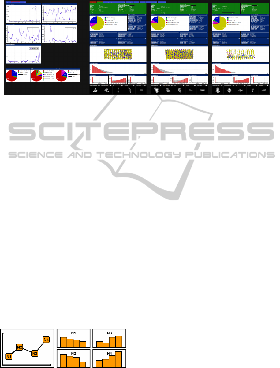
Figure 1: This screenshot shows the level of traversal set to samples. On the left, several graphs analyzing trends in various ag-
gregated values are shown. On the right, the samples of the current data tree are visualized in depth. Each sample is presented
in multiple views consisting of various visualization types and data from different hierarchical levels (context+details).
Some of the phenomena under observation in our spe-
cific data set are listed below. They can be analyzed
with our system.
• Defects floating in the liquid steel may have an
ascending force, like that of bubbles in sparkling
water. As a result, since the outermost layer of
the steel slab solidifies first when it meets a lower
ambient temperature, defects should be trapped in
the so-called inclusion band, which is located in
the surface of the slab. The larger a defect is,
the greater its ascending force and therefore the
higher its position in the inclusion band.
• Other properties that may influence the position
of defects are sphericity (form descriptor), type of
defect, and properties inherited from the melting
charge, such as material ingredients or the dura-
tion of the oxygen blowing process.
• With certain types of defects, the defects size may
correlate with its sphericity, again like bubbles in
sparkling water. The bigger the defect is, the more
nearly spherical it will be.
• A more complex relation may be the melting tem-
perature in combination with the defects position.
Because initial temperature determines how long
steel remains molten, the degree of influence the
defect’s size on its position may vary.
Figure 2: An overview showing aggregated nodes, while
small multiples showing more detailed data.
5 SYSTEM DESCRIPTION
The first idea is to have small multiples as well as an
overview as shown in fig. 2. On the right side, there
is a typical small multiple visualization. Each of the
so-called multiples is a histogram. This indicates that
there is already some kind of hierarchical data. There
are n nodes, each having multiple data points attached
to it. The overview to the left does not show the nodes
as a complex visualization, instead, the child data for
each node are aggregated to a single value, which then
can be plotted. Each data point in the plot is one (ag-
gregated) node.
Both visualizations have advantages and disad-
vantages. The overview is good, when there is a
meaningful method of aggregation. Therefore, in-
stead of showing multiple histograms, a graph show-
ing only average values can be beneficial as users can
interpret that very quickly. The disadvantage, how-
ever. is the loss of information. The original data,
shown as histograms, reveal more information, which
may also be interesting. While most ensemble visual-
ization systems focus on such aggregated overviews,
we want to offer an alternative and focus on the more
detailed multiples.
In summary, when there is a level of traversal t,
which is the level of interest in the tree, then the small
multiple visualization show each multiple tn in a sep-
arate visualization by using child data from level t+n.
In contrast, the overview visualization shows all mul-
tiples tn in a single visualization. Each data point is
an aggregation of all the children of tn.
The described example showed a one-dimensional
data set. This could have been the defect sizes for
all samples in the histograms and the average defect
size in the overview. However, in our real-world data
IPFViewer-AVisualAnalysisSystemforHierarchicalEnsembleData
261
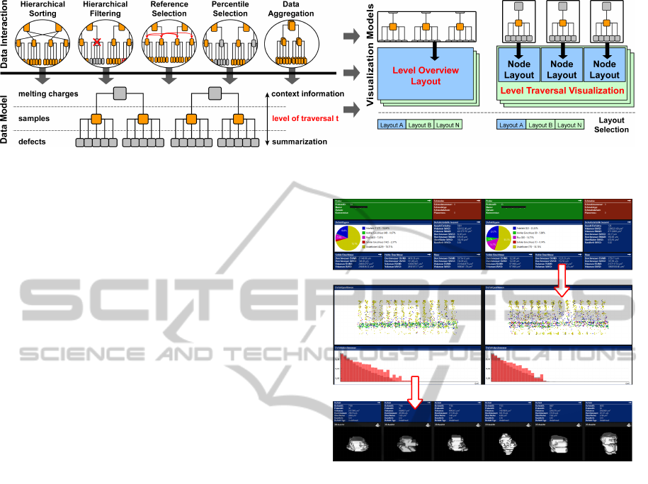
Figure 3: The system architecture has a data tree in the center, the main data model. Several data interactions are available for
manipulating that tree. The resulting tree is visualized by two distinct visualizations.
set, we have many more data dimensions, modalities
and hierarchies. Using multiple views is a popular
way to handle such complexities. Therefore, we en-
hanced our system to use multiple-view systems for
the overview visualization and the small multiples as
shown in fig. 1. On the left, multiple aggregated di-
mensions are shown in the level overview and on the
right, there are the small multiples, each of which
is a multiple-view system. As these multiples are
no longer necessarily small, we call the visualization
level traversal visualization. A more detailed descrip-
tion of the visualizations will follow in subsection 5.2.
5.1 Interaction Techniques
Fig. 3 shows the complete system. It reveals that there
is a single data model. This means that the nodes in
the overview and the level traversal visualization are
in the same order. Moreover, filtering nodes will af-
fect both visualizations. The following sections will
explain the interaction techniques in greater detail.
5.1.1 Navigating and Searching
Using visuals, such as histograms, to search can be
highly beneficial because humans can interpret them
much more quickly than they can lists of values.
The visual search is comparable to modern image
browsers, where files are mapped to a grid of pictures
to support the user in finding an image of interest. Our
system does the exact same thing with visuals of en-
semble data.
There are two ways to traverse the tree of a hier-
archical ensemble data set. A traditional file browser
traverses from the top of the tree to the bottom by se-
lecting a node on each level. This can be done in our
system: All melting charges are presented in a grid
in a scrollable area (fig. 4, top). Summarized statis-
tical data from each sample related to that melting is
displayed. After a melting charge has been selected,
the samples that are the children of the selection are
shown (fig. 4, middle). After selecting a sample,
Figure 4: A multi-level navigation from meltings to samples
and then to defects.
all its defects can be browsed (fig. 4, bottom). This
is a typical multi-level navigation (Streit and Schulz,
2009).
Another way to search nodes of interest is to use a
level traversal, that is, to traverse the tree from side to
side. This may be beneficial when the user is search-
ing for a specific characteristic in a level, for exam-
ple, a specific distribution of defects. In this case, the
parent node is not of interest and thus the navigation
process does not start on the top level but on the level
of interest.
5.1.2 Hierarchical Filtering
To limit the number of visible nodes, filters can be ap-
plied. First, an attribute is selected from a list of avail-
able attributes. Here, attributes from all hierarchical
levels are offered. Filtering out parent nodes in a tree
will also filter out their children. Additionally, an ag-
gregation method is used when an attribute has been
chosen from a level that is lower than the current level
of traversal. In this case, multiple values would exist
for the specified attribute (one for every child node),
IVAPP2014-InternationalConferenceonInformationVisualizationTheoryandApplications
262
and therefore it has to be coupled with an aggregation
method such as sum, count, avg, min, max or median.
Statistical methods utilizing more than one attribute
can also be used, such as correlation, variance, co-
variance, regression etc. Aggregation is carried out
using SQL implementation. Additional aggregation
methods can be added directly into SQL. Once the
attribute selection has been defined to gain a single
value, an operator and a value for a comparison can be
set. It is also possible to create filters based on basic
existential quantifications like ”there is at least one”
or ”there are none” and to use multiple filters. One
example of this is the filtering of samples that have an
average defect diameter smaller than 50 of µm.
5.1.3 Hierarchical Sorting
Additionally, the nodes can be sorted. Here again,
attributes from higher levels or the current level of
traversal can be used, as can aggregated values from
lower levels. Reordering the nodes on any level of
a tree will, of course, also reorder their children on
lower levels. The main purpose of sorting the nodes
on the screen is to enable trend analysis, as shown in
fig. 5.
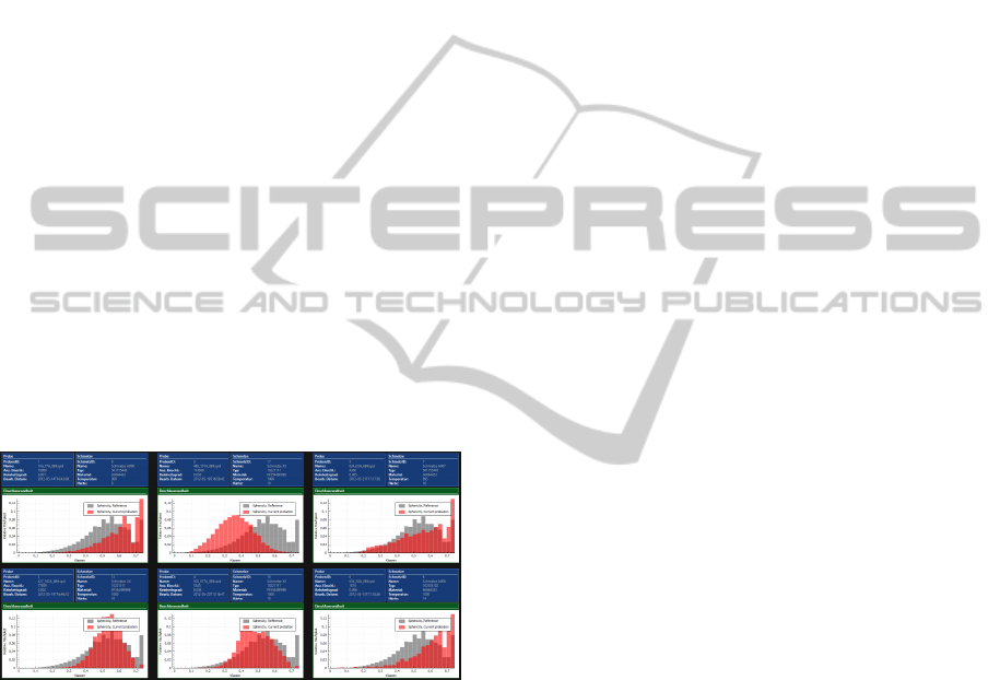
5.1.4 Reference Visualization
Figure 5: Several samples presented by histograms to allow
trend analysis. The red bars visualize the distribution of the
defects sphericity in the sample, and the grey bars visualize
the same data dimension from reference data.
Often, the significance of data is only visible in
comparison with other data. This is especially true
for ensemble data sets. What is the best way to clas-
sify the results of the current visible ensemble mem-
ber? This may be very difficult and at best visible to
a domain expert. To ease the classification, ensemble
data sets are commonly compared to reference data
(Kehrer and Hauser, 2013). The histograms in fig. 5
reflect the sphericity (shape descriptor) of the defects
for some samples. While the classification of the data
for one sample (the red bars) is not self-explanatory, it
is easy when the sample is compared to the reference
data (the grey bars). A more expressive alternative is
box plots (Mcgill et al., 1978). They display not only
the average [delete as a reference], but also the min-
imum, maximum and mean as well as further quar-
tile information. Thus, users can also see how far the
sample data lies outside of an uncertainty boundary.
5.1.5 Reference Selection
The interesting question is what to define as refer-
ence data. Within our ensemble data set from the
steel production facility, there are hundreds of differ-
ent grades of steel. For each the amount, distribution
and size of defects vary a great deal per definition.
On the other hand, only samples that have roughly the
same melting temperature are comparable as that pro-
cess parameter influences the defects so much. Ob-
viously, finding the right reference data is something
that needs to be flexible and may vary from applica-
tion to application and even from investigation to in-
vestigation.
Within our system, users define the reference data
by simply defining a list of attributes that have to
be equal. Thus, for the level traversal visualization,
where each sample is shown in a gallery, an attribute
name for the reference data may be the steel grade.
Our system will automatically fill the reference data
for each sample, so that only data from the same grade
as the individual sample is shown. When the attribute
is not categorical but numerical, an interval size or tol-
erance can be defined additionally; for example, the
user might stipulate that, besides adding only samples
with the same steel grade to the reference data, those
samples also have to have the same melting tempera-
ture, plus/minus 100 degrees.
5.1.6 Percentile Selection and Aggregation
Human perception is limited. Thus, one objection
to our system might be that the many millions of
nodes exceed the human users ability to analyze them.
While the perceptual overload regarding the visual-
izations of a single node can be solved by adopting the
multiple-view layout, there are two solutions avail-
able for dealing with the large number of nodes in
data space.
First, the number of nodes can be limited so that
only certain percentiles are visible. This can help in
the case of trend analysis. While including the com-
plete gallery of nodes may result in the visualization
of only small, nearly imperceptible changes from one
node to the next, presenting only a sampling of the
nodes (percentiles) may lead to the visualization of
more considerable changes. However, it is possible
that outliers might be included in the sample, render-
ing accurate trend analysis more difficult.
IPFViewer-AVisualAnalysisSystemforHierarchicalEnsembleData
263

Second, multiple nodes can be aggregated. While
this method is more secure against outliers, it can be
very slow when many millions of nodes have to be
aggregated and are visible at the same time. How-
ever, it can be done when the nodes have already been
filtered to a smaller number or when the number of
percentiles is high; for instance, aggregating tens of
nodes performs well and is more secure regarding out-
liers because it makes checking the area neighboring
percentiles less important. There is still a lot of work
ahead regarding data aggregation. While we imple-
mented aggregation of multiple nodes for histograms,
scatter plots and statistical summaries, we are still
working on aggregation methods for images and vol-
ume data.
5.2 Visualization
After describing the data interaction capabilities, the
description of the visualizations follows. It is com-
mon to visualize different hierarchical levels side by
side to support analysis (Kehrer et al., 2011)(Guo
et al., 2011). The level overview serves as an
overview of the selected level of traversal, while the
level traversal visualization shows detailed data of
level t+n about each node. There are various visual-
ization techniques that try to deal with the data com-
plexities that occur. There exists a great overview of
how to deal with multifaceted scientific data (Kehrer
and Hauser, 2013). We decided to use coordinated
multiple views as they are very flexible and can play
a variety of roles. Flexibility is very important as
there exists no one layout that is optimal for every
task (Wilson and Potter, 2009). This is not only true
for general multidimensional data sets, but also for the
range of tasks with which our system can assist.
To support users, our system can save user-
generated multiple-view layouts. Once a layout has
proven useful, it can be assigned a name and saved so
that it can be reused at a later time. While browsing
the nodes, changing the layouts is always possible by
clicking on the list of layout names at the top of the
visuals. While this is also possible in other systems,
like Microsoft Visual Studio
1
or Eclipse
2
, it is not yet
common in information visualization systems. One
reason for that may be the number of heterogeneous
data sets. A layout can only be reused for the same
data set or other data sets using the same data struc-
ture. Since the latter is the case for ensemble data
sets, quick access to predefined layouts is very bene-
ficial as it saves a lot of time that would otherwise be
spent re-creating layouts.
1
http://www.microsoft.com/visualstudio/
2
http://www.eclipse.org/
The user can choose from a range of visualization
options, including histogram, graph, pie chart, scat-
ter plot, text area, image and volume rendering. Two
resources of particular note in this regard are State
of the Art: Coordinated and Multiple Views in Ex-
ploratory Visualization (Roberts, 2007) and Guide-
lines for Using Multiple Views in Information Visual-
ization (Wang Baldonado et al., 2000). Because the
layouts are flexible and user generated, we do not
want to present specific layouts. Instead, we want to
describe the diverse requirements for the three tasks
our system supports: single node analysis, checking
for repeatability and trend analysis.
5.2.1 Single Node Analysis
Fig. 6 (left) shows a typical layout for analyzing one
individual node. The emphasis is on only one node;
neighboring nodes are not important. Thus, a lot of
screen space is used to visualize various aspects of
the hierarchical and multidimensional node in various
views. Multiple views are needed because the knowl-
edge about what data is interesting is not yet avail-
able. Context information, mostly textual, from par-
ents is shown, as are aggregated data and statistical
visuals about children. Also, simple data mining of
interesting nodes can be conducted to show anoma-
lies; for example, one might chose to visualize the
volume data of the largest defect or longest crack be-
cause they represent the greatest deterioration in steel
quality. This can be expressed with functions like
min, max, median, percentile etc. The use cases for
this layout role are
• generating a general hypothesis, which can be ap-
proved using neighboring nodes
• finding relationships between data dimensions,
like the influence of the defect volumes on the de-
fect positions
• finding anomalies and outliers that need further
investigation
• control of the current node, such as comparing the
outcome to a reference outcome
• and rapid assessment of the significance of indi-
vidual nodes, which is invaluable in cases such as
navigation of production outcomes
5.2.2 Checking for Repeatability
This functionality is often used right after the analy-
sis of a single node as described above. The result of
the initial analysis can be compared to other nodes. Is
the relationship between two variables or views also
visible in other ensemble members? The layouts can
IVAPP2014-InternationalConferenceonInformationVisualizationTheoryandApplications
264
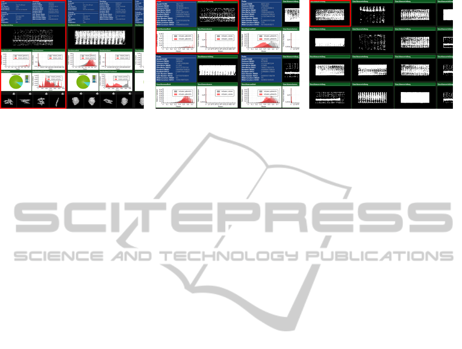
Figure 6: Three different layout examples created for single node analysis, checking for repeatability and trend analysis.
be smaller and represent only that aspect of the data
that needs to be proven for repeatability, as shown in
fig. 6 (middle). In comparison to trend analysis, the
attention lies not on the differences between multi-
ple nodes, but on individual nodes examined one at
a time. Thus, multiple views are arranged to sup-
port each other. Filtering and sorting nodes is of great
importance in order to analyze whether the observed
result from one node is likely to be present in other
nodes, for example, it may depend on the steel grade
or the melting temperature.
5.2.3 Trend Analysis
Differences between nodes can be analyzed for trend
analysis. Here, the focus is not just on whether a given
characteristic can be found multiple times, but on the
degree to which that characteristic changes depending
on input parameters. Therefore, the nodes are sorted
according to those parameters and the data character-
istic of interest visualized. Various sort attributes can
be tested to find relationships and trends. Often, this
is done with single repeated visuals (small multiples).
However, using multiple views per node reveals
another dimension of relationships. When one data
dimension influences another data dimension in a sin-
gle node, the range of that influence may in turn be
influenced by some input parameter. For instance, the
position of a defect can be influenced by its size be-
cause larger defects rise faster while the steel is liquid.
However, because the initial temperature determines
the duration of the liquidity state, the degree of that
influence may vary.
6 IMPLEMENTATION
The system is implemented in C++ with the help of
OpenGL, Qt and vtk. The volume data is stored in
HDF5 files, while the rest of the data is stored in
a PostgreSQL database. The layout definitions are
saved as XML and contain visualization properties
(sizes, colors, etc.) and the names of SQL tables,
columns and aggregate functions to use. The system
data model queries the SQL table of interest (level
of traversal) and then adds those results (row defini-
tions) to the queries coming from the layouts. The vi-
sualizations are rendered through a render-to-texture
function, so that scrolling leads to a simple redraw of
a texture instead of a repaint of traditional windows.
View Frustum Culling enables the system to handle
multiple millions of nodes side by side. The system is
also extensible to more than three hierachical levels.
7 USER FEEDBACK
We collected feedback from the staff of the steel pro-
duction facility and also from information visualiza-
tion experts. Reactions were positive. Comparable
visualization systems focus on the creation of visual-
izations. Thus, once users create a visualization, they
switch between ensemble members manually to up-
date the data shown, for instance, selecting the en-
semble members in a text-based table view. With our
system, every layout change is seen directly for multi-
ple ensemble members. When a visualization appears
uninteresting, users can check other ensemble mem-
bers very quickly to verify this impression. This is
done either by scrolling or by setting up the layout in
such a way that multiple ensemble members can be
seen simultaneously.
The staff of the steel production facility had origi-
nally worked with static data reports, which had to be
opened one at a time. With our system, they were able
to create a node layout that provided the same infor-
mation as their previous reports. They can now search
much faster for specific characteristics and outliers in
the reports through sorted and filtered side-by-side vi-
sualizations, which also include up-to-date reference
data. While there are still disagreements over which is
the best layout to use, there is general agreement that
our system is useful and the staff were quick to adopt
it. Regarding choice of layout, since different groups
IPFViewer-AVisualAnalysisSystemforHierarchicalEnsembleData
265

have different expectations about content and visual-
izations, they defined different user groups, each with
their own set of layouts.
Regarding the more complex use cases, we plan
to conduct a user evaluation in future. While small
multiples in general have proven to be effective in
many situations (Archambault et al., 2011), it is un-
known how well they cooperate with multiple views.
Through small multiples of multiple views, users can
examine more complex relationships. For instance,
when a multiple view layout of one node reveals a
relationship between two data dimensions, how can
users perceive trends between multiple nodes within
that relationship? How does the influence of a de-
fects size on its position change as the temperature
of the melting charge increases? The influence may
be higher at higher melting temperatures. We plan
to publish a systematic expert and user evaluation to
study the strengths and weaknesses of our approach
in detail.
8 CONCLUSIONS AND FUTURE
WORK
In this paper, we have presented IPFViewer, a sys-
tem for visual analysis of hierarchical ensemble data.
Through the combination of small multiples with
multiple views and combining multiple hierarchical
levels, users can create multiple aggregated and non-
aggregated visualizations. Since layouts are user gen-
erated, the system is very flexible and can support
various analysis tasks. While we presented some ex-
amples to show the usefulness of our approach, the
full potential remains to be proven in a comprehen-
sive user evaluation. Newly developed high-density
displays and display grids are an especially useful ad-
dition to our system. The number of ensemble mem-
bers and the views themselves can be scaled to fit the
visible screen area. In future work, we will extend the
capabilities in areas of uncertainty visualization and
data aggregation.
REFERENCES
Archambault, D., Purchase, H., and Pinaud, B. (2011). An-
imation, small multiples, and the effect of mental map
preservation in dynamic graphs. IEEE Transactions
on Visualization and Computer Graphics, 17(4):539–
552.
Guo, H., Wang, Z., Yu, B., Zhao, H., and Yuan, X. (2011).
Tripvista: Triple perspective visual trajectory analyt-
ics and its application on microscopic traffic data at a
road intersection. In Pacific Visualization Symposium
(PacificVis), 2011 IEEE, pages 163–170.
Kehrer, J. and Hauser, H. (2013). Visualization and visual
analysis of multifaceted scientific data: A survey. Vi-
sualization and Computer Graphics, IEEE Transac-
tions on, 19(3):495–513.
Kehrer, J., Muigg, P., Doleisch, H., and Hauser, H. (2011).
Interactive visual analysis of heterogeneous scientific
data across an interface. IEEE Transactions on Visu-
alization and Computer Graphics, 17(7):934–946.
Matkovic, K., Jelovic, M., Juric, J., Konyha, Z., and Gra-
canin, D. (2005). Interactive visual analysis end
exploration of injection systems simulations. In
C. T. Silva, E. Gr
¨
oller, H. R., editor, IEEE Visualiza-
tion 2005, pages 391–398. IEEE.
Mcgill, R., Tukey, J. W., and Larsen, W. A. (1978).
Variations of box plots. The American Statistician,
32(1):12–16.
Nocke, T., Flechsig, M., and Bohm, U. (2007). Visual ex-
ploration and evaluation of climate-related simulation
data. In Simulation Conference, 2007 Winter, pages
703–711.
Pang, A. T., Wittenbrink, C. M., and Lodh, S. K. (1996).
Approaches to uncertainty visualization. The Visual
Computer, 13:370–390.
Potter, K., Wilson, A., Bremer, P.-T., Williams, D., Dou-
triaux, C., Pascucci, V., and Johnson, C. (2009).
Ensemble-vis: A framework for the statistical visu-
alization of ensemble data. In Data Mining Work-
shops, 2009. ICDMW ’09. IEEE International Con-
ference on, pages 233–240.
Roberts, J. (2007). State of the art: Coordinated multi-
ple views in exploratory visualization. In Coordi-
nated and Multiple Views in Exploratory Visualiza-
tion, 2007. CMV ’07. Fifth International Conference
on, pages 61–71.
Streit, M. and Schulz, H.-J. (2009). Towards multi-user
multi-level interaction. Collaborative Visualization on
Interactive Surfaces-CoVIS’09, page 5.
Tufte, E. (1990). Envisioning information. Graphics Press,
Cheshire, CT, USA.
Wang Baldonado, M. Q., Woodruff, A., and Kuchinsky, A.
(2000). Guidelines for using multiple views in infor-
mation visualization. In Proceedings of the working
conference on Advanced visual interfaces, AVI ’00,
pages 110–119, New York, NY, USA. ACM.
Wilson, A. T. and Potter, K. C. (2009). Toward visual anal-
ysis of ensemble data sets. In Proceedings of the 2009
Workshop on Ultrascale Visualization, UltraVis ’09,
pages 48–53, New York, NY, USA. ACM.
IVAPP2014-InternationalConferenceonInformationVisualizationTheoryandApplications
266
