
Role of Human Perception in Cluster-based Visual Analysis of
Multidimensional Data Projections
Ronak Etemadpour
1
, Robson Carlos da Motta
2
, Jose Gustavo de Souza Paiva
3
, Rosane Minghim
2
,
Maria Cristina Ferreira de Oliveira
2
and Lars Linsen
1
1
Jacobs University Bremen, Bremen, Germany
2
Universidade de S
˜
ao Paulo, S
˜
ao Carlos, Brazil
3
Federal University of Uberl
ˆ
andia, Uberl
ˆ
andia, Brazil
Keywords:
Projections, Multidimensional Data, Perception-based Evaluation.
Abstract:
Visualization of high-dimensional data requires a mapping to a visual space. Whenever the goal is to preserve
similarity relations, multidimensional projections or other dimension reduction techniques are commonly used
to project high-dimensional data point to a 2D point using a certain strategy for the 2D layout.Typical analysis
tasks for projected multidimensional data do not necessarily match the expectations of human perception.
Learning more about the effectiveness of projection layouts from a users perspective is an important step
towards consolidating their role in supporting visual analytics tasks. Those tasks often involve detecting and
correlating clusters. To understand the role of orientation and cluster properties of size, shape and density, we
first conducted a study with synthetic 2D scatter plots, where we can set the respective properties manually.
Then we picked five projection methods representative of different approaches to generate layouts of high
dimensional data for two domains, image and document data. The users were asked to identify the clusters
on real-world data and answers to questions were compared for correctness against ground truth computed
directly from the data. Our results offer interesting insight on the use of projection layouts in data visualization
tasks.
1 INTRODUCTION
Multidimensional data analysis aims to verify the ex-
istence of patterns and trends in sets of instances,
by the detection of the overall data distribution, and
by the observation of clusters or correlations. This
analysis can be visually performed by the use of
information visualization techniques. Multidimen-
sional projections are examples of these techniques,
in which the original dimensions are projected to a
lower-dimensional space (typically 2D), and the in-
stances are then displayed as 2D scatter plots. This
mapping process inevitably leads to information loss,
and different strategies can be applied to develop pro-
jection methods that preserve certain properties of the
data distribution. Often a compromise between dif-
ferent design goals is necessary. In this sense, the
quality of the projected views can be analyzed by esti-
mating how well certain design goals were met. Such
quality measures are typically based on distances be-
tween points in the multidimensional space and the
projected space. What is often neglected however is
the fact that the projected views are interpreted by hu-
mans, and that a natural mathematical formalization
may not suffice to guarantee that the automatic evalu-
ations of clusterings will seem natural to the users.
The goal of this paper is to investigate the role
of human perception when analyzing projected views.
Our hypothesis is that cluster properties affect the hu-
man interpretation. For example, we assume that dis-
tance may be perceived incorrectly because of percep-
tional cues being triggered. In particular, we focus on
the role of cluster density, shape, size, and orientation
when performing typical visual analysis tasks.
To investigate the perceptual factor, we formulated
hypotheses, see Section 3, and conducted a user study
to test against them. Subjects were asked to per-
form typical visual analysis tasks on project views,
which have been obtained by applying a representa-
tive selection of projection methods to multidimen-
sional data sets from two domain. For several aspects,
it was important to only modify one cluster property,
while keeping the others unchanged. Since this is ba-
sically impossible to achieve with real data projec-
tions, we had to rely on some synthetically generated
scatterplots, see Section 4. We performed a statistical
analysis of the outcome of the user study. Section 5
presents our findings and conclusions.
276
Etemadpour R., Carlos da Motta R., de Souza Paiva J., Minghim R., Ferreira de Oliveira M. and Linsen L..
Role of Human Perception in Cluster-based Visual Analysis of Multidimensional Data Projections.
DOI: 10.5220/0004682102760283
In Proceedings of the 5th International Conference on Information Visualization Theory and Applications (IVAPP-2014), pages 276-283
ISBN: 978-989-758-005-5
Copyright
c
2014 SCITEPRESS (Science and Technology Publications, Lda.)

2 RELATED WORK
Multidimensional projection techniques can be di-
vided into two major groups namely linear and non-
linear projection techniques. Linear projection tech-
niques create linear combinations of the data at-
tributes, defining them in a new orthogonal basis of
lower dimensionality. Among such techniques, PCA
(Principal Component Analysis) (Jolliffe, 1986) is of-
ten employed to generate similarity layouts by reduc-
ing data to two or three dimensions. Nonlinear tech-
niques attempt to minimize a function of the informa-
tion loss incurred by the projection. Normally, this
function is based on the dissimilarities among the in-
stances or on distances among the multidimensional
points. Non-linear projection techniques can be estab-
lished using Multidimensional Scaling (MDS) (Borg
and Groenen, 2010) that aims at maintaining dis-
tances within a cluster. Isomap is a method that ex-
tends the metric of multidimensional scaling (MDS)
by incorporating the geodesic distances imposed by
a weighted graph and tries to maintain distances be-
tween clusters according to that metric (Tenembaum
et al., 2000). Here and within our paper, a cluster
refers to a subset of the multidimensional data points
that are similar to each other and dissimilar to points
not belonging to the subset. Force-directed place-
ment approaches are a class of algorithms for draw-
ing graphs. Their purpose is to position the nodes of
a graph such that all the edges are connected with a
virtual spring of length proportional to the distance
between the corresponding data points. A spatial em-
bedding is obtained with an iterative simulation of the
spring forces acting on this hypothetical physical sys-
tem by assigning forces to the set of edges and nodes
based on their relative positions and using these forces
to simulate the motion of the edges and nodes or to
minimize their energy.
Many numerical measures have been introduced
to estimate the quality of layouts produced by pro-
jection methods. Estimates such as the silhouette co-
efficient (Tan et al., 2005) combine concepts of both
cohesion and separation for both individual points and
clusters. For an individual point i, it calculates a factor
a as an average distance of i to the points in its clus-
ter and a factor b as the minimum average distance of
i to points in another cluster. The silhouette coeffi-
cient for a point is then given by S = 1 −
a
b
if a < b or
S =
a
b
− 1 if a ≥ b. The value lies between 0 and 1,
where higher values imply performance. Neighbor-
hood hit (Paulovich et al., 2008) evaluates the projec-
tions capability of preserving the neighborhood rela-
tionships among the points. Several approaches for
selecting good layouts have been proposed, including
visual approaches that plot quality measures in graph-
ical form. The correlation coefficient (Geng et al.,
2005) between the distance vectors, that contain the
distances between all pairs of points, provide a mea-
surement of the validity by evaluating distances. Be-
trini et al. (Bertini et al., 2011) started a collection of
quality metrics in high-dimensional data visualization
that have been used in a variety of contexts and pur-
poses and provided a way to reason about their char-
acteristic features. Authors presented an analysis of
the visualization techniques, the quality metrics, and
the processing pipeline. They derived a set of factors
for discriminating the quality metrics, visualization
techniques, and the process. However, the perceptual
factor in interpreting the projected views has majorly
been neglected in all these numerical measures.
Rensink and Baldridge (Rensink and Baldridge,
2010a; Rensink and Baldridge, 2010b) presented a
rigorous way to evaluate the visual perception of
correlation in scatter plots based on classical psy-
chophysical methods originally developed for simple
properties such as brightness. The scatter plots were
considered containing 100 points with a bivariate nor-
mal distribution. Means were 0.5 of the range of
the points, and standard deviations 0.2 of this range.
Precision as well as accuracy over all correlations of
the scatter plots have been described by two related
functions governed by two parameters. Accuracy was
measured using reference scatter plots with fixed up-
per and lower values, with a test scatter plot adjusted
so that its correlation appeared to be halfway between
these. Results of the discrimination tests has shown
that just noticeable differences in correlation can be
described by a variability parameter and an offset pa-
rameter. Authors believe that precision is proportional
to offset and accuracy is proportional to the logarithm
of this quantity. Their approach did not consider vi-
sual analysis task though.
Tatu et al. (Tatu et al., 2010) investigated quality
measures computed from projections from a user per-
ception perspective. In their user study, subjects were
confronted with a set of 18 scatter plots and asked
to select and rank the five most useful ones for the
task of best separating three given classes encoded by
color, considering a single data set. They did not look
into arbitrary multidimensional data projections. Al-
buquerque et al. (Albuquerque et al., 2011) attempted
to find a perception-based quality measure for scat-
ter plots, constructing a perceptual embedding for the
different projections based on the data from a psy-
chophysics study and multidimensional scaling. This
embedding together with a ranking function was then
used to estimate the value of the projections for a
specific user task in a perceptual sense. This rank-
RoleofHumanPerceptioninCluster-basedVisualAnalysisofMultidimensionalDataProjections
277

ing evaluates scatter plots for finding correlation be-
tween the dimensions and separation between classes.
Sedlmair et al. (Sedlmair et al., 2012) proposed a tax-
onomy of visual cluster separation factors in scatter
plots and presented an in-depth qualitative evalua-
tion of two recently proposed and validated separa-
tion measures. They found that quality assessment of
cluster separation by these measures was highly dis-
crepant with human assessments obtained from sys-
tematic inspection by two researchers with the mea-
sures showing a high number of failure cases. In their
qualitative data study, two investigators visually in-
spected over 800 plots to determine whether or not
the measures created plausible results. Their cate-
gories is split into within-cluster and between-cluster
factors and ordered by their ability to influence scale,
point distance, shape, and position. This work is
most closely related to ours, as we are considering the
role of cluster properties when interpreting projected
views. We enhance their findings by evaluating the
factors that influence the perception.
Concerning the role of rotation of scatter plots and
shape of clusters in 2D layouts, it is worth mention-
ing the work by Healey et al. (Healey et al., 1996)
on pre-attentive features with respect to orientation
as well as the Gestalt laws presented by Ware (Ware,
2000), respectively. Healey et al. believe that stud-
ies from pre-attentive vision can assist in the design
of visualization tools. They have tested visual fea-
tures that can be detected in this way, orientation and
hue, that caused rapid and accurate numerical estima-
tion. Furthermore, random variation in one of these
features resulted in no interference when subjects es-
timated the percentage of the other. There has also
been some fundamental work on the Gestalt princi-
ples within the cognitive psychology community that
relate to our work. The Gestalt principles describe
psychological phenomena underlying human percep-
tion of given tasks by viewing them as organized and
structured wholes. For the detection of non-spherical
clusters, various researchers sought more robust ways
to identify arbitrarily shaped clusters rather than the
sum of their constituent parts computationally.
Ahuja et al. (Ahuja and Tuceryan, 1998) studied
a computational approach presented to extract basic
perceptual structure or the lowest level grouping in
dot patterns aiming at extracting the perceptual seg-
ments of dots due to their relative locations. The
grouping was seeded by assigning to dots their lo-
cally evident perceptual roles and iteratively modi-
fying the initial estimates to enforce global Gestalt
constraints. The result was a partitioning of the dot
pattern into different perceptual segments or tokens
and the grouping was accomplished by interpreting
dots as belonging to interior or border of a perceptual
segment, being along a perceived curve, or being iso-
lated. At the lowest perceptual level the segments of
dots grouped together, because of their relative loca-
tions. Mayorga and Gleicher (Mayorga and Gleicher,
2013) provided a new technique for displaying point
data that scales well with the number of points. They
believed that scatter plots suffer from overdraw as the
number of points per unit area increases. Based on
the Gestalt law of proximity (Ware, 2000), that per-
ception tends to group similar objects that are close
together as part of a greater whole, visual estimates of
density within the group in a 2D display may be im-
possible. Since the shape of the perceived grouping
may not match the distribution of density in the un-
derlying data, they used contours to aggregate points.
3 HYPOTHESES
In our study, we want to investigate whether only the
distances (in projected space) matter or whether other
cluster properties influence subjects decisions on typ-
ical visual analysis tasks. We assume that the density
of points within clusters and the size of clusters can
impact the interpretation of distances and grouping.
According to Gestalt laws, the shape and orientation
of a cluster should also influence decisions during vi-
sual analysis. For example, when two stretched clus-
ters are aligned, they may be perceived as a continu-
ation of one cluster. Or, features may be more easily
perceived when they align with a horizontal or vertical
axis. Following these ideas, we formulate the follow-
ing hypotheses for cluster-based visual analysis tasks:
H1) Cluster density (in projected space) influence the
answers to the tasks, H2) Cluster size (in projected
space) influence the answers to the tasks, H3) Clus-
ter shape (in projected space) influence the answers to
the tasks, and H4) Rotation affects the performance of
projections.
4 DESIGN OF USER STUDY
In the following, we describe the design of our user
study. We first describe the tasks that we considered
for multidimensional data analysis using scatter plots
in a projected 2D visual space. Then, we describe the
data sets and projections employed in our user study,
followed by a description of the synthetic examples
we generated. Finally, we describe the experimental
set-up of the user study and how the outcome was an-
alyzed.
IVAPP2014-InternationalConferenceonInformationVisualizationTheoryandApplications
278

4.1 Tasks
We identify typical analysis tasks for multidimen-
sional data. Such tasks are often concerned with iden-
tifying clusters and investigating distances (or simi-
larities) within clusters or between clusters or yet be-
tween an individual point and clusters.
A relation-seeking task is to investigate the simi-
larities between subgroups. The subgroups represent
clusters or individual objects. Hence, we are inter-
ested in investigating whether a point (or object) is
more similar to one cluster or to another. Similarly,
we are interested in investigating whether a cluster is
more similar to a second cluster or a third. Conse-
quently, we defined the two tasks:
Q1: Identify the closest cluster to a given object.
Q2: Identify the closest cluster to a given cluster.
In both tasks, we consider two clusters (color-
coded by green and blue) and try to determine
whether the green or the blue cluster is closer to the
reference (depicted in red). The colors blue and green
are assigned randomly to the clusters to avoid any bias
towards a specific color.
A pattern-identification task is to detect clusters
within a given point distribution. For a given scatter
plot, we asked the subjects to identify and report back
the number of clusters, defining the task:
Q3: Estimate the number of clusters in a given
point distribution (scatterplot).
Here, all points are colored in blue.
4.2 Projections
We selected four techniques as representatives of
three distinct strategies for embedding data in two
dimensions, namely statistical dimension reduction,
MDS, and force-directed placement. We also in-
cluded a technique based on similarity trees (Cuadros
et al., 2007), which is a different type of point place-
ment and had not been previously used as a projec-
tion. The techniques picked are PCA (Principal Com-
ponent Analysis) (Jolliffe, 1986), Isomap (Isometric
Feature Mapping) (Tenembaum et al., 2000), LSP
(Least Square Projection) (Paulovich et al., 2008),
Glimmer (Ingram et al., 2009), and NJ tree (Paiva
et al., 2011) layout. Our choice covers modern and
classic techniques that have been introduced aiming
at capturing different data behaviors.
PCA is a classical dimension reduction strategy,
often employed to generate visual embeddings of
data, which uses an orthogonal transformation to con-
vert a set of observations of possibly correlated vari-
ables into a set of values of linearly uncorrelated vari-
ables. 2D layouts are obtained considering the two
first principal components, at the risk of disregarding
other potentially relevant components.
LSP is a multidimensional projection technique
based on least square approximations that compute
the coordinates of a set of projected points based on
the coordinates of a reduced number of control points
with defined geometry. From an initial projection of
the control points, it builds a linear system from infor-
mation given by the projected points and their neigh-
borhoods, which is solved to obtain a 2D embedding
of the remaining data points. A Laplacian operator
ensures that points in a particular neighborhood re-
main proximate in the target space. The choice of rep-
resentatives affects precision of the resulting layout,
with good results achieved with sampling by cluster-
ing. LSP is a fast and modern technique that is also
accurate according to high quality measurements.
Isomap is one of the most promising nonlinear di-
mension reduction techniques that replaces the orig-
inal distances by geodesic distances computed on a
graph to obtain a globally optimal solution to the
distance preservation problem. A weighted nearest
neighbor graph is built from the data, with pairwise
point distances as edge weights. The shortest path
in this graph gives the distance between two points.
Isomap is effective on data that present non-linear re-
lationships, that both PCA and classical scaling typi-
cally fail to detect. However, when Isomap is applied
to real-world data, it shows some limitations, such as
being sensitive to noise.
Glimmer is a recent technique representative of
force-directed placement MDS and used for perform-
ing metric distance scaling. It uses the GPU to reduce
the total computation time and it employs a hierarchi-
cal approach to improve the quality of the final solu-
tion. In Glimmer the iterative point placement proce-
dure is highly optimized by usage of GPU hardware
combined with a multilevel strategy that operates on
a hierarchical model of the underlying particle-spring
system. It is also fast and generates good quality lay-
outs as evaluated by stress preservation measures.
NJ tree is a faster alternative to the original NJ-tree
layout algorithm (Cuadros et al., 2007) and generates
more precise layouts. Tree layouts favor good perfor-
mance on tasks that require visual segregation of clus-
ters. We wanted to check whether their good grouping
and distance properties would be perceived by users
in the same way as the projections if the edges are re-
moved from the layouts. The internal nodes as well as
the lines depicting the branches were removed from
the layouts to obtain scatterplots of the data points,
similar to the other layouts shown to subjects. We re-
fer to these as Tree projection layouts, or just NJ.
RoleofHumanPerceptioninCluster-basedVisualAnalysisofMultidimensionalDataProjections
279

4.3 Multidimensional Data Sets
We identified two multidimensional data domains ex-
hibiting different characteristics. The first application
is the visual analysis of document collections. Each
document represents a data object. The corresponding
multidimensional point is a feature vector that repre-
sents the frequency of occurrences of representative
words (keywords) in the document. The second ap-
plication is the visual analysis of image collections.
Each image represents an object and the correspond-
ing multidimensional point is a vector of features that
are derived from the image using image processing
steps. Document data are typically of very high di-
mensionality when compared to the number of ob-
jects, which imposes a certain data sparseness. Im-
age feature vectors are typically of significantly lower
dimensionality, which leads to a generally denser dis-
tribution.
We use two document and two image data sets.
The first document data set - referred to as CBR - con-
tains 680 objects with 1,423 dimensions. The docu-
ment information includes title, authors, abstract, and
references from scientific papers in four different sub-
jects
1
. The second document data set - referred to as
KDViz - contains 1,624 objects with 520 dimensions
and four highly unbalanced labels generated from an
Internet repository
2
. The first image data set - re-
ferred to as Corel
3
- contains 1,000 objects with 150
dimensions. The images are photographs on ten dif-
ferent themes (Li and Wang, 2003). The second im-
age data set - referred to as Medical - contains 540 ob-
jects with 28 dimensions (features) including Fourier
descriptors and energies derived from histograms as
well as mean intensity and standard deviation com-
puted from the images themselves. Table 1 shows the
projected layouts of all four data sets obtained with
each of the five projections identified in this section.
Colors reflect the data class labels provided by the ap-
plication.
4.4 Synthetic Data
One of the modern psychological rules that was ap-
plied to visual and pattern perception is called Gestalt
approaches (Wertheimer, 2005). Our goal is to exam-
ine whether it is just (Euclidean) distances that matter
when visually analyzing the scatter plots or whether
there are other characteristics of the clusters that influ-
ence the visual analysis from a perceptual view. The
characteristics we investigated were cluster density
1
http://vicg.icmc.usp.br/infovis2/DataSets
2
http://vicg.icmc.usp.br/infovis2/DataSets
3
UCI KDD Archive, http://kdd.ics.uci.edu
Table 1: The layouts obtained with the five tested projec-
tions on the four data sets investigated. Circle color indi-
cates instance class label.
Glimmer Isomap LSP PCA Tree
CBR
KDViz
Corel
Medical
(i.e., point density within a cluster as defined above),
cluster size (i.e., the number of objects or points that
belong to a cluster), and cluster shape (e.g., whether
a cluster appears to be round or elongated). When ex-
amining the role of cluster density, cluster size, and
cluster shape on Tasks Q1 and Q2, we need examples
where only one of these parameters varies while the
others remain constant.
We first generated 2D scatter plots where the two
examined clusters have the same (or similar) shape
and size, while the density varies. We picked a round
shape as default and points are placed uniform ran-
domly within the given area of the cluster. Then, we
generated scatter plots, where the size (i.e., number
of points) was changing and we looked into chang-
ing size and density simultaneously (shape remained
roundish).
Next, we generated scatter plots with varying
shapes, i.e., one cluster was more roundish and an-
other one more longish, while density and size were
the same. A scatter plot has also been created with
two longish clusters, one bent and the other straight.
The bending may be in the direction away or towards
the reference point. The examples are shown in Fig-
ure 1. We also added a control scatter plot, where both
clusters have the same density, size, and shape.
4.5 Experimental Set-up
For each of the five projection techniques and each of
the four data sets, we generated a scatter plot visual-
ization of the projected layout, leading to 20 scatter
plots. Let us first consider the investigation of the ori-
entation. In (Healey et al., 1996) two unique orienta-
IVAPP2014-InternationalConferenceonInformationVisualizationTheoryandApplications
280

(a) (b) (c)
Figure 1: Task Q1: Finding closest cluster to reference point
for synthetic data with varying cluster shape. (a) one cluster
is more bent and the other more longish; (b) the reference
point is located in a direction orthogonal; (c) the reference
point is located in a space between two clusters.
tions were used, 0
◦
rotation and 60
◦
rotation. Here, we
picked the cluster-identifying task (Task Q3) and ran-
domly generated rotated views of 45
◦
and 60
◦
in math-
ematically positive or negative direction for all five
projections and all four data sets.
In addition, we manually generated 2D scatter
plots using the synthetic clusters described above that
vary in density, size, and shape. The manually gener-
ated scatter plots consist of the two clusters encoded
by color and another cluster (Task Q2) or an object
(Task Q1), respectively, located between them at an
equal distance from both (defined as the minimal dis-
tance between the clusters objects). Hence, if only
distances matter, we expect that subjects in about 50%
of the cases choose the first cluster and in about 50%
of the cases choose the second cluster for the distance-
based Tasks Q1 and Q2. We created 20 synthetic im-
ages as the examples shown in Table 2. This leads to
a total of 40 scatter plots for all conducted studies.
Given the high number of scatter plots, the body
of subjects was divided into two groups. The first
group of 31 students was assigned the Tasks Q1 and
Q2 for the synthetic data, while the second group of
30 students was assigned the Tasks Q3 for the pro-
jected multidimensional data. Subjects assigned the
same task set executed them in the same (random) se-
quence and saw the same images. All subjects ful-
filled their tasks in two sessions with a short break
in between. The body of subjects consisted of 61
students at an undergraduate or graduate level in the
fields of applied mathematics and computer science.
They had not been engaged with projections in depth,
although they possibly had different levels of knowl-
edge about projections. They were provided with a
20-minutes introduction on projections, scatter plots,
and the setup of the user study. It was not necessary
to confront them with the applications behind the data
(document and image data).
The system always first presented the task to the
subjects. Once they felt comfortable about having
understood the task, they were confronted with a se-
quence of still images showing the respective scatter
plots. For each image they were asked to answer the
question as soon as they knew the answer. To force
participants to act as quickly as possible, we intro-
duced a time limit. In a pilot study with eight par-
ticipants we observed that it took them on average
7.7 seconds to fulfill the tasks and the average max-
imum time was 24.75 seconds. Therefore, in the ac-
tual study we gave the participants 30 seconds to com-
plete the tasks, after which the scatter plot image dis-
appeared. The question would remain until answered.
4.6 Statistical Analysis
For the projected multidimensional data, we com-
puted means and standard deviation of the errors.
Given the ground truth for the real data, we can com-
pute the errors in the answers of the subjects for Task
Q3 that required the subjects to estimate a number as
follows:
e =
|n
true
− n
answer
|
n
true
· 100,
where n
true
is the estimated ground truth and n
answer
is the reported answer.
To test for statistical significance of the individ-
ual results, we first tested the distribution of the error
values against normality using the Shapiro-Wilk tests.
In case of non-normal distribution, we applied the
Wilcoxon test on non-parametric two related samples
when comparing two groups. In case of normal dis-
tribution, we used t-test when comparing two groups.
For the investigations with statistical methods on
synthetic data, the set-up was such that it was ex-
pected that approximately 50% of the subjects would
give one of the two possible answers. It was tested
whether the results deviate significantly from the ex-
pected value using a two-tailed binomial test.
5 RESULTS
When looking at Tasks Q1 and Q2 for the synthetic
examples, one would expect that roughly half of the
subjects would pick one cluster as the closer one and
half the other one, as the distances of the highlighted
cluster (Task Q2) or object (Task Q1) to the given two
clusters are the same. Indeed, for our control exam-
ples, where the two given clusters have same density,
size, and shape, the answers follow this expectation.
However, when varying the cluster properties, an-
swers showed significant biases. When choosing two
clusters with different densities (same size and same
shape), the vast majority of the subjects answered that
the highlighted cluster (87.1%, p < 0.0001) or object
(93.6%, p < 0.0001) is closer to the less dense cluster.
RoleofHumanPerceptioninCluster-basedVisualAnalysisofMultidimensionalDataProjections
281
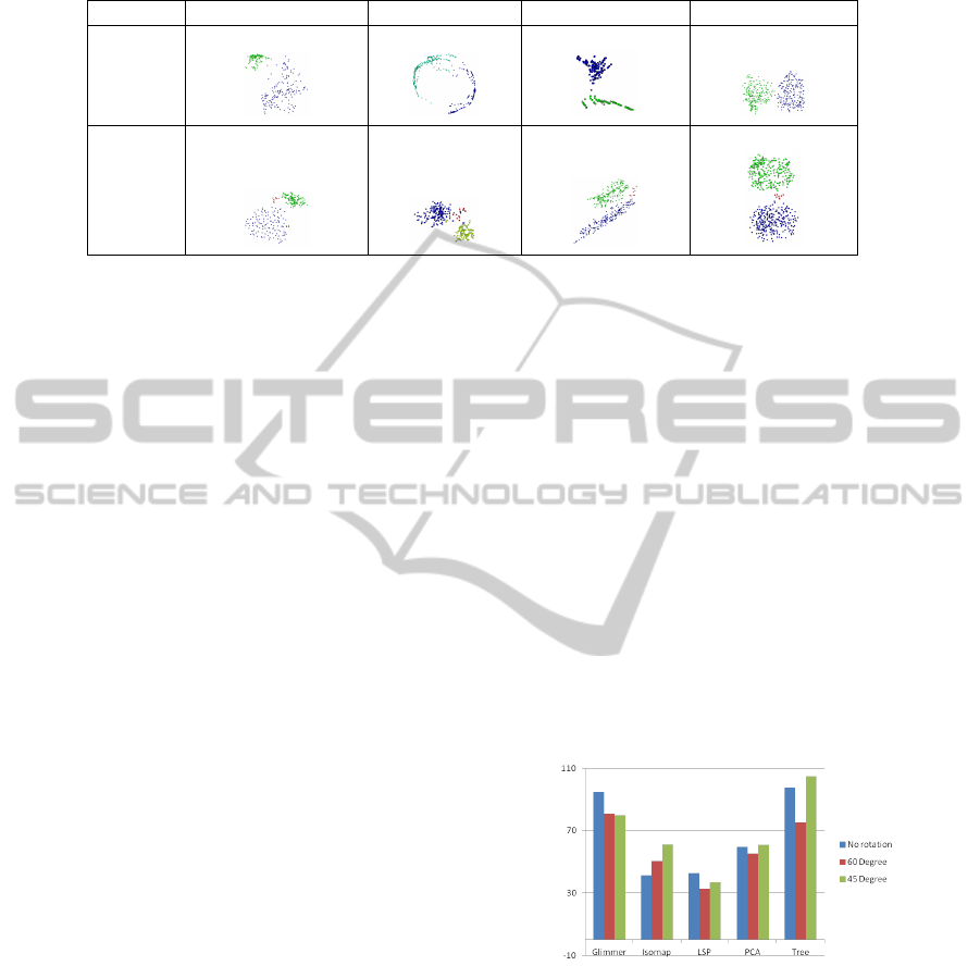
Table 2: Examples for scatter plots used for Tasks Q1 and Q2. The red color indicates the reference object or group, respec-
tively. Green and blue colors encode the two clusters equally distant to the reference.
Changing Density Changing Size Changing Shape Same Properties
Task Q1
Task Q2
When choosing two clusters with different size (same
density and same shape), there was a slight prefer-
ence towards saying that the larger cluster is closer to
the highlighted cluster (54.8%, p = 0.3601) or object
(51.6%, p = 0.5). However, this preference is not sta-
tistically significant. We also investigated examples
where both density and size were changed. The find-
ings confirm that density is the more dominant cluster
characteristic for the given tasks.
When choosing two clusters with different shape
(same density and same size), we investigated two set-
ups. In a first set-up, the highlighted cluster or ob-
ject is located in the principal direction of a longish
given cluster. Surprisingly, this did not lead to a sta-
tistically significant increase in choosing this longish
cluster as the one closest to a highlighted object (Task
Q1; 45.2%, p = 0.36) or a highlighted cluster (Task
Q2; 54.8%, p = 0.3601). Hence, the continuation of
the principal direction as a perception of Gestalt did
not play a significant role for the given tasks. In a
second set-up, one given cluster was roundish and the
other longish, but the highlighted cluster or object was
not located in the principal direction of the longish
cluster. It was observed that the longish cluster was
considered closer (with statistical significance, p =
0.022) in Task Q1 (74.2%), but there was no statis-
tical significance for Task Q2 (54.8%, p = 0.3601).
These findings can provide a starting point for further
investigations on the role of cluster shapes for per-
ceiving distances in scatterplots, e.g., by considering
other shapes and set-ups.
From our experiments, we can conclude that the clus-
ter characteristics do influence the results, although
not all of them. Density seems to be most important
in this regard. We can confirm Hypotheses H1 and
H3 on density and shape, but not Hypothesis H2 on
size. Figure 2 summarizes the results of the compar-
ative analysis of the five projections for Task Q3 on
counting the number of clusters. The bar charts show
the mean error values, which are computed accord-
ing to the description in Section 4.6. We analyzed for
each data set, each rotation, and each projection in-
dividually, whether there is a significant difference in
the answers obtained when using the original layout
and when using a rotated version. In the vast majority
of the cases, no statistically significant difference was
reported. A significant difference was observed only
in two exceptional cases, but these exceptions did
not exhibit any noticeable pattern: Wilcoxon Signed
Ranks Test showed significant higher error (p= 0.023)
for the 45
◦
rotated view in KDViz dataset compared to
the original scatter plot when using the Tree layout,
and there was also a significantly less mean error (p=
0.012) for the 60
◦
rotated view in Corel dataset when
using LSP. In general, there was always a positive cor-
relation (Paired Samples Correlations) for this study,
i.e., people who did well on the rotated one also did
well on the unrotated. Thus, we must reject Hypothe-
sis H4.
Figure 2: Mean error values for Task Q3 on estimate the
number of clusters with different projection methods. Orig-
inal scatterplots (blue) are compared against rotated views
(red and green).
6 CONCLUSIONS
We conducted a controlled user study to evaluate how
users perceive multidimensional data projection lay-
outs when performing typical visual analysis tasks.
In particular, we evaluated the role of cluster charac-
teristics such as density, size, shape, and orientation.
We considered layouts obtained with five projection
IVAPP2014-InternationalConferenceonInformationVisualizationTheoryandApplications
282

methods on data sets with distinct characteristics in
terms of sparseness and distance distribution. When
there was the need to isolate one of the cluster charac-
teristics, we used synthetic 2D scatter plot examples.
Our findings were that density and shape of clus-
ters significantly affect the perception during a visual
inspection leading to biased instead of balanced re-
sults in our experiments. Cluster size did not lead to
significant affects. The orientation of the scatter plots
did also not affect the interpretation significantly. In
general, though, we have observed that cluster prop-
erties do influence the outcome. Hence, perception is
an important aspect when analyzing projections that is
not captured in the typically applied numerical quality
estimates.
ACKNOWLEDGEMENTS
This work was supported by the research center on
Visual Communication and Expertise (VisComX) at
Jacobs University, Bremen, Germany.
REFERENCES
Ahuja, N. and Tuceryan, M. (1998). Extraction of early
perceptual structure in dot patterns: Integrating re-
gion, boundary, and component gestalt. Computer
Vision, Graphics, and Image Processing archive, 48
Issue:3:304–356.
Albuquerque, G., Eisemann, M., and Magnor, M. (2011).
Perception-based visual quality measures. In Proc.
IEEE Symposium on Visual Analytics Science and
Technology (VAST), pages 13–20.
Bertini, E., Tatu, A., and Keim, D. (2011). Quality metrics
in high-dimensional data visualization: An overview
and systematization. IEEE Transactions on Visualiza-
tion and Computer Graphics, 17(12):2203 –2212.
Borg, I. and Groenen, P. J. F. (2010). Modern Multidimen-
sional Scaling Theory and Applications. Springer Se-
ries in Statistics. Springer, 2nd. edition edition.
Cuadros, A. M., Paulovich, F. V., Minghim, R., and Telles,
G. P. (2007). Point placement by phylogenetic trees
and its application to visual analysis of document col-
lections. In Proceedings of the 2007 IEEE Symposium
on Visual Analytics Science and Technology, pages
99–106. IEEE Computer Society.
Geng, X., Zhan, D. C., and Zhou, Z. H. (2005). Super-
vised nonlinear dimensionality reduction for visual-
ization and classification. IEEE Transactions on Sys-
tems, Man, and Cybernetics, Part B: Cybernetics, 35
Issue:6:1098 – 1107.
Healey, B. G., Booth, K. S., and Enns, J. T. (1996). High-
speed visual estimation using preattentive processing.
ACM Transactions on Computer-Human Interaction,
3(2):107–135.
Ingram, S., Munzner, T., and Olano, M. (2009). Glimmer:
Multilevel mds on the gpu. IEEE Transactions on Vi-
sualization and Computer Graphics, 15(2):249–261.
Jolliffe, I. T. (1986). Pincipal Component Analysis.
Springer-Verlag.
Li, J. and Wang, J. Z. (2003). Automatic linguistic indexing
of pictures by a statistical modeling approach. IEEE
Transactions on Pattern Analysis and Machine Intel-
ligence, 25(9):1075–1088.
Mayorga, A. and Gleicher, M. (2013). Splatterplots:
Overcoming overdraw in scatter plots. IEEE Trans-
actions on Visualization and Computer Graphics,
TBD(TBD):TBD. Accepted, To Appear.
Paiva, J., Florian, L., Pedrini, H., Telles, G., and Minghim,
R. (2011). Improved similarity trees and their ap-
plication to visual data classification. IEEE Trans-
actions on Visualization and Computer Graphics,
17(12):2459–2468.
Paulovich, F. V., Nonato, L. G., Minghim, R., and Lev-
kowitz, H. (2008). Least square projection: A fast
high-precision multidimensional projection technique
and its application to document mapping. IEEE
Transactions on Visualization and Computer Graph-
ics, 14(3):564–575.
Rensink, R. and Baldridge, G. (2010a). The perception of
correlation in scatterplots. Computer Graphics Forum
(Proceedings of EuroVis 2010), 29:1203–1210.
Rensink, R. and Baldridge, G. (2010b). The visual percep-
tion of correlation in scatterplots. Journal of Vision,
10(7):975.
Sedlmair, M., Tatu, A., Munzner, T., and Tory, M. (2012).
A taxonomy of visual cluster separation factors. Com-
puter Graphics Forum (Proc. EuroVis), 31(3):1335–
1344.
Tan, P. N., Steinbach, M., and Kumar, V. (2005). Intro-
duction to data mining. Addison-Wesley Longman,
Boston, MA, USA.
Tatu, A., Bak, P., Bertini, E., Keim, D. A., and Schnei-
dewind, J. (2010). Visual quality metrics and human
perception: an initial study on 2D projections of large
multidimensional data. In Proceedings of the Working
Conference on Advanced Visual Interfaces (AVI ’10),
pages 49–56.
Tenembaum, J. B., de Silva, V., and Langford, J. C. (2000).
A global geometric faramework for nonlinear dimen-
sionality reduction. Science, 290:2319–2323.
Ware, C. (2000). Information visualization: perception for
design. Morgan Kaufmann Publishers Inc., San Fran-
cisco, CA, USA.
Wertheimer, M. (2005). Untersuchungen zur lehre von der
gestalt. Psychological Research, 4:301–350.
RoleofHumanPerceptioninCluster-basedVisualAnalysisofMultidimensionalDataProjections
283
