
Dynamic Multiscale Visualization of Flight Data
Tijmen Klein, Matthew van der Zwan and Alexandru Telea
Scientific Visualization and Computer Graphics, University of Groningen, Nijenborgh 9, Groningen, The Netherlands
Keywords:
Flight Visualization, Graph Visualization, Graph Bundling, Movement Data Visualization.
Abstract:
We present a novel set of techniques for visualization of very large data sets encoding flight information
obtained from Air Traffic Control. The aims of our visualization are to provide a smooth way to explore the
available information and find outlier spatio-temporal patterns by navigating between fine-scale, detail, views
on the data and coarse overviews of large areas and long time periods. To achieve this, we extend and adapt
several image-based visualization techniques, including animation, density maps, and bundled graphs. In
contrast to previous methods, we are able to visualize significantly more information on a single screen, with
limited clutter, and also create real-time animations of the data. For computational scalability, we implement
our method using GPU-accelerated techniques. We demonstrate our results on several real-world data sets
ranging from hours over a country to one month over the entire world.
1 INTRODUCTION
In the last years, the availability of large and accu-
rate data sources describing the motion of various
types of vehicles, e.g. airplanes, vessels, automobiles,
and pedestrians, has massively increased (Andrienko
et al., 2007; Keim et al., 2007; Andrienko et al., 2011;
Andrienko et al., 2012; PlaneFinder, 2013). The
availability of such movement data sets can help in
a wide range of analyses and use-cases, such as Air
Traffic Control (ATC), epidemics propagation, and
crisis situation analysis.
Within this context, we focus on the analysis of
airplane movement data sets. Such data sets consist
of several airplane trajectories, or trails, each one be-
ing in turn a temporal sequence of data points de-
scribing the position, height, velocity, flight direction
vector (and possibly more attributes) of a single air-
plane over its flight time span. Visualization of flight
trails can assist in numerous ATC scenarios, such as
finding and explaining historical flight outliers; un-
derstanding the correlation between flight congestion
and weather patterns; training of ATC controllers;
and better planning of flight routes over given spatio-
temporal intervals (Bilimoria et al., 2001; Hurter
et al., 2009; Hurter et al., 2013; Thales, Inc., 2013;
Eurocontrol, 2013).
However, visualizing large trail data sets poses
several challenges, of which we consider here the fol-
lowing:
a b
Figure 1: (a) Flights over France, July 5
th
, 2006, visualized
with (Hurter et al., 2009), color-coded by height. (b) Zoom-
in over Paris area.
Computational Scalability. Movement data sets are
by their nature orders of magnitude larger than their
static counterparts. For instance, Fig. 1 shows a sin-
gle day of air traffic over France, which contains 20K
trajectories, each having hundreds of data points (one
data point is recorded every 4 minutes). A data set for
the air traffic over the entire world and over several
weeks will easily have millions of trails. Generating
real-time visualizations from such data sets is clearly
a computational challenge.
Visual Scalability. Besides the computational
challenge, large trail data sets will also contain many
high-density traffic regions. In turn, visualizing such
regions will create visual clutter and occlusions.
Moreover, if we want to depict not just spatial
positions, but additional attributes such as speed,
104
Klein T., van der Zwan M. and Telea A..
Dynamic Multiscale Visualization of Flight Data.
DOI: 10.5220/0004685701040114
In Proceedings of the 9th International Conference on Computer Vision Theory and Applications (VISAPP-2014), pages 104-114
ISBN: 978-989-758-003-1
Copyright
c
2014 SCITEPRESS (Science and Technology Publications, Lda.)

flight ID, and flight height, the information den-
sity increases even further.
In this paper, we present a visualization system for
air traffic that aims to address the above challenges.
In contrast to ATC systems that address more spe-
cific use-cases (Thales, Inc., 2013; Eurocontrol, 2013;
Gaspard-Boulinc et al., 2003; Hurter et al., 2009),
our goal is to efficiently and effectively visualize at-
tributed trails over large time and space intervals. We
achieve visual scalability by several level-of-detail, or
multiscale, techniques: animation, density maps, and
graph bundling. We achieve computational scalabil-
ity by implementing the above techniques efficiently
on the GPU. Overall, our contribution extends earlier
work in trail visualization (Scheepens et al., 2011;
Hurter et al., 2009; Hurter et al., 2013) with sev-
eral temporal attributes, on the one hand, and making
the visualization suitable for large data sets, on the
other hand. We demonstrate our visualization on both
medium-scale data sets (French air traffic, one week)
and very large data sets (the world, one month).
The structure of this paper is as follows. Section 2
overviews related work in the area of trail visualiza-
tion. Section 3 introduces the proposed visualization
techniques. Section 4 presents several visualization
results for the analysis of country-scale and world-
scale air traffic. Section 5 discusses our techniques.
Section 6 concludes the paper.
2 RELATED WORK
Visual air traffic analysis techniques and tools can be
roughly divided into two classes, as follows.
Decision support systems, such as ATC systems,
typically handle low-to-moderate size data sets, such
as the region over an airport or city (Fig. 1 b), or
thousands of trails over larger geographical areas.
These tools provide sophisticated query mechanisms
to support various ATC tasks. The Future ATM
Concepts Evaluation Tool (FACET) is capable of
quickly generating and analyzing thousands of air-
craft trajectories (Bilimoria et al., 2001). It provides
a simulation environment for the climb, cruise, and
descent phases of an aircraft’s flight. Traffic patterns
are shown in 2D and 3D, under various current and
projected conditions for specific airspace regions.
Similar systems have been developed by Eurocontrol,
the European Organization for the Safety of Air
Navigation. For example, the Network Strategic
Tool (NEST) (Eurocontrol, 2013) is a tool used
by air traffic practitioners for airspace structure
design and development, capacity planning and
post-operations analysis, the organization of traffic
flows, the preparation of scenarios for fast time
simulations, and ad-hoc studies at local and network
level. EPOQUES (Gaspard-Boulinc et al., 2003) is
a tool which gathers and analyzes radar recordings
and audio communications. It proposes underlying
techniques to treat Air Traffic Management (ATM)
safety occurrences, such as helping operators to
detect and analyze situations when two aircraft go
beyond safety distance. CoFlight (Thales, Inc., 2013)
is a flight data processing (FDP) open-architecture
framework for the storage, analysis, and visualization
of 4D (spatio-temporal) flight data. A comprehensive
list of over 50 ATC-related systems and tools is
given in (GAIN Group, 2004). While such systems
emphasize the importance of visualization for ATC
systems, they all lack high visual scalability and/or
the ability to show multiple data attributes at the same
time. Specifically, there is no way to continuously
navigate between the different levels of abstraction,
which makes it harder to link global and local scale
patterns.
Exploration systems, in contrast to decision support
systems, aim at showing as much traffic data to the
user as possible, without prior filtering, so the user
can spot unexpected behavior. By next detecting out-
lier and/or mainstream patterns in such visualizations,
users can focus on a subset of the data, and refine
their understanding thereof. Many such systems em-
ploy a space-filling (also called dense-pixel, or image-
based) metaphor (Mansmann et al., 2007): By try-
ing to use each screen pixel to convey data, users
can explore larger data sets on a wider range of lev-
els of abstraction, from fine-grained and local pat-
terns to coarse global patterns. Image-based tech-
niques also naturally map to GPU implementations,
which helps their computational scalability. For in-
stance, (Willems et al., 2010) use density maps to
show thousands of trajectories of nautical vessels on
2D maps and also to emphasize high-congestion ar-
eas. By next combining several density maps, a few
attributes can be analyzed simultaneously (Scheep-
ens et al., 2011). (Lambert et al., 2010b) use GPU
techniques to quickly compute uncluttered layouts of
large aircraft trajectories in both 2D and 3D (Lam-
bert et al., 2010a). The FROMDADY system allows
interactive linking and brushing of airplane trails to
support complex queries in the entire attribute space
recorded in the data set (Hurter et al., 2009). Density
maps are effective to tackle the visual scalability prob-
lem, by aggregating spatially close information for
DynamicMultiscaleVisualizationofFlightData
105

trajectory analysis (Andrienko et al., 2011; Andrienko
et al., 2012; Marzuoli et al., 2012). Multimodal inter-
actions help users in posing complex queries with lit-
tle effort (Letondal et al., 2013). Bundling techniques
are effective in showing the coarse-scale connectivity
structure of a set of trails that link a set of spatial lo-
cations in a clutter-free manner (Hurter et al., 2012;
Holten and van Wijk, 2009; Ersoy et al., 2011; Cui
et al., 2008). Bundling can also be used to show the
dynamics of trails, e.g., how flight patterns change
over a geographical area over a week (Hurter et al.,
2013). Focus+context interaction techniques help in
further reducing clutter and posing complex spatial-
and data- queries in trajectory visualizations (Hurter
et al., 2011; Kr
¨
uger et al., 2013).
3 VISUALIZATION TECHNIQUES
We now introduce our image-based visualization
techniques for plane trails. Throughout the exposi-
tion, we use as running example the one-week French
air traffic data set from (Hurter et al., 2013) (52K
flights, about 900K recorded plane positions).
3.1 Data Model
We model a flight path, or trail T , as a sequence of
points
T = {p
i
= ((x, y) ∈ R
2
, h ∈ R
+
,t ∈ R
+
)
i
} (1)
which we order along increasing values of t
i
. The
points p
i
hold recorded samples of the plane’s posi-
tion (x, y), flying altitude h, and possibly additional
quantities such as ground and air speed. Our data set
is thus a collection T S = {T
i
}. Attributes can be also
defined at the trail level, e.g., the flight ID. At an even
higher level, we can have attributes at the level of a
group of spatially-and-temporally close trails, which
we call a trail bundle (Hurter et al., 2013).
3.2 Multivariate Animated
Visualization
Our main visualization techniques are animation
and density maps, akin to (Scheepens et al., 2011;
Willems et al., 2010). However, we take several dif-
ferent design decisions, leading to a different visual-
ization, as follows.
First, we consider four instantaneous attributes
(that is, sampled at all moments t
i
, Eqn. 1):
A1: instantaneous positions of in-flight airplanes;
A2: height along flight trails;
A3: flight directions along trails;
A4: airplane flight speed along their flight trails.
Next, we construct a density map
ρ(x) =
∑
T ∈T S
Z
p∈T
K
x − p
h
(2)
by convolving the trail-set with a Gaussian or
Epanechnikov (parabolic) kernel K of width h. ρ is
subsequently interpreted as luminance to become the
background of the visualization, similarly to (Scheep-
ens et al., 2011). However, in contrast to (Scheep-
ens et al., 2011), we use the density map only as a
context visualization atop of which our actual fine-
grained animation takes place, whereas (Scheepens
et al., 2011) use the density map as their prime vi-
sualization vehicle. Figure 2 a shows the density map
for the French airline data set. Bright white-gray ar-
eas show regions of intense traffic for the entire con-
sidered time range. Dark gray regions indicate areas
where few or no flights were recorded in this period.
Next, we consider a so-called sliding time-
window w(t) = [t, t + ∆], which moves with constant
speed (given by a user-controlled animation setting)
over the considered time range. Given this time-
window, we select all data points p
i
∈ T S for which
t
i
∈ w(t). Rather than drawing entire trails T atop
of the background, such as e.g. (Scheepens et al.,
2011) or (Hurter et al., 2013), we now consider trail
segments T
∆
(t) which contain all trail sample points
falling in w. We draw these trail segments, textured
with a transparency (alpha) texture. This texture is
built by placing at the sample point positions p
i
a train
of 1D Gaussian half-pulses φ
i
tangent to the trail seg-
ments (p
i
, p
i+1
). The pulses φ
i
are scaled so that they
are 1 at the location of p
i
and near zero at a distance
δv
i
downstream the flight path, where v
i
is the instan-
taneous plane speed at p
i
and δ is a user-set parameter.
The final texture is built by modulating the pulses φ
i
with a large 1D Gaussian envelope Φ
∆
placed over w
and summing up the modulated values (see Fig. 3).
Texturing serves two purposes, as follows. First,
setting both ∆ and δ to very low values creates images
where the arrow-like (high to low alpha) shapes cre-
ated by φ
i
, and their motion due to the sliding window,
shows the instantaneous plane positions at a given
time moment (A1) as well as their motion along trails
(Fig. 2 a). In contrast, setting δ to low values but ∆ to
larger values creates ‘trains’ of arrow-like shapes that
slide along trails. Figure 2 b shows a snapshot from
such an animation. Here, short pulses indicate slow-
motion planes – indeed, slower planes mean closer-
spaced sample points, thus shorter pulses. Analo-
gously, longer pulses show fast planes. Finally, we
can add a third attribute to the visualization by using
VISAPP2014-InternationalConferenceonComputerVisionTheoryandApplications
106
a b
c
d
Paris
Bordeaux
Toulouse
Lyon
N
S
E
W
A
1
A
2
B
2
B
1
C
1
C
2
D
2
D
1
E
1
E
2
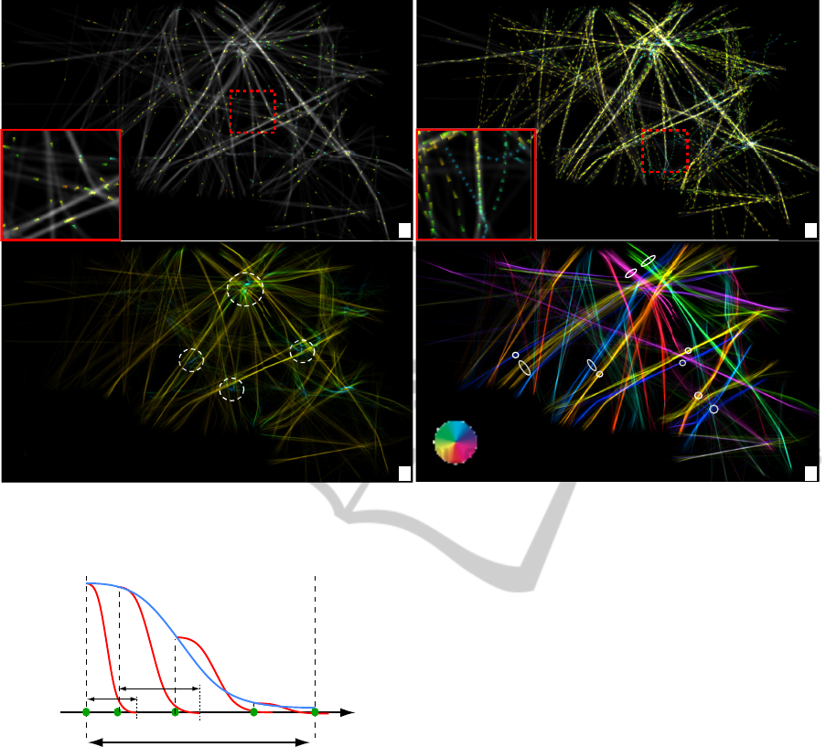
Figure 2: Animated multivariate visualization, French airline data set. (a) Instantaneous plane positions, with color-coded
height. (b) Trail segments over short time periods, with color-coded height. Trails over entire studied one-week period with
color coding height (c) and direction (d).
t
t
t+Δ
Δ
p
i
p
i+1
p
i+2
p
i+3
φ
i
Φ
Δ
α=1
α=0
φ
i+1
φ
i+2
φ
i+3
δv
i
δv
i+1
Figure 3: Construction of directional pulses for animation.
color mapping. For instance, in Fig. 2 b (inset), we
use a blue-to-red (rainbow) color map to map altitude.
We see here a fine-grained blue trail segment indicat-
ing a slow, low-altitude, outlier flight in an area with
fast (long pulses) and higher (green) flights (A4).
Increasing both δ and ∆ also allows us to smoothly
navigate from instantaneous views on the data to more
global views. Figure 2 c shows this for ∆ set to
roughly 8 hours and δ to 4 hours respectively for
our one-week flight data set. Colors map flight alti-
tude (A2). Blue spots indicate regions densely pop-
ulated by landing zones (airports). Warm lines show
in-flight routes. By looking at the latter, we can see
that most studied flights have the same altitude. This
observation correlates with flight rules for civil air-
craft for the studied territory (France). Figure 2 d
shows a similar map, with trails colored now using
a directional hue color map (see color wheel in the
image), thus addressing A3 over the entire studied
time period. Directional color coding lets us discover
several close-and-parallel, opposite-direction, flight
paths, e.g. A
1
, A
2
; B
1
, B
2
, C
1
,C
2
and D
1
, D
2
(going
southwest-northeast and conversely); and E
1
, E
2
(go-
ing roughly northwest to southeast and conversely).
Similar patterns (not shown here for conciseness) ex-
ist for almost all the other similar-size time intervals
in the studied 7-day period. From such images, we
can conclude that flights linking pairs of airports fol-
low parallel paths but are structurally not overlapping
in space.
However useful in showing the flight directions,
flight speed, and overall flight locations, the above
visualizations suffer from a certain amount of clutter,
especially for large values of ∆. Indeed, in such cases,
our trail-segment set contains many crossing flights,
especially in high-density areas such as close to
airports. Understanding flight patterns in such areas
is important for many ATC planning tasks (Letondal
et al., 2013; Hurter et al., 2009). We further help
users in getting clearer, less cluttered, insight in such
areas by using several transfer functions, as follows:
Alpha Transfer Function. Consider, for instance,
DynamicMultiscaleVisualizationofFlightData
107
a
Tue 8 April 2008, 06:30 AM Thu 10 April 2008, 06:30 AM Fri 11 April 2008, 19:30 PM
c
d
e
b
Paris area
Figure 4: Emphasizing specific flight ranges and decreasing occlusion by color and alpha transfer functions.
that we are interested in low-altitude flight segments
(close to airports). To focus on these regions, we
modulate the pulse textures φ
i
with a transfer function
f (h) = (
h
max
−h
h
max
)
k
α
, where h and h
max
are the altitude
and its maximum value respectively. Values of
k
α
< 1 render low-altitude trail segments gradually
transparent, allowing to focus on the high-altitude
ranges. Values of k
α
> 1 render high-altitude trail
segments more transparent, allowing to focus on
low-altitude ranges.
Color Transfer Function. Consider, for instance,
that we color map the altitude attribute. If we are
interested in focusing on altitude variations for the
low-altitude (close to airport) range, we need to ded-
icate more dynamic range to this signal range. To do
this, we apply a transfer function f (x) = x
k
color
to the
normalized altitude attribute prior to color mapping.
Values of k
color
< 1 emphasize high altitude ranges.
Values k
color
> 1, in contrast, emphasize low altitude
ranges.
Figure 4 shows the effects for our French airline
data set. Image (a) shows the effect of k
color
= 1 and
k
α
= 2. As the high-altitude trail segments become
more transparent, we can now better focus on the air-
port zones and thus the landing and take-off trail seg-
ments. These are apparent on the image as colder col-
ors (blue). Image (b), taken for a longer time-window
∆ value, shows the effect of k
color
= 0.5 and k
α
= 1.5.
We see now more and longer trails, since ∆ is longer.
However, the clutter due to overdraw stays limited,
due to the fading out of high-altitude trail segments
caused by k
α
. The low k
color
value allows us to visu-
ally separate the warm-colored cruise trail segments
(which have higher altitude) from the cold-colored
landing and takeoff segments (which have lower al-
titude). Images (c-e) show three snapshots from our
one-week period taken at different moments of the
morning and evening, for ∆ = 30 minutes. Here, by
using k
α
= 3, we are able to de-clutter even more of
the crowded airport regions, and see the so-called ‘ap-
proach lanes’ of the planes, i.e. the general paths that
planes take when taking off or landing at an airport.
Although images (c-e) are for three different days and
two different times of day, we notice that the approach
lanes above the Paris area are quite similar. This is
not a trivial finding since, if we look at other times of
day, such patterns are quite different. The found ex-
planation (in discussions with ATC controllers) is that
planes that land and/or take off early in the morning or
late in the evening are typically long-distance hauls,
which have more stable approach lanes than shorter-
range flights common during the day.
VISAPP2014-InternationalConferenceonComputerVisionTheoryandApplications
108
a
N
S
E
W
b
N
S
E
W
D
1
D
2
B
2
A
2
B
1
A
1
C
1
C
2
Figure 5: Emphasizing airport connection patterns by trail bundling.
3.3 Animation and Bundling
As shown so far, our flight visualization offers sev-
eral scales, or levels of detail, at which the data can
be examined – ranging from instantaneous plane posi-
tions to trail fragments and ending with large trail sets
over several days. However, apart from this temporal
multiscale, we can also exploit the spatial multiscale
of our trail data. Looking at e.g. Fig. 2 d, we see
that trails come naturally grouped in sets of closely
spaced, relatively parallel, trails. This observation has
been exploited by many bundling algorithms that sim-
plify the visualization by bringing together all trails
in such sets, e.g. (Hurter et al., 2012; Holten and
van Wijk, 2009; Ersoy et al., 2011; Cui et al., 2008).
The resulting images, although they distort the spa-
tial information, are much more effective than trails
in showing the connectivity patterns between airports,
and how these change in time.
Recently, (Hurter et al., 2013) have shown how
trail bundling can be applied to airline trails, by ap-
plying the efficient and robust KDEEB bundling al-
gorithm (Hurter et al., 2012) to a so-called stream-
ing graph containing only trails whose start time mo-
ment falls within a sliding time-window. However,
their solution does not show any additional attributes
atop of the emerging bundles, such as flight direc-
tions, height, or speed. We extend here this ap-
proach, by combining bundling with our multivari-
ate attribute-based animations. In detail, we apply
(Hurter et al., 2013) to trails selected by our time-
window w(t). This delivers a set of bundled trails.
Next, we project on these trails the attribute values of
the corresponding sampling points (for identical time
moments) from the original, unbundled, trails. Fi-
nally, we use the visualizations described in Sec. 3.2
to create the final images.
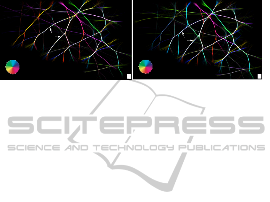
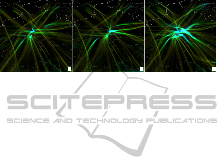
Figure 5 illustrates this. Images (a,b) use the same
color coding as in Fig. 2 d. However, the trails are
now given by two frames of the bundled flight graph,
which correspond to two moments in two different
days in our one-week data set. Since trails are bun-
dled, geographical (spatial) information is lost: Bun-
dles indicate now just connections between airports,
rather than actual flight paths. Still, directional color-
coding is useful to show temporal insights. First, we
see that the connection pattern is roughly identical for
the two studied moments. Flights in bundles A and
B keep their directions over time, respectively north-
west (green) and southeast (pink). Flights in the big
central white bundle structure C go equally in both di-
rections at both studied moments, since white is the
result of additively blending opposite colors in our
color map. In contrast, flights in bundle D go south-
west (yellow D
1
in Fig. 2 e) and then return northeast
at moment 2 (blue D
2
in Fig. 2 f). All the other vi-
sualizations described in Sec. 3.2, such as animating
pulses along bundles to show flight directions, or us-
ing transfer functions to focus on specific data ranges,
are further available.
3.4 Congestion Detection
An important and frequently occurring task in move-
ment data analysis is detecting and examining so-
called congestion areas, i.e. spatial zones where many
vehicles are present at a given time moment (Scheep-
ens et al., 2011; Hurter et al., 2009). In ATC, such
areas are particularly important to prevent air traffic
congestion and, thus, delays or an increase in fuel
consumption. On smaller spatial scales, congestion
areas become collision areas, i.e. zones where a high
risk of vehicle collision exists. Correlating the ap-
pearance of such zones with other parameters can give
important insights in the reasons why such problems
occurred and ways to solve them (Eurocontrol, 2013;
Gaspard-Boulinc et al., 2003; Bilimoria et al., 2001).
An early, and relatively simple, approach to con-
gestion area detection was given by (Scheepens et al.,
2011): By visualizing the density map ρ (Eqn. 2), we
DynamicMultiscaleVisualizationofFlightData
109
can detect zones of high vehicle densities. However,
this solution was proposed in a static setting: There is
a single density map computed for the entire studied
time period. As such, dynamic congestion patterns
that occur and disappear on smaller time-scales are
not visible. Secondly, this basic solution does not as-
sume there is a higher probability of collision in the
direction of vehicle motion and for rapid vehicles than
for other situations.
We extend this idea by using anisotropic kernels
K in Eqn. 2. In contrast to the isotropic radial ker-
nel, such kernels are larger in the direction of instan-
taneous motion of a vehicle than in other directions. A
simple way to implement this is to use e.g. elliptic ker-
nels whose large axis is tangent to the trail and scaled
to be equal to the instantaneous velocity. A further
refinement involves using asymmetric kernels, which
are longer in the motion direction than in the opposite
direction, thereby modeling the fact that congestion or
collision is more probable in front of a moving vehi-
cle than behind it. Other kernels can be immediately
used to model other types of congestion probabilities,
as and when desired.
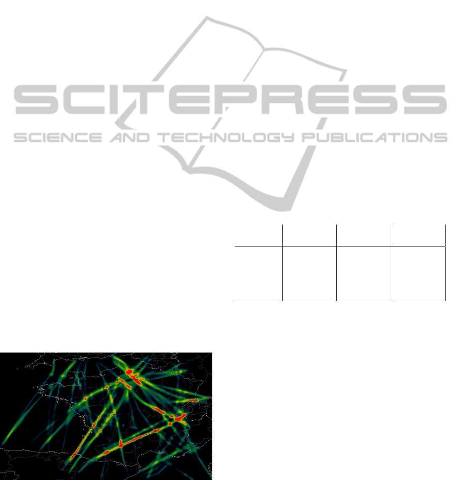
Figure 6 shows the result of visualizing this con-
gestion density map for the French airline data set.
Here, we color mapped the quantity max(ρ − 1, 0) to
a rainbow color map. Indeed, ρ is by construction
equal or larger than 1 at every plane location, and only
values larger than 1 indicate a congestion probability,
i.e., the overlap of two kernels corresponding to two
different planes. We also used k
α
= 0.2 to focus on
higher-altitude trail segments, as we are more inter-
ested to detect and assess in-flight congestion rather
than congestion close to or on the airstrips. The ker-
nel size was set to be equivalent to a duration of 30
minutes, thereby modeling a use-case where if several
planes at high altitude get closer to each other than a
flight time of 30 minutes, we consider the area as be-
ing congested. The red patterns visible in the image
delineate quite clearly the emerging congestion pat-
Figure 6: Congestion detection. The kernel size corre-
sponds to a time-interval of 30 minutes. Alpha blending
is used to focus on higher flights.
terns. These patterns are not (easily) visible using any
of the earlier-used visualizations. We notice that the
congestion areas are, in most cases, well aligned with
the the main flight routes, which is expected. How-
ever, we also see a few red blobs which do not follow
the elongated structure parallel to these routes. These
indicate congestion areas that occur at the intersection
of several routes rather than on a single route.
4 RESULTS
We used our visualization to analyze several data sets
over different space and time periods. Statistics for
the data sets shown in this paper are given in Tab. 1.
Besides the French data set, we show also a data set
with three days of flights over Europe and one with
one-month flights over the entire world. Our goal was
the explorative scenario outlined in Sec. 2: Given a
large and unknown data set, can we (as users) quickly
form a general impression on the distribution of
flights in terms of spatial location, direction, speed,
and height? Secondly, can we discover outlier flight
patterns, which diverge, in some significant way,
from the overall flight patterns in the same data set?
Below we present several of our findings.
Table 1: Data set statistics for examples in this paper.
Statistics French Europe World
air-traffic air-traffic air-traffic
start date 06/04/2008 01/06/2013 01/06/2013
end date 12/04/2008 03/06/2013 30/06/2013
# flights 52547 50984 748057
# sample 870880 873240 14711646
points
Outlier Landing/Takeoff Patterns. In Fig. 4 (d-e),
we found that landing/takeoff patterns over the Paris
area, for three moments, are quite similar. How-
ever, we cannot generalize to infer that such patterns
are constant for all moments. Also, the zoom level
in Fig. 4 is too low, so potential small-scale pattern
changes would not be visible.
We repeated the experiment shown in Fig. 4 (d-
e) at a finer zoom level. Also, we set ∆ to 24 hours,
to show more data in one animation frame, thereby
allowing us to move the animation faster to cover a
longer time period quicker. Next, we watched the ani-
mation for our one-week data set. Pattern changes are
easily spotted as changes in the animation. We thus
discovered that pattern changes indeed exist. Figure 7
shows three frames from this animation, for three dif-
ferent days. We quickly see that the Saturday traf-
VISAPP2014-InternationalConferenceonComputerVisionTheoryandApplications
110
a
b
c
Sun 6 April 2008 Tue 8 April 2008 Sat 12 April 2008
Figure 7: Height-colored trails over a duration of 24 hours with an alpha-based emphasis on low flights (and airports). We see
a clear difference in landing directions Sunday vs Tuesday. Saturday shows a significant increase in traffic around Paris.
fic is much more intense than on Sunday and Tues-
day. This confirms the expected week variation of
flight patterns. More interestingly, the Tuesday land-
ing/takeoff routes are quite different than the ones for
the other two days. To explain this further, we looked
up data for wind direction around the Paris area for
these three days, and found out that the wind patterns
on Tuesday were quite different than for the other two
days. This explains our finding, as ATC rules indicate
that landing/takeoff flight segments are indeed com-
puted based on wind directions.
Global Flight Patterns. We now consider a larger
data set, covering the entire world. The data, available
online (PlaneFinder, 2013), is gathered continuously
by hobbyists that record ADS-B plane feeds (ADS-
B, 2013) used by commercial and private planes to
transmit their name, position, altitude, call sign, sta-
tus, and other information, and consolidated into a
global server. ADS-B is gradually replacing radar
as the most efficient method for ATC, so our visual-
izations will potentially become directly relevant for
ATC-related tasks in the near future. In contrast to
the French airline data set, obtained directly from the
French ATC authorities, the world data set is far less
uniformly sampled, depending on the position of hob-
byist receivers throughout the world. However, this
data set is orders of magnitudes larger (see Tab. 1).
We processed this data to create the trails data set nec-
essary for our visualization, by matching IDs of the
same flight, removing duplicate sample points (com-
ing from different beacons), and separating flights
having the same ID that occur during different days.
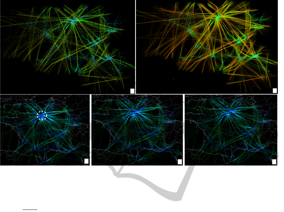
Figure 8 shows an overview of the world traf-
fic on June 1, 2013. Image (a) is a snapshot
from (PlaneFinder, 2013), showing plane positions
at one moment during the day with icons. Besides
flight densities, little is visible on this image. Im-
age (b) shows our visualization of flight routes for
that day, color-coded by flight direction. As for the
smaller French data set (Fig. 2 d), we see here too
that flights linking the same (close) airports but hav-
ing different directions follow parallel, but separated,
lanes – such as the broad one between Europe and
the US. However, the densely flown regions, such as
Europe, are too cluttered at this scale. One solution
to de-clutter is to reduce the parameters δ and ∆, to
focus on shorter time-ranges. Image (c) shows this
result. Here, the arrow-like glyphs become visible
and as such indicate the flight directions more clearly
(see insets). As such, the European region also be-
comes more de-cluttered. To further de-clutter and
obtain local detail, we zoom in over Europe (image
(d)), and increase back δ and ∆ to see full one-day
trails, like in image (b). We can again see here the
lane separation patterns, such as the one linking the
Canary islands with the mainland and connecting the
main hubs, e.g. London, Paris, and Amsterdam with
the rest of the map. Image (e) shows the same region,
this time color-coded by altitude. Low-flight zones
such as airport areas are blue, and cruise segments are
green. We see that the average cruise heights over
Europe are quite similar. The sizes of the blue spots
indicate the extent of low-flight zones close to air-
ports. Interestingly, the entire of south-east Britain is
such a zone, which is not crossed by any high-altitude
flight (yellow trails). In contrast, the Paris area shows
a similarly-sized blue zone, but which gets crossed by
quite many high-altitude flights. Image (f) shows the
Europe traffic with trail bundling, colored by flight di-
rections. We notice here many white bundles: These
are parallel and close trails which have nearly equal
counts of flights in opposite directions. Indeed, since
the KDEEB algorithm works by grouping trails in
distance order, trails that end up in the same bundle
are by construction the closest ones to that bundle’s
DynamicMultiscaleVisualizationofFlightData
111
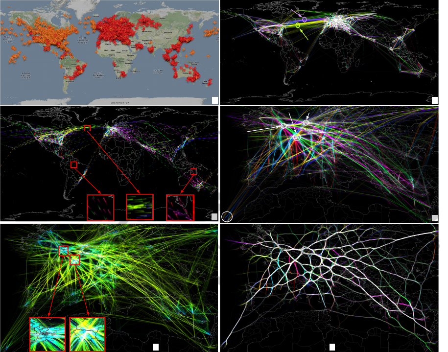
a
b
ights US to Europe
ights Europe to US
d
Canary islands
Paris
Amsterdam
London
c
f
e
Paris
area
London
area
* single-direction ight groups
*
*
*
*
8BeCcfc50g8BeCcfc50g
Figure 8: (a,c) Overview of world traffic, June 1, 2013. (d-f) Details over Europe (see Sec. 4).
location. And, secondly, since trail colors are ad-
ditively blended and we use directional hue-coding,
we achieve gray (or white) when a bundle contains
(nearly) equal trail amounts running in opposite di-
rections. We can thus infer that most trail groups over
Europe over the considered day contain roughly equal
numbers of flights in opposite directions. This situa-
tion was different for the two considered day moments
for the French airspace shown in Fig. 5. Thus, we in-
fer that, at a coarser day-over-Europe scale, air traffic
is more balanced. Finally, we see in Fig. 8 f also a few
outlier colored trails (see markers in image). These
are groups of flights that go in a single direction, i.e.,
there are no opposite-direction flights in the same spa-
tial region for the entire considered day.
5 DISCUSSION
Several aspects are relevant to our presented tech-
nique, as follows.
Scalability. We implemented our visualization in
Python and C++, using OpenGL pixel shaders for
the rendering part (texture computation, blending,
transfer functions, and congestion map, see Sec. 3).
For bundling (Sec. 3.3), we use a novel CUDA-based
implementation of the KDEEB principle (Hurter
et al., 2012), as follows. First, we compute the
density map using separable 1D convolution kernels,
and a gathering design, rather than the scattering
design using 2D OpenGL texture sprites in KDEEB.
Secondly, we parallelize all operations (density map
computation, trail advection, and trail re-sampling),
as compared to only density computation in KDEEB.
Table 2 shows our timings on a 2.6 GHz Windows
VISAPP2014-InternationalConferenceonComputerVisionTheoryandApplications
112

PC with a NVidia 690 GTX card, for various trail
selections. The bundling cost is roughly linear with
the number of sample points. Compared to the results
in (Hurter et al., 2012), our bundling is about 30 times
faster, on identical hardware. The computational
complexity of our technique is linear in the number
of trail sample points falling in the considered time-
window of length ∆. Given the above-mentioned
design decisions, we can all in all create real-time
animations of flight data for a few million sample
points. This performance was not achievable with
earlier techniques (Hurter et al., 2013; Hurter et al.,
2009; Eurocontrol, 2013; Kr
¨
uger et al., 2013).
Table 2: CUDA bundling statistics.
Statistics # flights # sample bundling time
points (msecs)
Data set 1 50984 683216 74
Data set 2 23433 886323 89
Data set 3 50984 1280680 124
Limitations. While our technique has significantly
less visual clutter than e.g. (Hurter et al., 2009; Hurter
et al., 2013; Kr
¨
uger et al., 2013) by means of trans-
fer functions and bundling, highly dense flight ar-
eas viewed at a coarse scale will still have a high
amount of overlapping flights. This problem is solved
in (Scheepens et al., 2011) by showing only aggre-
gated information. In contrast, we choose to tolerate
the clutter to be able to show individual outliers in
such areas. To increase resolution, we use a large 60-
inch touchscreen, which makes finer-grained patterns
easier visible. A second limitation concerns the num-
ber of attributes that we can show simultaneously on
a trail – currently, this is limited to three (speed, di-
rection, and altitude). Showing more attributes is an
open challenge to all similar research.
6 CONCLUSIONS
We have presented a set of visualization techniques
for the interactive exploration of very large move-
ment data sets emerging from Air Traffic Control.
Our main goals were to achieve high information
density with limited clutter, present several move-
ment attributes such as altitude, position, and speed
at the same time. We achieve these goals by fol-
lowing an image-based visualization design based
on density maps (to show amount of flights), an-
imation (to show direction and change in flight
patterns over time), and graph bundling (to show
coarse-scale similar patterns and their change over
time). We achieve computational scalability by us-
ing a fully GPU-based implementation using pixel
shaders and CUDA. The visualization design and im-
plementation also allows users to smoothly navigate,
in both space and time, between local detail and
global patterns. We demonstrated our techniques on
several data sets ranging from hours over a single
country to one month over the entire world. Fur-
ther information and material is available online at
http://www.cs.rug.nl/svcg/SoftVis/FlightVis.
Although visual scalability is still challenged by
the sheer amount of information to be shown, our
method is considerably more scalable both in vi-
sual space and computational complexity than current
methods used for the same types of data sets and anal-
ysis. In the future, we plan to augment our visualiza-
tion by adding interactive queries in order to enable
users to compare and search spatio-temporal patterns
of interest, and also enhance the image-based design
to allow for the display of more data attributes at the
same time.
ACKNOWLEDGEMENTS
The authors would like to thank Planefinder for letting
us use their data.
REFERENCES
ADS-B (2013). Automatic dependent surveillance broad-
cast. http://www.ads-b.com.
Andrienko, G., Andrienko, N., Burch, M., and Weiskopf, D.
(2012). Visual analytics methodology for eye move-
ment studies. IEEE TVCG, 18(12):2889–2898.
Andrienko, G., Andrienko, N., and Heurich, M. (2011).
An event-based conceptual model for context-aware
movement analysis. Int. J. Geogr. Inf. Sci.,
25(9):1347–1370.
Andrienko, G., Andrienko, N., and Wrobel, S. (2007). Vi-
sual analytics tools for analysis of movement data.
ACM SIGKDD Exploration Newsletter, 9(2):38–46.
Bilimoria, K. D., Sridhar, B., Chatterji, G. B., Sheth, K. S.,
and Grabbe, S. (2001). Facet: Future atm concepts
evaluation tool. Air Traffic Control Quarterly, 9(1).
Cui, W., Zhou, H., Qu, H., Wong, P., and Li, X. (2008).
Geometry-based edge clustering for graph visualiza-
tion. IEEE TVCG, 14(6):1277–1284.
Ersoy, O., Hurter, C., Paulovich, F., Cantareira, G., and
Telea, A. (2011). Skeleton-based edge bundles for
graph visualization. IEEE TVCG, 17(2):2364 – 2373.
Eurocontrol (2013). NEST: Network Strategic Tool.
www.eurocontrol.int/articles/airspace-modelling.
GAIN Group (2004). Guide to methods and
tools for airline flight safety analysis. flight-
DynamicMultiscaleVisualizationofFlightData
113

safety.org/files/analytical methods and tools.pdf, 2
nd
ed.
Gaspard-Boulinc, H., Jestin, Y., and Fleury, L. (2003). Epo-
ques: a user-centerd approach to design tools and
methods for atm safety occurences treatment. In Proc.
ESReDA (European Safety, Reliability and Data Asso-
ciation). European Commission.
Holten, D. and van Wijk, J. J. (2009). Force-directed edge
bundling for graph visualization. CGF, 28(3):670–
677.
Hurter, C., Ersoy, O., and Telea, A. (2011). Moleview: An
attribute and structure-based semantic lens for large
element-based plots. IEEE TVCG, 17(12):2600–2609.
Hurter, C., Ersoy, O., and Telea, A. (2012). Graph bundling
by kernel density estimation. CGF, 31(3):435–443.
Hurter, C., Ersoy, O., and Telea, A. (2013). Smooth
bundling of large streaming and sequence graphs. In
Proc. PacificVis, pages 374–382. IEEE.
Hurter, C., Tissoires, B., and Conversy, S. (2009). From-
DaDy: Spreading data across views to support itera-
tive exploration of aircraft trajectories. IEEE TVCG,
15(6):1017–1024.
Keim, D., Andrienko, G., Andrienko, N., Jankowski, P.,
Kraak, M., MacEachren, A., and Wrobel, S. (2007).
Geovisual analytics for spatial decision support: Set-
ting the research agenda. Intl. J. Geo. Info. Sci.,
21(8):839–857.
Kr
¨
uger, R., Thom, D., W
¨
orner, M., Bosch, H., and Ertl, T.
(2013). TrajectoryLenses - a set-based filtering and
exploration technique for long-term trajectory data.
CGF, 32(3):451–460.
Lambert, A., Bourqui, R., and Auber, D. (2010a). 3D edge
bundling for geographical data visualization. In Proc.
Information Visualisation, pages 329–335.
Lambert, A., Bourqui, R., and Auber, D. (2010b). Winding
roads: Routing edges into bundles. CGF, 29(3):432–
439.
Letondal, C., Hurter, C., Lesbordes, R., Vinot, J. L., and
Conversy, S. (2013). Flights in my hands: coherence
concerns in designing strip’tic, a tangible space for air
traffic controllers. In Proc. ACM CHI, pages 2175–
2184.
Mansmann, F., Keim, D. A., North, S. C., Rexroad, B.,
and Sheleheda, D. (2007). Visual analysis of network
traffic for resource planning, interactive monitoring,
and interpretation of security threats. IEEE TVCG,
13(6):985–997.
Marzuoli, A., Hurter, C., and Feron, E. (2012). Data vi-
sualization techniques for airspace flow modeling. In
Proc. Intelligent Data Understanding (CIDU), pages
79–86.
PlaneFinder (2013). Live flight status tracker.
planefinder.net.
Scheepens, R., Willems, N., van de Wetering, H., An-
drienko, G., Andrienko, N., and van Wijk, J. J. (2011).
Composite density maps for multivariate trajectories.
IEEE TVCG, 17(12):2518–2527.
Thales, Inc. (2013). CoFlight Flight Data Processing
Framework. www.thalesgroup.com.
Willems, N., van de Wetering, H., and van Wijk, J. J.
(2010). Visualization of vessel movements. CGF,
28(3):959–966.
VISAPP2014-InternationalConferenceonComputerVisionTheoryandApplications
114
