
Visualizing Large Scale Vehicle Traffic Network Data
A Survey of the State-of-the-art
H. W. A. S. Gondim
1
, H. A. D. do Nascimento
1
and D. Reilly
2
1
Institute of Informatics, Federal University of Goias, Campus II, Caixa Postal 131. CEP 74001-970, Goiania - GO, Brazil
2
Faculty of Computer Science - Dalhousie University, 6050 University Ave., Halifax, Nova Scotia B3H 4R2, Canada
Keywords:
Urban Traffic, Traffic Congestion, Information Visualization.
Abstract:
Analyzing and improving large urban traffic networks is a difficult process due to complex interrelationships
between the many variables that impact vehicle traffic behavior. Information visualization techniques can
facilitate the tasks of analyzing large amounts of data and of exploring potential solutions to practical traffic
problems. Surprisingly, there is a relative lack of investigation focused on how information visualization
techniques should be applied and adapted to the field of Traffic Engineering. This paper presents an overview
of what has been done on this topic by reviewing the use of information visualization in traffic systems over
the years, and highlighting the current state-of-the-art by focusing on several innovative pieces of research.
We provide a classification of the reviewed work and identify areas that have been understudied.
1 INTRODUCTION
Large urban areas in many countries suffer from in-
creasing traffic congestion. Such congestion costs
money, and impedes the growth of a country. It also
affects people’s health; for example, vehicles moving
at low speed tend to consume more fuel and produce
more toxic gases than when traveling faster (Seong
et al., 2011). A study conducted in 45 countries on
the growth of world income and vehicle ownership
forecasted an increase of two billion vehicles by 2030
(Dargay et al., 2007). Therefore, mitigating the urban
traffic congestion problem is important for econom-
ical and social development, as well as for environ-
mental reasons.
Traffic problems are not simple to solve as they
depend on several dynamic and interrelated aspects
(urbanism, population distribution, location of work-
places, social, economical and leisure activities, etc.)
which are hard to describe and to model in full de-
tail (Button, 2001). As a result, the study of this sub-
ject usually involves dividing a traffic problem into
steps or stages, in order to facilitate understanding.
The famous Four-Step Model (McNally, 2000) is an
example. It is comprised of the following steps: trip
generation, trip distribution, modal split (trips by car,
buses, subway, etc.) and traffic assignment. There
are many other ways of analyzing these problems. In
general, they can be divided into three major phases:
(1) collecting information and describing the network
and the travel demands (at different periods of the day
and days of the week), (2) defining a traffic assign-
ment model that considers the characteristics of the
network and the transportation modes, and (3) experi-
menting with the model and variations of the network
through simulation.
The issues that need to be addressed in each phase
have been well studied and a variety of strategies have
been devised for dealing with them. For instance, ve-
hicle traffic networks are often modeled using graph
theory concepts, while travel demands are usually
represented in the form of two-dimensional arrays
called origin-destination (OD) matrices, for distinct
modes of transportation (car, bus, etc.), periods of the
day (rush hours, night time, etc.), and days of the
week (Ashok and Ben-Akiva, 1993). Macroscopic,
mesoscopic and microscopic methods (either static or
dynamic) exist for traffic assignment at different reso-
lutions (Baskar et al., 2009) and each helps to predict
vehicle traffic behavior in decision support systems.
However, algorithms and calculations are not suf-
ficient to obtain feedback quickly, and to uncover pat-
terns in the complex data sets collected for and gen-
erated by these systems. Thus, tools for visualization
are important for such applications.
Information visualization combines aspects of
human-computer interfaces, computer graphics and
data mining, representing data in a graphical format
337
Gondim H., do Nascimento H. and Reilly D..
Visualizing Large Scale Vehicle Traffic Network Data - A Survey of the State-of-the-art.
DOI: 10.5220/0004686603370346
In Proceedings of the 5th International Conference on Information Visualization Theory and Applications (IVAPP-2014), pages 337-346
ISBN: 978-989-758-005-5
Copyright
c
2014 SCITEPRESS (Science and Technology Publications, Lda.)

that expands users’ visual perception and promotes
better understanding of the data (Agrawal et al., 1993;
Fayyad et al., 1996). A visualization can support three
general activities:
• Exploratory Analysis – finding new knowledge
contained in the data through an analytical pro-
cess that explores visual representation for high-
lighting trends / patterns that can lead to new hy-
pothesis.
• Confirmatory Analysis – visually demonstrating
the validation or rejection of a particular hypothe-
sis.
• Presentation – graphically representing relation-
ships, structures, behaviors, and other intrinsic
characteristics to the data.
Given the great advances in the area of informa-
tion visualization research, surprisingly few studies
have focused on the role of visualization in the anal-
ysis of traffic problems. There is certainly some form
of visualization present in many computational sys-
tems that assist in the modeling and the simulation of
vehicle traffic. But they have been mostly employed
for illustrating a process or a problem. Reported work
that does employ information visualization generally
does not consider the techniques used per se; rather,
it assumes that the use of visualization (in some form)
yields certain de facto benefits.
The limited application of information visualiza-
tion to traffic problems is perhaps understandable,
since it is not trivial to identify a graphical representa-
tion that is appropriate for the type of data and that ad-
equately considers the principles of human perception
(Gershon et al., 1998), (Chen, 2005). One major issue
is the difficulty in representing multi-attribute data in
ways that don’t overwhelm our perceptual abilities.
This is especially relevant for traffic, where we need
to analyze complex data sets over both temporal and
spatial dimensions (Boyandin et al., 2011).
This paper surveys the state of the art in the use of
information visualization techniques to support mod-
eling, simulation and analysis of urban traffic. Vi-
sualizations supporting navigation are not considered
here, as our focus is to investigate techniques that
help traffic engineers and city government planners
improve traffic conditions. In addition, we focus on
urban traffic networks due to their complexity.
The paper is organized as follows: Section 2
presents the state-of-the-art, describing research that
uses information visualization for vehicle traffic mod-
eling, simulation and analysis. Section 3 provides a
characterization of the research in this area and identi-
fies some understudied aspects. In Section 4 we draw
our conclusions and suggest areas for future work.
2 INFORMATION
VISUALIZATION FOR
VEHICLE TRAFFIC
Many visualization techniques proposed to support
the study of traffic problems have their foundation
in well-established fields, most notably Cartogra-
phy (Taylor et al., 2000; Meyer and Miller, 2001).
The majority of visualizations that appear in the traf-
fic engineering literature are common 2D geographic
maps, or geographic maps employing a 3D perspec-
tive. Standard map features from cartography are
widely used, including the division of political re-
gions (suburbs, estates, etc.) by polygonal area fea-
tures, the use of line features for representing streets,
avenues, water channels and rivers, and the use of vi-
sual attributes like color, shade and texture to classify
or highlight map elements.
Geographic Information System (GIS) and Deci-
sion Support System technologies have been applied
to traffic engineering to yield modeling and simula-
tion systems that combine georeferenced data with
an interactive multiple layer visual representation, for
the analysis and planning of traffic networks (Huang
and Pan, 2007). Some popular commercial GISs
in this category are the software Saturn (Van Vliet,
2013) and Dracula (Liu et al., 2008), TransCAD
(Caliper, 2012) and VISSIM (PTV, 2013). Many
other traffic modeling systems are also gaining pop-
ularity, such as the free software SUMO (Krajzewicz
et al., 2013), MITSIM (MitSim, 2013) and PetGyn
(Jradi et al., 2009).
Recently, several research projects have explored
innovative ways of presenting traffic data. They differ
from previous research and from commercial systems
in their application of new presentation metaphors
and more complex visual approaches, or by being
highly interactive. We survey such pieces of work
here. They are grouped in this section according to
the information visualization classification proposed
by (Keim and Kriegel, 1996), to provide a prelim-
inary categorization of the work. This classifica-
tion includes Geometric Projections (consisting of all
techniques that show projections of multidimensional
data sets), Pixel-oriented views (which map each data
value to a colored pixel), and Hierarchical presen-
tations. Keim et al. also described a Graph-based
group, but we have realized that all papers that fall in
this category also draw a graph as a geographic pro-
jection of a map. Therefore, those papers were classi-
fied as belonging to the Geometric Projection group.
IVAPP2014-InternationalConferenceonInformationVisualizationTheoryandApplications
338
2.1 Geometric Projection
As expected, geometric projection remains a key ap-
proach for generating interactive visualizations of
traffic network data. Increasingly, researchers are
applying advanced graphical techniques (animations,
perspective transformations, morphing), expanding
the expressive power of geometric projections in ways
that suit the presentation of traffic flow, multidimen-
sional traffic data, and the complex relationships be-
tween network elements (e.g., origins, intersections,
destinations).
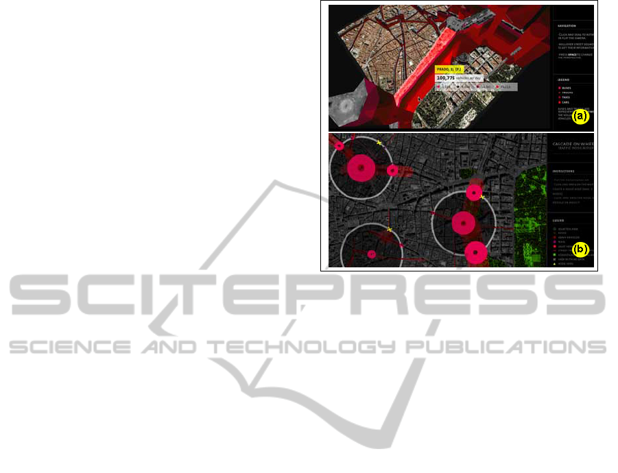
Cascade on Wheels (Thirion et al., 2008) is a vi-
sualization project started during the Visualizar Work-
shop at the Medialab Prado in Madrid in 2007. The
project’s main goal was to express the amount of vehi-
cles in big cities using metaphor. Two visualizations
were developed and applied to data regarding taxis,
buses and light and heavy vehicle flows in the central
region of Madrid in 2006.
The first visualization, referred to as Walls Map
Piece (Figure 1-(a)), shows traffic data using a wall
metaphor. It presents a 2D satellite map of the city,
in which it is possible to select streets and visualize
their names and traffic data (the amount and type of
vehicles) in a given day. By selecting a tool, the visu-
alization then turns into a 3D map with streets raised
according to the amount of daily traffic flow in them.
Each street segment creates a wall with height propor-
tional to its amount of traffic. The user can rotate the
3D map to view the sides of walls, which show the
amount of vehicles of each type using bar charts. A
similar approach applied to vehicle crash analysis can
be found in (Li et al., 2007).
The second visualization (called Traffic Noise
Mixer) makes use of an audio layer combined with a
network satellite map (see Figure 1-(b)). The user can
interact with the visualization by drawing, dragging
and growing circular regions over the map. Sounds
with specific frequencies and amplitude are then gen-
erated and played, representing the amount and the
types of vehicles traveling in the selected regions.
The LIVE Singapore project (Kloeckl et al.,
2011), created by the SENSEable City Laboratory at
MIT, explores the development of an open platform
for the collection, elaboration and distribution of a
large and growing number of different kinds of real-
time data that originate in a city (e.g., from cellular
networks, taxi fleets, public transport, seaports and
airports). The platform provides support for gener-
ating interactive visualizations employing geometric
projections. Some applications built with the LIVE
Singapore framework are discussed next.
Members of the LIVE Singapore Project (Kloeckl
Figure 1: (a) Walls Map Piece - a 2D/3D map with walls
representing streets with dense traffic. The greater the flow
of vehicles in a street segment, the higher the corresponding
part of the wall. (b) Traffic Noise Mixer. Audible noise is
produced in order to indicate the amount and types of vehi-
cle in selected regions. Courtesy of (Thirion et al., 2008).
et al., 2011; Chen et al., 2011) proposed transforma-
tions (compression / distension) of a map of Singa-
pore according to the time demanded for traveling be-
tween origin-destination of points, in a view called
“Isochronic Singapore”. About 290 controlling points
were defined. Selecting an origin point causes the
map to be visually distorted so that the distance from
that origin to all destinations in the network is propor-
tional to the travel time between them. The visualiza-
tion also changes automatically as the observed traffic
flows in the network vary during the day.
The Data Lenses visualization(Cruz, 2012) is part
of the Live Singapore project as well. It was created to
enable precise monitoring of activities of urban pub-
lic transportation (buses) in Singapore. The visual-
ization uses lenses that work like magnifying glasses
(see Figure 2). The users can move the lens or change
its properties (like radius and magnification level) to
improve perception of a dense information area. It is
possible to adjust the lenses to present different lay-
ers of information, such as bus lines at each bus stop
(in blue), the number of bus passengers, the number
of passengers boarding/exiting at the bus stops (in or-
ange) and the total amounts paid for tickets at each
bus stop (in red).
Furthermore, the LIVE Singapore visualization
called “Traffic Origins” (Kloeckl et al., 2012) aims
to identify road events that usually cause congestion.
In this visualization, information previously available
about road events can be combined with simulation
models for better comprehension of traffic conditions
VisualizingLargeScaleVehicleTrafficNetworkData-ASurveyoftheState-of-the-art
339
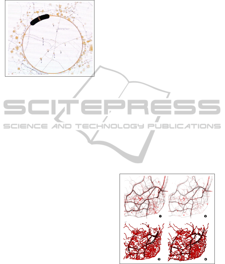
Figure 2: The Data Lenses visualization permits the am-
plification and suppression of urban traffic data on a map.
Courtesy of (Cruz, 2012).
and to predict the impact of traffic interruption in the
network. Three types of events can be automatically
highlighted in the visualization using colored circles:
accidents (in red), intense traffic (in blue) and broken
vehicles (in orange). After identifying a region of the
map where one of these events occurrs, the visualiza-
tion emphasizes the color in the nearby streets (inside
the circle) to improve perception of their traffic flow
speed. The advantage of this techinique is to focus
the users attention only on the important occurrences,
given by circled events with colored information.
The Web site “Every Death on Every Road in
Great Britain 1999 - 2010” (BBC, 2011), produced
by the British Broadcasting Corporation (BBC) and
released in 2011, uses geometric projection to show
the evolution of traffic accidents over time. It presents
data and facts about accidents with injuries and deaths
on Great Britains roads over a span of eleven years.
The visualization resembles a nightly aerial map view,
with lights indicating road collisions that caused in-
juries and deaths.
Other research has considered technical chal-
lenges involved in generating traffic visualizations
employing geometric projection. For example, the
work of Chen et al. (Chen et al., 2008) considers the
difficulty in modeling large meshes of roads. In this
context, they proposed a system to assist the user on
modeling/drawing a road network using stress fields.
As another example, Sewall et al. (Sewall et al.,
2011) present a hybrid model that combines con-
tinuum (macroscopic) and agent-based (microscopic)
methods for efficient and effective traffic simulation
and visualization of large-scale networks in real time.
In general, macroscopic methods are faster but do not
capture individual vehicle behaviors precisely. On the
other hand, microscopic methods are more flexible for
modeling traffic elements in detail, but demand ex-
tra processing power. In their approach, a large net-
work can be divided into several small regions and
each region can be simulated by either the micro-
scopic or macroscopic method. This hybrid model
allows a fine-grain detail of a network region of in-
terest, while simultaneously keeping the simulation
of the remaining part of the network with the contin-
uum method. Traffic data from the different methods
are interchanged.There are other papers with similar
visualizations (Kim et al., 2009; Mahut and Florian,
2010; Svennerberg, 2010; Buch et al., 2011).
Other research has deeply integrated visualiza-
tion tools into traffic analysis system. The CityMo-
tion Project (Silva et al., 2010) was developed by
researchers of the University of Coimbra, MIT and
the University of Porto, between 2007 and 2010.
Their goal was to build knowledge infrastructure,
computational models and user applications that al-
low access to real-time information about the state of
transportation-related resources as well as to do pre-
dictions regarding their future state.
One of the CityMotion subprojects is called “Vi-
sualizing the Circulatory Problems of Lisbon” (Cruz
and Machado, 2011). That project resulted in alter-
native visualizations to identify bottlenecks in a road
network based on a metaphor of the circulatory sys-
tem of a living being. The scenario is Lisbon in 2009
with data from 1,534 vehicles. They presented two
types of visualizations inspired by basic biology.
Figure 3: Images (1) and (2) represent clots in Lisbon at
9am and 7pm, respectively. Images (3) and (4) show blood
vessels in Lisbon at 7:04 am and 8:44 am. Courtesy of (Cruz
and Machado, 2011).
In the first visualization, shown in images (1) and
(2) of Figure 3, blood clots (as red circles) represent
zones of slow traffic. The diameter of the clots is in-
versely proportional to traffic speed.
IVAPP2014-InternationalConferenceonInformationVisualizationTheoryandApplications
340

In the second visualization, shown in images (3)
and (4), color and the size of blood vessels change
according to the number of vehicles and the average
transit speed in each road.
In both visualizations, traffic in low speed tends
to darken the related blood vessel, representing blood
stagnation. In contrast, if the traffic speed is high, the
blood vessel is painted in lighter color.
The “Pulse of the City” (Reades, 2011; Reades,
2012) is an animated view developed by Jonathan
Reades
1
that also applies the circulatory system
metaphor. It shows the usage of public railway trans-
portation lines in London, presenting railway lines
over a cartographic map with a dark background. As
time passes and commuters travel in the railway sys-
tem, railway line segments increase in thickness ac-
cording to their use. If a railway segment that had
many passengers before becomes less used, its thick-
ness shrinks to normal size. Since the animation cov-
ers many days and periods of the day, even with rush
hours, the resulting visual effect is of a living circula-
tory system that pulses with blood.
While the circulatory system metaphor is one
specific approach, a range of projects more gener-
ally apply deformation and color to highlight areas
of concern in traffic visualizations. Another visu-
alization from the CityMotion project is “Morphing
City” (Cruz, 2011), which presents a map whose lines
are deformed (compressed or distended) if the current
flow speed on the road is lesser or greater than the av-
erage global speed. Color assists in the interpretation
of the map as well: deformations that compress the
view are assigned cold colors, while warm colors are
applied for expansions. The Morphing City visualiza-
tion enables rapid identification of critical points since
areas with intense traffic are highlighted by warmer
colors and appear to expand in comparison to other
routes.
Seong et al. (Seong et al., 2011) use Geomet-
ric Projection to model and map noise produced by
urban traffic in Fulton County, Georgia, USA. They
created a visualization where decibel ranges are rep-
resented by colors: buildings with low noise level are
shown in green, high levels of noise appear in red,
and there is a color scale indicating intermediate lev-
els. A range of visualizations considering noise and
air pollution have been considered in other research
(Tsai et al., 2009; Elbir et al., 2010; Pamanikabud and
Tansatcha, 2010; Zannin et al., 2013), most employ-
ing some form of geometric projection.
In our review, we also found some projects that
aim to visualize origin-destination matrices using a
combination of geometric projections and other tech-
1
http://vimeo.com/user11576485/pulseofthecity
niques, including graph-based approaches. The work
of Boyandin et al. (Boyandin et al., 2011) is one
example. It highlights the limitations of geometric
projections alone when applied to temporal origin-
destination datasets. The paper then introduces an in-
teractive visualization called Flowstrates (Figure 4),
which presents two different geometric maps with a
heatmap in the center, using color to represent de-
mand over time. Similar visualizations are presented
in (Wood et al., 2011).
Figure 4: The image represents the annual number of
refugees of Ethiopia. Each column in the heatmap (between
two maps) indicates temporal scale. In this example Soma-
lia is the country which receives more refugees (hot colors
represents a big density, when cool colors is small).
In another project (Wood et al., 2010), the authors
draw OD matrices as colored cells and lines over a
cartographic map, according to the density of trips
between the OD pairs. In addition, Gunay (Gunay,
2009) shows OD matrices using Wavelets transforma-
tions in order to highlight similarity in data.
2.2 Pixel-oriented
In this section we discuss recent work that employs
a pixel-oriented approach. Just as with graph-based
examples, this also is done in a manner that integrates
with a geometric projection.
The work of (Xie and Yan, 2008) presented spa-
tial patterns of traffic accidents in roads. A variation
of the Kernel Density Estimation (KDE) technique
was developed that smooths density surface of spatial
point events over a 2D geographic space. The new
approach was implemented in the ESRI ArcGIS en-
vironment and tested with traffic accident data from
2005 in Bowling Green, Kentucky, USA, provided
by the Kentucky State Police Department. The re-
searchers found that the new KDE was more effective
than the standard method for estimating traffic acci-
dent densities.
In order to help understand the results, the authors
used a map visualization, as shown in fig 5. Figure
5-(a) highlights the density of accidents by varying
the thickness of roads in the positions where there are
VisualizingLargeScaleVehicleTrafficNetworkData-ASurveyoftheState-of-the-art
341
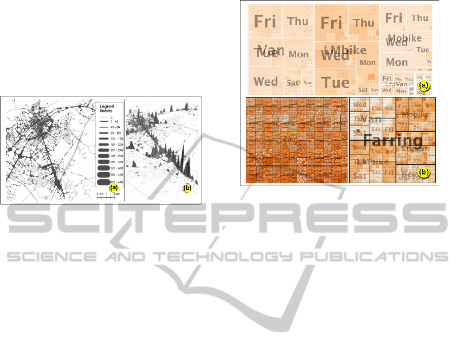
many accidents. This is carried out a smoothing pro-
cedure that expands and connects points of the net-
work if they are already close to each other and there
is a high number of accidents in them. Figure 5-(b)
presents the same data but uses a 3D perspective to
show traffic accident densities (the higher the density,
the higher the peak over an area).
Figure 5: Visualizing traffic accident densities. The im-
age (a) indicates traffic accident densities by expanding and
connecting nearby points. Other presents this data in a 3D
view using height to indicate density. Courtesy of (Xie and
Yan, 2008).
Other visualization approaches based on varia-
tions of KDE can be found (Ha and Thill, 2011; Liu
et al., 2012; Wang et al., 2009; Mesbah et al., 2012).
2.3 Hierarchical
Wood et al. (Wood and Dykes, 2008) explore the use
of treemaps for variable selection in spatial-temporal
data. Their study focuses on a dataset consisting
of 90 million georeferenced vehicle locations from
a courier fleet. The data was collected during 18
months and each location contains its geographic po-
sition (given by GPS), timestamp, vehicle type (in-
cluding van, large van, motorbike, large motorbike
and bicycle) and travel speed. The goal of that study
was to demonstrate that treemap visualizations can
help users identify useful patterns in the data and to
select information for further analysis.
The researchers present two approaches for visu-
alizing the dataset. In the first one shown in Figure 6-
(a), the data is hierarchically organized according to
vehicle type, day of the week (from Monday to Sun-
day) and hour of the day (24 hours in total). In the
lowest level of the hierarchy, each treemap rectangle
has an area proportional to the volume of vehicles (ac-
cording to the corresponding type, day of week and
hour). Color intensity is also used for mapping the
average speed of these vehicles.
In the second approach, illustrated in Figure 6-(b),
a map of the city is divided into a grid of rectangu-
lar regions. Each cell of the grid contains a treemap
Figure 6: (a) Treemap showing traffic data classified by
transportation mode, day of week and hour of the day. The
rectangles are ordered by size from top-left to bottom-right
for each level of the classification. (b) An area of London
divided into cells of 1km square each (left). In each cell
there is a treemap of the hierarchically ordered vehicle data.
The image on the right is a zoomed view of the “Farring”
cell. Lighter colors indicate that vehicles traveled at a lower
average speed. Courtesy of (Wood and Dykes, 2008).
presenting data from that region, hierarchically orga-
nized as before. Color intensity indicates either traffic
volume or average speed in each small rectangle at
the lowest level of the hierarchy.
Despite being used for visualizing data for a
courier fleet, the same approaches can be applied to
other traffic data in a straightforward way.
3 CHARACTERISTICS AND
UNTREATED ASPECTS
As we have seen, current traffic network visualiza-
tion research is heavily oriented toward geometric
projection-based approaches. We can characterize the
visualization techniques we have discussed according
to different criteria so that it becomes easier to com-
pare them as well as to identify as-yet-unexplored av-
enues for traffic visualization. We propose here two
major criteria for vehicle traffic related visualizations:
• Type of data. The visualizations are grouped
according to the main type of traffic data they
present. These types include, but are not lim-
ited to the following: O-D matrices, rigid net-
work infrastructures (such as roads, bridges and
intersections), flexible elements of the network
(that can be changed with little or no infrastruc-
tural intervention, such as lane direction, max-
IVAPP2014-InternationalConferenceonInformationVisualizationTheoryandApplications
342
imum speed limits, signal settings, turning re-
strictions, parking authorizations, trip and park-
ing tolls, etc.), flow measurements or flow esti-
mations, and meaningful high level data such as
information about car accidents and other events.
One can see that such data can be naturally orga-
nized into levels in a hierarchical multilayer way,
as is usually done in geographic information sys-
tems. Therefore, we can further classify a traf-
fic visualization according to whether it was de-
signed for presenting a given layer of data or a
combination of them.
• Target task. In this case, the visualizations are
classified according to the kind of task(s) they are
intended to support. We envision three types of
tasks. The first is simply to present traffic data
for overall understanding and for pattern identifi-
cation. This involves showing the data and pos-
sibly allowing interaction to control the visual-
ization attributes, or to apply filters. The second
type of task is to input data. Although user in-
terface components like dialog boxes, tables and
text fields could be used for inputting data into a
traffic system, we mean here a more intuitive and
visually-oriented way of entering information by
direct manipulation of the elements of a visual-
ization. The third type of task is to simulate and
optimize traffic behavior through the exploration
of multiple scenarios of the network and traffic
conditions. This task is very common in decision
support systems for traffic engineering. We can
say that it involves an aggregation of the previous
two tasks in order to allow the user to pursue a
more complex goal. Similarly to the first classi-
fication criterion, this second one is not mutually
exclusive in its options, allowing the presence of
two or all three target tasks simultaneously.
We analyzed the visualizations reviewed in Sec-
tion 2 according to these criteria and presented the
result in Table 1.
Note that it is possible to characterize the views
according to the type of visualization approach too
(2D, 3D, treemap, etc.) and by the interaction tech-
niques used. We consider these other criteria useful,
but mainly to further differentiate visualizations that
have already been classified by the other means.
One of the main observations from our survey of
the field of visualizing vehicle traffic data and traf-
fic problems is that there are many combinations of
the two criteria proposed above for which no visual-
ization technique is currently available. Furthermore,
there has been no systematic study that demonstrates
how to build good visualizations for variations of data
type and target task.
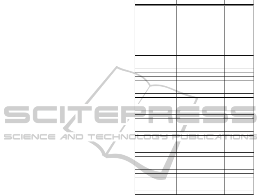
Table 1: Characterization of the reviewed visualizations.
Type of Data Target Task
Projects
OD Matrix
Network Infrastrucure
Flexible network elements
Flow
High Level Meaningful Data
Data Presentation
Inputting Data
Simulation and Exploration
(Waze, 2013) x x x x x x
(Zannin et al., 2013) x x x x x
(Cruz, 2012) x x x x x
(Reades, 2012) II x x x x
(Liu et al., 2012) x x x
(Mesbah et al., 2012) x x x x x
(Seong et al., 2011) x x x x
(Sewall et al., 2011) x x x x x
(Reades, 2011) x x x x
(Cruz, 2011) x x x x x
(Kloeckl et al., 2011) x x x x x
(Chen, 2011) x x x x x
(Boyandin et al., 2011) x x x
(BBC, 2011) x x x x x
(Ha and Thill, 2011) x x x x
(Elbir et al., 2010) x x x x x
(Wood et al., 2010) x x x x
(Silva et al., 2010) x x x x x x x
(Kim et al., 2009) x x x x x
(Wang et al., 2009) x x x x x
(Outram et al., 2009) x x x x x
(Tsai et al., 2009) x x x x
(Wood and Dykes, 2008) x x
(Jradi et al., 2009) x x x x x x x
(Xie and Yan, 2008) x x x x x
(Thirion et al., 2008) x x x x
(Chen et al., 2008) x x x
(Madsen et al., 2007) x x x x x
(Tang and Wang, 2007) x x x x x x
(Li et al., 2007) x x x x x
(Wang, 2005) x x x x x x
(Elbir, 2004) x x x x
(Borho, 2003) x x x x x x
(Brandt et al., 2003) x x x x
(Claramunt et al., 2000) x x x x x x
Another important observation is that, for many
tasks and data types for which supposedly reason-
able visualization techniques have been applied, the
visualizations are revealed to be ineffective or inef-
ficient in some common cases. For instance, a tra-
ditional way of denoting flow orientation on streets
and turning permissions/restrictions on intersections
is by drawing arrows that indicate the flow directions.
However, when the network is large, it becomes prac-
tically impossible to visualize these details in a car-
tographic map. Interactive zoom can solve this prob-
lem, but at the expenses of compromising perception
of the complete network. Also, it does not allow
effective simultaneous visualization of multiple de-
tailed regions of the network. Innovative pieces of re-
search as the work done by Sewall et al. (Sewall et al.,
2011), that uses augmented reality over a 2D network
map to present animations of vehicles moving, would
offer flow direction perception while preserving full-
picture zoom level. However, this approach demands
high processing power, does not show the network
characteristics in regions where there is absence of
flow, and does not provide a good visualization of
VisualizingLargeScaleVehicleTrafficNetworkData-ASurveyoftheState-of-the-art
343

flow orientation at intersections with many crossings
and turning permissions.
The Flowstrates approach (Boyandin et al., 2011),
as another example, improves the understanding of
Origin-Destination matrices, but has several limita-
tions. There is a lot of visual overlapping when the
number of selected OD pairs increases. Furthermore,
it does not show how OD demands translate into real
traffic flow, particularly when considering an urban
traffic network, with many possible flow paths.
In general, the existing visualizations suffer from
two main problems: visual overlapping as the size
of the data set steadily increases, and an inability to
present different types of data in an integrated way
(network structures, OD demands, traffic flow, etc.).
It is also difficult to develop a “robust” visualization
that produces visually acceptable results for all traf-
fic scenarios, since we are dealing with very dynamic
systems in which small changes of the network struc-
ture may result in totally different flow behavior.
Finally, the majority of traffic-related visualiza-
tions and interaction techniques considered to date
were designed with traditional mouse+keyboard or
touchscreen configurations in mind. Few researchers
are investigating the use of novel HCI approaches, go-
ing beyond the simple dualities of large/small screens
and touch/indirect interfaces to build on the frontier
and explore how techniques from augmented reality,
tangible, mobile and ubiquitous computing can play a
role.
Some interesting examples are emerging in the
processes of collecting traffic data. For example, the
Copenhagen Wheel Project (Outram et al., 2009) con-
sists of an electric wheel extension (called “hub”)
that transforms any ordinary bike into a hybrid e-
bike with a motor, batteries, GPRS, and sensors for
torque, moisture, carbon dioxide, temperature and
noise. While a bicyclist follows their route, the sen-
sors collect information and send them to an iPhone
every two seconds via Bluetooth.
Copenhagen Wheel is one example of a larger
trend toward Crowdsourcing traffic network data
(Howe, 2006; Weissman and Villalobos, 2012). Waze
(Waze, 2013) is an application for mobile devices that
allows traffic information to be shared, such as loca-
tions with congestion, accidents, objects on a track,
as well as tips and warnings. It has been reported that
the use of such software can help in better choices of
route (Chen et al., 2012; Talele et al., 2012).
In future, systems that exploit crowdsourcing,
open data, and heterogeneous data sets will need to
manage information that is not always complete, cor-
rect or provided at the same level of granularity. This
will also impact on how to best visualize and interact
with the data.
4 CONCLUSION
We have reviewed the research on information visual-
ization applied to vehicle traffic problems and data in
order to show the state-of-the-art in this field.
We then proposed a characterization approach for
traffic-related visualization methods. Based on our re-
view and on the characterization criteria, one can see
that there still lacks much investigation of interactive
visualization methods for certain tasks and types of
traffic data. Furthermore, a range of emerging HCI
techniques has not generally been employed by re-
searchers working in this domain. We have also iden-
tified two main limitations with current approaches:
visual overlapping and poor integration of different
forms of traffic network data. Our paper is a step to-
wards better understanding these challenges, by re-
viewing the state-of-the-art in this field and by situ-
ating the existing research within our categorization
scheme. Nevertheless, there is still much to investi-
gate and to define in this area.
For future research, we suggest:
• more exploration of techniques for integrating
multiple views, each optimized for specific types
of network data;
• consideration of 3D interaction techniques to mit-
igate the problem of visual overlapping;
• expanding the characterization scheme to include
interactive techniques and conceptual approaches
for inputting data;
• further exploring interactive visualizations for the
task of inputting different types of traffic-related
data; and
• adapting emerging HCI techniques to traffic-
related visualization in decision support systems.
REFERENCES
Agrawal, R., Imielinski, T., and Swami, A. (1993).
Database Mining: A Performance Perspective.
Knowledge and Data Engineering, IEEE Transactions
on, 5(6):914–925.
Ashok, K. and Ben-Akiva, M. E. (1993). Dynamic Origin-
destination Matrix Estimation and Prediction for Real-
time Traffic Management Systems. In International
Symposium on the Theory of Traffic Flow and Trans-
portation (12th: 1993: Berkeley, Calif.). T ransporta-
tion and Traffic Theory.
IVAPP2014-InternationalConferenceonInformationVisualizationTheoryandApplications
344

Baskar, L., De Schutter, B., and Hellendoorn, J. (2009).
Optimal Routing for Intelligent Vehicle Highway Sys-
tems Using a Macroscopic Traffic Flow Model. In In-
telligent Transportation Systems, 2009. ITSC’09. 12th
International IEEE Conference on, pages 1–6. IEEE.
BBC (2011). Every death on every road in Great
Britain 1999-2010. http://www.bbc.co.uk/news/
uk-15975564. [Online; acessed 1-July-2013].
Borho, S. (2003). ATLAS: A Language For Modeling
And Simulating Urban Traffic Visualization Of Traffic
Models. PhD thesis, Faculty of Engineering Carleton
University.
Boyandin, I., Bertini, E., Bak, P., and Lalanne, D. (2011).
Flowstrates: An Approach for Visual Exploration
of Temporal Origin-destination Data. In Computer
Graphics Forum, volume 30, pages 971–980. Wiley
Online Library.
Brandt, J., Christensen, J., Frohn, L., and Berkowicz, R.
(2003). Air Pollution Forecasting from Regional to
Urban Street Scale Implementation and Validation for
Two Cities in D enmark. Physics and Chemistry of
the Earth, Parts A/B/C, 28(8):335 – 344.
Buch, N., Velastin, S., and Orwell, J. (2011). Intelli-
gent Transportation Systems, IEEE Transactions on,
title=A Review of Computer Vision Techniques for the
A nalysis of Urban Traffic, 12(3):920–939.
Button, K. J. (2001). Handbook of Transport Systems and
Traffic Control, volume 3. Emerald Group Publishing.
Caliper (2012). TransCad Transportation Planning Soft-
ware. http://www.caliper.com/tcovu.htm. [On-
line; acessed 1-July-2013].
Chen, C. (2005). Top 10 Unsolved Information Visualiza-
tion Problems. Computer Graphics and Applications,
IEEE, 25(4):12–16.
Chen, G., Esch, G., Wonka, P., Mulller, P., and Zhang, E.
(2008). Interactive Procedural Street Modeling. In
ACM Transactions on Graphics (TOG), volume 27,
page 103. ACM.
Chen, X. (2011). Isochronic Singapore.
http://xiaoji-chen.com/blog/2011/
isochronic-singapore/. [Online; acessed
1-July-2013].
Chen, X. et al. (2011). Seeing Differently: Cartography for
Subjective Maps Based on Dynamic Urban Data. PhD
thesis, Massachusetts Institute of Technology.
Chen, X., Santos-Neto, E., and Ripeanu, M. (2012). Crowd-
sourcing for On-street Smart Parking. In Proceedings
of the Second ACM International Symposium on De-
sign and Analysis of Intelligent Vehicular Networks
and Applications, pages 1–8. ACM.
Claramunt, C., Jiang, B., and Bargiela, A. (2000). A New
Framework for the Integration, Analysis and Visual-
isation of Urban Traffic Data Within Geographic I
nformation Systems. Transportation Research Part
C: Emerging Technologies, 8:167 – 184.
Cruz, P. and Machado, P. (2011). Visualizing the Circula-
tory Problems of Lisbon. In ACM SIGGRAPH 2011
Posters, page 92. ACM.
Cruz, P. M. (2011). Morphing City. http://fmachado.
dei.uc.pt/featured/visualizing-traffic.
[Online; acessed 1-July-2013].
Cruz, P. M. (2012). Data Lenses. http://pmcruz.com/
information-visualization/data-lenses. [On-
line; acessed 1-July-2013].
Dargay, J., Gately, D., and Sommer, M. (2007). Vehicle
Ownership and Income Growth, Worldwide: 1960-
2030. The Energy Journal, pages 143–170.
Elbir, T. (2004). A GIS Based Decision Support System
for Estimation, visualization and Analysis of Air Pol-
lution for Large T urkish cities. Atmospheric Environ-
ment, 38(27):4509 – 4517.
Elbir, T., Mangir, N., Kara, M., Simsir, S., Eren, T., and
Ozdemir, S. (2010). Development of a GIS-based De-
cision Support System for Urban Air Quality Manage-
ment in the City of Istanbul. Atmospheric Environ-
ment, 44(4):441 – 454.
Fayyad, U. M., Piatetsky-Shapiro, G., Smyth, P., and Uthu-
rusamy, R. (1996). Advances in Knowledge Discov-
ery and Data Mining.
Gershon, N., Eick, S. G., and Card, S. (1998). Information
Visualization. Interactions, 5(2):9–15.
Gunay, B. (2009). Using Wavelet Transforms for Better In-
terpretation of Traffic Simulation. Traffic Engineering
and Control, 50(10).
Ha, H.-H. and Thill, J.-C. (2011). Analysis of Traffic Haz-
ard Intensity: A Spatial Epidemiology Case Study of
Urban Pedestrians. Computers, Environment and Ur-
ban Systems, 35(3):230 – 240.
Howe, J. (2006). The Rise of Crowdsourcing. Wired Mag-
azine, 14(6):1–4.
Huang, B. and Pan, X. (2007). GIS Coupled with Traf-
fic Simulation and Optimization for Incident Re-
sponse. Computers, Environment and Urban Systems,
31(2):116–132.
Jradi, W., do Nascimento, H. A. D., Longo, H., and Hall,
B. R. (2009). Simulation and analysis of urban traf-
fic the architecture of a web-based interactive decision
support system. pages 1–6.
Keim, D. A. and Kriegel, H.-P. (1996). Visualization Tech-
niques for Mining Large Databases: A Comparison.
Knowledge and Data Engineering, IEEE Transactions
on, 8(6):923–938.
Kim, K., Oh, S., Lee, J., and Essa, I. (2009). Augment-
ing Aerial Earth Maps with Dynamic Information. In
Mixed and Augmented Reality, 2009. ISMAR 2009.
8th IEEE International Symposium on, pages 35–38.
IEEE.
Kloeckl, K., A., A., R., B., and P., C. (2012). Traf-
fic Origins. http://senseable.mit.edu/
visual-explorations-urban-mobility/
traffic-origins.html. [Online; acessed 1-
July-2013].
Kloeckl, K., Di Lorenzo, G., SENN, O., and Ratti, C.
(2011). LIVE Singapore!-an Urban Platform for
Real-time Data to Program the City. Proceedings of
CUPUM.
Krajzewicz, D., Hertkorn, G., Rossel, C., and Wagner,
P. (2013). Simulation of Urban Mobility - SUMO.
VisualizingLargeScaleVehicleTrafficNetworkData-ASurveyoftheState-of-the-art
345

http://sumo.sourceforge.net/. [Online; acessed
1-July-2013].
Li, L., Zhu, L., and Sui, D. Z. (2007). A GIS-based
Bayesian Approach for Analyzing Spatial Temporal
Patterns of Intra-city Motor Vehicle Crashes. Journal
of Transport Geography, 15(4):274 – 285.
Liu, R., Vilet, D. V., and Watling, D. P. (2008). Dy-
namic Route Assignment Combining User Learning
and microsimulation - DRACULA . http://www.
its.leeds.ac.uk/software/dracula/. [Online;
acessed 1-July-2013].
Liu, Y., Wang, F., Xiao, Y., and Gao, S. (2012). Urban
Land Uses and Traffic Source-sink Areas: Evidence
from GPS-enabled Taxi Data in Shanghai. Landscape
and Urban Planning, 106(1):73 – 87.
Madsen, C., Carlsen, K. C., Hoek, G., Oftedal, B., Nafstad,
P., Meliefste, K., Jacobsen, R., Nystad, W., Carlsen,
K.-H., and Brunekreef, B. (2007). Modeling the Intra-
urban Variability of Outdoor Traffic Pollution in Oslo.
Atmospheric Environment, 41(35):7500 – 7511.
Mahut, M. and Florian, M. (2010). Traffic Simulation With
Dynameq. Fundamentals of Traffic Simulation, pages
323–361.
McNally, M. G. (2000). The Four-step Model. Handbook
of Transport Modelling, 1:35–41.
Mesbah, M., Currie, G., Lennon, C., and Northcott, T.
(2012). Spatial and Temporal Visualization of Tran-
sit Operations Performance Data at a Network Level.
Journal of Transport Geography, 25(0):15 – 26.
Meyer, M. D. and Miller, E. J. (2001). Urban Transporta-
tion Planning: A Decision-oriented Approach.
MitSim (2013). MitSim. http://sourceforge.net/
projects/mitsim/. [Online; acessed 1-July-2013].
Outram, C., Ratti, C., and Biderman, A. (2009).
Copenhagen Wheel. http://senseable.mit.edu/
copenhagenwheel/. [Online; acessed 1-July-2013].
Pamanikabud, P. and Tansatcha, M. (2010). Virtual Visual-
ization of Traffic Noise Impact in Geospatial Platform.
In Geoinformatics, 2010 18th International Confer-
ence on, pages 1–6.
PTV (2013). PTV Vissim . http://vision-traffic.
ptvgroup.com/en-uk/. [Online; acessed 1-July-
2013].
Reades, J. (2011). Pulse of the City. http:
//simulacra.blogs.casa.ucl.ac.uk/2011/
08/pulse-of-the-city/. [Online; acessed
1-July-2013].
Reades, J. (2012). Pulse of the City Reboot.
http://simulacra.blogs.casa.ucl.ac.uk/
2012/05/pulse-of-the-city-reboot/. [Online;
acessed 1-July-2013].
Seong, J. C., Park, T. H., Ko, J. H., Chang, S. I., Kim, M.,
Holt, J. B., and Mehdi, M. R. (2011). Modeling of
Road Traffic Noise and Estimated Human Exposure
in Fulton County, Georgia, USA. Environment Inter-
national, 37(8):1336–1341.
Sewall, J., Wilkie, D., and Lin, M. C. (2011). Interactive hy-
brid simulation of large-scale traffic. In ACM Transac-
tions on Graphics (TOG), volume 30, page 135. ACM.
Silva, J. A., R., M., J., V., and A., S.
(2010). CityMotion Project. http://www.
mitportugal.org/transportation-systems/
intelligent-transportation-systems.html.
[Online; acessed 1-July-2013].
Svennerberg, G. (2010). Beginning Google Maps API 3.
Apress.
Talele, T., Pandit, G., and Deshmukh, P. (2012). Dynamic
Ridesharing Using Social Media. International Jour-
nal.
Tang, U. and Wang, Z. (2007). Influences of Urban Forms
on Traffic-induced Noise and Air pollution: Results
From a Modelling System. Environmental Modelling
and Software, 22(12):1750 – 1764.
Taylor, M. A., Woolley, J. E., and Zito, R. (2000). Integra-
tion of the Global Positioning System and Geographi-
cal Information Systems for Traffic Congestion Stud-
ies. Transportation Research Part C: Emerging Tech-
nologies, 8(1):257–285.
Thirion, S., C., C., J., H., and R., M. (2008). Cas-
cade on Wheels. http://medialab-prado.es/
article/visualizar_muestra_de_resultados_
del_taller. [Online; acessed 1-July-2013].
Tsai, K.-T., Lin, M.-D., and Chen, Y.-H. (2009). Noise
Mapping in Urban Environments: A Taiwan Study.
Applied Acoustics, 70(7):964 – 972.
Van Vliet, D. (2013). Simulation and Assignment of Traffic
to Urban Road Networks - SATURN . http://www.
saturnsoftware.co.uk/. [Online; acessed 1-July-
2013].
Wang, H., Zou, H., Yue, Y., and Li, Q. (2009). Visualizing
Hot Spot Analysis Result Based on Mashup. In Pro-
ceedings of the 2009 International Workshop on Loca-
tion Based Social Networks, LBSN ’09, pages 45–48,
New York, NY, USA. ACM.
Wang, X. (2005). Integrating GIS, Simulation Models, and
Visualization in Traffic Impact Analysis. Computers,
Environment and Urban Systems, 29(4):471 – 496.
Waze (2013). Waze. http://www.waze.com/. [Online;
acessed 1-July-2013].
Weissman, D. and Villalobos, M. (2012). Mobility Apps.
Wood, Jo Slingsby, A. and Dykes (2008). Using Treemaps
for Variable Selection in Spatio-temporal Visualisa-
tion. Information Visualization, 7(3-4):210–224.
Wood, J., Dykes, J., and Slingsby, A. (2010). Visualisation
of Origins, Destinations and Flows with OD Maps.
Cartographic Journal, The, 47(2):117–129.
Wood, J., Slingsby, A., and Dykes, J. (2011). Vi-
sualizing the Dynamics of London’s Bicycle-Hire
Scheme. Cartographica: The International Jour-
nal for Geographic Information and Geovisualization,
46(4):239–251.
Xie, Z. and Yan, J. (2008). Kernel Density Estimation of
Traffic Accidents in a Network Space. Computers,
Environment and Urban Systems, 32(5):396–406.
Zannin, P. H. T., Engel, M. S., Fiedler, P. E. K., and Bunn,
F. (2013). Characterization of Environmental Noise
Based on Noise Measurements, Noise Mapping and
Interviews: A Case Study at a University Campus in
Brazil. Cities, 31(0):317 – 327.
IVAPP2014-InternationalConferenceonInformationVisualizationTheoryandApplications
346
