
A Geological Metaphor for Geospatial-temporal Data Analysis
Tom Liebmann, Patrick Oesterling, Stefan J
¨
anicke and Gerik Scheuermann
Image and Signal Processing Group, Institute of Computer Science, University of Leipzig, Leipzig, Germany
Keywords:
Visual Data Exploration, Abstract Data Visualization, Geo-Visualization, Comparative Visualization.
Abstract:
To provide visual access to geospatial-temporal data, existing systems usually highlight the data’s spatial,
temporal and topical distribution individually in separated, but linked views. Because this design often com-
plicates queries that concern multiple data aspects and also involves more user interaction, in this paper, we
present a geological metaphor that aims to combine relations between orthogonal data aspects. We describe
how our adopted landscape metaphor intuitively depicts global and local relationships based on its surface,
glyph augmentation and inner sediment structure. We validate the geological metaphor with case studies,
compare it with existing systems and describe how it can be integrated into those as an alternative map view.
1 INTRODUCTION
Analyzing data and extracting information from
databases has long been text-based. However, defin-
ing queries with proper keywords can be frustrat-
ing and browsing through textual result sets does not
scale well, depends on language, and excludes human
abilities to distinguish and rank things visually. If
data contains additional meta-information, query re-
sults can be spatialized to rely on preemptive, paral-
lel abilities of the human eye-system. According to
Ware (Ware, 2004), the user can then quickly distin-
guish data aspects based on, e.g., position, color or
shape rather than on words in textual results.
For example, in case of geospatial-temporal data,
i.e. data associated with geospatial position and a
time-stamp, it has proven beneficial to lay out items
on a map to identify interesting subsets and to steer or
refine queries interactively. Several frameworks, such
as GeoTemCo (J
¨
anicke et al., 2013), VisGets (D
¨
ork
et al., 2008), or CrimeViz (Roth et al., 2010) have
been introduced. They typically consist of at least a
map- and a time-widget to provide spatial and tem-
poral context, respectively, and they usually support
linked-selection and linked-brushing. Selections are
often specified in other (maybe overlayed) widgets
like tag-clouds, histograms, or overview-widgets.
However, because these frameworks illustrate or-
thogonal information in separate widgets, data as-
pects can also be analyzed only individually. As a
result, queries concerning multiple aspects may not
be feasible, or they require more user interaction. For
example, if the data’s spatial distribution over time,
or topical distribution at certain locations over time
is questioned, the user is required to perform single
selections in the time-widget, while watching how
linked selections change in the map-widget. Not only
does this imply many selections, the user also needs
to store a mental map of all changes because linked
selections replace each other. Many approaches also
augment the map with glyphs to indicate data oc-
currence. For large data, this can be problematic if
glyphs overlap or if aggregated glyphs, with size pro-
portional to item count, suggest data in actually void
areas. Furthermore, glyph color is often used to dis-
tinguish queries or data types, and has thus only little
potential to convey other information dimensions.
In this paper, we present a 3-D geological
metaphor for geospatial-temporal data to illustrate re-
lations between orthogonal information dimensions in
one view. To this end, we distort the map so that
data occurrence is evidenced by hills with elevation
proportional to item count in that area. We color a
hill’s surface to display temporal distribution and use
glyphs per hill as a third information channel to re-
flect an item’s class, which could represent its affili-
ation to a particular query, or another data attribute.
Because terrains are familiar and intuitive to humans,
global overview of the data’s main aspects can eas-
ily be extended to local analysis. We allow the user
to dissect hills to watch sediment evolution over time.
Depending on sediment granularity, relations between
orthogonal key information like geospatial position,
time and class can thus be analyzed at the same time.
161
Liebmann T., Oesterling P., Jänicke S. and Scheuermann G..
A Geological Metaphor for Geospatial-temporal Data Analysis.
DOI: 10.5220/0004742901610169
In Proceedings of the 5th International Conference on Information Visualization Theory and Applications (IVAPP-2014), pages 161-169
ISBN: 978-989-758-005-5
Copyright
c
2014 SCITEPRESS (Science and Technology Publications, Lda.)

Landscape metaphors support intuitive data explo-
ration and provide another degree of freedom in 3-D.
Still, using three dimensions rather than two and dis-
torting and coloring the map can limit the metaphor’s
application. Therefore, we view its strengths on less
detailed maps and in scenarios where precise dis-
play of single data aspects is neglected in favor of a
combined illustration of relationships between several
data dimensions. Often these relations disclose fea-
tures that deserve closer investigation regarding one
or two data aspects in a second analysis step. Our
visualization is integrable into other frameworks as a
surrogate map-widget. Therefore, it supports filtering
and highlighting of linked-selections, as well as send-
ing user selections back to other widgets.
2 RELATED WORK
Visualizing data in combination with maps (Tominski
et al., 2005) to provide the user with spatial context
relates to thematic cartography and geo-visualization.
An overview is given by (Dent, 1999) and (Slocum
et al., 2009). Showing information as intuitive land-
scapes has long tradition in information visualization
and was, for example, adopted as ThemeScapes (Wise
et al., 1995) to depict and reorganize information
that is not inherently spatial, or as GraphScapes (Xu
et al., 2007) to reveal multivariate graph clustering
using landscapes as attribute surfaces that are aug-
mented with the underlying graph. An ontology of
the landscape metaphor and an overview how it actu-
ally works is given by (Fabrikant et al., 2010).
Systems to analyze geo-temporal data typically
break down the analysis semantically, by follow-
ing the information-seeking mantra ’Overview First,
Details on Demand’, as proposed by (Shneiderman,
1996), but also technically by providing the user with
linked views on different data aspects. The role of
multiple coordinated views in exploratory visualiza-
tion is described by (Roberts, 2007).
The concepts of visual data exploration and geo-
temporal data analysis, including their principles and
challenges are thoroughly explained by (Andrienko
and Andrienko, 2005; Andrienko and Andrienko,
2006). In our adopted geological metaphor we use
a third dimension to indicate data occurrence and to
reflect temporal evolution of inner sediment struc-
ture. Utilizing 3-D for time-geography studies to re-
late event times to locations on a map is often seen
to originate from the Space-Time Cube (Kraak, 1988)
that uses space-time paths and their footprints on the
map to understand movement data. Throughout the
years this model has been improved and adopted, for
example, by GeoTime (Kapler and Wright, 2005) to
visualize the spatial inter-connectedness of informa-
tion over time; including extensions to augment Geo-
Time with a story system that uses narratives, hy-
pertext linked visualizations, annotations, and pat-
tern detection for analytic exploration (Eccles et al.,
2008). In a similar fashion (Tominski et al., 2012)
gain insights into trajectory attribute data by inte-
grating spatial and temporal displays based on color-
coded trajectory bands that are stacked perpendicular
to the map. For multivariate data analysis, the usage
of kernel density estimation to determine probability
values was also employed by (Kim et al., 2013) to
present Bristle Maps, a series of straight lines that
extend from map elements such as roads to create a
multivariate attribute encoding, and by (Maciejewski
et al., 2010) to find spatiotemporal hotspots by over-
laying heatmaps and contours for different data as-
pects, linked to time-series plots for user-selected re-
gions of interest.
Most frameworks for geo-temporal data analy-
sis, such as GeoTemCo (J
¨
anicke et al., 2013), Vis-
Gets (D
¨
ork et al., 2008) and CrimeViz (Roth et al.,
2010), share a very similar architecture in that they
employ a map-widget and a time-widget to provide
spatial and temporal context, respectively. They
mainly differ in that not all of them support compar-
ative analysis, that some of them provide additional
tag-clouds and result views, and that temporal selec-
tion in their time-widgets happens at different gran-
ularities — using stacked bar-charts, histograms, or
graphs. Together with the trivial visualization of the
Iraq conflict incidents (Rogers, 2010), these systems
use glyph augmentation to indicate data occurrence
on the map, though varying in quality by trying to
avoid glyph overlap and visual clutter using different
binning- and aggregation-solutions.
Our work differs in that we focus on a more ab-
stract, but combined display of several data aspects
in one view. We substitute data item glyphs for hill
elevation to indicate item count - which allows us to
present features with more granularity and higher ac-
curacy on the map. Furthermore, spatial granularity
is decoupled from item count and the map’s zoom-
level. For example, in GeoTemCo large glyphs can
easily cover void areas around local peaks and actu-
ally distant parts could be represented by one glyph
because of high item count at these locations. Then
the user has to zoom-in, which unnecessarily reduces
the number of visible and thus comparable features on
the map.
IVAPP2014-InternationalConferenceonInformationVisualizationTheoryandApplications
162
3 LANDSCAPE METAPHOR FOR
GLOBAL DATA ANALYSIS
This section describes how our landscape metaphor
is designed to convey orthogonal information dimen-
sions and how the user interacts with the visualization
— both inside the widget and by linked-selections
from other widgets.
3.1 Map Distortion
Conceptually, each data item is assigned a volume so
that data occurrence is finally evidenced by agglom-
erations with extent and height proportional to item
count. We use a Gaussian-based approach and con-
sider all data positions to be samples of an unknown
random variable whose density distribution we ap-
proximate. The probability density function then de-
scribes the shape and the structure of the map.
Gaussian density estimation is subject to a kernel
filter radius σ that controls each item’s volumetric ex-
tent. The user can change this parameter to control
the landscape’s level-of-detail and to coarsen or refine
features, e.g. by isolating countries, regions, or single
cities with different filter radii. For aesthetic land-
scapes, elevation values can be reduced by (linear or
logarithmic) kernel scaling and maximum height val-
ues can be bound to a percentage of the map extent.
Showing data concentration as hills permits fast
localization and comparison, includes hierarchies
(sub-clusters) and illustrates features locally: since
item count translates into elevation, neighbored void
areas are not covered by data representatives; like
large, aggregated glyphs in 2-D would do. Still, per-
spective projection can impede comparing heights of
elevations. Although we consider precise comparison
to be part of local data analysis (cf. Section 4), the
usage of hypsometric tints can counter this issue.
3.2 Landscape Color
In void areas, the map still provides enough spatial
context to relate hills to geographic locations. On the
hills, however, map readability is likely to be reduced
due to distortion. Therefore, map display can be deac-
tivated on hills to utilize surface color to convey time
as a second information dimension.
Because a hill reflects the agglomeration of poten-
tially many data items, multiple time-stamps can con-
tribute to each surface point’s color. The idea is to use
the mean time and standard deviation of all involved
time-stamps and to map both values to one color. To
this end, the whole dataset’s time span is mapped to
a color gradient. Then for each set of time-stamps,
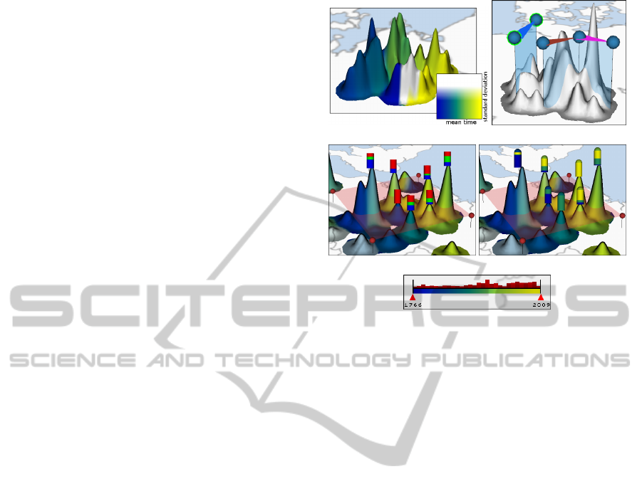
(a) (b)
(c) (d)
(e)
Figure 1: (a) Landscape with surface colored by time. (b)
Active (green) and inactive line segments to localize pro-
file generation. (c) Glyph-augmentation showing data item
proportions for class and (d) for time for every component
above the red polygon. (e) Slider to filter data items by time.
the mean time is first mapped onto the gradient and
then the standard deviation defines that color’s light-
ness. This scheme allows to display the chronological
sequence of the dataset and to distinguish young, old,
and mid-aged regions. Moreover, controlling light-
ness values with standard deviation helps distinguish
mid-aged regions from (lighter) regions where young
and old data items are just mixed (cf. Figure 1a).
3.3 Data Filter
To support handling big datasets and to facilitate
closer investigation of suspicious features, the user
can filter data by class, time, and hill elevation.
The class filter determines whether a data item
should contribute to the landscape construction based
on its class affiliation. This is helpful if the spatial and
temporal distribution of single classes is questioned,
or if only a few classes should be compared. The filter
can be set with a simple list or any other third-party
widget that allows to select possible classes.
The time filter defines two points in time and ex-
cludes all data items with a time-stamp outside this
period. While a simple two-slider widget, maybe aug-
mented with histograms to indicate item count, is suf-
ficient, more sophisticated widgets, as proposed in
GeoTemCo (J
¨
anicke et al., 2013) or VisGets (D
¨
ork
et al., 2008), can also be used. In any case, we rec-
ommend to augment the time-widget with the color
AGeologicalMetaphorforGeospatial-temporalDataAnalysis
163

gradient used for the landscape surface. This helps
identify thresholds necessary to eliminate particular
hills based on their color (cf. Figure 1e).
The elevation filter removes or preserves parts of
the landscape based on user-defined minimum and
maximum height values. Hills with an elevation out-
side this range are removed from the landscape. The
filter is helpful to eliminate small hills in regions with
only little data occurrence, but also to remove promi-
nent hills to concentrate on vague features.
The filter order is crucial because class and time
filters affect the height of all remaining hills before
they are eventually filtered by correct elevation.
3.4 Glyph Augmentation
Because map distortion and surface color already
summarize the data’s spatial and temporal distribu-
tion, glyphs can now provide information about a
third data aspect for items below the surface. Note
that in contrast to a single value on the surface,
glyphs also provide another degree of freedom to
present compositions or proportions. The user inter-
actively controls glyph generation per hill by defin-
ing polygons on the map. By default a single poly-
gon comprises the whole map to generate glyphs for
all separated hills. A polygon’s height can then be
changed by moving it parallel to the map, which
changes the number of landscape components that re-
main above. Glyph are finally generated for every
component within and being crossed by a polygon.
This way, one can effectively control whether sub-
hills should contribute to their parent-hill’s glyph, or
if they should have an own glyph. If placed directly
on the map, a single glyph provides proportions for all
data items within the polygon. Glyph generation thus
depends on hill granularity (cf. Section 3.1), but can
also be adjusted based on sub-hill relationships. Us-
ing polygons at different heights also allows to com-
pare features at different granularities.
We use rectangular bars that always face towards
the user’s viewing direction to indicate the distri-
bution of class or time within the hills. In both
cases, all data items that contribute to a component
above a polygon are analyzed and proportions are
then mapped on the glyph. For the class glyph, pre-
defined colors can be used (cf. Figure 1c) to quickly
identify how classes are distributed over the map and
over time based on the landscape’s color. Glyphs can
also be used to convey proportions of the data’s time
aspect. Because proportions are better perceived if
only a few colors are used (Ware, 2004), we divide the
time span into three and map the proportions of old,
mid-aged, and young data items using the color gradi-
ent that represents time. A semicircle above each bar
additionally indicates the mean time (cf. Figure 1d).
Glyphs and whole polygons support data selec-
tion. Picking them could, e.g., trigger tag-cloud aug-
mentation or linked-selections. Glyph colors can also
be extended to support linked-brushing for items se-
lected in other widgets.
3.5 Defining Sediment Profiles
Although proportions on glyphs already provide more
details than surface color, they do not consider
chronological order. Because the data’s time aspect
can be in highly interesting relations with class or
location, we reveal them using the landscape’s inner
sediment structure. To this end, the user interactively
controls for which hills sediment profiles should be
exposed. Sediment profiles are perpendicular to the
map and thus specified as line segments to define lo-
cation and extent. To better relate profiles to the map,
line segments are triangular-shaped and colored (cf.
Figure 1b). Furthermore, they are freely movable by
dragging the triangle bar or the vertical plane, resiz-
able by dragging the end-points, and they can be con-
nected to support local analysis from different angles.
It is thus easily possible to juxtapose inner structure
of physically distant parts of the landscape.
4 SEDIMENT PROFILES FOR
LOCAL DATA ANALYSIS
Sediment profiles could be exposed by excavation
or by making occluding hills transparent. However,
because this visual approach would still suffer from
problems with orientation and perspective distortion
in 3-D, we display sediment profiles side-by-side in a
2-D view. This section describes a profile’s properties
and how multiple profiles are managed.
4.1 Sediment Profile
Conceptually, sediments arise during the landscape
construction if data items are handled in groups and
in chronological order. Sediments are thus always
sorted by time and a sediment’s height depends on the
number of group elements and their current weight
on the profile. A data item’s weight is the amount of
profile intersection with its volumetric representation,
i.e., for Gaussians, the density it contributes to the lo-
cation of the line segment in the map-widget.
We use two partitioning schemes. If partitioned
by time, the whole time span is evenly divided into
a user-defined number of groups. Items are then
IVAPP2014-InternationalConferenceonInformationVisualizationTheoryandApplications
164
(a) (b)
Figure 2: (a) Sediment profile augmented with glyphs. (b)
Profile in split-mode to identify peaks per sediment layer.
grouped based on their time-stamp and each group is
represented by a sediment. Note that a sediment’s ap-
pearance in the profile still depends on the line seg-
ment’s position and the data’s spatial distribution. If
partitioned by number, all data items are divided into
groups of user-defined size. The minimum size is one,
when each data item has its own sediment.
Sediment colors play an important role to display
relations between multiple data aspects. To relate
time to location we color sediments by time. That
is, the mean time of a sediment group’s time-stamps
is first interpolated according to their current weights
and then mapped on the color gradient. This reveals
in which order inner structure emerged (cf. Figure 5,
second row). If adjacent sediments have similar col-
ors it can be difficult to identify spatial distribution,
i.e. whether temporally close items are distributed on
different hills. In this case, random colors help dis-
tinguish close-by sediments (cf. Figure 5, first row).
Coloring sediments by class allows to relate time to
both location and class. Single-item sediments di-
rectly use the class’ color. For larger groups, colors
are mixed according to the items’ weights. Although
mixing colors can result in invalid class colors, this
technique still provides good results for sufficiently
small sediment groups (cf. Figure 5, third row).
A sediment’s shape is inherently affected by its
subjacent layers. Because this can complicate finding
local maxima for curved layers, we provide a split-
sediments mode. While the chronological order is still
preserved, every sediment is treated as if it was at the
bottom (cf. Figure 2). This permits precise compari-
son of local data increase between two points in time
or at two different locations in the profile.
The sediments allow to display single data items.
Although we could exactly fragment each layer ac-
cording to the data items’ volumetric representations,
for aesthetic reasons, we only place glyphs per data
item. A glyph’s horizontal and vertical position is de-
termined by its item’s location and by the shape of
its sediment layer, respectively. Glyph size is pro-
portional to the item’s weight, i.e. it is maximal if
the profile is placed directly on top of it in the land-
scape view. Glyphs are colored by class and addi-
(a) (b)
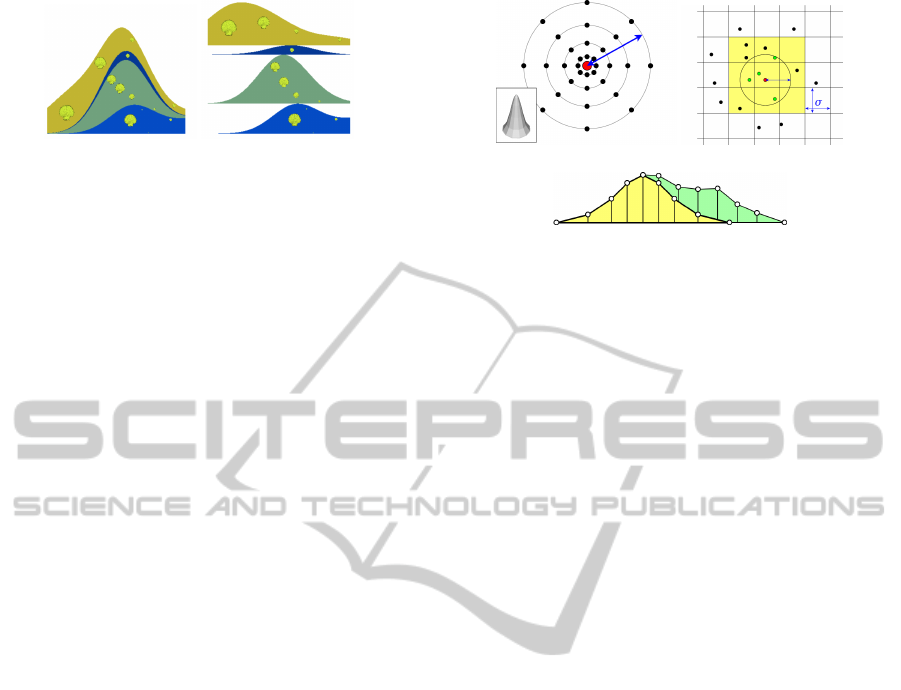
(c)
Figure 3: (a) Gaussian sample mask of radius σ (blue) with
additional sample points (black) around data item (red). (b)
Grid to quickly identify other items in σ-distance. (c) Quad-
strips to assemble sample positions into sediment layers.
tional meta-information can be presented at mouse
hover events. Although glyphs can be of arbitrary
shape, we use clam-shaped glyphs to be visually in
line with the sediment metaphor.
A profile provides several means to select data
items either glyph- or sediment-based. Glyph-based
selection includes direct picking or using arbitrarily
shaped polygons. Sediment-based selection means to
select data as arbitrary groups of sediments. Linked-
brushing, i.e. highlighting items that are selected in
other widgets, is achieved by adjusting glyph colors.
4.2 Management of Multiple Profiles
To display individual profiles, line segments can be
manually (de-)activated in the landscape view. Pair-
wise profile comparison is then achieved by chang-
ing their order in the 2-D view. To better relate a
profile to the map, the corresponding line segement’s
triangular-shaped color bar is placed below the pro-
file. Furthermore, we allow the fusion of sediment
profiles. In this case, an extended profile is generated
based on two line segments and they are combined
visually by merging their item groups. This is help-
ful for line segments that are connected at their end-
points or if physically distant parts of the landscape
should be treated as if they were actually next to each
other (as will be demonstrated in Section 6.1).
5 IMPLEMENTATION ISSUES
The implementation of the landscape metaphor is
straightforward and can be realized as a simple mod-
ule chain. If a module’s parameter changes, repetitive
landscape construction then efficiently starts at this
module and only includes subsequent modules. At
first, the data is filtered by class and time before den-
AGeologicalMetaphorforGeospatial-temporalDataAnalysis
165
sities are evaluated for remaining data items. After
filtering those items by density, the landscape geome-
try is generated and vertices are provided with correct
elevation and color values. The last modules create
glyphs per hill and sediment profiles, as triggered by
user interaction. The remainder of this section pro-
vides details about major implementation issues.
5.1 Landscape Metaphor
Implementing the landscape as a regular high-
resolution grid quickly becomes unmanageable for
accurate display of small hills on a big map. There-
fore, we apply discrete sampling masks at (filtered)
data item positions to obtain a sufficiently precise ap-
proximation (cf. Figure 3a). Then a 2-D Delaunay
triangulation of all sample points serves as the final
landscape. To color the surface without interpola-
tion artifacts, required information, like mean time
and standard deviation of contributing data items, is
attached to each vertex and processed by a fragment
shader using color gradient textures (cf. Figure 1a).
Many calculations can also be accelerated and paral-
lelized if data items are stored in a grid with a res-
olution of the Gaussian filter radius (cf. Figure 3b).
To generate glyphs per hill, the Delaunay triangula-
tion can easily be separated into connected compo-
nents above a certain height by starting a depth-first
search from every vertex to mark component associ-
ation. This process executes in linear time as every
vertex is processed only once. Data information as-
signed to each vertex is then used to generate glyphs.
5.2 Sediment Profiles
Sediment layers are generated by equidistant sam-
pling of the density function on the line segments de-
fined in the landscape view. Simple quad-strips are
used to assemble sediment layers and the whole pro-
file (cf. Figure 3c). To identify data items that con-
tribute to the profile, data can be stored in a kd-tree.
Then a range query with a size that comprises the pro-
file on the map quickly returns the desired items.
6 CASE STUDIES
In this section, we demonstrate the key features of our
geological metaphor. At first, we perform an exem-
plary investigation on a literature dataset, followed by
a comparison of the landscape to alternative overview
visualizations, based on the Iraq war logs (Rogers,
2010). We use a machine with two 2.4 GHz Quad-
core processors and 8 GB RAM. The whole construc-
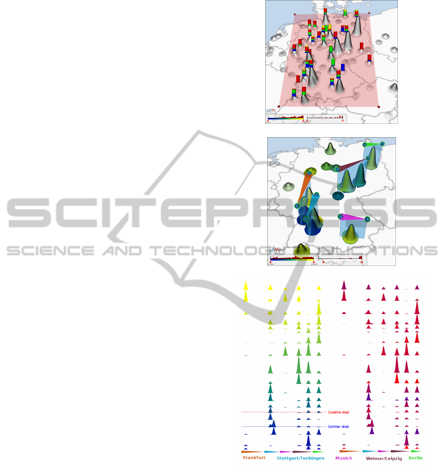
(a)
(b)
(c)
Figure 4: (a) Glyphs showing the distribution of Goethe
(red), Lessing (yellow), Schiller (blue), and Shakespeare
(green) at major locations in Germany. (b) Line segments
to localize sediment profile generation. (c) Fused profiles in
split-mode, colored by time (left) and writer (right).
tion and user interaction is fluent and respond times
after parameter changes are negligible.
6.1 Exemplary Analysis Process
The dataset in our first scenario consists of documents
published by or dealing with four important writers,
namely Goethe, Schiller, Lessing, and Shakespeare.
IVAPP2014-InternationalConferenceonInformationVisualizationTheoryandApplications
166
The data was extracted from an online public ac-
cess catalog (OPAC) and contains 4.436 records that
spread over some hundred years. Each record is an-
notated with a writer, longitude- and latitude values,
and the publication year. Because the data is primarily
distributed over Germany, we limit our analysis to this
area. To get a first impression about the data’s spatial
distribution, we choose a Gaussian filter radius that
is able to split features at city-level. Then we draw a
polygon around all features located in Germany and
we change its height so that prominent features are
assigned with a glyph to summarize the writer (class)
distribution. As shown in Figure 4a, the data clearly
concentrates in a few cities, and the most remarkable
insight extracted from the glyphs is the dominating
presence of publications by Goethe (red). The poten-
tial occlusion of hills and glyphs can be problematic
in 3-D. However, occlusions can easily be reduced by
rotating the whole scene, and, on the other hand, this
drawback is compensated by better local feature ac-
centuation if item count translates into hill elevation;
instead of large, aggregating glyphs on a 2-D map.
Because Goethe and Schiller represent the major-
ity of records in Germany, we use the class filter to re-
strict the landscape construction to both writers. Fur-
thermore, we use the elevation filter to remove small
features. To provide more details about the spatial,
temporal and class evolution of published documents,
we place a line segment at each major hill in order to
analyze their inner sediment structure. The scenario is
illustrated in Figure 4b. Note how the landscape color
already indicates where data items are old, young or
mid-aged. To compare all individual profiles at the
same time, we fuse them into one and use a sediment
partition by time with 20 sediments. Figure 4c shows
two versions of the fused profile in split-mode. The
left one is colored by time and the right one is col-
ored by class. Colored triangles below both profiles
correspond to the line segments to indicate the cities.
The first profile clearly reveals two insights: In terms
of time, the dataset contains publications from the au-
thor’s lifetime until today (yellow), while most of the
documents appeared after their death (dotted lines).
In terms of location vs. time, data occurrence for both
writers follows their major places of activity during
their lifetime (Leipzig, Stuttgart), but spreads to other
cities after they died, most likely because many peo-
ple in capital cities dealt with their heritage (Berlin,
Munich, Frankfurt). The highest peak is Weimar,
where both writers lived and died. The second profile
relates the writer to both location and time. It uncov-
ers that the publication places of Goethe and Schiller
primarily varied in the early years, but mixed later on.
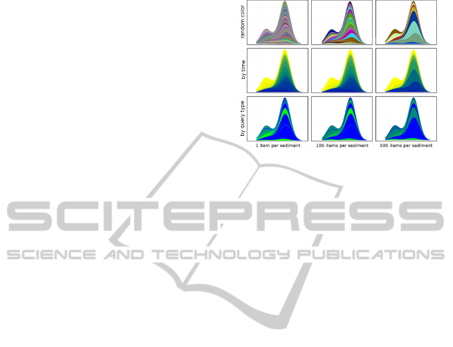
To address the visual effect of using the presented
Figure 5: Sediment profiles for different color schemes and
with varying sediment granularity.
sediment color schemes at different granularities, we
concentrate on those documents by Schiller and Less-
ing that are located around Frankfurt and Stuttgart.
We use a larger Gaussian filter radius to abstract the
whole region instead of single cities. In all profiles
shown in Figure 5, the time aspect is encoded in the
order of the sediments. That is, even if sediments are
colored by class, we can still observe that the smaller
hill appeared later than the other one. Of course, the
relation between time and location is best reflected
if sediments are colored by time. But at finer gran-
ularities, even this obvious coloring scheme can hide
spatial variance. This can be countered with a random
coloring. In our scenario, this reveals that especially
old data items occur at up to five locations, before
the two main hills eventually dominate. For coarser
granularities, colors for aggregated class and time are
interpolated. While this could result in invalid class
depiction, the indication of interesting relationships -
that might deserve further investigation using a finer
sediment granularity - still works sufficiently well un-
til a sediment group contains very many items.
6.2 Overview Capabilities
The major advantage of the geological metaphor is
the manifold and detailed information conveyed by
inner sediment structure. However, we also want to
compare overview capabilities, i.e. how much static
information is provided without further user interac-
tion. We choose the Iraq war logs for this scenario.
The data was published by Wikileaks and consists of
around 60.000 records that describe incidents with at
least one casualty from 2004 to 2009.
The first visualization, as presented by The
Guardian (Rogers, 2010), is shown in Figure 6a. Ev-
ery data item is represented by a small circle-glyph at
the incident’s location on the map. While it is easy to
AGeologicalMetaphorforGeospatial-temporalDataAnalysis
167
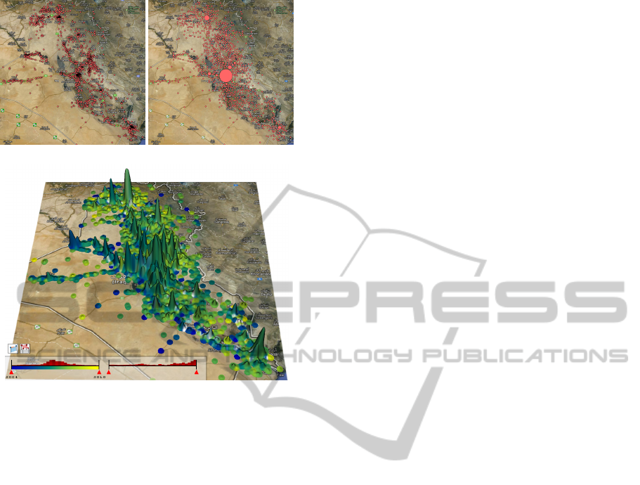
(a) (b)
(c)
Figure 6: Iraq war logs: (a) Single glyphs per data item,
courtesy of ’The Guardian’ (Rogers, 2010). (b) Aggregated
glyphs, courtesy of ’GeoTemCo’ (J
¨
anicke et al., 2013). (c)
Our landscape metaphor with surface colored by time.
extract the data’s spatial extent, its spatial distribution
can not be determined reliably. Even though glyphs
occasionally appear as visually dense areas, reading
concrete item count is impeded by glyph overlap.
Conflict centers can thus only be guessed and glyph
color is furthermore wasted to indicate a single data
class. Figure 6b shows the visualization provided by
GeoTemCo (J
¨
anicke et al., 2013). The authors use an
iterative process to combine overlapping glyphs un-
til each glyph is overlap-free. Final glyph size then
reflects the number of aggregated glyphs. Although
the visualization looks much clearer, there are still
some problems: If many data items occur at one sin-
gle location this results in a very big glyph; that grows
even more due to increasing overlap with neighbor-
ing glyphs. Therefore, to avoid having a Baghdad-
glyph (center of the map) covering the whole screen,
glyph size is logarithmized. This, however, impedes
the comparison of single items to glyphs that poten-
tially aggregate dozens of items; which happens near
Al Bukamal (middle left side) and is visible as a dense
area in Figure 6a, but hidden in Figure 6b. Glyph
color is again wasted for one single class.
Figure 6c shows the landscape metaphor for the
same dataset. Regions of higher item count are eas-
ily identified as outstanding hills. Because we do not
use 2-D glyph size, but 3-D hill elevation, feature
granularity is much finer because item count space-
efficiently translates into height values; thus high-
lighting more distinct features on the same map. Fur-
thermore, we only need to decrease the Gaussian
filter radius to split hills at this zoom-level of the
map; while GeoTemCo has to zoom-in to split ag-
gregated glyphs and can not compare distant features
anymore. Most importantly, because we do not use
single-colored glyph-augmentation, we can utilize the
2-D landscape surface to convey time as a second data
aspect. The color distribution indicates that the major-
ity of all incidents happened at the data’s mean time in
2007 (green), while some old (blue) and young (yel-
low) regions stand out. At some places (lower right
side), hills are even white due to high standard devia-
tion. This indicates that incidents in this area occurred
in the beginning (2004) and at the end (2009) of the
conflict and suggests further analysis.
7 CONCLUSIONS
We presented a geological metaphor to illustrate,
compare and further investigate multiple queries of
different type in a geospatial-temporal context. Com-
pared to existing approaches, we focus on the depic-
tion of relations between multiple data aspects. Al-
though individual aspects could be illustrated with
higher accuracy in separated widgets, we opted for
a more abstract, but combined visualization of their
relationships because we think that, though at lower
granularity, these relationships are more important to
reveal interesting features that deserve further analy-
sis in a next step.
The geological metaphor provides means to con-
vey different information at varying granularity.
While the most summarized information of a data as-
pect is a scalar value that can be mapped to surface
color, finer granularities are then provided as propor-
tions on glyphs and, finally, as sediment layers that
also consider chronological order. The intuitive sedi-
ment metaphor provides easy access to relate time, lo-
cation, class, and item count to each other at the same
time in one sediment profile. Furthermore, we decou-
pled local feature accentuation and glyph granularity
from the map’s zoom-level. Although the Gaussian
filter radius could still be adjusted with the zoom, we
think its more important not to lose features on the
map, e.g. to compare distant cities. Glyph granularity
is additionally determined by (sub-)hill components
above the polygon.
We implemented the proposed metaphor as a sur-
IVAPP2014-InternationalConferenceonInformationVisualizationTheoryandApplications
168

rogate map-widget to complement other frameworks
by quickly indicating relationships between data as-
pects that could then be analyzed individually with
specifically tuned widgets.
ACKNOWLEDGEMENTS
The authors thank anonymous reviewers for valuable
comments and assistance in revising the paper. The
work presented in this paper was supported by a grant
from the German Science Foundation (DFG), number
SCHE663/4-1 within the strategic research initiative
on Scalable Visual Analytics (SPP 1335).
REFERENCES
Andrienko, G. and Andrienko, N. (2006). Visual Data Ex-
ploration: Tools, Principles, and Problems. In Clas-
sics from IJGIS: twenty years of the International
journal of geographical information science and sys-
tems, pages 475–479. CRC Press.
Andrienko, N. and Andrienko, G. (2005). Exploratory
Analysis of Spatial and Temporal Data: A Systematic
Approach. Springer.
Dent, B. D. (1999). Carography: Thematic Map Design.
McGraw-Hill, 5th edition.
D
¨
ork, M., Carpendale, S., Collins, C., and Williamson, C.
(2008). Visgets: Coordinated visualizations for web-
based information exploration and discovery. IEEE
Transactions on Visualization and Computer Graph-
ics, 14(6):1205–1212.
Eccles, R., Kapler, T., Harper, R., and Wright, W. (2008).
Stories in geotime. Information Visualization, 7(1):3–
17.
Fabrikant, S. I., Montello, D. R., and Mark, D. M. (2010).
The natural landscape metaphor in information visu-
alization: The role of commonsense geomorphology.
J. Am. Soc. Inf. Sci. Technol., 61(2):253–270.
J
¨
anicke, S., Heine, C., and Scheuermann, G. (2013).
GeoTemCo: Comparative Visualization of
Geospatial-Temporal Data with Clutter Removal
Based on Dynamic Delaunay Triangulations. In
Csurka, G., Kraus, M., Laramee, R., Richard, P.,
and Braz, J., editors, Computer Vision, Imaging and
Computer Graphics. Theory and Application, volume
359 of Communications in Computer and Information
Science, pages 160–175. Springer Berlin Heidelberg.
Kapler, T. and Wright, W. (2005). Geo time information vi-
sualization. Information Visualization, 4(2):136–146.
Kim, S., Maciejewski, R., Malik, A., Jang, Y., Ebert, D. S.,
and Isenberg, T. (2013). Bristle maps: A multivari-
ate abstraction technique for geovisualization. IEEE
Transactions on Visualization and Computer Graph-
ics, 19(9):1438–1454.
Kraak, M. J. (1988). The space-time cube revisited from a
geovisualization perspective. Proceedings of the 21st
International Cartographic Conference, 1995.
Maciejewski, R., Rudolph, S., Hafen, R., Abusalah, A. M.,
Yakout, M., Ouzzani, M., Cleveland, W. S., Grannis,
S. J., and Ebert, D. S. (2010). A visual analytics
approach to understanding spatiotemporal hotspots.
IEEE Transactions on Visualization and Computer
Graphics, 16(2):205–220.
Roberts, J. C. (2007). State of the art: Coordinated multiple
views in exploratory visualization. In Proceedings of
the 5th International Conference on Coordinated Mul-
tiple Views in Exploratory Visualization (CMV2007).
IEEE Computer Society Press.
Rogers, S. (2010). The Guardian - Wik-
ileaks Iraq war logs: every death mapped.
http://www.guardian.co.uk/world/datablog/interactive/
2010/oct/23/wikileaks-iraq-deaths-map (Retrieved
2013-09-17).
Roth, R. E., Ross, K. S., Finch, B. G., Luo, W., and
MacEachren, A. M. (2010). A User-Centered Ap-
proach for Designing and Developing Spatiotemporal
Crime Analysis Tools. In Purves, R. and Weibel, R.,
editors, Proceedings of GIScience.
Shneiderman, B. (1996). The eyes have it: A task by data
type taxonomy for information visualizations. In Pro-
ceedings of the 1996 IEEE Symposium on Visual Lan-
guages, pages 336–343. IEEE Computer Society.
Slocum, T. A., McMaster, R. B., Kessler, F. C., and Howard,
H. H. (2009). Thematic Cartography and Geovisual-
ization. Prentice Hall Series in Geographic Informa-
tion Science. Prentice Hall, 3rd, international edition.
Tominski, C., Schulze-Wollgast, P., and Schumann, H.
(2005). 3d information visualization for time depen-
dent data on maps. 2010 14th International Confer-
ence Information Visualisation, 0:175–181.
Tominski, C., Schumann, H., Andrienko, G., and An-
drienko, N. (2012). Stacking-based visualization of
trajectory attribute data. IEEE Transactions on Visu-
alization and Computer Graphics, 18(12):2565–2574.
Ware, C. (2004). Information Visualization: Perception for
Design. Morgan Kaufmann, 3rd edition.
Wise, J. A., Thomas, J. J., Pennock, K., Lantrip, D., Pot-
tier, M., Schur, A., and Crow, V. (1995). Visual-
izing the non-visual: spatial analysis and interaction
with information from text documents. In Proceedings
of the 1995 IEEE Symposium on Information Visual-
ization, INFOVIS ’95, pages 51–, Washington, DC,
USA. IEEE Computer Society.
Xu, K., Cunningham, A., Hong, S.-H., and Thomas, B. H.
(2007). Graphscape: integrated multivariate network
visualization. In Hong, S.-H. and Ma, K.-L., editors,
APVIS, pages 33–40. IEEE.
AGeologicalMetaphorforGeospatial-temporalDataAnalysis
169
