
A Sketch of a Theory of Visualization
Randy Goebel
Alberta Innovates Centre for Machine Learning, Department of Computing Science,
University of Alberta, Edmonton, Alberta, Canada
Keywords:
Visualization, Induction, Data Abstraction, Picture Abstraction, Dimensionality Reduction, Data Picture
Mapping, Domain Semantics.
Abstract:
A picture results from a possibly multi-layer transformation of data to a visual vocabulary in which humans
can draw inferences about the original data. The goal of this visualization process is to expose relationships
amongst the data that are otherwise difficult to find, or only emerge by the process of the transformation. In
case of the former kind of inference (confirming a relationship that did exist but was not obvious), visualization
provides a kind of inferential amplifying effect. In the case of the latter (exposing new data relationships),
visualization provides an inductive mechanism to create hypotheses not manifest in the original data. In this
regard, the creation of pictures from data is about data compression, which is naturally a kind of machine
learning. Just as statistical concepts like average and standard deviation provide a measure on properties
of a set of numbers, so too does visualization provide a kind of “measure” on data compressed to a visual
vocabulary presented as a picture. Our position is that visualization is about the (potentially multi-step, multi-
layered) transformation of data to pictures, and that ever such transformation must make choices about what
kinds of relations to preserve, and what kinds of data artifacts to avoid in each such transformation. Like
a chain of formal inference, conclusions following from the end result (the picture) are determined by what
each transformation in the inference chain is intended to accomplish. We argue that the visualization of large
data sets, too large to inspect directly, requires a rigorous theory of how to transform data to pictures, so that
the scientists as observers can be assured that inferences drawn from the pictures are either confirmable in the
detailed data, or at least plausible hypotheses which can be further pursued by seeking further data (evidence).
1 INTRODUCTION
The process of visualization is about transforming
data into pictures. As Stuart Card has written, “The
purpose of information visualization is to amplify
cognitive performance, not just to create interesting
pictures. Information visualizations should do for
the mind what automobiles do for the feet.
1
” There
are, of course, an incredibly large number of ways
in which one could transform some arbitrary collec-
tion of data into a picture. But it is sensible to first
consider those transformations that expose data rela-
tionships not easily revealed, either because of data
complexity or data volume.
The real practical challenge of visualization is
making choices: how should one select within the
data to focus the quest for implicit relationships, and
what kind of visual vocabulary should those data be
mapped to? Neither question can be addressed well
1
(Card, 2012), page 539.
without some way of evaluating which kind of data
selection and picture transformation is “best.” If the
the overall motivation of visualization is to expose im-
plicit data relationships, then visualization evaluation
needs to be able to determine which methods provide
the best support for inferences drawn from the pic-
tures created from the selected data.
There is no existing theory of visualization which
can be used to guide the decisions about how to com-
press large data sets and transform them into pictures.
There is, of course, some strong even compelling ar-
guments that the foundation of any visualization the-
ory must be based on the cognitive processes of hu-
man perception (e.g., (Patterson et al., 2013)). And
there is also computational scaffolding that provides
a computational perspective on a potential pipeline of
picture production (Card et al., 1999). Furthermore,
it is clear that a number of researchers have noted the
relationship between visualization manipulation and
analytics (e.g., (May et al., 2010)), and it is clear that
the effectiveness of amplifying human inference on
218
Goebel R..
A Sketch of a Theory of Visualization.
DOI: 10.5220/0004852702180221
In Proceedings of the 5th International Conference on Information Visualization Theory and Applications (IVAPP-2014), pages 218-221
ISBN: 978-989-758-005-5
Copyright
c
2014 SCITEPRESS (Science and Technology Publications, Lda.)
pictures is improved by interaction. Our position here
is not to argue against the role of human cognition in a
theory of visualization, nor to suggest picture manip-
ulation is not important. Instead, our goal is to sketch
a set of what we view as necessary and complemen-
tary components of a visualization theory, based on
machine learning coupled with evaluation based on
visual inference.
To keep the statement of the position simple, we
will use the term “picture” to mean any visual rep-
resentation of data, including photographs, video,
and any existing visualization outputs like bar charts,
radar plots, and dynamic interactive immersive dis-
plays. We will argue that a picture results from a se-
ries of transformations, through a layer of connected
vocabularies, where each layer emerges from the pre-
vious by some kind of machine learning data com-
pression. Each compression step is responsible for
finding appropriate aggregations of data, in order to
support the recognition of data trends (e.g., averages
of numeric data, size of measure data, etc.), which
eventually get mapped to a picture vocabulary.
The result is a picture, and the interpretation of the
picture by humans leads to inferences about the orig-
inal or base data which has travelled through a series
of compression transforms. The quality of the picture
is measured in two ways: 1) how many accurate in-
ferences are exposed for the viewer, and 2) what new
relationships amongst the data are revealed by the pic-
ture.
2 INFORMAL OBSERVATIONS
ABOUT “GOOD”
VISUALIZATIONS
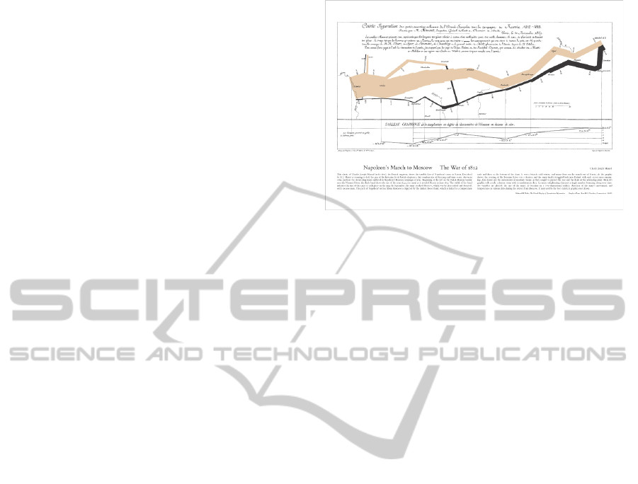
From a reprinting in Tufte’s first graphical design
book (Tufte, 1983), Jacques Minard’s drawing of
Napoleon’s march on Moscow is given in Fig 1. It is
immediately obvious that the declining width of the
dark line represents the declining number of soldiers
at the campaign proceeded.
In fact the most important aspect of an picture
evaluation is really about this idea of what is immedi-
ately obvious. And since there are so many alternative
ways to render a picture, it is natural to believe that
some will make some inferences more obvious than
others.
In this regard, we can already get a pretty good
idea about how to assess alternative pictures of the
same data: some will make it easier to make obvious
inferences. Like the relative size of Napoleon’s army
in Fig 1, a relation table of a time series of numbers
Figure 1: Jacques Minard’s “Napoleon’s March on
Moscow”.
would still support the inference of how the size of the
army changed over that time series. But the picture
makes it easier to see.
Similarly, but perhaps less obvious, some alterna-
tive pictures of the same data will expose hypotheti-
cal relationships in the data that were simply not pre-
viously considered; for example, the Napoleon dia-
gram includes a chart near the bottom that shows the
change in temperature during the campaign, but it is
not so easy to create hypotheses about the weather’s
impact on the size of the army as it travelled. Can
the weather be considered as a factor independent of
the geographical location of the army, for example?
It is easy to imagine alternative pictures, e.g., that
show topographical relief, and then consider factors
like climbing over mountains as a potential impact on
the army’s progress.
The summary point is first, that evaluation of the
quality of a picture produced from data is an inte-
gral component of any theory of visualization, and
second, that one should distinguish between pictures
which not only aid in the perspicuity of drawing in-
ferences on the data, but also provide support for ex-
posing plausible hypotheses on the data.
3 ABSTRACTION LAYERS IN
DATA AND PICTURE DOMAINS
In contrast to traditional logical chains of inference,
those within a multi-layer theory of visualization
can transcend abstraction boundaries, as illustrated in
Fig 2. In (Goebel et al., 2013), the use of machine
learning to actually build these multi-layer models is
described; here we merely note the following proper-
ties of the simple three layer model of protein struc-
ture.
ASketchofaTheoryofVisualization
219
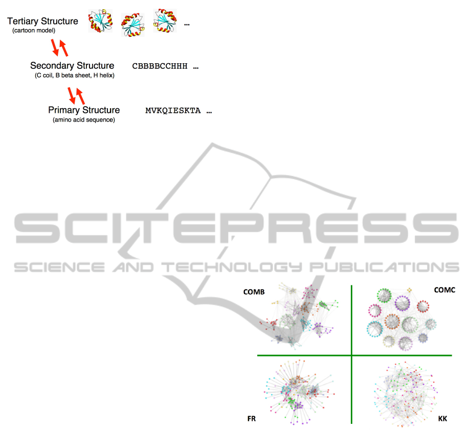
Figure 2: An abstraction of three levels of protein represen-
tation.
First, at the lowest level of detail, the base data
is the confirmed sequence of amino acids that com-
prise the protein in question. Note that conventional
systems biology is able to accurately create these se-
quences from proteins with perfect accuracy. But the
visualization in Fig 2 is not about the base data it-
self, but about an abstraction of that data, labelled as
the protein’s secondary structure. This more abstract
vocabulary is of random coils (C), beta sheets (B),
and helices (H). So the transformation from the amino
acid level to the secondary structure is an aggregation
or compression step: it compresses the simpler amino
acid sequences into the secondary structure vocabu-
lary.
Note that this transformation is not currently well-
defined. The secondary structure rendered in the vo-
cabulary of C, B, and H is a hypothesis about the pro-
tein structure, and as explained in the Wiki entry for
protein secondary structure, the “C” is really a catch
all for undetermined structure. But this illustrates the
inductive nature of these multi-layer transformations,
ending in a picture: the transformation from amino
acid sequence, to secondary structure (vocabulary C,
B, H), then to the tertiary structure represented by
three dimensional “cartoon” models is an inductive
multi-step transformation from base data to picture.
In practise, such transformation as valuable as hy-
pothesis management systems (e.g., (Bertschi et al.,
2011)), because there are relatively well defined con-
straints that identify the elements of each layer as hy-
potheses about protein structure.
Similarly, in a more general theory of visualiza-
tion, the picture produced at the end of the data to
picture transformation chain should at least present a
picture that constrains the viewer to plausible infer-
ences about the data in question.
4 VISUALIZATION EVALUATION
More attention is here required regarding earlier com-
ments about the manner in which pictures support the
drawing of inferences by humans. Within this sketch
of a theory of visualization, a central hypothesis is
that the goal of a picture is to assist humans in draw-
ing inferences about data that would otherwise be dif-
ficult or even impossible from the base data itself.
One only has to consider a practical example of how
large a spreadsheet can get before one fails to see re-
lationships intended within the cells.
So if the base data are too voluminous or com-
plex to provide the basis for drawing inferences as
humans, then one would expect a variety of differ-
ent visualization methods would encourage inference,
one way or another. A simple illustration of alterna-
tive methods to visualize community clusters is given
below in Fig 3. The four different community clusters
are layed out with the Fruchterman-Rheingold (FR),
Kameda-Kawai (KK), and the COMB and COMA
layout methods of Fagnan et al. (Fagnan et al., 2012).
While the four different pictures are abstracted from
the same base data, a viewer will have a preference
for which picture is preferred when asked to infer the
number of distinct communities.
Figure 3: Four alternative graphical layouts of the same
data.
A more impactful illustration of the need to con-
sider the kinds of inferences a human could draw from
alternative pictures of the same data is give in Fig 4.
In this case, the figure demonstrates how human per-
ception can be fooled into incorrect inferences ((Adel-
son, 1995)). It is clear that it is not just that visual-
ization evaluation must consider those inferences bet-
ter enabled by alternative pictures, but that great care
must be taken to not introduce artifacts that lead to
incorrect inference (unless that is intended).
The summary point is that evaluation is not just
necessary, but requires a formulation based on how
alternative pictures support either efficient inference
about confirmable data relationships, evidence for
likely hypotheses consistent with but not contained
within the base data, while ensuring no artifact sug-
IVAPP2014-InternationalConferenceonInformationVisualizationTheoryandApplications
220

Figure 4: Demonstration of the checkerboard illusion.
gests wrong or implausible inferences. As a compo-
nent of a theory of visualization, an evaluation method
will ensure all these issues are in some way addressed.
5 SUMMARY
There is still much to say about how a multi-layer
theory of visualization should be structured, and how
the properties at one level are selected and preserved
when mapped to the subsequent layer. Indeed, dy-
namic visual analytics is about how direct manipula-
tion of a picture can be constrained by the next lower
level so that users exploring the properties of a picture
are constrained to make only plausible adjustments to
that picture (cf. (Cooper et al., 2010)).
But the primary value of such a theory is to
articulate principles, which are typically domain-
dependent, for the multi-layer mappings from base
data to picture. This ensures that anomalies are not
created in the mappings, and that the resulting pic-
tures can be evaluated with respect to their inferential
value. In that regard, evaluation must focus on how
alternative mappings to pictures make accurate con-
strained inference easy or difficult.
ACKNOWLEDGEMENTS
This research is supported in part by AICML, iCORE,
NSERC, AITF, and the Meme Lab of Hokkaido Uni-
versity. I am grateful for continued discussions on all
aspects of visualization with Wei Shi, Yuzuru Tanaka,
Walter Bischof, Christopher Culy, Jonas Sjobergh,
and Bob Spence. All misconceptions and misrepre-
sentations remain my own.
REFERENCES
Adelson, E. H. (1995). The checker shadow illu-
sion. see /web.mit.edu/persci/people/adelson/ check-
ershadow illusion.html.
Bertschi, S., Bresciani, S., Crawford, T., Goebel, R., Kien-
reich, W., Lindner, M., Sabol, V., and Moere, A. V.
(2011). What is knowledge visualization? perspec-
tives on an emerging discipline. 2010 14th Interna-
tional Conference Information Visualisation, 0:329–
336.
Card, S. K. (2012). Information visualization. In Jacko,
J. A., editor, Human-Computer Interaction Hand-
book: Fundamentals, Evolving Technologies, and
Emerging Applications, 3rd Edition, pages 515–545.
CRC Press.
Card, S. K., Mackinlay, J. D., and Shneiderman, B. (1999).
Readings in information visualization - using vision to
think. Academic Press.
Cooper, S., Treullie, A., Barbero, J., Leaver-Fay, A., Tuite,
K., Khatib, F., Snyder, A. C., Beenen, M., Salesin, D.,
Baker, D., and Popovi
´
c, Z. (2010). Predicting pro-
tein structures with a multiplayer online game. Na-
ture, 466:756–760.
Fagnan, J., Za
¨
ıane, O. R., and Goebel, R. (2012). Visualiz-
ing community centric network layouts. In Banissi, E.,
Bertschi, S., Burkhard, R. A., Cvek, U., Eppler, M. J.,
Forsell, C., Grinstein, G. G., Johansson, J., Kender-
dine, S., Marchese, F. T., Maple, C., Trutschl, M., Sar-
fraz, M., Stuart, L. J., Ursyn, A., and Wyeld, T. G., ed-
itors, Information Visualization 2012, pages 321–330.
IEEE Computer Society.
Goebel, R., Shi, W., and Tanaka, Y. (2013). The role of di-
rect manipulation of visualizations in the development
and use of multi-level knowledge models. In 17th In-
ternational Conference on Information Visualization,
pages 325–332. IEEE Computer Society.
May, R., Hanrahan, P., Keim, D., Shneiderman, B., and
Card, S. (2010). The state of visual analytics: Views
on what visual analytics is and where it is going. In Vi-
sual Analytics Science and Technology (VAST), 2010
IEEE Symposium on, pages 257 –259.
Patterson, R., Liggett, K., Blaha, L., Grinstein, G., Havig,
P., Kaveney, D., Moore, J., and Sheldon, K. (2013).
A theory and model of visualization. International
Journal of Computer Graphics and Visualization.
(preprint).
Tufte, E. R. (1983). The visual display of quantitative in-
formation. Graphics Press.
ASketchofaTheoryofVisualization
221
