Doctoral Thesis
A Visual Analysis System for Hierarchical Ensemble Data
Matthias Thurau
Computer and Cognitive Sciences (INKO), University of Duisburg-Essen, Duisburg, Germany
1 STAGE OF THE RESEARCH
My research is done during a project with the steel
making industry in cooperation with the university of
Duisburg-Essen. We cooperated with a big German
steel production facility to digitize samples of steel to
control and enhance steel quality. While the project
included various areas of research for four doctoral
students, my part is the visual representation of re-
sults. I am working on the visual analysis system
since two years and have planned another year to fin-
ish the implementation, evaluation and doctoral thesis
writing.
2 OUTLINE OF OBJECTIVES
Steel making is a very complex process consisting of
various stages. At each stage, the production param-
eters can vary to fulfill the wishes of differing cus-
tomers. There are thousands of grades of steel, each
having specialized properties relating to corrosion,
heat resistance, deformability, welding quality, costs
and so forth. To fulfill these differing requirements,
variations occur in the production process. There may
be variations in the process flow, whether intention-
ally such as varying the number of production steps
in order to reduce costs, which would normally affect
the purity of the steel or unintentionally through mal-
functions. Also, there are variations in the process
parameters, like different melting temperatures, dif-
ferent material ingredients and the different timings
and durations of each production step. Additionally,
the process is subject to various natural fluctuations
that have an impact on the outcome. While the smelt-
ing furnace should be heated to a certain temperature,
it may fluctuate by several degrees and may thus af-
fect the outcome.
The outcome is measured in the form of a multi-
dimensional data set for a sample of the finished steel
slab. The steel-making facility is digitizing scientific
volume data about defects found in the steel. These
defects can be impurities in the form of nonmetallic
inclusions, argon bubbles or cracks. The volume data
is analyzed in a preprocess to create shape descriptors,
which can be analyzed much faster than the original
volume data.
Summarizing said, there are hundreds of input pa-
rameters, whether desired or undesired through un-
certainty, that influence the outcome. That outcome
again is highly complex and huge. The outcome
is hierarchical, multidimensional, multivariate, mul-
timodal and hierarchical. This is highly compara-
ble to typical ensemble data sets which often come
from simulations, like climate research (Nocke et al.,
2007). However, ensemble data from simulations of-
ten include timevarying results, taken from different
time-steps of the simulation. The dimension of time
is not supported by my system, as the data set is not
computer-simulated and thus only analyzes a single
measured outcome.
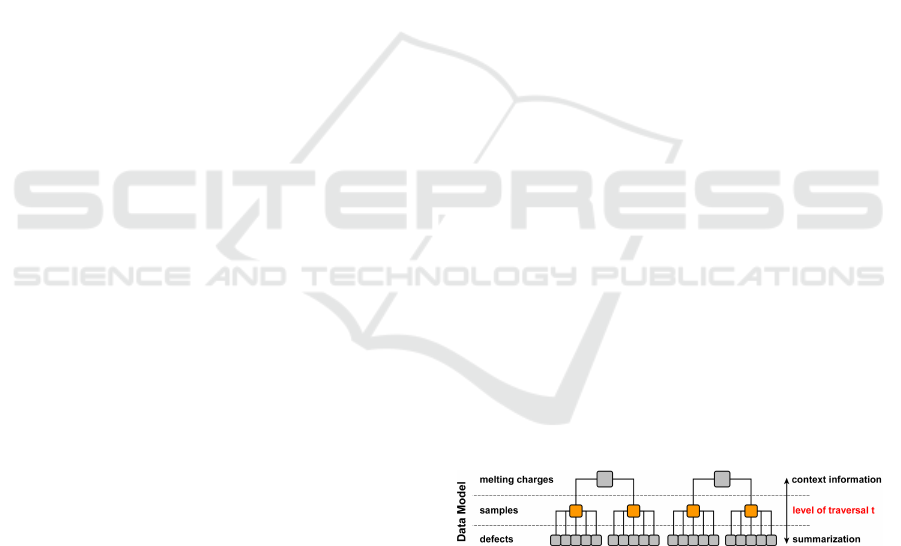
Figure 1: The system architecture has a data tree in the cen-
ter, the main data model. Several data interactions are avail-
able for manipulating that tree.
Fig. 1 shows the data model. The hierarchical data
sets consists of three levels, named melting charges,
samples and defects in our use case scenario. There is
a level of traversal t, which is the hierarchical level of
the nodes to compare. As an example, we can com-
pare samples with each other, but not samples with
defects as that would not make much sense.
3 RESEARCH PROBLEM
The goal of the analysis of our ensemble data set is
to identify the significance of various input parame-
ters on the output (sensitivity analysis), analyze those
changes in detail (trend analysis), find relationships
between different output variables (dimensions), an-
52
Thurau M..
Doctoral Thesis - A Visual Analysis System for Hierarchical Ensemble Data.
Copyright
c
2014 SCITEPRESS (Science and Technology Publications, Lda.)

alyze the range of outcomes (uncertainty) and find
anomalies and outliers within the samples for qual-
ity control purposes. Some of the expected results
are the following. Defects floating in the liquid steel
may have an ascending force, like that of bubbles in
sparkling water. As a result, since the border of the
steel slab solidifies first when it meets a lower ambi-
ent temperature, defects should be trapped in the so
called inclusion band, which is located in the upper
part of the slab. The larger a defect is, the greater
its ascending force and therefore the higher its posi-
tion in the inclusion band. Other properties that may
influence the position of defects are sphericity (form
descriptor), type of defect, and properties inherited
from the melting charge, such as material ingredients
or the duration of the oxygen blowing process. With
certain types of defects, the defects size may corre-
late with its sphericity, again like bubbles in sparkling
water. The bigger the defect is, the more spherical it
may be. A more complex relation may be the melt-
ing temperature in combination with the defects po-
sition. Because initial temperature determines how
long steel remains molten, the degree of the influence
of the defects size on its position may vary. Several of
these effects and relationships can be analyzed with
my system.
4 STATE OF THE ART
4.1 Visualizing the Complex Data
Hierarchy
One possibility is to visualize a selected level of
traversal t with some kind of visualization. For in-
stance, a histogram is shown which summarizes a sin-
gle dimension of all the nodes on level t, e.g., the
cleanliness of all samples. This actually means, that
each node on level t is simplified so that it can be vi-
sualized. This of course can be very beneficial, as
some of the ”unimportant” dimensions aren’t shown
and thus won’t distract the end user. I call this kind of
visualization a level overview visualization as it gives
a brief summary of the whole level t. Another exam-
ple is the visualization of a two dimensional graph to
reveal the influence of an input parameter to an out-
come dimension (trend analysis), e.g., the steel clean-
liness over the smelting temperature. While my sys-
tems allows the visualization of a level overview, it is
not the focus of my research.
Small multiples (Tufte, 1990), on the other hand,
are well known to visualize multiple nodes using the
data of lower hierarchical levels, e.g., each sample is
represented by a histogram of the volumes of the de-
fects found in it. This is actually a more detailed way
to visualize the complete level t. I applied that idea
and extended the small multiples to ”small multiples
of multiple views”.
Finally, there exist many visualization systems to
analyze such data sets. A single node is a com-
plex data structure, because it has context information
available and also multiple child-nodes consisting of
various dimensions and modalities. Hierarchical visu-
alizations, like treemaps, could reveal the hierarchical
structure but that would not be of interest here as there
is a fixed hierarchy known by the end users. State of
the art are visualization systems, which allow the se-
lection of hierarchical levels and data dimensions in
combination to a visualization type (histogram, graph,
etc.) to get a visualization, or view, on a selected slice
of the data. Multiple of those visualizations and views
(Multiple Views) can be arranged side by side to sup-
port the data analysis in more detail and are today’s
state of the art. Further more, linking and brushing
abroad single views are used to help analyzing the
data further more.
4.2 First Contribution
I retain and support the state of the art of general
purpose multiple view systems to get an insight of
a complex node, like one sample. Users can build
their own MultiView-layouts using various visual-
ization types to visualize different dimensions and
hierarchical levels at once (Wang Baldonado et al.,
2000). My added contribution is, that the user-created
MultiView-layout is reused multiple times to visual-
ize multiple nodes side by side. Therefore, the user is
encouraged and supported to configure the layout in
such a way, that the specific data from a node of level
t is visualized, as shown in fig. 2 and 4.
There is some text-based information from par-
ent nodes (melting charges), some statistical visual-
izations summarizing lower nodes (piechart of defect
types, etc.) and scientific volume visualizations from
especially dangerous defects found through simple
data mining techniques.
The expected outcome is a huge enhancement in
data selection, because the typical node selection of
state of the art systems uses some text-based explorers
or smaller simplified visualizations. My system visu-
alizes the nodes fully so that the users can search vi-
sually by scrolling through the nodes, comparable to
small multiples. It is able to seamlessly adapt to dif-
ferent roles, whether the analysis of a single ensemble
member (typically a large coordinated multiple view)
or the trend analysis of multiple ensemble members
DoctoralThesis-AVisualAnalysisSystemforHierarchicalEnsembleData
53
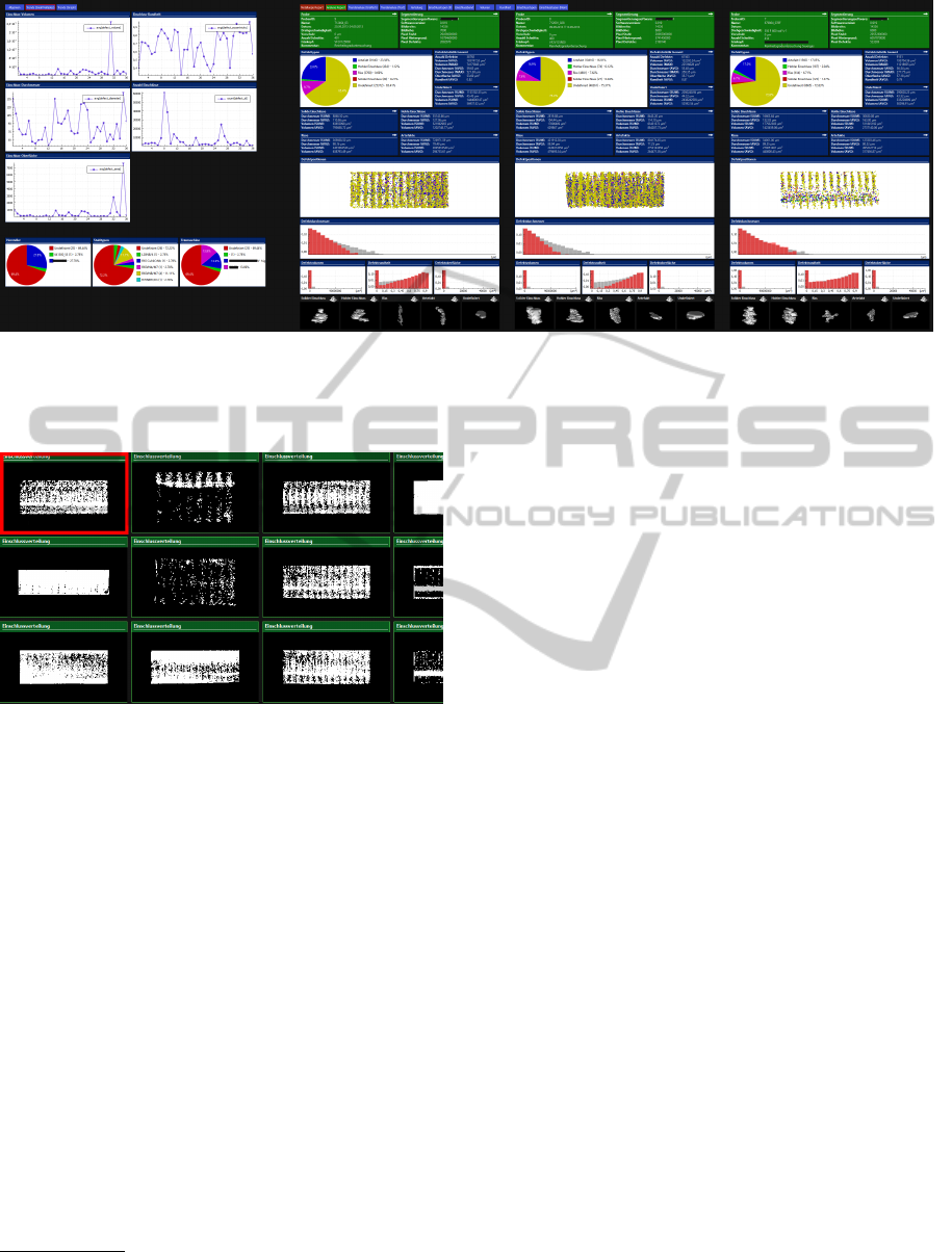
Figure 2: This screenshot shows the level of traversal set to samples. The samples of the current data tree are visualized. Each
sample is presented in multiple views consisting of various visualization types and data from different hierarchical levels
(context+detail). Level overview visualizations are positioned on the left side. By scrolling further to the right, more samples
can be seen.
Figure 3: A layout for small multiples consisting of only
one view per node.
(typically small multiples using a single small visu-
alization, fig. 3). For that reason, my system allows
layouts to be saved for reuse at a later time. Changing
the layouts is done by clicking its name on the top of
the screen. Multiple predefined layouts are common
in systems like Eclipse
1
or Microsoft Visual Studio
2
.
Also, I expect great results for trend analysis by
resorting and filtering the data on different hierar-
chical levels. For that reason, I am thinking about
adding intelligent or augmented scrollbars, that show
additional information about the current nodes visible
(McCrickard and Catrambone, 1999). As the amount
of nodes may exceed a practical amount to study,
users can adjust the system to only show a desired
amount of percentiles of the nodes of level t. Also,
users can aggregate nodes to study groups of nodes as
described next.
1
http://www.eclipse.org/
2
http://www.microsoft.com/visualstudio/
4.3 Visualizing Ensemble Data
When dealing with ensemble data or multi-run data
(Wilson and Potter, 2009), one of the main tasks is
to compare. How does one ensemble member differ
from other ensemble members? Which input param-
eters led to the ”best” ensemble member? State of the
art is to visualize reference data into the visualizations
to see a single ensemble member in comparison to the
whole ensemble (Kehrer and Hauser, 2013). As refer-
ence data consists mostly of multiple nodes, the visu-
alizations are enhanced by techniques know from un-
certainty visualization (Pang et al., 1996), e.g., each
bin of a histogram is enhanced by a whisker-boxplot
showing the the reference ensemble members in com-
parison (Mcgill et al., 1978). These visualizations
do not only show a single value, but a range of val-
ues. That range can be shown with varying precisions.
While averaged values may be enough for some anal-
ysis, other analysis may demand for a five-number
summary (minimum, lower quartile, median, upper
quartile, maximum) or even the full reference data
by visualizing them altogether into a single visualiza-
tion (like done with families of curves (Konyha et al.,
2012)).
On the other hand, ensemble members of inter-
est can be aggregated to form a group. That way, a
group of ensemble members can be compared to an-
other group of ensemble members. This means in par-
ticular, two groups of ensemble members are to be vi-
sualized side by side using uncertainty visualization
techniques.
VISIGRAPP2014-DoctoralConsortium
54
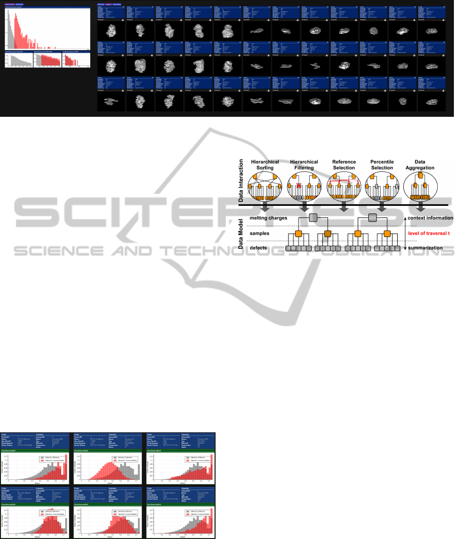
Figure 4: This screenshot shows the level of traversal set to defects. The user created a layout to see the volume data and
some meta information about the defect.
4.4 Second Contribution
Through the way of dealing with multiple data nodes
by visualizing multiple MultiView-layouts side by
side, there came the idea to aggregate those layouts
to visualize groups of nodes. This way, user see vari-
ous groups side by side on the screen, each group vi-
sualized by a MultiView-layout. This is of particular
interest for groups of samples having the same pro-
cess input parameter. The translation of a single node
layout to a group layout can be done mostly auto-
matic. For Instance, when the layout of a sample used
a traditional histogram of defect-volumes, a layout
for a group of samples will show a histogram based
on whisker-boxplots. Basically, every visualization
type is enhanced to show uncertainties that originate
through the groups or aggregates of nodes. Those en-
hancements will be implemented for various visual-
ization forms, like pie charts, text areas, histograms,
graphs and scatter plots (Pang et al., 1996). For other
forms, like volume data visualization, I will refer to
literature on how to visualize aggregated volume data
(Rhodes et al., 2003).
Figure 5: Several samples presented by histograms. The
red bars visualize the distribution of the defects sphericity
in the sample, and the grey bars visualize the same data di-
mension from reference data (in this case, the aggregation
of all samples of the same steel grade as this particular sam-
ple). While the red bars show original data of a sample, the
grey bars represent averaged data from the reference group.
Figure 6: Several data interaction techniques are available
to change the data model tree.
The complete set of data interaction techniques is
shown in fig. 6. Data aggregation can be done based
on categorical numbers or strings, like the steel type
(like SQL GROUP BY). Visualizing groups based on
the steel types makes much sense, as each steel type
uses a different set of input parameters and therefore
the outcomes per steel type should be more equally
and comparable. Data aggregation on dimensions of
cardinal numbers can be achieved by putting them
into groups of intervals, whether with equally divided
interval ranges (e.g. melting temperatures 1000-1100;
1100-1200; ...) or with equally divided number of
nodes in each interval (e.g. melting temperatures
1000-1059; 1059-1099; ...). Here again, by using the
data interaction technique hierarchical sorting, users
can sort those groups, for instance by the average de-
fect volume, and thus analyze trends.
The interactive reference selection is also a new
contribution in this context. The user can configure a
list of dimensions that have to be equal. For instance,
the user may ask for the steel-type and the melting-
temperature (+/- 100) to be equal to be matched into
the reference data of the corresponding node. That
kind of input-methodology is used, as each node or
group of nodes has a different steel-type and melting-
temperature and thus asks for a different set of ref-
erence data. By visualizing a single MultipleView-
layout, the user could just select reference data di-
rectly, for instance through selection with the mouse.
DoctoralThesis-AVisualAnalysisSystemforHierarchicalEnsembleData
55

However, the layout descriptions for my system us-
ing multiples of MultiView-layouts asks for a more
general input methodology so that the layouts can be
reused for different nodes.
5 METHODOLOGY
Most of the described ideas will be implemented so
that evaluations with user and experts can take place.
I plan to publish a systematic evaluation as part of
my doctoral thesis to identify the strengths and weak-
nesses of my approach in detail.
We work with very large data sets. This makes the
system unusable for fast and interactive exploration
and analysis when not dealt with. The large amount
of visualizations is one of the smaller problems. Each
visualization can be rendered to a texture, so that the
translation of the screen (scrolling) only demands a
redraw of that texture. The visualization is only fully
redrawn, when users interact in a more complex way
(like rotating). Interaction on views can have different
kind of complexities:
• not linked: only the interacted visualization will
change
• locally linked: multiple visualizations within the
same node (single MultiView-layout) will change
• globally linked: multiple visualizations from all
nodes will change
However, redraw-operations have to be done
screen-wide only. When a visualization is not visi-
ble, the new interactions can be applied as soon as it
comes into the visible area. As the MultiView-layouts
have a fixed size, the scrollbar-position can be used to
calculate the corresponding node-id very fast.
One of the bigger problems is the visualization
of reference data and aggregated nodes. When data
groups use much of the available data sets at once,
data preparation need much time. Therefore, I plan to
implement the visualization of aggregated nodes and
reference data with a incremental visualization, where
nodes are added to the visualization data one at a time
(Fisher et al., 2012).
6 EXPECTED OUTCOME
As a part of this system is already implemented, I al-
ready collected feedback from the staff of the steel
production facility and also from information visu-
alization experts. Reactions were positive. The vi-
sual search capabilities proved to be very useful. The
staff had originally worked with reports that had to
be opened one at a time. With my system, they were
able to create a node layout that equals their previ-
ous full data report. They can now search much faster
for specific characteristics and outliers in the reports
through the side-by-side visualizations, which also in-
clude reference data. By sorting, they were able to
analyze trends and by filtering, determine the require-
ments for certain trends and analysis results. Chang-
ing the node layout to visualize only a limited aspect
or dimension of the data set is beneficial, in that it
speeds up checking for repeatability and trend analy-
sis. However, users had difficulty locating the exact
layout they had previously saved. They had the lay-
out appearance in mind but not necessarily its name
they used to save it. Regarding the more complex use
cases, we plan a user evaluation in future research.
When a multiple view layout of one node reveals a
relationship between data dimensions, how can users
perceive trends between multiple nodes within that re-
lationship? For instance, how does the influence of a
defects size on its position change as the temperature
of the melting charge increases? The influence may
be higher at higher melting temperatures.
REFERENCES
Fisher, D., Popov, I., Drucker, S., and schraefel, m. (2012).
Trust me, i’m partially right: incremental visualiza-
tion lets analysts explore large datasets faster. In Pro-
ceedings of the SIGCHI Conference on Human Fac-
tors in Computing Systems, CHI ’12, pages 1673–
1682, New York, NY, USA. ACM.
Kehrer, J. and Hauser, H. (2013). Visualization and visual
analysis of multifaceted scientific data: A survey. Vi-
sualization and Computer Graphics, IEEE Transac-
tions on, 19(3):495–513.
Konyha, Z., Le
ˇ
z, A., Matkovi
´
c, K., Jelovi
´
c, M., and Hauser,
H. (2012). Interactive visual analysis of families
of curves using data aggregation and derivation. In
Proceedings of the 12th International Conference on
Knowledge Management and Knowledge Technolo-
gies, i-KNOW ’12, pages 24:1–24:8, New York, NY,
USA. ACM.
McCrickard, D. and Catrambone, R. (1999). Beyond the
scrollbar: an evolution and evaluation of alternative
navigation techniques. In Visual Languages, 1999.
Proceedings. 1999 IEEE Symposium on, pages 270–
277.
Mcgill, R., Tukey, J. W., and Larsen, W. A. (1978).
Variations of box plots. The American Statistician,
32(1):12–16.
Nocke, T., Flechsig, M., and Bohm, U. (2007). Visual ex-
ploration and evaluation of climate-related simulation
data. In Simulation Conference, 2007 Winter, pages
703–711.
VISIGRAPP2014-DoctoralConsortium
56

Pang, A. T., Wittenbrink, C. M., and Lodh, S. K. (1996).
Approaches to uncertainty visualization. The Visual
Computer, 13:370–390.
Rhodes, P. J., Laramee, R. S., Bergeron, R. D., and Sparr,
T. M. (2003). Uncertainty visualization methods in
isosurface volume rendering. In Eurographics 2003,
Short Papers, pages 83–88.
Tufte, E. (1990). Envisioning information. Graphics Press,
Cheshire, CT, USA.
Wang Baldonado, M. Q., Woodruff, A., and Kuchinsky, A.
(2000). Guidelines for using multiple views in infor-
mation visualization. In Proceedings of the working
conference on Advanced visual interfaces, AVI ’00,
pages 110–119, New York, NY, USA. ACM.
Wilson, A. T. and Potter, K. C. (2009). Toward visual anal-
ysis of ensemble data sets. In Proceedings of the 2009
Workshop on Ultrascale Visualization, UltraVis ’09,
pages 48–53, New York, NY, USA. ACM.
DoctoralThesis-AVisualAnalysisSystemforHierarchicalEnsembleData
57
