
New Visualization Model for Large Scale Biosignals Analysis
Catarina Cavaco
1
, Ricardo Gomes
1
, Hugo Gamboa
1,2
and Ricardo Matias
3,4
1
CEFITEC, Physics Department, Faculdade de Ci
ˆ
encias e Tecnologias - Universidade Nova de Lisboa, Lisbon, Portugal
2
PLUX Wireless Biosignals, Lisbon, Portugal
3
School of Health Care, Polytechnic Institute of Set
´
ubal, Set
´
ubal, Portugal
4
Neuromechanics Research Group, Interdisciplinary Centre for the Study of Human Performance (CIPER),
Faculdade de Motricidade Humana - Universidade de Lisboa, Lisbon, Portugal
Keywords:
Long-term Biosignals, Big Data, Biosignals Visualization, Biosignals Annotation, Medical Monitoring.
Abstract:
The development of new resources in the medical field, such as wearable sensors, allowed the improvement of
biosignals monitoring. Acquired data is then an important source of information to clinicians and researchers.
Thus, extracting useful information from data is a task of the greatest importance that involves a variety of
concepts and methods, from which stands out data visualization. However, these methods present several
limitations mainly when dealing with big data. In this paper we present an innovative web-based application
for biosignals visualization and exploration in a fast and user friendly way overcoming the detected limitations.
Three case studies are presented and a usability study supports the reliability of the implemented work.
1 INTRODUCTION
The technological innovation in medical systems has
been of the utmost importance in the monitoring im-
provement of human body signals, so-called biosig-
nals. There are several types of biosignals resulting
of the electrical, magnetic, chemical or mechanical
activity during biological events such as heart beat
or muscle activity. They can also be classified con-
sidering their nature, application or their characteris-
tics (Kaniusas, 2012). Biosignals monitoring can be
done through the use of non-invasive wearable sen-
sors which combined with systems allow the storage
of the data acquired. Relevant information can then
be extracted from this data to support clinicians and
researchers decision-making, as well as to inform pa-
tients. Therefore, to achieve the goal of extracting rel-
evant information from the data, a variety of concepts
and methods, such as data visualization, are involved.
Since humans main input sense is visual, data vi-
sualization is considered essential in signal analysis
(Aigner et al., 2011). The integration of the human
visual perception with the current massive computa-
tional capacities results in this concept which supports
the examining, understanding and transmitting of the
vital information carried by a signal (Iliinsky and
Steele, 2011). However, data visualization presents
some limitations that have to be considered. Besides
the computation capacity limited by the memory and
time to run an algorithm, the display is restricted
by the number of pixels available to show the data.
On the human side, the limitations comprise the hu-
man perceptual and cognitive capacities which can re-
sult in incorrect data interpretations both in time and
space (too fast or too dense for the correct perception)
(Munzner, 2009).
The demand for studies that result in large
amounts of data, such as sleep analysis or neuro-
muscular diseases monitoring, is increasing. In this
case, difficulties become evident. Dealing with mas-
sive sources of data, which can be considered big
data, increase the complexity of the problems de-
scribed before and its processing with traditional ap-
plications presents several limitations (Hudson and
Cohen, 2006).
Considering the extreme importance of biosig-
nals analysis and the outlined hurdles, the aim of
this work was to present an innovating solution for
large dataset analysis, what involves visualization and
annotation, in the context of biosignals. This was
achieved through the better conjugation between pro-
cessing and storage capabilities of computers and the
visual, creative and knowledge capabilities of hu-
mans. In this study we present a novel web-based ap-
plication for biosignals visualization and exploration
in a fast and user friendly way.
190
Cavaco C., Gomes R., Gamboa H. and Matias R..
New Visualization Model for Large Scale Biosignals Analysis.
DOI: 10.5220/0005207201900197
In Proceedings of the International Conference on Bio-inspired Systems and Signal Processing (BIOSIGNALS-2015), pages 190-197
ISBN: 978-989-758-069-7
Copyright
c
2015 SCITEPRESS (Science and Technology Publications, Lda.)

The remainder of the paper is organised as fol-
lows. Section 2 reviews related work on visualization
and annotation of large datasets of biosignals. In sec-
tion 3, it is presented the application framework. Sec-
tion 4 refers to the developed visualization model and
Section 5 presents the case studies considered. Sec-
tion 6 presents the usability study carried out. Finally,
in section 7 the main conclusions are drawn and di-
rections for further research are given.
2 RELATED WORK
The high concern in clinical systems for improving
the physical and psychological wellness has resulted
in the advent of crucial systems specifics for biosig-
nals. The PhysioNet (Goldberger et al., 2000) of-
fers free web access to a large biosignals databases
that can include ground-truth information, and it also
comprises a wide collection of software for viewing
and analysing biosignals. The OpenSignals software
enables the visualization and analysis of the biosig-
nals acquired by a wearable hub that along with this
software constitute the biosignalsplux system (PLUX,
2014), an advanced biosignal monitoring platform for
sports and biomedical research. The ActiLife6 is the
visualization software that integrates the ActiGraph
system (ActiGraph, 2012), the most used actigraphy
monitoring system in research and clinical trials in-
volving physical activity and sleep assessment. In
cardiology, one of the most common examinations is
the Holter, an ambulatory Electrocardiography (ECG)
for a minimum 24-hour period, conducted with the
purpose of screening for ECG disturbances. The
Welch Allyn Holter System (Welch Allyn, 2007) is
one of the available systems to perform Holter exam-
inations. Notwithstanding the high development of
visualization tools, they face yet some issues, partic-
ularly when dealing with big data. The possible inte-
gration of applications in real life platforms to mon-
itoring diseases increases the demand for novel solu-
tions.
3 APPLICATION FRAMEWORK
3.1 System Requirements
The development of the visualization application took
into account some base requirements. Therefore, the
developed application had to:
• be applied to all type of biosignals
• enable the possibility to explore up to 10 days of
continuous acquisitions
• show the time lapses where the signal acquisition
was interrupted
• allow the handling of annotations
• present a fast and user friendly interface
Lastly, the proposed model had to represent a
commitment between usability and performance, al-
lowing the user to analyse a biosignal without having
to deal with signal processing algorithms directly.
3.2 System Architecture
The implemented visualization tool is a web-based
platform. This decision is justified by the fact that
the web standards currently available provide some
of the best tools for the creation of rich graphical user
interfaces and it also eliminates complex installation
and configuration procedures. A client-server model
was developed. The local server was implemented in
Python language (Beazley, 2009) and the communica-
tion between the visualization platform and the server
is done with WebSockets. The flow of information is
schematically represented in Figure 1.
Visualization
Platform
request
response
Processing
Algorithms
server
Figure 1: Information Flow. The client sends request mes-
sages to the server which responds by serving a message
containing the requested information. The generated re-
sponses are then interpreted by a series of JavaScript li-
braries and the results dynamically displayed on the page.
Considering the possible client’s requests, it was
implemented different Python Application Program-
ming Interfaces (APIs). Through the use of Python
language to access and manipulate the data and
JavaScript language (Duckett, 2014) to present the
data and deal with the user-interface tasks, a highest
performance is reached.
3.3 Data Architecture
The manipulation of very large amounts of data must
involve suitable data format for storage and access
this data. Although presenting some limitations, the
Hierarchical Data Format 5 (HDF5) has proven to be
the best option for the intended task (Gomes et al.,
2012). Before submitting a record file to the visual-
ization tool it should be previously processed. The
processing API involves filtering, subsampling, and
NewVisualizationModelforLargeScaleBiosignalsAnalysis
191

events detection. As a result, different groups of data
are created in the HDF5 file. The previous compu-
tation of some variables will speed up the visualiza-
tion since the APIs previously referred only access the
data instead of computing it.
4 VISUALIZATION MODEL
A generic model for visualization is proposed in
(Van Wijk, 2005) and schematically represented in
Figure 2.
Data
Image
Visualization
Specification
Visualization
Perception
Exploration
Knowledge
User
Figure 2: Simple model of visualization. In this model
the central process is the visualization where data is trans-
formed into a time varying image according to a specifi-
cation. Then, the resulting image is perceived by a user,
leading to an increase of users knowledge. Finally, the in-
teractive exploration of the image enables to adapt the pre-
vious specification based on the current knowledge in order
to further explore the data. Adapted from (Van Wijk, 2005).
4.1 Visualization Process
4.1.1 Domain Problem Characterization
As already stated, the benefits of long-term monitor-
ing (more than 24 hours of acquisition) have drawn
considerable attention in healthcare. In (Jung et al.,
2012) and (Goya-Esteban et al., 2009) are presented
two examples of 7 days of continuous measurements
of electrical biosignals such as ECG and electromyo-
graphy (EMG).
However, dealing with the analysis of massive
sources of information remains a challenge that has
to be overcome. For example, displaying the 24 hours
of an ECG signal recorded with a modern Holter
recorder, which uses sampling rates of 1000Hz or
higher (Hilbel et al., 2008), results in a falling attempt
of drawing more than 80 million data points. Since a
standard computer’s screen has only some thousands
of available pixels (Pakhira, 2010), displaying the pre-
viously mentioned signals not only exceeds the capa-
bilities of the visualization device, but also results in
a massive time and memory consuming rate. Even
if the visualization is possible, the representation of
such a large amount of data points will surpass the
human perceptual capacity resulting in incorrect in-
terpretations of the data both in time and space.
4.1.2 Abstraction Design
After a specific domain problem has been identified,
it has to be abstracted into a more generic represen-
tation. Despite not always being performed, it is an
essential process when dealing with massive data sets.
The created abstraction took into account that
biosignals only contain crucial information in specific
time intervals - in cyclic or sporadic events. There-
fore, considering only these events, it is possible to
highlight the key information in the biosignal and to
suppress the irrelevant details. Furthermore, this will
support the variability analysis in a physiological net-
work. (West, 2013) states its importance. As a result,
considering only the portions of the signal which con-
tain important information, instead of the whole sig-
nal, considerably reduces the number of data points to
plot.
4.1.3 Visualization in Layers
The proposed model comprises a multi-level visu-
alization architecture. This architecture enables the
easy search and focus in the interest regions through
a simple navigation in the biosignal. While the first
layer displayed gives the user a global overview of the
whole biosignal, the others provide a more detailed
visualization of the selected interval of the above
layer (by default the selected interval is the first one).
In the application there are seven standard infor-
mation layers divided into a defined number of inter-
vals. The choice of the standard information layers
had in consideration the system requirements and the
fact that each layer should be divided into an integer
number of intervals with the size of the layer imme-
diately below. The chosen layers, their number of in-
tervals and type of data representation that each layer
represents are described in Table 1.
The total number of information layers displayed
in the platform depends on the total duration of the
biosignal that is being analysed. The first layer to be
displayed corresponds to the lowest layer that can rep-
resent the whole signal. All the layers below this one
will also be displayed. Figure 7 ilustrates this case;
the signal considered only has 20 hours of record,
then the first layer to be displayed was the 1 day layer.
BIOSIGNALS2015-InternationalConferenceonBio-inspiredSystemsandSignalProcessing
192

Table 1: Model Layers.
Layer
Number of
Intervals
Data
Representation
10 days 10 Events
1 day 24 Events
1 hour 4 Events
15 minutes 3 Events
5 minutes 5 Subsampled
1 minute 60 Subsampled
1 second 1 Raw
4.1.4 Visualization Techniques
Besides line and bar plots, two standard techniques
in data visualization, horizon plots, were also con-
sidered. An horizon plot is a stacked graph that en-
ables the performance comparison of a large num-
ber of time-dependent variables. It is built by adding
color bands to a line graph and mirroring the negative
values respecting the x-axis. Thereafter, using a tech-
nique called two-tone pseudo coloring the color bands
are overlaid in the graph. This technique is then inte-
grated with the small multiples technique which en-
ables the display of a series of small graphs stacked
one above the other (Heer et al., 2009). The main in-
terface combines only the line and bar plots to show
the data selected. While the bar plots are used for the
1 hour layers, the line plots are used for the remain-
ing ones (Figure 7). The horizon plots are used in
the analysis page, later discussed, enabling the com-
parison of a variety of features in a restricted space
(Figure 4).
The visualization elements are rendered in Scal-
able Vector Graphics (SVG) which are more reliable
and flexible than the HTML canvas elements (Murray,
2013). The Web Graphics Library (WebGL) elements
were also considered. Despite providing a similar ren-
dering functionality in a faster way due to its interac-
tion with the graphics processing unit, the toolboxes
currently available to perform this type of rendering
are still too complex or not stable enough to provide
a suitable visualization.
4.2 The Perception and Cognition
Process
The graphical perception refers to the ability to de-
code the information encoded on graphs (Heer et al.,
2009). Therefore, in order to enhance the graph-
ical perception some variables, such as positions,
shapes and colours, were carefully assessed. The plat-
form also includes a fast and responsive design and
thoughtful default colours.
4.3 The Interactive Exploration Process
The direct interaction with the data enables the user
to focus on some details according to his objectives.
Basic interaction techniques are often used to im-
prove the visualization exploration and for this reason
they are familiar to the majority of the users. The
choice of these techniques comprised the zoom and
pan techniques, the use of tooltips and the presence
of modal dialogs to alert or guide the user. It also
enables the saving of the exploration carried out.
4.3.1 Annotations
The annotation of the biosignals is a demanding task
that depends on human subjective intervention and re-
quires specific knowledge. Therefore, the developed
platform enables the annotations handling, thereby
improving the biosignal interpretation through the
notes made by the user in the relevant biosignal re-
gions. Figure 3 illustrates the presence of annotations
in the platform.
4.3.2 Further Analysis
The choice of key signal features can be a fundamen-
tal method to discover important information hidden
on the signal. Therefore, in the developed application,
it is possible to request for a more detailed analysis of
some layers (Figure 4). The features selected to anal-
yse a specific layer depend on the biosignal that is be-
ing analysed, however they are grouped in the same
domains: temporal, statistical and spectral.
5 CASE STUDIES
5.1 Data Acquisition and Processing
The acquisition system consisted in a set of biomedi-
cal sensors, a wireless acquisition unit and a smart-
phone. A surface EMG sensor at the gastrocne-
mius muscles of the right leg, a triaxial accelerometry
(ACC) sensor at the right hip, and a 3 lead ECG sen-
sor at the left side of the chest were used along with
the bioPLUX research system. The biosignals were
acquired with a sampling frequency of 1000 Hz and
with a 12 bit resolution and the data was sent via Blue-
tooth to the smartphone, saved in a text file and then
converted to an HDF5 file. Three acquisitions were
carried out in a home atmosphere performing daily
living activities. In order to provide large files to use
in the developed tool, the last signals were replicated
or combined. The ECG and the ACC signals were
NewVisualizationModelforLargeScaleBiosignalsAnalysis
193
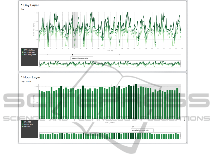
Figure 3: Navigation and Annotations. The selection of the sixth interval in the 1 day layer, i.e. the sixth hour of that day, will
switch the data in the 1 hour layer in order to correspond to the data of the sixth hour. Annotations are visually represented
in the platform by a timestamp placed at the beginning of the annotation time frame in a division below the x axis. When the
timestamp is clicked, it shows its message and a rectangular grey region highlighting the time frame of the annotation arises
in the graph. Therefore, the 1 day layer presents three annotations (one highlighted), however only the second one belongs to
the interval displayed at the 1 hour layer.
replicated until achieve a duration of 10 days, in the
ECG case, and 2 days 9 hours 32 minutes and 55 sec-
onds, in the ACC case. The EMG signal consisted
in the combination of the two EMG acquisitions with
intervals where the acquisition was interrupted, what
resulted in 6, 4 and 6 hours of acquisition intercalated
with 3 hours and 30 minutes without acquisition.
5.2 Electrocardiography
The ECG signal is a cyclic signal that consists in the
recording of the electrical activity of the heart. There-
fore, it provides a fundamental way of cardiac moni-
toring allowing the detection of cardiac abnormalities
(Kaniusas, 2012).
The abstraction for the ECG signal was performed
through the consideration of the R peak in the QRS
complex, one of the most important to analyse in an
ECG waveform (Neophytou et al., 2012). Although
the main event to consider is the positions where these
peaks occur, it was also computed another event, the
number of peaks that occur per minute (the heart rate).
5.2.1 Features Selection
The selection of features to provide a further analysis
of the ECG signal was done considering a derivation
of the main event above considered. The Heart Rate
Variability (HRV) represents the variation of the in-
tervals between heartbeats (RR intervals) and its stan-
dard features provide a vital source of signal informa-
tion.
5.2.2 Results
Figures 5 and 6 represent the result of one possible
analysis of the ECG signal considered. Through the
zoom, pan, the creation of annotations and the use
of tooltips was possible to find a probably artefact
caused by the chest muscles contraction. The dou-
ble clicking in the graphs allow to switch the data in
the layers below until the desired event be displayed.
BIOSIGNALS2015-InternationalConferenceonBio-inspiredSystemsandSignalProcessing
194
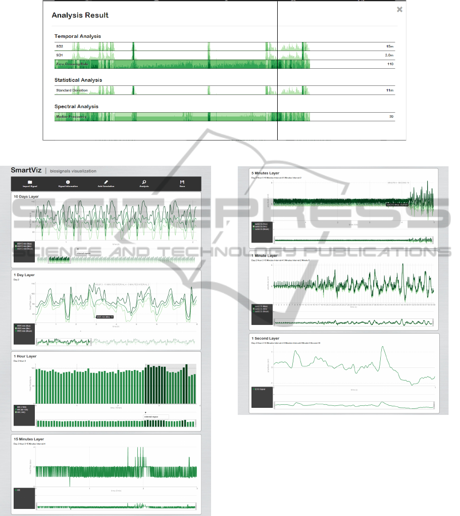
Figure 4: Further Analysis Result of the 15 minutes layer of an EMG signal.
Figure 5: ECG signal analysis result.
5.3 Electromyography
An EMG signal is an electrical signal generated dur-
ing a muscle contraction. Therefore, it enables the
quantification of the neuromuscular function and for
this reason these signals are mostly used to measure
the degree of muscle activation and to access the neu-
Figure 6: Continuation of the previous Figure.
rophysiologic mechanisms of fatigue (Arjunan et al.,
2011).
The event with most importance in the EMG anal-
ysis is therefore the signal activation (onset and off-
set times). However, the EMG signal is also usually
analysed by the root mean square value (Soares et al.,
2013).
5.3.1 Features Selection
The further analysis of the EMG signal is performed
by the zero crossing rate, the short and long diame-
ters of a Poincar
´
e plot, the standard deviation and the
median frequency features.
NewVisualizationModelforLargeScaleBiosignalsAnalysis
195

5.3.2 Results
Figure 7 presents the first layer of the EMG signal
considered. The analysis of this layer enables to get
the general intervals where there was or not acqui-
sition and the inactivity hours where the muscle in
study did not perform any contraction.
Figure 7: EMG signal analysis result (first layer).
5.4 Accelerometry
The ACC signal provides the measurement of the
applied acceleration acting along a reference axis.
Therefore, its analysis provides crucial information
that can be used in functional status and monitor
falling studies (Lan et al., 2012), sleep analysis (Acti-
Graph, 2012) and in neuromuscular diseases diagno-
sis (Machado et al., 2014).
The abstraction for the ACC signals was settled
considering that the signal represent different activ-
ities performed by the subject. These activities can
be classified as static states and dynamic states (Acti-
Graph, 2012). These two states are usually distin-
guish by the Signal Magnitude Area (SMA) feature.
When the SMA value exceeded a preset threshold
thus the subject is classified as being in a dynamic
state (Lan et al., 2012; Carus et al., 2013).
5.4.1 Features Selection
The selected features to perform the further analysis
of the ACC signal were the autocorrelation, the root
mean square, the mean, the standard deviation and the
median and fundamental frequencies (Machado et al.,
2014). These features were computed with the total
acceleration signal.
5.4.2 Results
The result of the ACC signal analysis is similar to the
EMG signal, however instead of activations, here we
present the idea of static or dynamic states.
6 USABILITY EVALUATION
In order to assess the usability of the developed
work, a study with the System Usability Scale (SUS)
(Brooke, 2013) was carried out.
To the date the usability study performed included
10 participants with ages between 23 and 28 years
who had no experience with the application. All the
participants belonged to the final target of users of
the developed tool - health science professionals. The
participants were instructed to use freely the system,
opening a file and exploring it with the available in-
teraction tools. The average score of the performed
tests was 80/100 what indicates a good system with
a high perceived usability. In the end of the test the
majority of the participants agreed that some basic
concepts were needed in order to perform a suitable
analysis, however, these concepts should already be
known by the final user. They also agreed that a nec-
essary guidance should be provided at the first use of
the system, still, it would not be necessary after this
first use. Nevertheless, the participants stated that the
system is intuitive, useful and suitable, they also indi-
cated that they were likely to recommend it.
7 CONCLUSIONS AND FUTURE
WORK
This work introduces a novel visualization inter-
face which allows the professionals, who work with
biosignals, to get insight into the large data sets ac-
quired by the enhanced monitoring systems that have
been introduced in the last years. The visualization
model followed includes a web-server, a multi-level
layer layout, an abstraction approach and the imple-
mentation of different visualization techniques. Dif-
ferent explorative interaction techniques were also de-
veloped in which stands out the handling of annota-
tions. Three case studies were presented and several
performance tests were done. Finally, an usability
evaluation was carried out in which an average score
of 80 was achieved, which indicates a good usability
performance.
Despite the developed application has proven to
be a suitable approach, further research can be per-
formed.
We propose the use of more case studies. De-
spite of the considered signals represent the two pos-
sible types of biosignals events, cyclic and sporadic,
the consideration of another set of biosignals such as
electroencephalogram or respiration signals will fur-
ther validate the developed work enabling its use in
BIOSIGNALS2015-InternationalConferenceonBio-inspiredSystemsandSignalProcessing
196

more research studies. The search for WebGL ren-
dering tools should be carrying on and when possible
these elements should replace the implemented SVG
elements. Despite the SUS provides a confident mea-
sure of the perceived usability with a small group of
participants, it was carried out only with biomedical
engineers. Hence, this study should also be performed
by doctors. The integration of the processing in the
acquisition system would provide a real time process-
ing which would reduce the time spent in processing.
REFERENCES
ActiGraph, S. D. (2012). ActiLife 6 users manual.
Aigner, W., Miksch, S., Schumann, H., and Tominski,
C. (2011). Visualization of Time-Oriented Data.
Springer, 1 edition.
Arjunan, S. P., Kumar, D., Wheeler, K., Shimada, H., and
Naik, G. (2011). Spectral properties of surface EMG
and muscle conduction velocity: A study based on
sEMG model. In Biosignals and Biorobotics Confer-
ence (BRC), 2011 ISSNIP, page 14. IEEE.
Beazley, D. M. (2009). Python Essential Reference. Devel-
oper’s Library. Pearson Education, 4 edition.
Brooke, J. (2013). SUS: a retrospective. Journal of Usabil-
ity Studies, 8(2):29–40.
Carus, J. L., Pelaez, V., Garcia, S., Fernandez, M. A., Diaz,
G., and Alvarez, E. (2013). A non-invasive and au-
tonomous physical activity measurement system for
the elderly. pages 619–624. IEEE.
Duckett, J. (2014). JavaScript and JQuery: Interactive
Front-End Web Development. John Wiley & Sons, 1
edition.
Goldberger, A. L., Amaral, L. A. N., Glass, L., Hausdorff,
J. M., Ivanov, P. C., Mark, R. G., Mietus, J. E., Moody,
G. B., Peng, C.-K., and Stanley, H. E. (2000). Phys-
ioBank, PhysioToolkit, and PhysioNet : Components
of a new research resource for complex physiologic
signals. Circulation, 101(23):e215–e220.
Gomes, R., Nunes, N., Sousa, J., and Gamboa, H. (2012).
Long term biosignals visualization and processing. In
BIOSIGNALS, pages 402–405.
Goya-Esteban, R., Mora-Jimenez, I., Rojo-Alvarez, J. L.,
Barquero-Prez, O., Manzano-Martinez, S., Pastor-
Prez, F., Pascual-Figal, D., and Garcia-Alberola, A.
(2009). Rhythmometric analysis of heart rate variabil-
ity indices during long term monitoring. In Computers
in Cardiology, 2009, page 5760. IEEE.
Heer, J., Kong, N., and Agrawala, M. (2009). Sizing the
horizon: the effects of chart size and layering on the
graphical perception of time series visualizations. In
Proceedings of the SIGCHI Conference on Human
Factors in Computing Systems, pages 1303–1312.
Hilbel, T., Lux, R. L., Dietzsch, J., Schliephake, M., and
Katus, H. A. (2008). Performance and productivity
benefits using multi-core processors for the analysis
of digital long-term ECG recordings. In Computers in
Cardiology, 2008, pages 1069–1072. IEEE.
Hudson, D. L. and Cohen, M. E. (2006). Intelligent analysis
of biosignals. In Engineering in Medicine and Biology
Society, 2005. IEEE-EMBS 2005. 27th Annual Inter-
national Conference of the, pages 323–326.
Iliinsky, N. P. N. and Steele, J. (2011). Designing data vi-
sualizations. O’Reilly, Farnham.
Jung, H.-C., Moon, J.-H., Baek, D.-H., Lee, J.-H., Choi, Y.-
Y., Hong, J.-S., and Lee, S.-H. (2012). CNT/PDMS
composite flexible dry electrodesfor long-term ECG
monitoring. IEEE Transactions on Biomedical Engi-
neering, 59(5):1472–1479.
Kaniusas, E. (2012). Fundamentals of biosignals. In
Biomedical Signals and Sensors I, Biological and
Medical Physics, Biomedical Engineering, pages 1–
26. Springer Berlin Heidelberg.
Lan, C.-C., Hsueh, Y.-H., and Hu, R.-Y. (2012). Real-time
fall detecting system using a tri-axial accelerometer
for home care. pages 1077–1080. IEEE.
Machado, I., Gomes, R., Gamboa, H., and Paix
˜
ao, V.
(2014). Human activity recognition from triaxial ac-
celerometer data. In BIOSIGNALS.
Munzner, T. (2009). Visualization. In Fundamentals of
Computer Graphics, pages 675–720.
Murray, S. (2013). Interactive data visualization for
the web: [an introduction to designing with D3].
O’Reilly, Sebastopol, CA.
Neophytou, N., Kyriakides, A., and Pitris, C. (2012). ECG
analysis in the time-frequency domain. In Bioinfor-
matics & Bioengineering (BIBE), 2012 IEEE 12th In-
ternational Conference on, page 8084. IEEE.
Pakhira, M. (2010). Requirements of a graphical system. In
Computer Graphics Multimedia and Animation. PHI
Learning Pvt. Ltd., 2nd edition.
PLUX, w. b. S. (2014). biosignalsplux.
Soares, S. B., Coelho, R. R., and Nadal, J. (2013). The use
of cross correlation function in onset detection of elec-
tromyographic signals. In Biosignals and Biorobotics
Conference (BRC), 2013 ISSNIP, pages 1–5. IEEE.
Van Wijk, J. J. (2005). The value of visualization. In Visu-
alization, 2005. VIS 05. IEEE, pages 79–86.
Welch Allyn (2007). Expert holter software system - direc-
tions for use.
West, B. (2013). Fractal Physiology and Chaos in
Medicine. World Scientific, 2 edition.
NewVisualizationModelforLargeScaleBiosignalsAnalysis
197
