
Report Optimization using Visual Search Strategies
An Experimental Study with Eye Tracking Technology
Lisa Falschlunger, Christoph Eisl, Heimo Losbichler and Elisabeth Grabmann
University of Applied Sciences Upper Austria, Controlling, Finance and Accounting Department, 4400 Steyr, Austria
Keywords: Information Visualisation, Cognition Processes, Perception Processes, Eye Tracking, Report Optimization.
Abstract: The success of visualisations is determined by the ability of users to retrieve relevant information in an
effective and efficient way. The way in which information is perceived can be analysed by examining visual
search strategies of users. Visual search strategies in graphical representations however, are individual and
have not been well explored up to now. Recent studies show that eye tracking experiments help in gaining
new insights into these strategies. Apart from error rates and task completion times, eye tracking focuses on
the way observers of visualisations read and make sense of the presented stimulus. In this way sequential
strategies can be analysed, compared and used in order to optimize graphical layouts. In this study we use
the approach of Parallel Scan Path visualisation in combination with Levenshtein Distance to determine
similarities between search strings when viewing graphical representations in standardized business com-
munication. This study shows a positive correlation between search strategies and task completion time and
allows the evaluation of different design layouts. Positive significant effects can be detected when examin-
ing experience (with respect to standardized and repetitive reporting) and layout optimization (with respect
to graphical representations and page layout). Optimal search strategies can be identified when users are ex-
perienced and using an optimized layout.
1 INTRODUCTION
Visual representations are used in business commu-
nication on a daily basis. This is due to the fact that
people tend to retrieve and process information more
efficiently and effectively in the presentation format
of a graph than in text or plain numbers (Conati and
Maclaren, 2008, Renshaw et al., 2003). Visual stim-
uli rely on the use of people’s well established skill
of perceptual sense making (Lurie and Mason,
2007). The cognitive burden can be shifted to the
automated perceptual processing of visualisations
resulting in a lower workload (Speier, 2006).
However, understanding the impact of individual
differences on the process of perception is difficult
because not every cognitive factor and its effects on
the visualisation performance has yet been identified
(Peck et al., 2012, Pfitzner et al., 2001). Therefore
although the benefits of visualisations are known
and visualisations are used frequently in almost all
disciplines the full process of cognition is not trans-
parent or controllable (Huang and Eades, 2005).
Instead it is complex and individual, as it depends on
many different influencing factors such as personali-
ty, spatial ability, task, presentation mode, emotional
state, experience, knowledge or culture (Barat 2007,
Huang and Eades 2005, Peck et al. 2012).
Besides this problem concerning influential fac-
tors the question for the right technology to investi-
gate and measure this process is raised in the litera-
ture (Elmqvist and Soon Yi, 2013). One method that
seems to have gained interest is the use of eye track-
ing technology to better understand and interpret the
process of information retrieval and therefore the
process of perception (Conati and Mclaren, 2008,
Falschlunger et al., 2014, Goldberg and Helfman,
2014). Eye tracking can provide insights into diag-
nostic information to a designer that exceeds the
information provided by the analyses based solely
on response time and error rate (Goldberg and
Helfman 2011). In this study we use this technology
to contribute to the research on influential factors on
the process of visual perception. In particular two
factors are being researched: the effect of experience
with respect to standardized and repetitive reporting
and the effect of design choices with respect to
graphical representations including page layout.
In this paper we provide a discussion on previ-
ous research in this area and present the basis for the
conducted experiments. Then the applied method is
209
Falschlunger L., Eisl C., Losbichler H. and Grabmann E..
Report Optimization using Visual Search Strategies - An Experimental Study with Eye Tracking Technology.
DOI: 10.5220/0005251702090218
In Proceedings of the 6th International Conference on Information Visualization Theory and Applications (IVAPP-2015), pages 209-218
ISBN: 978-989-758-088-8
Copyright
c
2015 SCITEPRESS (Science and Technology Publications, Lda.)

explained in detail before describing the deduced
hypotheses. The results will be shown and discussed
in the final parts of the paper.
2 THEORETICAL BACKGROUND
2.1 Information Visualisation in
Business Communication
In business communication graphs and tables are the
most common visualisations used (Beattie et al.,
2008). Whether to use a table or a graph has been
discussed since the 70s in the literature (Vessey,
1991), however functions and understanding of the
structure of the brain in combination with visualisa-
tions has only been the focus of discussion in the last
few years in the field of information visualisation.
The purpose is to find visual abstractions that help
the human brain to process and understand infor-
mation in a more effective and efficient way (Keller
et al., 2006).
As mentioned before, there are a lot of different
influences on the process of perception, however, in
this paper only two of these influences are discussed
and investigated. The effect of experience was cho-
sen because this is one of the least investigated areas
in this field (Peck et al., 2012) and layout optimiza-
tion incorporates previous knowledge and enhances
the understanding of the factor experience even
further.
2.1.1 Effect of Experience on the Cognitive
Process
Experience is associated with the formation of effec-
tive reasoning strategies for given problem types.
Strategies learned in combination with visual repre-
sentations can be used every time the same stimulus
is presented. Studies on Cognitive Load supporting
this thinking investigate the difference between
working memory and long-term memory. On the
one hand, working memory represents the temporary
storage area with very limited capacity and duration
and on the other hand, long-term memory represents
permanent storage with unlimited capacity (Mostyn,
2012, Sohn an Doane, 2003). Studies indicate that a
standardized and repetitive reporting shift the pro-
cess of perception to long-term memory and there-
fore enhance the process of perception (Anderson et
al., 2011,Peck et al., 2012).
Learned experience is said to influence the be
haviour when similar situations arise, however, there
is little research on the impact of experience on the
interaction with visual representations (Peck et al.
2012).
2.1.2 Effect of Design and Layout of
Graphical Representations on the
Cognitive Processes
Another way to lower Cognitive Load is to enhance
the capacity of short term memory by enhancing
effectiveness and efficiency of the chosen display
format (Anderson et al., 2011, Peck et al., 2012). A
visual stimulus that does not take human cognitive
architecture into account is likely to be random in its
effectiveness. Research in previous studies indicate
that the way visual representations are designed and
formated influences the perception of users (Ander-
son et al., 2011, Falschlunger et al., 2014, Hill and
Milner, 2003, Huang and Eades, 2005). Working
memory in the context of information load, for ex-
ample, states that it is better for the decision making
process to display relevant information in close
proximity because of limited resources in short-term
memory (Parsons and Tinkelman, 2013). Theory
also suggests that labels and figures should be
placed in juxtaposition to their data series to empha-
size their relationship and reduce cognitive load
(Falschlunger et al., 2014).
The layout of a visualisation therefore predeter-
mines visual search strategies and by optimizing
these layouts capacity limits can be enhanced. A
short summary of rules identified in previous re-
search is listed below (Falschlunger et al., 2014,
Renshaw et al., 2003, Ware, 2013):
• Do not use broken or non-zero axis
• Do not use three-dimensional effects for two
dimensional displays
• Do not use gridlines when values are stated next
to or above the data marker
• Use gridlines when no values are stated next to
or above the data marker
• Place data label in close proximity to the data
marker they represent
• Do not use too many data in one chart
• Use colors that are distinguishable
2.2 Use of Eye Tracking for Evaluation
of Information Visualisation
According to Raschke et al. (2012) eye tracking is a
state of the art technique to investigate the usability
of graphical interfaces while taking into account
cognitive abilities of the human brain. Eye tracking
is supposed to provide new insights into the differ-
IVAPP2015-InternationalConferenceonInformationVisualizationTheoryandApplications
210
ences of sequential strategies between various de-
sign alternatives and therefore helps to improve the
effectiveness and the efficiency of graphical repre-
sentation for specific user groups (Goldberg and
Helfman, 2011). This methodological approach
measures the common metrics used (task completion
time and error rates), how the attention of an observ-
er changes during the period under review and it
helps to compare different search strategies of dif-
ferent user groups (Raschke et al., 2014).
When analyzing eye tracking data, fixations,
saccades, and scan paths are of particular interest.
Fixations are short stops where the eye can process
information, whereas longer fixations are associated
with greater visual and/or cognitive complexity
(Goldberg and Helfman, 2014, Renshaw et al. 2003).
Saccades are quick movements from one fixation to
another, which can be used to derive a participant’s
attention pattern (Toker et al. 2013) and scan paths
represent a string of related fixations and saccades.
For analysis, an unduly long scan path is believed to
indicate a non-meaningful representation or a poor
layout (Renshaw et al., 2003).
In eye tracking studies that test the usability of a
visual representation, a large amount of data is col-
lected which observes complete specific tasks.
While data collection is relatively simple nowadays
due to technical progress, analysis is difficult be-
cause of the high variety of scan paths between users
(Tang et al. 2012). Individual scan paths are often
seen as random and noisy, however, methods are
available to compare as well as aggregate them in
order to form groups and uncover cognitive strate-
gies (Goldberg and Helfman 2010).
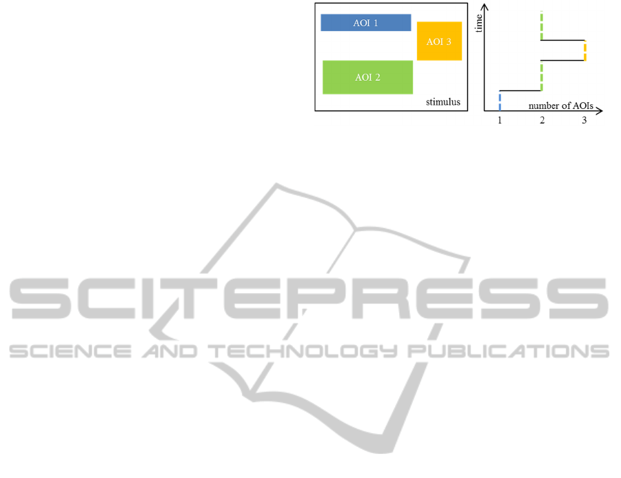
In this study we use a string comparison method
for analysis: the Parallel Scan Path visualisation
technique developed by Raschke et al. (2012). The
model is based on the analysis of areas of interest
(AOIs) and the sequence in which these AOIs are
fixated as well as re-fixated. Parallel Scan Path visu-
alisation helps in comparing different strategies by
visualising scan paths (Raschke, 2014). The vertical
axis represents time and the horizontal axis the
number of AOIs identified (see figure 1). Through
visualizing sequential strings similar patterns can be
identified much easier and grouped together.
Therefore the following metrics are used: total
number of fixations over a given length of time, the
gaze duration as well as the number of fixations in a
defined AOI. For AOI definition spatial clustering is
used by choosing AOIs where the focus of attention
lies (Goldberg and Helfman, 2010). Identification of
these areas is made through the help of heat maps
generated by NYAN 2.0 Software. According to
Figure 1: Gaze Duration Sequence Diagram (based on
Raschke et al., 2012).
Blignaut (2010) heat maps are semi-transparent,
multi-colored layers that cover areas of higher atten-
tion with warmer colors and areas of less attention
with cooler colors.
Using sequential orders (by writing down the ex-
act way the identified areas are fixated), a string can
be generated. An example would be:
1111111111133111113333331. As requested in the
paper of Raschke et al. (2014a), in order to focus on
the sequential order of areas fixated it is necessary to
generate a compressed string. Compression is
achieved by replacing series of the same number by
only one number in the string. The result of the
compression of the above stated example therefore
is: 13131. This compressed string is used to distin-
guish search strategies between groups. A string
comparison method (Levenshtein distance) of these
compressed strings is used (Goldberg and Helfman
2010). The Levenshtein distance (LD) calculates the
minimum number of operations needed to insert,
delete, or substitute characters or numbers in one
string to be transformed into another one (Le-
venshtein, 1966, Tang et al. 2012). Strings with low
LD are grouped together.
3 METHOD
3.1 Design
Participants answer a question by looking at two
different design layouts presented on a computer
screen. Figures within the presented stimuli are
slightly changed so no memory effect applies. Ran-
domization of the two displays is used. After read-
ing, participants are supposed to answer the question
and then the test leader moves on to the next slide by
clicking. No time constraints are imposed.
3.2 Participants
Two experimental groups are formed: the first group
consists of staff from different hierarchy levels of a
ReportOptimizationusingVisualSearchStrategies-AnExperimentalStudywithEyeTrackingTechnology
211
company who are familiar with the report (referred
to as “group familiar” or “experienced report users”)
and the layout of the tested page and the second
group consists of part time students who have never
seen the report or the layout of the tested page be-
fore (referred to as “group unfamiliar” or “novice
report users”) but have experience in report as well
as graph reading.
19 evaluable scan paths for the group “familiar”
and 18 evaluable scan paths for the group “unfamil-
iar” are analysed in this study. Scan paths with low
quality of fixations have been detected and sorted
out (Holmqvist et al., 2012). All participants had
normal or corrected-to-normal vision.
3.3 Apparatus
The study is conducted in a pervasive lab and the
height and the distance to the eye tracker is the same
for each participant. A headrest is used to ensure
minimum head movement. The eye tracking hard-
ware by Interactive Minds is a binocular eye track-
ing system with a sampling rate of 120 Hz. A nine
point calibration and NYAN 2.0 software are used.
3.4 Stimuli and Procedure
Stimuli are presented with a white background. The
question is placed on the top of the screen marked
by a grey box. The first stimulus used as example in
this paper is one page out of a monthly reporting of a
listed company in Austria. The page represents a
layout used in 74% of the report and therefore can
be identified as the most important layout for opti-
mization. An anonymized example of this page can
be seen in figure 2 (note: only the relevant part of
the page is displayed for better readability).
The question is formulated in agreement with the
company and targeted at the most important infor-
mation of the page which is: Are we below or above
the budget in the current month?
According to the literature it can be expected
that the continuous use of this layout enhances the
perception process of the experienced group. This
leads to the first deductible hypotheses:
H1: Experienced report users are faster than novice
report users when viewing a familiar layout
with a familiar content.
H2: Experienced report users have a shorter se-
quence string when viewing a familiar layout
with a familiar content than novice report us-
ers.
H3: There is a positive correlation between time
and sequence strings.
H4: Levenshtein Distance within the group of ex-
perienced reports users is lower when viewing
a familiar layout with a familiar content than
within the group of novice report users.
As we are trying to optimize the page layout an
example using the same amount of information but
considering the results of research in information
visualisation especially for graphical displays is
created and shown in figure 3 (note: only the rele-
vant part of the page is displayed for better readabil-
ity).
The same question is asked in order to compare
results: Are we below or above the budget in the
current month?
Again when considering previous literature, it
can be expected that users who are familiar with the
content show better performance than novice users.
Additionally, the page layout optimization should
lead to better results than the page layout presented
before.
Figure 2: First stimulus of the experiment.
Investment expenditures
0.0
5.0
10.0
15.0
20.0
25.0
30.0
Jan Feb Mar Apr May June July Aug Sept Oct Nov Dec
TEUR
alpine ski snowboard nordic ski touring skis
snow-shoe Forecast Budget
IVAPP2015-InternationalConferenceonInformationVisualizationTheoryandApplications
212
Figure 3: Second stimulus of the experiment.
This leads to the following testable hypotheses:
H5: Experienced report users are faster when
viewing a new layout with familiar content
than novice report users
H6: Experienced report users have a shorter se-
quence string when viewing a new layout
with familiar content than novice report us-
ers.
H7: There is a positive correlation between time
and sequence strings.
H8: Levenshtein Distance within the group of ex-
perienced report users is lower when viewing
a new layout with familiar content than with-
in the group of novice report users.
H9: The influential factor page layout has a higher
impact on visual search strategies than the
factor experience.
H10: Novice report users are affected more when
the page layout is changed.
4 RESULTS AND DISCUSSION
4.1 Stimulus 1
The error rate for stimulus 1 for participants that are
familiar with the report is 0% and for participants
that are unfamiliar with the report it is 3.7%. No
significance (p=0.346) can be detected between
groups using a non-parametric test (Mann-Whitney-
U test).
Analysis for efficiency starts by comparing re-
sponse times for each group. Average response time
in group “familiar” is 11.2 seconds compared to 15.8
seconds in group “unfamiliar”. No significant differ-
ence can be detected using students t-test (p=0.377).
The next step is to compare the overall number
of fixations needed. Again no difference between
groups can be detected (group 1: 45.8 and group 2:
68.1 with a p-value of 0.422). Hypothesis 1 that
experienced report users are faster than novice
userscannot be confirmed.
However, efficiency can be analysed in more de-
tail when evaluating visual search strategies. In
order to be able to analyse the visual search strate-
gies of participants three steps have to be followed.
Step one is to summarize all fixations of all partici-
pants of each group (participants who are familiar
with the report and participants who see the report
for the first time) by the use of heat maps. Step two
is to use these heat maps as a basis for the definition
of AOIs and step three is the generation of the Gaze
Duration Sequence Diagram.
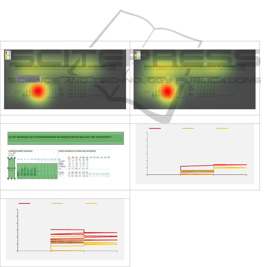
The generated heat maps for stimulus 1 and the
corresponding AOI definition is shown in figure 4.
The grey box in example (a) ensures anonymity of
the company. Six areas of interest are defined.
For the group “familiar” 80.3% of the gaze dura-
tion lies within the defined AOIs and for the group
“unfamiliar” 85.5%. This justifies the identification
of task relevant areas and annotations and therefore
supports the selection of these areas as AOIs.
The area gaining the most gaze duration of the par-
ticipants that are familiar with the reports is AOI 1
(60.2%), which shows the task. The second most
interesting area is AOI 2 including the part of the
chart where the answer can be extracted (18.0%),
and the third most observed area is AOI 4 including
the data labels (9.9%). Results for participants that
see the report for the first time are the following:
AOI 1 59.9%, AOI 2 18.6% and AOI 4 10.8%. The
numbers look similar but there is an indication that
those who are not familiar with the use of the de-
fined color-use (red for forecast and blue for budget)
spend more time reading the data labels than those
who are familiar with the report.
Investment expenditures
Hycom AG
in TEUR
Budget 10.3 13.7 16.7 17.3 15.3 19.2 24.3 20.0 28.3 27.0 25.0 28.7
Forecast 22.3 23.3 23.7 24.7 25.0 24.0
pos. Variance
neg. Variance
Actual
6.7 17.3 19.3 14.7 17.3 15.0
3.7
2.7
2.0
3.7
2.7
4.2
Jan Feb Mar Apr May June July Aug Sept Oct Nov Dec
ReportOptimizationusingVisualSearchStrategies-AnExperimentalStudywithEyeTrackingTechnology
213
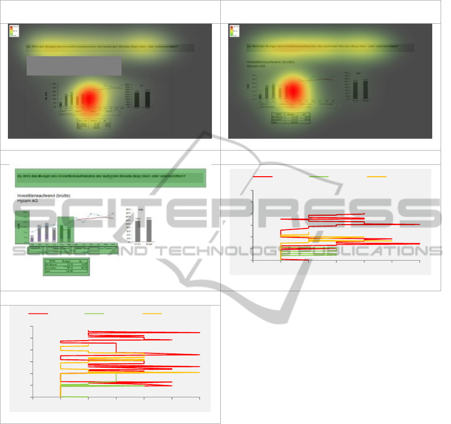
Heat map for participants of the group
“familiar”
Heat map for patricipants of the group
“unfamiliar”
(a)
(b)
AOI definition for both groups Parallel Scan Path visualisation “familiar”
(c)
(d)
Parallel Scan Path visualisation “unfamiliar”
(e)
Figure 4: In a) the heat map of all participants that are familiar with the report is shown in b) the heat map for those that see
the report for the first time, in c) the annotated areas of interest on the stimulus are presented, and in d and e) Parallel Scan
Path visualisations showing the average scan path of the identified group that has similar strings according to Levenshtein
Distance as well as the longest and the shortest compressed string identified for both groups.
Differences within groups and between groups are
significant using chi square analyses between the
defined AOIs (x² for participant and AOI is 0.000
and x² for groups and AOI is 0.007). These results
indicate that scanning strategies are different be-
tween participants but the difference between the
two groups is higher.
The Parallel Scan Path visualisation show that
the group that is unfamiliar with the report needs
more time and re-visited AOIs more often than the
group that was familiar with the report. Especially
with regard to the AOIs 3 to 5 it is shown that those
were revisited more often. The number of changes
between AOIs for group 1 is 9.9 and for group 2
15.7. The difference between groups is significant.
Hypothesis 2 that experienced report users have a
shorter sequence string can be confirmed. Addition-
ally, a significant and relatively strong positive cor-
relation between task completion time and number
of string variables can be identified (Pearson correla-
tion 0.687 and p=0.00) and therefore also hypothesis
3 can be confirmed.
For further analysis of the compressed strings
LD is used. The larger the LD the more differences
0
5
10
15
20
25
30
0 1 2 3 4 5 6
longest shortest average
0
5
10
15
20
25
30
0 1 2 3 4 5 6
longest shortest average
IVAPP2015-InternationalConferenceonInformationVisualizationTheoryandApplications
214
can be detected between two scan paths. LD is high-
er for group two (12.9) than for group 1 (average
9.4) and a significant difference can be detected
between groups (p=0.00). This result indicates that
more similarities between strings can be detected
within the group “familiar” and hypothesis 4 that LD
is lower for experienced users than for novice report
users can be confirmed.
4.2 Stimulus 2
The error rate for stimulus 2 is the same for both
experimental groups 0%. No significance (p=1.000)
can be detected using a non-parametric test (Mann-
Whitney-U test). When analysing efficiency, the
average response time in group “familiar” is 7.6
seconds compared to 11.7 in group “unfamiliar”.
A low significant difference can be detected using
students t-test (p=0.073). The overall number of
fixations needed shows a significant difference be-
tween groups (group 1: 30.1 and group 2: 46.9, p=
0.011). These results indicate that the experimental
group “familiar” is faster and needs fewer fixations
until responding to the stated question. Hypothesis 5
that experienced report users are faster than novice
report users when viewing a new layout with famil-
iar content can be confirmed.
The same scan path analysis for efficiency as
conducted for stimulus 1 is done for stimulus 2. The
generated heat maps and the corresponding AOI
Figure 5: In a) the heat map of all participants that are familiar with the report is shown in b) the heat map for those that see
the report for the first time, in c) the annotated areas of interest on the stimulus are presented, and in d and e) Parallel Scan
Path visualisations showing the average scan path of the identified group that has similar strings according to Levenshtein
Distance as well as the longest and the shortest compressed string identified for both groups.
Heat map for participants of the group “familiar” Heat map for patricipants of the group “unfamiliar”
(a)
(b)
AOI definition for both groups Parallel Scan Path visualisation „familiar“
(c)
(a)
Parallel Scan Path visualisation „unfamiliar“
(b)
0
5
10
15
20
25
30
0 1 2 3
longest shortest average
0
5
10
15
20
25
30
0 1 2 3
longest shortest average
ReportOptimizationusingVisualSearchStrategies-AnExperimentalStudywithEyeTrackingTechnology
215

definition is depicted in figure 5. Again the grey box
in example (a) is to ensure anonymity and cover the
company’s name. For the group “familiar” 85.6% of
the gaze duration lies within the defined AOIs and
for the group “unfamiliar” 83.0%. This again justi-
fies the selected AOIs as task relevant areas. The
area gaining the most gaze duration for group 1 is
AOI 1 (53.5%), which includes the task. The second
most interesting area is AOI 2 including the part of
the chart where the answer can be extracted (42.6%),
and third most observed area is AOI 3 including the
data labels (3.9%). Results for participants that see
the report for the first time are as follows: AOI 1
61.9%, AOI 2 31.0% and AOI 3 7.6%.
Differences within the group “familiar” are not
significant (p=0.113) indicating that the observed
AOIs are similar between participants. Differences
within the group “unfamiliar” are significant (x² is
0.001) indicating that more individual scan path
strategies need to be applied by users that are not
familiar with the content. Differences between the
two groups under investigation are significant (and
x² for groups and AOI is 0.007).
The Parallel Scan Path visualisation (displayed
in figure 7) indicates that the group that is unfamiliar
with the report needs more time and re-visits AOIs
more often than the group that is familiar with the
report, even though a new layout is used. The num-
ber of changes between AOIs for group 1 is 5.0 and
for group 2 8.7. The difference between groups is
significant (p=0.006) and therefore hypothesis 6
stating that experienced report users have a shorter
sequence string than novice report users when view-
ing a new layout with familiar content can be con-
firmed. Again a significant and relatively strong
positive correlation between task completion time
and number of string variables can be identified
(Pearson correlation 0.701and p=0.00) confirming
hypothesis 7.
LD is higher for group “unfamiliar” (average
5.5) than for group “familiar” (average 2.6) and the
difference is significant (p=0.000). This result indi-
cates that more similarities can again be detected
within the group “familiar” and hypothesis 8 indicat-
ing that LD within the group of experienced report
users is lower when viewing a new layout with fa-
miliar content than within the group of novice report
users can be confirmed.
4.3 Comparison of Stimuli 1 and 2
When taking a closer look at the presented stimuli
and the differences between the original layout and
the optimized one, no significant changes can be
detected when analysing error rates.
When the layout of the display is optimized ex-
perience with the content affects the time and the
fixations needed positively. A reduction of 23.9% of
the required time and 27.8% of the number of fixa-
tions till response can be found, however, the differ-
ence between the two stimuli for the required time is
not significant (t-test for response time p=0.202 and
for number of fixations p=0.319).
Along with the layout optimization, the number
of areas of interest could be reduced from six areas
to only 3. Compared to the numbers in stimulus 1
the time needed to look at the data labels decreases.
As a result changes of fixation between AOIs are
significant between both presented stimuli. The
original layout needs 41.8% more changes between
the defined areas as the optimized layout (12.7
changes vs. 7.4 changes). This result is significant
(p=0.001).
When analysing the effects of experience and
page layout, it can be found that the difference be-
tween the old and the new page layout is higher
(41.8% and significant) than the difference between
experienced and novice report users (29.2% and not
significant). Hypothesis 9 that the influential factor
of page layout has a higher impact on visual search
strategies than the factor experience can be con-
firmed. Furthermore, it can be found that experi-
enced users are affected more by layout changes
than novice report users. However, contrary to ex-
pectations experienced users improve their perfor-
mance more than novice report users. Therefore
hypothesis 10 has to be rejected.
5 CONCLUSIONS
Eye tracking analysis allows the visualization of the
individual search strategies of participants while
observing visual stimuli and retrieving information.
This visualisation helps in the identification of the
potential for optimization and therefore the en-
hanced efficiency and effectiveness of graphical
representations of company reports. Analysis based
solely on time and error often do not allow for the
deduction of strategies for optimal design, however,
analyses based on strings provides a solid base for
layout optimization.
A relatively strong positive correlation indicating
the relationship between the length of a compressed
string and the response time can be identified, allow-
ing us to use this measure for layout optimization.
The results of this study indicate that experience
does influence performance positively by reducing
IVAPP2015-InternationalConferenceonInformationVisualizationTheoryandApplications
216

the number of first fixations and re-fixations in dif-
ferent areas of interest. Additionally, changing the
layout of a report page according to guidelines
(based on the human cognition) faster response
times and lower the amount of fixations and re-
fixations needed. The influence of layout changes is
even higher when participants are familiar with the
content of the report which is surprising given they
are used to the displayed layout and have to apply
new search strategies.
These results indicate that recipients of a report
have to get familiar with the content in order to be
able to draw the right conclusion in a fast way.
However. they also indicate that an optimized layout
helps both groups of investigation (the familiar as
well as the unfamiliar ones). Standardization there-
fore is desirable but should not hinder changes to-
wards a perception-optimized layout. The results of
this study could further be confirmed by other tested
report-pages within the reported experiment as well
as with experiments in other companies using their
own reports. Further research will be conducted on
the detailed relationships between visual stimuli
(e.g. table or graph, graph types, graph layout and
design) and individual factors (e.g. culture, experi-
ence, working memory capacity) to be able to pre-
dict information retrieval performance.
REFERENCES
Anderson, E. W., Potter, K. C., Matzen, L. E., Shepherd, J.
F. Preston, J. F., Silvia, C.T, 2011. A user study of
visualization effectiveness using EEG and cognitive
load. In Proceedings of IEEE EuroVis2011. Vol. 30.
No. 3. pp. 791-800.
Barat, A. H., 2007. Human perception and knowledge
organization: visual imagery. In Library Hi Tech. Vol.
25. No. 3. pp. 338-351.
Beattie, V., Dhanani, A., Jones, M. J., 2008. Investigating
presentational change in U.K. annual reports: a longi-
tudinal perspective. In Journal of Business Communi-
cation. Vol. 45. Nr. 2. pp. 181-222.
Blignaut, P., 2010. Visual span and other parameters for
the generation of heatmaps. In Proceedings of the ET-
RA2010. Austin. March 22-24. pp. 125-128.
Conati, C., Maclaren, H., 2008. Exploring the role of
individual differences in information visualization. In
Proceedings of AVI2008. pp. 199-206.
Elmqvist, N., Soo Yi, J., 2013. Patterns for visualization
evaluation. In Information Visualization. Special Issue
Article. Vol. 0. No. 0. pp. 1-20.
Falschlunger, L., Eisl. C., Losbichler, H., Greil, A., 2014.
Improving information perception of graphical dis-
plays: an experimental study on the display of column
graphs. In Proceedings of the WSCG2014. Pilsen. 2-4
June. pp. 19-26.
Goldberg, J. H., Helfman, J. I., 2010. Scanpath clustering
and aggregation. In Proceedings of the ETRA2010.
Austin. March 22-24. pp. 227-234.
Goldberg, J. H., Helfman, J. I., 2011. Eye tracking for
visualization evaluation: reading values on linear ver-
sus radial graphs. In Information Visualization. Vol.
10. No. 3. pp. 182-195.
Goldberg, J. H., Helfman, J. I., 2014. Eye tracking on
visualization: progressive extraction of scanning strat-
egies. In Handbook of Human Centric Visualization.
pp. 337-372.
Hill, W. Y., Milner, M. M., 2003. Guidelines for graphical
displays in financial reporting. In Accounting Educa-
tion. Vol. 12. No. 2. pp. 135-157.
Holmqvist, K., Nyström, M., Mulvey, F., 2012. Eye track-
er data quality: what it is and how to measure it. In
Proceedings of the ETRA2012. Santa Barbara. Ca.
March 28-30. pp. 45-52.
Huang, W., Eades, P., 2005. How people read graphs. In
Proceedings of the APVIS 2005. Sydney. Vol. 45. pp.
51-58.
Keller, T., Gerjets, P., Scheiter, K., Garsoffky, B. 2006.
Information visualizations for knowledge acquisition:
the impact of dimensionality and color coding, In In-
structional Design for Effective and Enjoyable Com-
puter-Supported Learning. Vol. 22. No. 1. pp. 43-65.
Levenshtein, V., 1966, Binary codes capable of correcting
deletions, insertions, and reversals, In Soviet Physics
Doklady, Vol. 10, pp. 707-710.
Lurie, N. H., Mason, C. H., 2007. Visual representation:
implications for decision making. In Journal of Mar-
keting. Vol. 71. No. 1. pp. 160-177.
Mostyn, G. R., 2012. Cognitive load theory: what it is,
why it’s important for accounting instruction and re-
search. In Issues in Accounting Education. Vol. 27.
No. 1. pp. 227-245.
Parsons, L. M., Tinkelman, D., 2013. Testing the feasibil-
ity of small multiples of sparklines to display semi-
monthly income statement data. In International Jour-
nal of Accounting Information Systems. Vol. 14. No. 1.
pp. 58-76.
Peck, E. M, Yuksel, B., Harrison, L, Ittkeym A., Chang,
R., 2012. Position paper: towards a 3-dimensional
model of individual cognitive differences. In Proceed-
ings of the BELIV2012. Seattle. WA USA. Pp. 1-6.
Pfitzner, D., Hobbs, V., Powers, D., 2001. A unified taxo-
nomic framework for information visualization. In
Proceedings of the AICE2000. Canberra. pp. 1-10.
Raschke, M., Chen, X., Ertl, T., 2012. Parallel scan-path
visualization. In Proceedings of the ETRA2012, Santa
Barbara, CA, March 28-30, pp. 165-168.
Raschke, M., Blascheck, T., Richter, M., Agipkin, T., Ertl,
T., 2014a. Visual analysis of perceptual and cognitive
processes. In Proceedings of the IVAPP2013. pp.1-8.
Raschke, M., Herr, D., Blascheck, T., Ertl, T., 2014b. A
visual approach for scan path comparison. In Proceed-
ings of the ETRA2014. Safety Harbor. March 26-28.
pp. 135-142.
ReportOptimizationusingVisualSearchStrategies-AnExperimentalStudywithEyeTrackingTechnology
217

Renshaw, J. A., Finlay, J. E., Tyfa, D., Ward, R. D. 2003:
Designing for visual influence: an eye tracking study
of the usability of graphical management information.
In Proceedings of the INTERACT2003. pp. 144-151.
Sohn, Y., Doane, S., 2003. Roles of working memory
capacity on long-term working memory skill in com-
plex task performance. In Memory & Cognition. Vol.
31. No. 3. pp. 458-466.
Speier, C., 2006. The influence of information presenta-
tion formats on complex task decision-making per-
formance. In International Journal of Human-
Computer Studies. Vol. 64. No. 11. pp. 1115-1131.
Tank, H., Topczewski, J. J., Topczewski, A. M., Pienta, N.
P., Permutation test for groups of scanpaths using
normalized levenshtein distance and application in
NMR questions. In Proceedings of the ETRA2012.
Santa Barbara. Ca. March 28-30. pp. 169-172.
Toker, D., Conati, C., Steichen, B., Carenini, G., 2013.
Individual user characteristics and information visuali-
zation: connecting the dots through eye tracking. In
Proceedings of Human Factors in Computing Systems
(Proceedings of CHI’13), ACM, pp. 295-304.
Vessey, I., 1991. Cognitive fit: a theory-based analysis of
the graphs versus tables literature. In Decision Sci-
ence, Vol. 22, No. 2, pp. 219-240.
Ware, C., 2013. Information visualization – perception for
design, Third Edition, ISBN-10: 0123814642.
IVAPP2015-InternationalConferenceonInformationVisualizationTheoryandApplications
218
