
Leaf Glyph
Visualizing Multi-dimensional Data with Environmental Cues
Johannes Fuchs, Dominik J
¨
ackle, Niklas Weiler and Tobias Schreck
University of Konstanz, Universit
¨
atsstr. 10, 78462 Konstanz, Germany
Keywords:
Glyph Visualization and Layout, Nature-inspired Visualization, Leaf Shape, Multi-dimensional Data Analy-
sis, Data Aggregation.
Abstract:
In exploratory data analysis, important analysis tasks include the assessment of similarity of data points, label-
ing of outliers, identifying and relating groups in data, and more generally, the detection of patterns. Specifi-
cally, for large data sets, such tasks may be effectively addressed by glyph-based visualizations. Appropriately
defined glyph designs and layouts may represent collections of data to address these aforementioned tasks. Im-
portant problems in glyph visualization include the design of compact glyph representations, and a similarity-
or structure-preserving 2D layout. Projection-based techniques are commonly used to generate layouts, but
often suffer from over-plotting in 2D display space, which may hinder comparing and relating tasks.
We introduce a novel glyph design for visualizing multi-dimensional data based on an environmental metaphor.
Motivated by the humans ability to visually discriminate natural shapes like trees in a forest, single flowers in
a flower-bed, or leaves at shrubs, we design a leaf-shaped data glyph, where data controls main leaf properties
including leaf morphology, leaf venation, and leaf boundary shape. We also define a custom visual aggregation
scheme to scale the glyph for large numbers of data records. We show by example that our design is effectively
interpretable to solve multivariate data analysis tasks, and provides effective data mapping. The design also
provides an aesthetically pleasing appearance, which may help spark interest in data visualization by larger
audiences, making it applicable e.g., in mass media.
1 INTRODUCTION
Glyph-based data visualization has a long tradition
in Information Visualization research and application.
The basic idea in glyph visualization is to map data
properties to visual properties of some appropriately
designed visual structure. By the interplay of the dif-
ferent visual properties, each glyph then represents a
data record. Many data records can be compared by
appropriately laid out glyph displays. Glyph visual-
ization, like other areas in Information Visualization,
can be considered both a science and an art. Specifi-
cally, the design of glyphs may be inspired intuitively
by common, well-known shapes or icons. For ex-
ample, Chernoff faces were inspired by face proper-
ties, and sticky figures by abstraction of human body
shapes.
A subset of the designs studied in Information Vi-
sualization to date has been inspired by nature. For
example, tree structures have inspired hierarchical
node-link diagrams. As another example, the notion
of information landscapes or terrains is also borrowed
from nature. There is reason to believe that the hu-
man visual sense, due to long evolutionary processes,
is highly trained in recognizing, distinguishing and
comparing natural forms. These visual recognition
processes typically work well even in low illumina-
tion conditions, or in presence of partial occlusion of
natural objects. By background knowledge and expe-
rience, humans are able to efficiently recognize natu-
ral shapes, also often in cases where only parts of the
shape or their boundary are visible.
Based on this motivation, we investigate the de-
sign space for leaf shapes as natural metaphors for
data glyphs. From observing leaves in nature, it is
clear that there is a large variability in the different
types and forms of leaves that exist. Overall leaf
shape, shape boundary, and shape interior all com-
prise several visual parameters that can in principle,
be used to map data to generate glyphs. To the best
of our knowledge, this is the first work to systemat-
ically study the design space of leaf-based glyph vi-
sualization, and identify an encompassing set of leaf
variables to map data to. In conjunction with appro-
priate glyph layouts (based e.g., on projection), and
visual aggregation techniques, effective and intuitive
195
Fuchs J., Jäckle D., Weiler N. and Schreck T..
Leaf Glyph - Visualizing Multi-dimensional Data with Environmental Cues.
DOI: 10.5220/0005292801950206
In Proceedings of the 6th International Conference on Information Visualization Theory and Applications (IVAPP-2015), pages 195-206
ISBN: 978-989-758-088-8
Copyright
c
2015 SCITEPRESS (Science and Technology Publications, Lda.)

data displays can be realized. Our rationale for us-
ing leaf-based data visualization is two-fold. First,
the design space is large, giving ample opportunities
for the visualization expert to map data variables to
visual variables. As will be discussed, our variable
space amounts to more than 20 different visual vari-
ables than can be controlled. While we have not for-
mally evaluated the effectiveness of these variables or
their combinations, we presume this is a large design
space from which appropriate effective selections can
be found. Second, we propose that nature-inspired de-
signs, by their potential aesthetic appearances and fa-
miliarity, can be suited to spark interest in visual data
analysis for wider audiences, e.g., for use in mass me-
dia. Also, it resonates well with visualization of envi-
ronmental data, as has been previously demonstrated,
e.g., by a respective infographic used by OECD (see
Section 2.2).
The remainder of this paper is structured as fol-
lows. In Section 2, we discuss glyph-based and
nature-inspired data visualization approaches. Sec-
tion 3 defines the design space for leaf glyphs, based
on identification of main visual leaf properties which
are candidates for data mapping. Then, in Section 4,
we define several visual aggregation schemes to scale
2D glyph layouts for large numbers of data points.
Section 5 then applies our design to several data sets.
By exemplary data analysis cases, we demonstrate the
principal applicability of our approach. Finally, Sec-
tion 6 summarizes our work and outlines future re-
search in the area.
2 RELATED WORK
Our work extends the design space of two existing
branches of research by introducing a compact data
representation making use of environmental cues.
The related work is, therefore, split into two parts.
The first part covers the area of space efficient visual-
ization techniques, namely, data glyphs. The second
part addresses research using environmental cues to
convey data. We do not address research in the area of
computer graphics, since this work mainly focuses on
photo-realistic representation of the environment. We
refer the interested reader to a summary work about
this topic by Deussen and Lintermann (Deussen and
Lintermann, 2005).
2.1 Glyphs
In the literature, there exists a large variety of glyph
designs. Elaborate summaries can be found in (Borgo
et al., 2012) (Ward, 2008). To come up with a
comprehensive categorization we make use of Ward’s
classification of data glyphs (Ward, 2008). In his re-
search he distinguishes between three different ways
a data point can be mapped to a glyph representation.
First, Many-to-One Mapping: All data dimen-
sions and their respective value are mapped to a com-
mon visual variable. Therefore, these designs can be
systematically created by choosing the most effective
visual variable for a certain task. Additional guidance
is given by Cleveland et al. with a ranking of visual
variables (Cleveland and McGill, 1984). Well-known
examples making use of a position/length encoding
are star glyphs (Siegel et al., 1972), whisker and fan
plots (Pickett and Grinstein, 1988)(Ware, 2012), or
profile glyphs (Du Toit et al., 1986). The designs just
differ in their layout of the dimensions (i.e., circular
or linear) and some minor variations like the pres-
ence or absence of a surrounding contour line. Other
glyph designs make use of color encodings to repre-
sent the data value. Clock glyphs (Kintzel et al., 2011)
map the dimensions in a radial fashion, whereas pixel-
based glyph designs (Levkowitz and Herman, 1992)
layout the dimensions linearly. Of course, color can-
not convey the data as accurate as a position/length
encoding (Fuchs et al., 2013), however, for certain
tasks like spotting outliers the color encoding is a
reasonable choice. There is even a design mapping
the data values to the angle of its rays. Sticky fig-
ures (Pickett and Grinstein, 1988) use the visual vari-
able orientation, which is not so accurate in commu-
nicating exact data values. However, when used as an
overview visualization the designs convey individual
shapes, which are perceived as a whole nicely approx-
imating the underlying data point.
Second, One-to-One Mapping: Each dimension
is mapped to a different visual variable. Probably,
the most well-known representations here are Cher-
noff faces (Chernoff, 1973). The single data values
are mapped to face characteristics, like the size of the
nose or the angle of the eyebrows. Other more ex-
otic designs are bugs (Chuah and Eick, 1998) (chang-
ing the shape, length or color of wings, tails and
spikes), or hedgehogs (Klassen and Harrington, 1991)
(manipulating the spikes by changing the orientation,
thickness and taper). The major drawback of these
kinds of glyph representations is that they are often
sensitive to the order by which the data dimensions
are mapped to visual variables. Variation of the order
could significantly change the final glyph representa-
tion and its visual perception by users. Additionally,
measuring differences between single dimension val-
ues within a data point is typically a difficult task, as
the analyst has to compare different kinds of visual
variables with each other (e.g., compare length with
IVAPP2015-InternationalConferenceonInformationVisualizationTheoryandApplications
196

saturation or angle, etc.)
Third, One-to-Many Mapping: The dimensions
are represented by two or more visual variables. This
redundant mapping can be useful to strengthen the
perception of individual dimensions. For example, in
star or profile glyphs the dimensions can be addition-
ally encoded by coloring the single data rays. Clock
glyphs can make use of an additional length encoding
for the single colored slices to encode the underlying
data values more accurately.
2.2 Environmental Cues
Visualizations making use of environmental cues
need not necessarily be glyph representations. Ste-
faner uses an abstract tree layout to show the edit-
ing history of Wikipedia entries represented as single
branches (Stefaner, 2014a). The branches grow to the
right whenever people decided to delete an article or
to the left in the other case. The resulting tree nicely
summarizes 100 articles with the longest discussion
whether to keep them or not. Another tree-based ap-
proach in combination with leaves visualizes poems
in a more artistic way (M
¨
uller, 2014). The branches
of the tree are invisible just dealing as an anchor point
to arrange the glyphs. Each word in the poem is rep-
resented with a leaf glyph and attached along the tree
structure. The work is not eligible of representing the
text data accurately but tries to illustrate a creative
unique picture or fingerprint of the underlying poem.
A more data-driven glyph design is the botanical
tree (Kleiberg et al., 2001), which again uses a 3D
tree layout to represent hierarchical information. The
single nodes are represented as fruits. The authors ar-
gue that people can more easily identify single nodes
in this visualization compared to a more abstract rep-
resentation because they are used to detect fruits or
leaves on shrubs or trees. A 2D visualization us-
ing a botanical tree metaphor are so-called Contact-
Trees (Sallaberry et al., 2012) which show relation-
ships in data, e.g., contacts between persons. The
branches consist of single lines representing an at-
tribute in the data, e.g., a longer line refers to an older
tie between people. Finally, fruits or leaves are added
to the tree according to some data property, e.g., the
kind of relation between people (friends, co-workers
etc.) However, the fruits and leaves are highly ab-
stract representations (mainly colored dots) and their
shape does not change according to some data charac-
teristics. The OECD’s Better Life Index visualization
(Stefaner, 2014b), on the other hand, systematically
changes the appearance of the single flower glyphs
used to represent data. Stefaner uses such environ-
mental cues to visualize multi-dimensional data about
country characteristics. Each country is represented
by one flower. The petals encode the different eco-
nomic branches with varying sizes and lengths for the
corresponding values. The flowers are arranged ac-
cording to their weighted rank across all dimensions.
People can change the layout by changing the weights
of the dimensions or simply focusing on just one di-
mension.
We contribute to this body of existing work with
the definition of a highly detailed leaf glyph, which
closely follows the main morphological and func-
tional variations among leaves. It is able to effectively
map data variables. We also provide a custom aggre-
gation scheme to scale leaf layouts for large number
of records.
3 ENVIRONMENTAL GLYPH
According to Biological literature, leaves may be cat-
egorized by their function or usage in the environment
(Beck, 2010). For our purposes, we divide leaves ac-
cording to their shape (or morphology). The overall
appearance of a leaf consists of the combination of
(1) the overall shape type, (2) the boundary details,
and (3) the leaf venation. We consider these three as-
pects as the main dimensions for controlling the leaf
glyph by mapping data. As a result we come up with
a design space structured along the overall leaf shape,
which we discuss next.
3.1 Leaf Shape Design Space
Following Palmer who pointed out: “Shape allows a
perceiver to predict more facts about an object than
any other property” (Palmer, 1999), this visual vari-
able should be used for the most important data di-
mension. In the environment, there exists a nearly
endless amount of different leaf shapes since each leaf
is unique. However, it is possible to distinguish leaves
according to their overall shape (Deussen and Linter-
mann, 2005). A first categorization can be done be-
tween conifer and deciduous leaves.
Conifer leaves can be found for example at fir
or pine trees and have a thin long needle-like shape.
Therefore, they do not offer much space for a vena-
tion pattern, which we want to use later for mapping
additional attributes (e.g., Acicular leaves). Since the
differences in shape are quite small for the different
kinds of this group and the provided area is limited
due to the distorted aspect ratio, we do not consider
them in our design space.
Deciduous leaves cover a large group of different
LeafGlyph-VisualizingMulti-dimensionalDatawithEnvironmentalCues
197
shapes and can again be further divided into four sub-
categories (Deussen and Lintermann, 2005).
Pinnate and palmate compound leaves are shapes,
which consist of several smaller leaflets attached to a
shared branch (e.g., Alternate, or Odd and Even Pin-
nate leaves etc.). In order to avoid any misinterpreta-
tion between single leaflets at a branch and individual
leaves, we discard this group from our final design
space. However, these kinds of leaves seem an appro-
priate representation to visually summarize multiple
data points where one leaflet corresponds to a single
leaf.
Lance-like leaves have a parallel venation and are
thin and long, similar to conifer leaves. Therefore,
it is difficult to distinguish different kinds of these
leaves since the differences in the overall shape are
limited. Like the conifer leaves, we do not keep them
in our design space because of the limited area to map
a venation pattern, and because of possible confusion
of different lance-like shapes.
Leaves with net veins or reticulate venation pat-
terns encompass the largest group of deciduous leaves
with a big diversity in shape. We restrict ourselves
to the most common leaf shapes for this category
to avoid misinterpretation of intermediate structures,
which could not clearly be distinguished. Addition-
ally, we focus on leaves with a big surface to show ve-
nation patterns and small stems to save space. Leaves
similar to Flabellate, Unifoliate, etc. will, therefore,
not be considered.
The most important requirement for shapes in vi-
sualizations is that they should be easily distinguish-
able. Therefore, our final design space covers el-
liptic (e.g., Ovate, Obtuse, Obcurdate etc.), circu-
lar (e.g., Orbicular), triangular (e.g., Deltoid), arrow-
like (e.g., Hastate, Spear-shaped etc.), heart-like (e.g.,
Cordate, Deltoid etc.), two variations of tear-drop like
(e.g., Acuminate, Cuneate etc.), wave-like (e.g., Pin-
natisect), and star-like (e.g., Palmate, Pedate, etc.)
shapes. Figure 1 illustrates the nine different leaf
shape categories covered by our design space. In Sec-
tion 5 we will introduce a heuristic to map data points
to leaf shapes, based on the idea of representing outly-
ing points by the more jagged leaf shapes; conversely,
non-outlying points will be represented by the more
regular or smooth leaf shapes.
Figure 1: Leaf Shapes: Selected from our overall design
space, these are the shapes used in our final glyph design.
From left to right: Elliptic, circular, triangular, arrow-like,
heart-like, tear drop up, tear drop down, wave-like, and star-
like shapes.
We take these categories as a starting point and
further extend them by mapping additional attribute
dimensions to the width and the height of the glyph,
scaling the overall shape. Therefore, similar shapes
according to a certain data characteristic can look
different because of the varying aspect ratio. How-
ever, the individual shape categories can still be dis-
tinguished (Figure 2). Because of this decision, we
will deviate from the precise environmental reference,
where leaves typically show a homogeneous aspect
ratio. However, we thereby are able to encode ad-
ditional data dimensions. Note that we do not want
to represent leaves as accurate as possible (or even
photo realistic), but use their expressiveness to visu-
alize data.
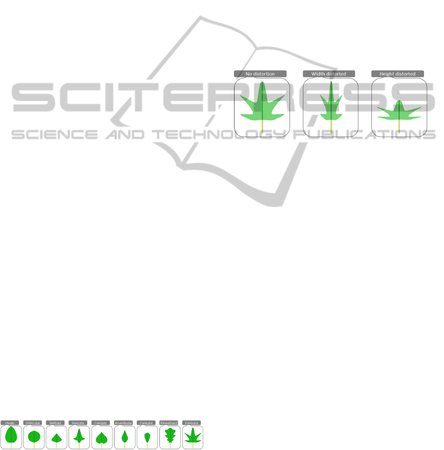
Figure 2: Leaf Scaling: The Palmate leaf shape is scaled
using either the width (middle), or the height (right) of the
glyph. Even after scaling, the glyph can still be recognized
as a star-like leaf, although the precise environmental refer-
ence to the Palmate leaf is reduced.
3.2 Leaf Boundary Design Space
Basically, the boundary (or margin) of a leaf can be
described as either serrated or unserrated. Unserrated
boundaries have a smooth contour adapting to the
overall leaf shape. Serrated boundaries are toothed
with slight variations depending on the size of teeth,
their arrangement along the boundary, and their fre-
quency. Of course, there are more detailed differ-
ences and variations in nature. However, especially
in overview visualizations (the major domain of data
glyphs), distinguishing between small variations of
the contour line of a leaf shape is nearly impossible.
We therefore focus on just the two main boundary cat-
egories of teethed or smooth (serrated or unserrated).
For mapping data values to the leaf boundary, we dis-
tinguish between a smooth and a toothed contour line
and vary the width, height, and frequency of the teeth
according to the underlying data value (Figure 3).
3.3 Leaf Venation Design Space
We also control the leaf venation pattern as to map
additional data variables to the glyph. Several main
leaf venation patterns exist, which differ in their over-
all structure within the leaf. A rough distinction can
IVAPP2015-InternationalConferenceonInformationVisualizationTheoryandApplications
198
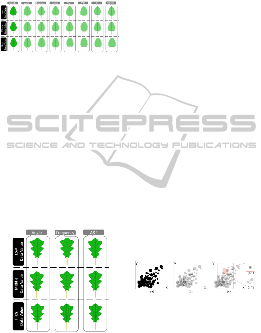
Figure 3: Leaf Boundary: Modifying the boundary in our
design is realized by changing the frequency, the height, or
the width of the boundary serration (teeths). Combinations
of these three variables are possible and increase the ex-
pressiveness of the glyph. The figure illustrates all possible
combinations for low, middle, and high data values for an
elliptically shaped leaf glyph.
be made between single, not intersecting (e.g., Par-
allel), paired (e.g., Pinnate), or net-like (e.g., Reticu-
late) veins. The venation is perceived as an additional
texture for the glyph and further increases the glyph
expressiveness. Since it is hard to find a natural order
within this texture, we propose to use the venation
type for visualizing qualitative (or categorical) data,
similar than the overal leaf shapes discussed in Sec-
tion 3.1. Within a given venation type, we may also
encode numeric data. This works as follows. Gen-
erally, the leaf is split in the middle by a main vein,
with small veins growing from there in a given direc-
tion (angle). For mapping numerical data, we may ei-
ther control this angle of the veins branching out from
the main vein. An alternative is to control the number
of veins shown on the surface Figure 4. As a result,
we come up with a venation texture able of encoding
categorical and numerical data.
Figure 4: Leaf Venation: The texture for the venation sys-
tem can either be created by mapping data values to the an-
gle or frequency of the veins separately, or by combining
the two. The figure illustrates all possible combinations for
low, middle, and high data values for a wave-like leaf shape.
3.4 Summary
Besides modifying the leaf shape given by morphol-
ogy, boundary and venation, further dimensions can
be assigned to the color hue or saturation of the glyph.
Of course, the designer has to pay attention to the
contrast between the venation texture and the back-
ground color. Additionally, orientation of the glyph
in the display can be used to encode further numeric
information. We draw a short stem to each leaf shape,
showing its orientation. Finally, it is also possible to
modify the stem’s width or height as well.
This represents a comprehensive design space for
mapping data to leaf glyphs, controlled by 12 cate-
gorical and 14 numeric parameters, summing up to
26 variables altogether (see Table 1 for an overview
of all variables.) We propose this design space as a
toolbox from which the designer may select visual
variables as appropriate. The number of 26 param-
eters is considered more a theoretical upper limit of
data variables that we can show. We expect not all vi-
sual parameters in this design space to be of the same
expressiveness; but some variables may be more ef-
fective than others, and may not all be orthogonal to
each other. Careful choice should be done in selected
and prioritizing the variables. An option is of course
always, to redundantly code data variables to different
glyph variables, to emphasize perception of important
data variables. In Section 5, we will illustrate by prac-
tical examples, how glyph variables can be combined
to form data displays.
4 LEAF GLYPH AGGREGATION
When visualizing large data sets, leaf glyphs are
prone to overlap in the display, reducing the effective-
Figure 5: Main principles of aggregating point data in a
scatterplot. In (a), point data is visualized in a scatterplot.
The point data is represented in three different dimensions:
small, medium, and large. Differences and data values can
barely be identified since the visualization is cluttered. To
overcome this issue, we apply transparency in (b), partially
solving the issue of clutter. In (c), grid-based aggregation is
applied. All points that fall within the same cell are aggre-
gated. (c.1) shows a prototype-oriented aggregation: Points
are stacked in order to be able to distuinguish them. (c.2)
shows abstraction by visual aggregation: Points are aligned
along a line.
LeafGlyph-VisualizingMulti-dimensionalDatawithEnvironmentalCues
199
Table 1: Summary of the parameters of our glyph design. It comprises 14 numeric and 12 categorical variables, which form
the theoretic upper limit for the expressiveness of our glyph. Note that in practice, these variables are expected to not all be
orthogonal, and comprise different perceptional performance, depending also on the data.
Leaf Design Numeric Variables Categorical Variables
Shape 2 (x/y scale) 9 (selected morphologies)
Boundary 3 (frequency, width, height of teeth) –
Venation 2 (number, angle of child veins) 3 (parallel, paired, net)
Other 8 (hue, saturation, orientation, x/y position, stem width/height) –
Sum 15 12
ness of perceiving data from individual glyphs. Fig-
ure 5 outlines possible solutions by example of a scat-
terplot. The scatterplot (a) visualizes point data us-
ing three different point dimensions: small, medium,
and large. An increasing amount of visualized points
produces significant clutter resulting in perceptional
problems – the user is not able to distinguish between
data points properly. We point out three different ag-
gregation techniques: (b) Alpha Compositing, (c.1)
Prototype Generation, and (c.2) Abstraction. First,
we apply transparency in (b) to provide a visually
pleasing representation that also reveals differences
between data points. In some cases, the application
of transparency is not enough. For example, if mul-
tiple data points share the same position, the opac-
ity might sum up until no difference is perceivable.
Therefore, we propose in (c) two different aggrega-
tion techniques that build on top of transparency and
the application of a grid-based aggregation. Specifi-
cally, we place a user-defined grid on top of the visu-
alization. All data points sharing the same cell are ag-
gregated. In (c.1), all included data points are stacked
so that the different dimensions can still be perceived.
In contrast, (c.2) creates a new representation instead:
All included data points are aligned in a clutter-free
manner along a line.
These effects can at the same time be perceived in
nature: leaves can overlap or coincide with others. We
adapt the proposed aggregation techniques and extend
them in order to find a representative aggregate glyph
which summarizes multiple leaf glyphs.
In Figure 6 and Figure 7 we point out the applica-
tion of the aggregation techniques – Alpha Composit-
ing, Prototype Generation, and Abstraction – with re-
spect to nature. We next explain them in terms of their
counterpart in nature, and apply them to our visualiza-
tion of leaf glyphs.
4.1 Alpha Compositing
We use Alpha Compositing (Porter and Duff, 1984)
to reveal details on overlapping glyphs by applying
transparency. This technique describes the process of
Figure 6: Aggregation by Alpha Compositing. When
multiple leaves overlap or coincide, we are not able to dis-
tinguish properly between their shapes and related charac-
teristics. To overcome this issue, we propose to apply alpha
compositing. It reveals details by applying transparency to
the leaves.
combining multiple, separately rendered images in or-
der to provide a transparent appearance. The result of
the application of transparency to the glyphs is shown
in Figure 6.
As mentioned in Section 3, different leaf shapes
and characteristics need to be taken into account. In
nature, leaves own the characteristic that even when
multiple leaves overlap, we perceive differences due
to their diverse shape and color. To support this, we
apply transparency to the leaves. Figure 6 presents the
first results. The application of transparency works
well, in our experience, for a limited amount of leaf
glyphs. When too many leaves overlap, perceptional
problems can arise: Since the transparency also ag-
gregates, from a certain extent on, the glyphs can be-
come occluded and not be distinguishable anymore.
For this reason, we propose two additional aggre-
gation techniques we observed in nature: Prototype
Generation and Abstraction.
4.2 Prototype Generation
As mentioned above, transparency might not be
enough when aggregating multiple glyphs. Therefore,
we propose to additionally generate a prototype glyph
that aggregates the characteristics of all considered
glyphs. We apply a grid to the image space and ag-
gregated all leaves whose calculated center point falls
IVAPP2015-InternationalConferenceonInformationVisualizationTheoryandApplications
200
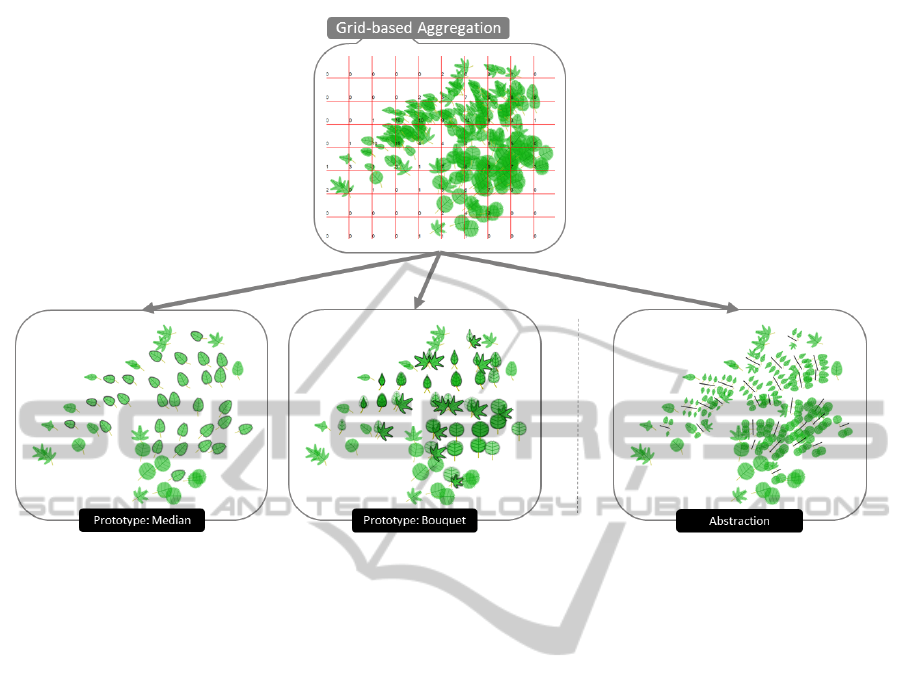
Figure 7: Grid-based Aggregation. We apply a grid to the visualization and calculate the center point of each leaf glyph, and
aggregate all glyphs whose center points coincide within the same cell. Two different aggregations can be used: Prototype
Generation and Abstraction. The first determines a representative glyph for the corresponding cell in the form of a median
glyph or a bouquet glyph. The second creates (similar to what we observe in nature), a branch with multiple leaves based on
the attributes of the considered leaves.
into the same grid cell; the cell dimensions are user
defined. The glyph representing such cell can either
be a representative of a statistical concept such as the
median value of all coinciding glyphs or a bouquet
which combines different leaf glyph types (analogous
to different flower types). Figure 7 shows the result of
both techniques, visualization of the median as well as
the visualization in form of a bouquet. For both tech-
niques, the transparency is preserved in order to be
able to distinguish between different attribute values
that determine the shape of a leaf glyph.
Our first proposed prototype is the representation
of the median. We therefore create a new leaf glyph
that has a simple appearance by means of its shape.
We use the median venation, margin, and shape in or-
der to describe a set of leaves that coincide in one cell.
Similar to a bouquet, we derive our second pro-
posed prototype by combining and aligning all con-
tained leaf glyphs. First, all leaf glyphs sharing the
same shape are stacked using transparency as de-
scribed in Section 4.1. Second, stacked leaf glyphs
are aligned in a radial manner according to their
shape. This means, while in the first step glyphs are
stacked according to their shape, in the second step
they are radially moved and aligned according to the
shape classes as pointed out in Section 3. As a result,
we get a representation similar to a bouquet.
4.3 Abstraction by Visual Aggregation
Based on the grid aggregation, we need to address
issues that emerge when too many glyphs fall into
one cell. Prototype generation may fail, if too many
glyphs along too many different shapes are aggre-
gated, and the visualized prototype may then suffer
from clutter. Therefore, we propose abstraction by
visual aggregation. We describe the new visual rep-
resentation for an aggregated set of glyphs. Similar
to growth characteristics of leaves we observe in na-
ture, this aggregation technique represents an aggre-
gated set of leaf glyphs as a new branch with multiple
leaves on it. All leaf glyphs are aligned side-by-side
along a branch according to Figure 7.
5 ILLUSTRATIVE APPLICATION
We defined an encompassing scheme to generate leaf
glyph-based data visualizations for large data sets.
We implemented the above described designs in an
LeafGlyph-VisualizingMulti-dimensionalDatawithEnvironmentalCues
201
interactive system. We here exemplify results we
obtained with three data sets. These results aim to
show the principle applicability. Note that a thorough
comparison against alternative glyph designs and user
testing remain to be done in future work.
5.1 Forest Fire
The forest fire data set is available in the UCI ma-
chine learning repository (Cortez and Morais, 2007)
and called forest fire. It contains data about burned
areas of forests in Portugal on a daily basis for one
year. Additionally, weather information is included,
e.g., temperature, humidity, rain and wind conditions
at respective points in time. This data set does not
contain any categorical data which could be mapped
to the leaf shape. Therefore, we initially clustered the
data points with the DBSCAN algorithm (Han et al.,
2011) and assign local or global outliers to different
glyph shapes (Figure 8). Our idea is to map outliers to
the more jagged leaf shapes, while non-outlier points
get mapped to more regular or smooth shapes, thereby
providing a first visual assessment of the degree of
outlyingness for the data. Our analysis task is to find
similarities between burned areas to be able to predict
fires due to certain weather conditions.
First, we applied alpha compositing as an aggre-
gation technique to get a rough idea of the data (Fig-
ure 9). We used one glyph for each data point and po-
sitioned them according to their temperature (y-axis)
and humidity (x-axis) value in a common scatterplot
layout. The orientation of the leaves illustrates the
wind strength and color hue/saturation is used to en-
code the time (i.e., month) of the data point (i.e., green
refers to the first half of the year (spring and summer),
red to the second half (autumn and winter)). The
amount of rain is mapped to the margin, and the ve-
nation pattern. The overall size of the glyph encodes
the area of burned forest land after a logarithmic nor-
malization.
Figure 9 clearly shows three clusters of data points
separated by color (i.e., month). Most forest fires
occur in the summer time (May - September) repre-
sented by yellow leaves. This cluster ranges from low
to high temperature and humidity values, showing a
visual correlation between the two. It seems that most
leaves are pointing to the left indicating low wind con-
ditions. A single maple leaf at the upper right corner
represents an outlier, which is surrounded by smaller
leaves pointing in the opposite direction. If we have a
closer look at this data point we can see that the mar-
gin is smooth (no rain), the wind is strong (oriented
to the right) and the temperature is high (y-position).
With this understanding of the data, it is plausible that
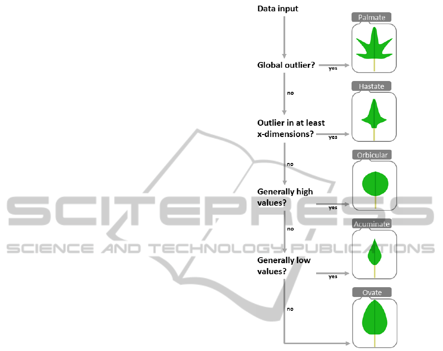
Figure 8: Shape Categories: Based on the results of the
clustering we assign different leaf shape templates accord-
ing to the data characteristics.
the burned forest area is so large. Low rain, high tem-
perature, and strong winds all support the spread of a
forest fire. Another interesting finding is the outlier
highlighted with the label 1. Compared to the other
leaves, this is the only glyph with a highly serrated
margin encoding a high amount of rain. It is interest-
ing to see that the area of burned forests is relatively
high although it rains a lot. Perhaps the higher wind
strength is a possible reason, however, rain does not
prevent bigger fires to happen.
For the other half of the year (red and green col-
ors) the temperature is higher with lesser forest fires,
which is a surprising fact. However, the size of these
leaves especially in winter times (colored red) are rel-
atively big and are oriented to the right (strong wind
conditions). This visual correlation between tempera-
ture, wind condition and the size of burned areas is an
expected finding since the wind is most often respon-
sible for spreading fire in a certain direction.
IVAPP2015-InternationalConferenceonInformationVisualizationTheoryandApplications
202
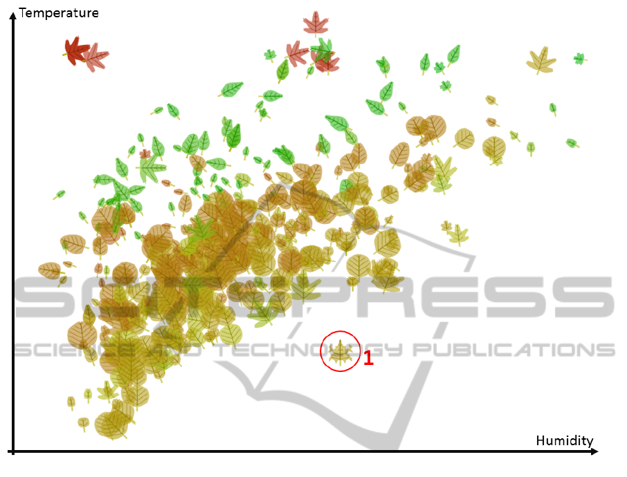
Figure 9: Forest Fire Data Set: We applied alpha compositing for aggregation to get a first overview of the data set. We
used the following mapping to represent the multi-dimensional data: Shape
ˆ
= local/global outlier, y-position
ˆ
= temperature,
and x-position
ˆ
= humidity, color hue/saturation
ˆ
= time (i.e., month), size
ˆ
= area of burned forests, venation and margin
ˆ
= rain,
orientation
ˆ
= wind.
Since we now understand the overall structure of
the data, we switch to an alternative aggregation tech-
nique to better understand the highly cluttered area
(Figure 10). Because of our prototype generation, we
loose the orientation of the glyphs and, therefore, the
wind condition. In the highly cluttered area in the
middle of the plot, several different maple leaf shapes
are now visible. They refer to outliers detected by our
previous clustering algorithm. It is interesting to see
that the temperature for these data points is relatively
low with nearly no rain and mixed humidity. Typical
indicators for fire, like high temperature, low humid-
ity and high wind strengths seem not to be the main
reason for the large burned forest areas. Perhaps other
factors, e.g., the area or the coverage of fire stations,
might be explaining factors here.
Of course, these findings would need to be sub-
stantiated by additional data considerations. Further
information, e.g., the amount of firemen fighting the
fire, the exact kind and amount of trees, or the time
until the fire was recognized are important side fac-
tors not covered within the data. However, with our
new glyph approach we were able to easily identify
timely patterns, outliers, and similar behavior of data
points.
5.2 Iris and Seeds
Figure 11 illustrates two well-known data sets (i.e.,
iris and seeds) from the UCI machine learning repos-
itory as an infographic representation. For both data
sets, an initial k-means clustering is performed based
on the number of classes within the data set. The clus-
ters are then mapped to unique leaf shapes and pro-
jected to 2D space by Principal Component Analysis
(PCA). As a last step the data dimensions are mapped
to leaf glyph properties providing insights of the data.
Due to the projection, some classes can already be
distinguished. However, additionally assigning the
clusters to different shapes helps to characterize the
data more easily.
By mapping all data dimensions to glyph features,
LeafGlyph-VisualizingMulti-dimensionalDatawithEnvironmentalCues
203
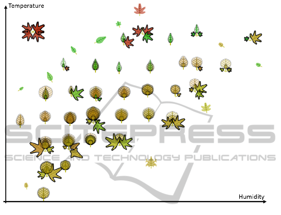
Figure 10: Forest Fire Data Set: We applied a prototype aggregation technique to reveal insights to the highly cluttered areas
in the plot. Interesting to note are the relatively big outlier leaf shapes, which were not visible beforehand.
it is possible to extract more detailed information. In
the seeds data set, there is a visual correlation be-
tween orientation (length of the grain) and venation
frequency (width of the grain). The same thing is true
for the color hue (asymmetry coefficient) and the y-
position (1st principal component). The size (com-
pactness) seems to slightly reflect the x-position (2nd
principal component).
The iris data set is clearly divided into two differ-
ent clusters by performing a PCA projection. How-
ever, the data contain three classes, which are mapped
to the shape by performing a k-means clustering. The
visualization clearly shows two classes within the sin-
gle cluster on the left. There seems to be a high corre-
lation between the sepal height and length, which are
mapped to the height and length of the glyph respec-
tively. Since no leaf shape gets rescaled, the ratio be-
tween the two is read similar. Within the three classes,
there is an almost equal distribution of the petal length
mapped to the color hue. Finally, the orientation rep-
resents the petal width, which highly correlates to the
x-position (2nd principal component).
6 CONCLUSION AND FUTURE
WORK
We introduced Leaf Glyph, a novel glyph design in-
spired by an environmental metaphor. Due to its nat-
ural and pleasing appearance, we expect users are
likely to be able to discriminate data by shape and
properties. The glyph is based on a naturally promi-
nent shape, which should connect well to human per-
ception, supposedly also under conditions of partial
overlap. We systematically structured the leaf glyph
design space. Specifically, we mapped data to the
main properties of the leaf glyph: leaf morphology,
leaf venation, and leaf boundary. Furthermore, we de-
fined a custom visual aggregation to scale the glyph
for large numbers of data records with respect to its
counterpart in nature. Finally, we exemplified the ap-
plicability and effectiveness of our approach in a mul-
tivariate data analysis task.
This work is only the first step in studying the
effectiveness of nature-oriented data visualization.
While we believe leaf glyphs can form intuitive and
IVAPP2015-InternationalConferenceonInformationVisualizationTheoryandApplications
204
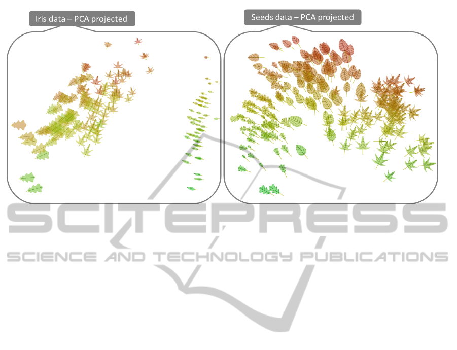
Figure 11: Infographic Representation: The well-known iris and seeds data sets from the UCI machine learning repository
are visualized using a 2D projection, and an appropriate mapping of data dimensions to leaf shape characteristics.
effective data glyphs, more thorough evaluation is
needed. Specifically, we want to compare the leaf
glyph against alternative glyphs from the literature,
such as Chernoff faces, and pixel-oriented glyphs.
This should also include user-studying of effective-
ness and efficiency of the technique. We also believe
our approach is aesthetically pleasing and may spark
interest by a wider audience, for use, e.g., in mass me-
dia communication. The leaf glyph may by design,
fit well to visualization of environment survey data.
Also, this should be evaluated by qualitative consid-
eration.
As a next step, we will combine our multi-
dimensional leaf glyph representation with related
botanical tree metaphors to extend the design space
with a hierarchical layout. We think the combination
of the two will support people with no computer sci-
ence background more easily in understanding com-
plex data structures due to the environmental refer-
ence. We further will test this in a controlled envi-
ronment against more abstract representations such as
TreeMaps, etc.
ACKNOWLEDGEMENTS
This work has been supported by the Consensus
project and has been partly funded by the European
Commission’s 7th Framework Programme through
theme ICT-2013.5.4 ICT for Governance and Policy
Modelling under contract no.611688.
REFERENCES
Beck, C. B. (2010). An introduction to plant structure and
development: plant anatomy for the twenty-first cen-
tury. Cambridge University Press.
Borgo, R., Kehrer, J., Chung, D. H., Maguire, E.,
Laramee, R. S., Hauser, H., Ward, M., and Chen, M.
(2012). Glyph-based Visualization: Foundations, De-
sign Guidelines, Techniques and Applications. In Pro-
ceedings of Eurographics, pages 39–63. Eurograph-
ics.
Chernoff, H. (1973). The use of faces to represent points in
k-dimensional space graphically. Journal of the Amer-
ican Statistical Association, pages 361–368.
Chuah, M. C. and Eick, S. G. (1998). Information rich
glyphs for software management data. Computer
Graphics and Applications, IEEE, 18(4):24–29.
Cleveland, W. and McGill, R. (1984). Graphical perception:
Theory, experimentation, and application to the devel-
opment of graphical methods. Journal of the Ameri-
can Statistical Association, pages 531–554.
Cortez, P. and Morais, A. d. J. R. (2007). A data mining
approach to predict forest fires using meteorological
data.
Deussen, O. and Lintermann, B. (2005). Digital design of
nature. Springer.
Du Toit, S. H., Steyn, A. G. W., and Stumpf, R. H. (1986).
Graphical Exploratory Data Analysis. Springer-
Verlag, New York.
Fuchs, J., Fischer, F., Mansmann, F., Bertini, E., and Isen-
berg, P. (2013). Evaluation of Alternative Glyph De-
signs for Time Series Data in a Small Multiple Setting.
In Proceedings Human Factors in Computing Systems
(CHI), pages 3237–3246. ACM.
Han, J., Kamber, M., and Pei, J. (2011). Data Mining: Con-
LeafGlyph-VisualizingMulti-dimensionalDatawithEnvironmentalCues
205

cepts and Techniques. Elsevier Ltd, Oxford, 3rd edi-
tion.
Kintzel, C., Fuchs, J., and Mansmann, F. (2011). Moni-
toring Large IP Spaces with Clockview. In Proceed-
ings Symposium on Visualization for Cyber Security,
page 2. ACM.
Klassen, R. V. and Harrington, S. J. (1991). Shadowed
hedgehogs: A technique for visualizing 2d slices of
3d vector fields. In Proceedings of the 2nd conference
on Visualization’91, pages 148–153. IEEE Computer
Society Press.
Kleiberg, E., van de Wetering, H., and van Wijk, J. (2001).
Botanical visualization of huge hierarchies. In In-
formation Visualization, 2001. INFOVIS 2001. IEEE
Symposium on, pages 87–94. IEEE.
Levkowitz, H. and Herman, G. (1992). Color scales for im-
age data. Computer Graphics and Applications, IEEE,
12(1):72–80.
M
¨
uller, B. (2014). Poetry on the road.
http://www.esono.com/boris/projects/poetry05/.
Retrieved July 2014.
Palmer, S. E. (1999). Vision science: Photons to phe-
nomenology, volume 1. MIT press Cambridge, MA.
Pickett, R. M. and Grinstein, G. G. (1988). Iconographic
Displays for Visualizing Multidimensional Data. In
Proceedings of the Conference on Systems, Man, and
Cybernetics, volume 514, page 519. IEEE.
Porter, T. and Duff, T. (1984). Compositing digital images.
In Proceedings of the 11th Annual Conference on
Computer Graphics and Interactive Techniques, SIG-
GRAPH ’84, pages 253–259, New York, NY, USA.
ACM.
Sallaberry, A., Fu, Y.-C., Ho, H.-C., and Ma, K.-L. (2012).
Contacttrees: Ego-centered visualization of social re-
lations. Technical report.
Siegel, J., Farrell, E., Goldwyn, R., and Friedman, H.
(1972). The Surgical Implications of Physiologic
Patterns in Myocardial Infarction Shock. Surgery,
72(1):126.
Stefaner, M. (2014a). The deleted. http://notabilia.net/. Re-
trieved July 2014.
Stefaner, M. (2014b). Oecd better life index.
http://moritz.stefaner.eu/projects/oecd-better-life-
index/. Retrieved July 2014.
Ward, M. (2008). Multivariate Data Glyphs: Principles and
Practice. Handbook of Data Visualization, pages 179–
198.
Ware, C. (2012). Information Visualization: Perception for
Design. Morgan Kaufmann, Waltham.
IVAPP2015-InternationalConferenceonInformationVisualizationTheoryandApplications
206
